Vertical Views
Techniques for depicting terrain from directly above were developed for two primary reasons. First, the oblique view inherently hides some map features; a vertical view, by contrast, offers a view of all landscape features within the map frame. The vertical view also allows the map maker to position features appropriately in geographic space—thus providing concrete spatial information, rather than a more artistic visual representation (Slocum et al. 2009).
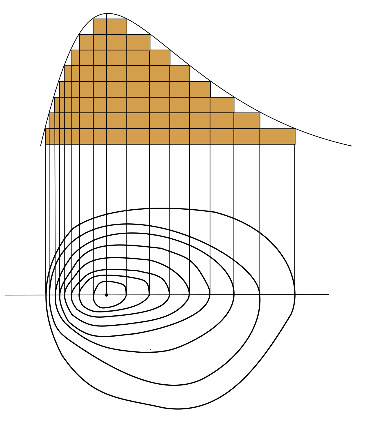
In the vertical view, terrain is typically represented with contour lines. Contour lines drawn on a map connect points of equivalent elevation. Figure 6.4.1 demonstrates how contour lines relate to the landscape from which they are derived—note that the bottom image is a 2D rendering of what is presumed to be a regularly-shaped mountain feature.
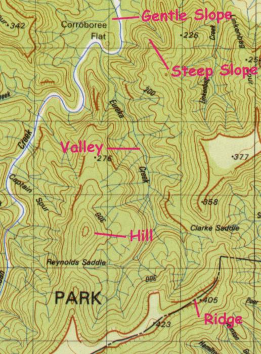
As demonstrated by Figure 6.4.1, gentle slopes are represented on contour maps by lines spaced farther apart than steep slopes. This is because elevation values change more quickly across steeper slopes, meaning that contour lines will need to be drawn more often (across the same map distance) to accurately represent the terrain. Figure 6.4.2 below shows a topographic map with markings to denote gentle and steep slopes, as well as valleys, hills, and ridges.
A map’s contour interval is the change in elevation (typically in meters) between drawn contour lines. This is a form of sampling (e.g., every 20m), meaning that topographic maps do not display every possible contour line, but rather display (as all maps do) a simplified view of the landscape.
In addition to mapping elevated features such as hills and mountains, contour maps are also useful for depicting underwater terrain. While topographic maps visualize elevations above sea level, bathymetric maps depict elevations below sea level.
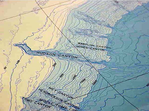
On topographic maps, increasing values indicate higher elevations. Bathymetric values—as they also represent a distance from sea level—increase in the opposite direction. So just as the highest values on topographic maps represent the highest mountains, the highest bathymetric measurements represent the deepest depths of the earth’s oceans.
Despite their usefulness in accurately depicting terrain, contour lines do require some prior knowledge for their proper interpretation, as they do not present an immediately intuitive view of the landscape. To mediate this, cartographers have developed innovative methods for artistically depicting terrain on vertical-view maps using additional elements of design.
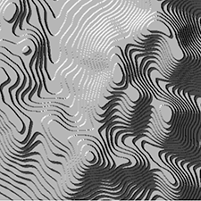
One popular method is Tanaka’s method (Tanaka 1950), often called Tanaka contours. Tanaka contours assume that the map is being illuminated by a light source from some direction, and contour lines are drawn lighter (i.e., illuminated) and thinner when facing the light source, and darker (i.e., in shadow) and thicker when perpendicular to the light source. The result is a contour map wherein the form of the landscape is more intuitively depicted (Figure 6.4.5). Ridges and valleys are far less likely here to be confused.
A similar but simplified method called illuminated contours was developed by J. Ronald Eyton (1984).
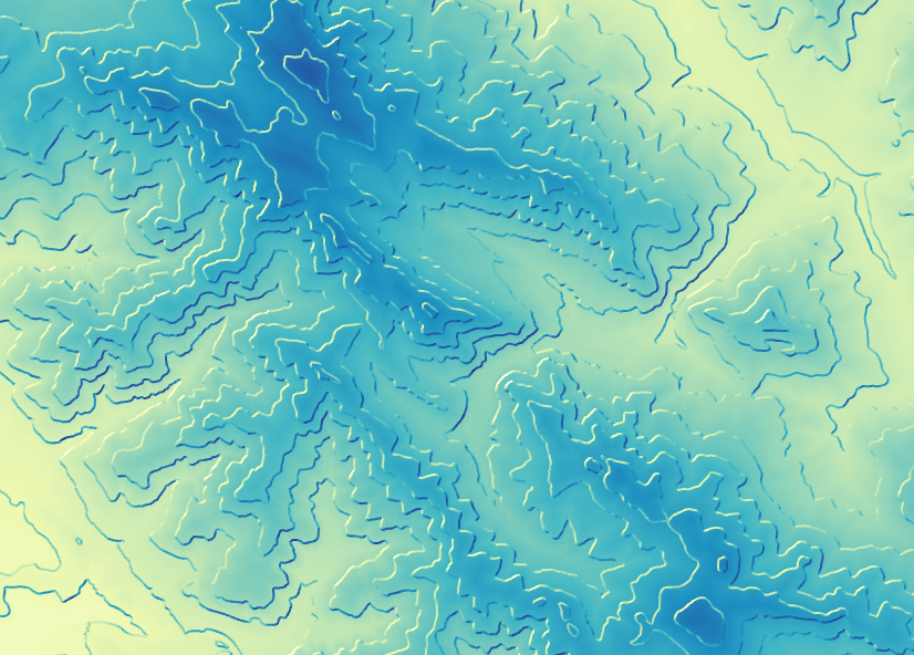
This method, shown in Figure 6.4.6, varies lightness as in Tanaka’s technique but does not vary line thickness. Contrary to Tanaka’s approach, which was applied manually, Eyton (1984) developed his method in the early days of computerized mapping—he used consistent line thickness to reduce computation time.
Other techniques for designing contour maps have been developed by other cartographers. You are encouraged to explore the recommended readings or search the web on your own to learn more about these techniques.
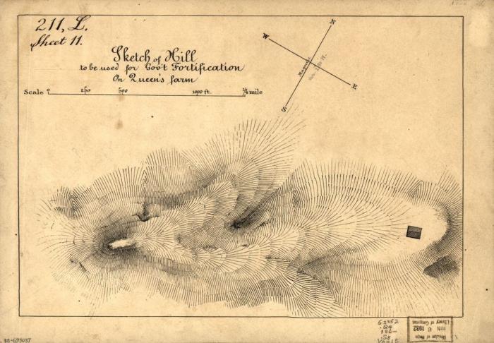
A mostly-outdated alternative to contour lines called hachures also exists. Hachures are created by drawing a series of lines perpendicularly to contours. The spacing between hachures are drawn proportional to the slope—steeper areas are highlighted by increased density of these lines (Slocum et al. 2009). A hachure-like technique can also be used to manually create shaded relief (a visually-appealing and artistic depiction of landforms), but its traditional purpose was to show a geometrically-correct depiction of slope.
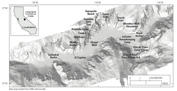
Shaded relief is commonly added to maps to give the reader a more intuitive impression of landform shapes. It presumes the existence of an imaginary light source and displays shadows over landforms accordingly, giving the illusion of depth. An example is shown in Figure 6.4.8.
The light source imagined in shaded relief mapping comes traditionally from the upper-left of the map (Northwest, assuming a North-up map view). At first, this might seem inappropriate—the sun rarely shines onto the Earth from a Northwestern direction, at least in the locations where most people live. This convention does not come from the earth sciences, however, but instead from guidelines in art developed in response to the realities of everyday life at the human scale.
Humans are used to illumination from the sun—as well as other light sources (e.g., lamps, overhead lighting)—coming from above our heads. As most people are right-handed, an upper-left light source ideal for writing. Even left-handed people typically write from left-to-right and top-to-bottom, due to the left-right convention of most languages. Figure 6.4.9 demonstrates the appropriateness of this upper-left light source.

We have become so accustomed to this location of light that light projected from other directions (e.g.. from underneath) results in features looking incorrect to the human eye. Imagine someone holding a flashlight underneath their chin in the dark—the reason their facial features appear so strange is that we are accustomed to seeing them lit from above.
Figure 6.4.10 below shows how changing the azimuth direction of an imagined light source can create confusion in the interpretation of landscape features. Both below maps depict the same location, and a valley exists within the yellow box on each. Left, the valley is shown via traditional Northwest illumination. When the map is illuminated from the Southeast (right) the valley now appears inverted—it looks like a ridge.
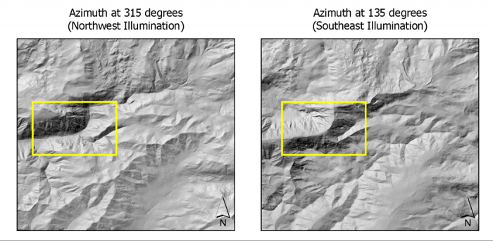
Much of cartography is about understanding not only the analytical elements of landscapes and map design variables, but human perception. The Northwest oblique light source convention is an excellent example of how cartographers have developed their techniques with this understanding in mind.
Recommended Readings
- Chapter 5: Landform Portrayal. Muehrcke, Phillip C., Juliana O. Muehrcke, and A. Jon Kimerling. 2001. Map Use: Reading, Analysis, Interpretation. Fourth. Madison, Wisconsin: JP Publications. Intergovernmental Committee on Surveying and Mapping. 2018.
- “Topographic Maps.” Accessed November 9, 2018.