Building Terrain Layers
Before the widespread use of computers and GIS for map-making, terrain visualization techniques such as hachures were drawn by hand, and elevation values were approximated using photographs and survey data. In modern cartography, almost all terrain layers begin with one map layer—a digital elevation model (DEM). Though you likely often see DEMs with additional design elements such as color tints and shaded relief, DEM data is actually as simple as shown in the image in Figure 6.5.1 below.
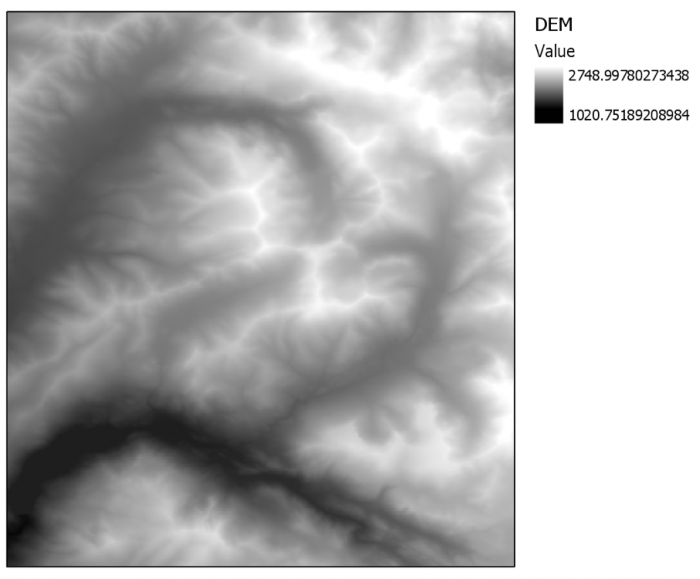
DEMs are raster, or grid-based data. Each grid cell (also called a pixel) in a DEM image has a single value, which corresponds to its elevation. In Figure 6.5.1 for example, the values closest to white are the locations of highest elevation at this location. Using GIS software, DEM data can be used to easily create additional terrain layers—the most common being hillshade, curvature, and contours.
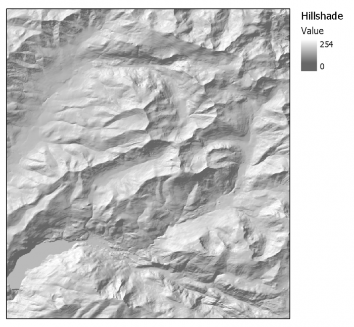
Hillshade is a term often used interchangeably with the term shaded relief discussed earlier. Hillshade is a greyscale raster data layer which uses lightness to imitate the highlights and shadows that would be cast by a hypothetical oblique light source. The highest values in a hillshade layer, then, are those which would be met with the highest levels of illumination from the light source.
Contour lines, as discussed in the vertical views section lesson, connect points of equal elevation across a terrain surface. The density of lines across the map depends on the slope of the terrain—steeper slopes result in lines being drawn closer together. When creating a contour map, you choose what contour interval to use on your map. Theoretically, an infinite number of contour lines can be drawn on any map. Cartographers typically consider multiple factors when choosing a contour interval, including the scale of their map and the steepness of the terrain.
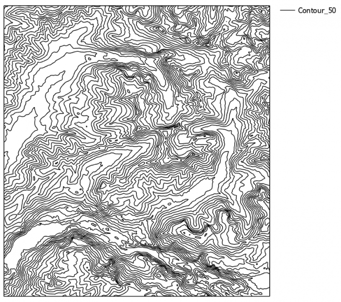
A common technique when symbolizing contour lines on maps is to draw index contours—contour lines that are more visually prominent—at less frequent intervals. Often, to avoid map clutter, only these contour lines are labeled. Map readers can then use the lines between them, called intermediate contours, to interpolate elevation values between them.
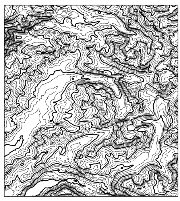
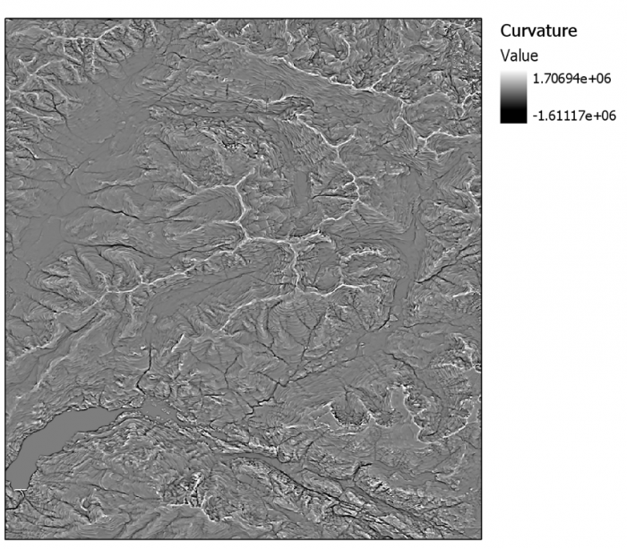
Digital Elevation Models can also be used to generate curvature layers, such as the one shown in Figure 6.5.5. Curvature is often referred to as “the slope of the slope.” In mathematical terms, it represents the second derivative of a terrain surface (Muehrcke, Muehrcke, and Kimerling 2001). We will not go into the technical details of how this layer is calculated—the important thing to know for map design is that curvature is excellent for showing inflection points in a surface—sharp ridges and deep valleys. In this way, adding a curvature layer can add additional visual interest to your terrain map.
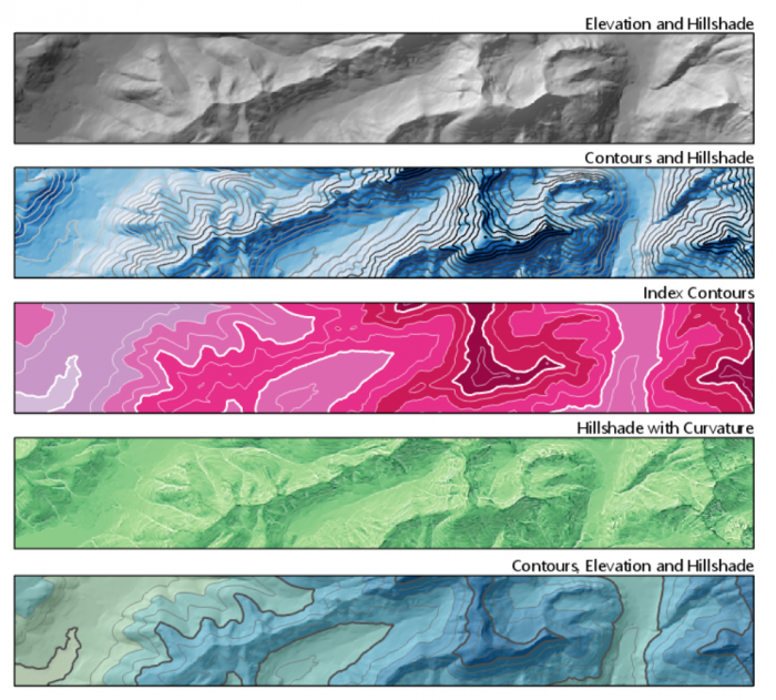
Viewed individually, none of these layers are very interesting. However, with just a digital elevation model from a source such as The National Map, you can generate several different terrain layers and use layer transparency, color, and other design elements to create imaginative depictions of Earth's terrain. Though terrain visualizations are typically used as a base layer for thematic or general-purpose map data, making maps just of Earth's terrain and experimenting with new, creative designs can be quite fun.
Recommended Readings
- Kennelly, Patrick. 2009. “Hill-Shading Techniques to Enhance Terrain Maps.” In International Cartographic Conference.
- Nelson, John. 2018. “Hacking a DEM Sunrise.” ArcGIS Blog. Accessed November 9, 2018.