From Reader to User
We often consider how our map readers might interpret or respond to a map we make. Predicting and designing our maps to account for this is a complex problem that we have discussed throughout this course. When making maps, we often must choose a suitable projection, symbolize data appropriately, visualize additional elements such as terrain, and so on. We also account for contextual factors: for example, we might expect our map readers to be stressed or working within time constraints. We may also need to design for media-based constraints such as black-and-white newspaper printing, or for challenging viewing scenarios, such as small sizes (e.g., in an academic journal article) or far distances (e.g., in a slideshow presentation).
You might recall the maps in Figure 9.1.1 from Lesson 1 - each was designed with a different type of map reader in mind.
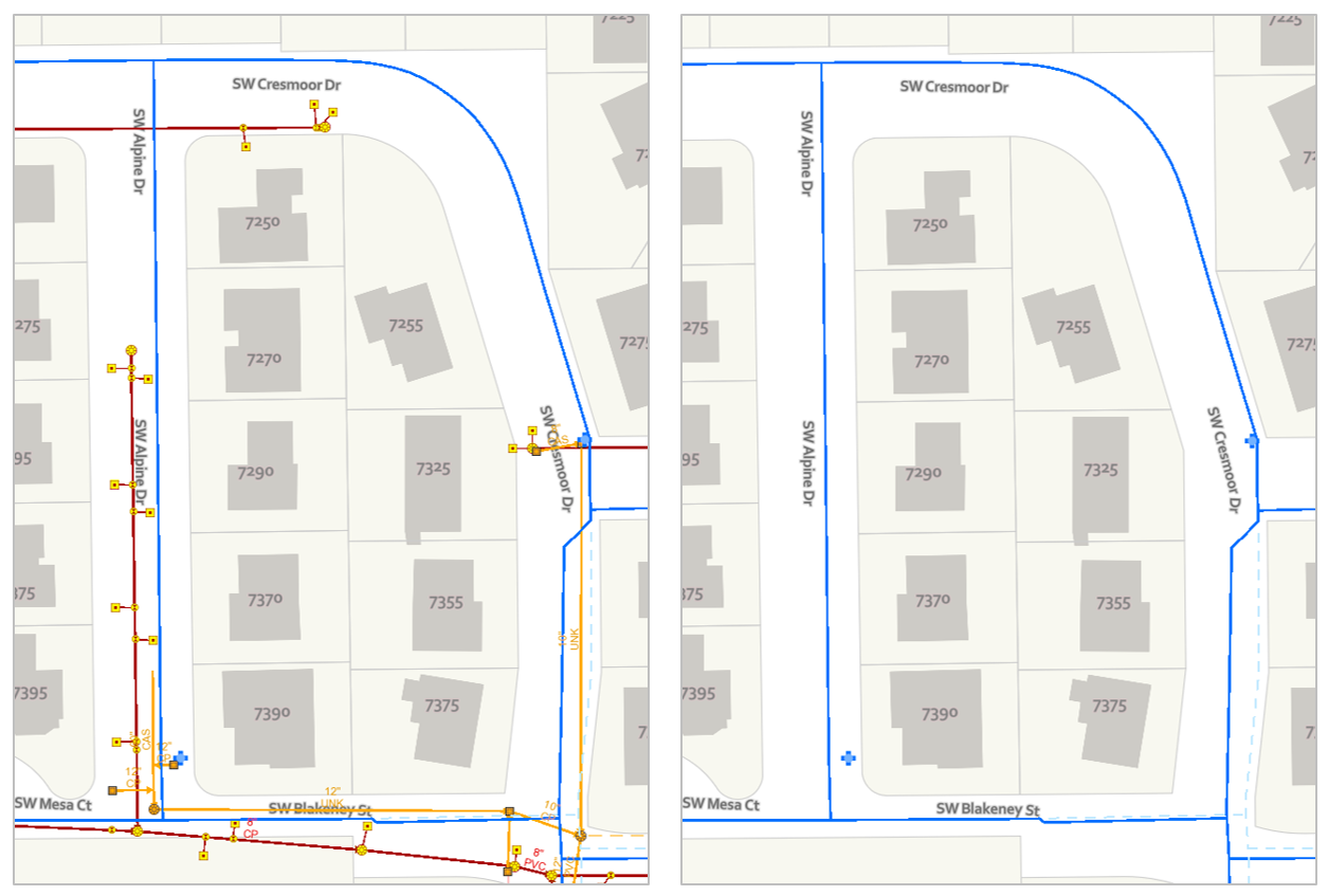
Figure 9.1.1 shows how minor alterations to a static map (here, technically still-frames of a larger map) can make it more suitable for a given map audience or purpose. Last lesson, we introduced interactive maps—maps that change based on some form of user input. This new realm of interactive mapping has turned our focus from the map reader to the map user (Roth et al. 2017). We now must consider not just how our map’s audience will interpret the map we design in a single state, but how they will interpret it as they use it, which is to say, as they alter it. An interactive map must work not only in one state, but ideally at every state that might be reasonably encountered by the map user. This is no small task.
Even basic interactions such as panning around a slippy map can introduce challenges. Figure 9.1.2, for example, shows two locations on an OpenStreetMap basemap, both at a 1:5,000 scale.
These maps are shown at the same scale but appear vastly different—and this makes sense, given that they are very different places. What this example highlights, however, is the variety between locations that pan-able maps must often be designed to cover. Web maps typically cannot be designed separately for each location (imagine the time that would take!) so cartographers use generalization algorithms and design rules to ensure that their maps will work at locations rural and urban, near and far, and at scales both small and large.
Panning (i.e., moving the map to another location) is among the most basic functions performed with interactive maps. Additional functions such as filtering and route-planning introduce further complexities to interactive map design. For insight on how to best support such tasks, cartographers have turned to the study of usability. Usability is defined by the International Organization for Standardization (ISO 9241-11:2018) as “the extent to which a system, product or service can be used by specified users to achieve specified goals with effectiveness, efficiency and satisfaction in a specified context of use.” Designers of websites, mobile apps, and many other technologies consider system usability when building their products. Though it is a subject with a rich history and many facets, Jakob Nielsen’s (1994) usability heuristics provide an excellent foundation for assessing the usability of a system (such as an interactive map).
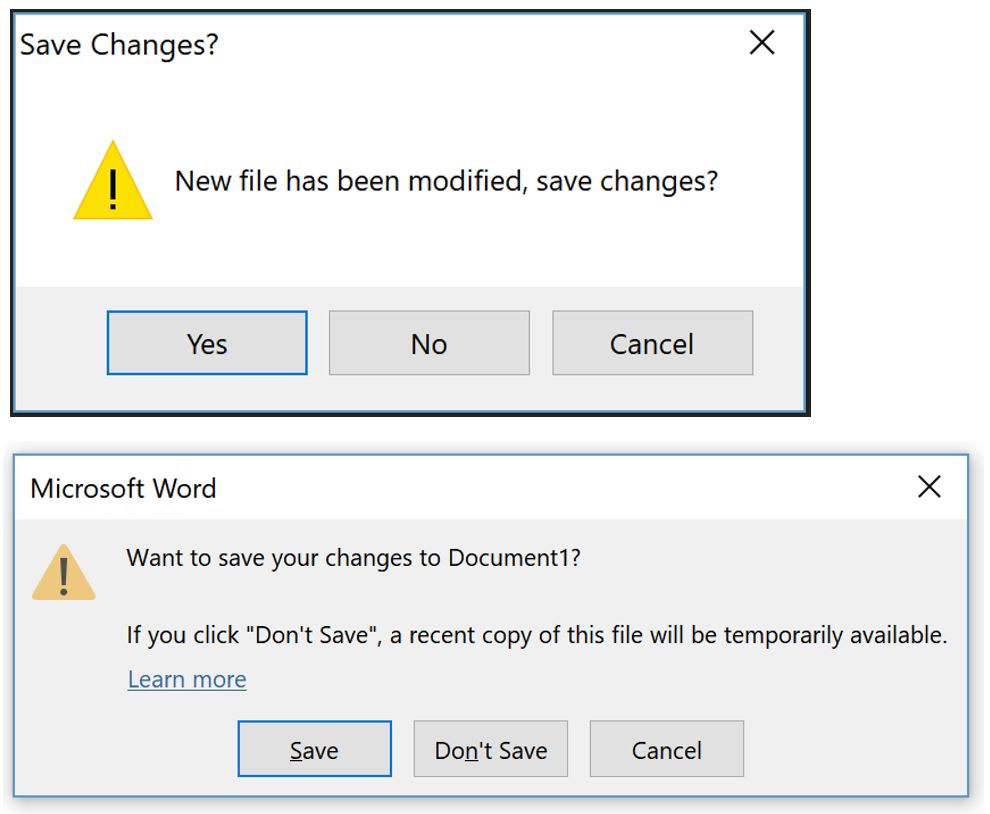
Figure 9.1.3 demonstrates two of Nielsen's usability heuristics: error prevention, and consistency and standards.
Student Reflection
View Nielsen’s usability heuristics online. Open ArcGIS Pro, and search for examples of these heuristics in the interface. You might also try this out with another favorite (or least favorite) software program. Which heuristics are implemented? Which are forgotten?
As suggested by the ISO (2018) definition, an important component of usability, and one that ought to be considered when implementing the usability heuristics is the idea of context of use. For example, a routing app might be designed specifically so that the interface can be safely manipulated (or not) while the user’s vehicle is in motion.
Despite the importance of context in designing usable systems, a significant amount of scientific research related to usability has focuses on developing more generalizable findings, such as whether users can identify changes in animated maps (Fish, Goldsberry, and Battersby 2011). When we consider how to assess maps in terms of their usefulness, it is helpful to distinguish between these two primary approaches: traditional, experimental research intended to elucidate generalizable insights, and design studies that focus on context-specific design. Roth and Harrower (2008) describe these sorts of studies as a continuum from controlled experimentation to usability testing. Despite the helpfulness of conceptualizing cartographic evaluation methods as existing along a continuum, we discuss these methods as falling more generally into one of two categories (1) experimental studies, and (2) design studies, for simplicity and brevity.
Recommended Reading
- Roth, Robert E., and Mark Harrower. 2008. “Addressing Map Interface Usability: Learning from the Lakeshore Nature Preserve Interactive Map.” Cartographic Perspectives, no. 60: 46–66. doi:10.14714/CP60.231.
- Roth, Robert E, Arzu Coltekin, Luciene Delazari, Homero Fonseca Filho, Amy Griffin, Andreas Hall, Jari Korpi, et al. 2017. “User Studies in Cartography: Opportunities for Empirical Research on Interactive Maps and Visualizations.” International Journal of Cartography. doi:10.1080/23729333.2017.1288534.