Geovisualization and GeoVisual Analytics
When we talk about interactivity in maps, we must consider not just user interactivity within maps, but interactively among maps, as well as with other tools and visual graphics. Interactive mapping has played an important role in the field of visual analytics, defined as “the science of analytical reasoning facilitated by interactive visual interfaces” (Thomas and Cook 2005).
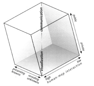
Recall the Cartography Cube from Lesson 1 (review this concept in the Communicating with Maps section). Most of the maps we have designed thus far would be considered to be in the communication (public, static, and intended to present known information) corner of the cube. Visual analytic tools typically belong in the opposite corner—these tools are characterized by high human-map interaction and are often designed with private data or data that is otherwise meant for domain experts. They also focus on revealing unknowns (i.e., generating insights), rather than communicating known trends.
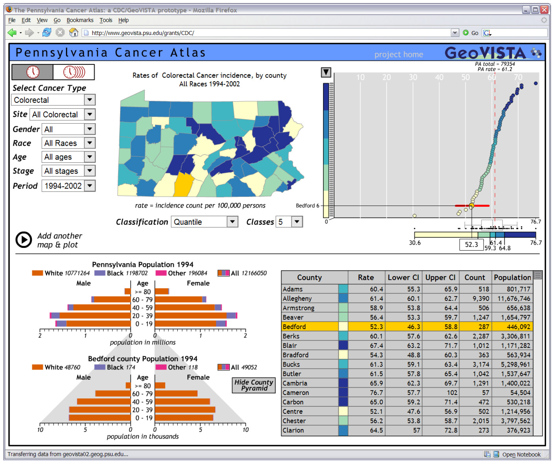
One domain in which visual analytics has been particularly popular is in public health and epidemiology. An example tool is shown below (Figure 9.4.2). The Pennsylvania Cancer Atlas is an interactive tool designed at the GeoVISTA Center at Penn State, with assistance from the Centers for Disease Control (CDC) (Bhowmick et al. 2008). The atlas includes a choropleth county-level map of Pennsylvania, coordinated charts and tables, and filtering and selection options to compare data across the views. In the view shown below, for example, Bedford County has been selected on the map by the user, and the scatterplot and table have been highlighted to focus on that county as well. This connecting of multiple visual depictions of data is called coordinated views.
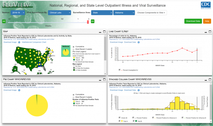
A more recent example is FluView, a visual analytic dashboard designed by the CDC for analyzing data related to incidence of the flu in the United States. FluView is shown in Figure 9.4.3 below—you can try it out by selecting the link here: FluView.
A demo of a more complex geovisualization built around visual storytelling, Detecting Disease Spread from Microblogs, is shown in the video in Figure 9.4.4. below:
Selecting ‘lil’ microblogs (0:02)
The first stage of our analysis involved identifying the key words and phrases that we thought were associated with the epidemic, this allowed us to select only those blog entries that we thought were relevant for the analysis of the disease.
Where, when, what (0:13)
Our main application comprised three views of the blog posts, firstly one showing where they occurred, secondly one showing when they occurred, including the associated weather over this timeline, and thirdly, the posts themselves. The distribution of posts shown on the map indicate a concentration around the hospitals, this led us to believe that at least some of these posts were second or third entries from people who’d already fallen ill elsewhere. We could confirm this by examining the history of the people who tweeted on the map. Here we see all posts by the same poster, indicating that they’d tweeted several times about the same illness. This led us to filter our data so that only the first entry from each poster was shown on the graph, here shown by red bars, and on the map we see that there are no longer any concentrations around the main hospitals, indicating that people first posted when they became ill, away from the hospitals.
Ground zero (1:21)
The timeline shows very clearly when the epidemic first starts, about the 18th of May. We can do a temporal selection on the data to find out how to disease begins to spread from that point. The timeline shows data grouped into bins of 6 hours. To identify ground zero we can change the resolution of the bins to a much finer-grained analysis. By performing a temporal selection at this new resolution, we begin to see what happens at the start of the outbreak. Looking at the map view as we move through time, we begin to see the first outbreaks of the disease in the downtown area. This led us to believe that there were three areas in the downtown region where the disease first emerged: The Vastopolos Dome, next to this Vastopolos Hospital, and around the Convention Center. We also see some spread towards the riverside of the Dome.
Spread and containment (2:18)
To be sure that we were viewing the real spread of the disease, rather than the propensity to microblog, we created a chi-expectations surface of the region, where dark green areas show a greater than expected density of ill posts, and purple areas show a less than expected density. In addition to the Dome, the Hospital, and the Convention Center, this also reveals that Eastside has a greater than expected density of incidences. The third region to show the spread of the disease is toward the west of the region on the banks of the river. This is in contrast to the southern areas of downtown and uptown area, which seem relatively unaffected by the disease. Finally, we summarize the distribution of points using a standard ellipse. This allows us to examine how the disease spreads over time, by performing a temporal selection on the bar chart at the bottom, and then moving through time, we can see how that standard ellipse, which gets dark green with a high concentration of the disease, is dragged towards the southwest by instances of a completely different disease, associated with the river. By filtering posts that show sickness, diarrhea, and stomach cramps, we clearly see the river association of the disease, which started at 2am on the 19th. To examine whether there’s any spread beyond the length of the river, we can perform a spatial selection of just those points associated with the river, and examine how that changes over time. Doing so reveals that while there’s a high concentration towards the northeast of the river, this doesn’t move downstream over time. We can therefore be confident that the disease is relatively well-contained.
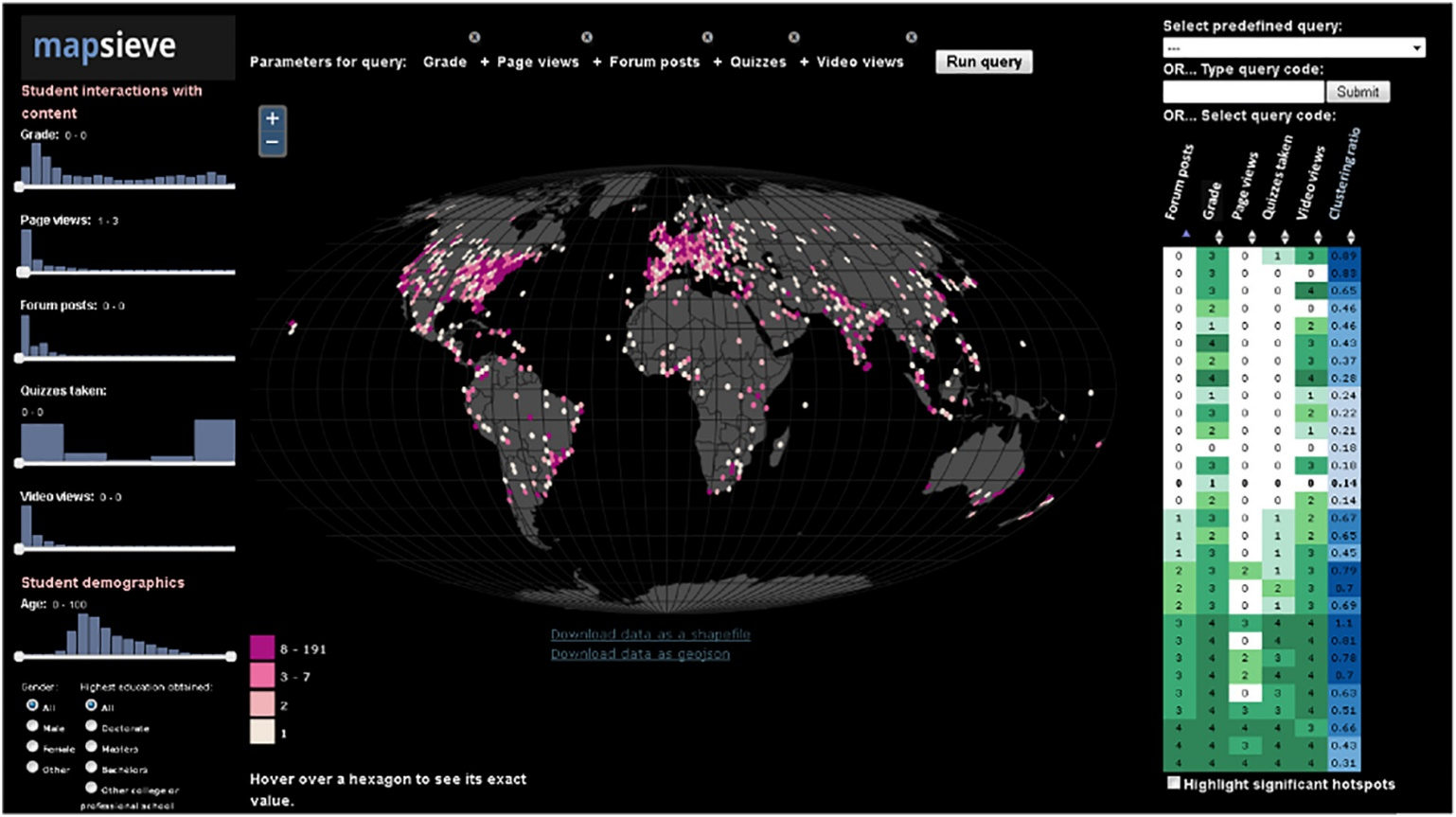
Though health and public safety applications are popular uses for (geo)visual analytic tools, they have been used in many domains. Figure 9.4.5 below shows the geovisualization tool MapSieve, designed for analyzing spatial patterns of student engagement in online courses taken by students all over the world.
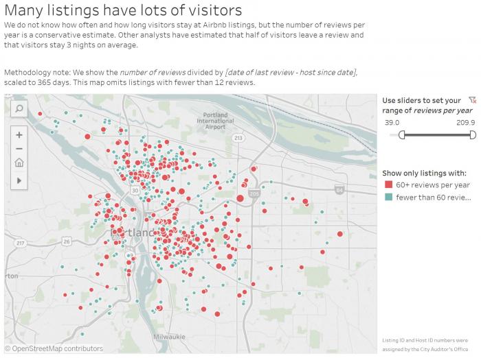
While the tools above focus on fairly complex data that often require domain knowledge for effective interpretation, similar visualization tools are also often used in more fun, less serious contexts. Figure 9.4.6, for example, shows a Tableau (data visualization software) dashboard that visualizes AirBnb data in Portland, Oregon. We will take a closer look at dashboards like this later in this lesson.
Similar interactive tools are often designed for mapping election results or other data of public interest. Graphics are often accompanied by a significant amount of text, both within the main view as explanatory text, or adjacent, to tell a story supported by the data. We discuss this more in the next section: Data Journalism.
Recommended Reading
Bhowmick, Tanuka, Anthony C Robinson, Adrienne Gruver, Alan M MacEachren, and Eugene J Lengerich. 2008. “Distributed Usability Evaluation of the Pennsylvania Cancer Atlas.” International Journal of Health Geographics, no. February 2015. doi:10.1186/1476-072X-7-36.