Lesson 3 Lab Visual Guide Index
- Starting File
- Get spatial data for the census tract-level map
- Download Census Data to Map
- Format Census Data for Import
- Add ACS data to your project
- Joining Census data to boundary files
- Symbolizing Data
- Creating a Layout
- Save-As: Building Dot Density Maps
- Additional Tips
-
Starting File
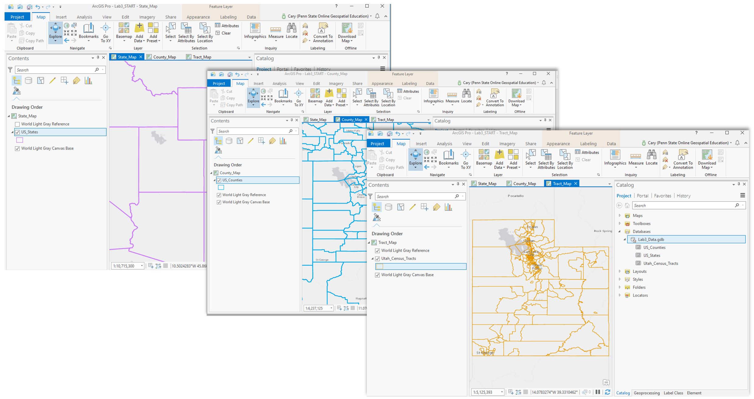
This is your starting file in ArcGIS Pro: It contains state and county boundary data for the entire US. Your maps will focus on a state of your choosing from the list given in the lab document.
For each mapping technique (proportional symbol; dot map), you will create three maps: state-level, county-level, and census-tract level. In addition to using the boundary files provided, you will download and add census tract boundaries, and data from the US Census Bureau's American Community Survey.
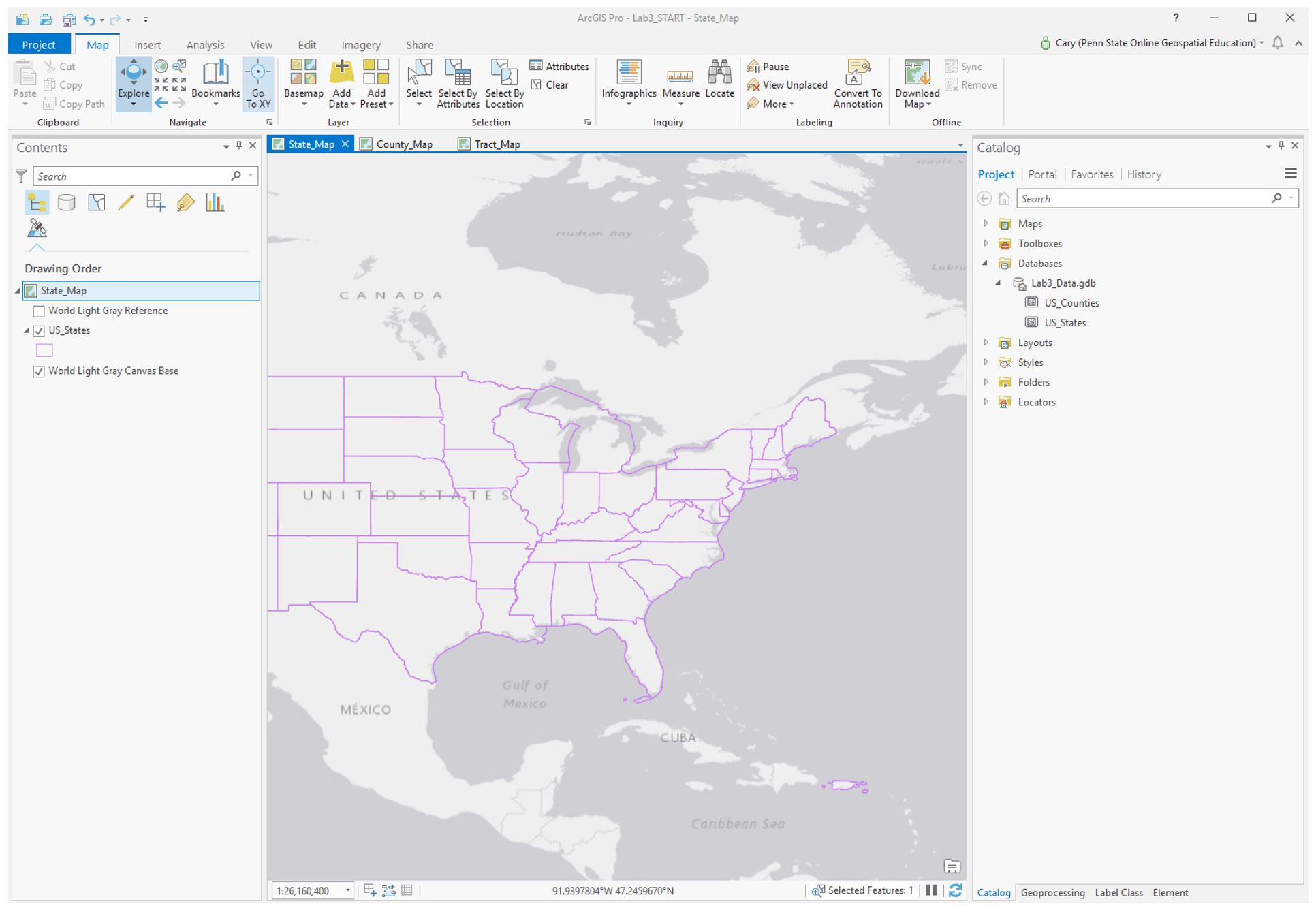 Visual Guide Figure 3.1. Starting file in ArcGIS Pro
 -
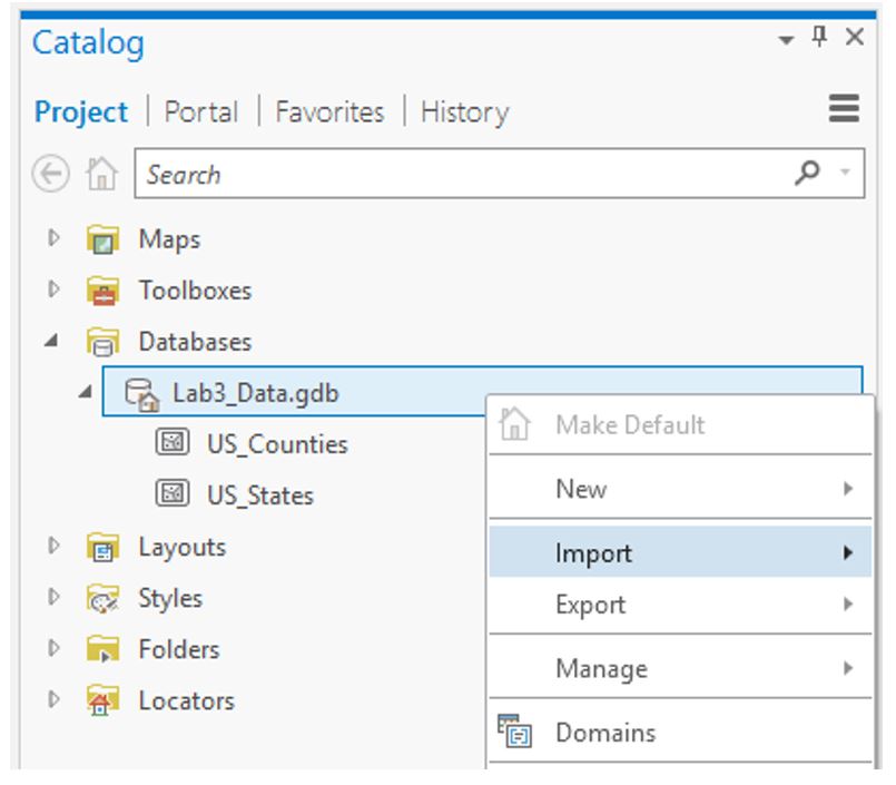
Get spatial data for the census tract-level map
Visit US Census Bureau: TIGER/Line Shapefiles. Select the appropriate data using the drop-down menus. Download and paste the zipped folder into your Lab 3 folder, extract all files, and import as a feature class into ArcGIS Pro (see Figures 3.2 and 3.3).
 Visual Guide Figure 3.2. The starting data in this lab file - you will be importing more.
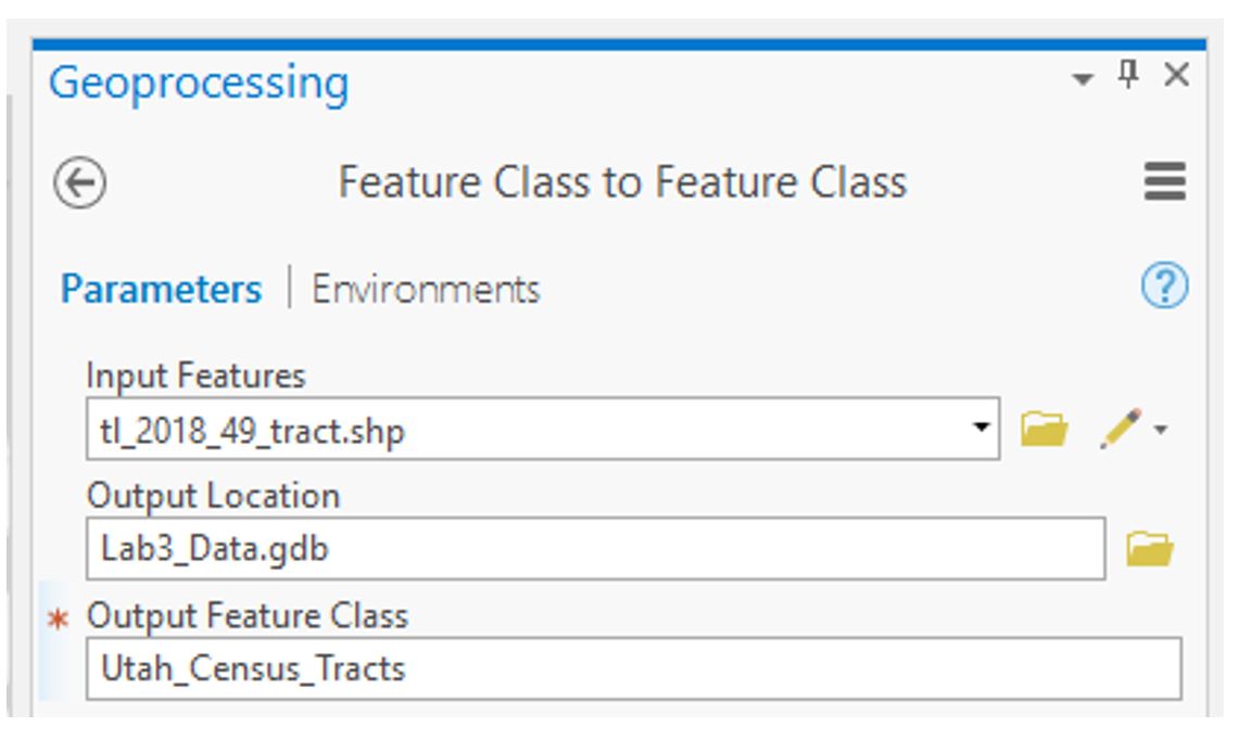 Visual Guide Figure 3.3. Running the import tool to add census tract data to your project's database.
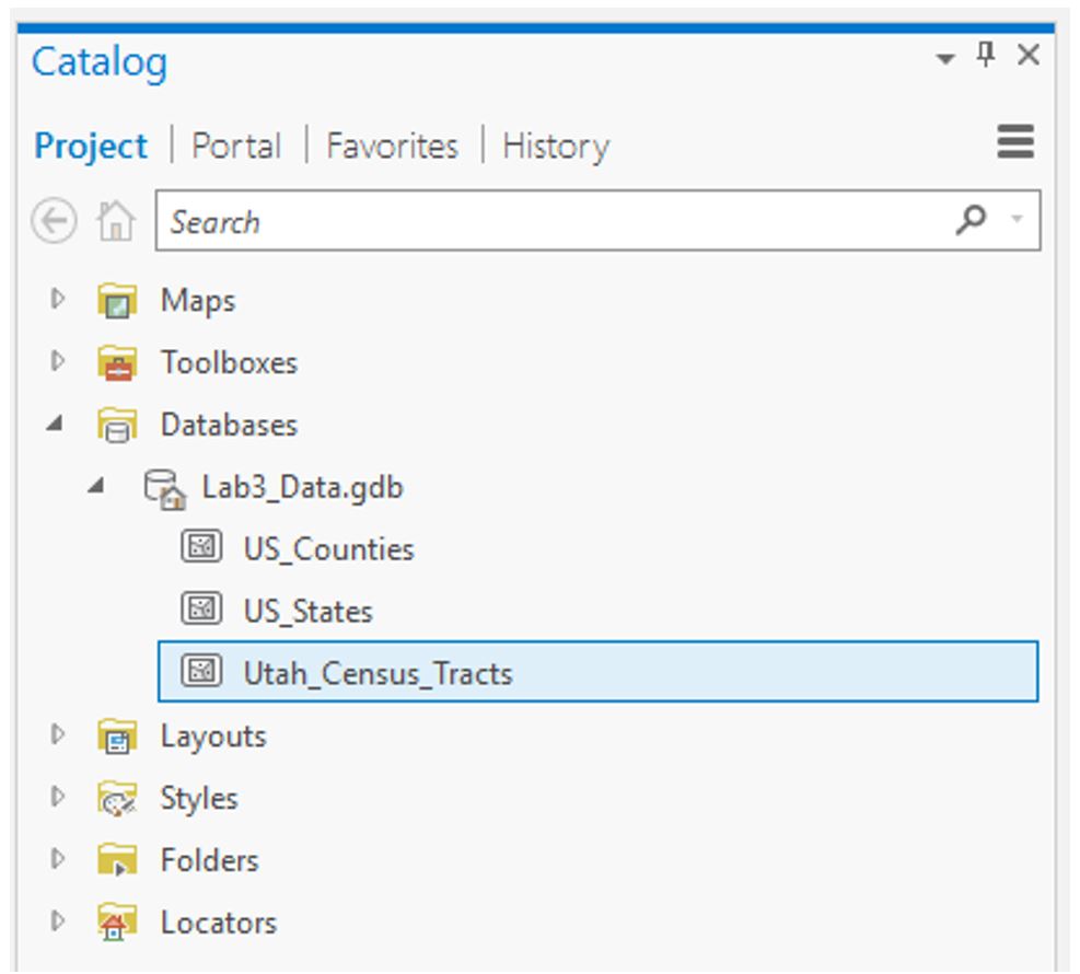 Visual Guide Figure 3.4. The result of your import: census tract data for one state in your geodatabase.
Add your newly-imported census tract data to the Tract_Map. At this stage, you should have three maps with boundaries: state, county, and census tract.
 Visual Guide Figure 3.5. Three maps of boundaries, each at a different scale.
 -
Download Census Data to Map
You will be downloading your census data using the US Census Bureau Data Tool
The ACS census data that you download will include demographic data of your choosing for the state, county, and tract level geographies. This demographic data will be in spreadsheet format that you will then join to the TIGER boundary files.
If you use the Advanced Search option in the census data tool, you may find it easier to search for Census data according to specific topics, geography, years, surveys, or codes. For example, assume I am interested in choosing ACS 2015 five year surveys for all census tracts in Ohio for the purpose of examining the number of veterans. Here is what I would search on using the Advanced Search option. The words listed below correspond to the search criteria in the Advanced Search interface. Note that you can narrow your serach for data by clicking on any of the search criteria in any order. Here is the order I used.- Surveys: Choose the ACA (American Community Survey) ACS 5-year estimates detailed tables
- Geogrpahy: Choose Tract - Ohio - then All tracts within Ohio
- Years: Choose 2015
- Topics: Download topic of interest for a variable of interest (e.g., populations and people - veterans)
- A listing of detailed tables will be returned from which you can choose one table
- The census tract results will likely be too large to display (no worries). On the screen that appears, download the data as a zipped Excel file format (do not just download the XLS or CSV format as these will not have the fields used for the join process)
- Once you have downloaded the tract data into your lesson folder, extract its content from the *.zip file, open up the Excel file, and inspect the rows and columns
- As you review the tract data, make sure the data you selected is appropriate for the symbolization methods in this lab (i.e., raw totals or counts)
- You can delete any columns that include null values as these values will not be mapped
- Repeat this process for the county and state data files for this lesson
Tip!
These screenshots show the ACS data sets for the "Households_" spreadsheet files containing count data as separate folders. Think about what makes the households an appropriate choice for the symbolization methods in this lesson? Please choose a different dataset other than housholds for your own maps.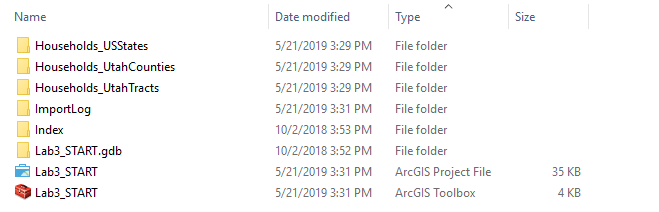 Visual Guide Figure 3.6. All folders neatly labeled within the Lab3 folder. The Households_ folder contain the ACS demographic data.
 -
Format Census Data for Import
For each geographic scale (state; county; tract), open the appropriate Excel file from your downloaded data folder and follow these steps:
1) Delete the top row (you only want one header row; this will become your top row/field names in ArcGIS).
2.) Save-As each Excel file (one per geographic scale) as a *.csv formatted file with a sensible name (so you can easily find it to import).As you scan through your file, you will see that there are likely a lot of data columns. Choose one column (variable) that interests you. Most of these columns (variables) you will not use for this lesson. Therefore, it is also helpful to delete the columns you don't need for your map, as this will make the table easier (faster) to import and deal with in ArcGIS.
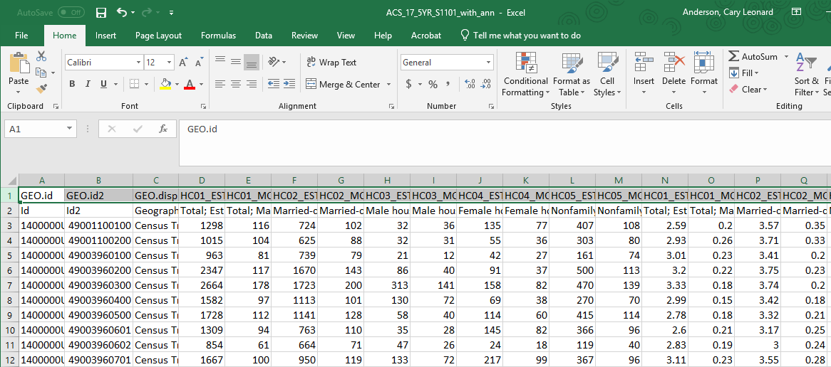 Visual Guide Figure 3.7. An American Community Survey (ACS) data file in Excel for the census tracts. The highlighted top row should be deleted from your *.csv file leaving the more helpful field names.
 -
Add ACS data to your project
Use the import table(s) function to import your CSV files. Hit F5 (refresh) if your data appears to be missing! It likely just needs to be refreshed.
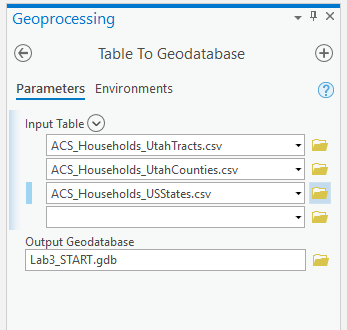 Visual Guide Figure 3.8. Importing your .csv files as tables in ArcGIS Pro.
Refresh your database in the catalog pane to see the tables you have imported.
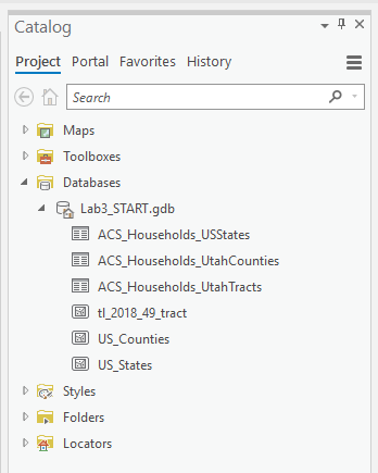 Visual Guide Figure 3.9. The Catalog Pane.
 -
Joining Census data to boundary files
For each map, we want to join our imported ACS table to the spatial boundary file.
To do this, we want to find the field that matches between the ACS table and the spatial attribute table – we will join them using this field. Figure 3.10 below shows that the STATEFP field in the US_States boundary files matches the Id2 field in our Census data table.
We have one problem: the values in the STATEFP field (boundary file) are stored as text values, but those in Id2 are stored as numbers.
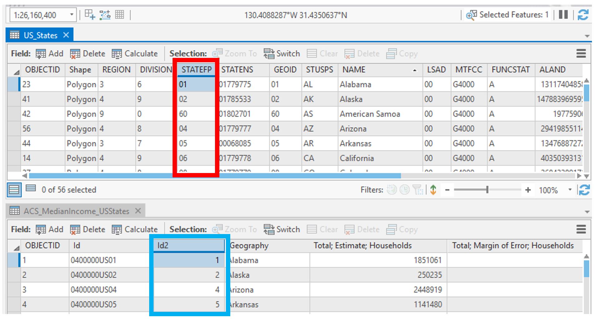 Visual Guide Figure 3.10. Comparing the type of values in the two attribute tables we want to join.
The easiest way to remedy this is to create a numerical field in our spatial boundary data attribute table and use that field to join it to the ACS data table.
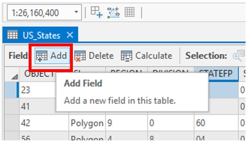 Visual Guide Figure 3.11. Adding a new field to an attribute table.
Choose “Double” as your Data Type. Don't forget to save!
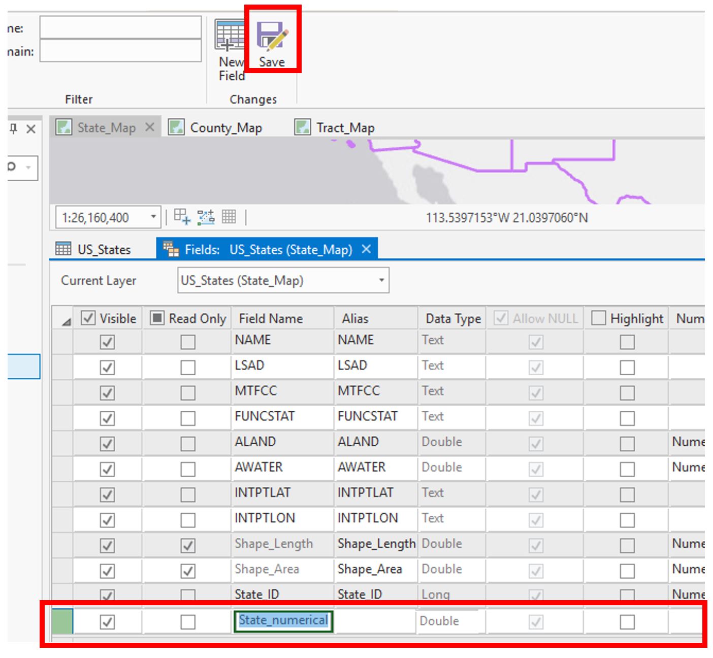 Visual Guide Figure 3.12. Adding a new (numerical) field.
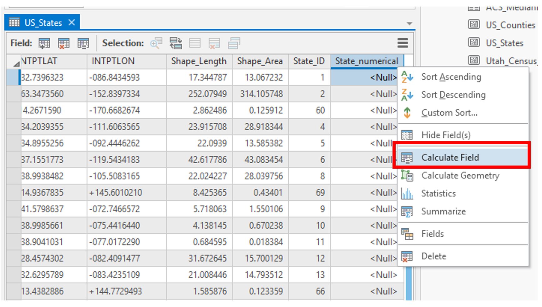 Visual Guide Figure 3.13. Calculating our newly-created field.
We will calculate this field by requesting that the new values be equivalent to those in the original text-based field (STATEFP) we wanted to use. In essence, we are creating a duplicate field with the same values, except that this time the values will be stored in numerical form.
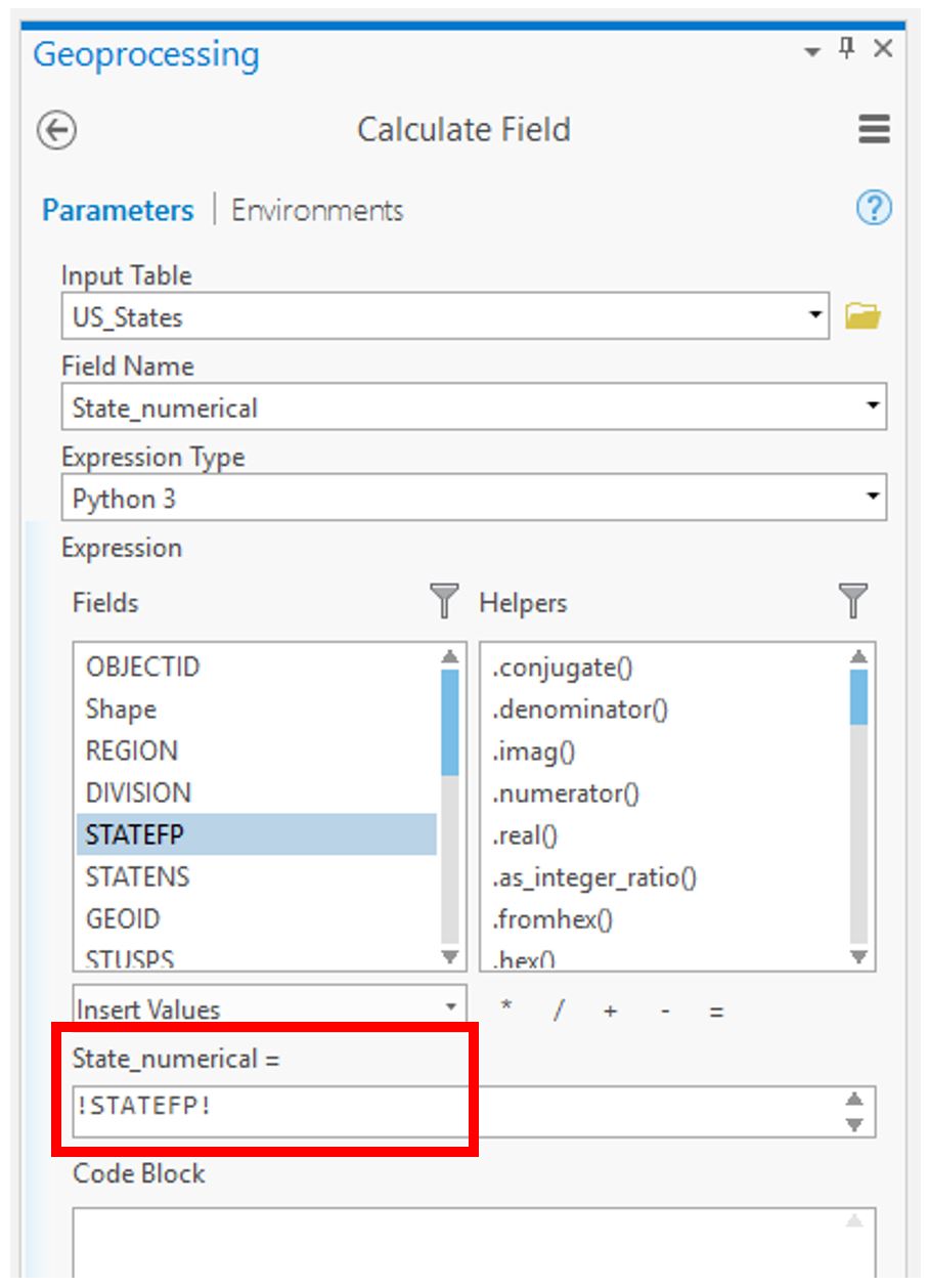 Visual Guide Figure 3.14. Calculating the field via an expression in ArcGIS Pro.
Your spatial file should now be ready to be joined to your ACS data!
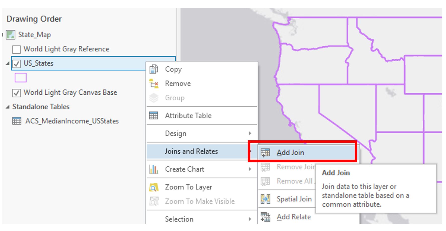 Visual Guide Figure 3.15. Adding a Join.
Add the join, using your newly calculated field and the matching field in your ACS data.
A Few Notes on Joining the State, County, and Tract Level Data.
- For the State table: when formatting the state *.csv data in Excel, add an ID column to the right of GeoID and type the value of the last 2 digits in GeoID (after "US") into each field, ex. 0400000US01 should be 1 or 0400000US10 should be 10.
- For the County table: do the same thing as directed above but type all of the digits following "US."
- For the Census Tract table: instead of creating a field in the Excel file, go into ArcGIS Pro and create a Text field within the census shapefile. Next, calculate the new field to equal this expression: "1400000US" + !GEOID!. Then join the Census Tract table to the census shapefile using that new field.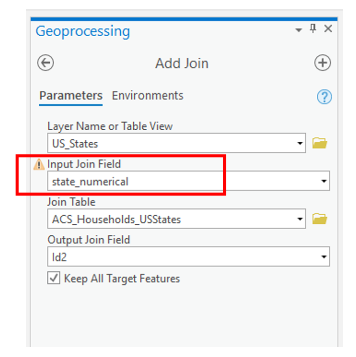 Visual Guide Figure 3.16. Adding a join - the geoprocessing view.
 -
Symbolizing Data
Before symbolizing your maps, repeat the previous steps (create and calculate new field; join ACS data) for your county-level and census tract-level maps. You will then have three maps ready to symbolize.
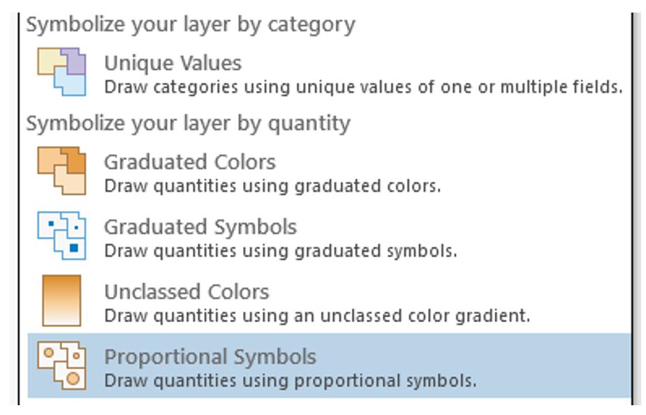 Visual Guide Figure 3.17. ArcGIS Pro symbolization choices.
Use the Proportional Symbols method to symbolize your data.
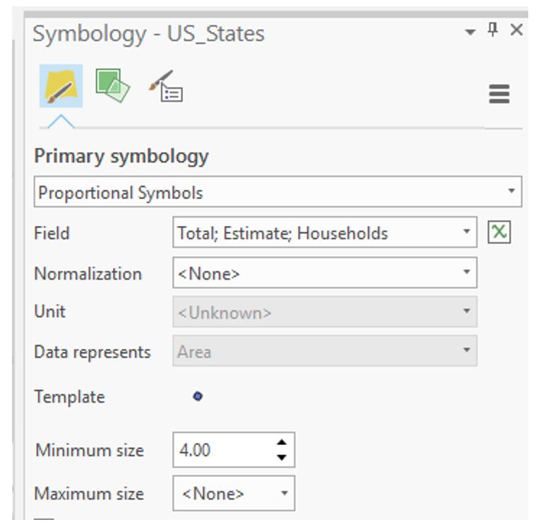 Visual Guide Figure 3.18. Proportional symbols in the Symbology pane.
Proportional Versus Graduated Symbosls
Think carefully about the parameters you choose here! If you set the parameter to <None>, the software will give you truely proportional symbols - allowing the symbol sizes to vary according to the range of data values. In some cases, your range of data may be very large. As a result, unless you constrict the Maximum Size to some value, your proportional symbols may become too large, cover up much of the map space, and create a visually undesirable design. Setting the Maximum size to some value constricts the range of symbol sizes and therefore does not portray a true proportional symbol approach. However, your design may benefit from setting the Maximum size to some finite value. Note that for true proportional symbols, your maximum symbol size should be <None> - otherwise, you are creating graduated, not proportional symbols. Remember that graduated symbols create individual classes of symbols where each class represents a range of data values and that range is symbolized by a single symbol. Proportional symbols, on the other hand, are displayed on a map where each symbol is shown in proportion to a data value. With proportional symbols, if you have 50 unique data values, then you will have 50 unqiuely sized symbols. You will need to experiment a bit here to determine which approach creates a more appropriate design for your data.
Background Option
On the Proportional Symbol window shown in Figure 3.18, the Background option is present. This option allows you to alter the outline style and fill color of the enumeration unit. This option comes in handy so that you don't need to add an unnecessary data layer of your enumeration units to your map environment. By setting the outline style and fill color using the Background option, your enumeration units will have a cohesive and appropriate design to them.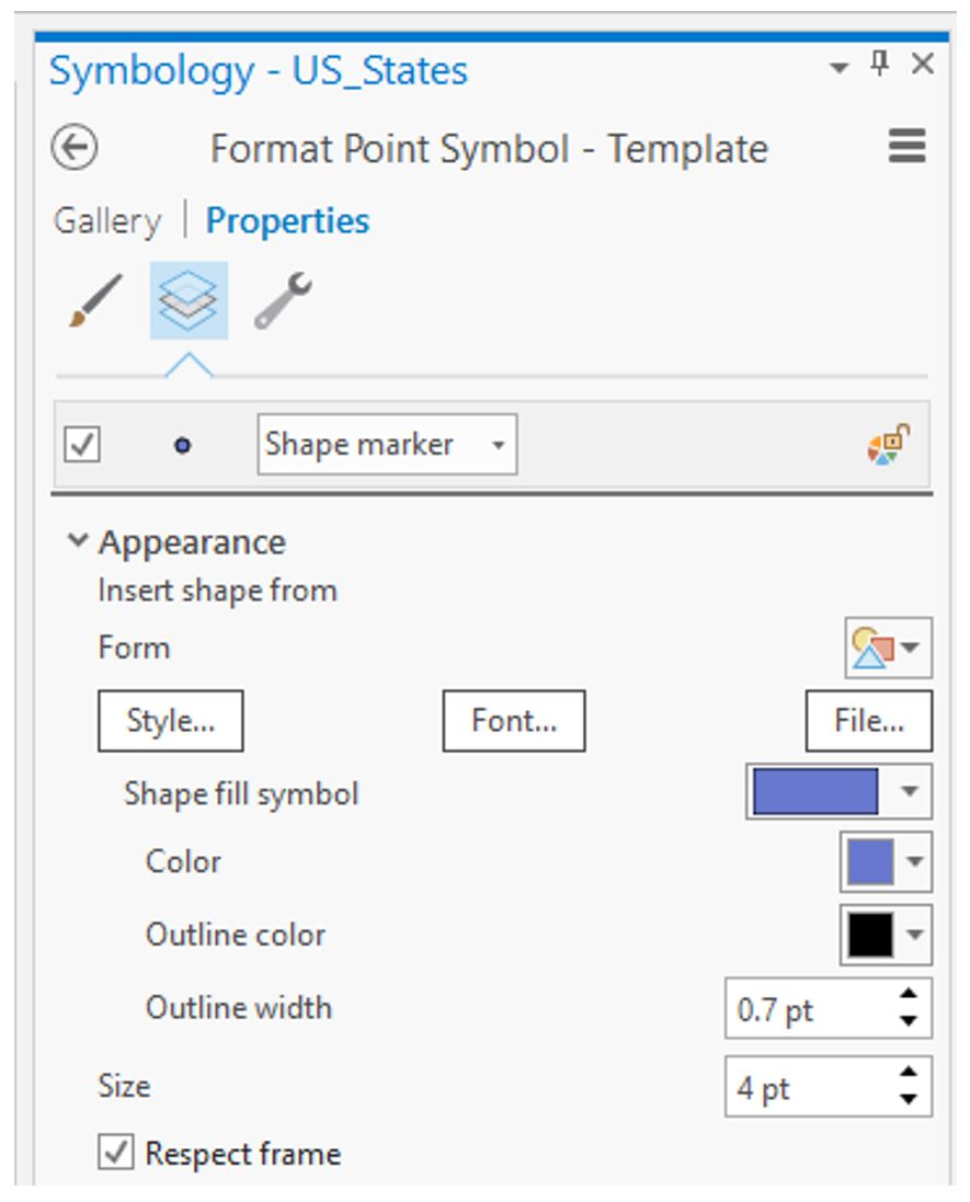 Visual Guide Figure 3.19. Changing the style of your proportional symbol template.
 -
Creating a Layout
Create a new standard-size (8.5" x 11") layout as you did in Lab #1. Insert a map frame and copy and paste it in the layout: this will create three maps at the same scale.
This (Figure 3.20) is just a quick layout example and should not be considered finished! You should follow the guidelines we have learned for creating a visual hierarchy and an excellent layout, etc.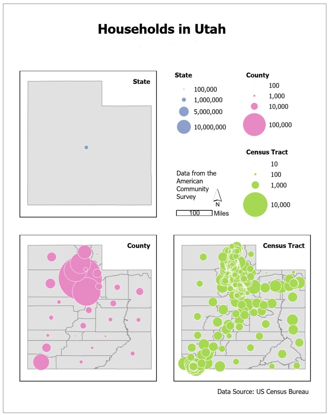 Visual Guide Figure 3.20. Example map layout with three maps, one for each scale. This is NOT a finalized design!
 -
Save-As: Building Dot Density Maps
Use the “Save-As” function and save a copy of your map project with a new name (like YourName_DotDensityMaps). This way, you won’t have to add any new data. Creating your second layout will be much easier this way - instead of doing data joining, downloading, etc., you can just focus on the design!
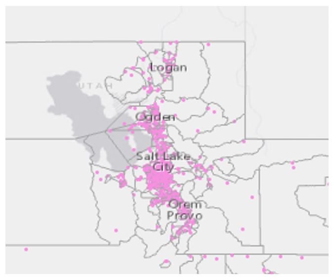 Visual Guide Figure 3.21. Example view of dots on a map.
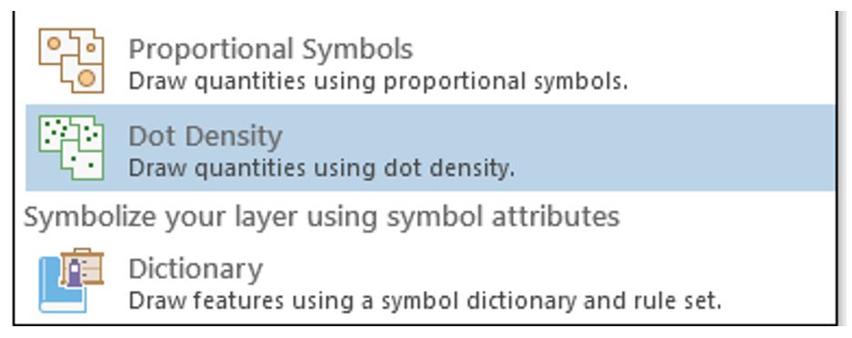 Visual Guide Figure 3.22. Choosing the dot density symbolization method.
Have fun adjusting your symbolization as appropriate! Try out different colors and symbols. Experiment with the parameters to see what works! The best design will depend on many factors, including the scale of your map, your chosen state, and the data you are mapping.
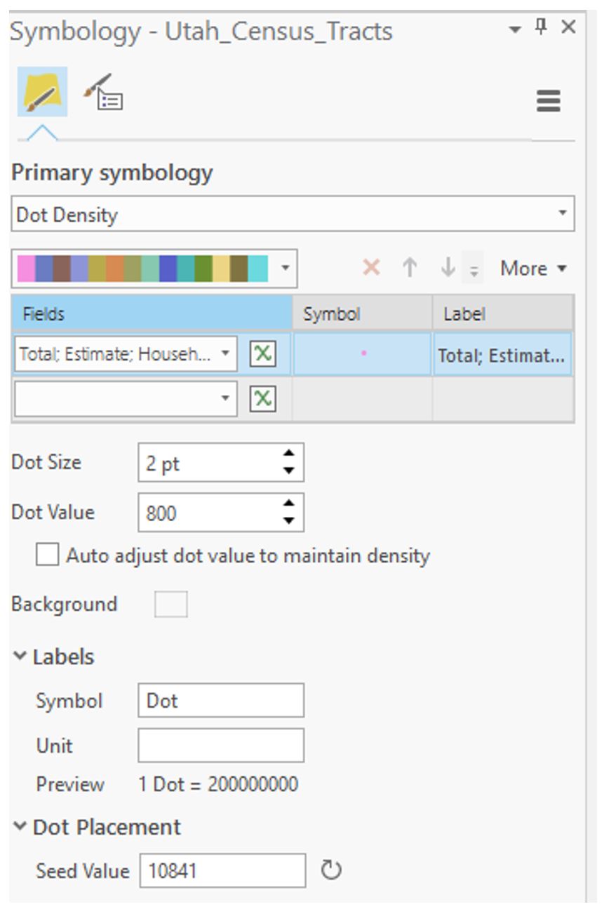 Visual Guide Figure 3.23. Adjusting parameters using the dot density symbolization method.
 -
Additional Tips
You are free to edit your data in this lab as needed to clean it up. Delete states (or any type of row) as needed. You may want to make any unneeded boundaries invisible instead, as this will make it easier to bring them back if necessary.
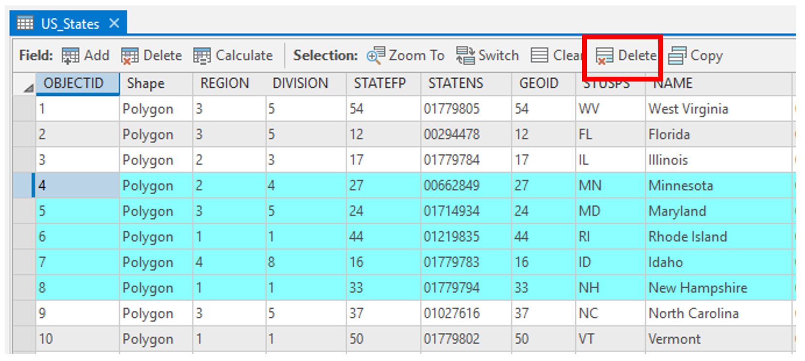 Visual Guide Figure 3.24. Selecting rows for deletion in the attribute table.
You can change the number of legend items using the symbology pane.
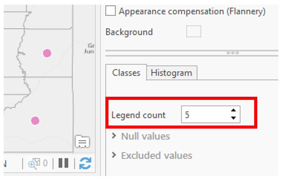 Visual Guide Figure 3.25. Adjusting your map legend via the Symbology Pane.
Reference current and previous lesson content for design ideas. Test several layout configurations and lots of symbol designs (sizes; colors; outlines; transparency) – you’ll learn a lot as you go!
Credit for all screenshots is to Cary Anderson, Penn State University; Data Source: US Census Bureau.