Lesson 9 Lab Visual Guide Part II
In Part 2, create your own Tableau Story.
- Delving into New Data
- Mapping Point Data in Tableau
- Symbolization with Charts
- Adding New Area Data
- Advanced Customization
- Combining Charts and Maps
-
Delving into New Data
There are several geographies that Tableau will automatically recognize: States, Countries, Zipcodes, and Coordinates (lat/long). The process for Countries and Zipcodes is the same as States, which was demonstrated in the tutorial (Visual Guide Part 1). Shown below is a spreadsheet of school locations in Philadelphia, PA, which includes point location data (lat/long coordinates).
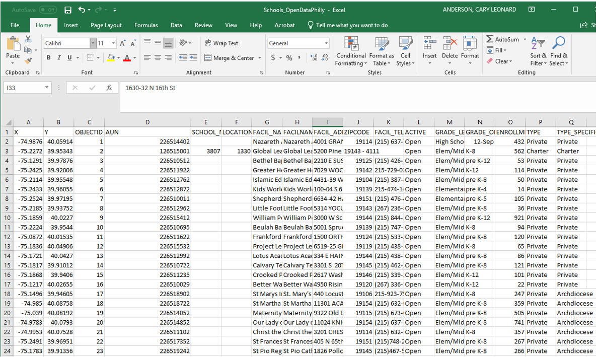 Visual Guide Figure 9.16. Philadelphia school data from OpenDataPhilly.
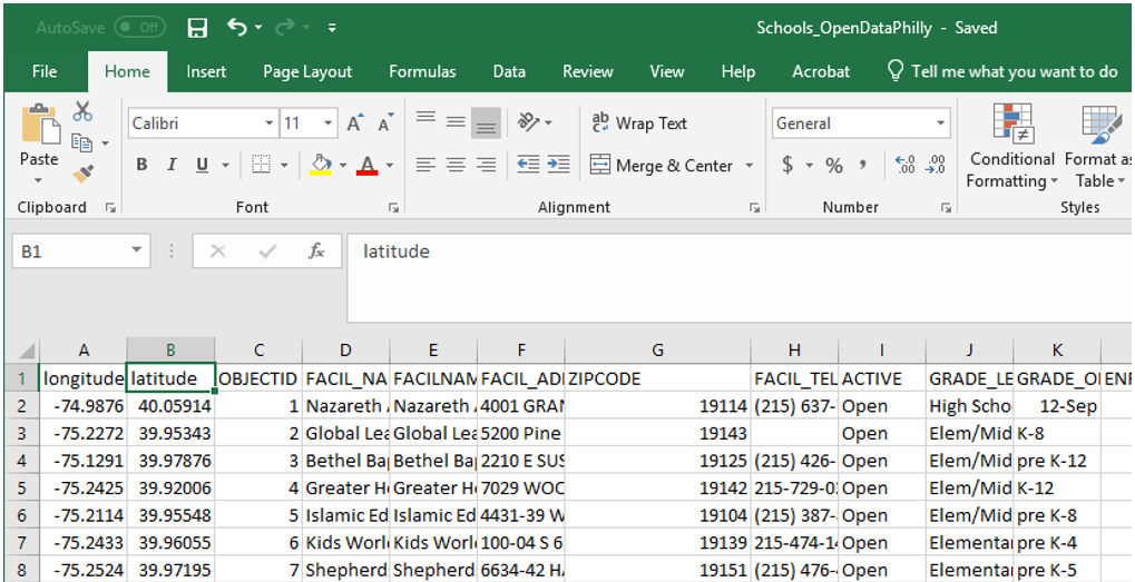
Lat/long data in the above spreadsheet is shown in the X and Y columns. To make things easier, I'm going to rename these latitude and longitude. Clean up anything else as needed. I edited one zipcode that was improperly formatted.
 Visual Guide Figure 9.17. Editing Coordinate Data.
 -
Mapping Point Data in Tableau
Recall from Part 1 that dimensions are elements such as States that you want to visualize data about, and measures are the variable data we want to display. In this example, Tableau categorized latitude and longitude as measures, but we would like to use them as dimensions. To change a data type from a measure to a dimension, simply drag it to the dimensions section.
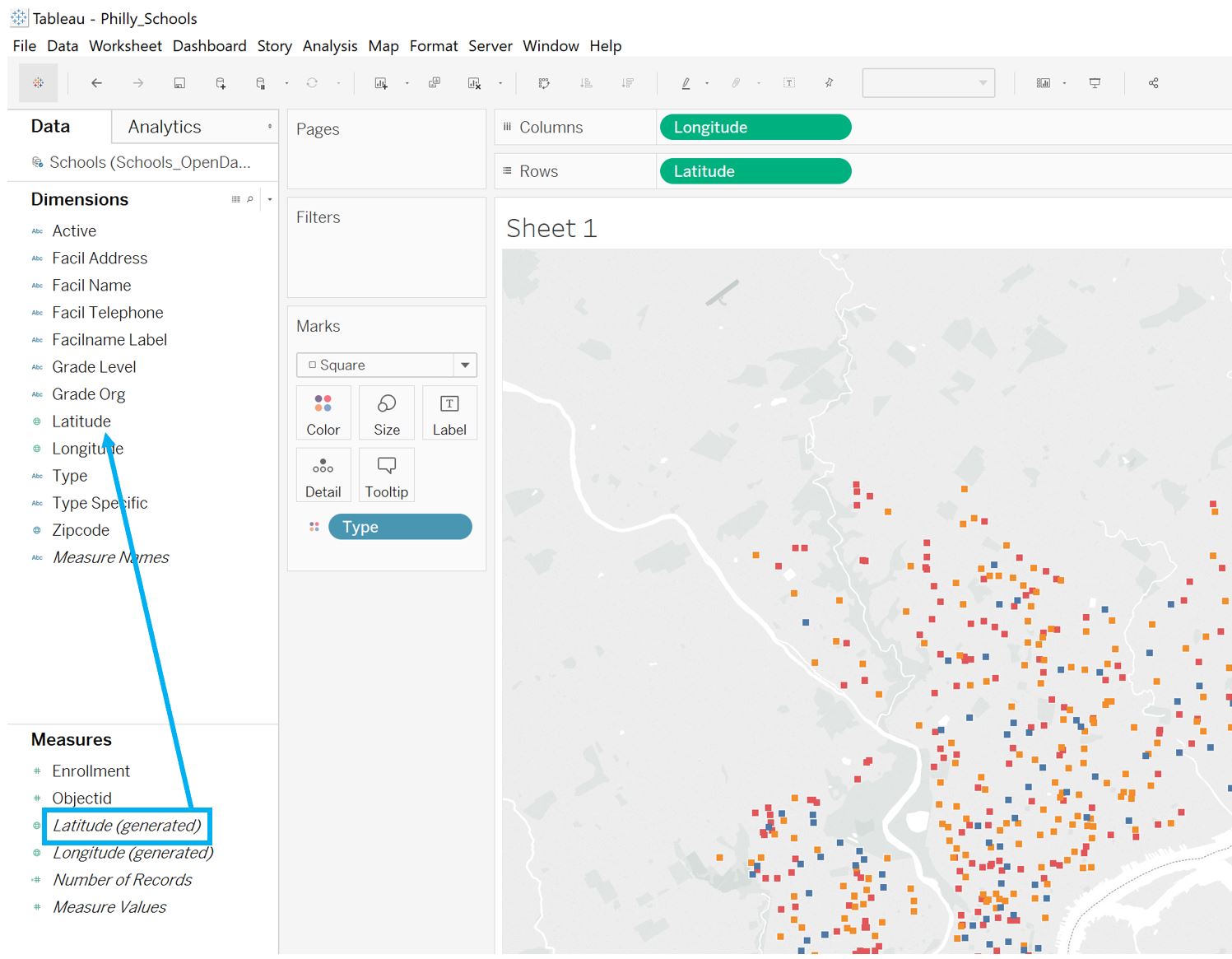 Visual Guide Figure 9.18. Changing latitude from a measure to a dimension.
Once you have longitude and latitude dimensions, you can add them to the columns and rows sections (respectively) to create your point locations map! Use the Marks menu (Figure 9.18) for adjusting symbol size, shape, etc.
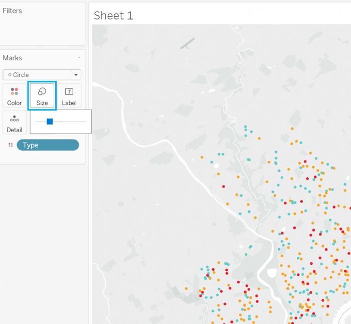 Visual Guide Figure 9.19. Adjusting point location size.
We previously discussed cleaning up tooltips in Tableau. Tooltips will automatically describe data displayed on your map, but you may want to add additional data to them. For example, here we have mapped all schools and colored them by their school type. If we want to add the school name to the tooltip but not to the map, we can drag that measure directly to the Tooltip box in the Marks section to add it.
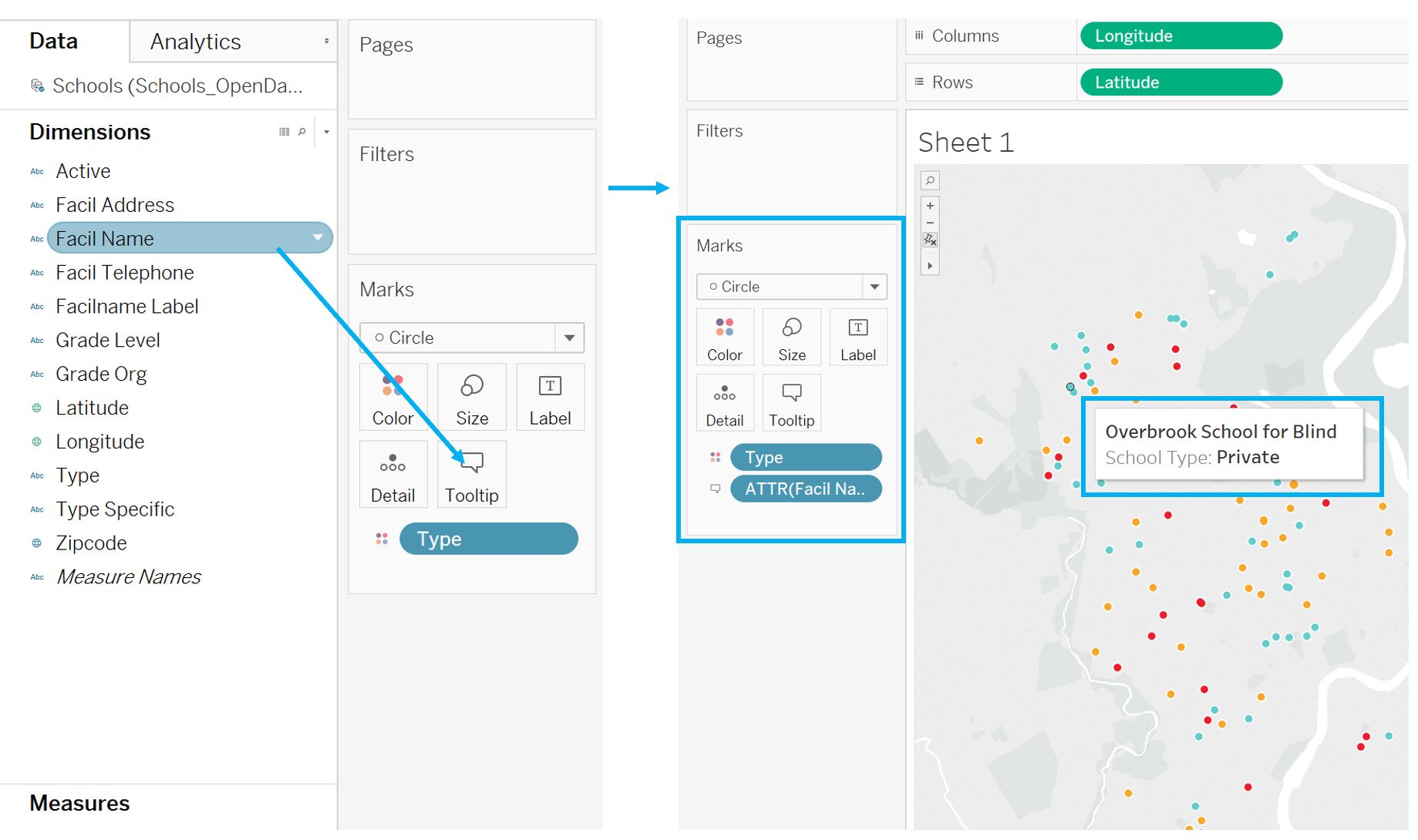 Visual Guide Figure 9.20. Adding facility (school) names to the map's tooltips.
 -
Symbolization with Charts
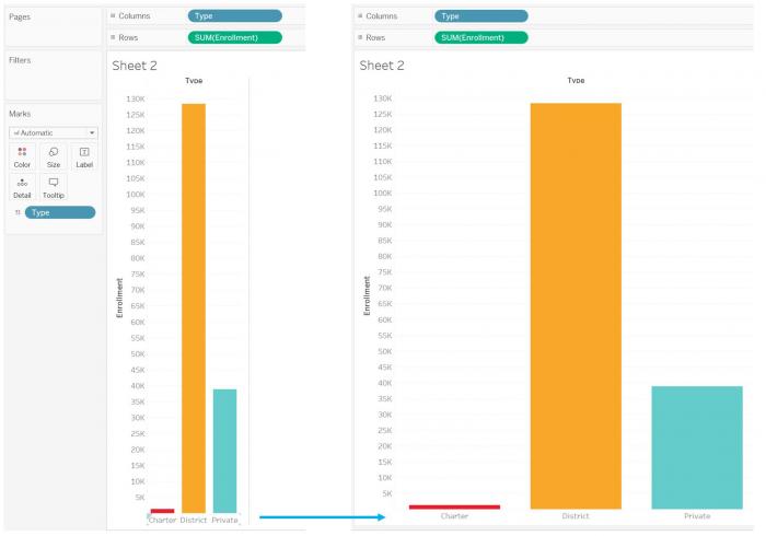
There are many options for altering the design of graphs and charts as well. For example, you can "drag to resize" a chart (Figure 9.21). Note in this example that the categorical color palette matches the one from the map - this is a good way to make comparisons easier for your viewers.
 Visual Guide Figure 9.21. Dragging to re-size a bar chart.
You can also change how your measures are calculated (and thus, displayed). In Part 1, each dimension (state) had only one row in the data table, so it didn't matter whether we mapped the sum or the average - they were the same value. In this second example, we could visualize the sum, or total enrollment for each type of school, (as in Figure 9.21) but it would be more interesting to show the average enrollment for each school type. You can alter how a measure is calculated as shown in Figure 9.22 below.
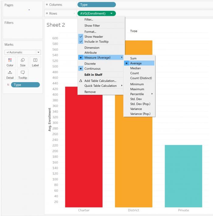 Visual Guide Figure 9.22. Changing how a measure is calculated and displayed.
Though the examples in the lab instructions only use maps and bar charts, there are many other charts available in Tableau that you might create. The example shown below is a treemap. Click the "Show Me" menu to view all chart options. You also can look online for more advanced customization options - for example, there are tutorials that discuss how to create hexbin maps.
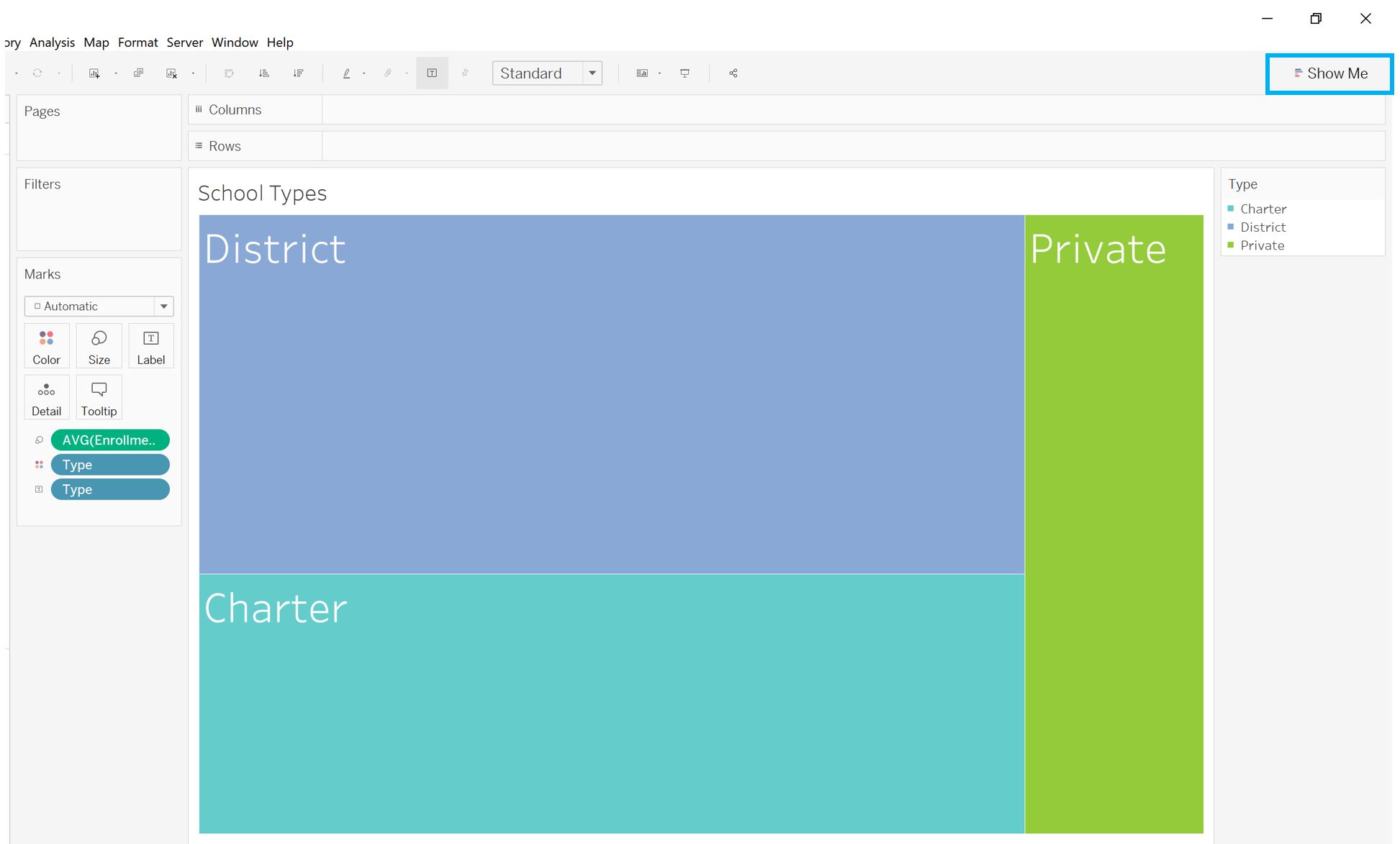 Visual Guide Figure 9.23. Designing a treemap in Tableau.
 -
Adding New Area Data
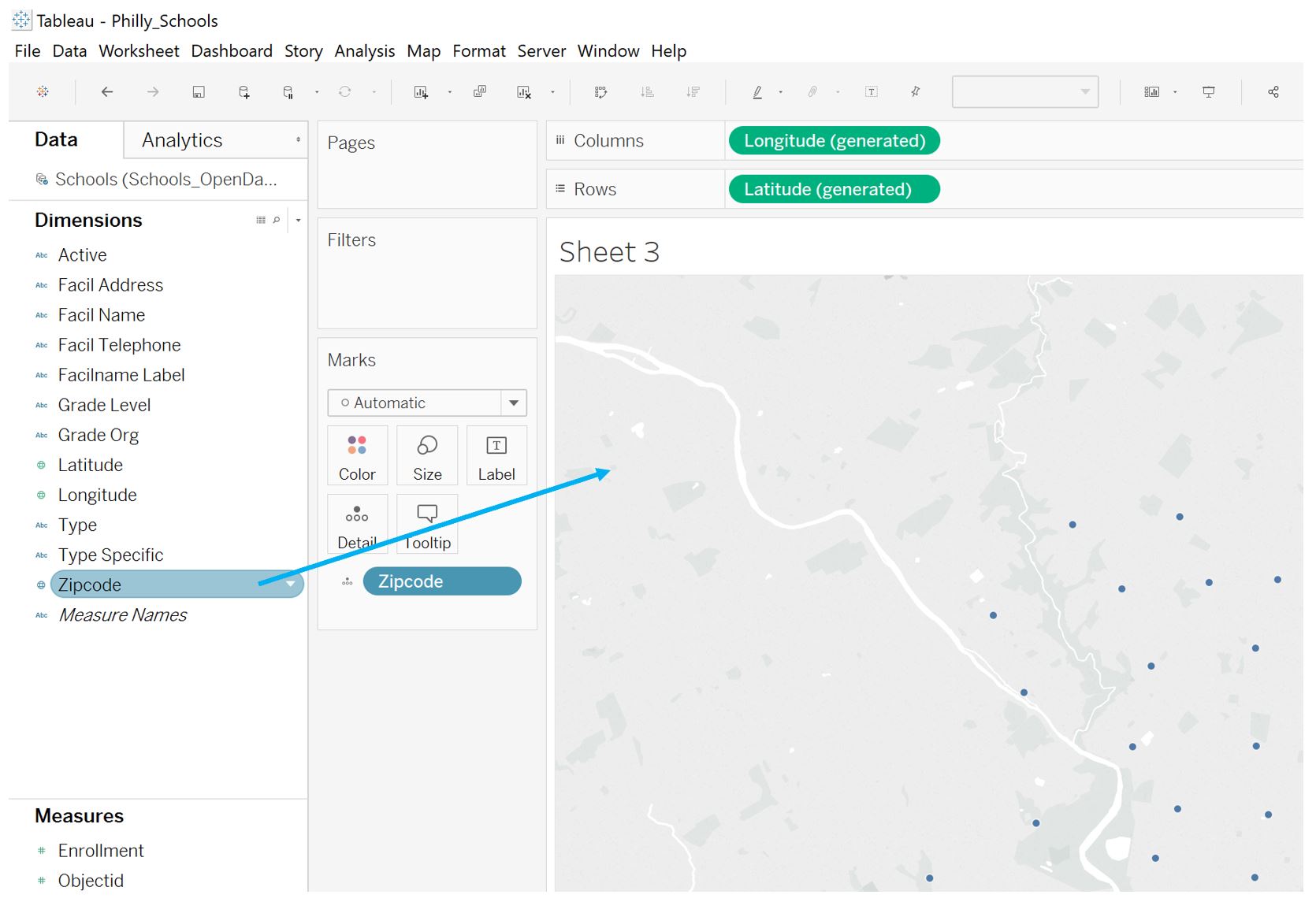
The data you use may have multiple types of geographies. For example, though we have only mapped the schools from this Philadelphia Schools dataset as points so far, the data also listed the zipcode for each school. Zipcodes are one of the geographies that Tableau automatically recognizes, so we can use this to create a graduated symbol or choropleth map to compare with our point locations map.
To do this, as we did with the States dimension in Part 1 of the Visual Guide, simply drag the Zipcode dimension onto the map.
 Visual Guide Figure 9.24. Creating a map from a Geography dimension (here, zipcodes) in Tableau Desktop.
To symbolize this map, drag your measure of interest to the color section of the Marks window, as shown below. Tableau will likely automatically created a choropleth (they call this a "filled map") but you can change this as well.
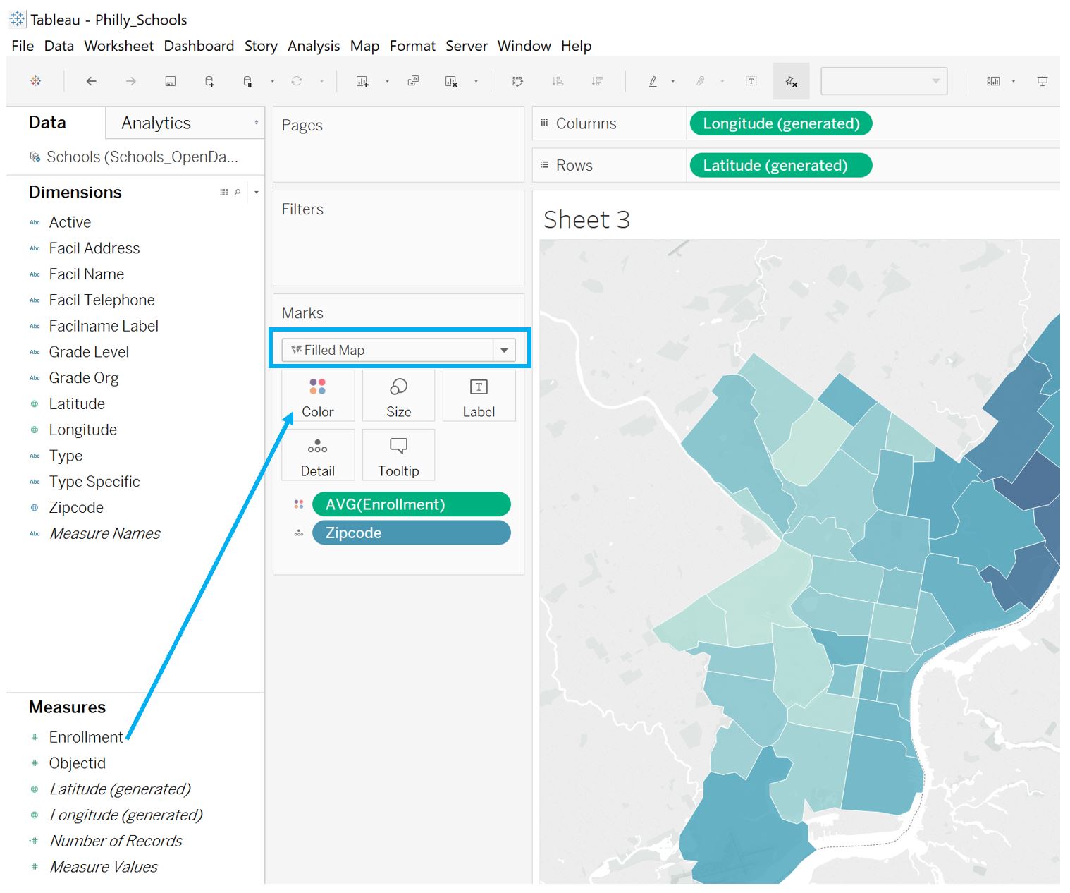 Visual Guide Figure 9.25. Symbolizing a map in Tableau: creating a choropleth map from a data measure.
 -
Advanced Customization
Tableau provides quite a few options for advanced customization. For example, you may want to use a color palette, such as one from ColorBrewer or CARTOColors, that is not included in Tableau. Follow the instructions here: Create Custom Color Palettes to add your own custom color palette.
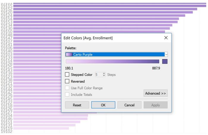 Visual Guide Figure 9.26. A graph designed with a custom color palette imported from CartoColors.
Another (simpler) customization you can make is to change the basemap used in your Tableau map. The default light grey Tableau map, for example, does not provide much locational context. We can instead use a basemap from Mapbox. Log into your Mapbox Studio account, and find a map - you should select "Share & use" as shown in the top-right corner of Figure 9.27 below. This will lead to a URL you will paste into Tableau.
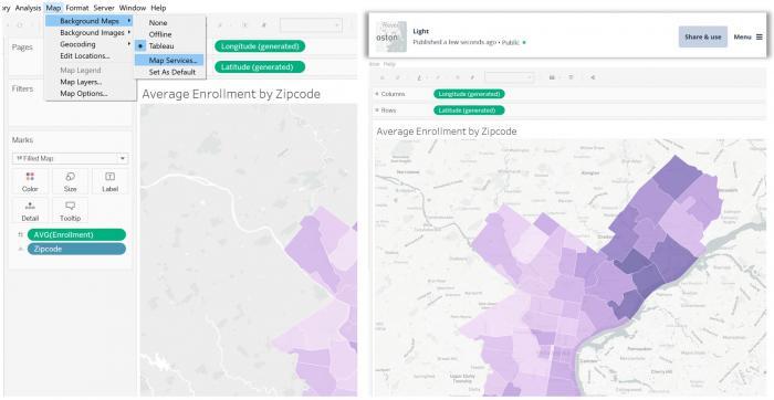 Visual Guide Figure 9.27. Adding a Mapbox basemap to your Tableau map.
Instructions are also listed in Mapbox for adding a map to Tableau. You should follow these instructions (click Map > Background Maps > Map Services > add > Mapbox Maps; paste the share URL). Once you paste the URL, the other fields in Tableau will auto-populate.
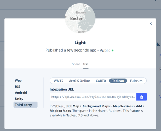 Visual Guide Figure 9.28. Getting a share URL from Mapbox Studio.
 -
Combining Charts and Maps
Tableau dashboards can become fairly complex, but for this lab, we will not include too many pieces. Figure 9.29 is an example of a dashboard that compares two maps and a bar chart. See Part 1 of this visual guide for a refresher on how to create a Tableau dashboard.
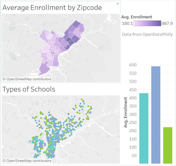 Visual Guide Figure 9.29. An example Tableau dashboard.
As you work, try out different arrangements of maps and charts, as well as different chart types. In Figure 9.30 below, the graphics shown in this guide have been divided into two dashboards: one about enrollment by zipcode, and one about enrollment by school type. Each of these dashboards was then added to the overall Tableau Story as a story point (the two story points are Enrollment and Types).
Once you've designed your story, the last step is to shorten and clarify axis labels, simplify tooltips, adjust font sizes and styles, etc.
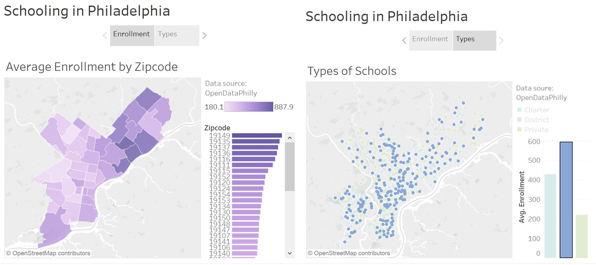 Visual Guide Figure 9.30. Editing bar chart tooltips in Tableau.
This example can be found here: Schooling in Philadelphia, a Tableau Story by Cary Anderson. Note that you can download the workbook to practice with if you so choose.
Credit for all screenshots is to Cary Anderson, Penn State University. Screenshots from Tableau Desktop, data source: OpenDataPhilly, School Facilities