Model Scenarios
Before we look at the results of GCMs that run into the future, we have to understand a few things about the experimental setups that go into these models. In order to do these experiments, the modelers have to apply forcings just as we did with our simple climate model in Module 3, and the primary variable is CO2 (carbon emissions) added to the atmosphere through human activities such as burning fossil fuels, farming, making cement, etc.
The IPCC (Intergovernmental Panel on Climate Change) has developed a whole set of scenarios (about 40) that represent the possible carbon emissions history for the next 100 years. The carbon emission is used as a key variable in driving climate modeling for each scenario. These scenarios are known as Representative Concentration Pathways (RCPs) and each one is based on an emissions trajectory. The IPCC has focused on several individual RCPs that provide a range of emissions and climate scenarios. At the outset for simplicity in this module we do not use the RCP emissions terminology because it is not very intuitive. Instead, we use groups of RCPs known as families (also developed by the IPCC) defined by the severity of the cuts (or lack thereof!) and the amount of cooperation between countries. Each family or scenario is based on a bunch of assumptions about population growth, economic growth, and choices we might make regarding steps to minimize carbon emissions. You can read more about the whole set of emissions scenarios at Wikipedia: Special Report on Emissions Scenarios. But for our purposes, we'll focus on 3 families representing very different emissions scenarios.
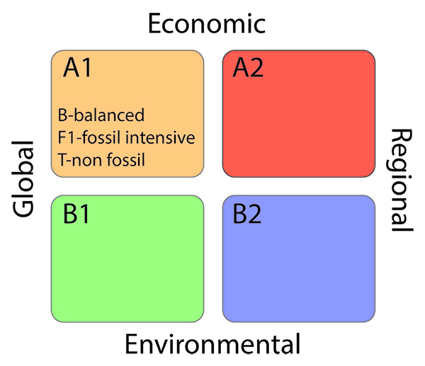
This image is a 2x2 matrix diagram illustrating four climate change scenarios based on two axes: economic focus (global vs. regional) and environmental focus (economic vs. environmental). Each quadrant represents a different scenario, labeled A1, A2, B1, and B2, with distinct characteristics.
- Diagram Type: 2x2 matrix
- Axes:
- X-Axis: Economic focus
- Left: Global
- Right: Regional
- Y-Axis: Environmental focus
- Top: Economic
- Bottom: Environmental
- X-Axis: Economic focus
- Quadrants:
- A1 (Top Left, Orange):
- Global economic focus
- Economic priority
- Labels: B-balanced, F1-fossil intensive, T-non fossil
- A2 (Top Right, Red):
- Regional economic focus
- Economic priority
- B1 (Bottom Left, Green):
- Global economic focus
- Environmental priority
- B2 (Bottom Right, Blue):
- Regional economic focus
- Environmental priority
- A1 (Top Left, Orange):
The matrix visually categorizes future climate scenarios based on whether societies prioritize global or regional economic development and whether they focus on economic growth or environmental sustainability, with A1 including sub-scenarios emphasizing different energy strategies.
The first of these scenarios is called SRES A2, and it is commonly known as business-as-usual — in other words, it leads to a continuation of increased annual carbon emissions that follows the recent history. In effect, this scenario represents a somewhat divided world, one in which we just can't reach agreements on what to do about limiting emissions of CO2, so each country does what seems to be in its own best interests. This world is characterized by independently operating, self-reliant nations. This world also includes a continuously increasing population — it does not level off during this time period. Above all, in this world, decisions are based primarily on perceived economic interests, and the assumption is made that these interests do not include the development of alternative energy sources.
The second scenario, called SRES A1B is a bit more optimistic. This scenario envisions an integrated world characterized by rapid economic growth, a population that reaches 9 billion by 2050 and then declines gradually, and the rapid development of alternative energy sources that facilitate increased economic growth while limiting and eventually reducing carbon emissions. This scenario also assumes that there will be rapid development and sharing of technologies that help us reduce our energy consumption. One of the keys to this scenario is that countries are integrated — they act together and find ways to improve the conditions for everyone on Earth. At this point in time, A1B is an optimistic but realistic scenario; B1 would take a revolution in the way the world economies work. And A2 or "business as usual," well, we will show you this is not the road we want to travel!
The third scenario, called SRES B1, represents an even more integrated, more ecologically friendly world, but one in which there is still steady and strong economic growth. As in scenario SRES A1B, the population in this scenario peaks at 9 billion in 2050 and then declines. One way to think of this scenario is that it represents a rapid, strong, and global commitment to the reduction of carbon emissions — it represents the best we could possibly do, and yet it does not rely on miracle technologies. The only real miracle it requires is that we all quickly figure out how to think and act globally and not focus solely on our own national interests. Most projections ignore scenario B2, as the combination of regional and environmental strategies is highly unlikely.
In graphical form, here are the three emissions scenarios.
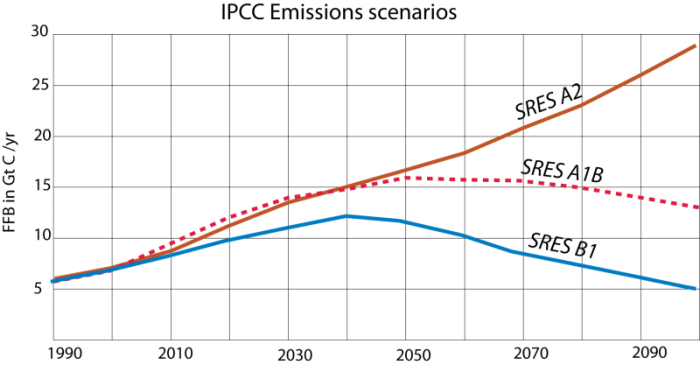
This image is a line graph comparing three different trends over time, represented by three distinct lines in blue, pink, and brown. The graph lacks labeled axes, but it appears to show changes in some variable over a period, possibly related to climate or environmental data.
- Graph Type: Line graph
- Lines:
- Blue Line:
- Starts low, rises to a peak around the midpoint
- Declines steadily afterward, ending lower than the starting point
- Pink Line (with dots):
- Starts low, rises gradually
- Peaks slightly after the blue line, then declines slowly
- Ends slightly above the starting point
- Brown Line:
- Starts low, rises steadily throughout
- Shows a consistent upward trend with no decline
- Ends significantly higher than the starting point
- Blue Line:
- Trend:
- Blue line shows a rise and fall pattern
- Pink line shows a moderate rise with a slight decline
- Brown line shows a continuous increase
The graph illustrates three distinct trends over time, with the blue line peaking and declining, the pink line showing a more moderate rise and fall, and the brown line indicating a steady increase throughout the period.
Each scenario shows emissions of carbon to the atmosphere (mainly from fossil fuel burning — FFB) in units of Gigatons of carbon per year (Gt C/yr; a GT is a billion tons!), so this is an annual rate. In terms of a STELLA model (which we will return to in the next Module), this represents a flow into the atmosphere. Roughly half of the carbon emitted will remain in the atmosphere and lead to a stronger greenhouse effect, which will, in turn, increase global temperature and change the climate in a variety of ways.
Next, we'll have a look at the main driver for emissions reduction, the Paris Climate Agreement and then frame the model scenarios in terms of their implications for climate change and climate policy.