How Good are GCMs?
This is obviously a very important question — if we are to rely on these models to guide our decisions about the future, we need to have some confidence that the models are good. The most important approach is to see if the model can simulate the known climate history. We set the model up to represent the state of the climate at some point in the past — say 1900 — and then we see how well the model can reproduce what actually happened.
As you can see in the figure below, the models are collectively quite good:
This image is a line graph showing global temperature anomalies from 1900 to 2000, measured in degrees Celsius. The graph includes multiple data series to represent uncertainty, with annotations marking significant volcanic eruptions that influenced global temperatures.
- Graph Type: Line graph
- Y-Axis: Temperature anomaly (°C)
- Range: -1.0°C to 1.0°C
- X-Axis: Years (1900 to 2000)
- Data Representation:
- Temperature Anomalies: Multiple black lines
- Represent various data series, showing uncertainty
- Fluctuate between -0.5°C and 0.5°C until 1980
- Rise sharply after 1980, reaching around 0.8°C by 2000
- Mean Trend: Red line
- Smoothed average of the black lines
- Starts around -0.3°C in 1900
- Shows a gradual increase, with a steeper rise after 1980
- Temperature Anomalies: Multiple black lines
- Annotations (Volcanic Eruptions):
- Santa Maria: Around 1902
- Agung: Around 1963
- El Chichón: Around 1982
- Pinatubo: Around 1991
- Each eruption corresponds to a temporary dip in temperature
- Trend:
- General upward trend in temperature anomalies over the century
- Temporary cooling periods following major volcanic eruptions
The graph illustrates a long-term warming trend in global temperatures over the 20th century, with notable short-term cooling events caused by volcanic eruptions, followed by a significant temperature increase after 1980.
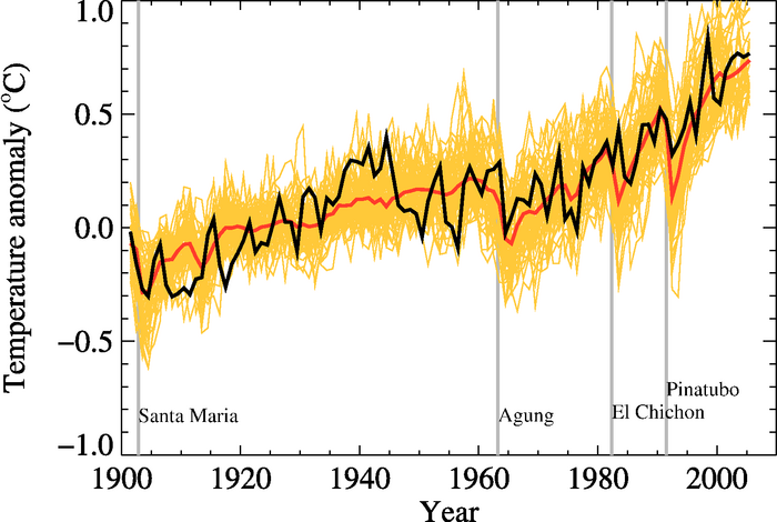
In this figure, the black line is the instrumental global average temperature (as an anomaly, which is a departure from the mean value from 1901 to 1950), the yellow lines represent the output from 58 model runs by 14 different models, and the red is the average of those 58 runs. The vertical gray lines are times of major volcanic eruptions, which are always followed by a few years of cooler temperatures.
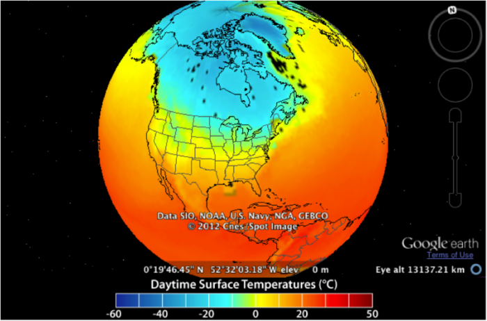
Now, let’s look at how closely the models can simulate the spatial pattern of temperatures over the Earth. To begin with, we’ll look at January temperatures for the time between 2003 and 2005 — here is what we can reconstruct from observations (which are better in some places than others — we know the Sea Surface Temperature (SST) much better than the land temperature, since SST is very precisely measured by satellites).
This image is a globe view showing daytime surface temperatures across North America, with data sourced from SIO, NOAA, U.S. Navy, NGA, and GEBCO, and presented via Google Earth. The map uses a color gradient to represent temperatures in degrees Celsius, captured at a specific location and altitude.
- Map Type: Globe view (North America focus)
- Measurement: Daytime surface temperature (°C)
- Location and Altitude:
- Coordinates: 0°19'46.45" N, 52°32'03.18" W
- Elevation: 0 m
- Eye altitude: 131372.71 km
- Color Scale (bottom of the map):
- Range: -60°C to 50°C
- Colors: Dark blue (-60°C) to dark red (50°C), with green, yellow, and orange in between
- Regions with Notable Temperatures:
- Coldest (dark blue, -60°C to -20°C):
- Arctic regions (northern Canada, Greenland)
- Cool (green to light blue, -20°C to 0°C):
- Central and northern Canada
- Parts of Alaska
- Moderate (yellow to orange, 0°C to 20°C):
- Most of the continental U.S.
- Southern Canada
- Warm (red, 20°C to 50°C):
- Southern U.S. (Texas, Arizona, Florida)
- Mexico and Central America
- Coldest (dark blue, -60°C to -20°C):
- Additional Info:
- Data source: SIO, NOAA, U.S. Navy, NGA, GEBCO
- Copyright: 2012 Cnes/Spot Image
- Platform: Google Earth
The globe view highlights a stark temperature gradient, with extremely cold temperatures in the Arctic, moderate temperatures across most of the U.S., and warmer conditions in the southern U.S. and Central America.
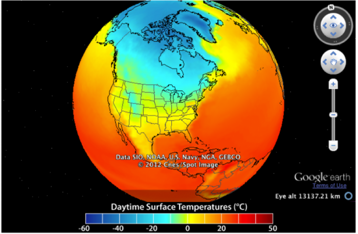
Now, we look at the same time period from a model simulation.
This image is a globe view showing daytime surface temperatures across North America, with data sourced from SIO, NOAA, U.S. Navy, NGA, and GEBCO, and presented via Google Earth. The map uses a color gradient to represent temperatures in degrees Celsius, captured at a specific altitude.
- Map Type: Globe view (North America focus)
- Measurement: Daytime surface temperature (°C)
- Altitude:
- Eye altitude: 131372.71 km
- Color Scale (bottom of the map):
- Range: -60°C to 50°C
- Colors: Dark blue (-60°C) to dark red (50°C), with green, yellow, and orange in between
- Regions with Notable Temperatures:
- Coldest (dark blue, -60°C to -20°C):
- Arctic regions (northern Canada, Greenland)
- Cool (green to light blue, -20°C to 0°C):
- Central and northern Canada
- Parts of Alaska
- Moderate (yellow to orange, 0°C to 20°C):
- Most of the continental U.S.
- Southern Canada
- Warm (red, 20°C to 50°C):
- Southern U.S. (Texas, Arizona, Florida)
- Mexico and Central America
- Coldest (dark blue, -60°C to -20°C):
- Additional Info:
- Data source: SIO, NOAA, U.S. Navy, NGA, GEBCO
- Copyright: 2012 Cnes/Spot Image
- Platform: Google Earth
The globe view highlights a significant temperature gradient, with extremely cold temperatures in the Arctic, moderate temperatures across most of the U.S., and warmer conditions in the southern U.S. and Central America.
You can see that in general, they are quite similar to each other, but we can gain a bit more insight into the relationship between the observations and the model by subtracting the model from the observations — the result is this:
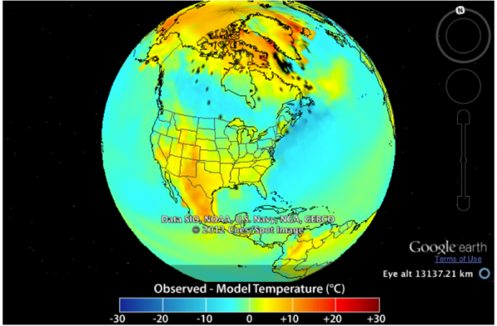
This image is a globe view showing the difference between observed and modeled surface temperatures across North America, with data sourced from SIO, NOAA, U.S. Navy, NGA, and GEBCO, and presented via Google Earth. The map uses a color gradient to represent temperature differences in degrees Celsius, captured at a specific altitude.
- Map Type: Globe view (North America focus)
- Measurement: Observation minus model temperature (°C)
- Altitude:
- Eye altitude: 131372.71 km
- Color Scale (bottom of the map):
- Range: -30°C to 30°C
- Colors: Dark blue (-30°C) to dark red (30°C), with green, yellow, and orange in between
- Regions with Notable Differences:
- Colder than Modeled (blue, -30°C to -10°C):
- Arctic regions (northern Canada, Greenland)
- Slightly Colder than Modeled (green to light blue, -10°C to 0°C):
- Central and northern Canada
- Parts of Alaska
- Near Model Prediction (yellow to orange, 0°C to 10°C):
- Most of the continental U.S.
- Southern Canada
- Warmer than Modeled (red, 10°C to 30°C):
- Southern U.S. (Texas, Arizona, Florida)
- Mexico and Central America
- Colder than Modeled (blue, -30°C to -10°C):
- Additional Info:
- Data source: SIO, NOAA, U.S. Navy, NGA, GEBCO
- Copyright: 2012 Cnes/Spot Image
- Platform: Google Earth
The globe view highlights discrepancies between observed and modeled temperatures, with the Arctic showing colder-than-modeled conditions, the U.S. generally aligning with model predictions, and the southern U.S. and Central America being warmer than modeled.
Here, you can see that the model and the observations are generally quite close, within a couple of degrees of zero, where zero would be a perfect match. Areas that are yellow to orange are regions where the actual temperature is greater than the modeled temperature; blue areas are regions where the actual temperature is lower than the model. It would be a challenging task to figure out the cause of these differences, but at a very fundamental level, it is related to the fact that things like clouds are very important to the climate system, and the processes that actually form clouds occur on such a small scale that the models cannot resolve them. Cloud formation is one example of what the modelers call a sub-grid process, and modelers have to devise clever ways of getting around this. This is an area where refinements continue to occur, but for the time being, we see that the models do an impressive job, but not a perfect job. As you can see in the above results, models tend to underestimate the temperatures on land, so we should consider model results for the future to also underestimate the true temperatures.
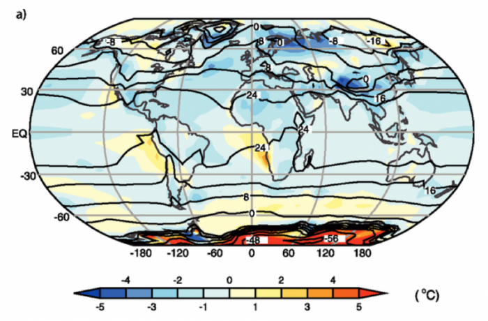
If we average over longer time periods and also average many model results together, we get what climate modelers refer to as an ensemble mean, and these ensemble means do a remarkably good job of matching the observations, as is shown below.
This image is a world map labeled "a)" showing temperature anomalies in degrees Celsius across the globe. The map uses a color gradient to indicate deviations from the average temperature, with contour lines marking specific temperature values.
- Map Type: World map
- Measurement: Temperature anomaly (°C)
- Color Scale (bottom of the map):
- Range: -5°C to 5°C
- Colors: Dark blue (-5°C) to dark red (5°C), with light blue, white, and yellow in between
- Regions with Notable Anomalies:
- Colder than Average (blue, -5°C to -1°C):
- Northern North America (Canada, Alaska)
- Parts of Siberia
- Contour lines: -16°C in northern Canada, -8°C in Siberia
- Warmer than Average (red, 1°C to 5°C):
- Southern Ocean (around Antarctica)
- Contour lines: 48°C near Antarctica
- Near Average (white to yellow, -1°C to 1°C):
- Most of Europe, Africa, and South America
- Contour lines: 0°C in central Africa, 24°C in the equatorial Pacific
- Colder than Average (blue, -5°C to -1°C):
- Additional Features:
- Latitude lines: 60°N, 30°N, EQ, 30°S, 60°S
- Longitude lines: -180°, -120°, -60°, 0°, 60°, 120°, 180°
The map highlights significant temperature anomalies, with colder-than-average conditions in northern North America and Siberia, and much warmer-than-average conditions in the Southern Ocean near Antarctica.
In this figure, the observed annual mean temperatures for the time period 1961-1990 are represented by the black contour lines, labeled in °C (-56°C in Antarctica and about 24°C in equatorial Africa). The colors represent the model temperatures (from 14 models, for the same 1961-1990 time period) minus the observations; positive values mean the models estimate temperatures that are too high. On the whole, the models slightly underestimate the temperatures, and they have particular problems at very high latitudes and in areas that are topographically complex.
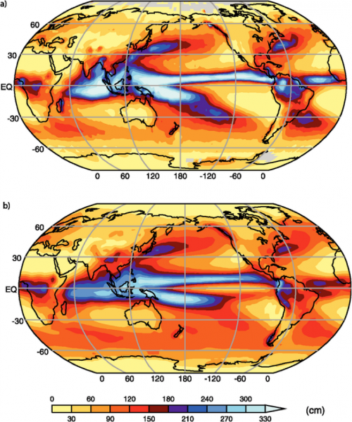
As mentioned above, one of the important aspects of GCMs is that they calculate the precipitation, and this provides another means of evaluating how good the models are. The figure below shows a comparison of the observed annual precipitation and the average of the 14 models used by the IPCC study.
This image consists of two world maps, labeled "a)" and "b)," showing sea surface height anomalies in centimeters across the globe. The maps use a color gradient to indicate variations in sea surface height, likely related to oceanographic phenomena such as El Niño or La Niña.
- Map Type: Two world maps (a and b)
- Measurement: Sea surface height anomaly (cm)
- Color Scale (bottom of the maps):
- Range: 0 cm to 330 cm
- Colors: Yellow (0 cm) to dark blue (330 cm), with orange, red, and purple in between
- Map a):
- Regions with Notable Anomalies:
- High Anomalies (blue, 240–330 cm):
- Equatorial Pacific (stretching from South America to Indonesia)
- Moderate Anomalies (red to purple, 120–240 cm):
- Surrounding areas of the equatorial Pacific
- Low Anomalies (yellow to orange, 0–120 cm):
- Most of the Atlantic and Indian Oceans
- Polar regions
- High Anomalies (blue, 240–330 cm):
- Latitude Lines: 60°N, 30°N, EQ, 30°S, 60°S
- Longitude Lines: 0°, 60°, 120°, 180°, -120°, -60°
- Regions with Notable Anomalies:
- Map b):
- Regions with Notable Anomalies:
- High Anomalies (blue, 240–330 cm):
- Central equatorial Pacific (more concentrated than in map a)
- Moderate Anomalies (red to purple, 120–240 cm):
- Surrounding areas of the equatorial Pacific
- Low Anomalies (yellow to orange, 0–120 cm):
- Most of the Atlantic and Indian Oceans
- Polar regions
- High Anomalies (blue, 240–330 cm):
- Latitude Lines: 60°N, 30°N, EQ, 30°S, 60°S
- Longitude Lines: 0°, 60°, 120°, 180°, -120°, -60°
- Regions with Notable Anomalies:
The maps illustrate variations in sea surface height, with map a) showing a broader high anomaly across the equatorial Pacific, and map b) showing a more concentrated high anomaly in the central equatorial Pacific, suggesting changes in ocean conditions between the two periods.
As can be seen, the models, on average, do quite well at simulating the global pattern of precipitation.
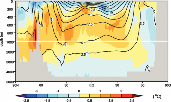
AOGCMs calculate the circulation and temperature of the world’s oceans, and we compare their ability in that regard by comparing the model-generated temperatures averaged over 1957 to 1990 with the observations from that time period.
This image is a cross-sectional diagram showing ocean temperature anomalies in degrees Celsius across a latitudinal range from 90°N to 90°S, with depth extending from the surface to 4000 meters. The diagram uses a color gradient and contour lines to indicate temperature variations at different depths and latitudes.
- Diagram Type: Cross-sectional view
- Y-Axis: Depth (meters)
- Range: 0 m to 4000 m
- X-Axis: Latitude
- Range: 90°N to 90°S
- Color Scale (bottom of the diagram):
- Range: -2.5°C to 2.5°C
- Colors: Dark blue (-2.5°C) to dark red (2.5°C), with light blue, white, and yellow in between
- Temperature Anomalies:
- Colder than Average (blue, -2.5°C to -0.5°C):
- Near the surface at 90°N (Arctic)
- Contour lines: -2.5°C at the surface
- Warmer than Average (red, 0.5°C to 2.5°C):
- Surface waters from 60°N to 60°S
- Contour lines: 15°C at the surface near the equator, 12.5°C at 200 m depth
- Near Average (white to yellow, -0.5°C to 0.5°C):
- Deeper waters (below 1000 m) across all latitudes
- Contour lines: 0°C at 1000 m depth
- Colder than Average (blue, -2.5°C to -0.5°C):
- Additional Features:
- Contour lines: 0°C, 2.5°C, 5°C, 7.5°C, 10°C, 12.5°C, 15°C, 20°C
- Latitude markers: 90°N, 60°N, 30°N, EQ, 30°S, 60°S, 90°S
The diagram illustrates that surface waters, particularly in the tropics, are significantly warmer than average, while deeper waters remain closer to average temperatures, with the Arctic surface showing colder-than-average conditions.
In this figure, we see the latitude-averaged observed ocean temperature from 1957 to 1990 in the contours, and the average model ocean temperatures minus the observed temperatures in colors. For most of the oceans, the models are ± 1°C from the observations.
In sum, it should be fairly clear that although these models are incredibly complicated, they do a fairly good job of reproducing the temporal and spatial characteristics of our climate, especially when we look at longer time averages. In other words, if we compare the model results for a given day with the actual observations of that day, the agreement is not very good; the agreement gets better on a monthly-averaged basis, and it gets even better on an annually-averaged basis. Today, models are in a constant state of improvement, with certain elements, such as the impact of clouds, needing a lot more understanding.