Surface Water
As was mentioned in the previous section on precipitation predictions from GCMs, there are some important implications for water supplies. In this section, we will take a look at how the model results might impact surface water in the future.
Surface water is of great importance since it is the primary source of water for agriculture. It is estimated that 69% of worldwide water use is for irrigation, and of this, about 62% comes from surface water which includes streams, lakes, and reservoirs.
When rain falls on the surface, most of it is absorbed by the soil, and then from there, it slowly migrates to streams, and from there into lakes and reservoirs, but it ultimately leaves a region, through stream flow and evaporation, to return to the oceans or the atmosphere — this is just a part of the large global water cycle. The total amount of water flowing in the streams of a region provides a useful measure of how much water is available for agriculture. We'll discuss this in depth in Module 9.
It takes around 3,000 liters of water to produce enough food to satisfy one person's daily dietary needs. This is a considerable amount when compared to that required for drinking, which is just 2-5 liters. To produce food for over 7 billion people who inhabit the planet today requires the water that would fill a canal ten meters deep, 100 meters wide and 7.1 million kilometers long – that's enough to circle the globe 180 times!
As we have seen, a GCM will predict the amount of rainfall over the surface of the Earth, and if we combine that with a model of the topography of the land areas (which is included in the GCMs), we can figure out how much water will flow as surface water through different regions. This has been done by taking the average precipitation from 20 GCMs operating under the SRES A1B scenario and then calculating how that surface water flow compares to the long-term average from 1900 to 1970. The resulting data provide us with a very good idea of what to expect in the future if we follow the A1B scenario.
The results of the surface water predictions can be seen here, but we will focus in on 3 snapshots from this history in a series of maps. We begin with a view of the predictions for the year 2020.
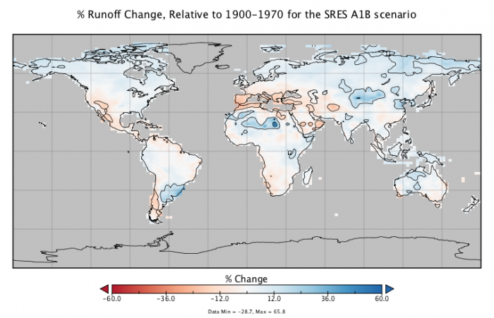
This image is a world map titled "% Runoff Change, Relative to 1900-1970 for the SRES A1B scenario." The map shows projected changes in runoff (the flow of water over the Earth's surface) as a percentage relative to the 1900–1970 baseline, based on the SRES A1B climate scenario, which assumes rapid economic growth and balanced energy sources.
- Map Type: World map
- Measurement: Percentage change in runoff (%)
- Color Scale (bottom of the map):
- Range: -60.0% to 60.0%
- Colors: Red (decrease, -60.0%) to blue (increase, 60.0%), with white at 0% (no change)
- Data range: Min -28.7%, Max 65.8%
- Regions with Notable Changes:
- Significant Decrease (red, -60% to -12%):
- Southern Europe (Mediterranean region)
- Parts of Central America
- Small areas in the Middle East
- Moderate Decrease (orange, -12% to 0%):
- Western U.S.
- Parts of South America (southern Brazil, Argentina)
- Central Africa
- No Change (white, around 0%):
- Most of North America, Australia, and Asia
- Large parts of South America and Africa
- Moderate Increase (light blue, 0% to 12%):
- Northern Europe
- Parts of Russia and Central Asia
- Eastern Africa
- Significant Increase (blue, 12% to 60%):
- Arctic regions (northern Canada, Siberia)
- Parts of Southeast Asia
- Small areas in South America (northern Andes)
- Significant Decrease (red, -60% to -12%):
The map illustrates a varied global impact on runoff, with significant reductions projected in southern Europe and parts of Central America, while increases are expected in Arctic regions and parts of Southeast Asia under the SRES A1B scenario.
This image is a 30-year average, centered on the year 2020. The blue areas will see an increase in streamflow, and the red areas will see a decrease. The map includes contour lines that separate the values according to the labeled tick marks on the map scale. As we might expect, the changes are relatively small at this point, but the Mediterranean region has noticeably less streamflow.
As we move forward in time, to 2050, the changes become more dramatic.
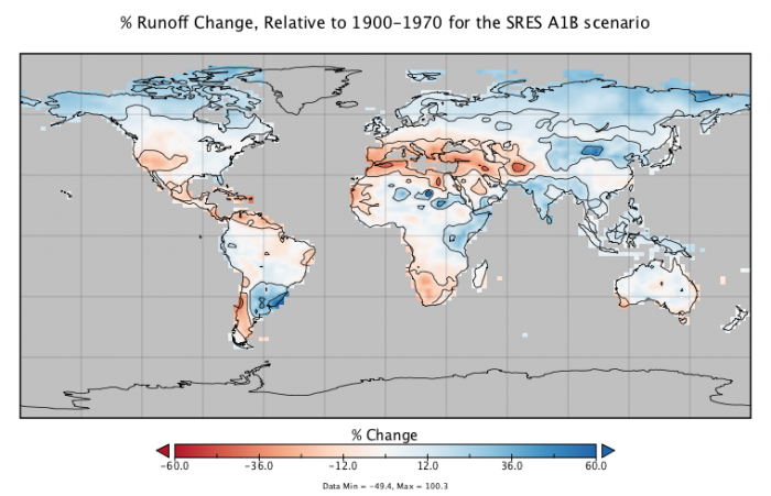
This image is a world map titled "% Runoff Change, Relative to 1900-1970 for the SRES A1B scenario." The map illustrates projected changes in runoff (surface water flow) as a percentage compared to the 1900–1970 baseline, according to the SRES A1B climate scenario, which assumes rapid economic growth and balanced energy sources.
- Map Type: World map
- Measurement: Percentage change in runoff (%)
- Color Scale (bottom of the map):
- Range: -60.0% to 60.0%
- Colors: Red (decrease, -60.0%) to blue (increase, 60.0%), with white at 0% (no change)
- Data range: Min -45.4%, Max 100.3%
- Regions with Notable Changes:
- Significant Decrease (red, -60% to -12%):
- Southern Europe (Mediterranean region)
- Parts of Central America
- Small areas in the Middle East
- Moderate Decrease (orange, -12% to 0%):
- Western U.S.
- Parts of South America (southern Brazil, Argentina)
- Central Africa
- Northern Australia
- No Change (white, around 0%):
- Most of North America, eastern Brazil, and sub-Saharan Africa
- Large parts of Asia and Australia
- Moderate Increase (light blue, 0% to 12%):
- Northern Europe
- Parts of Russia and Central Asia
- Eastern Africa
- Significant Increase (blue, 12% to 60%):
- Arctic regions (northern Canada, Siberia)
- Parts of Southeast Asia
- Southern South America (southern Chile, Argentina)
- Significant Decrease (red, -60% to -12%):
The map highlights a varied global pattern of runoff changes, with notable reductions projected in southern Europe and Central America, and increases in Arctic regions and Southeast Asia under the SRES A1B scenario.
And as we continue into the future, the picture in 2080 looks like this:
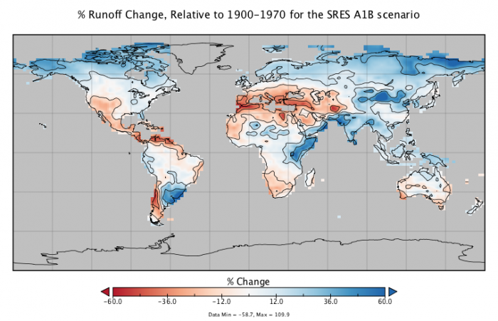
This image is a world map titled "% Runoff Change, Relative to 1900-1970 for the SRES A1B scenario." It shows projected changes in runoff (surface water flow) as a percentage compared to the 1900–1970 baseline, based on the SRES A1B climate scenario, which assumes rapid economic growth and balanced energy sources.
- Map Type: World map
- Measurement: Percentage change in runoff (%)
- Color Scale (bottom of the map):
- Range: -60.0% to 60.0%
- Colors: Red (decrease, -60.0%) to blue (increase, 60.0%), with white at 0% (no change)
- Data range: Min -58.7%, Max 100.9%
- Regions with Notable Changes:
- Significant Decrease (red, -60% to -12%):
- Southern Europe (Mediterranean region)
- Parts of Central America
- Small areas in the Middle East and Central Asia
- Moderate Decrease (orange, -12% to 0%):
- Western U.S.
- Parts of South America (southern Brazil, Argentina)
- Central Africa
- Northern Australia
- No Change (white, around 0%):
- Most of North America, eastern Brazil, and sub-Saharan Africa
- Large parts of Asia and Australia
- Moderate Increase (light blue, 0% to 12%):
- Northern Europe
- Parts of Russia and Central Asia
- Eastern Africa
- Significant Increase (blue, 12% to 60%):
- Arctic regions (northern Canada, Siberia)
- Southern South America (southern Chile, Argentina)
- Parts of Southeast Asia
- Significant Decrease (red, -60% to -12%):
The map depicts a varied global pattern of runoff changes under the SRES A1B scenario, with significant reductions in southern Europe and Central America, and notable increases in Arctic regions and southern South America.
By the year 2080, we see that there are some fairly stark differences in streamflow. A large swath around the Mediterranean, including much of Europe, North Africa, and the Middle East all will have significant reductions in streamflow, which will add stress to an agricultural system that is already operating at close to its limit. Consider also that the world by this time will certainly have a minimum of 10 billion people. Much of the Southwestern US (including California) and Central America will also experience a reduction in streamflow. This is clearly bad news for a place like California, which is already going to great lengths to bring surface water to its cities and major agricultural production areas via a system of canals. And for Central America, continuing drought will lead to even more mass migration to the US southern border. We will discuss this in much more detail in Module 9.
On the other hand, consider where most of the Earth's population is — China and India. Both of these regions, according to the model results, should experience an increase in surface water availability, which is good news.
Another big trend is that the high latitudes of the Northern Hemisphere experience a very large increase in surface runoff. This could be important if population patterns shift northward in a warming world.
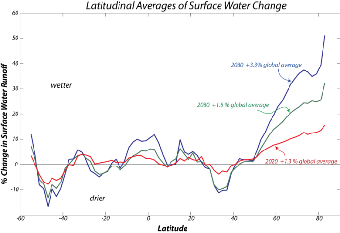
We now consider how these changes add up over the whole globe — is surface runoff increasing or decreasing as we go into the future? The 3 maps shown above have been averaged along lines of latitude to give a simpler sense of the change, and then these latitudinal averages are summed and weighted according to the different areas each latitudinal band represents to give a global sum.
This image is a line graph showing the percentage of global average sea ice extent over time, with data for the years 2000, 2012, and 2020. The graph compares the sea ice extent for these specific years against the global average, expressed as a percentage above or below the average.
- Graph Type: Line graph
- Y-Axis: Percentage of global average sea ice extent (%)
- Range: Not explicitly labeled, but visually spans from below -3% to above 3%
- X-Axis: Time (not explicitly labeled with months or days, but implied to cover a yearly cycle)
- Data Representation:
- 2000: Green line
- Labeled as +1.6% global average
- Starts above the average, fluctuates slightly, and ends slightly above the average
- 2012: Red line
- Labeled as +1.3% global average
- Starts below the average, dips significantly mid-year, and recovers slightly but remains below the average
- 2020: Blue line
- Labeled as -3.2% global average
- Starts below the average, fluctuates with notable dips, and ends significantly below the average
- 2000: Green line
- Trend:
- 2000 shows a relatively stable extent above the global average
- 2012 shows a significant decline mid-year, ending slightly above the average
- 2020 shows consistently lower extent, with a marked decrease compared to the average
The graph illustrates a trend of decreasing sea ice extent over the two decades, with 2020 showing a substantial reduction compared to 2000 and 2012, indicating a loss of global sea ice relative to the average.
As can be seen, the tropics and the high latitude regions tend to get wetter through time, while the mid-latitudes tend to become drier, and on a global scale, there is slightly more surface water runoff as we move into the future — though a 3.3% change is not too large. Nevertheless, remember the map pattern of the change — this is the more important aspect of the model data.
So, in summary, as with precipitation, the future seems to hold a mixture of more and less surface water runoff, and this will have some important implications for where we will produce our food in the future and which places may be better suited for human habitation in the future. We will discuss the implications of the projections for regional drought in places such as the south-central US and Australia in more detail in Modules 9.