Temperature
In this section, we explore the predictions from GCMs regarding the temperature under different IPCC emissions scenarios described in the previous section. As part of the 2022 IPCC Assessment Report, all of the major GCM modeling groups around the world ran their models with the same Representative Concentration Pathways (RCPs) and emissions scenario families (A2, A1B, and B1) in order to provide the best estimate of what the future climate might look like under these scenarios. Each model is different, and so their results are also different. The figure below gives a sense of how much variability and similarity there is in these models. Remember that climate scientists believe that it is key that we maintain the warming below 2oC; above that level the consequences, including drought, heatwaves, melting of ice sheets, could be dire.
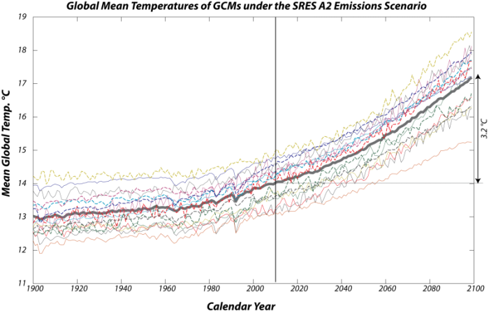
This image is a line graph displaying the output of multiple Global Climate Models (GCMs) under the SRES A2 scenario, often referred to as the "business as usual" scenario. The graph shows the average global temperature anomaly in degrees Celsius from 1900 to 2099, with each thin colored line representing a different GCM's projection.
- Graph Type: Line graph
- Y-Axis: Global temperature anomaly (°C)
- Range: Not explicitly labeled, but spans approximately -1°C to 5°C
- X-Axis: Years (1900 to 2099)
- Data Representation:
- Individual GCMs: Multiple thin colored lines (blue, red, green, yellow, orange, purple, etc.)
- Each line represents a different GCM's projection
- Lines start around -0.5°C in 1900, showing historical fluctuations
- All lines exhibit a general upward trend, with increasing spread by 2099
- Spread in 2099: Roughly 2°C to 5°C, showing a similar range of warming
- Mean of GCMs: Thick gray line
- Represents the average of all GCM outputs
- Starts around -0.5°C in 1900
- Rises steadily, reaching approximately 3.2°C above the present temperature by 2099
- Individual GCMs: Multiple thin colored lines (blue, red, green, yellow, orange, purple, etc.)
- Trend:
- 1900–2000: Lines show historical warming of about 1.1°C, with fluctuations
- 2000–2099: All models project continued warming, with the mean increasing by about 3.2°C
- The projected warming by 2099 is roughly three times the warming experienced in the last century (1.1°C)
The graph illustrates the projected global temperature increase under the SRES A2 scenario, with a significant spread among GCMs but a consistent upward trend, culminating in a mean warming of 3.2°C by the end of the century, highlighting the potential for substantial climate change under a business-as-usual emissions pathway.
Each of the thin colored lines represents the output from a different GCM — here we see the average global temperature through time, starting in 1900 and going until 2099, using the SRES A2 scenario, which is the one we sometimes call "business as usual." There is obviously a big spread in the results, but they all have more or less the same general form and a similar range (the difference between the minimum and maximum temperatures). The thicker gray line is the mean from all these models, and we can see that by the end of the century, the mean rises by about 3.2 °C above the present temperature — this is roughly three times the warming we have experienced in the last century (about 1.1oC).
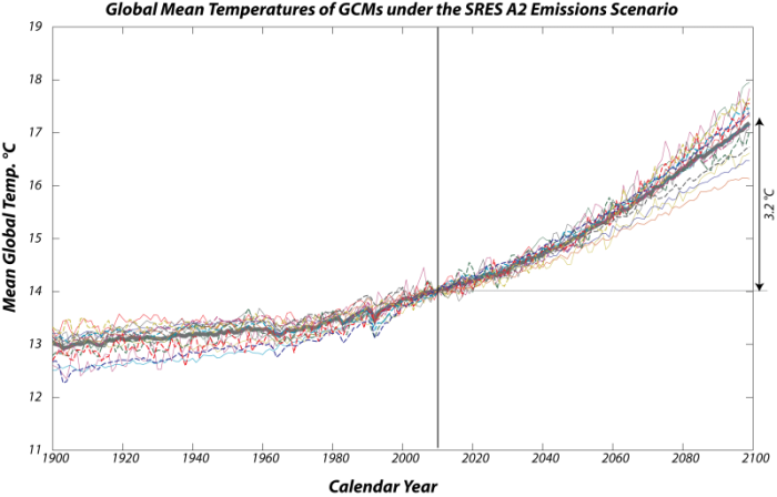
The differences in these curves reflect, among other things, different starting conditions, and if we force them to all have the same temperature today, the similarities are more apparent:
This image is a line graph showing the relative global temperature changes projected by multiple climate models over the period from 1900 to 2099. Each thin colored line represents the output from a different climate model, illustrating the variability in their projections.
- Graph Type: Line graph
- Y-Axis: Relative temperature change (°C)
- Range: Not explicitly labeled, but spans approximately -1°C to 5°C
- X-Axis: Years (1900 to 2099)
- Data Representation:
- Individual Models: Multiple thin colored lines (blue, red, green, yellow, orange, purple, etc.)
- Each line represents a different climate model's projection
- Lines start around -0.5°C in 1900, showing historical fluctuations
- All lines exhibit a general upward trend, with increasing spread by 2099
- Spread in 2099: Less than 2°C (roughly 2°C to 4°C)
- Most models fall within 0.5°C of the mean temperature
- Mean Temperature: Thick gray line
- Represents the average of all model outputs
- Starts around -0.5°C in 1900
- Rises steadily, reaching approximately 3.2°C by 2099
- Individual Models: Multiple thin colored lines (blue, red, green, yellow, orange, purple, etc.)
- Trend:
- 1900–2000: Lines show historical fluctuations with a slight upward trend
- 2000–2099: All models project continued warming, with the mean increasing to 3.2°C
- The mean warming of 3.2°C by the end of the century is noted as disastrous for the planet
The graph highlights the variability among climate models in projecting future temperature changes, with a spread of less than 2°C by 2099, but most models clustering within 0.5°C of the mean. The mean warming of 3.2°C underscores the potential for significant and harmful climate impacts.
This view gives a sense of how much the models differ in their relative temperature changes over the next century. You can see that by the end of the century, the spread of temperatures is a bit less than 2°C, but most of the models fall within a half a degree from the mean temperature — the thick gray line. As we have discussed, this mean warming of 3.2 °C would be disastrous for the planet.
The lesson here is that the similarities in the models are far more important than their differences, and that they forecast a significant temperature rise by the end of the century as we essentially continue with our emissions of carbon into the atmosphere.
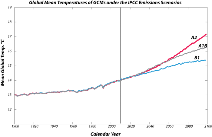
Next, let’s have a look at what the models say about the different emissions scenarios. Just to refresh your memories, here are those emissions scenarios again:
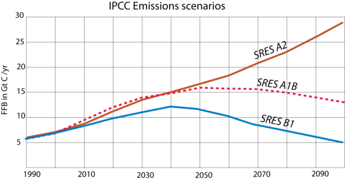
This image is a line graph comparing three different trends over time, represented by three distinct lines in blue, pink, and brown. The graph lacks labeled axes, but it appears to show changes in some variable over a period, possibly related to climate or environmental data.
- Graph Type: Line graph
- Lines:
- Blue Line:
- Starts low, rises to a peak around the midpoint
- Declines steadily afterward, ending lower than the starting point
- Pink Line (with dots):
- Starts low, rises gradually
- Peaks slightly after the blue line, then declines slowly
- Ends slightly above the starting point
- Brown Line:
- Starts low, rises steadily throughout
- Shows a consistent upward trend with no decline
- Ends significantly higher than the starting point
- Blue Line:
- Trend:
- Blue line shows a rise and fall pattern
- Pink line shows a moderate rise with a slight decline
- Brown line shows a continuous increase
The graph illustrates three distinct trends over time, with the blue line peaking and declining, the pink line showing a more moderate rise and fall, and the brown line indicating a steady increase throughout the period.
Recall that in these emissions scenarios, we talk about the annual rate of carbon emissions to the atmosphere and that carbon takes the form of CO2 in the atmosphere.
Here are the corresponding global temperature histories from the collection of models for these different scenarios:
This image is a line graph comparing three different trends over time, represented by three distinct lines in blue, pink, and gray. The graph lacks labeled axes, but it appears to show changes in some variable over a period, possibly related to climate or environmental data.
- Graph Type: Line graph
- Lines:
- Blue Line:
- Starts low, shows small fluctuations initially
- Rises steadily after the midpoint, continuing upward
- Pink Line (with dots):
- Starts low, mirrors the blue line initially
- Rises more sharply after the midpoint, surpassing the blue line
- Ends significantly higher than the starting point
- Gray Line:
- Starts low, rises steadily throughout
- Shows a consistent upward trend, similar to the blue line but slightly higher
- Ends above the blue line but below the pink line
- Blue Line:
- Trend:
- Blue and gray lines show a steady, gradual increase
- Pink line shows a steeper increase in the latter half
- All lines exhibit an overall upward trend
The graph illustrates three distinct trends over time, with the blue and gray lines showing a steady increase, while the pink line demonstrates a more pronounced rise in the latter part of the period.
As expected, the A2 scenario results in the highest temperature rise, followed by the A1B and the B1 scenarios. Remember that the A1B scenario represents a pretty optimistic view of how we will react to the challenge of climate change, but even in that case, the temperature rises by about 2.3 °C in the next century, which is above the Paris 2.0oC target. And even in the dramatic reduction in emissions envisioned in the B1 scenario, the temperature still rises by about 1.4°C — greater than what we’ve experienced in the last century. The lesson here is that we need to be prepared for continued climate change even if we take steps to limit carbon emissions into the atmosphere. And note that only B1 keeps us below the catastrophic 2.0oC threshold discussed earlier.
Next, we turn to the really interesting aspect of the GCM results, which are the spatial patterns of climate change. Why is this so interesting and important? The reason is that what really matters to us is how the climate changes in key areas -- areas that will affect sea level through melting of glacial ice, areas where people are concentrated, and areas where we produce food to feed ourselves. Remember that the climate of the Earth is highly variable, and if we talk about a global temperature rise of 3.2 °C, we have to remember that the temperature will rise more than that in some places (such as the polar regions) and less than that in the tropics.
We begin with a look at the climate of the future as predicted by the NCAR (National Center for Atmospheric Research in Boulder, Colorado) model — this model seems to often fall close to the mean of all the other models.
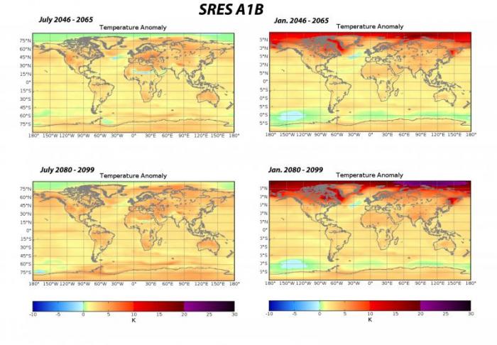
This image consists of four world maps showing temperature anomalies in Kelvin (K) under the SRES A1B scenario for two different periods: July 2046–2065 and July 2080–2099, as well as January 2046–2065 and January 2080–2099. Each map uses a color gradient to indicate temperature changes relative to a baseline.
- Diagram Type: Four world maps
- Measurement: Temperature anomaly (K)
- Color Scale (bottom of the maps):
- Range: -3.0 K to 3.0 K
- Colors: Dark blue (-3.0 K) to dark red (3.0 K), with light blue, white, and orange in between
- Maps:
- July 2046–2065 Temperature Anomaly (Top Left):
- Warmer than Average (red, 1.5 K to 3.0 K):
- Central Africa, Middle East, India
- Slightly Warmer (orange, 0 K to 1.5 K):
- Most of North America, Europe, Asia
- Near Average or Cooler (white to blue, -3.0 K to 0 K):
- Parts of the Arctic, southern South America
- Warmer than Average (red, 1.5 K to 3.0 K):
- January 2046–2065 Temperature Anomaly (Top Right):
- Warmer than Average (red, 1.5 K to 3.0 K):
- Arctic regions, northern North America, Siberia
- Slightly Warmer (orange, 0 K to 1.5 K):
- Most of the Northern Hemisphere
- Near Average or Cooler (white to blue, -3.0 K to 0 K):
- Southern Hemisphere, especially southern South America
- Warmer than Average (red, 1.5 K to 3.0 K):
- July 2080–2099 Temperature Anomaly (Bottom Left):
- Warmer than Average (red, 1.5 K to 3.0 K):
- Central Africa, Middle East, India, central North America
- Slightly Warmer (orange, 0 K to 1.5 K):
- Most of the globe
- Near Average or Cooler (white to blue, -3.0 K to 0 K):
- Small areas in the Arctic, southern South America
- Warmer than Average (red, 1.5 K to 3.0 K):
- January 2080–2099 Temperature Anomaly (Bottom Right):
- Warmer than Average (red, 1.5 K to 3.0 K):
- Arctic regions, northern North America, Siberia
- Slightly Warmer (orange, 0 K to 1.5 K):
- Most of the Northern Hemisphere
- Near Average or Cooler (white to blue, -3.0 K to 0 K):
- Southern Hemisphere, especially southern South America
- Warmer than Average (red, 1.5 K to 3.0 K):
- July 2046–2065 Temperature Anomaly (Top Left):
- Additional Features:
- Latitude lines: 90°N to 90°S
- Longitude lines: 180°W to 180°E
The maps illustrate projected temperature anomalies under the SRES A1B scenario, showing significant warming in July and January for both periods, with the most pronounced increases in the Arctic during January and in tropical regions during July, intensifying by the end of the century.
Here, we see 4 views of the surface temperature anomaly relative to the 1960-1990 mean. The upper 2 panels represent the mean temperature anomaly for the 20-year period from 2046 to 2065 in the month of July on the left and January on the right. In the lower 2 panels, we see similar views for the 20-year period from 2080 to 2099. The color scale below is for all of the panels and shows the anomaly in °K, but you can also think of this as °C.
Let’s start with the mid-century forecast. It calls for moderate warming in the range of 2 °C relative to the 1960-1990 mean. For both months, the warming is slightly higher on land than in the oceans, and there are a couple of spots of cooling: at the southern edge of the Sahara, one in the Southern Ocean around Antarctica, and one in the North Atlantic. The striking feature of this model result is the big change in the high latitudes of the Northern Hemisphere in January, where a large region will experience much warmer winter temperatures — up to 10° C warmer. The changes are even more dramatic for the end of the century, with the northern winters warming by up to 20° C above the 1960-1990 mean! This clearly spells the end of polar ice, which already is at its lowest extent ever. Notice also that much of Canada and Siberia warm by up to 10° C; this has important implications for the reduction in permafrost, which will increase the flow of carbon into the atmosphere via positive feedback (more on this in the next module).
The pattern of warm winters is important for a number of reasons. For one thing, it means that there will be less growth of ice in glaciers during the time of the year that they accumulate ice; thus they will shrink faster, and sea level will rise at a higher rate. Another unexpected result of warmer winters is increased problems from some insect pests whose populations normally are greatly reduced by cold winters, and when it does not get cold enough in the winter, they expand their range and cause greater damage. This is already happening in the western US with the pine bark beetle, whose population has exploded in recent years, leading to the decimation of large forested areas. These dead pine trees are then fuel for large forest fires whose scale exceeds fires in the historical record.
On the other hand, warmer winters lead to lower energy demands for heating, but this is offset by the greater energy demands for cooling during the summer months (the season where cooling would be required will also increase).
For comparison, we now compare the end-of-century forecast for the other 2 scenarios, A2, which is our business as usual case, and B1, which is our optimistic case with the A1B forecast.
First, we have the A2 scenario, which leads to the highest warming:
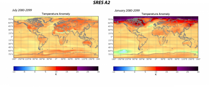
For July, this scenario leads to warming of the continents that is between 5 and 10° C — very little of the US would escape warming in excess of about 6° C; the same is true for much of Europe. Winter shows an even more dramatic warming, with vast regions warming by more than 20 °C. A2 would result in a major increase in the number of days over 90o F in places such as Atlanta Austin, Dallas and Phoenix literally half of the days of the year would exceed that level of discomfort. And polar ice would melt much faster than in A1B or B1.
Now, for the other extreme, the B1 scenario at the end of the century:
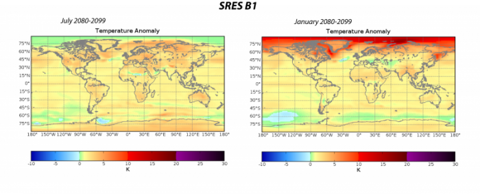
As expected, the warming is far less dramatic, but still shows an impressive warming at the high latitudes of the Northern Hemisphere in the winter months. But, for most of the land areas, where people are concentrated and where we grow a lot of our food, the climate changes generally do not exceed a warming of 2°C.
These comparisons demonstrate the importance of reducing emissions to scenario B1 levels.