
Precipitation
Next, we turn to precipitation, and we will be looking at anomaly maps, showing the difference between the model’s precipitation rate (i.e., mm/month or mm/day) and the average precipitation rate for 1960-1990. It will help us to begin with a glimpse of actual typical precipitation rates for the two months of interest here — January and July. Below, we see this pair of maps:
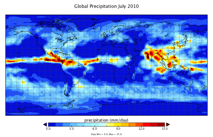
This image is a world map titled "Global Precipitation July 2010," showing the distribution of precipitation in millimeters per day (mm/day) across the globe for that month. The map uses a color gradient to indicate precipitation levels, with data statistics provided at the bottom.
- Map Type: World map
- Measurement: Precipitation (mm/day)
- Color Scale (bottom of the map):
- Range: 0.0 mm/day to 15.0 mm/day
- Colors: Dark blue (0.0 mm/day) to dark red (15.0 mm/day), with light blue, yellow, and orange in between
- Regions with Notable Precipitation:
- High Precipitation (red, 12.0–15.0 mm/day):
- Equatorial regions, particularly the Intertropical Convergence Zone (ITCZ)
- Central America, northern South America (Amazon Basin)
- West Africa, India, and Southeast Asia
- Moderate Precipitation (yellow to orange, 3.0–12.0 mm/day):
- Parts of the eastern U.S., eastern China, and northern Australia
- Low Precipitation (blue, 0.0–3.0 mm/day):
- Most of the Northern Hemisphere (outside the ITCZ)
- Southern South America, southern Africa, and central Australia
- High Precipitation (red, 12.0–15.0 mm/day):
- Data Statistics (bottom of the map):
- Minimum: 0.0 mm/day
- Maximum: 35.8 mm/day
- Mean: 2.7 mm/day
The map illustrates global precipitation patterns for July 2010, with the highest rainfall concentrated along the equator, particularly in Central America, the Amazon, West Africa, and Southeast Asia, while much of the Northern and Southern Hemispheres outside these regions experienced lower precipitation.
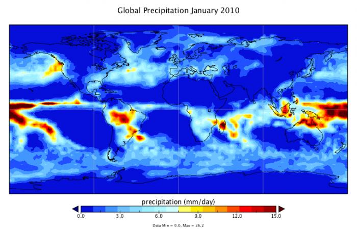
This image is a world map titled "Global Precipitation January 2010," showing the distribution of precipitation in millimeters per day (mm/day) across the globe for that month. The map uses a color gradient to indicate precipitation levels, with data statistics provided at the bottom.
- Map Type: World map
- Measurement: Precipitation (mm/day)
- Color Scale (bottom of the map):
- Range: 0.0 mm/day to 15.0 mm/day
- Colors: Dark blue (0.0 mm/day) to dark red (15.0 mm/day), with light blue, yellow, and orange in between
- Regions with Notable Precipitation:
- High Precipitation (red, 12.0–15.0 mm/day):
- Equatorial regions, particularly the Intertropical Convergence Zone (ITCZ)
- Northern South America (Amazon Basin), Central America
- Southeast Asia, parts of Indonesia, and northern Australia
- Moderate Precipitation (yellow to orange, 3.0–12.0 mm/day):
- Southern Brazil, parts of West Africa
- Eastern Australia, parts of the southern U.S.
- Low Precipitation (blue, 0.0–3.0 mm/day):
- Most of the Northern Hemisphere (North America, Europe, Asia)
- Southern Africa, central Australia, and southern South America
- High Precipitation (red, 12.0–15.0 mm/day):
- Data Statistics (bottom of the map):
- Minimum: 0.0 mm/day
- Maximum: 26.2 mm/day
- Mean: 2.8 mm/day
The map illustrates global precipitation patterns for January 2010, with the highest rainfall concentrated along the equator, particularly in the Amazon Basin, Southeast Asia, and northern Australia, while much of the Northern Hemisphere and non-equatorial Southern Hemisphere regions experienced lower precipitation.
Here, red is used to show high rainfall, and blue is used to show low rainfall. The precipitation rates here are shown in terms of millimeters of rain per day (the high value here of 15 mm/day is about 0.6 inches/day). In the eastern US, for instance, the July rainfall is about 1 mm/day.
Looking into the future, we will again utilize the results from the NCAR model, looking at 20-yr. means from the climate model results to get a smoothed out version of the results. We focus here on the SRES A1B scenario, looking at the months of July and January.
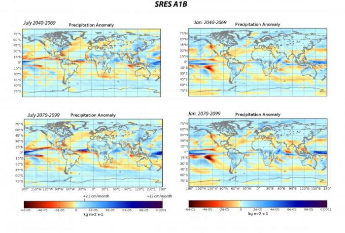
This image consists of four world maps showing precipitation anomalies under the SRES A1B scenario for two different periods: July 2040–2069 and July 2070–2099, as well as January 2040–2069 and January 2070–2099. The anomalies are measured in kg m^-2 s^-1, with a color gradient indicating changes in precipitation relative to a baseline.
- Diagram Type: Four world maps
- Measurement: Precipitation anomaly (kg m^-2 s^-1)
- Color Scale (bottom of the maps):
- Range: -0.0001 to 0.0001 kg m^-2 s^-1
- Colors: Dark blue (-0.0001) to dark red (0.0001), with light blue, white, and yellow in between
- Maps:
- July 2040–2069 Precipitation Anomaly (Top Left):
- Increased Precipitation (red, 0.00005 to 0.0001 kg m^-2 s^-1):
- Central Africa, northern South America, Southeast Asia
- Decreased Precipitation (blue, -0.0001 to -0.00005 kg m^-2 s^-1):
- Mediterranean, parts of the Middle East, southern North America
- Near Average (white to yellow, -0.00005 to 0.00005 kg m^-2 s^-1):
- Most of the Northern Hemisphere, Australia
- Increased Precipitation (red, 0.00005 to 0.0001 kg m^-2 s^-1):
- January 2040–2069 Precipitation Anomaly (Top Right):
- Increased Precipitation (red, 0.00005 to 0.0001 kg m^-2 s^-1):
- Northern North America, northern Europe, Siberia
- Decreased Precipitation (blue, -0.0001 to -0.00005 kg m^-2 s^-1):
- Parts of the Southern Hemisphere, including southern South America
- Near Average (white to yellow, -0.00005 to 0.00005 kg m^-2 s^-1):
- Equatorial regions, most of Africa
- Increased Precipitation (red, 0.00005 to 0.0001 kg m^-2 s^-1):
- July 2070–2099 Precipitation Anomaly (Bottom Left):
- Increased Precipitation (red, 0.00005 to 0.0001 kg m^-2 s^-1):
- Central Africa, northern South America, Southeast Asia (more pronounced than 2040–2069)
- Decreased Precipitation (blue, -0.0001 to -0.00005 kg m^-2 s^-1):
- Mediterranean, Middle East, southern North America (more intense than earlier period)
- Near Average (white to yellow, -0.00005 to 0.00005 kg m^-2 s^-1):
- Parts of the Northern Hemisphere, Australia
- Increased Precipitation (red, 0.00005 to 0.0001 kg m^-2 s^-1):
- January 2070–2099 Precipitation Anomaly (Bottom Right):
- Increased Precipitation (red, 0.00005 to 0.0001 kg m^-2 s^-1):
- Northern North America, northern Europe, Siberia (more pronounced than 2040–2069)
- Decreased Precipitation (blue, -0.0001 to -0.00005 kg m^-2 s^-1):
- Southern South America, parts of the Southern Hemisphere
- Near Average (white to yellow, -0.00005 to 0.00005 kg m^-2 s^-1):
- Equatorial regions, most of Africa
- Increased Precipitation (red, 0.00005 to 0.0001 kg m^-2 s^-1):
- July 2040–2069 Precipitation Anomaly (Top Left):
- Additional Features:
- Latitude lines: 90°N to 90°S
- Longitude lines: 180°W to 180°E
The maps illustrate projected precipitation anomalies under the SRES A1B scenario, showing increased precipitation in tropical regions during July and in northern high latitudes during January, with decreased precipitation in the Mediterranean and southern regions, intensifying by the end of the century.
The units here are a bit odd — kilograms per meter squared per second — but it is still a rate, and if we do a conversion, we find that 0.0001 of these units equals 25 centimeters per month, or a bit less than one centimeter per day, which is 10 millimeters per day. Have a look at the map for July 2040 to 2069. In the eastern US, the precipitation anomaly is about 2e-5 kg/m2s. At first, it is difficult to get a sense of whether this is important. This anomaly translates to about 45 mm/month, or about 1.5 mm/day. From the July 2001-December 2019 map above, we see that the typical rate for July in this region is on the order of about 4-5 mm/day, so an increase of 1.5 mm/day is about a 30% increase — fairly significant.
Interestingly, there is not much of a change in the anomaly for this region (eastern US) as we move to the end-of-the-century map in the lower left panel above. And in both cases, the western US is drier by a bit. If we look at the January maps, we see a bigger change between the two time periods, getting drier by the 2080-2099 period. For January, it is important to note that in the Western US, the precipitation is decreased; this could mean problems for the water supply out west, where the winter snows, as they melt in the summer, represent a major part of the water budget.
What about the other scenarios? Below, we see the precipitation anomaly maps for the A2 scenario — the one that leads to a hotter climate — for the 2080-2099 time period.
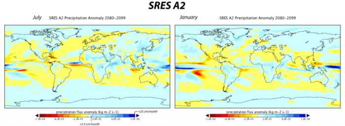
This image consists of two world maps showing precipitation flux anomalies under the SRES A2 scenario for the period 2080–2099, one for July and one for January. The anomalies are measured in kg m^-2 s^-1, with a color gradient indicating changes in precipitation relative to a baseline, and additional scales for percentage changes and millimeters per month.
- Diagram Type: Two world maps
- Measurement: Precipitation flux anomaly (kg m^-2 s^-1)
- Color Scale (bottom of the maps):
- Range: -1.8e-4 to 1.8e-4 kg m^-2 s^-1
- Colors: Dark blue (-1.8e-4) to dark red (1.8e-4), with light blue, white, and yellow in between
- Additional Scales:
- Percentage change: -42% to 42%
- mm/month: -125 to 125 mm/month
- Maps:
- July 2080–2099 Precipitation Anomaly (Left):
- Increased Precipitation (red, 0.9e-4 to 1.8e-4 kg m^-2 s^-1, 21% to 42%, 62.5 to 125 mm/month):
- Central Africa, northern South America, Southeast Asia
- Decreased Precipitation (blue, -1.8e-4 to -0.9e-4 kg m^-2 s^-1, -42% to -21%, -125 to -62.5 mm/month):
- Mediterranean, Middle East, southern North America, parts of Australia
- Near Average (white to yellow, -0.9e-4 to 0.9e-4 kg m^-2 s^-1, -21% to 21%, -62.5 to 62.5 mm/month):
- Most of the Northern Hemisphere, southern South America
- Increased Precipitation (red, 0.9e-4 to 1.8e-4 kg m^-2 s^-1, 21% to 42%, 62.5 to 125 mm/month):
- January 2080–2099 Precipitation Anomaly (Right):
- Increased Precipitation (red, 0.9e-4 to 1.8e-4 kg m^-2 s^-1, 21% to 42%, 62.5 to 125 mm/month):
- Northern North America, northern Europe, Siberia
- Decreased Precipitation (blue, -1.8e-4 to -0.9e-4 kg m^-2 s^-1, -42% to -21%, -125 to -62.5 mm/month):
- Southern South America, parts of the Southern Hemisphere
- Near Average (white to yellow, -0.9e-4 to 0.9e-4 kg m^-2 s^-1, -21% to 21%, -62.5 to 62.5 mm/month):
- Equatorial regions, most of Africa, Australia
- Increased Precipitation (red, 0.9e-4 to 1.8e-4 kg m^-2 s^-1, 21% to 42%, 62.5 to 125 mm/month):
- July 2080–2099 Precipitation Anomaly (Left):
The maps illustrate projected precipitation anomalies under the SRES A2 scenario for 2080–2099, showing increased precipitation in tropical regions during July and in northern high latitudes during January, with significant decreases in the Mediterranean, southern North America, and parts of the Southern Hemisphere.
Compared to the A1B scenario for the same time period, we see a generally drier picture for the US, though the differences are actually quite small. Note that in this scenario, as in others, the tropics get wetter.
For scenario SRES B1, the one where the temperature at the end of the century is only slightly higher than the present, the precipitation changes are generally quite small, as can be seen in the map below:
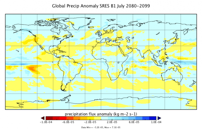
This image is a world map titled "Global Precip Anomaly SRES B1 July 2080-2099," showing precipitation flux anomalies in kg m^-2 s^-1 under the SRES B1 scenario for the period of July 2080–2099. The map uses a color gradient to indicate changes in precipitation relative to a baseline, with data statistics provided at the bottom.
- Map Type: World map
- Measurement: Precipitation flux anomaly (kg m^-2 s^-1)
- Color Scale (bottom of the map):
- Range: -1.0e-04 to 1.0e-04 kg m^-2 s^-1
- Colors: Dark red (-1.0e-04) to dark blue (1.0e-04), with yellow, white, and light blue in between
- Regions with Notable Anomalies:
- Increased Precipitation (blue, 0.5e-05 to 1.0e-04 kg m^-2 s^-1):
- Northern North America, northern Europe, Siberia
- Parts of Southeast Asia and the equatorial Pacific
- Decreased Precipitation (red, -1.0e-04 to -0.5e-05 kg m^-2 s^-1):
- Central America, northern South America (Amazon Basin)
- Parts of West Africa and the Mediterranean
- Near Average (white to yellow, -0.5e-05 to 0.5e-05 kg m^-2 s^-1):
- Most of the Southern Hemisphere, including southern South America, Africa, and Australia
- Parts of the Northern Hemisphere, including central North America and central Asia
- Increased Precipitation (blue, 0.5e-05 to 1.0e-04 kg m^-2 s^-1):
- Data Statistics (bottom of the map):
- Minimum: -5.2e-05 kg m^-2 s^-1
- Maximum: 7.1e-05 kg m^-2 s^-1
The map illustrates projected precipitation anomalies under the SRES B1 scenario for July 2080–2099, showing increased precipitation in northern high latitudes and parts of the equatorial Pacific, while regions like Central America, the Amazon Basin, and the Mediterranean experience decreased precipitation.
Here, the very light colors indicate slight increases and decreases in the precipitation rate for July — the same picture holds for January as well.
In summary, the precipitation results indicate that in general, there are very complicated patterns of precipitation change, and for much of the globe, they are quite minimal. The model predicts that there will be wetter areas and drier areas, and what really matters is how these changes correlate with the regions where people live and grow their food. Under the A2 scenario (business-as-usual), we should expect a generally drier western and south-central US and a generally wetter northeastern U.S. We will revisit this issue in Module 8.