Prioritize...
When you've finished this section, you should be able to describe different datasets used to assess Earth's temperature (namely paleoclimate proxies, the modern surface temperature record, and satellite temperature data) along with their limitations, and explain why Earth's temperature doesn't steadily increase each year, even with the anthropogenic strengthening of the greenhouse effect. You should also be able to discuss the dangers of using "cherry-picked" data, and explain why all locations on the planet are not warming equally.
Read...
Recall from our lesson on temperature controllers that measuring temperature is not a straightforward task. Different types of thermometers exist, and the specific environment around each thermometer can certainly affect your measurements (which is why car and bank thermometers aren't considered reliable official measurements, for example). When thinking about Earth's longer-term climate, the issue is even more complex. The "modern" surface temperature record only dates back to the 1800s, so it only covers a tiny fraction of Earth's history. So, how can we put recent global temperature changes in context if we only have temperature records since the 1800s?
Well, in short, we only have direct temperature measurements since the 1800s. But, scientists have discovered ways to learn about past atmospheric composition and temperatures and have created paleoclimate temperature proxies (temperature approximations of past climates), by studying things like ice sheets, tree rings, corals, and ocean sediment (among other things). These paleoclimate temperature reconstructions can go back thousands or even millions of years, but keep in mind that such historical temperature reconstructions are approximations; they're not perfect, and they have a range of uncertainties associated with them. Still, scientists have found some commonalities among various paleoclimate proxies of temperature and carbon dioxide based on different sources, which gives confidence that the reconstructions are reasonable (albeit imperfect) approximations of past climates.
One important aspect that such reconstructions have revealed is the connection between global temperature and carbon dioxide concentration. The graph below, which is based on data from ice cores retrieved from Antarctica, shows the close connection between atmospheric carbon dioxide and temperature over the 800,000 years leading up to the industrial age. The two traces don't match each other exactly, but it's pretty clear that warmer times have been times of higher carbon dioxide concentration and cooler times have been times of lower carbon dioxide concentration.
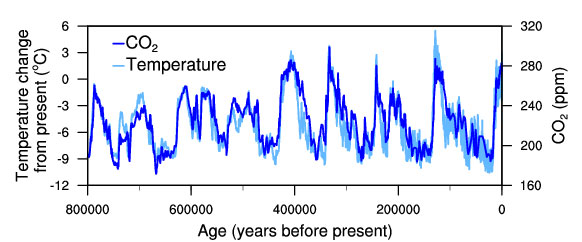
I should note that the correlation between carbon dioxide and temperature isn't simple cause and effect based on increased carbon dioxide strengthening the greenhouse effect and causing warming. Temperature also impacts the rates of various natural processes in the carbon cycle, so other factors (beyond the scope of the course) are involved in the similar historical trends you see in the graph above, but it's pretty clear that trends in temperature and carbon dioxide concentration go together!
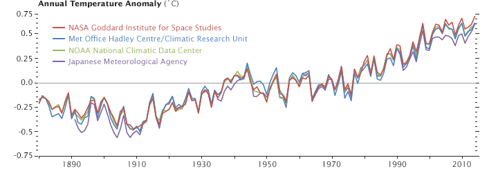
In more modern times (since the 1800s), we have directly observed surface temperatures with thermometers. But, even with direct observations, determining an average temperature for the planet isn't an easy task. Temperature observation sites are primarily located on land, and most of them are located in the Northern Hemisphere. Furthermore, observation sites are irregularly spaced (more are located around cities), and the vast amounts of the earth covered by oceans have historically had relatively few direct temperature observations by comparison.
The complications don't stop there. Temperature observation sites use different measuring equipment (ranging from liquid-in-glass thermometers to more modern electrical thermometers), and even record their observations at different times of day (believe it or not, that matters in average temperature calculations, too). So, scientists from around the globe have analyzed millions of temperature observations in an effort to develop a homogeneous, representative temperature record for the earth. While there's no perfect solution to tackling some of these complications, the temperature records from independent agencies around the world (each of which has slightly different methods for calculating global temperature) all show nearly identical long-term warming trends (see graph below).
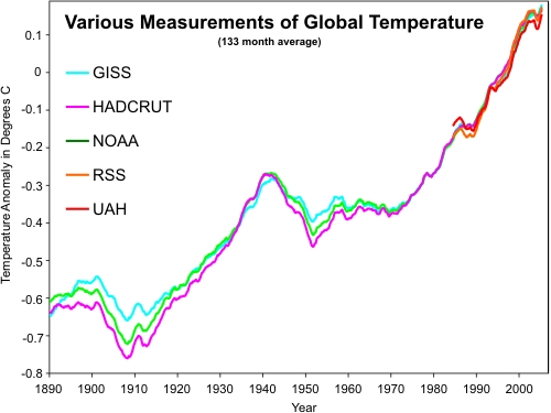
In more recent decades, with the invention of satellites, scientists have another tool at their disposal for assessing global temperature. As you know, satellites can remotely sense temperature, and although remotely sensed measurements are imperfect, satellites have been very important in improving our ability to measure temperatures over the oceans and in other areas of the globe with few (or no) surface observations. While satellite data has a short period of record (it only goes back to 1979), satellite measurements of global temperature match surface-based observations reasonably well (satellite records are "RSS" and "UAH" on this graph of 133-month average global temperatures from skepticalscience.com). In yet another way to assess global temperature, scientists now use computer model analyses, which take available surface and satellite observations and use sophisticated algorithms to combine all the data together into one analysis.
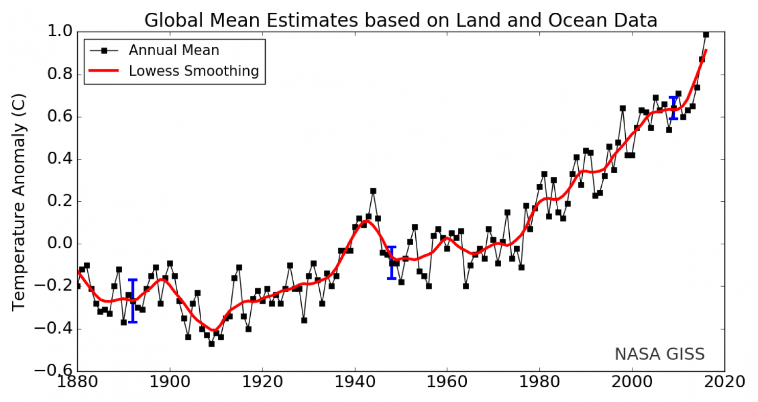
While all of the datasets show warming over their period of record, they also show lots of year-to-year ups and downs. For example, here's a detailed look at NASA's temperature record. The overall trend is up, but you can find periods (single years, or even a few decades at a time) where temperatures don't rise at all. Why is that, if atmospheric carbon dioxide is steadily increasing?
The simple answer is that carbon dioxide, and greenhouse gases in general, aren't the only controllers of Earth's temperatures. Observed temperature changes are a result of a combination of all climate-change drivers -- natural and anthropogenic. So, over short periods of time (a few months to perhaps a few decades), global temperature may not rise at all, or may even decline. That's because a combination of other factors (solar cycles, ocean cycles, volcanoes, etc.) are working together to overwhelm the signal from anthropogenic warming. On the other hand, during times when natural factors (solar cycles, ocean cycles, etc.) favor warming, global temperature tends to spike upward because both natural and anthropogenic factors are favoring warmth. In other words, we shouldn't expect every single year to be warmer than the previous one. Global temperature has ups and downs, but over longer periods of time (decades to centuries), the anthropogenic warming is winning out.
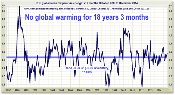
So, don't be fooled by cherry-picked (selectively chosen and incomplete) data that you may come across from time-to-time. Internet blogs are rife with dubious graphics that claim to "disprove" global warming by showing some period of time (often a few years to a decade or two) which shows no warming (or even cooling). Take this example of cherry-picking I found on the Web, which used one of the satellite data sets to show that no global warming had occurred for a period of 18 years and 3 months (from October 1996 through December 2014). Such a claim may have been true at the time, but it wasn't very meaningful. To see what I mean, check out how someone "cherry-picking" global temperature data from 1970 through 2016 may view it (top image, below), compared with the more relevant, longer-term trend (bottom image, below).
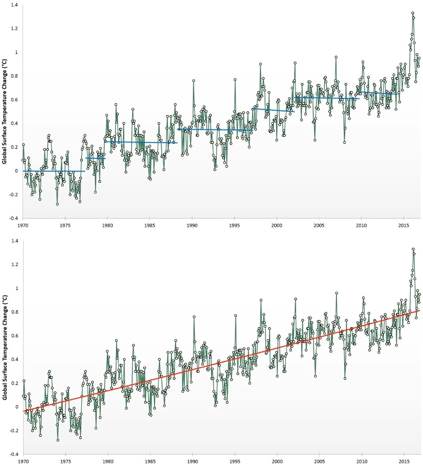
So, those shorter term periods (a few years to a decade or two) when global temperatures don't increase (or maybe even decrease slightly) are very real, but not particularly relevant in terms of longer-term warming. A person viewing one of the short periods with no warming (marked by the blue trend lines in the top graph above) would miss the more important trend (shown on the bottom graph). It's also telling that each cherry-picked period in the top graph may not have a warming trend itself, but each is warmer than the previous one! The main message is that you should beware of cherry-picked data (and not just with respect to climate change)!
Global Warming versus Local Warming
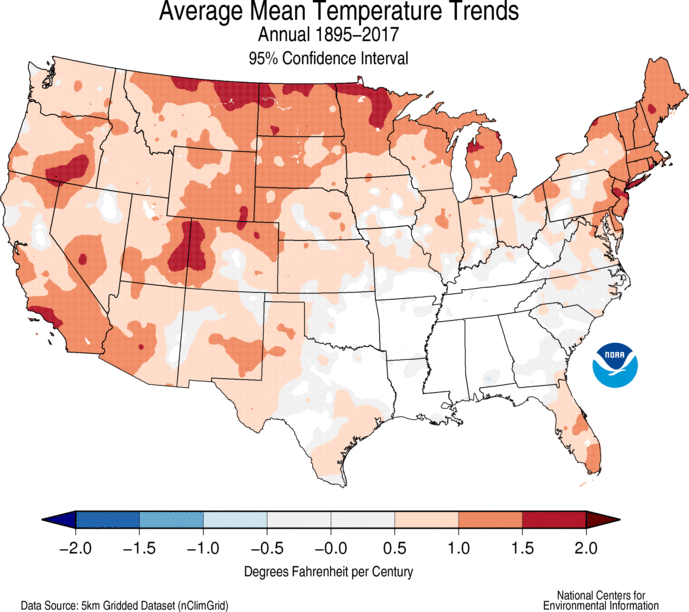
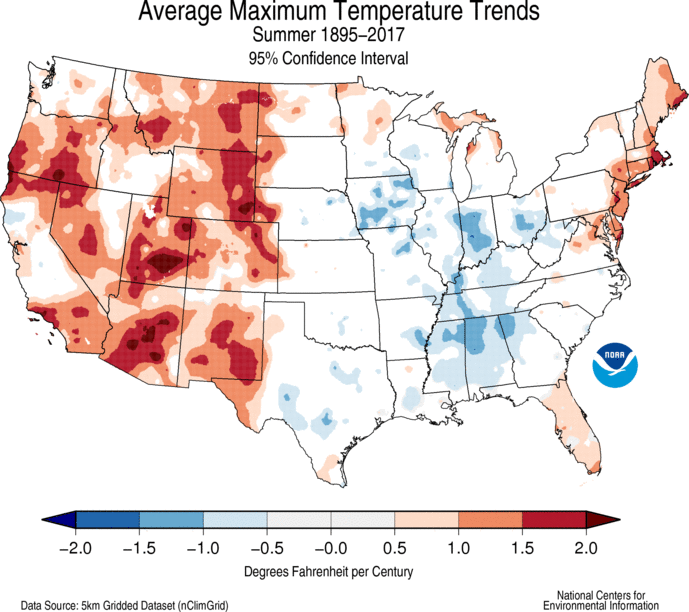
The graphs we've examined so far show an obvious upward trend in global atmospheric temperatures during since the late 1800s, but are all locations on the globe warming equally? The short answer is "no." Generally speaking, cities are tending to warm faster than surrounding rural areas, thanks to local urban-heat island effects combining with global trends. Still, many rural areas are warming, too. This map showing temperature changes in the United States between 1895 and 2017 shows that some areas have warmed more than others. Some areas, such as parts of the Great Plains, Midwest and interior Southeast, have hardly warmed at all.
How could an area not be warming at all in the midst of global warming? Well, local and regional land-use changes are one likely culprit behind the relative lack of warming in those areas. As these former grassland prairies are used to grow an increasing number of crops, increased transpiration and evaporation are leading to local cooling during summer afternoons in particular, because some of the sun's energy is being used to evaporate water. Yes, daily maximum temperatures during summer have actually declined in some areas between 1895 and 2017 because of increases in local and regional evaporation from agriculture. So, local and regional land use changes are certainly a factor in the temperature changes that a particular city or region experiences; therefore, you should keep in mind that temperature trends in your region may or may not be perfectly in line with global trends. I should also add that regional variations in atmospheric aerosol concentrations (from air pollution emitted from coal-fired power plants, for example) can affect incoming solar radiation on a local or regional basis, which can impact temperature trends.
Still, there's no doubt that most areas of the globe are warming, as this NASA animation of global temperatures from 1880 to 2017 shows. The colors on the graphic represent differences from the global average temperatures between 1951 and 1980 (blues represent colder than that period's average; oranges and reds represent warmer). The animation reinforces the fact that all parts of the globe are not warming equally, and overall, higher latitudes in the Northern Hemisphere have warmed the most. But, regardless of regional variations, most areas of the planet are warming and every major temperature record (based on surface observations, satellite data, or some combination) show that Earth's average temperature is increasing. What are some consequences of our warming planet? We'll investigate up next.