Prioritize...
When you've completed this page, you should be able to name the isopleths for temperature ("isotherms") and pressure ("isobars"). You should also be able to estimate a value at a point on a contour map of temperature or pressure (or any variable, for that matter).
Read...
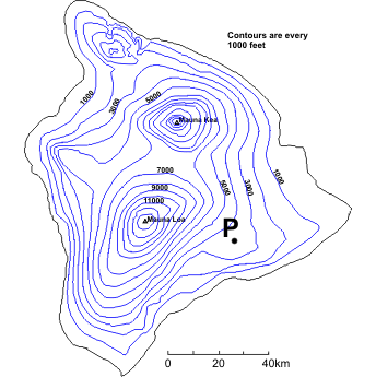
Meteorologists regularly use contour maps to see how weather variables (temperature or pressure, for example) change over large areas, but they also use them to estimate values of weather variables at individual points. To get us started on interpreting contour maps, we're first going to revisit our topographic map of Hawaii (right).
How would we go about figuring out the elevation of the point marked "P"? First, we must identify the two contours that lie on either side of "P." In some cases the contours that we need are clearly labeled; however, in other instances, you will need to use the contour interval (1,000 feet, in this case) to "count" up or down from a labeled contour. On our map, point "P" lies between 3000 feet and 4000 feet contours, so the elevation at point "P" is greater than (but not equal to) 3000 feet but less than (but again, not equal to) 4000 feet. We know that point "P" is not equal to either of these values because it does not lie on one of the contour lines.
Technically, this is all that we can say for sure about the elevation at point "P" -- it can be anywhere between 3,000 and 4,000 feet. However, often instead of giving a range of elevation, we would prefer a single number. In such cases, we can interpolate (make an estimate by assuming the elevation changes linearly) between the two known contours. In this case, we can see that point "P" is about half-way between the two contours and thus has an elevation of approximately 3,500 feet. Using interpolation usually provides us with a sufficient approximation, but we must always realize that it's only an estimate.
What about closed contours that have no other contours drawn within them? Look again at the contour map and focus your attention on the southern-most peak, Mauna Loa. How might we estimate the height of this peak? Clearly, we do not have two contours to use... or do we? The last drawn contour is 13,000 feet. This means that the peak is higher than 13,000 feet. However, we know that the summit of Mauna Loa is not higher than 14,000 feet. Why? Well, if it were, then the 14,000 feet contour would have been drawn around the summit. So, for an inner-most closed contour, the range is always between the last drawn contour and the next undrawn contour. You should also note that interpolation cannot be performed in such cases because we have no way of knowing how far away the undrawn contour is. The summit of Mauna Loa is 13,452 ft (within our deduced range of 13,000-14,000 feet), but we really couldn't have known that just from our topographic map (unless the peak elevation was labeled).
Two variables that are commonly contoured by meteorologists are temperature and air pressure. Isopleths of temperature are called isotherms (contours of constant temperature), and isopleths of pressure are called isobars (contours of constant pressure). Don't confuse the two! It would be incorrect to look at a map that shows only contours of constant temperature and call them "isobars," for example.
Maps with isobars of sea-level pressure help meteorologists recognize areas of high and low pressure. Why is this important? Well, generally speaking, areas of high pressure at the surface are often areas of "fair" weather (relatively calm, with at least some sunshine). Meanwhile, regions of low pressure are often somewhat unsettled (cloudy with precipitation). To see a map with isobars of sea-level pressure, check out the image below, from 15Z on May 1, 2017.
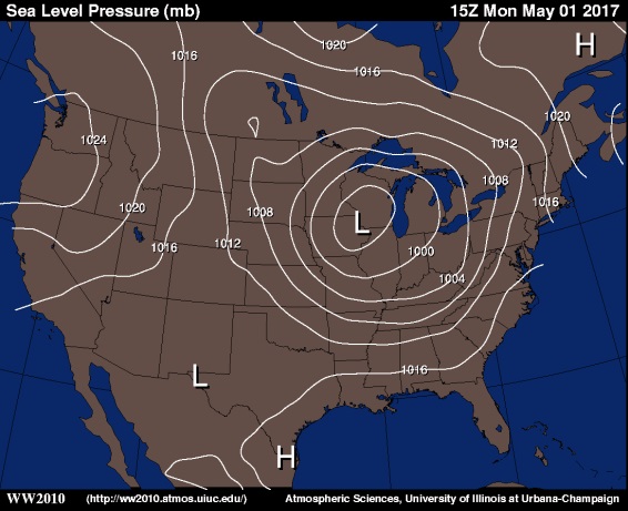
The H's mark centers of high pressure (highest pressure in the region), while the L's mark centers of low pressure (lowest pressure in the region). The feature that would immediately jump out at a weather forecaster as a region of "active" weather is the large area of low pressure centered over the Midwest (near the Iowa / Wisconsin border).
The first step in interpreting values from this image is to figure out the contour interval, which is four millibars (millibars is a standard unit of pressure). Knowing that, we can estimate the pressure near the center of the low over the Midwest. The inner-most closed isobar is 996 millibars (it's unlabeled, but it's inside of the 1000 millibar isobar and values are decreasing toward the center of the low), so the pressure must be less than 996 millibars. However, there's no 992 millibar isobar drawn, so the pressure must be greater than 992 millibars.
Similarly, meteorologists contour maps of temperature because such maps allow them to easily spot areas of cold and warm air. But, maps of isotherms are often color-coded to help make the interpretation easier (for what it's worth, colors are sometimes used on topographic maps, too). I caution you that color schemes and contour intervals can vary widely on images you may see on television or online, and determining which color is which can sometimes be a real challenge. But, if you understand how to interpret contour maps, you can keep your wits about you and use the isotherms (in conjunction with the colors, if you'd like) to gather useful information.
For example, check out the map of isotherms at 15Z on May 1, 2017, below. The contour interval on the image is 5 degrees Fahrenheit. Given that, what would you say is an appropriate range in temperature for somewhere in Indiana? Given that the 60 degree Fahrenheit isotherm and 55 degree Fahrenheit isotherm nearly match the eastern and western borders of the state (respectively), it's fair to say that temperatures in Indiana were greater than 55 degrees Fahrenheit, but less than 60 degrees Fahrenheit. And, if you look at the color key on the right of the image, the shade of yellow-green (or is it green-yellow?) over Indiana matches the color used for temperatures between 55 and 60 degrees Fahrenheit (although some might find it hard to tell).
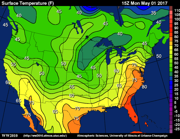
If we wanted to pick a specific point, "P," on the map, near Indianapolis, Indiana, and estimate a specific temperature, we could do that, too. Point "P" is approximately half-way between the 55 and 60 degree Fahrenheit isotherms, so the temperature at "P" is about half-way between 55 and 60 degrees Fahrenheit. We'll call it 57 or 58 degrees Fahrenheit, knowing that we're just making our best estimate based on the isotherms.
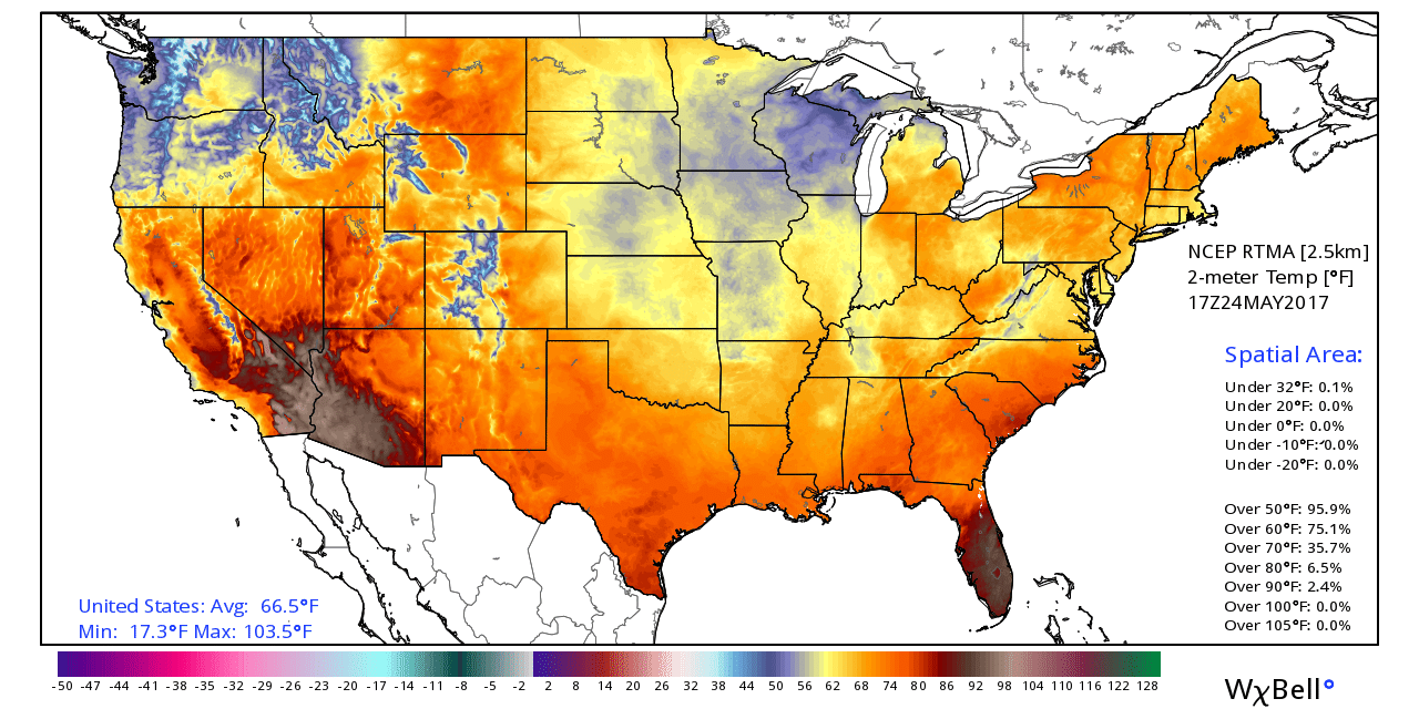
I should also point out that sometimes you won't even see isotherms plotted, and instead, a temperature map will just be shaded. In reality, every boundary where colors change is an isotherm (even if it's not drawn or labeled), and sometimes very small contour intervals are used. On such maps, like this analysis of temperatures from 17Z on May 24, 2017. Using the color key is the only way to go, and even then (because colors change every degree in this case), estimating a specific temperature at a point can be difficult when the shadings are so similar.
To see a few more examples of interpreting values from a contour map, watch the short video (3:28) below.
Click here for a transcript of this video.
Extracting information from contour maps is a really valuable skill. You'll see contour maps on TV weathercasts and on weather websites and mobile apps. So it's very helpful to be able to gather some information from them, and I’m going to show you some examples of how to interpret contour maps.
This is a map of surface temperature at 19Z on Thursday, May 18, 2017. If we do the time conversion, that’s 3 PM Eastern Daylight Time. So, this map comes from mid-afternoon in the eastern U.S. Along the West Coast, it was noon.
On this map of afternoon temperatures we can see that it was really warm for mid-May in the East. Using the pattern of isotherms, we can estimate the actual temperatures anywhere on the map.
The first step is always to determine your contour interval, and here it’s 5 degrees Fahrenheit. We see an 85 degree isotherm running through Pennsylvania. All along that isotherm, the temperature is 85 degrees, and immediately to its east is a 90 degree isotherm. All along that isotherm, the temperature is 90 degrees, so each isotherm represents a change of 5 degrees compared to the isotherm that it’s adjacent to.
Knowing that, we can estimate temperature anywhere on the map. If we picked a spot here in central Pennsylvania we know the temperature is between 85 and 90 degrees, because it falls between those two contours.
Anywhere inside this 90 degree isotherm, the temperature is greater than 90 degrees, but we know it’s less than 95 degrees because there is no 95 degree isotherm drawn.
For a different challenge, we could pick a spot in western North Carolina. What’s the temperature here? It looks like it lies between two 85 degree isotherms. But, if we look way back to the west, we see this 80 degree isotherm running through the Midwest. So, temperatures in Western North Carolina are greater than 80 degrees, but less than 85 degrees.
If we change to a map of sea-level pressure in millibars, here we don’t have the color coding, but the process is the same.
Once we determine our contour interval we’re all set, and it looks like it’s 4 millibars here, since we have a 1004 millibar isobar here in Texas, immediately adjacent to a 1008 millibar isobar.
So, if we wanted to know the pressure near this center of low pressure in Texas, we know that it’s less than 1004 mb. The values of isobars are decreasing as you get closer to the low, from 1008 here to 1004 here. But, we know the pressure is also greater than 1000 millibars since there is no 1000 millibar isobar drawn. So, the pressure here is between 1000 and 1004 millibars.
Here in Missouri, we have another one of those cases where it looks like it’s between contours with the same value. 1012 mb here to the northwest, and 1012 millibars to the southeast. But, if we look here to the southwest and the northeast, we have 1008 millibar isobars, so we know the pressure at our point in Missouri greater than 1008 millibars, but less than 1012 millibars.
So, always start by identifying your contour interval, and study values of the contours near your point to estimate a range of values.
Finally, before you continue on, make sure to check the Key Skill and Quiz Yourself sections below. They'll help you make sure that you can interpret contour maps on your own, which is a useful skill outside of meteorology, too (elevation and many other variables can be isoplethed, and the principle for interpreting the values is the same, regardless of what's being plotted).
Key Skill...
Consider the examples below using various different kinds of contour maps.
Example #1:
Let's start with an easy one. Consider this contour map of temperatures with a point "P" located on the Iowa/Nebraska border. What temperature range would you specify at point "P"?
Answer: Point "P" is located between the 10 degrees Fahrenheit and 5 degrees Fahrenheit isotherms. Therefore, the temperature at point "P" is less than 10 degrees Fahrenheit but greater than 5 degrees Fahrenheit.
Example #2:
Here's another easy one. Consider this contour map of temperatures with a point "P" located in western Virginia. What temperature range would you specify at point "P"?
Answer: Point "P" is located inside the 45 degree Fahrenheit isotherm. Note that the temperature outside of this closed contour is 50 degrees Fahrenheit. This means that temperature is decreasing towards the center of the contours (that is, this is a temperature minimum). Since the contour interval is 5 degrees, the next undrawn contour would be 40 degrees Fahrenheit. Therefore, the temperature at point "P" is less than 45 degrees Fahrenheit but greater than 40 degrees Fahrenheit.
Example #3:
Ready for a problem that is a bit more challenging? Consider this contour map of sea-level pressure with a point "P" located in Montana. What range of pressures would you consider possible at point "P"?
Answer: At first, it looks like point "P" is located between 1020 millibars and ... 1020 millibars. If you think of these isobars as elevation (just as a visual aid), you will note that point "P" sits atop a large, flat plateau of pressure. It certainly has a pressure greater than 1020 millibars because each of the surrounding 1020 millibars lines has lower pressures on the other side. Next, we know that these contours are drawn every 4 millibars, so we know that the pressure at point "P" is not greater than 1024 millibars (indeed there are some 1024 millibar isobars northwest and southeast of our location). So, the answer is that the pressure at point "P" lies between 1020 millibars and 1024 millibars (not including those values).
Quiz Yourself...
Think you understand how to extract information from contour maps? Take this self-quiz below to see how you do. First, hit the "Quiz me" button and look for the red push-pin on the map provided. Fill in the range in values that the pin represents, and hit "Submit" to check your answer.