Prioritize...
Upon completion of this page, you should be able to describe and interpret simple statistical measures of weather and climate information. Specifically, students should focus on "normal," mean (average), extremes (records), the climate period of record, and range.
Read...
Perhaps you've heard the saying, "There are three kinds of lies: lies, damned lies, and statistics." There's no doubt that statistics can be used to deceive, or that some statistics can be misinterpreted, but statistics are a huge part of a meteorologist's toolbox. In fact, they're often used in weather forecasts that you probably see all the time!
For example, one statistic that you've probably seen is the probability (or chance) of precipitation. If you hear that there's a 40 percent chance of rain tomorrow, do you know what that actually means? Study after study shows that most people don't! The probability of rain doesn't tell us anything about how long it will rain, how heavy the rain will be, or what percentage of a given area will get rain (those are all common misconceptions).
A 40 percent chance of rain tomorrow means there's a four in ten chance that any point (your backyard, perhaps) in a forecast area will receive at least 0.01 inches of rain tomorrow. Alternatively, if the same forecast scenario occurred ten times, at least 0.01 inches of rain would fall on four days at any point in the forecast area, and no measurable rain would fall in the forecast area the other six days.
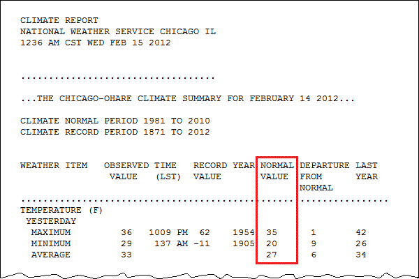
Some statistics that meteorologists use are a little more straightforward than probability of precipitation. For example, the observations that you learned about that go into the station model can be tracked over a long period of time to determine the long-term averages and extremes (highest and lowest values) at a location. These long-term averages and extremes constitute a location's "climate" and meteorologists often refer to them as "climatology." The National Weather Service is the keeper of many weather records in the U.S., and each day, each office of the National Weather Service issues a "climate report," which summarizes the previous day's temperature and precipitation and compares them to the climate record. Below is a sample display of temperature data in an NWS Climate Report from February 14, 2012 at Chicago's O'Hare Airport.

Climatology is extremely useful for weather forecasters because it gives an expectation (based on history) of types of weather that are typical at the location. While climate information runs the gamut from temperatures to dew points, to winds, to precipitation, etc., here we'll focus our discussion on temperatures since temperature statistics are cited so commonly. We'll start with so-called "normal" temperatures.
There's Nothing Normal about Normal Temperatures
One of the statistics in the climate report above is the ”normal value“ of maximum, minimum, and (daily) average temperature. What does that mean? Well, "normal" temperatures are based on perhaps the most often used statistical measure in meteorology (and in general)--the mean (or "average"). The mean is simply the sum of a set of observations, divided by the number of observations. Meteorologists average lots of things, such as temperatures over the course of a day, a week, a month, a year, or even longer.
So, how did the NWS come up with 35 degrees Fahrenheit for the normal maximum temperature in the report above? They calculated the mean of all of the high temperatures for February 14 over a 30-year period in Chicago. Similarly, the "normal minimum temperature" of 20 degrees Fahrenheit is just the mean of the minimum temperatures for February 14 over a 30-year period. So, normal temperatures are 30-year means (averages). In case you're wondering how to interpret the "normal average" temperature of 27 degrees Fahrenheit, it's the 30-year mean of the daily average temperature (the average of the daily high and low temperatures for February 14 at Chicago).
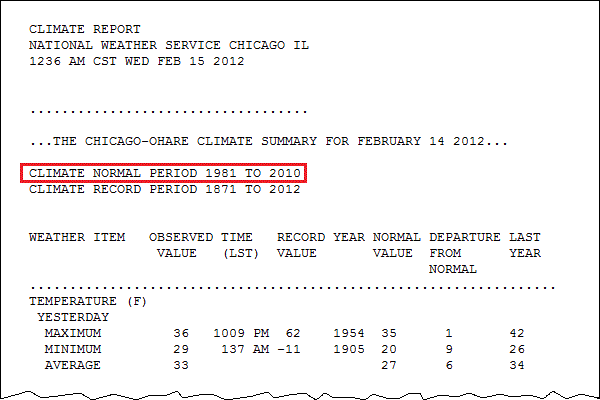
Note that in Chicago's climate report above, the 30-year means ("NORMAL VALUE") came from weather observations taken during the period from 1981 to 2010. Every ten years, the averaging period for calculating normals changes. We started using 1981-2010 in the year 2011, but in 2021 the averaging period became 1991-2020. The switch to "new normals" every ten years usually results in normal temperatures that are a little different than previous normals. Moreover, the common use of the term "normal" is unfortunate because weather seldom behaves exactly in a "normal" way. In winter, for example, a season renowned for occasionally abrupt temperature swings, it sometimes turns out that a city's normal high for the date never actually occurred as a high temperature on the date in question during the previous 30-year period! So, there's nothing "normal" about "normal" temperatures!
Still, normal temperatures are useful for meteorologists because on most days, temperatures don't deviate all that much from normal. Indeed, a forecaster should be cautious about forecasting a high temperature that's 25 degrees above the normal high for the date. Such large departures from normal are possible, but they may only occur a few times each year.
Record Temperatures and the Climate Period of Record
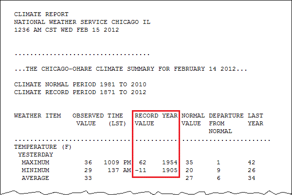
The climate period of record refers to the length of time that weather observations have been taken for a given city. For example, the ”CLIMATE RECORD PERIOD“ in Chicago's climate report indicates that weather records in Chicago started in 1871; however, the period of record varies from city to city. Some places in the United States have reliable weather records dating back to the late 1800s, while others only date back to the 1930s to 1950s (or even more recently). Keep the idea of a "climate period of record" in mind whenever you hear someone tout an extreme, or record value (the highest or lowest temperature observed in the period of record), for a given day as "the highest (or lowest) temperature ever" for the date. What they really mean is that it's the highest or lowest temperature for the date in the period of record. So, the record high and record low for February 14 in Chicago represent the highest and lowest temperatures observed on February 14 since 1871. Before records began, we have nothing reliable to compare to.
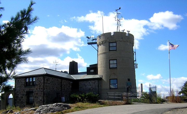
Furthermore, if you hear about a record high (or low) temperature being broken, it's always worth asking "what's the period of record?" A record high at a station that has only been keeping records for 30 or 40 years might not be a big deal. In other words, it might be setting a record only because they've been keeping weather observations for such a short period of time. It takes more extreme weather events to break records at locations that have a period of record 100 years or longer, such as the Blue Hill Meteorological Observatory (pictured on the right) in Milton, Massachusetts. The Blue Hill Observatory has the longest single, continuous set of weather records in the U.S. (going back to 1885). The location for taking weather observations in most cities (like Chicago) has changed at least once since the late 1800s (if they've been taking observations that long).
Temperature Ranges
Another statistic that meteorologists commonly use is the range of a set of observations, which is simply the difference between the maximum observation and minimum observation. Meteorologists often look at the range of temperatures over the course of a single day (called the "diurnal range"), or the range of temperatures over the course of a month, year, etc.
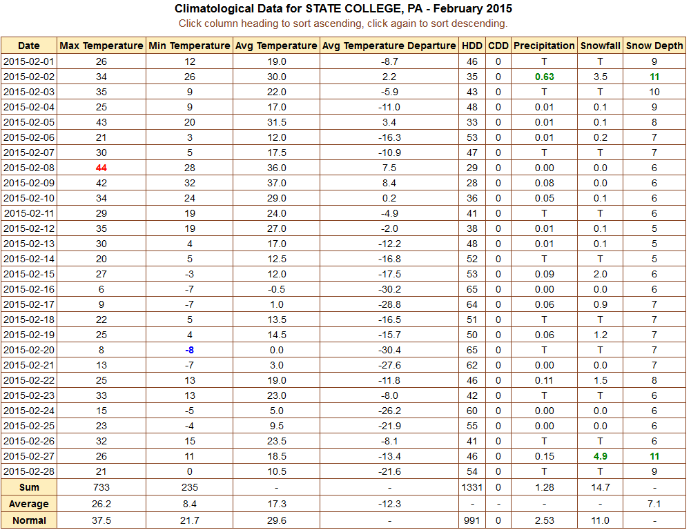
For example, take this table of climatological data for State College, Pennsylvania from February, 2015, which was the coldest February on record at Penn State, where weather records began in 1893. The highest temperature measured during the month was 44 degrees Fahrenheit (in red in the "Max Temperature" column). Meanwhile the lowest temperature measured during the month was -8 degrees Fahrenheit (in blue in the "Min Temperature" column). So, during February 2015 temperatures in State College ranged from 44 degrees Fahrenheit to -8 degrees Fahrenheit. If we take the difference between the two, that gives us 44 degrees Fahrenheit - (-8 degrees Fahrenheit) = 52 degrees Fahrenheit. So, February 2015 had a 52 degree Fahrenheit temperature range in State College. If you wanted to find the range of monthly temperatures for all Februaries in State College, you would take the single highest temperature on record from all Februaries and subtract the single lowest temperature on record for all Februaries (and that would give you a much larger range than the range for February 2015).
These statistics (means, normals, and ranges) are pretty straightforward, but make sure you remember what each of them is telling you. Meteorologists use them a lot, and they'll certainly come up again in this course!
Now we're going to shift gears a bit. In the past few sections, we've talked about weather observations at a single location, but meteorologists need to observe the weather over large areas, too, and that requires us to talk a bit about maps and map projections. We'll start "mapping things out" in the next section.