
A Satellite's View of the Climate Energy Budget
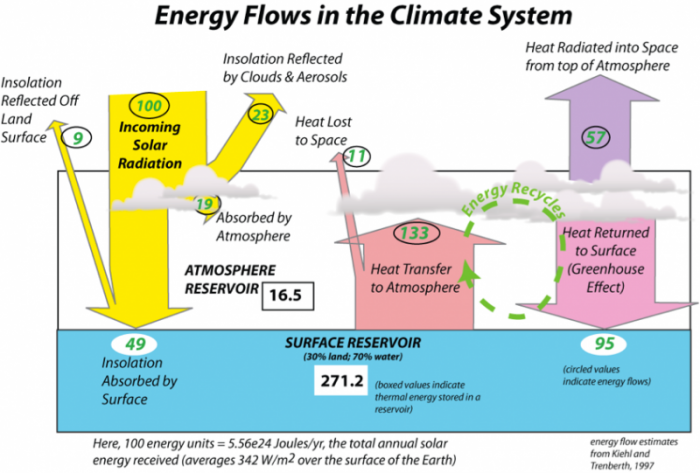
The image is a diagram titled "Energy Flows in the Climate System," illustrating the flow of solar energy through Earth's climate system, including the atmosphere and surface reservoirs. It quantifies the energy in units (relative to 100 units of incoming solar radiation) and highlights processes like reflection, absorption, heat transfer, and the greenhouse effect. The diagram is attributed to Kiehl and Trenberth (1997).
- Overall Structure:
- The diagram is divided into three main sections: incoming solar radiation (left), the atmosphere (center), and the surface reservoir (bottom). Arrows and numerical values indicate the flow and distribution of energy.
- Incoming Solar Radiation (Left Side):
- 100 units: Represented as a yellow arrow labeled "Incoming Solar Radiation," entering from the top left.
- 9 units: Reflected off the land surface, labeled "Insolation Reflected off Land Surface" (yellow arrow pointing back upward).
- 23 units: Reflected by clouds and aerosols, labeled "Insolation Reflected by Clouds & Aerosols" (yellow arrow pointing upward).
- Total Reflected: 9 + 23 = 32 units of the incoming 100 units are reflected back to space.
- Atmosphere (Center Section):
- 19 units: Absorbed by the atmosphere, labeled "Absorbed by Atmosphere" (yellow arrow curving into the atmosphere).
- 16.5 units: Labeled "Atmosphere Reservoir," indicating the energy stored in the atmosphere.
- 11 units: Lost to space as heat, labeled "Heat Lost to Space" (purple arrow pointing upward).
- 133 units: Transferred from the surface to the atmosphere, labeled "Heat Transfer to Atmosphere" (red arrow pointing upward).
- 57 units: Radiated into space from the top of the atmosphere, labeled "Heat Radiated into Space from top Atmosphere" (purple arrow pointing upward).
- 95 units: Returned to the surface via the greenhouse effect, labeled "Heat Returned to Surface (Greenhouse Effect)" (green arrow pointing downward).
- A section labeled "Energy Recycles" indicates the cycling of energy between the surface and atmosphere.
- Surface Reservoir (Bottom Section):
- 49 units: Absorbed by the surface, labeled "Insolation Absorbed by Surface" (yellow arrow pointing downward).
- 271.2 units: Labeled "Surface Reservoir (30% land; 70% water)," indicating the total energy at the surface.
- A note within the surface reservoir states: "(boxed values indicate thermal energy stored in a reservoir)," referring to the 271.2 units.
- Another note states: "(circled values indicate energy flows)," referring to the other numerical values in the diagram.
- Energy Balance Note (Bottom Left):
- A note at the bottom left reads: "Here, 100 energy units = ~5.56E24 Joules/yr; the total annual solar energy received (averages ~342 W/m2 over the surface of the Earth)," providing the scale for the energy units used in the diagram.
- Visual Elements:
- The diagram uses color-coded arrows to represent different energy flows:
- Yellow for incoming and reflected solar radiation.
- Red for heat transfer from the surface to the atmosphere.
- Purple for heat lost to space.
- Green for heat returned to the surface via the greenhouse effect.
- Clouds are depicted in the atmosphere, and the surface is divided into land (30%) and water (70%).
- The diagram uses color-coded arrows to represent different energy flows:
The diagram effectively illustrates the energy balance of Earth's climate system, showing how incoming solar radiation is distributed, reflected, absorbed, and re-radiated, with a significant portion recycled through the greenhouse effect, as quantified by Kiehl and Trenberth in 1997.
Here 100 energy units = 5.56e24J/year, the total annual solar energy received averages 342 W/m^@ over the surface of the Earth
Incoming solar radiation: 100
Insolation Reflected by Clouds and Aerosols: 23
Insolation Reflected off Land Surface: 9
Insolation Absorbed by Surface: 49
Atmosphere Reservoir: 16.5
Surface Reservoir (30% Land, 70% Water): 271.2
Heat Transfer to Atmosphere: 133
Heat Lost to Space: 11
Heat returned to Surface (Greenhouse Effect): 95
Heat Radiated into Space from top of Atmosphere: 57
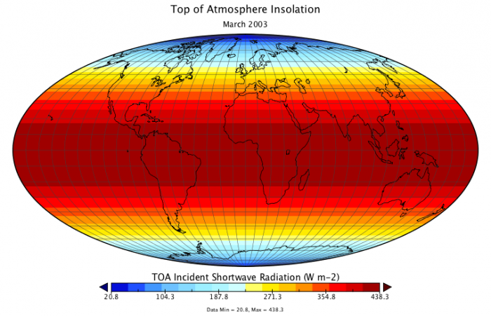
The diagram we have just been considering (repeated above), presents a good overview of how energy flows through the Earth’s climate system, but it does not give us a sense of how that energy is distributed across the surface of the globe and there are some important things to be learned from looking at this spatial pattern. For many years now, satellites have been monitoring these energy flows using spectrometers that measure the intensity of energy at different wavelengths flowing to the Earth and from the Earth. So, let’s see what can be learned from a quick study of these satellite views. First, we consider the insolation at the top of the atmosphere averaged for the month of March.
Of course, not all of this insolation strikes the surface — remember that just 49% of it reaches the ground. If we then look at the insolation reaching the ground, we see the following:
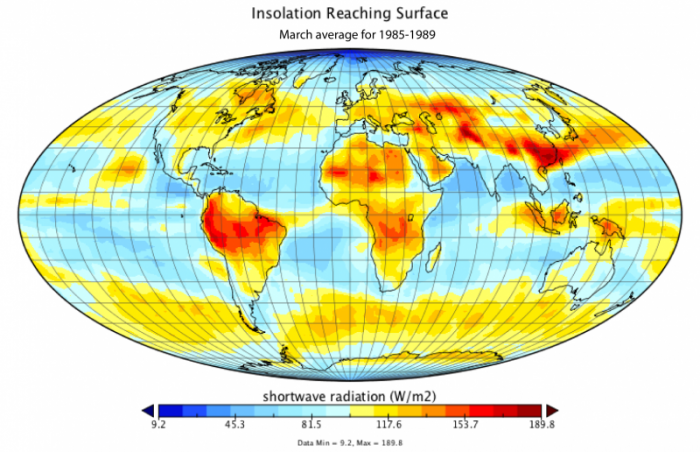
Notice that the highest flux is about 190 W/m2; far less than the maximum of almost 440 W/m2 that reaches the top of the atmosphere. The difference is due to reflection from clouds, reflection from the surface, and absorption by atmospheric gases.
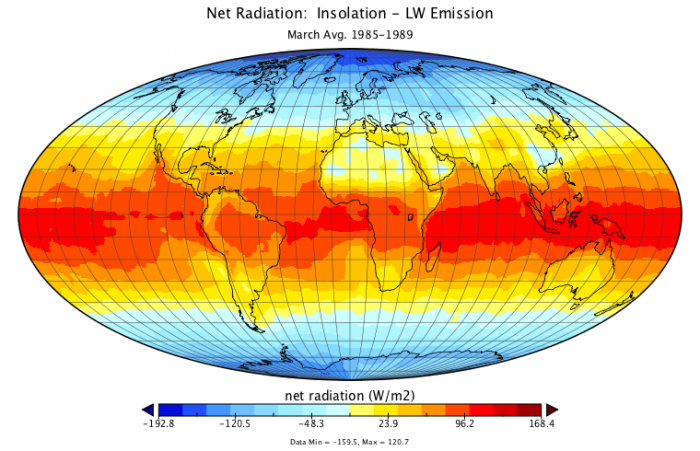
Now, let’s look at what comes back from the Earth, in the form of long wavelength energy, for the same time period.
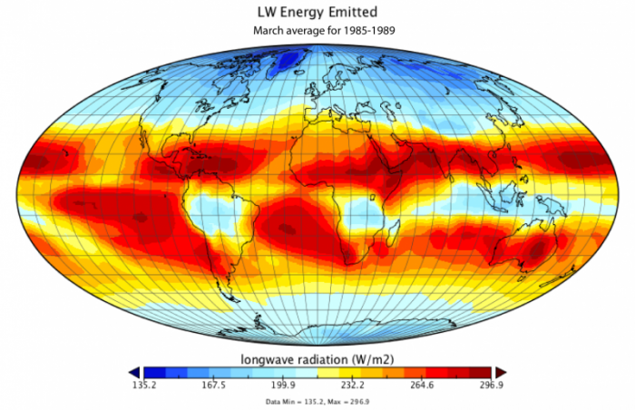
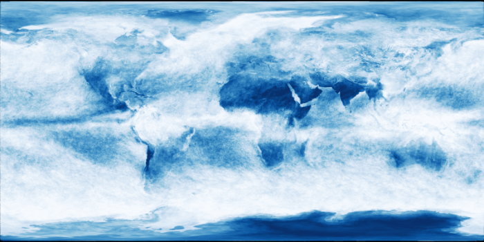
At the simplest level, we see that the tropics emit much more energy than the poles. This makes sense since we know they are warmer, and the Stefan-Boltzmann law tells us that the amount of energy emitted varies as the fourth power of temperature, and the tropics are warmer because they receive much more insolation (see figures above). Looking closely at the nearest above image, we see some interesting variations near the tropics — look at South America, Central Africa, and Indonesia, where the emitted energy is far less than we see elsewhere at these same latitudes. Why is this? Is it colder there? No, it is not colder there, which leads to another question — is the atmosphere above these regions absorbing more of the infrared energy emitted by the surface? Recall that one of the main heat-absorbing gases is water, and where you have a lot of water, you have a lot of clouds. So, let’s have a look at the typical average cloud cover for this time of year.
So, it is indeed the case that the amount of energy leaving the Earth varies according not only to the temperature but also to the concentration of heat-absorbing gases such as water.
Recall that we are focused on the energy budget here and whenever you do a budget, at the end, you look at the balance between what is coming in and what is going out. So, let’s do that now with the energy as measured by the satellites.
As can be seen in the figure above, the tropics receive more energy than they emit, while the poles emit more than they receive. This picture can also be seen in a somewhat simpler diagram in which we average the net energy flow at each latitude.
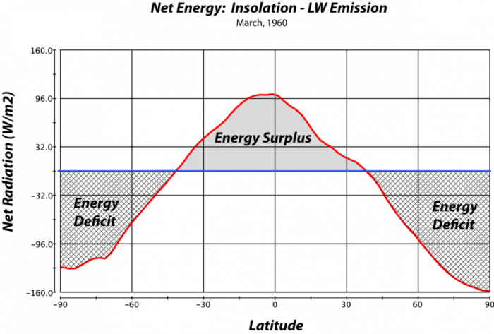
The image is a graph titled "Net Energy: Insolation - LW Emission, March, 1960," showing the net energy balance (incoming solar radiation minus outgoing longwave radiation) across different latitudes on Earth for the month of March 1960. The graph highlights regions of energy surplus and deficit.
- Axes:
- X-Axis (Latitude): Labeled "Latitude," ranging from -90° (South Pole) to 90° (North Pole), with major ticks at intervals of 30° (-90, -60, -30, 0, 30, 60, 90). The equator is at 0°.
- Y-Axis (Net Radiation): Labeled "Net Radiation (W/m2)," ranging from -160.0 to 160.0 watts per square meter (W/m²), with major ticks at intervals of 32.0 W/m² (-160.0, -96.0, -32.0, 32.0, 96.0, 160.0). The zero line represents a balance between incoming and outgoing radiation.
- Data Representation:
- The graph is a single curve plotted in red, representing the net energy (insolation minus longwave emission) at each latitude.
- The area above the zero line (positive values) is shaded gray and labeled "Energy Surplus," indicating where incoming solar radiation exceeds outgoing longwave radiation.
- The areas below the zero line (negative values) are shaded with a crosshatch pattern and labeled "Energy Deficit," indicating where outgoing longwave radiation exceeds incoming solar radiation.
- Curve Characteristics:
- Energy Surplus: The curve peaks around the equator (0° latitude), reaching a maximum of approximately 96 W/m², indicating a significant energy surplus in the tropics. The surplus extends from about -30° to 30° latitude.
- Energy Deficit: The curve dips below the zero line at higher latitudes, showing an energy deficit. It reaches a minimum of around -160 W/m2 at the poles (-90° and 90° latitude), indicating a significant energy deficit in polar regions.
- The curve crosses the zero line (net energy balance) at approximately -30° and 30° latitude, marking the transition between energy surplus and deficit zones.
- Overall Trend:
- The graph shows a clear latitudinal pattern: the tropics (near the equator) experience an energy surplus due to high insolation and relatively lower longwave emission, while the polar regions experience an energy deficit due to low insolation (especially in March, during the polar night in the Southern Hemisphere) and high longwave emission.
- The energy surplus in the tropics drives global atmospheric and oceanic circulation, as excess energy is transported toward the poles to balance the energy deficit.
The graph effectively illustrates the latitudinal variation in Earth's energy balance for March 1960, highlighting the role of solar insolation and longwave emission in creating energy surpluses and deficits that influence global climate patterns.