Carbon Dioxide Through Time
In the late 1950s, Roger Revelle, an American oceanographer based at the Scripps Institution of Oceanography in La Jolla, California began to ring the alarm bells over the amount of CO2 being emitted into the atmosphere. Revelle was very concerned about the greenhouse effect from this emission and was cautious because the carbon cycle was not then well understood. So, he decided that it would be wise to begin monitoring atmospheric concentrations of CO2. In the late 1950s, Revelle and a colleague, Charles Keeling, began monitoring atmospheric CO2 at an observatory on Mauna Loa, on the big island of Hawaii. Mauna Loa was chosen because its elevation and location away from industrial centers made it as close to a global signal as any other location. The record from Mauna Loa, one of the most classic plots in all of science, shown in the figure below, is a dramatic sign of global change that captured the attention of the whole world because it shows that this "experiment" we are conducting is apparently having a significant effect on the global carbon cycle. The climatological consequences of this change are potentially of great importance to the future of the global population. The CO2 concentration recently crossed the 400 ppm mark for the first time in millions of years! In 2025, the level has risen above 429 ppm (see CO2.Earth Webite for most up to date estimate).

This image is a line graph titled "Mauna Loa Observatory, Hawaii* Monthly Average Carbon Dioxide Concentration," displaying the monthly average CO₂ concentration from 1958 to 2024, with data from the Scripps CO2 Program, last updated in May 2024. The caption below the graph explains the seasonal cycles and long-term trends observed in the data.
- Graph Type: Line graph
- Y-Axis: CO2 concentration (parts per million, ppm)
- Range: 310 ppm to 420 ppm
- X-Axis: Years (1958 to 2024)
- Data Representation:
- CO2 Concentration: Black line with data points
- Starts at around 315 ppm in 1958
- Shows a steady upward trend with seasonal oscillations
- Reaches approximately 420 ppm by 2024
- Maunakea Data: Blue points
- Noted as "Maunakea data in blue," indicating specific measurements from Maunakea included in the dataset
- CO2 Concentration: Black line with data points
- Trend:
- The graph shows a clear long-term increase in CO2 concentration, rising by about 100 ppm over the 66-year period
- Seasonal cycles are evident, with annual fluctuations of a few ppm, peaking in spring and dipping in autumn due to Northern Hemisphere photosynthesis and soil respiration
- Additional Info:
- Source: Scripps Institution of Oceanography, UC San Diego
- Caption: "The record of CO2 measured at Mauna Loa, Hawaii shows seasonal cycles superimposed on a longer-term rise in the yearly average (black line). The seasonal cycles are related to seasonal variations in photosynthesis and soil respiration in the Northern Hemisphere, where most of the land mass is located at present. The long-term trend is related to the addition of CO2 to the atmosphere through the combustion of fossil fuels."
The graph visually demonstrates the steady rise in atmospheric CO₂ levels, driven by fossil fuel combustion, alongside seasonal variations linked to natural processes in the Northern Hemisphere.
As the Mauna Loa record and others like it from around the world accumulated, a diverse group of scientists began to appreciate Revelle's concern that we really did not know too much about the global carbon cycle that ultimately regulates how much of our CO2 emissions stay in the atmosphere.
The importance of present-day changes in the carbon cycle, and the potential implications for climate change became much more apparent when scientists began to get results from studies of gas bubbles trapped in glacial ice. As we learned in Module 1, the bubbles are effectively samples of ancient atmospheres, and we can measure the concentration of CO2 and other trace gases like methane in these bubbles, and then by counting the annual layers preserved in glacial ice, we can date these atmospheric samples, providing a record of how CO2 changed over time in the past. The figure below shows the results of some of the ice core studies relevant for the recent past -- back to the year 900 A.D.
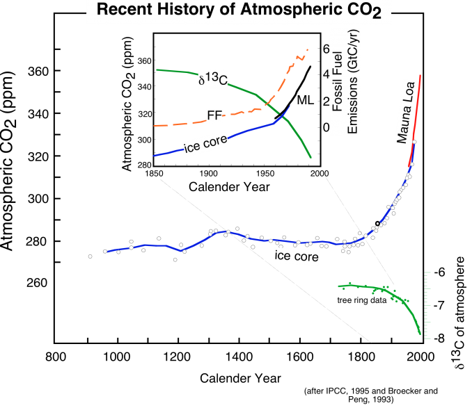
This image is a graph titled depicts the atmospheric CO2 concentration and related data from approximately 900 to 2000. The graph combines data from ice core records and Mauna Loa observations, illustrating changes in CO2 levels and carbon isotope composition (δ13C). The caption explains the data sources and the relationship between CO2 rise, fossil fuel combustion, and δ13C decline.
- Graph Type: Multi-line plot with inset
- Axes:
- X-Axis: Time (years, from 900 to 2000)
- Y-Axis (Left): Not explicitly labeled, but represents CO₂ concentration (ppm) and δ13C (per mil)
- Y-Axis (Right): Fossil fuel emissions (Gigatons of carbon per year, GtC/yr)
- Data Representation:
- CO2 Concentration (Ice Core): Blue line with white dots
- From 900 to ~1800, remains stable around 280 ppm
- Begins rising in the late 1800s, reaching ~300 ppm by 1900
- CO2 Concentration (Mauna Loa): Blue line
- Starts in 1958 at ~315 ppm, rises steadily to ~370 ppm by 2000
- δ13C (Ice Core and Observations): Green line
- Stable around -6.5 per mil from 900 to 1800
- Declines from the late 1800s, reaching ~ -8 per mil by 2000
- Fossil Fuel Emissions (FF): Orange dashed line
- Starts near 0 GtC/yr in 1800, rises sharply after 1850, reaching ~6 GtC/yr by 2000
- CO2 Concentration (Ice Core): Blue line with white dots
- Inset:
- Focuses on 1850–2000
- Shows detailed trends:
- CO2 rises from ~280 ppm to ~370 ppm
- δ13C declines from ~ -6.5 to ~ -8 per mil
- Fossil fuel emissions increase from near 0 to ~6 GtC/yr
- Annotations:
- Labels for "Ice core" and "FF" (fossil fuel) on data lines
- "Mauna Loa" label on the modern CO₂ data
- Indicates the onset of the Industrial Revolution (~1800) as the start of the CO₂ increase
- Caption:
- "The recent history of atmospheric CO2, derived from the Mauna Loa observations back to 1958, and ice core data back to 900, shows a dramatic increase beginning in the late 1800s, at the onset of the Industrial Revolution. At the same time, the carbon isotope composition (δ13C is the ratio of 13C to 12C in atmospheric CO2) of the atmosphere declines, as would be expected from the combustion of fossil fuels, which have low values of δ13C. The inset shows a more detailed look at the last 150 years, where we can see that the rise in CO2 coincides with the rise in the burning of fossil fuels."
The graph visually demonstrates a stable CO₂ level for centuries until the Industrial Revolution, followed by a sharp increase in CO₂ and fossil fuel emissions, accompanied by a decline in δ13C, consistent with the impact of burning fossil fuels.
The striking feature of these data is that there is an exponential rise in atmospheric CO2 (and methane, another greenhouse gas) that connects with the more recent Mauna Loa record to produce a rather frightening trend. Also shown in the above figure is the record of fossil fuel emissions from around the world, which show a very similar exponential trend. Notice that these two data sets show an exponential rise that seems to begin at about the same time. What does this mean? Does it mean that there is a cause-and-effect relationship between emissions of CO2 and atmospheric CO2 levels? Although we should remember that science cannot prove things to be true beyond all doubt, it is highly likely that there is a cause-and-effect relationship -- it would be an extremely bizarre coincidence if the observed rise in atmospheric CO2 and the emissions of CO2 were unrelated.
How serious is our modification of the natural carbon cycle? Here, we need a slightly longer perspective from which to view our recent changes, so we return to the records from ice cores and look deeper and further back in time than we did in the figure we have been examining.

This image is a graph that depicts atmospheric CO₂ concentrations over the past 400,000 years, with an inset focusing on the last 2,000 years. The data combines ice core records and modern observations from the Mauna Loa Observatory, illustrating both long-term natural fluctuations and the recent dramatic rise in CO₂ levels. The caption emphasizes the unprecedented nature of the modern CO₂ increase compared to historical patterns.
- Graph Type: Line graph with inset
- Main Graph:
- X-Axis: Time (thousands of years ago, from 400 kyr ago to present)
- Y-Axis: CO₂ concentration (parts per million, ppm)
- Range: 200 ppm to 300 ppm (main graph), up to 400 ppm (including recent data)
- Data Representation:
- Ice Core Data: Multiple colored lines (blue, green, red, cyan)
- Shows cyclical fluctuations between ~180 ppm and ~280 ppm over 400,000 years
- Cycles correspond to Ice Age cycles, with a periodicity of about 100,000 years
- Recent Data: Black line
- Sharp increase starting around 0 years ago (present), rising to ~400 ppm
- Ice Core Data: Multiple colored lines (blue, green, red, cyan)
- Trend:
- Regular oscillations tied to Ice Age cycles, with CO₂ varying by ~80 ppm
- Abrupt rise in CO2 in the last century, breaking the historical pattern
- Annotation:
- "Ice Age Cycles" label highlights the periodic fluctuations in CO₂
- Inset Graph (Top Left):
- Title: "The Industrial Revolution Has Caused A Dramatic Rise in CO₂"
- X-Axis: Year (AD, from 1000 to 2000)
- Y-Axis: CO2 concentration (ppm)
- Range: 280 ppm to 400 ppm
- Data Representation:
- Colored lines (blue, green, red, cyan) for ice core data, stable at ~280 ppm until ~1800
- Black line for Mauna Loa data, showing a steep rise from ~280 ppm in 1800 to ~400 ppm by 2000
- Trend:
- Stable CO2 levels until the Industrial Revolution (~1800)
- Rapid increase post-1800, accelerating in the 20th century
- Caption:
- "The record of atmospheric CO2 over the last 400,000 years shows that the recent rise in CO2 is unlike anything we’ve seen in the past 400 kyr both in terms of the rate of increase and the levels to which it is rising. Before this recent rise, CO2 fluctuated by about 80 ppm in connection with the ice ages (which as you can see have a regularity to their timing); this pattern has clearly been interrupted by the recent trend. The data shown here come from a variety of ice cores (blue, green, red, and cyan) and the Mauna Loa observatory (black)."
The graph visually contrasts the stable, cyclical CO2 variations tied to Ice Age cycles over 400,000 years with the unprecedented and rapid rise in CO2 since the Industrial Revolution, reaching levels not seen in the historical record.
In addition to providing a record of the past concentration of CO2 in the atmosphere, as we learned in Module 1, the ice cores also give us a temperature record. By studying the ratios of stable isotopes of oxygen that make up the glacial ice, we can estimate the temperature (in the region of the ice) at the time the snow fell (glacial ice is formed by the compression of snow as it gets buried to greater and greater depths). From these data, shown in the figure below, we can see the natural variations in atmospheric CO2 and temperature that have occurred over the past 160,000 years (160 kyr).
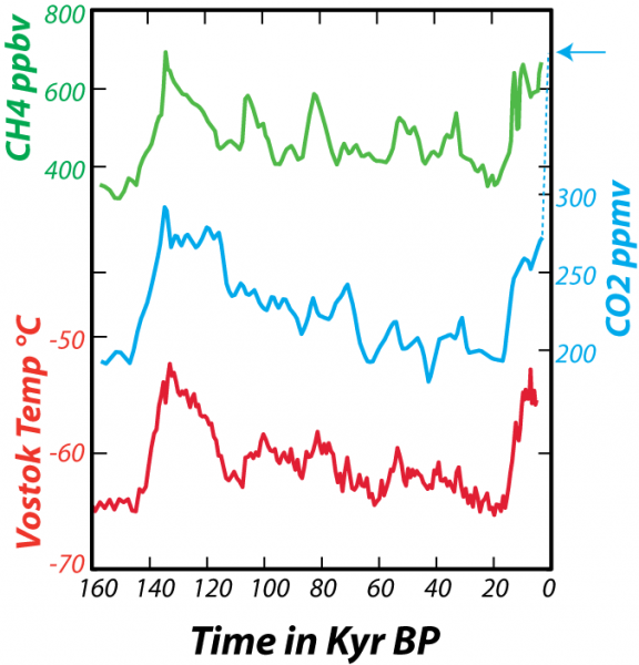
This image is a multi-line graph depicting data from the Vostok (Antarctica) ice core over the past 160,000 years (160 kyr BP, or "before present"). The graph shows the relationship between atmospheric concentrations of two heat-trapping gases—carbon dioxide (CO2) and methane (CH4)—and the temperature at Vostok. The caption explains the data sources and the relationship between gas concentrations and temperature.
- Graph Type: Multi-line plot
- X-Axis: Time in thousands of years before present (kyr BP)
- Range: 160 kyr BP to 0 kyr BP
- Y-Axes (three separate scales):
- Left (Top): CH4 concentration (parts per billion, ppb)
- Range: 300 ppb to 800 ppb
- Left (Middle): CO2 concentration (parts per million, ppm)
- Range: 180 ppm to 300 ppm
- Left (Bottom): Vostok temperature (°C)
- Range: -10°C to 0°C
- Right: CO2 concentration (ppm, for recent data)
- Range: 200 ppm to 410 ppm
- Left (Top): CH4 concentration (parts per billion, ppb)
- Data Representation:
- CH4 Concentration: Green line
- Fluctuates between ~350 ppb and ~700 ppb
- Peaks around 140, 120, 100, 70, 10 kyr BP; dips between these peaks
- Sharp rise near 0 kyr BP, reaching ~800 ppb
- CO₂ Concentration: Blue line
- Fluctuates between ~190 ppm and ~280 ppm
- Peaks align with CH4 peaks (140, 120, 100, 70, 10 kyr BP)
- Dashed blue line at 0 kyr BP shows a recent rise to ~410 ppm (indicated by an arrow)
- Vostok Temperature: Red line
- Fluctuates between ~-8°C and ~-2°C
- Peaks and dips closely correlate with CO₂ and CH₄, showing warmer periods at ~140, 120, 100, 70, 10 kyr BP
- Sharp rise near 0 kyr BP, aligning with gas increases
- CH4 Concentration: Green line
- Trends:
- Strong correlation between CO2, CH4, and temperature over 160 kyr
- Cyclical patterns with peaks roughly every 20–30 kyr, corresponding to glacial-interglacial cycles
- Recent data (dashed blue line) shows an unprecedented CO₂ rise to 410 ppm, far exceeding historical peaks
- Caption:
- "Data from the Vostok (Antarctica) ice core for the past 160 kyr show the relationship between variations in heat-trapping gases CO2 (carbon dioxide) and CH4 (methane) concentrations in parts per million (ppm) and parts per billion (ppb) and the temperature at Vostok. Note that each curve has its own scale for the vertical axis, but they all share the same time scale. The dashed blue line at the end shows the very recent rise in CO2 to the present day value of about 410 ppm, indicated by the arrow. The gas concentrations come from tiny bubbles trapped in the ice as it forms near the surface, while the temperature variations come from studying isotopes of oxygen and hydrogen in the ice itself. The ice cores thus provide us with an exceptional picture of atmospheric gas concentrations in the past and their relationship with temperature."
The graph illustrates the tight coupling of CO2, CH4, and temperature over 160,000 years, with cyclical fluctuations tied to glacial cycles, and highlights the dramatic, unprecedented rise in CO₂ in recent times, as captured by the Vostok ice core data.
In fact, looking at this much longer span of time enables us to clearly see that the present CO2 concentration of the atmosphere is unprecedented in the last several hundreds of thousands of years. As geoscientists, we are interested in more than just the last few hundred kiloyears, and so we look back into the past using sediment cores retrieved from the deep sea. Geochemists studying these sediments have been able to reconstruct the approximate concentration of CO2 in the atmosphere and the sea surface temperature (SST).
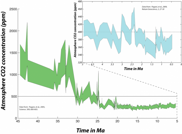
This image is a graph depicting the long-term history of atmospheric CO₂ concentrations over the past 45 million years (Ma), reconstructed from deep-sea sediment studies. The graph includes an inset focusing on the last 5 million years to highlight recent trends. The caption provides context about the CO₂ levels, their implications for Earth's climate, and comparisons to past conditions.
- Graph Type: Area plot with inset
- Main Graph:
- X-Axis: Time in millions of years ago (Ma)
- Range: 45 Ma to 0 Ma (present)
- Y-Axis: Atmospheric CO2 concentration (parts per million, ppm)
- Range: 0 ppm to 2500 ppm
- Data Representation:
- CO₂ Concentration: Green shaded area
- Represents the range of estimated CO2 concentrations
- Peaks around 40 Ma at ~2000–2500 ppm
- Declines gradually, with fluctuations, to ~300–500 ppm by 10 Ma
- Drops significantly after 10 Ma, reaching ~300 ppm by 0 Ma
- Trend:
- High CO₂ levels (>1000 ppm) dominate before 30 Ma
- Gradual decline with notable drops around 35 Ma and 10 Ma
- Relatively stable at ~300–400 ppm in the last 5 Ma
- CO₂ Concentration: Green shaded area
- X-Axis: Time in millions of years ago (Ma)
- Inset Graph (Top Right):
- X-Axis: Time in millions of years ago (Ma)
- Range: 5 Ma to 0 Ma
- Y-Axis: Atmospheric CO2 concentration (ppm)
- Range: 300 ppm to 450 ppm
- Data Representation:
- CO2 Concentration: Blue shaded area
- Shows upper and lower estimates of CO2 concentration
- Fluctuates between ~300 ppm and ~450 ppm
- Midpoint rises above current levels (~410 ppm) around 2.5 Ma ago
- Trend:
- Less precise estimates due to data limitations
- Indicates CO2 levels were last above modern levels ~2.5 Ma ago
- CO2 Concentration: Blue shaded area
- X-Axis: Time in millions of years ago (Ma)
- Annotations:
- Dashed line at ~2.5 Ma in the inset highlights when CO2 was last above current levels
- Sources cited: Pagani et al., 2005 (Science, 309, 600–603) for main graph; Pagani et al., 2010 (Nature Geoscience, 3, 27–30) for inset
- Caption:
- "The longer history of atmospheric CO2 as reconstructed from studies of deep-sea sediments. In the upper right, the blue region represents the upper and lower estimates back through time — you can see that it is difficult to be too precise going back this far in time — and you can see that the last time the midpoint of these estimates rose above the current level was around 2.5 Myr ago. This was a time when there was far less ice on Earth; the Arctic was apparently 15 to 20°C warmer than it is today, and sea level was about 20 meters higher than the present. As we go further back in time, we see that the atmospheric CO2 concentration rises to very high levels. The Earth was a very different place before about 30 Myr ago — sea level was perhaps 100 m higher and there was practically no ice on Earth."
The graph illustrates the long-term decline in atmospheric CO2 from extremely high levels (~2000–2500 ppm) 40 million years ago to modern levels (~410 ppm), with a significant drop after 30 Ma. The inset highlights that CO2 was last above current levels ~2.5 Ma ago, a period with warmer climates and higher sea levels, underscoring the unique climatic conditions of earlier Earth.
To find atmospheric CO2 levels equivalent to the present, we have to go back 2.5 million years. This means that, to the extent that the state of the carbon cycle is closely linked to the condition of the global climate, we are pushing the system toward a climate that has not occurred any time within the last several million years -- not something to be taken lightly.
The farther back in time we go, the more difficult it is to figure out how CO2 concentrations have changed, but that has not stopped some from attempting:
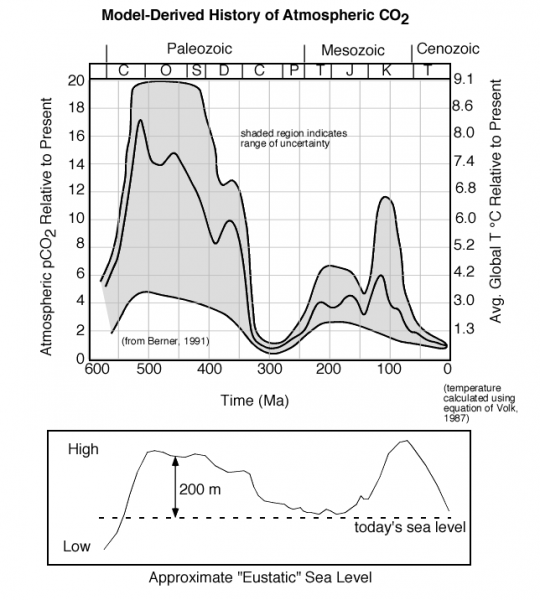
This image consists of two graphs illustrating the model-derived history of atmospheric CO₂ and its relationship to sea level over the past 550 million years (Ma). The upper graph shows CO₂ concentrations, and the lower graph shows approximate "Eustatic" sea level changes. The caption highlights the high CO₂ levels during specific periods and their correlation with high sea levels.
- Upper Graph:
- Title: Model-Derived History of Atmospheric CO₂
- X-Axis: Time (millions of years ago, Ma)
- Range: 550 Ma to 0 Ma (present)
- Y-Axis: Atmospheric CO₂ relative to present (RCO₂)
- Range: 0 to 20 (times the present CO2 level)
- Secondary Y-Axis: Global average temperature (°C)
- Range: 13.0°C to 9.1°C (calculated using equations of Varekamp, 1987)
- Data Representation:
- CO2 Concentration: Gray shaded region
- Represents the range of uncertainty in estimates
- Peaks around 500 Ma and 100 Ma, reaching ~15–18 RCO₂ (15–18 times present levels)
- Dips around 300 Ma and 50 Ma, dropping to ~2–4 RCO₂
- Recent levels (0 Ma) are around 1 RCO2 (present baseline)
- Geological Periods: Labeled above the graph
- Paleozoic (C, O, S, D, C, P)
- Mesozoic (T, J, K)
- Cenozoic
- CO2 Concentration: Gray shaded region
- Trend:
- High CO₂ levels (>10 RCO₂) before 350 Ma and around 100 Ma
- Lower levels (~2–4 RCO2) between 300 Ma and 50 Ma
- Gradual decline toward present levels
- Annotation:
- "Shaded region indicates range of uncertainty"
- Source: Data from Berner, 1991
- Lower Graph:
- Title: Approximate "Eustatic" Sea Level
- X-Axis: Time (millions of years ago, Ma)
- Range: 550 Ma to 0 Ma (aligned with upper graph)
- Y-Axis: Sea level (meters)
- Range: Low to High (qualitative scale, not numerically labeled)
- Approximate range: -200 m to 300 m relative to present
- Data Representation:
- Sea Level: Black line with shaded area
- Peaks around 500 Ma and 100 Ma, reaching ~200–300 m above present
- Dips around 300 Ma and 50 Ma, dropping to ~0 m or below
- Present sea level marked as "today's sea level"
- Sea Level: Black line with shaded area
- Trend:
- High sea levels correlate with high CO2 periods (before 350 Ma and ~100 Ma)
- Lower sea levels align with lower CO2 periods (~300 Ma and ~50 Ma)
- Caption:
- "The history of atmospheric CO2 over the last 550 Ma, based on modeling, shows extremely high levels about 100 Ma (million years ago) and before 350 Ma. Note that there are huge uncertainties associated with these estimates, but the mid-range of the estimates suggests that CO2 levels were very high during this time period. Interestingly, these periods of high CO2 more or less coincide with periods of high sea level, as can be seen in the lower panel."
The image illustrates that atmospheric CO₂ was significantly higher (up to 15–18 times present levels) during the early Paleozoic (~500 Ma) and Cretaceous (~100 Ma), with large uncertainties. These high-CO₂ periods correspond closely with elevated sea levels, suggesting a link between CO₂ concentrations and global climate conditions over geological time.
One thing that is clear is that further back in time, CO2 levels have been much, much higher, and the average global temperatures have also been much higher. Why does the CO2 concentration change so much? This is a big question whose answer involves many factors, but consider two that are relevant to what we'll learn about in this module. Photosynthesis only started in the Silurian (S on the timescale in the figure above), and photosynthesis is a major sink or absorber of atmospheric CO2. Sea level was much higher during the two big peaks in CO2 — this leaves less room for photosynthesis and it also decreases the planet's albedo, making it warmer. A warmer ocean cannot absorb atmospheric CO2 and instead, it releases it to the atmosphere.
In conclusion, from this brief look at the record of fossil fuel emissions and atmospheric CO2 concentrations, it is clear that we have cause for concern about the effects of the global CO2 "experiment". Because of this concern, there is a tremendous effort underway to better understand the global carbon cycle. In the remainder of this module, we will explore the global carbon cycle by first examining the components and processes involved and then by constructing and experimenting with a variety of models. The models will be relevant to the dynamics of the carbon cycle over a period of several hundred years -- these will enable us to explore a variety of questions about how the system will behave in our lifetimes and a bit beyond.