
Overview of the Carbon Cycle from a Systems Perspective
The global carbon cycle is a whole system of processes that transfers carbon in various forms through the Earth’s different parts. The carbon that is in the atmosphere in the form of CO2 and CH4 (methane) doesn’t stay in the atmosphere for long — it moves from there to other places and takes different forms. Plants use the CO2 from the atmosphere in photosynthesis to make carbohydrates and other organic molecules, and from there it may return to the atmosphere as CO2, or it may enter the soil as still different compounds that contain carbon. Some carbon is deposited in sedimentary rocks from the oceans, and much later, this carbon may be released to the atmosphere. So, carbon moves around — it flows — from place to place.
Because CO2 is such an important greenhouse gas, the way the carbon cycle works is central to the operation of the global climate system. Later in this module, we will work with a computer model of the carbon cycle to do experiments that will help us understand how it works, but it will help to begin with an overview of the carbon cycle from the systems perspective.
What is meant by a systems perspective? It just means that we focus on the places where carbon resides (the reservoirs, in systems terminology), how it moves from reservoir to reservoir, how much of it moves from place to place, and what controls those movements. This same perspective is behind the simple climate model we worked on in Module 3.
First, let’s consider the main reservoirs of carbon. These can be seen in the diagram below, where each box represents a different reservoir, and remember that in each of them, the carbon may be in very different forms. Note a GT or gigaton is a billion metric tons or 1015 grams which is a whole lot of carbon!
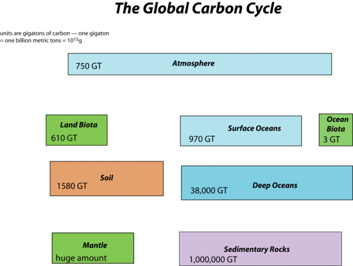
This image is a diagram illustrating the major reservoirs of carbon in the global carbon cycle, quantified in gigatons (GT) of carbon. The diagram uses color-coded boxes to represent different carbon storage compartments on Earth, arranged to show their relative sizes and roles in the carbon cycle.
- Diagram Type: Block diagram
- Components (Reservoirs with Carbon Stocks):
- Atmosphere:
- 750 GT
- Represented by a light blue horizontal box at the top
- Land Biota:
- 610 GT
- Green box, positioned below the atmosphere
- Surface Oceans:
- 970 GT
- Light blue box, positioned to the right of Land Biota
- Ocean Biota:
- 3 GT
- Small green box, positioned to the right of Surface Oceans
- Soil:
- 1580 GT
- Orange box, positioned below Land Biota
- Deep Oceans:
- 38,000 GT
- Large light blue box, positioned below Surface Oceans
- Mantle:
- "Huge amount" (not quantified)
- Green box, positioned below Soil
- Sedimentary Rocks:
- 1,000,000 GT
- Purple box, positioned below Deep Oceans
- Atmosphere:
- Visual Layout:
- The boxes are arranged in a grid-like pattern, with sizes roughly proportional to the carbon stored in each reservoir
- The Atmosphere, Land Biota, Surface Oceans, and Ocean Biota are at the top, indicating their relatively smaller but active roles
- Soil and Deep Oceans are larger, reflecting their significant carbon storage
- Sedimentary Rocks is the largest box, emphasizing its massive carbon reservoir
- The Mantle is noted as having a "huge amount," but no specific value is given, suggesting its vast but less accessible carbon pool
The diagram provides a clear visual summary of the distribution of carbon across Earth's major reservoirs, highlighting the dominance of sedimentary rocks and deep oceans in long-term carbon storage, while the atmosphere, biota, and surface oceans play more dynamic roles in the carbon cycle.
The mantle reservoir is huge and somewhat removed from the other reservoirs, thus we will not really bother with it. Among the other reservoirs, you can see that there is a huge range in the sizes. The ocean biota contain a very small amount of carbon relatively speaking, while sedimentary rocks contain a vast quantity (in the form of calcite — CaCO3 — that forms limestones, and coal, petroleum, etc.).
Now, let’s look at the system with the flows included, as arrows connecting the reservoirs:
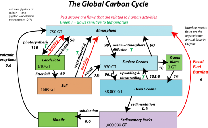
This image is a diagram of the global carbon cycle, focusing on the major reservoirs of carbon and the flows between them, with an emphasis on human-related activities. The diagram uses color-coded boxes to represent carbon reservoirs and arrows to indicate carbon flows, with red arrows highlighting flows altered by human activities and green arrows showing natural temperature-sensitive flows.
- Diagram Type: Block diagram with flow arrows
- Reservoirs (in Gigatons of carbon, GT):
- Atmosphere: 750 GT (light blue box, top)
- Land Biota: 610 GT (green box, middle left)
- Surface Oceans: 970 GT (light blue box, middle right)
- Ocean Biota: 3 GT (green box, top right)
- Soil: 1580 GT (orange box, below Land Biota)
- Deep Oceans: 38,000 GT (light blue box, below Surface Oceans)
- Mantle: "Huge amount" (green box, bottom left)
- Sedimentary Rocks: 1,000,000 GT (purple box, bottom right)
- Flows:
- Red Arrows (human-related activities):
- From Sedimentary Rocks to Atmosphere: Labeled "Fossil Fuel Burning," indicating carbon release from burning fossil fuels
- From Land Biota to Atmosphere: Represents deforestation and land-use changes releasing carbon
- From Soil to Atmosphere: Likely indicates carbon release from soil disturbance (e.g., agriculture)
- Green Arrows (labeled with "T," temperature-sensitive flows):
- Between Atmosphere and Land Biota: Photosynthesis and respiration, sensitive to temperature changes
- Between Atmosphere and Surface Oceans: CO₂ exchange, affected by temperature
- Between Surface Oceans and Deep Oceans: Carbon transfer via ocean circulation, temperature-dependent
- Red Arrows (human-related activities):
- Annotations:
- Text at top: "Red arrows are flows that are related to human activities, Green T = Flows sensitive to temperature"
- The diagram emphasizes human impacts (fossil fuel burning, deforestation) and natural processes influenced by temperature (e.g., photosynthesis, ocean CO₂ uptake)
The diagram visually summarizes the global carbon cycle, highlighting the significant role of human activities in increasing atmospheric carbon through fossil fuel burning and land-use changes, alongside natural temperature-sensitive carbon exchanges between the atmosphere, land, and oceans.
The black arrows represent natural processes of carbon transfer, while the red arrows represent changes humans are responsible for. The magnitudes of the flows are shown in units of gigatons of carbon per year. The diagram as constructed here represents a steady state if we just consider the black arrows; the flows going into each reservoir are equal to the flows going out of the reservoir — in other words, there is a balance. We will step through this system, talking about the processes involved in the flows, but first, let’s try to learn something from the numbers themselves in this diagram.
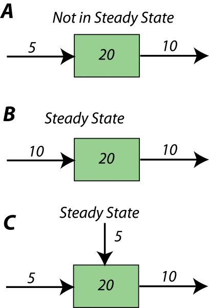
First, just a bit more on the notion of steady state. The diagram below illustrates some simple systems, one of which is not in a steady state, and the others of which are.
This image is a simple diagram consisting of three green rectangular boxes stacked vertically against a black background. Each box contains the number "20" in black text centered within it.
- Diagram Type: Stacked rectangular blocks
- Components:
- Three green rectangles, each identical in size and color
- Each rectangle has the number "20" displayed in the center
- Layout:
- The boxes are aligned vertically, evenly spaced, with small gaps between them
- The black background provides high contrast, making the green boxes and white text stand out
The image lacks additional context, labels, or annotations, so its specific meaning or purpose is unclear. It could represent a count, a value, or a placeholder in a larger diagram or presentation.
In the first example, A, more (10 units per time) is subtracted from the reservoir than is added (5 units per time), and so over time, the amount in the reservoir will decline — it will not remain constant, or steady. In each time step, it will lose 5 units of whatever the material is. In the other two (B,C), the amount added is the same as the amount subtracted, so these reservoirs will be in a steady state. If you look at example C, you see that the sum of inflows (5+5) is equal to the outflow (10).
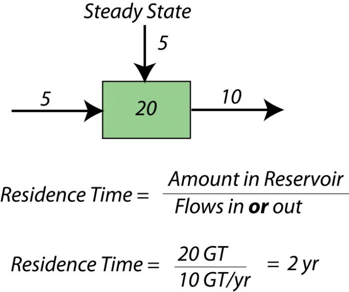
When a system is in a steady state, we can say something about the average time something will spend in the reservoir — this is called the residence time for the reservoir. Here is a simple example — if there are 40,000 students at Penn State, and 10,000 students enter each year and 10,000 students graduate each year, then the system is in a steady state. The residence time is the total number of students divided by either the number entering or graduating each year — this give 4 years as the average residence time. Here is a figure to explain the idea further:
This image is a simple diagram featuring a single green rectangular box against a black background. The box contains the number "20" in black text centered within it.
- Diagram Type: Single rectangular block
- Components:
- One green rectangle
- The number "20" displayed in the center of the rectangle
- Layout:
- The green box is positioned centrally within the black background
- The black background provides high contrast, making the green rectangle and black text stand out
The image lacks additional context, labels, or annotations, so its specific meaning or purpose is unclear. It could represent a count, a value, or a placeholder in a larger diagram or presentation.
The concept of residence time is a useful one in studying any kind of system because it tells us something about how quickly material is moving through a system, and more important, it tells us how quickly some part of the system, or the system as a whole, can respond to changes. If something has a short residence time, it can respond quickly to changes, whereas if it has a long residence time, it responds very slowly. Mathematically, the residence time is the same as something called the response time which, as the name implies, is a measure of how much time it takes for the system to respond to a change. The word "respond" in this context means "return to a steady state."
Although the residence time and the response time are often the same value, they represent different ideas. As we said earlier, the residence time is a measure of the average length of time something spends in a reservoir — like the average length of time a carbon atom spends in the atmosphere. The response time, instead, is a measure of how quickly something returns to steady state after some disturbance that knocks it out of steady state. So, response time is only meaningful in cases where a system has a tendency to remain in a steady state.
Now, let’s turn to the carbon cycle and consider some of the flows in and out of the reservoirs. What is the residence time for the atmosphere? To get this, we take the amount in the reservoir (750 GT) and divide it by the sum of the inflows or the outflows. Let’s take the outflows: 100 GT C/yr for photosynthesis + 90 GT C/yr going into the oceans. The residence time is thus:
This is a pretty short residence time. Now, let’s look at the deep ocean (which is the vast majority of the oceans) — its residence time is:
We use 10 for the inflow/outflow value because we use the net of the water flux into and out of the deep ocean. The result, 3,800 years, is much longer than the atmosphere, and what this means is that the carbon cycle has some parts that respond quickly, but other parts that respond very slowly, and the very slow parts tend to put a damper on how quickly the other parts can change. In other words, if we suddenly inject carbon dioxide into the atmosphere, you might think that the short residence time of the atmosphere means that the excess CO2 can be removed very quickly, but because these reservoirs are linked together, it turns out that the deep ocean must return to its steady state before the atmosphere can get back to its steady state.