Lab 5: Carbon Cycle Modeling (Introduction)
The goals of this lab are to:
- Simulate the fate of CO2 added to the atmosphere;
- Interpret what happens when we increase the rate of fossil fuel burning;
- Evaluate how the rate of carbon addition affects the maximum temperature and minimum pH attained under fossil fuel burning;
- Simulate the impact of the different emission scenarios on global temperature;
- Evaluate how permafrost melting amplifies warming under the different emission scenarios.
Please make sure that you read the Introduction to the lab. Skipping it will result in a lot of confusion and a lower score on the assignment.
Introduction
In the lab activity for this module, we will be working with a STELLA model of the global carbon cycle that is attached to the climate model we used in Module 3. This model incorporates the processes of carbon transfer in the terrestrial and oceanic realms discussed in the previous sections; it also includes the history (from 1880 to 2010) of human impacts on the carbon cycle in the form of emissions from burning fossil fuels, burning forests, and disrupting the soil. The model is initially set up to represent the carbon cycle in a steady state just before the industrial revolution, at which point human alterations to the carbon cycle began in earnest. We will use this model to explore different carbon emissions scenarios for the future, to see how the climate and carbon cycle might respond.
Here is what the model looks like, in a very simple, stripped-down form:
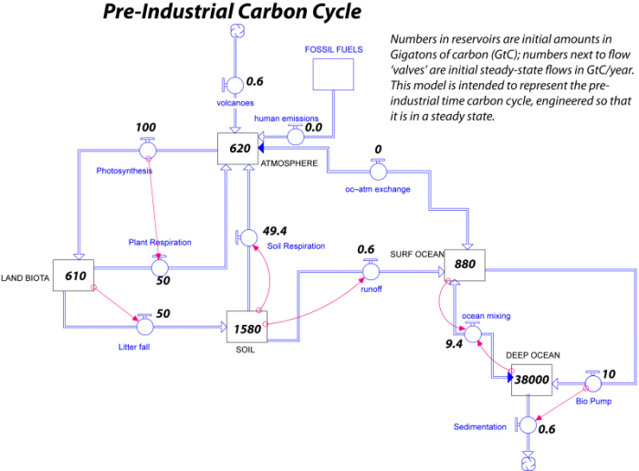
In this figure, you can see the initial amounts of carbon in each reservoir in GT and the annual flows of carbon between reservoirs in GT C/yr. A couple of things should be pointed out about this model. In some cases, flows have been combined into things called bi-flows that have arrows on each end; this means that carbon can flow either way. There is a bi-flow connecting the atmosphere and surface ocean that represents the two-way transfer of ocean-atmosphere exchange. There is another bi-flow connecting the surface and deep ocean that represents upwelling and downwelling combined into one.
The real model is quite a bit more complex-looking, as can be seen below:
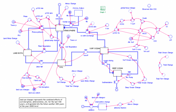
The complications here arise from the fact that most of the flows are expressed by rather complicated equations. Most of the flows have small red arrows attached to them; these show you what things affect the flow rate. Think of the circle in the middle of the flow pipe as being a valve on a water pipe that controls how much water moves through the pipe. In many cases, the red arrows come from the reservoir that is being drained by the flow; this means that the outflow is dependent on how much is in the reservoir — when you have more in a reservoir, the outflow is often greater, and in essence, the outflow is a percentage of how much is in the reservoir.
Note that the atmosphere reservoir is connected to a converter called pCO2 atm — this is the concentration of CO2 in the atmosphere and the units are in parts per million or ppm, the same units that CO2 concentrations are typically given in. In this model, the initial amount of carbon in the atmosphere gives a pCO2 value of 280 ppm (and by now, it is just over 400 ppm). The pCO2 atm converter is in turn connected to the same climate model we used in Module 3, where it determines the strength of the greenhouse effect. The climate model calculates the temperature at each moment in time and then passes that information back to the carbon cycle model in the form of a converter called global temp change, which is the change in global temperature relative to the starting temperature — this is like a temperature anomaly.
The global temp change converter is then attached to a couple of other converters that attach to the photosynthesis flow and the soil respiration flow. Both of these flows are sensitive to temperature and the temperature combines with something called a temperature sensitivity. You can see something above called the Tsens sr — this is the temperature sensitivity for soil respiration. Both photosynthesis and soil respiration are sensitive to the temperature; they increase with temperature. Global temp change is also connected to the surface temperature of the oceans (T surf) via a "ghosted" version of the converter — a dashed line version that helps eliminate so many long connecting arrows running all over the diagram.
The photosynthesis flow has lots of converters associated with it since it is dependent on numerous factors, but the main things are temperature and the atmospheric CO2 concentration.
The model also includes a whole set of connected converters in the upper right that do all of the calculations related to the carbon chemistry in the oceans; this is where the pH or acidity of the surface ocean is calculated.
At the very top right of the model, there is a converter called Observed Atm CO2 that contains the observed history of atmospheric CO2 concentration since 1880. This is in the model so that we can test how good the model is. If our carbon cycle model is good, then it should calculate a pCO2 that closely matches the observed record.
The model includes the history of carbon emissions from burning fossils fuels shown in the previous section; it also includes a history of land use changes that impact the carbon cycle. These land use changes are broken up into tree burning (that accompanies deforestation) and soil disruption (related to farming); they are then additions to the flow of carbon from the land biota and soil back into the atmosphere. These human alterations to the carbon cycle are shown in the model by clicking on the pink graph icons labeled ffb and land use changes on the right side of the model, as shown below.
As before, the model we will work runs on a browser; here is a link to the model. When you follow the link, you should see a screen like this (note the model has changed but the functions are similar):
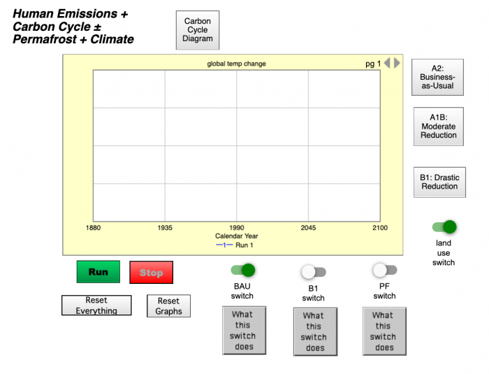
You can think of this as the control panel for the model, where you can run it, stop it, make changes, and look at the results in the form of different graphs. You can access the different graphs by clicking on the triangular tab at the lower left of the graph window. The controls here consist of a set of switches you can turn on or off — these will determine which of 3 different emissions scenarios are applied to the model. The three buttons on the right-hand side show what the 3 emissions scenarios look like. The video below explains how to work the switches. There is also a switch that can be used to either include or exclude the carbon emissions to the atmosphere from human-related land-use changes such as deforestation and soil disruption, but we will not mess around with this switch — just leave it in the "on" or up position as it is in the diagram above.
This initial model is set up to run from 1880 to 2100. Later, we will work with a model that runs farther into the future.
This is the interface to the carbon cycle model that we will be working with in this module. If we click on this button here, we would see a view of what the carbon cycle looks like that's implemented in this model. It's a complicated thing, but it's a very realistic carbon cycle model that's going to allow us to explore, in a pretty realistic way, what will happen to atmospheric CO2 and to other aspects of the carbon cycle as we change the burning of fossil fuels and the human effect on this particular system. This carbon cycle model here is attached to a little climate model, that you can see the edge of it over here, that's the same one that we worked with in Module 3. And so, the carbon cycle model will control the atmospheric CO2 concentration here, and then that will feed into the climate model here and control the greenhouse effect. And then the temperature, determined by the climate model, will then come back and affect different parts of the carbon cycle model here.
So, let me show you how to work this model. If you run it just the way you first open it, you'll see it calculates the global temperature change over time. So, zero is the temperature at 1880, but this is temperature relative to that time. And then, the temperature rises as we go to the year 2000 and 2100. Now, these switches down in here control different histories or scenarios of fossil fuel burnings. The business-as-usual emission scenario is what we ran first. So, when this switch is on, it uses that business-as-usual scenario, and it looks like this, where the carbon emissions just go up and up and up with no change all the way to 2100.
If we click this off, and leave this switch off, it's going to implement a scenario in which the fossil fuel burning just levels off. So, after the year 2010, it just levels off like this. So, we hold emissions constant, and we can see what happens to the temperature in the rest of the system in that case. If we turn this switch on, like that, it will implement this scenario here. It's a very unrealistic one, where after 2010, we drop quickly down to zero fossil fuel burning for the rest of time. So, this is a really dramatic case, just to see how the system will respond to that change.
Now, you can graph different parts of the system. Here, we can look at the atmospheric CO2 concentration. Here, we can look at the ocean pH. Here, we can look at where the carbon goes, what fraction of it stays in the atmosphere, what fraction goes into the biosphere, and what fraction goes into the oceans. This shows us the details of the fossil fuel burning history that we applied in that case. This plots both the atmospheric CO2 concentration and the fossil fuel burning history together, so you can see how they compare. This shows the values of carbon and all the different reservoirs in the carbon cycle model. This is the cumulative amount of carbon that we've released over time, so it just gets bigger and bigger and bigger. This is not the annual amount, but the cumulative.
Now, this is an interesting one to look at because it goes from 1880 to 2010, so the period of time that we know something about. And it plots in red the actual observed atmospheric CO2 level and in blue the CO2 level that the model calculates. And so, you can see that those two are very close throughout this whole time. And so, that means that our carbon cycle model, coupled with the climate model, is giving us a result that matches a historical record. And so, we say we have a good model, and we can essentially trust what it tells us in terms of projections off into the future.