Prioritize...
At the completion of this section, you should be able to describe and interpret what is displayed on water vapor imagery, describe what it's most commonly used for, and discuss its limitations (in other words, what it typically cannot show).
Read...
Our look at visible and infrared imagery has hopefully shown you that using a variety of wavelengths in remote sensing is helpful because this approach gives us a more complete picture of the state of the atmosphere. Meteorologists can use visible and infrared imagery to look at the structure and movement of clouds because these types of images are created using wavelengths at which the atmosphere absorbs very little radiation (so radiation reflected or emitted from clouds passes through the clear air to the satellite without much absorption). Now, what if we took the opposite approach? What if we looked at a portion of the infrared spectrum where atmospheric gases (namely water vapor) absorbed nearly all of the terrestrial radiation? What might we learn about the atmosphere? Water vapor imagery addresses that question.
In case you didn't catch it in the paragraph above, let me be clear: Water vapor imagery is another form of infrared imagery, but instead of using wavelengths that pass through the atmosphere with little absorption (like traditional infrared imagery), water vapor imagery makes use of slightly shorter wavelengths between about 6 and 7 microns. As you can tell from our familiar atmospheric absorption chart, these wavelengths are mostly absorbed by the atmosphere, and by water vapor in particular. Therefore, water vapor strongly emits at these wavelengths as well (according to Kirchoff's Law). Thus, even though water vapor is an invisible gas at visible wavelengths (our eyes can't see it) and at longer infrared wavelengths, the fact that it emits so readily between roughly 6 and 7 microns means the radiometer aboard the satellite can "see" it.
This fact makes the interpretation of water vapor imagery different than traditional infrared imagery (which is mainly used to identify and track clouds). Unlike clouds, water vapor is everywhere. Therefore, you will very rarely see the surface of the earth in a water vapor image (except perhaps during a very dry, very cold Arctic outbreak). Secondly, water vapor doesn't often have a hard upper boundary (like cloud tops). Water vapor is most highly concentrated in the lower atmosphere (due to gravity and proximity to source regions like large bodies of water), but then the concentration tapers off at higher altitudes.
The fact that water vapor readily absorbs radiation between roughly 6 and 7 microns also raises an interesting question -- just where does the radiation that ultimately reaches the satellite originate from? The answer to that question is the effective layer, which is the highest altitude where there's appreciable water vapor. In other words, the effective layer is the source for the radiation detected by the satellite. Above the effective layer, there is not enough water vapor to absorb the radiation emitted from below, nor is there enough emission of infrared radiation to be detected by the satellite. Any radiation emitted below the effective layer is simply absorbed by the water vapor above it. Therefore, the satellite measures the radiation coming only from the effective layer, and like traditional infrared imagery, this radiation intensity is converted to a temperature. Here's the key point: Water vapor imagery displays the temperature of the effective layer of water vapor (notice that the water vapor image below has a temperature scale, just like traditional infrared imagery).
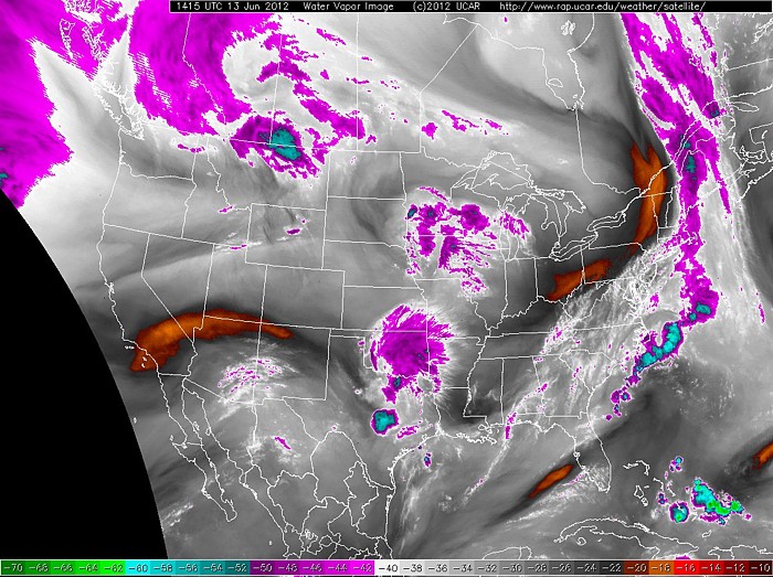
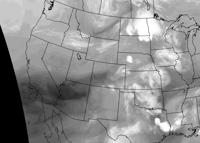
So what can we infer by knowing the temperature of the effective layer? Just like traditional infrared imagery, we make the assumption that temperature decreases with increasing altitude, which implies that colder effective layers reside higher in the atmosphere. This means that if we know the height of the effective layer, we can infer the depth of the dry air above it (remember that we cannot make any assumptions about what lies below the effective layer). For example, consider the region shaded orange over southern California in the image above. Here the temperature of the effective layer is a relatively balmy -18 degrees Celsius. This temperature corresponded to a height of 19,000 feet (5.8 km) on this date -- approximately in the middle region of the troposphere (I looked up the temperature profile for this location and time). So, if the effective layer is located at 19,000 feet, then we can infer that some of the mid-level and all of the upper-level atmospheric column is dry.
For a location over Denver, Colorado, which shows a temperature of - 30 degrees Celsius, the height of the effective layer was nearly 30,000 feet (9.1 km) on this date, and we can conclude that the upper troposphere contains more water vapor here than over southern California. Finally, turn your attention to the region of -60 degrees Celsius over central Texas (light blue). Here, the effective layer was way up at 40,000 feet (12.2 km) on this date. Such a cold, high effective layer can only be caused by high ice clouds typical of the tops of cumulonimbus clouds. I should point out that at such low temperatures very little water exists in the vapor phase. However, ice crystals also have a fairly strong emission signature between 6 and 7 microns, so if you see such cold effective layers (less than -45 degrees Celsius or so), you are most likely looking at ice clouds (cirrus, cirrostratus, cumulonimbus tops, etc.) rather than at water vapor.
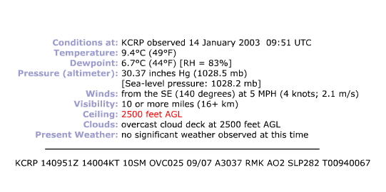
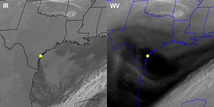
In the case above, did you notice that the lowest effective layer that we observed was 19,000 feet? That's not uncommon. Because emissions from water vapor near the earth's surface are absorbed by water vapor higher up, it's often impossible to detect features at very low altitudes. In other words, low clouds (stratus, stratocumulus, and nimbostratus) are rarely observable on water vapor imagery. To see what I mean, check out the pair of satellite images below (infrared on the left, water vapor on the right). The yellow dot represents Corpus Christi, Texas, which was shrouded in low clouds (gray shading on the infrared image). The surface observation from Corpus Christi at this time actually showed low clouds at 2,500 feet. Now examine the water vapor image. The effective layer resided in middle troposphere as evidenced by the dark shading on the water vapor image (indicating a warm effective layer). However, not even a hint of the low clouds can be seen. In this case, the effective layer (located above the low clouds) absorbed all of the radiation emitted from below, rendering the low clouds undetectable on the water vapor image.
I should note that newer satellite technology, which allows meteorologists to look at water vapor imagery created from multiple wavelengths, allows for features below 10,000 feet to be seen more commonly than in "the old days." However, features right near the surface are still only viewable in very cold, dry air masses (when the effective layer is near the surface).
Now that we've discussed how to interpret water vapor imagery, what might we use it for? Well, because water vapor is everywhere, and it moves along with the wind, forecasters most often use water vapor imagery to visualize upper-level circulations in the absence of clouds. In other words, water vapor can act like a tracer of air movement, much like smoke from an extinguished candle. For example, consider this enhanced infrared satellite loop and focus your attention on the Southwest U.S. Since no clouds are present, we can't really tell how the air is moving over this region. Now, check out the corresponding loop of water vapor images and focus your attention on the same area. What do you see? Do you notice the ever-so-slight counter-clockwise circulation of the air off the California coast? Such upper-level circulations are important to weather forecasters (they can sometimes be triggers for inclement weather), and we were only able to identify this circulation with the aid of water vapor imagery.
To see another example of how to interpret water vapor imagery, and to see the types of insights that meteorologists can get from examining it, check out the short video (2:33) below. In the video, ignore the black arc over the Pacific Ocean toward the left. That's just the satellite filtering out some bad data.
Let’s look at water vapor imagery and see what kinds of insights we can get from it. This particular image is from 1215Z on October 11, 2017, and to get your bearings, keep in mind that what’s being displayed here is really temperature.
The color key is along the bottom. Higher temperatures are toward the right of the key, and are represented by the warm colors – the oranges and reds. Lower temperatures are shown in increasingly bright shades of gray and white, and the really low temperatures are shaded in cool colors – the purples, blues, and greens.
So, from this image, we can see the temperature of the effective layer, that’s the highest layer in the troposphere with appreciable water vapor. This big streak across the center of the country has a relatively warm effective layer, as indicated by the orange and red coloring. The relative warmth of the effective layer means it lies in the middle troposphere, which means that the upper troposphere in this region must be particularly dry.
Just to the northwest, on the other hand, the effective layer is colder over Montana and Wyoming, where there’s bright white and purple shading. The colder effective layer in this area means that it’s higher in the troposphere, so we can conclude that the upper troposphere has more water vapor in this region compared to our large orange and red streak. The coldest areas in purple represent temperatures below -46 degrees Celsius, and likely correspond to emissions from high-topped clouds composed of ice crystals.
Perhaps the greatest use of water vapor imagery comes from the fact that emissions from water vapor in the middle and upper troposphere allow us to track wind flow aloft, even in areas with no clouds. Let’s loop these water vapor images over a 6-hour time period, and we can track air movements in the middle and upper troposphere.
For example, it’s easy to see this broad area of flow from the southwest in this zone with a dry upper troposphere. We can also see a notable counter-clockwise swirl along the Pacific Coast here. Meteorologists need to keep tabs on such circulations, as they can sometimes lead to inclement weather – note the signature of high cloudiness on the eastern flank of the swirl, as well as some indication of speckled high-topped clouds here over Washington and Oregon in the purple areas.
So, hopefully, you now have a basic idea of the types of observations and insights that we can get from water vapor imagery.
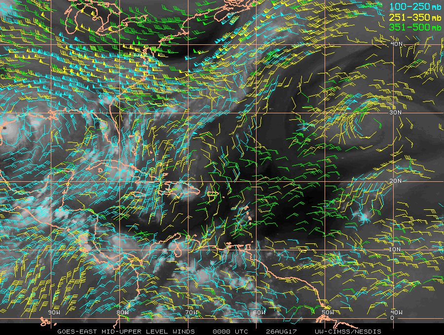
Water vapor imagery's ability to trace upper-level winds ultimately allows forecasters to visualize upper-level winds, and computers can use water vapor imagery to approximate the entire upper-level wind field. Here's an example of such "satellite-derived winds" in the middle and upper atmosphere at 00Z on August 26, 2017 (on the far left side of the image, you can see Hurricane Harvey about to make landfall in Texas). Having such observations over the data-sparse oceans is extremely valuable to forecasters, and much of this information gets put into computer models so that they better simulate the initial state of the atmosphere, which leads to better forecasts than if we didn't have these observations.
If you're interested in looking at current water vapor images, NOAA's GOES satellite server, the National Center for Atmospheric Research (NCAR), the College of DuPage, and Penn State all serve as good sources. Now that we've covered the three most commonly used types of satellite imagery, we're going to shift gears from remotely observing the weather from space, to remotely observing the weather from right near the ground with radar. Before moving on to radar imagery, take a moment to review the key points about water vapor imagery.
Water Vapor imagery...
- uses infrared radiation; except unlike traditional infrared imagery, it uses wavelengths at which water vapor strongly emits and absorbs infrared radiation.
- displays the temperature of the effective layer of water vapor. Warm effective layers mean that the middle to upper troposphere are "dry" (they contain very little water vapor). By comparison, colder effective layers indicate a higher concentration of water vapor and/or ice clouds in the upper troposphere.
- is not able to give any measure of the atmospheric water vapor content below the effective layer.
- usually does not show the presence of low clouds or water vapor near the surface. These almost always lie below the effective layer.
- is used to trace air motions in the middle and upper troposphere, even in areas with no clouds.