Top Two Panels: X's and N's Instead of X's and O's
Let's dissect all of the information available on four-panel progs by starting with the upper-left panel. For sake of continuity, let's stay with our theme of the "bomb" along the East Coast of the United States that produced 10 to 20 inches of snow across parts of the Middle Atlantic States and New England during the period, January 3-5, 2018. Specifically, we will discuss, in detail, the 12-hour four-panel prog based on the NAM initialization at 12 UTC on January 3, 2018. For the record, this four-panel prog was valid at 00 UTC on January 4, 2018, six hours before the prog we just showed you in the previous section. At this earlier time (00 UTC on January 4), the developing "bomb" along the East Coast was predicted to be already undergoing rapid intensification.
Football coaches draw X's and O's to map out a play. In a similar spirit, the 500-mb game plan highlights X's and N's on the upper-left panel of any standard four-panel prog. That's because the upper-left panel provides forecasts for 500-mb absolute vorticity, whose closed centers contain X's (vort maXes) and N's (vort miNs). Indeed, the upper-left panel (see below) on our chosen four-panel prog displays the predicted 500-mb heights (solid, dark lines, labeled in dekameters = tens of meters) and predicted contours of 500-mb absolute vorticity (color-filled). As you recall from Chapters 7 and 12, patterns of 500-mb heights reveal short- and long-wave troughs and ridges. In general, a vort max ("X") marking a short-wave trough on weather charts allows forecasters to locate the associated area of upper-level divergence to the east of the vort max. Likewise, a vort min ("N") indicating a short-wave ridge alerts forecasters to an associated area of upper-level convergence to its east.
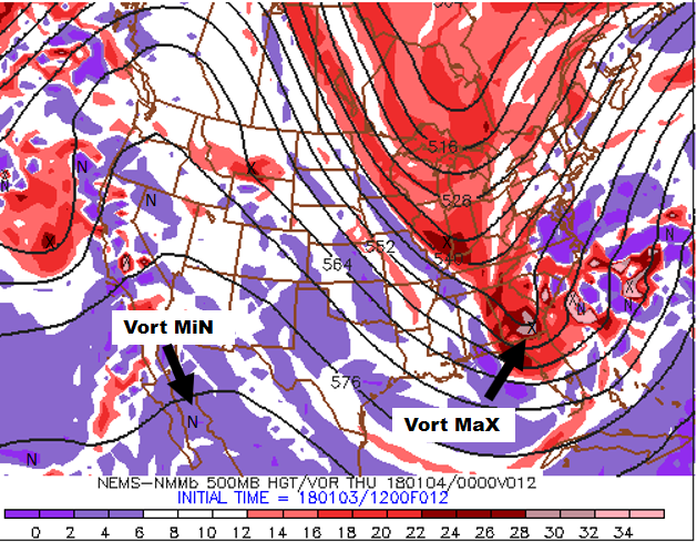
For convenience, areas of large absolute vorticity associated with 500-mb troughs appear in shades of red, with the deepest red designating relatively large values. As a result, the cores of deepest red typically contain an "X" (for the strongest short waves, the corresponding deepest red might contain a pinkish color, indicating an extremely large value of absolute vorticity). On the other hand, areas of relatively small absolute vorticity associated with 500-mb ridges (and low latitudes, in general), appear in shades of purple, with the brightest purple marking the smallest values (as a result, the cores of brightest purple typically contain an "N").
How should you incorporate the upper-left panel into your forecasting routine? Just keep in mind that surface low-pressure system tends to develop (or strengthen) to the east of relatively strong 500-mb short-wave troughs (vort maxes), while surface highs tend to form (or strengthen) to the east of robust 500-mb short-wave ridges (vort mins).
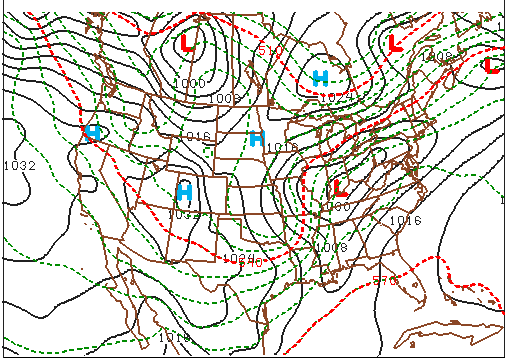
Practicing what we preach, please note, on the upper-left panel shown above, the primary short-wave trough and its associated vort max that were predicted to be over Georgia at 00 UTC on January 4, 2018 (the pinkish area inside the deep red that houses an "X"). There should be surface low to the east/northeast of this short-wave trough. Let's see. Shift your focus to the upper-right panel (below), and notice the intense "L" to the east of South Carolina (and east-northeast of the primary vort maX), clearly indicating that the upper-right panel predicts sea-level pressure (the thin, black lines represent predicted isobars). For all practical purposes, the upper-right panel is the model's forecast for how the surface weather map will look like at the time the prog is valid. By the way, the labeling of the predicted isobars follows the same convention of pressure analysis you learned in Chapter 6: 1000 mb is the standard contour and 4 mb is the standard contour interval.
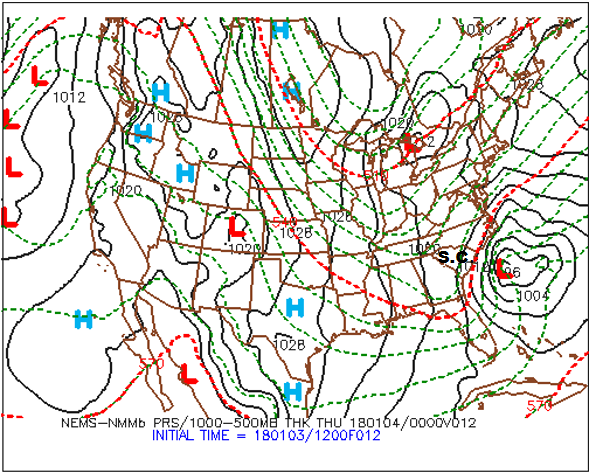
The bottom line here is that the upper-right panel affords you the opportunity to identify centers of high and low sea-level pressure (they’re even labeled for you) as well as surface troughs and ridges. From these patterns of predicted isobars, you can infer surface wind direction using the upper-right panel. Keep in mind that, in the Northern Hemisphere, winds blow counterclockwise around a low, crossing local isobars slightly inward toward low pressure. As you learned in Chapter 6, the angle the surface wind crosses local isobars averages about 30 degrees ... it can be as large as 45 degrees (or more) in rough terrain, and as small as 10 degrees over smooth seas. On the flip side, winds circulate clockwise around a surface high , crossing local isobars slightly outward away from the high’s center. We added a sample of surface wind vectors to an upper-right panel (below) from a generic four-panel prog (which is not shown here) in order to show you how to infer wind directions using the predicted sea-level isobars as your guide.
During your apprenticeship in weather forecasting, your success hinges, in part, on a sound, working knowledge of the cyclone model (recall Chapter 13). For example, you should be able to locate fronts associated with mid-latitude cyclones on the upper-right panel. Remember that, in order to do this, just locate the surface troughs!
While it's true that surface fronts lie in troughs, it's also true that there are troughs that don't contain a front. All is not lost, however, because large horizontal temperature gradients are also the hallmark of fronts. So, in order to get a more complete picture of a surface low-pressure system and its associated fronts, we somehow need to introduce temperature on the upper-right panel. Besides, we also need to think about cold and warm advection, which would be impossible to predict without some sort of temperature field.
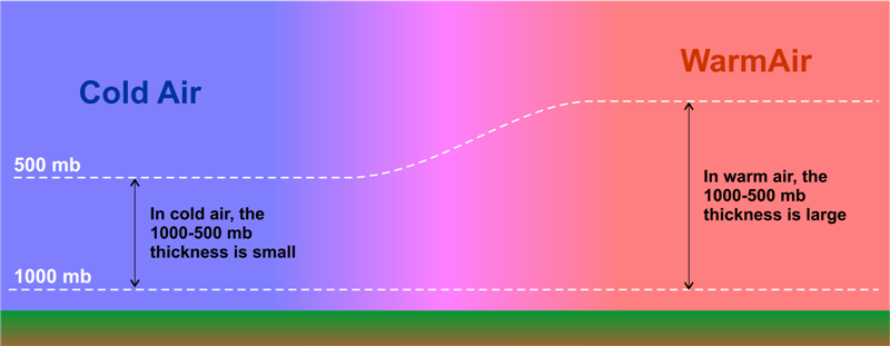
Enter the dashed lines on the upper-right panel, which are the predicted isopleths of 1000-500 mb thickness (in dekameters). Recall, from Chapter 16, that thickness is the vertical distance between any two pressure levels (see the figure below for a review). Given that pressure decreases more rapidly with altitude in cold air than in warm air, thickness is smallest where the average temperature is lowest in the layer of air between 1000 mb and 500 mb. Similarly, the 1000-500 mb thickness is largest where the average temperature is highest in this layer. So the thickness between the 1000-mb level and the 500-mb level is proportional to the average temperature in this layer. For supporting evidence, notice, on our chosen upper-right panel, that larger values of the 1000-500 mb thickness tend to lie over warmer, southern latitudes, while smaller values tend to congregate over northern latitudes. The reason that the layer between 1000 mb and 500 mb gets a lot of attention is that most of the weather action occurs in this layer. As a matter of practice, all computer models routinely calculate thickness between 1000 mb and 500 mb. The standard contour for 1000-500 mb thickness is 552 dekameters (5520 meters), with contour intervals of 6 dekameters (60 meters).
We point out that, on Penn State's version of the upper-right panel, the 510, 540, and 570-dekameter thickness lines are highlighted in red – they are special markers. You may recall that the “540 line” is a reasonable first estimate for the rain-snow line east of the Rockies. Operational weather forecasters use 510 dekameters to roughly indicate an Arctic air mass. Indeed, the average temperature in the layer of air between 1000 and 500 mb that corresponds to a thickness of 510 dekameters is a frigid -22oC (-8oF). At the other extreme, a thickness of 570 dekameters, which corresponds to an average layer temperature of about 8oC (46oF), is used by forecasters to indicate a very warm air mass. If 8oF sounds low for a very warm air mass, remember that it represents the average temperature from 1000 mb to 500 mb. So, while it's hot at the surface, temperatures at 500 mb are typically at least several degrees below 0oC (you'd need a winter coat).
The bottom line here is straightforward: Because 1000-500 mb thickness directly corresponds to the average temperature in this layer, you can treat isopleths of 1000-500 mb thickness as if they were isotherms. With this connection in mind, large horizontal gradients in thickness contours can help you to locate surface fronts. Recall that surface fronts typically lie just on the warm side of tight packings of isotherms. Thus, forecasters place fronts just on the warm side of tight packings of thickness contours (while simultaneously using troughs of low pressure to pinpoint the position of the front).
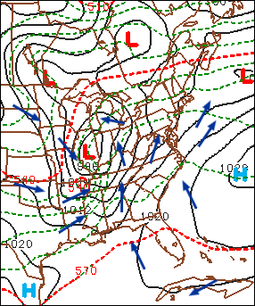
For example, look (above) at a generic upper-right panel of a NAM forecast for sea-level pressure and 1000-500 mb thickness (the full prog is not shown here). Focus your attention on the surface low-pressure system near the Kentucky-Indiana border. Note the pressure trough elongating to the south of the low, and the ribbon of tightly packed thickness lines that mark the large temperature gradient associated with the low's cold front.
And now for the pièces de résistance: We placed the cold front in the trough of low pressure just on the warm side of this tight packing of thickness contours (see our analysis below).
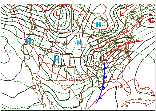
Now let’s turn to the low's warm front. For starters, a friendly word of advice: Drawing warm fronts on progs is usually more difficult than drawing cold fronts. There are a couple of reasons why locating warm fronts is harder than locating cold fronts. First, the horizontal temperature gradients associated with cold fronts tend to be larger than the temperature gradients corresponding to warm fronts (but not always). Second, the pressure troughs that contain warm fronts tend to be less pronounced than those that mark a cold front.
In this generic case, we're in luck because there is a fairly well-defined trough and a fairly well-defined thickness gradient that mark the warm front associated with the low predicted to be centered over the Indiana-Kentucky border. So, we placed the warm front in the trough and just on the warm side of the thickness packing (see our analysis above). In the area south of the warm front and east of the cold front, note the weak temperature gradient that's consistent with the warm sector of a mid-latitude cyclone.
Thus, the top two panels on standard four-panel progs allow you to locate 500-mb short-wave troughs, 500-mb short-wave ridges, and surface low- and high-pressure systems. From the predicted patterns of sea-level isobars and thickness contours, you can infer surface wind direction, the positions of surface fronts, and, based on the wind direction and the pattern of thicknesses, warm and cold advection.
The bottom two panels of the four-panel prog pertain to clouds and precipitation. We'll turn to them next.