Bottom Two Panels: Clouds and Precipitation
In keeping with the theme of our previous spotlight on four-panel progs, the historic winter storm of January 3-5, 2018, will serve as the backdrop for our discussion on the bottom-two panels. Let's start with the bottom-left panel of the NAM 12-hour prog intialized at 00 UTC on January 4, 2018 (see below), which we've conveniently cropped from the four-panel prog. This forecast was valid at 12 UTC on January 4, 2018.
For the record, the designated pressure level on this panel is 700 mb. Why the 700-mb level? This mandatory pressure level is approximately midway between 1000 mb and 500 mb at altitudes near 3000 meters (10000 feet), which places it near the epicenter of the "weather action" in the lower half of the troposphere. Moreover, 700 mb marks the first mandatory pressure level that lies almost completely in the "free atmosphere." In other words, 700 mb is high enough to essentially be removed from the constraints of the earth's surface, except for some of the highest peaks in the Rockies and the tops of other mountains in the western United States (the Cascades in Washington and Oregon, for example; here's a photograph of Mount Ranier, whose elevation is 14,410 ft, or about 4400 m).
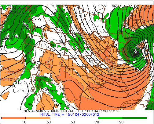
To get your bearings, we point out that the relatively thick, black contours represent 700-mb heights (labeled in dekameters). Without reservation, the predicted 700-mb heights provide forecasters with a more complete picture of the evolving weather pattern at this pressure level . Arguably, the most useful field on this bottom-left panel is the color-coded forecast for relative humidity. For starters, contours of predicted 700-mb relative humidity (the thin, black isopleths) are drawn for 10%, 30%, 50%, 70% and 90%. Green shades represent regions with high 700-mb relative humidity (greater than 70%). The darkest green marks areas with 700-mb relative humidity greater than 90%, which is getting pretty close to saturation. Meanwhile, shades of orange indicate low 700-mb relative humidity, with the darkest orange marking areas with 700-mb relative humidity less than 10%.
Let's get up to speed by first looking at the top two panels of the NAM's 12-hour prog initialized at 00 UTC on January 4, 2018. The screaming message from the top-right panel is, not surprisingly, the intense surface low-pressure system off the Middle Atlantic Coast. Now shift your attention to the supporting closed 500-mb low on the top-left panel. Without reservation, the surface low and supporting 500-mb low were expected to be almost vertically stacked, indicating that the low-pressure system was still in its powerful occlusion stage (revisit Chapter 13 to review the Cyclone Model if you need a refresher).
Given that the low-pressure system was in its occlusion stage, we should expect the low to have conveyor belts. And, indeed, it did! On the bottom-left panel below, the ribbon of low 700-mb relative humidity apparently drawn northward into the low's cyclonic circulation marks the system's dry slot. More formally, the dry slot shown on this 700-mb panel is the footprint of the low's dry conveyor belt.
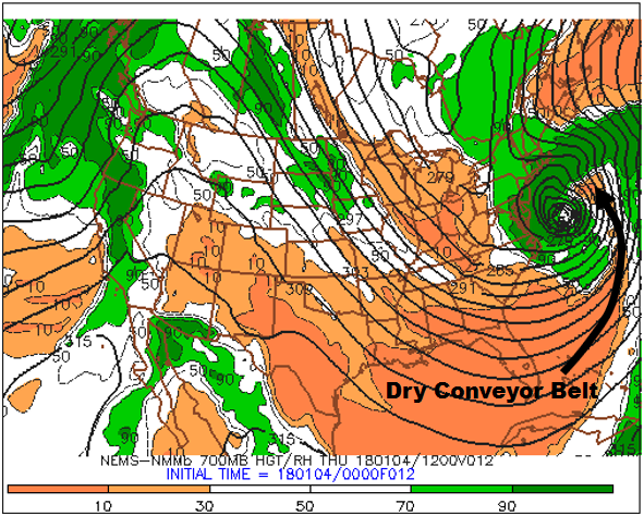
The intense low also had a cold conveyor belt, which can be drawn along the central axis of the arcing swath of high 700-mb relative humidity (90% or greater). You can see how we drew the cold-conveyor belt on this annotated bottom-left panel. Note that the swath of high 700-mb RH appears to wrap counterclockwise around the center of the 700-mb low, which is exactly the description of a cold conveyor belt.
There was also a warm-conveyor belt associated with this intense low, but it's too far off the Atlantic Coast for us to see (the limited eastward extent of the domain on this bottom-left panel does not completely capture the roughly north-to-south ribbon of relative high 700-mb relative humidity that we typically associate with a warm conveyor belt).
Obviously, very intense, mid-latitude cyclones with well defined conveyor belts don't routinely appear on daily weather maps of the United States ... which then begs the question: Does the 700-mb relative bottom-left panel have a more routine forecasting application? The answer is, "yes." Based on empirical evidence, there is a strong statistical correlation between the presence of clouds and predicted 700-mb relative humidity greater than 70%. Though this initially seems at odds with your understanding of how clouds form when the air becomes saturated (relative humidity = 100%), keep in mind that we're talking about a statistical correlation here. Indeed, over the long history of numerical weather prediction, forecasters have observed a relatively strong correlation between patterns of rather high 700-mb relative humidity (70% or greater) and the presence and patterns of clouds (especially stratiform clouds).
On the flip side, very low 700-mb relative humidity on the bottom-left panel can translate to a cloudless (clear) or mostly clear sky. There are exceptions to this "flip-side" statistical link, and we will reveal, in just a moment, how this link sometimes breaks down.
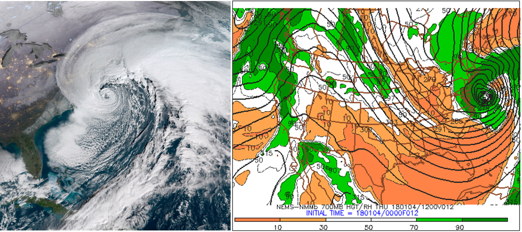
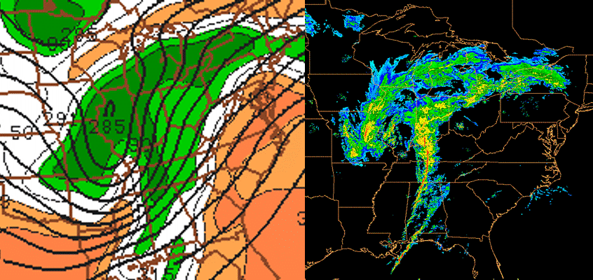
Let's investigate the strong correlation between high 700-mb relative humidity and clouds. The visible satellite image on the left (above) at 1345 UTC on January 4, 2018, shows the "bomb" off the Middle Atlantic Coast. The bottom-left panel (on the right, above) of the four-panel prog was valid at 12 UTC on January 4, 2018. Although the two time stamps are not exactly the same, they are close enough in time to make a reasonably valid comparison. Note how the pattern of high 700-mb relative humidity around the low (especially the dark green = 700-mb relative humidity of 90% or greater) closely matches the low's cyclonic swirl of clouds on the satellite image.
The match is really good, wouldn't you agree? Yes, the statistical correlation that we're discussing here can be impressively right on the money, even for features that seem to be too small. Indeed, note, on the bottom-left panel, the rather tiny, white "island" of lower 700-mb relative humidity at the center of the 700-mb low (relative humidity values between 30% and 70%). This "island" of lower 700-mb relative humidity near the center of the low-pressure system closely mimics the corresponding small, partially clear area on the satellite image. Formally, this "island" of lower 700-mb relative humidity at the center of an intense coastal storm is called a seclusion. So you now have a better sense for how strong the statistical correlation between patterns of 700-mb relative humidity and corresponding cloud structures can really be.
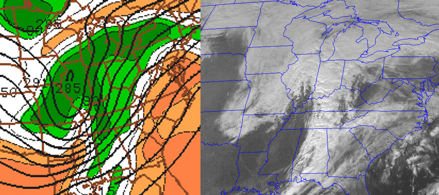
Lest you get the impression that there must be a very intense low in the forecast for this statistical correlation to ring true, check out the "generic" example (above) of a weaker low-pressure system over the central United States. Again, the statistical correlation between rather high 700-mb relative humidity and the presence and pattern of clouds associated with the low seems golden, doesn't it? Indeed, the bottom-left panel essentially predicted the shape of the cloud structure associated with the low, correctly capturing the position and shape of the comma head west and southwest of the low's center. The bottom-left panel also did a pretty good job on the dry slot / dry conveyor belt.
Does the statistical link relating very low 700-mb relative humidity to a clear or mostly clear sky always work? In simple but blunt terms, the answer is, "no." Let's investigate.
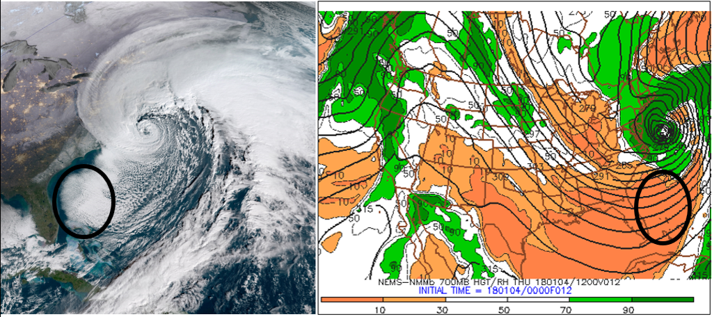
On the morning of January 4, 2018, west-northwesterly winds transported relatively cold air from Georgia and northern Florida over the Atlantic Ocean off the Southeast Coast. This cold advection over warmer water produced ocean-effect clouds (the shallow clouds within the black oval on the satellite image). The tops of these clouds did not reach up to 700 mb because the corresponding 700-mb relative humidity shown on the bottom-left panel (within the black oval) was very low (less than 10%). If you looked only at the bottom-left panel, you might expect the sky to be clear within the black oval, given such extremely low 700-mb relative humidity. But you would be wrong. Lesson learned: The statistical link between very low 700-mb relative humidity and a clear or mostly-clear sky can break down when shallow, low clouds are present.
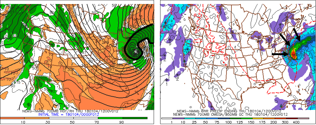
Take a little time to study the bottom-two panels (see above) on the NAM 12-hour four-panel prog (generated by the model run initialized at 00 UTC on January 4, 2018). For your convenience, we outlined, in black, the ribbon of high 700-mb relative humidity (90% or greater) associated with the deep low-pressure system along the Middle Atlantic Coast (except for the lower humidity inside the relatively tiny warm seclusion). Note the similarity between this pattern of high 700-mb relative humidity and the color-coded ribbon of predicted precipitation (marked by black arrows) on the bottom-right panel. The details about predicted precipitation on the bottom-right panel will be forthcoming. For now, we want you to simply recognize that, without reservation, there is a correlation between predicted precipitation (especially stratiform) and 700-mb relative humidity of 90% or greater.
Okay, let's begin to fill in the details about the predicted precipitation shown on the bottom-right panel of a traditional four-panel prog. The first label just below the map (NEMS-NMMb 6HR PRECIP ENDING THU 180104/12V012) contains a very important clue (highlighted in red): The predicted precipitation available from bottom-right panels is cumulative. Indeed, the color-filled areas represent the total liquid precipitation that the NAM predicts will fall in the six-hour period ending at the time that the computer prog was valid (in this case, 12 UTC on January 4, 2018). In other words, the color-filled contours represent a cumulative forecast of the liquid precipitation that will fall during the entire six-hour period (in this case, between 00 UTC and 12 UTC on January 4, 2018).
For the record, liquid precipitation translates to rainfall or the equivalent amount of meltwater (assuming it snows or sleets). We want to emphasize here that the color-filled areas on the bottom-right panel do not constitute a snapshot of future radar reflectivity at the specific time the prog is valid. Rather, the color-filled contours correspond to cumulative liquid precipitation that is expected to fall over the six-hour period ending at the time the prog was valid. An important distinction, don't you agree?
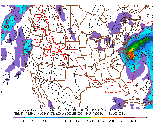
For reference, the row of numbers along the bottom of this panel corresponds to precipitation totals expressed in hundredths of an inch. So, for example, "10" means 0.10 inches, while "150" equals 1.50 inches. Putting what you just learned into action, please note that purple areas (1 to 10 on the color scale) represent regions where the NAM predicted between 0.01 and 0.10 inches of liquid precipitation during the six-hour period ending at 12 UTC on January 4, 2018 (over the Great Lakes, for example), while the dark-orange area off the Middle Atlantic Coast indicates predicted six-hour liquid equivalents between 2.00 and 3.00 inches.
In summary, the graduated color key along the bottom of this panel indicates the predicted ranges of cumulative liquid equivalents, expressed in hundredths of an inch, for the six-hour period ending at the time the prog is valid.
If you look closely and magnify this bottom-right panel, you'll see numbers within a few of the color-filled areas. For example, there's a "284" very close to the dark-orange area off the Middle Atlantic Coast (look again). Reading off the color scale along the bottom, note that dark orange corresponds to a six-hour predicted rainfall between 2.00 inches and 3.00 inches. This range is consistent with the "284" near the center of the dark-orange blob, which is the prog's way of designating a relative maximum of 2.84 inches of rain. Lesson learned: Numbers appearing within a colored area on this panel represent a relative maximum in cumulative precipitation. Moreover, a snowflake-like icon marks the exact location where the model predicts the relative maximum to occur.
The bottom-right panel also includes the predicted position of the 0°C isotherm at 850 mb (check it out). Recall from Chapter 16 that the 0°C isotherm at 850 mb can be used as a tool to estimate the rain-snow line. In this way, forecasters looking at the bottom-right panel can get a cursory sense for frozen versus unfrozen precipitation (keeping in mind, of course, that the bottom-right panel shows predicted cumulative precipitation and that it is not a future radar).
We're almost home. There's one other 700-mb parameter plotted on the bottom-right panel of the NAM four-panel progs. Below is a zoomed-in portion of the bottom-right panel of the 12-hour prog initialized at 00 UTC on January 4, 2018 (valid at 12 UTC on January 4). The thin, dashed lines that are labeled with minuses indicate areas of predicted upward motion at 700 mb. In this case, the ribbon of stronger upward motion (and heavier six-hour precipitation totals) was associated with the intensifying low's cold conveyor belt. Meanwhile, the thin, solid isopleths on this bottom-right panel mark areas of predicted downward motion at 700 mb. In this case, there is downward motion (and very light six-hour precipitation totals) in the purple swath (0.01" - 0.10") just to the east of the slug of heaviest cumulative precipitation off the East Coast. This purple ribbon of downward motion and very light six-hour precipitation totals coincided with the intensifying low's dry conveyor belt.
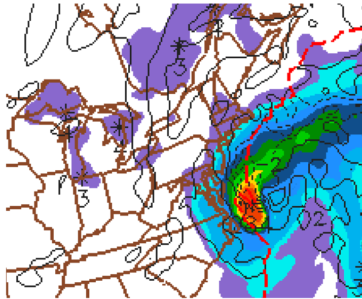
The use of "-" for upward air motions and "+" for downward motions might seem counterintuitive to you. To reconcile this seemingly contradictory sign convention, consider a parcel of rising air. Over time, the parcel's pressure decreases as it ascends higher into the atmosphere. Hence, the ascending parcel's change in pressure with time is negative. For subsiding parcels, pressure increases during descent. So downward motion is positive in the context of pressure changes with time.
Please file this link between vertical motion and an air parcel's pressure change with time away for future reference. And note that some websites reverse this convention, but you can usually tell which sign convention prevails because precipitation will generally correspond (or lie close to) areas of upward motion (as it does in the image above).
Revisit the bottom-right panel above and focus your attention off the Middle Atlantic Coast. The "-2" and "2" that label two of the contours of vertical motion at 700-mb represent the speeds of the air's ascent and descent. Formally, the units of vertical motion at 700 mb on the bottom-right panel are microbars per second (a microbar is one-thousandth of a millibar). A speed of 1 microbar per second is about 1 centimeter per second (which is less than half an inch per second). These tortoise-like, up-and-down air motions are representative of synoptic-scale values because vertical pressure gradients are, on average, balanced by gravity. Such slow ascent and descent are the rule rather than the exception.
We pause this discussion of the NAM four-panel progs (accessed from the Penn State e-Wall) to point out that the corresponding GFS bottom-right panel does not include vertical motion (sample GFS four-panel prog). In addition to 6-hour precipitation totals ending at the time the prog was valid (the same as the NAM), the GFS bottom-right panel displays 850-mb isotherms instead of 700-mb vertical motion (sample GFS bottom-right panel accessed from the Penn State e-Wall).
During our discussion of the bottom-two panels, we've made a couple of references to statistical correlations having greater application to stratiform precipitation (as opposed to convective precipitation). In the context of the bottom-right panel, let's further investigate the bases for making such claims.
Let's consider a "generic" case of a low-pressure system over the central United States (above; here's the corresponding generic surface analysis). Compare the bottom-left panel (left, above) showing predicted 700-mb relative humidity and heights with a mosaic of composite reflectivity produced at the same time the bottom-left panel was valid (right, above).
Though the NAM 700-mb relative humidity prediction on the bottom-left panel did a pretty good job capturing the precipitation north and west of the low (recall the statistical correlation between predicted 700-mb relative humidity and precipitation), you might have noticed that the lines of showers and thunderstorms developed ahead of the low's cold front (over Alabama) in an environment bereft of 700-mb relative humidity greater than or equal to 90%.
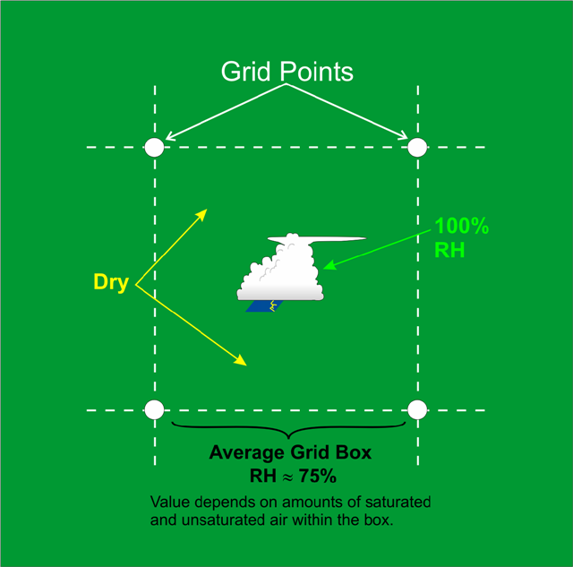
To resolve this apparent contradiction, keep in mind that the spatial scale of a thunderstorm (a cumulonimbus cloud) is typically less than the horizontal spacings of one grid box in most operational short-range computer models (see the schematic below ). Although the relative humidity inside a thunderstorm is essentially 100%, the relative humidity surrounding the thunderstorm is typically much lower. This has the effect of decreasing the overall average relative humidity in the grid box. Thus, in convective situations, the model-predicted 700-mb relative humidity can be misleading if you use it as the sole indicator of precipitation.
The bottom line here is that showers and thunderstorms can form in environments where the bottom-left panel sometimes predicts the 700-mb relative humidity to be noticeably less than 90%. So the statistical correlation between predicted 700-mb relative humidity on the bottom-left panel and precipitation gets a little tricky when the precipitation is convective.
There you have it. A complete whirlwind tour of a standard four-panel prog. You now have the basics to navigate the models listed on the Penn State e-Wall. We should caution you, however, that there are few permutations of the four-panel prog on the World-Wide Web. These variations can range from simple color differences to wholesale substitutions of a prog from a different pressure level. So just keep your wits about you if (and when) you access four-panel progs from other websites.
Armed with the ability to interpret four-panel progs from the Penn State e-Wall, how do weather forecasters resolve the inherent imperfections in the NAM, GFS, and other computer models?