Forecasting Strategies: An Introduction to Ensemble Forecasting
During the late afternoon of January 25, 2015 (2034 UTC, to be exact), the National Weather Service in New York City issued a short-term, deterministic forecast for historic snowfall in the Big Apple. This dire forecast came hours after earlier model runs at 06 UTC, 12 UTC, and 18 UTC predicted that the track of the approaching nor'easter would be closer to the coast than previously predicted. The European Center's model, whose forecasts are routinely given heavier weight by some forecasters, led the charge toward a more westward track and a potentially crippling snowstorm in New York City and the surrounding metropolitan areas.
It is not our intention here to criticize forecasters, who were trying their very best to get the forecast correct. The purpose of this section is to show you that there are other ways to present forecasts to the general public without such a high deterministic tenor. For example, below is the 72-hour probabilistic forecast for the 90th percentile of snowfall issued by the Weather Prediction Center at 00 UTC on January 26, 2015 (about four hours after the deterministic snowfall forecast issued by the National Weather Service in New York City). What exactly does this mean? Read on.
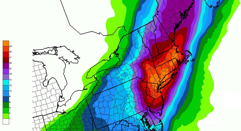
Look at New York City in the orange shading (Larger image). In a nutshell, there was a 90% probability that 33 inches of snow or less would fall during the specified 72-hour period. Now this forecast might strike you as a huge hedge by forecasters, but at least it alerts weather consumers that accumulations less than 33 inches are possible. Here's an alternative way to think about it: There was only a 10% probability of more that 33 inches of snow (some consolation, eh?). And yes, we realize that most folks will probably focus only on the high end of this probabilistic snowfall forecast, but we wanted to show you that there are, indeed, probabilistic alternatives, even if this probabilistic forecast seems to leave a lot to be desired. In its defense, this probabilistic forecast gave forecasters a sense for the maximum potential snowfall.
Okay, now that you're up to speed with regard to the existence of probabilistic alternatives to deterministic forecasts, let's go back and fill in some of the forecasting details surrounding the Blizzard of January 25-29, 2015. From a forecasting perspective, what happened? Was there a more scientifically sound alternative to the deterministic snowfall forecast?
On January 25, within a period of roughly 12 hours after the 06 UTC model runs became available, the forecast in New York City evolved from a Winter Storm Watch (snow accumulations of 10 to 14 inches) at 3:56 A.M. (local time) to a Blizzard Warning (snow accumulations of 20 to 30 inches) at 3:19 P.M (local time). Compare the two forecasts. The model runs at 06, 12, and 18 UTC were at the heart of the busted forecast in New York City and other cities and towns on the western flank of the storm's heavier precipitation shield.
Of course, we realize that hindsight is always 20-20, but we want to share our fundamental approach to using computer guidance in such situations: In a nutshell, don't simply choose "the model of the day." Unfortunately, on January 25, 2015, some forecasters defaulted too quickly to the European model and elevated it to "the model of the day." This decision to essentially use the solution from one specific deterministic forecast eventually led to a public outcry in New York City and other cities and towns of the western flank of the storm, where actual snowfall totals were far less than predicted.
Why was the western flank of this nor'easter such an issue? The simple answer is that the greatest forecast uncertainty lay on the storm's western flank. To understand this claim, check out the image below. The image displays the probability of 30 millimeters (a little more than one inch) of liquid precipitation during the 30-hour period from 00 UTC on January 27 to 06 UTC on January 28, 2015. For the record, the probabilities were determined by a series of 52 model simulations using the European model. All 52 simulations were initialized with slightly different conditions at 00 UTC on January 25, 2015. At New York City during this forecast period, there was a 60% to 70% probability of a little more than one inch of liquid precipitation = ten inches of snow (assuming a 10:1 ratio).
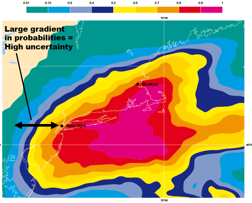
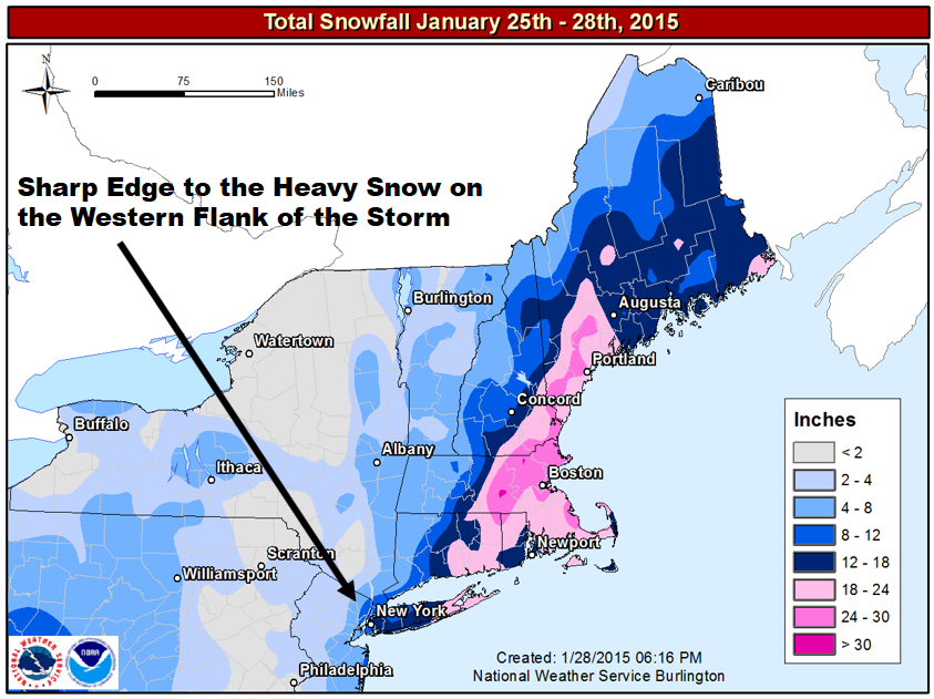
Note the large gradient in probabilities from New York City westward. Such a large gradient means that probabilities decreased rapidly westward from New York City. Thus, determining the western edge of heavy snowfall was fraught with potential error (as opposed, for example, to the smaller gradient in probabilities over eastern Long Island). In other words, there was high uncertainty in the snowfall forecast over New York City. The bottom line here is that the large gradient in probabilities was the footprint of an imminent sharp edge to the heavy snow on the western flank of the storm. A slight eastward shift in the low's track would have meant that a lot less snow would have fallen at New York City and cities and towns to the west of the Big Apple (hence, the high uncertainty). And, of course, that's exactly what happened.
In general, how should forecasters deal with the dilemma of uncertainty? Our approach to weather forecasting is akin to playing bingo ... the more bingo cards you play, the greater the odds that you'll win. Indeed, we strive to include the input of as many computer models as we can into our forecasts, and this approach logically includes ensemble forecasts.
We'll share more details about ensemble forecasting later in Chapter 17. For now, all you need to know is that the most basic kind of ensemble forecasts is a series of computer predictions (all valid at the same time) that were generated by running a specific model multiple times. Each run, called an ensemble member, in the series is initialized with slightly different conditions than the rest. If all the ensemble members of, say, the GFS model, have slightly different initial conditions but essentially arrive at the same forecast, then forecasters have high confidence in the ensemble forecast. By the way, the ensemble forecasting system tied to the GFS model is formally called the GEFS, which stands for the Global Ensemble Forecast System. For the record, the GEFS is run daily at 00, 06, 12, and 18 UTC.
Before we look at the GEFS in action, we should point out here that sometimes an ensemble prediction system (EPS) is based on more than one model, and we will look at a multi-model EPS in just a moment.
For now, let's examine forecasts from the GEFS in the context of the Blizzard of January 25-28, 2015. The image below displays the individual 24-hour forecasts by all the ensemble members of the GEFS. Each of these ensemble members were initialized with slightly different initial conditions at 12 UTC on January 26, 2015 (and, thus, they were all valid at 12 UTC on January 27, 2015). The color-filled circles indicate each ensemble member's predicted center of the nor'easter's minimum pressure. The black star marks the analyzed center of the low-pressure system.
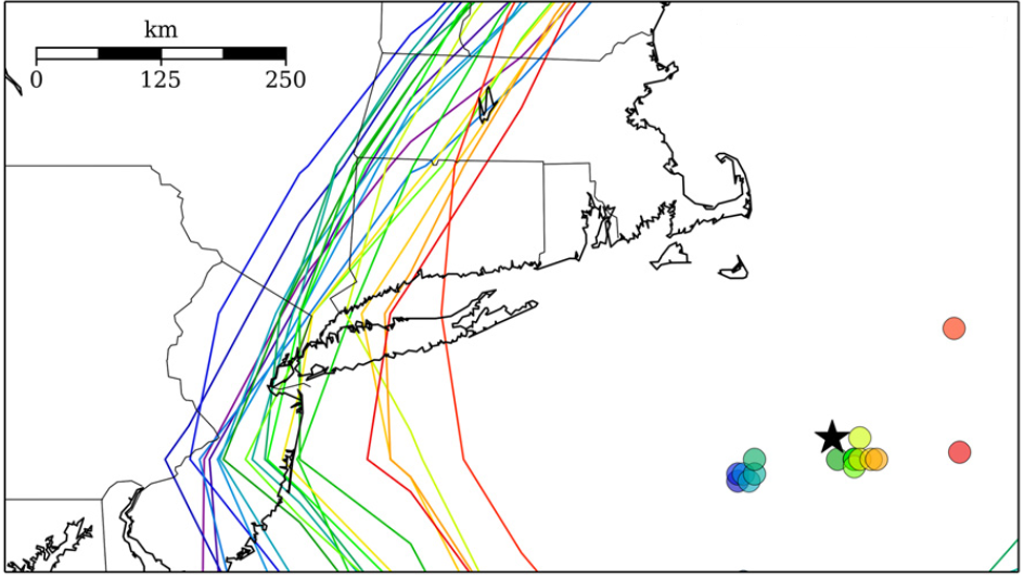
Clearly, there were ensemble members whose forecasts for the low's center were too far west and too far east (compared to the analyzed center). In other words, there was uncertainty associated with the predicted center of low pressure even at this rather late time. Meanwhile, the multi-colored contours represent each ensemble member's forecast for the westernmost extent of a snowfall of ten inches. Even with roughly 24 hours remaining before the storm hit New York City, the large "spread" in the positions of these contours still indicated a fairly high degree of uncertainty on the storm's western flank. Stated another way, this was, without reservation, not the time to be choosing the "model of the day."
Presenting a probabilistic forecast, such as the European ensemble forecast for probabilities that we discussed above (revisit this image), is a much more scientifically sound way to convey uncertainty to the general public. Yes, there was a big difference between the probabilistic forecast by the European ensemble forecast and the deterministic forecast based on a single run of the operational European model. To be perfectly honest, however, probabilistic predictions for snowstorms have yet to catch on in this country because the public demands deterministic forecasts for snowfall.
In lieu of a probabilistic presentation of the forecast when there's high uncertainty, the mean prediction of all the ensemble members of a specified model (or a multi-model ensemble prediction system) can be robust and fairly reliable. At the very least, the mean ensemble forecast can get you in the neighborhood of a reasonable deterministic weather forecast.
Take LaGuardia Airport, for example, which is not very far from New York City (map). LaGuardia Airport received 11.4 inches of snow from the Blizzard of January 25-28, 2015 (9.8 inches of snow were measured at Central Park in New York City). Given LaGuardia's proximity to New York City, the forecast at LGA also had a fairly high degree of uncertainty. But the mean ensemble forecast from a multi-model ensemble prediction system called the Short Range Ensemble Forecast (SREF, for short) produced a snowfall forecast much more accurate than the historic deterministic forecast issued by the National Weather Service. For the record, the SREF has 26 ensemble members from two different models (13 members associated with each model). The mean ensemble forecast yields a total of 27 forecasts available from the Short Range Ensemble Forecast. For the record, the SREF is run four times a day (at 03, 09, 15, and 21 UTC).
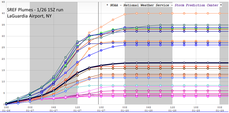
Above is the SREF plume for LaGuardia Airport. An ensemble plume such as this is like a forecast meteogram - it plots the time evolution of a predicted meteorological parameter from all 26 SREF ensemble members (in this case, total snowfall). The upward swing in the plots of all 26 ensemble members (multi-colors) from 18 UTC on January 26 indicates that snow was accumulating at the specified time, and any point on the upward-slanting plots represents the running predicted snowfall total up to this time. For example, the maximum predicted snow accumulation at LaGuardia at 00 UTC on January 27 was 5 inches (you can read the running total snowfall off the vertical axis of the plume). The mean ensemble forecast is plotted in black.
Almost all the ensemble members had snow accumulating until roughly 18 UTC on January 27 (the vertical gray line). A few ensemble members had snow accumulating at LaGuardia for a short time after 18 UTC on January 27. Thereafter, all the ensemble members "leveled out" and ran parallel to the time axis, indicating that accumulating snow was predicted to have stopped.
Focus your attention on the mean forecast. If you project the rightmost portion of the mean forecast that is parallel to the horizontal time axis to the snow totals on your left (see image below), you can read off the mean forecast for total snowfall at LaGuardia during this time period, which essentially covered the entire snowstorm. The mean forecast for total snowfall was approximately 18 inches, a little more than 6 inches too high, but much closer than the 2-3 feet predicted by the National Weather Service. A much more palatable forecast, wouldn't you agree?
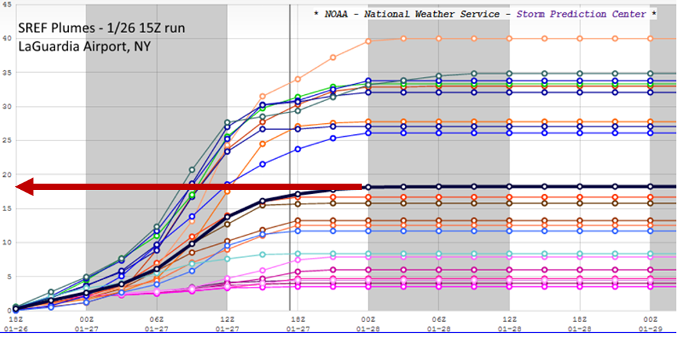
Needless to say, there was a large spread in the forecast by ensemble members, varying from snowfalls of only a few inches to as much as 40 inches. A deterministic forecast of 3-40 inches would never be acceptable, but the mean ensemble forecast of 18 inches was, at the very least, reasonable compared to the historic predictions of 2-3 feet. A word of caution ... If the individual predictions by all the SREF ensemble members had been clustered almost strictly above or strictly below the mean ensemble forecast, then the mean forecast might not have been reasonable. In such situations, a probabilistic forecast would be much more prudent. Maybe one day in the future, weather forecasts will have a more probabilistic tenor, especially in cases that have a high degree of uncertainy (such as New York City in the build-up to the Blizzard of January 25-28, 2015).
In fairness to the "favored" European model, its ensemble mean forecast for New York City was practically spot on. As you recall, the operational European model was way too high in the Big Apple. Such is the potential of forecasting using the ensemble mean as a starting point. Always remember, however, that the ensemble mean is no guarantee.
We offer this preview of ensemble forecasting to make a first impression that looking at more than one computer model is like playing bingo with more than one card ... it increases the odds of winning. Odds are higher that you will make a more accurate forecast if you don't wander too far from the mean ensemble forecast, as long as there's roughly the same number of ensemble members above and below the mean forecast (revisit the LaGuardia Airport SREF plume above).
Parting Words
Having just warned you about "choosing the model of the day," we point out that forecasters can still glean valuable insight by looking for trends in successive runs of individual models. In the case of the Blizzard of January 25-28, 2015, the pivotal forecast period, as we mentioned earlier, was 06 UTC to 18 UTC on January 25, when there was a westward trend (shift) in the predictions for the track of the surface low and the corresponding areas of heaviest liquid equivalent. Both the operational models (the European model, for example) and a group of ensemble members in the 09 UTC run of the SREF were at the heart of these two trends. Forecasters "jumped" at the trends and accordingly increased their earlier forecasts to historic levels. In retrospect, the westward shift in the 09 UTC SREF apparently produced a "confirmation bias" in forecasters, which seemed to confirm the western shift in earlier operational models. This confirmation supported their instincts to predict potentially historic snowfall, despite the uncertainty on the western flank of the storm.
Even after the operational models and ensemble forecasts started to slowly back off a historic snowstorm on the nor'easter's western flank (in New York City, most notably), forecasters stuck to their guns and kept the snowfall predictions in New York City at 2-3 feet. "Loss aversion," which is essentially the resistance by forecasters to admit to themselves that their historic snowfall forecasts were way too high, might have played a role in the relatively slow response in backing off historic snowfall forecasts. Loss aversion is not restricted to weather forecasting, however. It is a facet of the human condition. Indeed, loss aversion is "our tendency to fear losses more than we value gains" (New York Times, November 25, 2011).
The internal consistency of individual models is still a consideration that experienced forecasters routinely weigh. Forecasters have higher confidence in models whose successive runs do not waver from a specific weather scenario (the models were not very internally consistent leading up to the Blizzard of January 25-28, 2015). Fickle models that flip-flop between different solutions (as they did before the Blizzard of January 25-28, 2015) do not instill much confidence, so forecasters should give them less weight.
When computer models suggest the potential for a big snowstorm, a few "old-school" forecasters might wait as long as a couple of days to see whether consecutive model runs are internally consistent before going public with deterministic predictions for snowfall. Even though this wait-and-see approach is somewhat conservative, jumping the gun with regard to predicting snow totals sometimes results in forecasters having "egg" on their collective faces, which only serves to diminish public confidence in the profession of meteorology. However, waiting until the last possible moment to issue deterministic snowfall forecasts is, unfortunately, an approach no longer followed in this fast-paced world of data shoveling.
Forecasters also check to see if a model’s solution agrees with evolving weather conditions. For example, if a particular six-hour forecast from the NAM predicted rain in southern Ohio with surface temperatures at or just above the melting point of ice, but observations at that time indicated heavy snow with temperatures several degrees below 32oF (0oC), forecasters would tend to discount (or at least view with a wary eye) the model's solution beyond that time.
Until now, we've focused our attention on short-range forecasting, which typically deals with a forecast period that covers up to 72 hours into the future. Let's now turn our attention to medium-range forecasting.