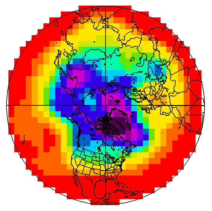
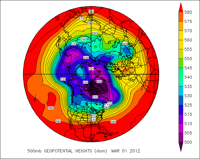
With a little imagination, you can perhaps see the problem with using a grid-point model to simulate atmospheric processes. Consider the map below that shows the 500-mb height pattern for March 1, 2012. From this polar stereographic perspective, you can see numerous long waves positioned around the globe. Now check out a gridded version of this height data. One of the first things you'll notice is that we have almost completely lost the sense of the waves that make up the pattern. Furthermore, by gridding the data in such a way, some of the finer features of the height pattern have vanished. Since many variables in the atmosphere can be visualized by wave-like structures (rather than square boxes), wouldn't it be better to model the atmosphere this way? It turns out there is a numerical weather prediction model that uses waves instead of grid boxes ... a spectral model.
The primary spectral model used by the National Centers for Environmental Prediction is the Global Forecast System, or GFS, for short. Rather than dividing the atmosphere into a series of grid boxes, the GFS describes the present and future states of the atmosphere by solving mathematical equations whose graphical solutions consist of a series of waves.
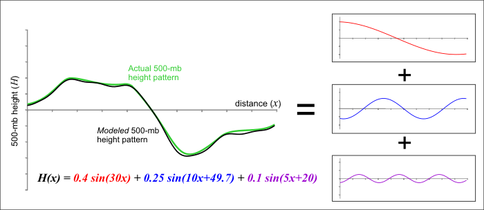
How is this done? As you might imagine, the mathematics of spectral modeling are beyond the scope of this book, but the key concept lies in the idea that any wavelike function can be replicated by adding various basic waves together. As an example, check out the figure below. Think of the green line as an actual 500-mb height line that could, for example, stretch across the U.S. and represent a long-wave ridge and trough. A spectral model first approximates this pattern by adding together a set of simple wave functions -- in this example, variations of a trigonometric function called the "sine" are used. We were able to closely duplicate the green curve by adding together three different wave functions (the red, blue, and purple curves). The resulting black curve is fairly close to the green curve and has a simple equation (mathematically speaking, of course) that a computer has no difficulty interpreting.
Thus, the first step in using a spectral model is to analyze the current patterns in the observed atmospheric variables and then closely replicate these patterns using sums of simple wave functions. One advantage to this approach is that the way in which wave functions change in space and time is well known. This mathematical fact helps illustrate a major advantage of spectral models -- they run faster on computers. Given these computational time savings, spectral models better lend themselves to longer-range forecasts than grid-point models like the NAM. Grid-point models push modern supercomputers to their limits just to churn out a respectable three- or four-day forecast. However, the GFS is routinely run out to 384 hours (16 days) four times a day (starting at 00 UTC, 06 UTC, 12 UTC and 18 UTC). One final advantage of spectral models is that their solutions are available for every point on the globe, rather than being tied to a regular grid array.
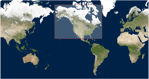
Lest you think that spectral models are the end-all-be-all of numerical weather prediction models, let us point out some of their shortcomings. While we just raved about the versatility of spectral models to crank out long-range forecasts, we would be remiss not to point out that they sometimes take a back seat to grid-point models. First, spectral models don't perform well on finite domains (regions with boundaries - see figure below). That's because the mathematical functions that represent the waves in the model are unbounded. Conveniently, however, we live on a sphere. This means that the wave functions can extend all the way around the globe, reconnecting where they began. Therefore, spectral models typically cover the entire globe rather than a relatively focused region, as grid-point models often do.
Another shortcoming of spectral models is that, while many atmospheric variables exhibit a wavelike appearance (the 500-mb height pattern, for example), some most definitely do not. Think about a day with showery or convective precipitation. The often-irregular spatial pattern of precipitation on such a day certainly does not lend itself to smooth, wavelike functions. For predicting such variables, spectral models just can't cut it. To overcome such problems, the GFS incorporates its own internal grid-point model to calculate troublesome variables and feed them back into the spectral mathematics. Yes, numerical weather prediction gets complicated awfully fast!
Bottom Line: When it comes to choosing between the grid-point and spectral techniques, there are indeed trade-offs.
Before we move on to actually interpreting some numerical weather prediction charts, let us point out that spectral models (despite being based on sound mathematical functions) are not immune from computational error. Simply put, a finite sum of wave functions cannot exactly reproduce every wave pattern. Notice the subtle differences between the black and green curves in this previous figure. These differences arise because only three different wave patterns are being added together. If we were to increase that number to 10 or 20 different waves, the match would be much closer (but still not perfect). Spectral models measure their "resolution" in terms of the number of waves that are added together to reproduce a particular pattern. At some point, there is a computational limit to how many new functions can be summed – thus, some error will be always be introduced, owing to the difference between the actual pattern and the pattern produced by the spectral model. As we demonstrated in this figure, our approximation of the observed pattern might be very good, but it takes only a very small amount of error to start leading the model astray (more on this later).
Now that you understand some of the basics behind numerical weather prediction models, let's get down to actually learning how to interpret model charts – sometimes called the "progs" – short for “prognostications.” Read on.