
The world consumes massive quantities of energy, with much of that energy embodied by GHG-emitting fossil fuels.[1] This image shows primary energy consumption by world region in 2015. Together, China and the United States represent 40% of global energy consumption. This is why our cooperation to solve climate change-related challenges is so pivotal.
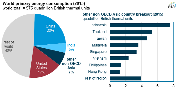
| United States | 17% |
|---|---|
| Other non-OECD Asia | 7% |
| India | 5% |
| China | 23% |
| Rest of the World | 48% |
| Country | Quadrillion British THermal Units |
|---|---|
| Indonesia | 7.5 |
| Thailand | 5.5 |
| Taiwan | 5 |
| Malaysia | 3.7 |
| Singapore | 3.5 |
| Vietnam | 2.5 |
| Philippines | 1.26 |
| Hong Kong | 1.2 |
| Rest of the Region | 4 |
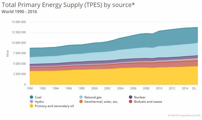
The next image shows a graph of global consumption by fuel type for 1990-2016. Overall consumption has almost doubled in this time period (and has more than doubled if we went back 40 years). The three fossil fuels (oil, coal, and natural gas) dominate, encompassing between 80 to 90 percent of energy consumption throughout the period. Oil provides the largest proportion of energy, but proportionally has lost ground to coal and especially natural gas (why might that be?). Coal has had an upsurge in the 21st century, especially after 2005, and may become the leading fossil fuel in the future as oil supplies drop and demand for energy increases in places such as China and India, with massive coal reserves but little oil and natural gas. Biomass and hydroelectric power grew a little. Other renewables are a trivial proportion of the global energy picture. Clearly, the grip of the GHG-producing fossil fuels on the world energy picture is strong.
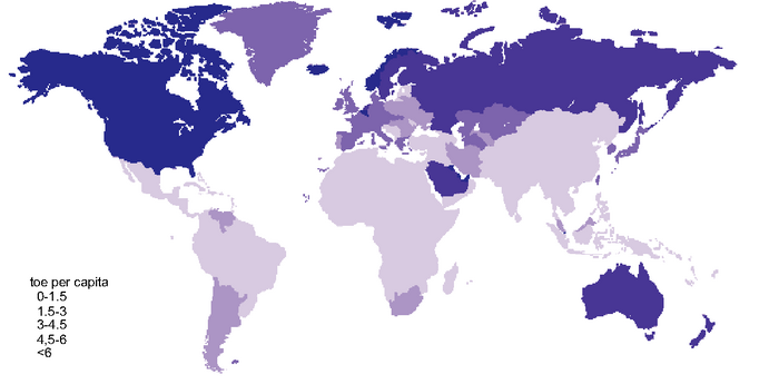
The next image shows a map of per capita energy consumption across the globe. An obvious general pattern emerges: low-latitude countries have very low per capita consumption –– and therefore low per capita GHG emissions –– while mid- to high-latitude countries have high per capita consumption and emissions. (Exceptions exist. For example, Saudi Arabia has anomalously high per capita energy consumption compared to surrounding countries because it is a wealthy, oil-rich country with a low population.) On the one hand, the pattern suggests that low-latitude countries with very low per capita energy consumption and very high populations such as China, India, and Indonesia, will become significant sources of GHGs as their per capita consumption figures rise. Indeed, China, which has the world’s largest population, has rapidly rising per capita energy consumption. Combined with its focus on coal as its primary energy source, China is now the world’s largest emitter of GHGs. India is hot on China’s heels, with a rapidly expanding coal-based economy. On the other hand, the pattern also suggests global inequities because the mid- to high-latitude countries have such very high per capita energy consumption figures. Opportunities exist for these countries to reduce per capita consumption by undertaking energy efficiency measures, adopting non-GHG-producing energy types, and modifying their energy-intensive lifestyles. This contrast between the low latitudes (the global South) and the mid- to high latitudes (the global North) is at the heart of the ongoing United Nations climate negotiations.
[1] Most of the remainder of this lesson is based on figures presented in Sims, et al., 2007. Energy supply. In: Climate Change 2007: Mitigation. Contribution of Working Group III to the Fourth Assessment Report of the Intergovernmental Panel on Climate Change [B. Metz, et al. (eds)], Cambridge University Press.