Trends, Weather, and Climate Change
On June 29, 2021, the mercury at Portland, Oregon reached 116oF. December 10 and 11, 2021 saw EF4 tornadoes roar through Kentucky and other states, killing 88 and wounding more than 630. In December 2021, 202 inches of snow fell in the Sierra Nevada of California. Hurricane Sandy made landfall in New Jersey on October 29th, 2012, a very late point in the year for a storm to reach the northeastern US coast. January 8th, 2013 was the hottest day ever for Australia with an average temperature for the entire continent of 40.3oC (nearly 105oF). The AVERAGE (day and night) temperature in Phoenix in June 2017 was almost 95 degrees. And nearly 61 inches of rain fell around Houston during Hurricane Harvey in August 2017. Each of these events provoked arguments in favor or against global warming. Yet, on their own, none of them were definitive proof one way or another.
To make a case for climate change, we need to find the average global climate signal, which is often difficult to discern from the noise of short-term variations and regional differences associated with what we call weather. It is very important to remember that climate is the time-averaged weather, so when we are talking about climate change, we are not talking about the weather that you experience on a daily or seasonal basis — a single heat wave is not evidence of global climate warming, just as one cold snap does not constitute global climate cooling. But repeated, unusual heat waves will shift the average temperature of a region, and this can be taken as a manifestation of a warming climate. The climate is inherently variable over time and space, so detecting a meaningful trend is a challenge that requires great care, a lot of data and often some complex statistics.
Now, a word of warning, you might find the remainder of this page a little dull! However, it happens to be one of the most essential topics of the whole issue of climate change. We absolutely have to understand the significance of trends if we are going to interpret them!
Let’s consider a hypothetical case to help you better understand the nature of the problem. The mean annual temperature is the average temperature over the course of a year, and it varies in a way that we can simulate with a randomly generated string of numbers (geoscientists often refer to such variation as “noise”) added to a constant, long-term mean temperature. We would see something like this:
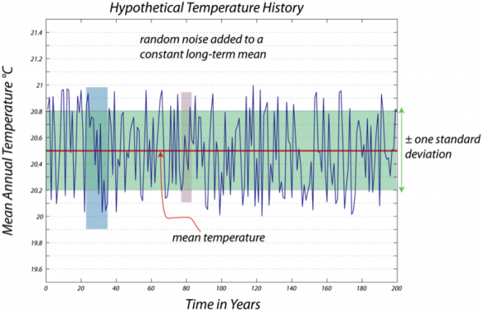
This is a line graph titled "Hypothetical Temperature History." The graph represents a dataset described as "random noise added to a constant long-term mean temperature." Here’s a detailed breakdown of the graph’s components:
Axes:
- The horizontal axis (x-axis) represents "Time in Years." It spans from 0 to 200 years, with major markers at intervals of 20 years (0, 20, 40, 60, 80, 100, 120, 140, 160, 180, 200).
- The vertical axis (y-axis) represents "Mean Annual Temperature" in degrees Celsius (°C). It ranges from 19.6°C at the bottom to 21.4°C at the top, with major markers at intervals of 0.2°C (19.6, 19.8, 20.0, 20.2, 20.4, 20.6, 20.8, 21.0, 21.2, 21.4).
Main Data:
- The graph shows a single blue line that represents the mean annual temperature over the 200-year period. The line fluctuates up and down in a jagged, irregular pattern, indicating random variations in temperature.
- These fluctuations are described as "random noise" added to a constant long-term average temperature.
Mean Temperature:
- A red dashed line runs horizontally across the graph at 20.4°C. This line is labeled "mean temperature," representing the constant long-term average temperature around which the data fluctuates.
- The blue line (temperature data) oscillates above and below this red dashed line throughout the graph.
Standard Deviation Band:
- A shaded green band surrounds the red dashed line (mean temperature). This band extends from 20.2°C to 20.6°C, meaning it covers a range of 0.2°C above and below the mean of 20.4°C.
- The band is labeled "± one standard deviation," indicating that most of the temperature data points (the blue line) fall within this range, as expected in a dataset with random noise following a normal distribution.
- The green band spans the entire width of the graph, from 0 to 200 years.
Highlighted Sections:
- There are two specific time periods highlighted on the graph:
- Blue Shaded Area (20 to 40 years):
- Between the 20-year and 40-year marks on the x-axis, a vertical blue shaded rectangle highlights this time period.
- During this period, the blue temperature line dips slightly below the mean temperature of 20.4°C, with some points approaching 20.2°C or slightly lower.
- This suggests a short-term cooling trend within the random fluctuations.
- Pink Shaded Area (100 to 120 years):
- Between the 100-year and 120-year marks on the x-axis, a vertical pink shaded rectangle highlights this time period.
- During this period, the blue temperature line shows a noticeable peak, rising above the mean temperature.
- A specific data point around the 110-year mark is marked with a red arrow pointing to the blue line, where the temperature reaches approximately 20.8°C.
- This indicates a short-term warming trend within the random fluctuations.
- Blue Shaded Area (20 to 40 years):
General Trend:
- Despite the short-term fluctuations highlighted in the blue and pink sections, the overall long-term trend of the temperature remains constant at the mean of 20.4°C.
- The random noise causes the temperature to vary, but there is no consistent upward or downward trend over the 200 years.
Purpose of the Graph:
- The graph illustrates how random noise can create short-term variations in temperature data, even when the long-term average temperature remains constant.
- The highlighted sections (cooling between 20-40 years and warming between 100-120 years) show how random fluctuations can sometimes appear as temporary trends, but these do not reflect a change in the long-term mean.
In this case, you might say that if the temperature strayed out of the green zone, you have unusually hot or cold weather, and you would expect this kind of temperature excursion to be a standard feature of the natural variability of the region's climate. But, the green zone has more or less fixed limits, so the standard for calling something a heat wave does not change over time.
Now, let’s look at another hypothetical case where the climate really is warming, but there is still the natural variability or noise on a shorter timescale.
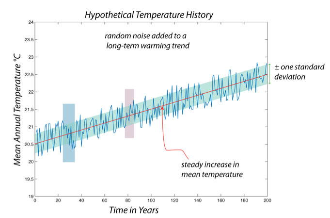
This is a line graph titled "Hypothetical Temperature History." The graph represents a dataset described as "random noise added to a long-term warming trend." Here’s a detailed breakdown of the graph’s components:
Axes:
- The horizontal axis (x-axis) represents "Time in Years." It spans from 0 to 200 years, with major markers at intervals of 20 years (0, 20, 40, 60, 80, 100, 120, 140, 160, 180, 200).
- The vertical axis (y-axis) represents "Mean Annual Temperature" in degrees Celsius (°C). It ranges from 19.0°C at the bottom to 24.0°C at the top, with major markers at intervals of 0.5°C (19.0, 19.5, 20.0, 20.5, 21.0, 21.5, 22.0, 22.5, 23.0, 23.5, 24.0).
Main Data:
- The graph shows a single blue line that represents the mean annual temperature over the 200-year period. The line fluctuates up and down in a jagged, irregular pattern, indicating random variations in temperature.
- These fluctuations are described as "random noise" added to a long-term warming trend.
Mean Temperature Trend:
- A red dashed line runs diagonally across the graph, sloping upward from the bottom left to the top right. This line is labeled "steady increase in mean temperature," representing the long-term warming trend.
- The red dashed line starts at approximately 19.5°C at year 0 and rises steadily to about 23.5°C by year 200, indicating a consistent increase in the mean temperature over time.
- The blue line (temperature data) oscillates above and below this red dashed line throughout the graph, but the overall trend of the blue line follows the upward slope of the red dashed line.
Standard Deviation Band:
- A shaded light blue band surrounds the red dashed line (mean temperature trend). This band extends approximately 0.2°C above and below the red dashed line at any given point.
- The band is labeled "± one standard deviation," indicating that most of the temperature data points (the blue line) fall within this range, as expected in a dataset with random noise following a normal distribution.
- The light blue band spans the entire width of the graph, from 0 to 200 years, and slopes upward along with the red dashed line.
Highlighted Sections:
- There are two specific time periods highlighted on the graph:
- Blue Shaded Area (20 to 40 years):
- Between the 20-year and 40-year marks on the x-axis, a vertical blue shaded rectangle highlights this time period.
- During this period, the blue temperature line dips slightly below the red dashed line (mean temperature trend), with some points approaching 19.5°C or slightly lower.
- This suggests a short-term cooling anomaly within the overall warming trend.
- Pink Shaded Area (100 to 120 years):
- Between the 100-year and 120-year marks on the x-axis, a vertical pink shaded rectangle highlights this time period.
- During this period, the blue temperature line shows a noticeable peak, rising above the red dashed line.
- A specific data point around the 110-year mark is marked with a red arrow pointing to the blue line, where the temperature reaches approximately 21.5°C, while the red dashed line (mean trend) is around 21.0°C at that point.
- This indicates a short-term warming spike within the overall warming trend.
- Blue Shaded Area (20 to 40 years):
General Trend:
- The overall long-term trend of the temperature shows a steady increase, as indicated by the upward-sloping red dashed line. The mean temperature rises from about 19.5°C at year 0 to about 23.5°C by year 200, an increase of approximately 4°C over 200 years.
- The random noise causes the temperature to fluctuate around this trend, creating short-term variations like the cooling between 20-40 years and the warming spike between 100-120 years.
- Despite these fluctuations, the overall direction of the temperature data (blue line) follows the upward trend of the red dashed line.
Purpose of the Graph:
- The graph illustrates how random noise can create short-term variations in temperature data, even when there is a clear long-term warming trend.
- The highlighted sections (cooling between 20-40 years and warming between 100-120 years) show how random fluctuations can sometimes appear as temporary anomalies, but the long-term warming trend remains consistent.
If you think of the upper edge of the green zone on the previous figure as indicating the line for defining a heat wave, look what happens in a case where there is a steady warming of the climate, with the same kind of weather causing the rapid ups and downs. If at time 0, we said that a temperature of 21°C was a heat wave, that becomes the mean climate temperature by time 60 in the above figure — so, what previously was a rare warm spell is now just the standard. This means that, by older standards, "heat waves" become more common as time goes on.
Note that, once again, we can find areas in this above figure where a shorter time period would seem to indicate cooling or warming. This reinforces the idea that we can’t really talk about climate change by looking at just a few years, and leads to the question of how much time we do need to look at to get a good understanding of climate change. In general, the longer, the better. But just to illustrate this, consider the following, where we take the same kind of hypothetical temperature record as above and systematically find the linear trends over time, with windows of varying length that slide along through the 200-year record.
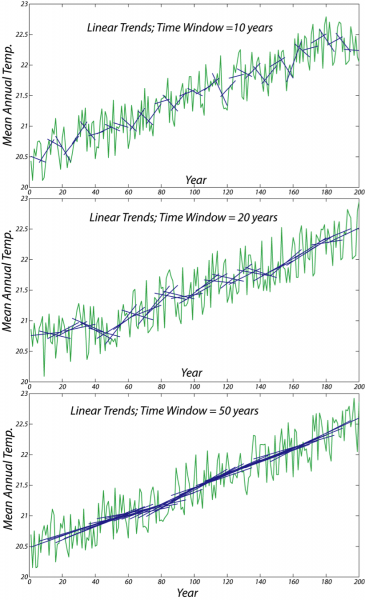
The image consists of three line graphs stacked vertically, each showing the mean annual temperature over a span of approximately 200 years, from around year 0 to year 200. The y-axis of each graph represents the mean annual temperature, ranging from 20.0 to 22.5 degrees. The x-axis represents the years.
Each graph illustrates the temperature data with two types of lines:
- A blue line representing the raw mean annual temperature data, which fluctuates significantly year to year.
- A green line showing the linear trend of the temperature data over a specific time window.
The three graphs differ in the time window used to calculate the linear trend:
- The top graph uses a time window of 10 years. The green linear trend line shows more variability, closely following the short-term fluctuations in the blue temperature data, but still indicates a general upward trend over the 200-year period.
- The middle graph uses a time window of 20 years. The green linear trend line is smoother than in the 10-year window, showing less short-term variability but still reflecting an overall upward trend in temperature.
- The bottom graph uses a time window of 50 years. The green linear trend line is the smoothest of the three, with minimal short-term fluctuations, clearly depicting a steady upward trend in mean annual temperature over the 200 years.
Overall, all three graphs demonstrate a consistent long-term increase in mean annual temperature, with the longer time windows (20 and 50 years) providing a clearer view of the overall trend by smoothing out short-term variations.
Why do we care about this? There are all sorts of reasons why this is important and interesting, but here are three primary reasons.
- The first reason for studying recent climate is that if we understand how climate has been changing in the recent past, we can establish a trend that we can use to project into the future.
- The second reason for studying recent climate is that knowing the history of climate change gives us a chance to understand how the climate system responds to various controls; for instance, we know the histories of solar insolation, fossil fuel burning, land clearing, addition of other pollutants to the atmosphere (other greenhouse gases and particles that block sunlight), and volcanic eruptions. Knowing these histories and knowing how the climate has changed, we are in a position to develop a good understanding of the role that each of these controls plays in changing the climate, which helps us predict future climate change with greater confidence.
- Finally, if climate change is real, then we cannot ignore it when planning for our future. The consequences of future climate change may require some difficult choices, so we had better be sure that there is a firm basis for the reality of climate change.