Temperature: Instrumental Records
Temperature is probably the most important observation regarding the global climate, but how to measure the temperature of something as large as the Earth is complex. Climate scientists have taken a variety of approaches to answering this question, depending on the timescale of interest; we’ll have a look at the results of these different approaches in this section.
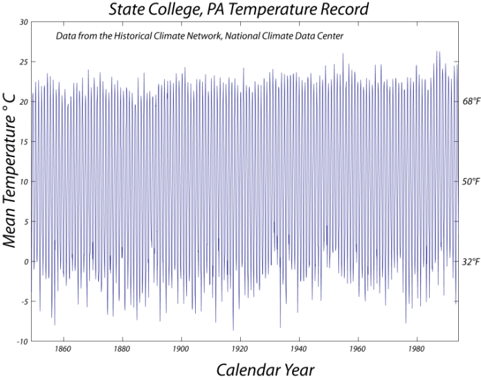
The first approach is the most obvious — you use thermometer data; this is usually called the instrumental record of climate. Let’s take a look at what some of these data look like for a place familiar to the authors — State College, PA. These data come from the US Historical Climatology Network, where you can find data from stations around the US. These data are the monthly mean temperatures from 1849 to 1994, so there has already been some averaging of the data to remove the day-to-day variability.
Outline Description of Audio Waveform Visualization
- Overview
- Three line graphs stacked vertically.
- Each graph displays monthly mean temperature over approximately 200 years.
- X-axis: Years (from 0 to 200).
- Y-axis: Monthly mean temperature (ranging from 20.0 to 22.5 degrees).
- Graph Components
- Thin Blue Line: Represents the monthly mean temperature data.
- Shows significant variation due to the annual cycle of temperature change.
- Variation is a bit more than 20°C, reflecting seasonal fluctuations.
- Green Line: Represents the linear trend of the temperature data.
- Calculated over different time windows for each graph.
- Thin Blue Line: Represents the monthly mean temperature data.
- Graph Details by Time Window
- Top Graph: Time Window = 10 Years
- Title: "Linear Trends; Time Window = 10 years".
- Thin blue line fluctuates widely due to monthly and seasonal changes.
- Green trend line shows more variability, following short-term trends.
- Indicates a general upward trend over the 200-year period.
- Middle Graph: Time Window = 20 Years
- Title: "Linear Trends; Time Window = 20 years".
- Thin blue line continues to show significant monthly variation.
- Green trend line is smoother than the 10-year window, reducing short-term variability.
- Still reflects an overall upward trend in temperature.
- Bottom Graph: Time Window = 50 Years
- Title: "Linear Trends; Time Window = 50 years".
- Thin blue line displays the same monthly variation of over 20°C.
- Green trend line is the smoothest, minimizing short-term fluctuations.
- Clearly shows a steady upward trend in temperature over 200 years.
- Top Graph: Time Window = 10 Years
- Overall Trend
- All three graphs indicate a consistent long-term increase in monthly mean temperature.
- The monthly data highlights a significant annual cycle with temperature variations exceeding 20°C.
- Longer time windows (20 and 50 years) provide a clearer view of the upward trend by smoothing out monthly and seasonal fluctuations.
What we are seeing in the above figure is weather, which is "noisy"; what we want is the climate record from this station, which is not obvious, but we will find it in the first lab exercise for this module. The data for this one station can give us a climate record for the immediate surroundings, but going from this record at one point to the global temperature requires a bit more work.
One approach is shown in the figure below. Say you have an array of weather stations on a map:

- Overview
- A schematic diagram illustrating a method to calculate the area represented by a weather station's temperature record.
- Depicts one of several strategies for this purpose.
- Set against a solid black background.
- Central Element
- Hexagonal Shape:
- A gray hexagon with black outlines, positioned centrally.
- Represents a weather station's area of influence.
- Central Star:
- A blue star located at the center of the hexagon.
- Likely represents the weather station itself.
- Hexagonal Shape:
- Surrounding Elements
- Blue Stars:
- Six blue stars of varying sizes scattered around the hexagon.
- Positioned at different distances and directions from the central hexagon.
- Likely represent other weather stations or reference points.
- Connecting Arrows:
- Red Arrows:
- Three red arrows with dashed lines.
- Extend from the central blue star to three of the surrounding blue stars (top-right, right, and bottom-right).
- Indicate connections or distances between the central weather station and others.
- Green Arrow:
- One green arrow with a dashed line.
- Extends from the central blue star to the top-left corner of the hexagon.
- May represent a specific direction or boundary of influence.
- Red Arrows:
- Blue Stars:
- Interpretation
- The hexagon likely defines the area of influence for the central weather station.
- The surrounding stars and arrows suggest a method of triangulation or spatial analysis.
- Red arrows may indicate distances or relationships to nearby stations for calculating the area.
- The green arrow might highlight a specific boundary or direction in the method.
- The diagram simplifies a strategy for determining how much area a weather station's temperature record represents.
The general approach is to draw lines between a station and all of its nearest neighbors, then find the midpoints of these lines (circles in the figure) then make a polygon that connects the circles, giving an area (in gray). This area (in km2) represents a tiny fraction, fi, of the Earth’s surface that is associated with the temperature, Ti, of this station. If you do this for all stations, and sum all the Ti x fi values from each station, you would have a global temperature (all of the fi values would add up to 1.00).
You can see from the above example that if you have good weather stations spread uniformly across the planet (land and sea) and they have been recording continuously for a long time, then one can take the mean annual temperature of each station and calculate a simple global average for each year, and thus the history of temperature change for our planet. But, as you might imagine, the stations are not uniformly distributed — they are clustered in populated countries — and the number of stations declines as you go backward in time, so the actual process of assembling an instrumental record takes some care. A variety of groups have done this using slightly different data sets and approaches. The trick here is in how you combine the individual temperature records to come up with a global average. This is complicated by the fact that some weather stations may have problems related to things like the "urban heat island effect." Man-made materials retain heat better than open land and the lack of trees also amplifies warming in cities, which are currently warming at double the rate of the global average! Thus, if urban development encroaches on a weather station, the urban heat island effect will make the local temperature rise for reasons that are unrelated to any regional climate change. Researchers have found ways of ensuring that this effect does not skew the results, and many different groups come up with results that are nearly identical, giving us confidence that the data analysis is sound. Just in case you are wondering, the mean surface temperature of the Earth as a whole is 15o C (59o F)!
There are a number of good estimates of the recent history of global temperature change, and they are shown, plotted at the same scale, in the figure below.
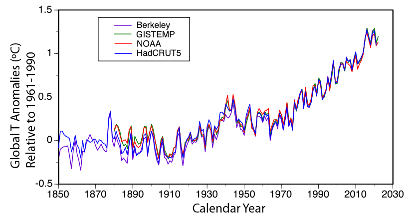
The image is a line graph displaying global temperature anomalies from 1850 to around 2025. The x-axis represents the calendar year, ranging from 1850 to 2030, with major ticks at intervals of 20 years (1850, 1870, 1900, 1930, 1950, 1970, 1990, 2010, 2030). The y-axis represents the global temperature anomalies in degrees Celsius (°C) relative to the mean for the period 1961–1990, ranging from -0.5°C to 1.5°C, with major ticks at intervals of 0.5°C.
The graph includes four distinct lines, each representing temperature anomaly data from a different research group, as indicated by a legend in the top left corner:
- Berkeley (Berkeley Earth Surface Temperature project from the University of California) is shown in purple.
- GISTEMP (from NASA) is shown in green.
- NOAA (from the National Oceanic and Atmospheric Administration) is shown in red.
- HadCRUT5 (from the Climate Research Unit of the University of East Anglia, England) is shown in light blue.
Each line shows the global temperature anomalies over time, with all four datasets exhibiting a similar overall trend: a general increase in temperature anomalies from 1850 to the present. The lines fluctuate year to year, reflecting natural variability, but the upward trend becomes more pronounced after around 1980. From 1850 to 1900, the anomalies are mostly negative (below 0°C), ranging between -0.5°C and 0°C, with some variability. From 1900 to 1980, the anomalies hover around 0°C, with fluctuations between -0.3°C and 0.3°C. After 1980, all four lines show a steady increase, reaching approximately 1.2°C to 1.5°C by 2025.
The four lines are closely aligned, indicating that the different groups—Berkeley, GISTEMP, NOAA, and HadCRUT5—produce similar results despite using slightly different approaches to data selection and conversion of station data into global temperatures. However, there are minor differences in the year-to-year fluctuations, reflecting the variations in methodology among the groups. The graph effectively illustrates the consensus on global warming trends across these
The figure above shows anomalies relative to the mean for 1960-1980. GISTEMP is from NASA, CRUTEM4 is from the Climate Research Unit of the University of East Anglia in England, Berkeley is from the Berkeley Earth Surface Temperature project from the University of California, and NOAA is from NOAA (no surprise here). These different groups use essentially the same data, but they have slightly different approaches to selecting which data to use and how to convert the station data into global temperatures.
It is interesting to see how similar the curves are given that they use different strategies for averaging the data, and some of the records are based on slightly different sets of weather stations. In particular, note that none of these estimates show a general cooling trend over this length of time — they all show warming. Back in the 1800s, there were fewer weather stations, and so it is more difficult to estimate global temperature back then (see figure below), but it gets steadily better as time goes on, and for the last few decades, we have excellent data due to the satellites that now circle the globe taking temperature measurements of every spot on Earth (more on this in a bit). What we see in the figure above is a detail of the blade of the "Hockey Stick" — beginning about 1900, the temperature starts to rise, then it flattens out a bit in the 1950s and early 1960s, and then it increases again at a faster pace since that time. The total warming since 1900 is about 1.1°C as a global average. And many recent years have broken records, 2024 was the warmest year on average and about 1.5°C above 1900 (but its too early to say that this number if permanent warming).
Looking in more detail at the Berkeley temperature estimate, which is based on about 1.6 billion measurements, we can see that the uncertainty, indicated in the figure below by the green band surrounding the red line, gets progressively larger as we go back in time, but the uncertainty is practically zero for more recent decades.
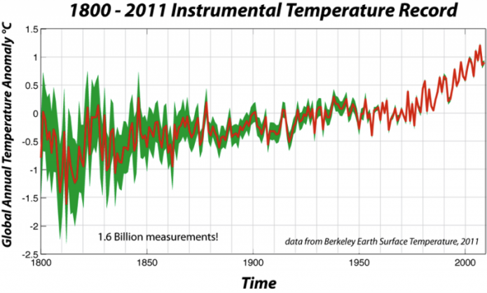
- Overview
- A line graph titled "1800–2011 Instrumental Temperature Record."
- Displays global annual temperature anomalies from 1800 to 2011.
- Data sourced from the Berkeley Earth Surface Temperature project (noted as "data from Berkeley Earth Surface Temperature, 2011").
- Includes a note: "1.6 Billion measurements!" indicating the dataset's scale.
- Axes
- X-Axis: Time
- Spans from 1800 to 2010.
- Major ticks at 50-year intervals (1800, 1850, 1900, 1950, 2000).
- Y-Axis: Global Annual Temperature Anomaly (°C)
- Ranges from -2.5°C to 1.5°C.
- Major ticks at 0.5°C intervals.
- X-Axis: Time
- Graph Elements
- Thick Red Line: Global Mean Temperature Anomaly
- Represents the global mean temperature as an anomaly over the period.
- Starts around -1.5°C in 1800.
- Fluctuates between -1.5°C and -0.5°C until around 1900.
- Shows a gradual increase from 1900 to 1980.
- Rises more sharply after 1980, reaching approximately 1.0°C by 2011.
- Green Shaded Area: Uncertainty Zone
- Surrounds the red line, indicating the uncertainty in the Berkeley temperature reconstruction.
- Wider in earlier years (1800–1850), around ±0.5°C, reflecting greater uncertainty.
- Narrows over time, especially after 1900, to about ±0.1°C by 2011.
- Reflects improved data reliability as more measurements become available.
- Thick Red Line: Global Mean Temperature Anomaly
- Trend and Interpretation
- Shows a clear long-term warming trend over the 211-year period.
- Significant temperature increase observed, especially in the 20th and early 21st centuries.
- Uncertainty decreases over time, correlating with the increase in measurement data.
- Highlights the reliability of the temperature reconstruction, with more precise data in later years.
This is a good point to explore a question about these records. Why does the annually averaged temperature rise and fall in such a complicated fashion? The sun does not vary in its brightness in such a dramatic fashion (the solar cycle related to sunspots can account for a global temperature variation of about a tenth of a degree), and the greenhouse gases that keep our planet warm do not vary in their concentration this much. Instead, it appears that a good deal of the variability seen in these records is related to things like volcanic eruptions and climate system oscillations like the El Niño – La Niña Southern Oscillation (ENSO), which is discussed in detail in Module 6. In short, ENSO is essentially a huge, sluggish, sloshing back and forth of warm water along the equator in the Pacific Ocean — it is like a wave that reflects back and forth between the two edges of the Pacific, and it has a global reach in terms of climate. During the El Niño phase of this oscillation, the warm water is pooled up on the eastern side of the equatorial Pacific and this has the effect of making the whole Earth warmer (the reasons for this are complex, but the effect is quite clear). Conversely, during the La Niña phase, the warm water is pooled up at the western edge of the equatorial Pacific and the whole globe tends to be cooler. The El Niño stage causes flooding rains in California, wet conditions in Florida (recommend you visit Disney during the La Niña!), but crippling drought in Australia and southern Africa.
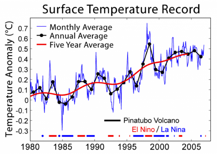
The image is a line graph displaying global surface temperature anomalies from 1980 to around 2008. The x-axis represents the years, ranging from 1980 to 2010, with major ticks at 5-year intervals (1980, 1985, 1990, 1995, 2000, 2005). The y-axis represents the temperature anomaly in degrees Celsius (°C), ranging from -0.3°C to 0.7°C, with major ticks at intervals of 0.1°C.
The graph includes three types of data representations, as indicated by a legend in the top left corner:
- A blue line represents the monthly average temperature anomaly, showing significant short-term fluctuations.
- Black dots represent the annual average temperature anomaly, plotted at yearly intervals, providing a clearer view of year-to-year changes.
- A red line represents the five-year average temperature anomaly, smoothing out short-term variations to highlight longer-term trends.
The temperature anomaly data shows a general upward trend over the period. In 1980, the monthly average starts around 0°C, with the five-year average slightly below 0°C. There are noticeable dips and peaks in the monthly data, such as a dip around 1992 and peaks around 1998 and 2005. The annual averages (black dots) follow a similar pattern but with less variability, while the five-year average (red line) shows a steady increase, rising from near 0°C in 1980 to about 0.5°C by 2008.
Additional annotations on the graph include:
- A black vertical line labeled "Pinatubo Volcano," marking the 1991 eruption of Mount Pinatubo, which corresponds to a noticeable dip in temperature anomalies around 1992–1993 due to the cooling effect of volcanic aerosols.
- Horizontal dashed lines in blue and red, labeled "El Niño/La Niña," indicating periods of El Niño (red) and La Niña (blue) events. These events correspond to peaks (El Niño, e.g., 1998) and dips (La Niña, e.g., 1985, 1999) in the temperature anomalies, reflecting their influence on global temperatures.
Overall, the graph illustrates a clear warming trend over the 28-year period, with short-term variations influenced by natural events like volcanic eruptions and El Niño/La Niña cycles, while the five-year average highlights the long-term increase in global surface temperatures.
The above figure shows the last 25 years of globally averaged instrumental surface temperature measurements. Also shown is the recent history of fluctuations in ENSO and the period of atmospheric disturbance due to the eruption of Mount Pinatubo in the Philippines in 1991, one of the largest of the 20th century; the volcano injected ash and sulfur gases into the upper atmosphere, where they blocked enough sunlight to cool the global climate for a period of about 3 years.
Satellites offer another way of studying temperature changes and they are not subject to the same problems associated with weather station data — they provide a complete coverage of surface temperature on land and at sea. But, as can be seen below, there is a very good agreement between satellite measurements and the weather station data (NOAA surface in the figure below). The only problem is that the satellite data only go back to about 1980.
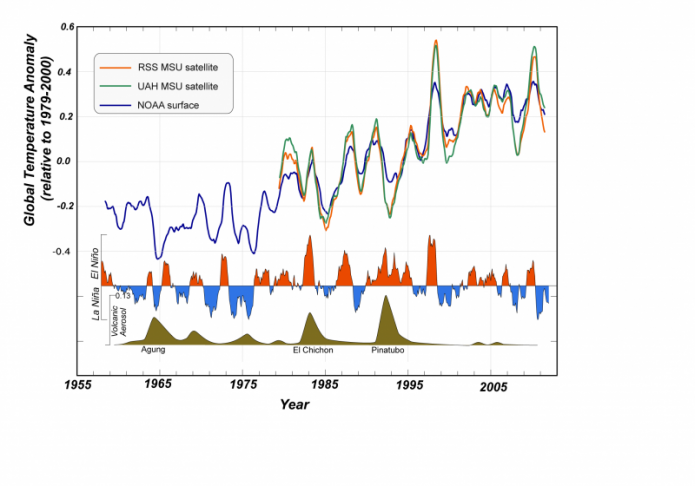
- Overview
- A line graph showing global temperature anomalies from 1955 to around 2010.
- Compares data from satellite and surface measurements.
- Includes annotations for significant climate events affecting temperature.
- Axes
- X-Axis: Year
- Spans from 1955 to 2010.
- Major ticks at 10-year intervals (1955, 1965, 1975, 1985, 1995, 2005).
- Y-Axis: Global Temperature Anomaly (°C)
- Ranges from -0.4°C to 0.6°C.
- Relative to the 1979–2000 average.
- Major ticks at 0.2°C intervals.
- X-Axis: Year
- Graph Elements
- Data Sources (Lines):
- RSS MSU Satellite: Orange line.
- Represents temperature anomalies from the Remote Sensing Systems (RSS) Microwave Sounding Unit (MSU) satellite data.
- UAH MSU Satellite: Green line.
- Represents temperature anomalies from the University of Alabama in Huntsville (UAH) MSU satellite data.
- NOAA Surface: Blue line.
- Represents temperature anomalies from NOAA surface measurements.
- RSS MSU Satellite: Orange line.
- Trends:
- All three lines show a general upward trend in temperature anomalies over the period.
- From 1955 to 1980, anomalies fluctuate around -0.2°C to 0°C.
- After 1980, a steady increase is observed, with anomalies reaching around 0.4°C to 0.5°C by 2010.
- The three datasets are closely aligned, with minor differences in year-to-year fluctuations.
- Data Sources (Lines):
- Climate Event Annotations
- Shaded Areas and Labels:
- La Niña/El Niño:
- Blue shaded areas indicate La Niña events (e.g., 1975, 1989, 1999), corresponding to dips in temperature anomalies.
- Red shaded areas indicate El Niño events (e.g., 1983, 1998), corresponding to peaks in temperature anomalies.
- Volcanic Eruptions:
- Brown shaded areas mark major volcanic eruptions with cooling effects:
- "Agung" (1963): A dip in temperature around 1963–1964.
- "El Chichón" (1982): A dip around 1982–1983.
- "Pinatubo" (1991): A significant dip around 1991–1993.
- Brown shaded areas mark major volcanic eruptions with cooling effects:
- La Niña/El Niño:
- Impact:
- Volcanic eruptions cause temporary cooling, visible as dips in the temperature anomaly lines.
- El Niño events cause temporary warming, visible as peaks, while La Niña events cause cooling, visible as dips.
- Shaded Areas and Labels:
- Interpretation
- The graph shows a clear long-term warming trend from 1955 to 2010, consistent across satellite (RSS, UAH) and surface (NOAA) data.
- Short-term fluctuations are influenced by natural climate events like El Niño, La Niña, and volcanic eruptions.
- The agreement between satellite and surface data reinforces the reliability of the observed warming trend.
The figure above shows the global instrumental temperature record in blue (NASA GISTEMP) is compared to two versions of the microwave sounder satellite (MSS) data of lower atmospheric temperatures (UAH from Univ. of Alabama, Huntsville; RSS from Remote Sensing Systems, Inc.). The timing of the ups and downs in the satellite record are a near-perfect match with the instrumental record, but the magnitude of change is greater according to the satellite measurements. For comparison, we show the history of the El-Niño La-Niña oscillation and periods of volcanic eruptions that load the atmosphere with tiny particles of sulfuric gas that block sunlight and cool the planet. The eruption of Pinatubo in the Philippines had a big effect, and strong El-Niño periods lead to warming — together, these two variables (volcanoes, and El-Niño) along with small fluctuations in sunlight, account for the majority of the "noise" in these records. Another important point of this figure is that it confirms that the instrumental temperature record does a good job of representing what actually happened.
Next, we look at the spatial variations in the temperature over different spans of time.
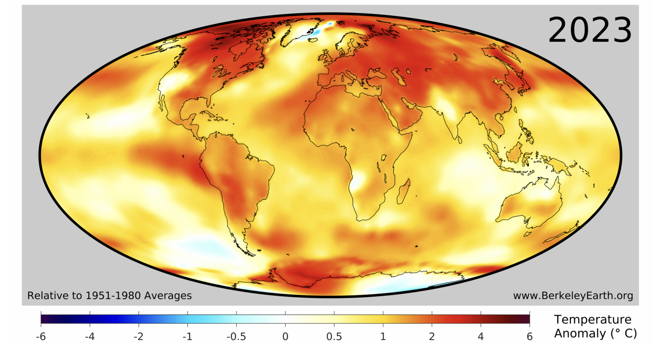
- Overview
- A world map displaying global temperature anomalies for the year 2023.
- Sourced from Berkeley Earth, as indicated by the website "www.BerkeleyEarth.org" in the bottom right corner.
- Temperature anomalies are relative to the 1951–1980 average.
- Map Projection
- Uses an elliptical map projection (likely a Mollweide projection).
- Shows the entire globe, with continents outlined in black.
- Centered on the Atlantic Ocean, with Africa in the middle, North and South America to the left, and Europe, Asia, and Australia to the right.
- Color Scale and Legend
- Color Gradient:
- Represents temperature anomalies in degrees Celsius (°C).
- Ranges from -6°C (dark blue) to +6°C (dark red).
- Gradient: Dark blue (-6°C), light blue (-1°C), white (0°C), yellow (0.5°C), orange (2°C), red (4°C), dark red (6°C).
- Label:
- Located at the bottom, reads "Relative to 1951–1980 Average" and "Temperature Anomaly (°C)."
- Color Gradient:
- Temperature Anomaly Distribution
- Warming (Positive Anomalies):
- Most of the globe shows positive temperature anomalies (yellow to dark red).
- North America, Europe, and Asia exhibit significant warming, with large areas in orange to red (2°C to 4°C).
- Parts of the Arctic, northern Canada, and Siberia show the highest anomalies, reaching dark red (up to 6°C).
- Africa, South America, and Australia also show widespread warming, mostly in yellow to orange (0.5°C to 2°C).
- Cooling (Negative Anomalies):
- Very few areas show negative anomalies (blue).
- A small region in the Arctic near Greenland shows light blue (-1°C to 0°C).
- Neutral Areas:
- Some regions, particularly in the southern oceans and parts of the Pacific, are near neutral (white, around 0°C).
- Warming (Positive Anomalies):
- Interpretation
- The map indicates widespread global warming in 2023 compared to the 1951–1980 baseline.
- The most significant warming occurs in the Northern Hemisphere, particularly in the Arctic, consistent with polar amplification.
- Minimal cooling is observed, limited to a small area in the Arctic.
- The predominance of yellow, orange, and red colors underscores a global trend of rising temperatures.
The figure above shows the difference in instrumentally determined surface temperatures between the period January 1999 through December 2008 and "normal" temperatures at the same locations, defined to be the average over the interval January 1940 to December 1980. The average increase on this graph is 0.48 °C, and the widespread temperature increase is considered to be an aspect of global warming. The most striking feature of this map is that the temperature changes have not been uniform across the globe; the high latitudes (above about 50 degrees) in the Northern Hemisphere have warmed more than any other part of the Earth, while the tropics warmed far less. But Antarctica has been warming significantly too, and, most recently in 2022 there have been record temperatures 20 °C warmer than normal!
We now turn our attention to the spatial pattern of temperature change over a much longer range of time — back to 1884. Below is an animation of the temperature change based on the instrumental record. It is worth remembering that the quality and quantity of the data get better and better as time goes on, so the early parts of this animation have more uncertainty connected to them.
The movie below is from NASA’s reconstruction of surface temperature since 1884, and it shows how Earth has warmed over the last century plus in a very, very graphic and indisputable way. Just in case you can't see this, 2016 was the warmest year on record, and 16 of the 17 warmest years have occurred since 2000!
Video: Global Warming: 1880-2021 (00:31) This video is not narrated.
Click here if the video above does not play
Play this movie and watch as the globe becomes dominated by the yellow, orange, and red colors signifying warmer temperatures. Note that the warming is not uniform across the globe, nor is it steady through time, but the warming trend is nevertheless clear to see.
Another way of looking at this history of warming is by taking the average temperature at each latitude for each year and then stringing those along the horizontal axis, as below:
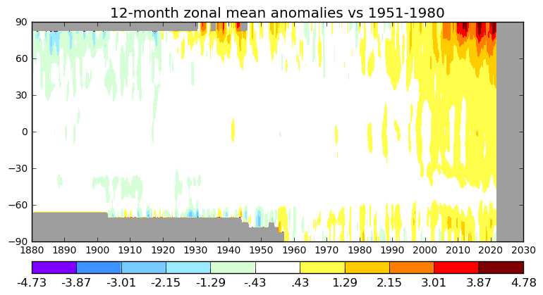
- Overview
- A heatmap titled "12-month zonal mean anomalies vs 1951–1980."
- Displays global temperature anomalies across different latitudes over time.
- Covers the period from 1850 to around 2025.
- Axes
- X-Axis: Time (Years)
- Spans from 1850 to 2030.
- Major ticks at 10-year intervals (1850, 1860, 1870, ..., 2020, 2030).
- Y-Axis: Latitude
- Ranges from -90° (South Pole) to +90° (North Pole).
- Major ticks at 30° intervals (-90°, -60°, -30°, 0°, 30°, 60°, 90°).
- X-Axis: Time (Years)
- Color Scale and Legend
- Color Gradient:
- Represents temperature anomalies in degrees Celsius (°C) relative to the 1951–1980 average.
- Ranges from -4.73°C (dark purple) to +4.78°C (dark red).
- Intermediate colors: purple (-3.87°C), blue (-3.01°C), light blue (-2.15°C), cyan (-1.29°C), light green (-0.43°C), white (0°C), yellow (0.43°C), orange (1.29°C), red (2.15°C), dark orange (3.01°C), dark red (3.87°C to 4.78°C).
- Label:
- Located at the bottom, indicating the color scale and temperature anomaly values.
- Color Gradient:
- Temperature Anomaly Distribution
- 1850–1950 (Cooler Period):
- Predominantly cooler anomalies (blues and purples) across most latitudes.
- Southern Hemisphere (-90° to 0°) and Northern Hemisphere (0° to 90°) show temperatures below the 1951–1980 average.
- Polar regions (near -90° and 90°) exhibit darker purples (up to -4.73°C).
- Equatorial regions (around 0° latitude) are closer to neutral (white) or slightly negative (light blue).
- 1950–1980 (Transition Period):
- Gradual shift toward warmer anomalies.
- Some areas, especially in the Northern Hemisphere, begin showing yellows (0.43°C).
- Southern Hemisphere remains mostly neutral or slightly cool (white to light blue).
- 1980–2025 (Warming Period):
- Warmer anomalies (yellows, oranges, reds) become dominant across most latitudes.
- Northern Hemisphere (30° to 90°) shows significant warming, with large areas in orange and red (1.29°C to 3.01°C).
- Arctic (60° to 90°) exhibits extreme warming, with dark red patches (up to 4.78°C) by 2020–2025, indicating polar amplification.
- Southern Hemisphere (-90° to 0°) warms more slowly, with yellows and oranges (0.43°C to 2.15°C).
- Antarctic (-90° to -60°) shows some neutral or slight cooling areas (white to light blue).
- 1850–1950 (Cooler Period):
- Interpretation
- Illustrates a clear global warming trend over the 175-year period.
- Most pronounced temperature increases occur in the Arctic (60° to 90°) after 1980.
- Earlier periods (1850–1950) and southern latitudes show cooler anomalies relative to the 1951–1980 baseline.
- Polar amplification is evident, with the Arctic experiencing the most extreme warming.
In the figure above, as in the movie above, the temperatures are given as anomalies, or differences relative to a mean established from some arbitrary period of time (1951-1980 in this case). One thing that is clear is that the polar region of the Northern Hemisphere is the area that has warmed the most — more than 6°C during this time period, when the mean global temperature has risen by a bit less than 1°C. Also clear is the fact that, starting around 1990, nearly all of the globe is warming. It's pretty hard to argue with this plot, isn't it?
But if you are still unconvinced, we have another dataset up our sleeves that is completely independent of all of the atmospheric data we have shown so far: the ground has also warmed up!