Guadeloupe River Flooding Summer 2025
Summer 2025 will long be remembered for the deadly flooding along the Guadeloupe River in central Texas. The devastating flooding was caused by massive amounts of rain from the remnants of a tropical system. Up to 20 inches of rain fell over a few hours early on July 4. The area is prone to flash flooding because the steep limestone cliffs and thin soils do not allow much water to infiltrate. So much of the water ends up in the Guadeloupe. On July 4, the river in rose by 26 feet in 45 minutes in some places and crested up to 38 feet above normal in other places. Numerous summer camps for kids and other campgrounds were situated in the flood plain and these were ravaged by the rapidly rising water. At least 136 people were killed by the floodwaters, tragically including many young campers. There have been tough discussions about the lack of warning to the camps along the river. The NWS put out a warning for life threatening flash flooding early on July 4, but for a variety of reasons word did not reach the campers. That will clearly change in the future.
There is no doubt that the intensity of the rainfall that caused this devastating flooding is related to climate change. A key fact to understand is that for every one degree of temperature increase, an air mass can hold 3 % more moisture, so as the atmosphere warms it becomes wetter. The type of downpours that occurred in central Texas are now happening in many parts of the country and flash flooding is now part of life in many areas.
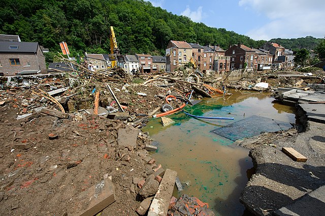
In the summer of 2021, Western Europe experienced severe and deadly flooding. The rainfall was extraordinary, possibly a 1000 year event as a storm system stalled for several days dumping 11 inches in 48 hours in eastern Belgium including 9 inches in the populated city of Liege, and up to 8 inches of rain in 9 hour period in Germany. Flooding occurred over a wide area including Belgium, Germany, Luxembourg, the Netherlands, Switzerland, and Austria. In Germany 243 people died, including 196 in Germany. In Belgium, floodwaters caused buildings to collapse and washed away cars. The floods were called the greatest natural disaster the country has ever experienced. In Germany, the Ahr river valley was particularly bad because gorges caused extensive flooding. The country’s flood warning system was cited for a monumental failure, although it appears that local authorities take some of the blame.
Fast forward to California in the winter of 2022-2023 and a series of atmospheric rivers bringing moisture from the tropics dumped huge amounts of rain on the coast and inland areas and snow on the Sierra Nevada. 78 trillion gallons of moisture fell during this time with over 30 inches and major flooding in lowland areas and up to 58 feet of snow in the mountains.
Video: Atmospheric rivers hitting California in January 2023 (0:12) (No Narration)
One near unanimous source of blame among scientists was climate change, with the flooding even exceeding current forecasts. Warmer atmosphere can hold more moisture. In addition, melting Arctic ice is causing the jet stream to weaken and this is leading the storms systems that move slower or stall. Combined these factors are leading to more extreme events including days of flooding rains.
As stated above, warm air holds more moisture than cooler air. What does a moister atmosphere mean for precipitation? It means two things — more precipitation over the globe and a higher frequency of extreme precipitation events. The spatial pattern of precipitation is complex — far more so than for temperature — and measuring the frequency of extreme events is a challenging statistical problem. But some progress has been made on these questions, at least for certain regions of the globe.
First, let's take a quick look at the precipitation pattern of the globe, which is now being measured in great detail by NASA's Aquarius satellite.
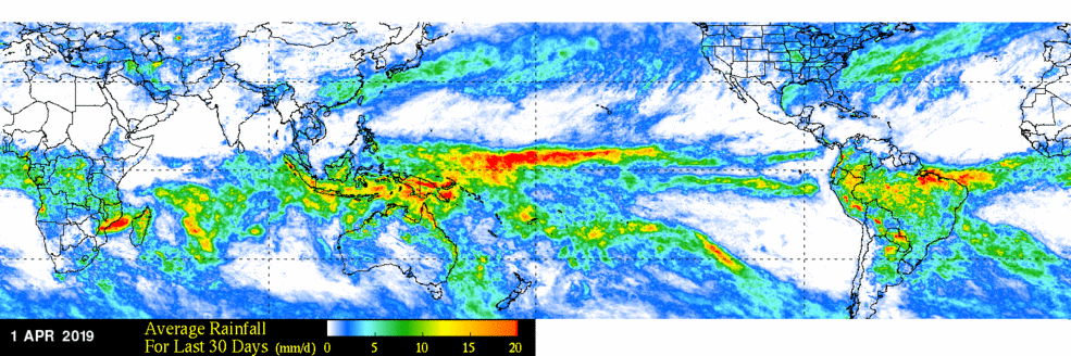
This image is a world map showing average rainfall over the last 30 days as of April 1, 2019. The map uses a color gradient to indicate rainfall amounts in millimeters per day across the globe.
- Map Type: World map
- Measurement: Average rainfall for the last 30 days (mm/day)
- Date: April 1, 2019
- Color Scale (bottom of the map):
- Range: 0 mm/day to 20 mm/day
- Colors: Blue (0 mm/day) to red (20 mm/day), with green and yellow in between
- Regions with Notable Rainfall:
- High Rainfall (red, 15–20 mm/day):
- Equatorial Pacific (stretching across the ocean)
- Parts of Southeast Asia
- Northern South America (Amazon region)
- Southern Africa
- Moderate Rainfall (yellow to green, 5–15 mm/day):
- Central Africa
- Parts of South America
- Southeast Asia
- Low Rainfall (blue, 0–5 mm/day):
- Most of North America, Europe, and Australia
- Northern Africa and the Middle East
- High Rainfall (red, 15–20 mm/day):
The map highlights significant rainfall in equatorial regions, particularly the Pacific and Amazon, while showing drier conditions in North America, Europe, and Australia during this period.
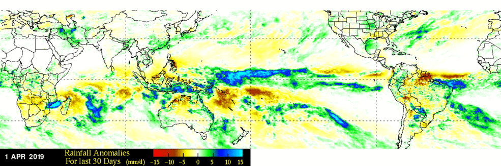
This image is a world map showing rainfall anomalies over the last 30 days as of April 1, 2019. The map uses a color gradient to indicate deviations from average rainfall in millimeters per day across the globe.
- Map Type: World map
- Measurement: Rainfall anomalies for the last 30 days (mm/day)
- Date: April 1, 2019
- Color Scale (bottom of the map):
- Range: -15 mm/day to 15 mm/day
- Colors: Red (drier, -15) to blue (wetter, 15), with yellow at 0 (average)
- Regions with Notable Anomalies:
- Drier Areas (red, -15 to -5 mm/day):
- Northern South America (Amazon region)
- Parts of Southeast Asia
- Wetter Areas (blue, 5 to 15 mm/day):
- Equatorial Pacific (stretching across the ocean)
- Southern Africa
- Parts of South America (southern Brazil)
- Near Average (yellow, -5 to 5 mm/day):
- Most of North America, Europe, and Australia
- Central Africa
- Drier Areas (red, -15 to -5 mm/day):
The map highlights significant rainfall deficits in the Amazon and Southeast Asia, while showing above-average rainfall in the equatorial Pacific and parts of southern Africa during this period.
The two images above show the rainfall averages in terms of mm/day for the month of March 2019, above, and the rainfall anomaly for the same month, below.
Earlier satellites did not have the same resolution, but the record goes back to the late 1970s, allowing us to get a picture of the longer-term mean precipitation patterns, which can be seen in the video below. Watch this movie a few times through to see the annual patterns of precipitation, and focus especially on the region around India, where the summer monsoons show up beautifully.
Video:IMERG Monthly Precipitation Climatology (2001 - 2022) (00:16) This video is not narrated.
On a global scale, there is no clear sign that the amount of precipitation is increasing, as can be seen in this next figure, which plots the global average precipitation rate for each month.
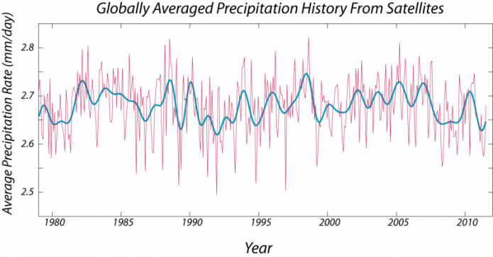
This image is a line graph titled "Globally Averaged Precipitation History From Satellites," showing the average precipitation rate from 1980 to 2010. The data is derived from satellite measurements and presented in millimeters per day.
- Y-Axis: Average precipitation rate (mm/day)
- Range: 2.5 mm/day to 2.8 mm/day
- X-Axis: Years (1980 to 2010)
- Data Representation:
- Raw Data: Pink line
- Shows high-frequency fluctuations
- Varies between 2.5 and 2.8 mm/day
- Smoothed Data: Blue line
- Represents a smoothed trend of the raw data
- Fluctuates more gradually, staying around 2.6 to 2.7 mm/day
- Raw Data: Pink line
- Trend:
- No clear long-term increase or decrease
- Periodic fluctuations, with peaks around 1983, 1998, and 2007
- Dips around 1992 and 2001
The graph indicates that global precipitation rates have remained relatively stable over the 30-year period, with short-term variations but no significant long-term trend.
The figure above shows the history of the monthly average precipitation rates, averaged over the globe — kind of a difficult thing to swallow at first. Think of the values plotted along the y-axis as being the precipitation rate, averaged over the whole globe for a given month. As you can perhaps see, there is a strong seasonal cycle (with peaks in the fall each year) — I've removed the seasonal variation from the raw data to give the thicker blue line, showing variability that is not related to the seasonal cycle. One thing that is clear is that there is no general upward or downward trend over this period, although there are ups and downs, some of which correspond to the El Niño oscillations.
So, global precipitation, on the whole, is not going up, as far as the data reveal. What this means is that although the atmosphere is getting moister, the new addition of moisture is not coming out as precipitation — the atmosphere is retaining this extra water vapor.
But because the trend suggests there will be extra water vapor in the atmosphere in the future, when the conditions are right for a big precipitation event, the event might be bigger than today or in the past. In addition, predictions suggest there might be more storm events that exceed a certain threshold so that they are classified as extreme precipitation events.
More regionally, the El Niño cycle produces a dramatic change in precipitation patterns in parts of the globe, with Southeastern Australia becoming dry in summer and more prone to bushfires. In the US, El Niño corresponds to heavy winter rainfall in California as the so-called "Pineapple Express" picks up and transports heat and moisture from the tropical Pacific. Folks in California always hope that El Niño events put an end to drought. More on that in Module 8. El Niño is generally not a good time to visit Florida in the winter, as the same pattern extends across the southern US.

This image is a diagram titled "Typical January-March Weather Anomalies and Atmospheric Circulation During Moderate to Strong El Niño & La Niña." It consists of two maps of North America, one for El Niño and one for La Niña, showing weather patterns and anomalies during these climate events.
- El Niño Map (Top):
- Title: El Niño
- Atmospheric Features:
- Low pressure (marked "L") over the eastern Pacific
- Persistent extended Pacific jet stream (red arrow) stretching across the Pacific
- Polar jet stream (purple arrow) over northern North America
- Weather Anomalies:
- Warm (red): Western Canada and Alaska
- Wet (green): Southern U.S. and Mexico
- Cool (blue): Central U.S.
- Dry (brown): Northern U.S. and parts of Canada
- La Niña Map (Bottom):
- Title: La Niña
- Atmospheric Features:
- High pressure (marked "H") over the eastern Pacific
- Variable Pacific jet stream (orange arrow) with a wavy pattern
- Polar jet stream (purple arrow) over northern North America
- Weather Anomalies:
- Cold (blue): Western Canada and Alaska
- Wet (green): Pacific Northwest and Great Lakes region
- Dry (brown): Southern U.S. and Mexico
- Warm (red): Southeastern U.S.
The diagram illustrates how El Niño brings wetter and cooler conditions to the southern U.S. with a strong jet stream, while La Niña results in drier conditions in the south, wetter conditions in the northwest, and a more variable jet stream.