Temperature: Ocean Warming
The oceans have absorbed over 90% of the excess heat resulting from greenhouse gas emissions since the 1970s. So if it weren’t for the ocean, the land would be a lot hotter than it is today. Since water absorbs a lot of heat, the ocean’s temperature has not increased as fast as the land’s though, but there have been some alarming trends in the last year or so (2023-2024).
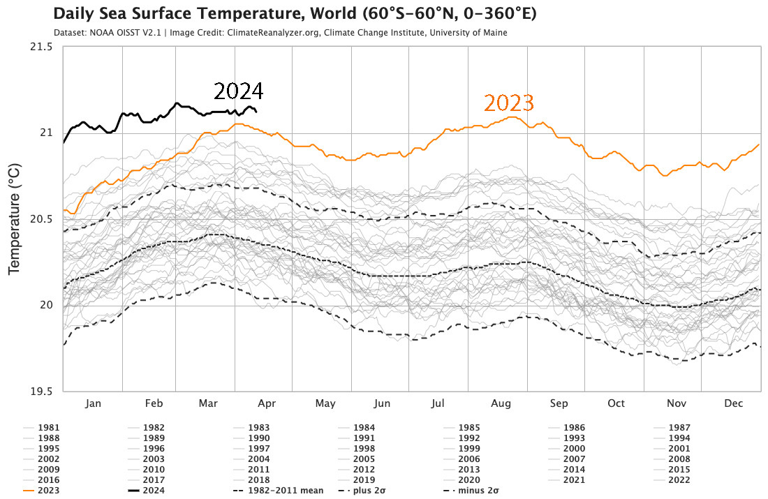
This image is a line graph titled "Daily Sea Surface Temperature, World (60°S–60°N, 0–360°E)." The data comes from NOAA OISST version 2.1, and the image is credited to ClimateReanalyzer.org, Climate Change Institute, University of Maine.
- Y-Axis: Sea surface temperature in degrees Celsius
- Range: 19.5°C to 21.5°C
- X-Axis: Months of the year (January to December)
- Data Representation:
- Years 1981–2022: Thin, dashed black lines (dense cluster showing historical variability)
- 1982–2011 Mean: Solid black line
- 1982–2011 Mean ± 2σ: Dotted black lines
- 2023: Solid orange line
- Peaks mid-year, just above 21°C
- 2024: Solid black line
- Peaks early at 21.5°C, declines but stays above 2023 for most of the year
- Legend (at bottom):
- Lists years 1981–2024
- 2023 (orange), 2024 (black), historical mean, and ±2σ labeled
The graph highlights a notable increase in global sea surface temperatures in 2023 and 2024 compared to the historical data from 1981 to 2022.
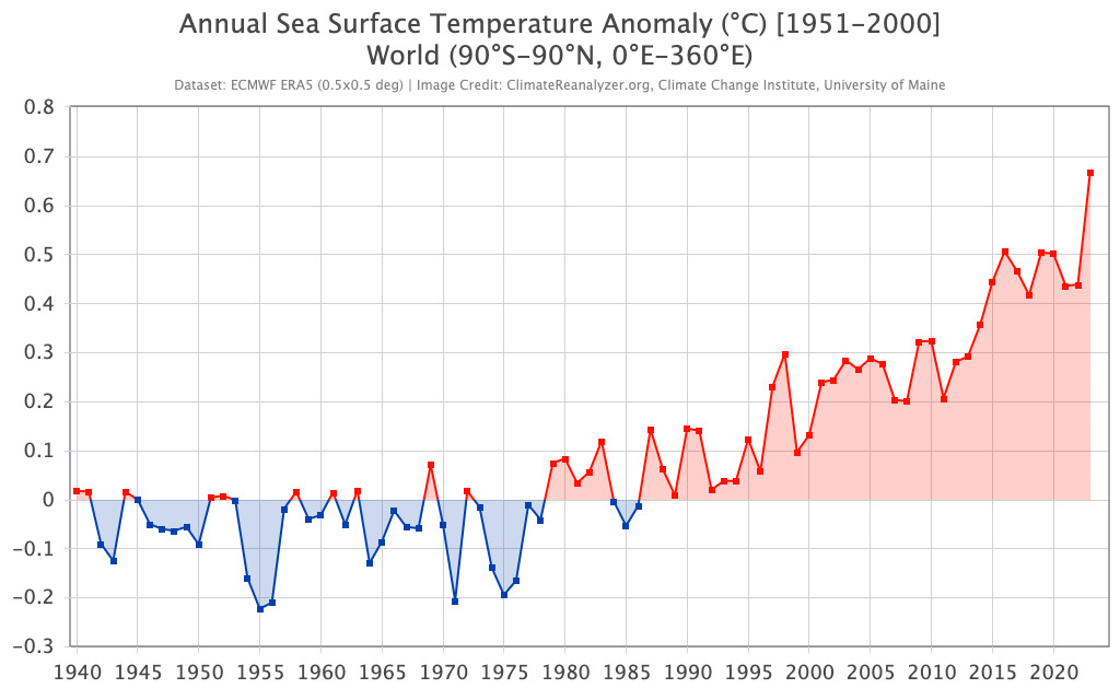
This image is a line graph titled "Annual Sea Surface Temperature Anomaly (°C) [1951-2000] World (90°S–90°N, 0°E–360°E)." The data is sourced from ECMWF ERA5 (0.5°x0.5° deg), and the image is credited to ClimateReanalyzer.org, Climate Change Institute, University of Maine.
- Y-Axis: Sea surface temperature anomaly in degrees Celsius
- Range: -0.3°C to 0.8°C
- X-Axis: Years (1940 to 2020)
- Data Representation:
- 1940–1980: Blue line with data points
- Fluctuates mostly below 0°C, with dips to -0.2°C
- Shaded blue area around the line indicates variability
- 1980–2020: Red line with data points
- Starts near 0°C, shows a general upward trend
- Peaks around 0.7°C in 2020
- Shaded red area around the line indicates variability
- 1940–1980: Blue line with data points
- Trend:
- Early years (1940–1980): Mostly negative anomalies (cooler than the 1951–2000 average)
- Later years (1980–2020): Increasingly positive anomalies (warmer than the 1951–2000 average)
The graph illustrates a clear warming trend in global sea surface temperatures from 1940 to 2020, with anomalies shifting from negative to significantly positive over the decades.
The instrumental record of temperature change in the oceans goes back to about 1850 and consists of thermometer measurements made on water samples taken by merchant and navy ships as they sailed the world’s oceans. The data are understandably best for parts of the oceans along major trade routes, and they are less abundant further back in time. These measurements, just like the land-based weather station data, have to be gridded to come up with a global average sea surface temperature. As might be expected, the sea surface temperature record is similar to the global temperature records, in part because the oceans make up almost 75% of Earth’s surface. But even if we separate out the land surface temperature from the global record and compare it to the ocean surface temperature, they are quite similar, as seen in the figure below.
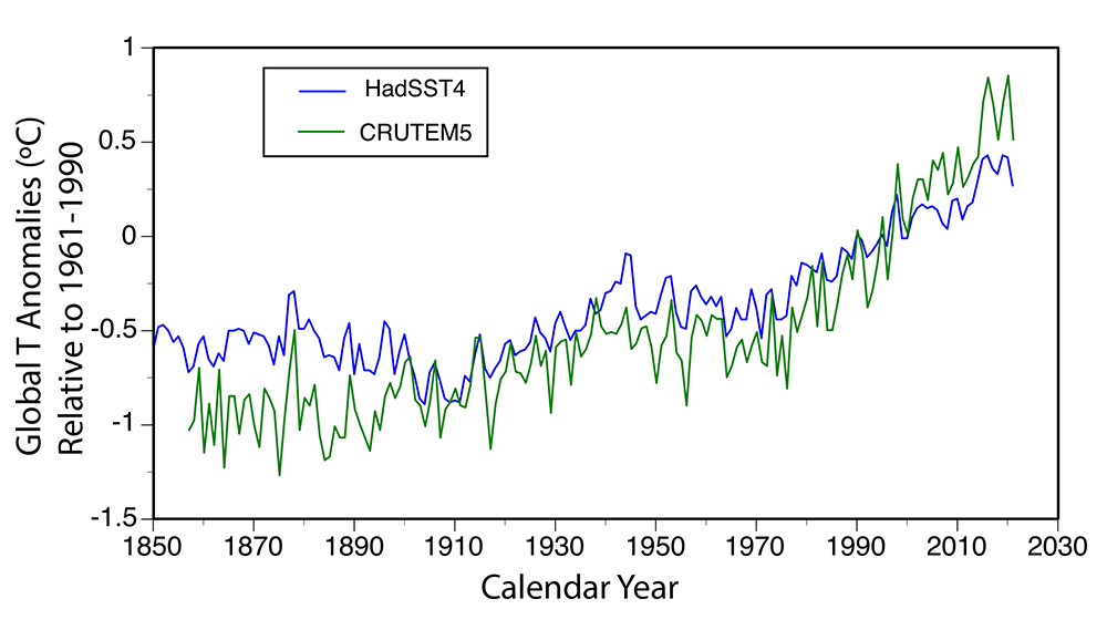
This image is a line graph showing global sea surface temperature anomalies from 1850 to 2030. The data is presented relative to the 1961–1990 average, with two datasets compared: HadSST4 and CRUTEM5.
- Y-Axis: Global temperature anomalies in degrees Celsius
- Range: -1.5°C to 1°C
- X-Axis: Calendar years (1850 to 2030)
- Data Representation:
- HadSST4: Blue line
- Represents sea surface temperature anomalies
- Starts around -0.5°C in 1850, fluctuates, and rises to about 0.8°C by 2030
- CRUTEM5: Green line
- Represents land surface temperature anomalies
- Starts around -0.5°C in 1850, fluctuates, and rises to about 0.9°C by 2030
- HadSST4: Blue line
- Trend:
- Both datasets show similar patterns with fluctuations
- General upward trend from 1850 to 2030
- CRUTEM5 (land) shows slightly higher anomalies than HadSST4 (sea) in recent years
- Legend (top left):
- HadSST4 (blue line)
- CRUTEM5 (green line)
The graph illustrates a clear long-term increase in both sea and land surface temperature anomalies over the 180-year period, with land temperatures warming slightly more than sea temperatures in recent decades.
Although the two records are quite similar, there are some differences — the SST changes over a smaller range than the land surface temperature, and the land temperature is subject to more dramatic swings. This difference is largely due to the greater heat capacity of the oceans relative to the air — it takes a long time to heat and cool the oceans, but air temperature can change quite rapidly.
Measurements from a system of hundreds of buoys stationed throughout the oceans allow us to take the temperature of the oceans over a depth range of 2000 m. These measurements go back in time to 1955 and show that not just the surface of the oceans, but the whole upper half of the oceans are slowly warming — only about 0.1 to 0.2 °C averaged over the globe during the past 50 years — but this is a vast amount of water that has been warmed.
So, while the whole ocean has absorbed a huge amount of heat, its overall temperature has changed little. Nevertheless, the very surface of the ocean has warmed almost as much as the rest of Earth’s surface and from the middle of 2023 through to 2024 the surface warming has been quite alarming with temperatures almost a degree warmer than in 2016.