Temperature: Borehole Temperatures
We next turn our attention to a very different means of reconstructing the temperature — studies of the temperatures measured in boreholes (i.e., holes drilled into the ground) at various locations around the Earth. The temperature profiles (how temperature changes with depth) for three representative boreholes in eastern Canada are shown in the figure below:
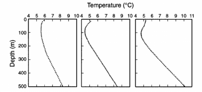
The image contains three line graphs, each depicting the relationship between ocean depth and temperature in degrees Celsius (°C). The graphs are arranged side by side, sharing a common y-axis but with slightly different x-axis ranges for temperature.
The y-axis, labeled "Depth (m)," represents the ocean depth, ranging from 0 meters at the top to 500 meters at the bottom, with major ticks at 100-meter intervals (0, 100, 200, 300, 400, 500). The x-axis, labeled "Temperature (°C)," represents the water temperature, with each graph having a slightly different range:
- The left graph ranges from 4°C to 10°C, with major ticks at 4, 5, 6, 7, 8, 9, and 10.
- The middle graph ranges from 4°C to 10°C, with major ticks at 4, 5, 6, 7, 8, 9, and 10.
- The right graph ranges from 4°C to 11°C, with major ticks at 4, 5, 6, 7, 8, 9, 10, and 11.
Each graph features a single dashed line representing the temperature profile:
- In the left graph, the temperature starts at around 9°C at the surface (0 m), decreases gradually to about 7°C at 100 m, then drops more sharply to around 5°C at 300 m, and continues to decrease slowly, reaching approximately 4°C at 500 m.
- In the middle graph, the temperature begins at around 8°C at the surface, decreases steadily to about 6°C at 100 m, then continues to drop to around 5°C at 300 m, and stabilizes near 4°C at 500 m.
- In the right graph, the temperature starts at around 10°C at the surface, decreases to about 8°C at 100 m, then drops to around 6°C at 300 m, and reaches approximately 5°C at 500 m.
The graphs illustrate the typical ocean temperature profile, where temperature decreases with increasing depth, reflecting the thermocline—a layer in the ocean where temperature decreases rapidly with depth. The slight variations in the temperature ranges and profiles across the three graphs may indicate different locations, seasons, or conditions affecting the ocean's thermal structure.
Note that in all three cases, the temperature curves around to higher temperatures near the surface — this reflects a response of soil and bedrock to warming from the atmosphere. In the absence of warming at the surface due to climate change, these temperature profiles would tend to follow the trends represented in the lower few hundreds of meters, and this would intersect the surface at around 3-4°C.
The basic idea here is a surprising one — that the way temperature changes down a borehole at the present time tells us something about how the surface temperature has changed in the past. This is indeed a remarkable and useful reality of some fairly basic physics of heat flow. It also provides us with an excellent way to filter out the “noise” in the climate record and focus on the main trends.
Heat is just a measure of the kinetic or vibrational energy of the atoms in some substance. If something is hot, its atoms are vibrating very fast, and because vibrating atoms affect neighboring atoms, heat can be transmitted; we often talk about this heat transmission as heat flow. Heat flows from hot regions to cold regions, and the rate of heat flow is proportional to what we call the thermal gradient — the rate of temperature change with distance. In our case, for distance, we are talking about depth in the Earth, and the center of the Earth is very hot — about 5000°C. The surface, instead, is quite cool at 15°C, so heat from the Earth tends to flow out to the surface, and this process is cooling the Earth very slowly. This situation leads to a geothermal gradient (rate of change of temperature with depth) that tends to be more or less steady at around 20 or 30°C per kilometer. The heat released to the surface is tiny compared to the energy coming from the Sun, so this geothermal heat, on a global basis, does not affect the climate.
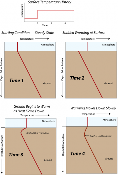
When the surface temperature rises and becomes hotter than the temperature just below the surface, heat moves down into the ground, but it does this quite slowly. When the surface temperature becomes colder, heat flows up from the ground, cooling the ground, and this cooling is transmitted downward slowly. This general idea is illustrated schematically in the figure below:
- Overview
- A schematic diagram titled "Surface Temperature History."
- Illustrates the process of heat penetration into the ground over four sequential time stages.
- Consists of four panels, each showing a temperature-depth profile at a different time.
- Top Section: Surface Temperature History
- A small graph at the top showing surface temperature over time.
- X-axis: Time, labeled with four points (1, 2, 3, 4).
- Y-axis: Temperature (not labeled with specific values).
- The graph shows:
- A flat line from Time 1 to Time 2 (labeled "Starting Condition – Steady State").
- A sudden increase at Time 2 (labeled "Sudden Warming at Surface").
- A flat line from Time 2 to Time 4, indicating sustained higher surface temperature.
- Main Panels: Temperature-Depth Profiles
- Four panels labeled Time 1, Time 2, Time 3, and Time 4.
- Each panel shows a vertical cross-section of the ground with the atmosphere above.
- Y-Axis: Depth
- Labeled "Depth" on the left side of each panel.
- Extends from the surface (top) downward into the ground (bottom).
- No specific depth values provided.
- X-Axis: Temperature
- Labeled "Temperature" at the top of each panel.
- No specific temperature values provided.
- Arrows indicate increasing temperature to the right.
- Panel Details
- Time 1: Starting Condition – Steady State
- A straight red line slopes downward from the surface to deeper ground.
- Indicates a linear temperature gradient, typical of a steady-state condition where temperature decreases with depth.
- Time 2: Sudden Warming at Surface
- The red line shows a sharp increase in temperature at the surface (top of the panel).
- The line then slopes downward, similar to Time 1, but starts at a higher temperature.
- Indicates the immediate effect of surface warming, with heat beginning to penetrate downward.
- Time 3: Ground Begins to Warm as Heat Flows Down
- The red line shows a curved profile.
- Near the surface, the temperature is high (same as Time 2).
- The temperature decreases with depth but more gradually than in Time 1.
- A label "Depth of Heat Penetration" with an arrow points to the depth where the curve begins to steepen, indicating how far the heat has penetrated.
- Time 4: Warming Moves Down Slowly
- The red line continues to show a curved profile.
- The temperature near the surface remains high.
- The curve is less steep than in Time 3, indicating that heat has penetrated deeper.
- The "Depth of Heat Penetration" label and arrow show a greater depth compared to Time 3, reflecting the slow downward movement of heat over time.
- Time 1: Starting Condition – Steady State
- Interpretation
- The diagram illustrates how surface warming affects subsurface temperatures over time.
- Initially, the ground is in a steady state with a linear temperature gradient (Time 1).
- A sudden increase in surface temperature (Time 2) initiates heat flow downward.
- Over time, the heat penetrates deeper into the ground (Time 3 and Time 4), with the depth of penetration increasing gradually.
- The process demonstrates the slow conduction of heat through the ground in response to surface temperature changes.
Each of the four rectangles shows the variation of temperature with depth above and below the surface at different times. At the beginning (Time 1), the temperature below the surface increases steadily, while it is constant above the surface. Then at Time 2, the surface temperature suddenly rises and is hotter than the ground right at the surface. By Time 3, the ground temperature right near the surface warms, but that warming does not penetrate very deeply. At Time 4, the surface temperature has continued to remain high, and the heat flowing down into the ground has reached a greater depth.
Rocks have a very low thermal conductivity (conductivity is the term used to describe the way heat is transported at the molecular level) compared to many other materials, which means that it can take a long time for rocks underground to respond to changes in surface temperatures. Because of the way that the heat flows through rocks, short-term changes are smoothed out as the heat diffuses through the rocks. This means that the borehole temperature profiles provide information only about changes in the long-term average temperature.
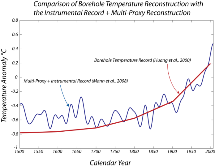
Unlike most other methods for studying paleoclimate, borehole thermometry does not need to be calibrated against the instrumental record. Hence, borehole thermometry provides an independent record of paleoclimate against which other paleoclimate techniques can be validated. Below, we see the results of the analysis of a global data set of borehole temperatures, which give us an estimate of the global temperature change.
- Overview
- A schematic diagram titled "Surface Temperature History."
- Illustrates the process of heat penetration into the ground over four sequential time stages.
- Consists of four panels, each showing a temperature-depth profile at a different time.
- Top Section: Surface Temperature History
- A small graph at the top showing surface temperature over time.
- X-axis: Time, labeled with four points (1, 2, 3, 4).
- Y-axis: Temperature (not labeled with specific values).
- The graph shows:
- A flat line from Time 1 to Time 2 (labeled "Starting Condition – Steady State").
- A sudden increase at Time 2 (labeled "Sudden Warming at Surface").
- A flat line from Time 2 to Time 4, indicating sustained higher surface temperature.
- Main Panels: Temperature-Depth Profiles
- Four panels labeled Time 1, Time 2, Time 3, and Time 4.
- Each panel shows a vertical cross-section of the ground with the atmosphere above.
- Y-Axis: Depth
- Labeled "Depth" on the left side of each panel.
- Extends from the surface (top) downward into the ground (bottom).
- No specific depth values provided.
- X-Axis: Temperature
- Labeled "Temperature" at the top of each panel.
- No specific temperature values provided.
- Arrows indicate increasing temperature to the right.
- Panel Details
- Time 1: Starting Condition – Steady State
- A straight red line slopes downward from the surface to deeper ground.
- Indicates a linear temperature gradient, typical of a steady-state condition where temperature decreases with depth.
- Time 2: Sudden Warming at Surface
- The red line shows a sharp increase in temperature at the surface (top of the panel).
- The line then slopes downward, similar to Time 1, but starts at a higher temperature.
- Indicates the immediate effect of surface warming, with heat beginning to penetrate downward.
- Time 3: Ground Begins to Warm as Heat Flows Down
- The red line shows a curved profile.
- Near the surface, the temperature is high (same as Time 2).
- The temperature decreases with depth but more gradually than in Time 1.
- A label "Depth of Heat Penetration" with an arrow points to the depth where the curve begins to steepen, indicating how far the heat has penetrated.
- Time 4: Warming Moves Down Slowly
- The red line continues to show a curved profile.
- The temperature near the surface remains high.
- The curve is less steep than in Time 3, indicating that heat has penetrated deeper.
- The "Depth of Heat Penetration" label and arrow show a greater depth compared to Time 3, reflecting the slow downward movement of heat over time.
- Time 1: Starting Condition – Steady State
- Interpretation
- The diagram illustrates how surface warming affects subsurface temperatures over time.
- Initially, the ground is in a steady state with a linear temperature gradient (Time 1).
- A sudden increase in surface temperature (Time 2) initiates heat flow downward.
- Over time, the heat penetrates deeper into the ground (Time 3 and Time 4), with the depth of penetration increasing gradually.
- The process demonstrates the slow conduction of heat through the ground in response to surface temperature changes.
Clearly, the shapes of the curves, or the rates of temperature change over this time period, are in close agreement, which is important since they come from very different, independent data sources. The borehole temperature reconstruction does not match the last bit of this time period, in part because the measurements begin further down the hole, and many of the measurements were made in the 1980s and 1990s before the instrumental record ends.