METEO 469 Course Outline
Lesson 1- Introduction to Climate and Climate Change
Introduction
Did you complete the Course Orientation?
Before you begin this course, please complete the Course Orientation.
About Lesson 1
Human-caused climate change represents one of the great environmental challenges of our time. To appreciate its societal, environmental, and economic implications, one must appreciate the basic underlying science. This course seeks to first lay down the fundamental scientific principles behind climate change and global warming. These principles involve aspects of atmospheric science and meteorology, as well as aspects of other areas of the physical and biological sciences. With a firm grounding in the basic science, we go on to explore other issues involving climate change impacts and the issue of mitigation — that is, solutions to dealing with the challenges presented by climate change.
In the process, we will learn how to do basic computations and to use theoretical models of the climate system of varying complexity to address questions regarding future climate change. Students will explore the impacts of various alternative greenhouse gas emissions scenarios and investigate policies that would allow for appropriate stabilization of future greenhouse gas concentrations. The structure of the course roughly parallels the treatment of the subject matter by the reports of the Intergovernmental Panel on Climate Change (IPCC), focusing first on the basic science, then the future projections and their potential impacts, and finally issues involving adaptation, vulnerability, and mitigation. We will use a variety of tools to inform our understanding of these topics, including digital video, audio, simulation models, and virtual field trips to online data resources.
In this first lesson, we are going to define climate and climate change, as well as the closely related matter of global warming. We will introduce the components of the climate system (the atmosphere, ocean, cryosphere, and biosphere). We will also briefly introduce some of the other key scientific concepts: atmospheric structure and composition, energy balance, atmospheric and oceanic circulation. We will draw a distinction between natural and human impacts on climate, and we will review the science behind greenhouse gases and the greenhouse effect. We will explore the crucial topic of feedback mechanisms, including important emerging knowledge regarding carbon cycle feedbacks. Finally, we will begin to explore a number of important overriding themes, such as the role of scientific uncertainty in decision making.
What will we learn in Lesson 1?
By the end of Lesson 1, you should be able to:
- Define the Earth's climate system and its components;
- Distinguish the factors governing natural climate variability from human-caused climate change;
- Explain the greenhouse effect;
- Describe the role of feedback mechanisms; and
- Discuss the role of uncertainty in decision-making.
What will be due for Lesson 1?
Please refer to the Syllabus for the specific time frames and due dates.
The following is an overview of the required activities for Lesson 1. Detailed directions and submission instructions are located within this lesson.
- Read:
- IPCC Sixth Assessment Report, Working Group 1
- Summary for Policy Makers
- Introduction: p. 4
- The Current State of the Climate: p. 4-11
- Summary for Policy Makers
- Dire Predictions, v.2: p. 8, 12-13, 22-25
- IPCC Sixth Assessment Report, Working Group 1
- Participate in the LESSON 1: GENERAL DISCUSSION OF METEO 469 discussion forum.
What is Climate?
When it comes to defining climate, it is often said that "climate is what you expect; weather is what you get". That is to say, climate is the statistically-averaged behavior of the weather. In reality, it is a bit more complicated than that, as climate involves not just the atmosphere, but the behavior of the entire climate system—the complex system defined by the coupling of the atmosphere, oceans, ice sheets, and biosphere.
Having defined climate, we can begin to define what climate change means. While the notion of climate is based on some sort of statistical average of behavior of the atmosphere, oceans, etc., this average behavior can change over time. That is to say, what you "expect" of the weather is not always the same. For example, during El Niño years, we expect it to be wetter in the winter in California and snowier in the southeastern U.S., and we expect fewer tropical storms to form in the Atlantic during the hurricane season. So, climate itself varies over time.
If climate is always changing, then is climate change by definition always occurring? Yes and No. A hundred million years ago, during the early part of the Cretaceous period, dinosaurs roamed a world that was almost certainly warmer than today. The geological evidence suggests, for example, that there was no ice even at the North and South poles. So global warming can happen naturally, right? Certainly, but why was the Earth warmer at that time?
A hint of why can be found in many of the careful renditions of what the Earth may have looked like during the age of dinosaurs. Some of the most insightful interpretations came from the 19th century Yale paleontologist, Othniel Charles Marsh. Let us look at one of his renderings:
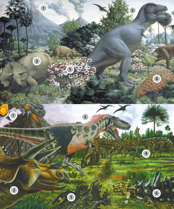
Think About It!
What features of the above mural might provide a clue for why the early Cretaceous was so warm?
As we will see later in this lecture, volcanic eruptions have had a cooling impact on climate on a historical time frame, by injecting reflecting aerosols into the atmosphere, which block out some amount of incoming sunlight for several years after the eruption. However, over millions of years, volcanic eruptions have a different, and indeed quite profound, influence on the atmospheric composition. They pump carbon dioxide into the atmosphere. More carbon dioxide means a stronger greenhouse effect. We will talk about this later in the lecture.
So, the major climate changes in Earth's geologic past were closely tied to changes in the greenhouse effect. Those changes were natural. The changes in greenhouse gas concentrations that we talk about today, are, however, not natural. They are due to human activity.
Importance: Why Should We Care About Climate Change?
As we have discussed, climate change can be natural. If climate changes naturally, then why should we be concerned about the climate change taking place today? After all, the early Cretaceous period discussed previously was warmer than today, but life thrived even in regions, such as the interior of Antarctica, that are uninhabitable today.
One misconception is that the threat of climate change has to do with the absolute warmth of the Earth. That is not, in fact, the case. It is, instead, the rate of change that has scientists concerned. Living things, including humans, can easily adapt to substantial changes in climate as long as the changes take place slowly, over many thousands of years or longer. However, adapting to changes that are taking place on timescales of decades is far more challenging.
Here is a useful "thought experiment" to illustrate what sort of discussion might be happening now if, instead of the current climate, we were living under the climate conditions of the last Ice Age, and human fossil fuel emissions were pushing us out of the ice age and into conditions resembling the pre-industrial period, rather than the actual case, where we are pushing the Earth out of the pre-industrial period and into a period with conditions more like the Cretaceous. Take a look at Figure 1.2 below, which indicates the Gulf coast continental outline near the height of the last Ice Age 18,000 years ago, vs. the current continental outline.
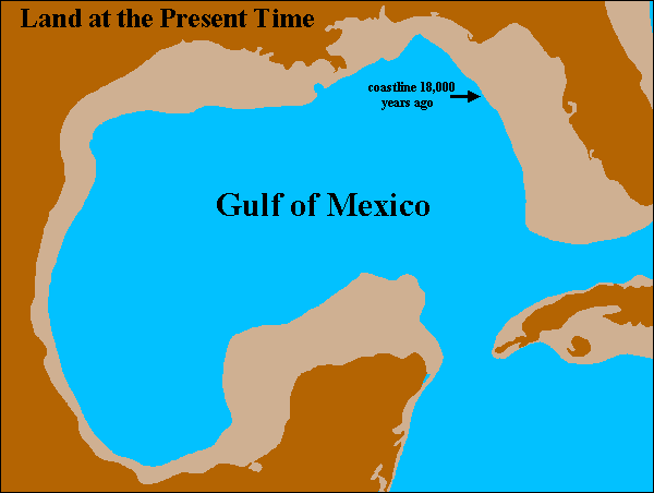
Everything in the lighter shading would be flooded in the transition from the ice age to pre-industrial modern climate. But what sort of effort would that have taken?
It turns out that the natural increase in atmospheric CO2 that led to the thaw after the last Ice Age was an increase from 180 parts per million (ppm) to about 280 ppm. This was a smaller increase than the present-time increase due to human activities, such as fossil fuel burning, which thus far have raised CO2 levels from the pre-industrial value of 280 ppm to a current level of over 400 ppm--a level which is increasing by 2 ppm every year. So, arguably, if the dawn of industrialization had occurred 18,000 years ago, we may very likely have sent the climate from an ice age into the modern pre-industrial state.
How long it would have taken to melt all of the ice is not precisely known, but it is conceivable it could have happened over a period as short as two centuries. The area ultimately flooded would be considerably larger than that currently projected to flood due to the human-caused elevation of CO2 that has taken place so far. The hypothetical city of "Old Orleans" would have to be relocated from its position in the Gulf of Mexico 100+ miles off the coast of New Orleans, to the current location of "New Orleans".
By some measures, human interference with the climate back then, had it been possible, would have been even more disruptive than the current interference with our climate. Yet that interference would simply be raising global mean temperatures from those of the last Ice Age to those that prevailed in modern times prior to industrialization. What this thought experiment tells us is that the issue is not whether some particular climate is objectively "optimal". The issue is that human civilization, natural ecosystems, and our environment are heavily adapted to a particular climate — in our case, the current climate. Rapid departures from that climate would likely exceed the adaptive capacity that we and other living things possess, and cause significant consequent disruption in our world.
So, hopefully, we have established that climate change is something worth caring about. Perhaps it is something worth doing something about. But you cannot really do anything about a problem that you do not understand, let alone know how to solve.
In the remainder of this lesson, we are going to try to begin to get a handle on the fundamental science underlying climate change and global warming.
Overview of the Climate System - Part 1
The Components of the Climate System
The climate system reflects an interaction between a number of critical sub-systems or components. In this course, we will focus on the components most relative to modern climate change: the atmosphere, hydrosphere, cryosphere, and biosphere. Please watch the following video to walk through the important aspects of these components.
Video: The Components of the Climate System (1:52)
PRESENTER: This is a schematic of the climate system. We can think of the climate as representing essentially four subsystems that are coupled together.
Among those subsystems are the atmosphere-- so that's one of the spheres. And that, of course, represents the chemistry and the dynamics of that component of the system, the atmosphere.
Then we have the hydrosphere, which is all the water that exists on the face of the earth in liquid form. So that would be the oceans and seas, rivers, lakes, et cetera. Water that exists in vapor form-- water vapor-- is part of the atmosphere.
Then we have the cryosphere, which is all of the water that exists in the form of snow and ice. That would include mountain glaciers, that would include the major ice sheets, and that would include snow that falls in the extra tropics during the winter.
Finally, then we have the biosphere, and that represents all living things on the face of the earth. And as we'll see in this course, the biosphere does indeed play a key role. It influences the composition of the atmosphere through the global carbon cycle, it influences the surface characteristics of the land, which has implications for climate.
So ultimately what we have are these four systems-- the hydrosphere, the atmosphere, the cryosphere, and the biosphere-- interacting with each other to form what we call the climate system PRESENTER: I think that this course fits into the major, energy and sustainability of policy, in a very vital way. I mean, climate change, in a sense, is sort of the 800-pound gorilla when it comes to the future energy policy. We need to take into account the fact that there are impacts, and there will continue to be impacts, that will grow in magnitude if we continue on our course of deriving energy from fossil fuel burning.
Decision-making ultimately relies upon taking both costs and benefits into account, and with climate change, there are costs, and many of those costs lie in our future. And in order to make appropriate decisions about how we balance the benefits of the energy that we can get today relatively cheaply from burning fossil fuels with the cost to society and to our environment of our continued reliance on fossil fuel burning, to really take on that big question, we need to understand the basics of climate change.
What is it about? What's causing it? What are the impacts, and what are the likely costs of future climate change? And how do we take into account these costs and benefits in making actual decisions about our energy future? So, hopefully, by the time this course is done, we will have brought all of those things together in a way that students can now think about this problem in a way that they wouldn't have been able to before they took the course.
Atmospheric Structure and Composition
The atmosphere is, of course, a critical component of the climate system, and the one we will spend the most time talking about.
One key feature about the atmosphere is the fact that pressure and density decay exponentially with altitude:
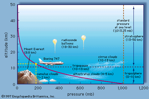
As you can see, the pressure decays nearly to zero by the time we get to 50 km. For this reason, the Earth's atmosphere, as noted further in the discussion below, constitutes a very thin shell around the Earth.
The exponential decay of pressure with altitude follows from a combination of two very basic physical principles. The first physical principle is the ideal gas law. You are probably most familiar with the form , but that form applies to a bounded gas, where the volume can be defined. In our case, the gas is free, and the appropriate form of the ideal gas law is
where is the atmospheric pressure, is the density of the atmosphere, is the gas constant that is specific to Earth's atmosphere, and is temperature.
The 2nd principle is the force balance. There are two primary vertical forces acting on the atmosphere. The first is gravity, while the other is what is known as the pressure gradient force — it is the support of one part of the atmosphere acting on some other part of the atmosphere. This balance is known as the hydrostatic balance.
The relevant pressure gradient force in this case is the vertical pressure gradient force. When we are talking about a continuous fluid (which the atmosphere or ocean is), then the correct form of force balance involves force per unit volume of fluid.
In this form, we have for gravity (the negative sign indicates a downward force):
where is Earth's surface gravitational acceleration ( ).
The pressure gradient force has to be written in terms of a derivative:
The positive sign ensures that an atmosphere with a greater density below exerts a positive (upward) force.
In equilibrium, these forces must balance, i.e.
Now we can use the ideal gas law (eq. 1.) to substitute for ρ, the expression , giving
or re-arranging a bit,
The term in parentheses can be treated as a constant (in reality, temperature varies with altitude, but it varies less dramatically than pressure or density, so it's easiest to simply treat it as a constant).
This is a relatively simple first order differential equation.
Self Check...
Do you remember how to solve this first order differential equation from your previous math studies?
Click for answer.
Or, we can exponentiate both sides to yield:
The expression for atmospheric pressure as a function of altitude is:
where is the surface pressure, and is the surface height (by convention typically taken as zero).
This equation is known as the hypsometric equation.
The combination has units of inverse length, and so we can define a scale height (assuming a mean temperature ,
and write:
this gives an exponential decline of pressure with height, with the e-folding height equal to the scale height, representing the altitude at which pressure falls to roughly 1/3 of its surface value. At this altitude, which as you can see from the above graphic is just a bit below the height of Mt. Everest, roughly 2/3 of the atmosphere is below you.
Self-check...
Using the hypsometric equation (9 above), estimate the altitude at which roughly half of the atmosphere is below you.
Click for answer.
Take logs of both sides and rearrange:
Take and use from earlier:
Let us look at the vertical structure of the atmosphere in more detail, define some key layers of the atmosphere:
Video: Key Layers of the Atmosphere (2:41)
PRESENTER: We're going to-- OK. Well, let's talk a little bit about Earth's atmosphere. Here we're viewing Earth from outer space. And we can see there's this faint blue shell encasing the planet. And that faint blue shell is indeed Earth's atmosphere. So this gives us a sense of how relatively thin Earth's atmosphere actually is.
As it turns out, the lower 80 kilometers-- so that is, the first 80 kilometers above the Earth's surface-- contains just about 99% of the atmosphere. So the atmosphere really is this thin blue shell around the Earth.
Now, we can further decompose the atmosphere into various layers. The lowest of these layers is what we call the troposphere. Depending on the latitude, it's somewhere between the first 10 and 14 kilometers. And it's the area of the atmosphere within which we reside, in which most of Earth's surface resides-- in fact, all of Earth's surface, even the tallest mountains. It's also the layer within which weather takes place.
Now, this plot here shows temperature as a function of altitude. And we can see that, within the troposphere, temperatures decrease. It turns out they decrease at a rate of about 6 and 1/2 degrees Celsius per kilometer. And they continue to do so until we reach this boundary here between the troposphere and the next layer up, the stratosphere, where that temperature trend reverses and temperatures, in fact, start to increase as we go up further in the atmosphere. The boundary between these two layers is what we call the tropopause.
Now, why do temperatures increase as we get into the stratosphere? Well, it has to do with the chemistry of the atmosphere. And in fact, the existence of ozone within the stratosphere-- it's the photodissociation of ozone by solar radiation and the heat given off during that photodissociation process that actually heats the stratosphere and leads to the increasing temperatures as we go up in the atmosphere.
Now primarily, in this course, we are going to focus on the troposphere and to some extent the stratosphere. Those are the main parts of the atmosphere that we're going to be interested in.
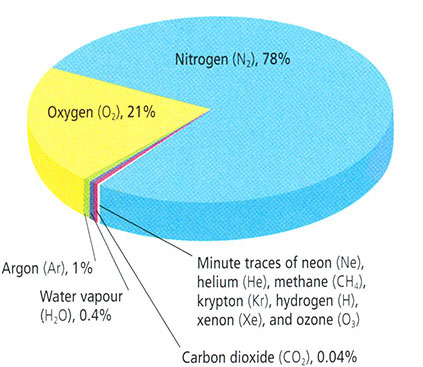
- Nitrogen (N2), 78%
- Oxygen (O2), 21%
- Argon (Ar), 1%
- Water vapor (H2O), 0.4%
- Carbon dioxide (CO2), 0.04%
- Minute traces of: neon (Ne), helium (He), methane (CH4), krypton (Kr), hydrogen (H), xenon (Xe), and ozone (O3)
© 2015 Pearson Education, Inc.
Now, let us talk a bit more about the atmospheric composition:
The atmosphere is mostly nitrogen and oxygen, with trace amounts of other gases. Most atmospheric constituents are well mixed, which is to say, these constituents vary in constant relative proportion, owing to the influence of mixing and turbulence in the atmosphere. The assumption of a well-mixed atmosphere and the assumption of ideal gas behavior, were both implicit in our earlier derivation of the exponential relationship of pressure with height in the atmosphere.
There are, of course, exceptions to these assumptions. As discussed earlier, ozone is primarily found in the lower stratosphere (though some is produced near the surface as consequence of photochemical smog). Some gases, such as methane, have strong sources and sinks and are therefore highly variable as a function of region and season.
Atmospheric water vapor is highly variable in its concentration, and, in fact, undergoes phase transitions between solid, liquid, and solid form during normal atmospheric processes (i.e., evaporation from the surface, and condensation in the form of precipitation as rainfall or snow). The existence of such phase transitions in the water vapor component of the atmosphere is an obvious violation of ideal gas behavior!
Of particular significance in considerations of atmospheric composition are the so-called greenhouse gases (CO2, water vapor, methane, and a number of other trace gases) because of their radiative properties and, specifically, their role in the so-called greenhouse effect. This topic is explored in greater detail later on in this lesson.
Overview of the Climate System (part 2)
Basics of Energy Balance and the Greenhouse Effect
An interactive animation provided below allows you to explore the balance of incoming and outgoing sources of energy within the climate system. A brief tutorial is provided below, first with the short wave component and then the long wave component of the energy budget. (Click image or link below to play the video.)
Video: Short Wave Components of the Energy Budget (2:15)
PRESENTER: OK, well, let's first look at the short wave part of the radiation budget. We start out with 100 parts of solar energy. Let's see what happens to those 100 parts within the atmosphere and the Earth's surface.
Well, 21% is reflected back out to space from cloud tops, 7% is back scattered by the atmosphere back out to space, and 3% is reflected from the Earth's surface. So if we add those up-- 21 plus 3, 24, plus 7-- 31 parts of that initial 100 unit of solar energy are reflected out to space, and that's what gives us Earth's albedo of roughly 31% or an albedo of 0.31.
OK, well, that leaves behind 69 parts of solar energy. So let's see what happens to those 69 parts.
3% are absorbed within the stratosphere by ozone, 18% is absorbed by the rest of the atmosphere or by dust, and then 3% is absorbed by clouds. So if we add that together, that's 18 plus 3, 21, plus 3, that's 24. 24 parts are absorbed somewhere within the atmosphere.
So that's 69 that weren't reflected to space. Of those 69, 24 are absorbed. That leaves behind now 45.
What happened to those remaining 45 unit of solar energy? Well, 25 are directly absorbed by the Earth's surface, and nearly as much, 20%, is actually diffuse radiation that scattered towards the surface.
The reason that we look up into the atmosphere and we see blue sky is because of the preferential scattering of the atmosphere in the wavelengths that correspond to blue light. And that's that 20% of diffuse radiation.
So that's the short wave budget of the atmosphere radiation budget.
Video: Long Wave Components of the Energy Budget (4:10)
[Please note that there is a slight error in the spoken part of the "Long Wave" video above, beginning around 3:17. While adding up the components of the long wave energy emitted by the atmosphere to space, which total 66 units, the narrator neglects to add in 8 units of direct heat loss to space.]
PRESENTER: OK, now we're going to look at the long wave component of the radiation budget, and we'll start at the surface.
Now we know that 45 parts of that initial solar energy, the initial short wave radiation, were absorbed at the surface, either from direct sunlight reaching the surface or diffuse radiation reaching the surface. So 45 were received by the surface. That means there are 45 parts of energy that need to leave the surface, and they do that in a number of different forms.
19 parts are released to the atmosphere through the transfer of latent heat, water evaporating from the surface, rising up in the atmosphere where it eventually condenses to form raindrops or cloud droplets. That delivers 19 parts of energy up into the atmosphere.
4 parts of energy are delivered up into the atmosphere through convective motions, through large scale wind patterns, storms, atmospheric disturbances that transport heat up into the atmosphere.
Now 110 parts leaves the surface as infrared radiation, as long wave radiation, emitted from the surface, but doesn't make it out to space because it's actually absorbed by greenhouse gases in the atmosphere.
Now of that 110, 96 are then emitted by those greenhouse gases back towards the surface, and 14 are emitted out to space. So that's a net gain-- it's a loss of 110, a gain of 96. So a net loss of only 14 parts.
Now 8 parts make it all the way out to space in the form of long wave radiation emitted from our surface. So we've got 14 plus 8, that's 22, plus 4, that's 26, plus 19, that's 45. That accounts for all 45 parts.
All right, well, let's see what happened up in the atmosphere. 19 parts of energy we said were delivered up into the atmosphere by latent heating, 4%-- 4 parts-- by convective heat transport from the surface and lower atmosphere, and a net gain of 14 parts of infrared radiation, and, of course, 8 parts were emitted all the way out to space.
So we've got 14 parts of infrared radiation that have been absorbed by the atmosphere, 23 that were gained from latent and convective heat transfer. And remember, we had 21 parts that were initially absorbed by the atmosphere-- 21 parts of the initial solar energy absorbed by the atmosphere or by clouds. 18 plus 3 gave us 21.
So we've now got 21 plus 23 plus 14. That gives us 66. So those 66 parts of energy that are absorbed by the atmosphere need to be admitted back out to space in the form of infrared radiation, and they are.
Add in the 3% that is emitted by ozone within the stratosphere, and that gives a 69-- the original 69 parts of solar energy that we started with that weren't reflected out to space. And so that completes our discussion of the global energy and radiation budget.
Now explore the two animations more carefully. It takes some time to absorb all of the information that is contained the animations. Return to the short wave energy budget animation and watch it again. Once you are satisfied that you understand the short wave energy information, go on to the somewhat more complex long wave energy budget animation and watch it until you understand all of the long wave energy information.
Consider how incoming and outcoming energy sources of shortwave and longwave radiation achieve a net balance:
- At the surface
- Within the atmosphere
- At the top of the atmosphere
In future lessons, we will examine the greenhouse effect in a more quantitative manner. Note here how the greenhouse effect works qualitatively. It involves the ability of greenhouse gases within the atmosphere to absorb longwave radiation, impeding the escape of the longwave radiation emitted from the surface to outer space.
In our first discussion session at the end of this lesson, you will be asked to speculate on certain aspects of this schematic, and to pose some questions of your own for your classmates to attempt to answer.
Seasonal and Latitudinal Dependence of Energy Balance
Next, let us note that the above picture represents average climate conditions, that is, averaged over the entire Earth's surface, and averaged over time. However, in reality, the incoming distribution of radiation varies in both space and time. We measure the radiation in terms of power (energy per unit time) per unit area, a quantity we term intensity or energy flux, which can be measured in watts per square meter (W/m2).
The dominant spatial variation occurs with latitude. On average, there is roughly 343 W/m2 of incoming shortwave solar radiation that is incident on the Earth, averaged over time, and over the Earth surface area. Obviously, there is more incoming solar radiation arriving at the surface near the equator than near the poles. On average, roughly 30%, or about 100 W/m2 of this incident radiation is reflected out to space by clouds and reflective surfaces of the Earth, such as ice and desert sand, leaving roughly 70% of the incoming solar radiation to be absorbed by the Earth's surface. The portion that is reflected by clouds and by the surface also varies substantially with latitude, owing to the latitudinal variations in cloud and ice cover:
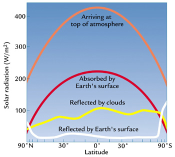
| Radiation (W/m 2) | 90ºn | 0º | 90ºs |
|---|---|---|---|
| ARRIVING AT THE TOP OF THE EARTH'S ATMOSPHERE | 200 | 420 | 190 |
| ABSORBED BYEARTH'S SURFACE | 95 | 210 | 93 |
| RELECTED BY cLOUDS | 95 | 100 | 95 |
| REFLECTED BY THE EARTH'S SURFACE | 97 | 91 | 110 |
Moreover, the distribution of outgoing longwave radiation also varies substantially with latitude:
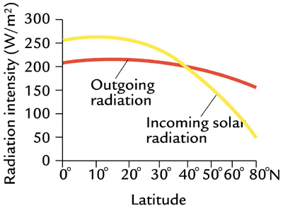
More terrestrial radiation is emitted from the warmer tropical regions and less emitted from the cold polar regions:
The disparity shown above (Figure 1.8) between the incoming solar radiation that is absorbed at the surface and the outgoing terrestrial radiation emitted from the surface poses a conundrum. As we can see in Figure 1.8, outgoing radiation exceeds incoming radiation near the poles, i.e., there is a deficit of radiation at the surface. Conversely, there is a surplus of incoming radiation near the equator. Should the poles, therefore, continue to cool down and the tropics continue to warm up over time?
Think About It!
Any idea what the solution to this conundrum might be?
Click for answer.
We will explore the details of how this is accomplished a bit later...
It is also worth noting that the incoming solar radiation is not constant in time. As we will see in later lessons, the output of the Sun, the so-called solar constant, can vary by small amounts on timescales of decades and longer. During the Earth's early evolution, billions of year ago, the Sun was probably about 30% less bright than it is today--indeed, explaining how the Earth's climate could have been warm enough to support life back then remains somewhat of a challenge, known as the "Faint Young Sun" paradox, although our understanding of it is improving.
Even more dramatic changes in solar insolation take place on shorter timescales—the diurnal and annual timescale. These changes, however, do not have to do with the net output of the Sun, but rather the distribution of solar insolation over the Earth's surface. This distribution is influenced by the Earth's daily rotation about its axis, which of course leads to night and day, and the annual orbit of the Earth about the Sun, which leads to our seasons. While there is a small component of the seasonality associated with changes in the Earth-Sun distance during the course of the Earth's annual orbit about the Sun (because of the slightly elliptical nature of the orbit), the primary reason for the seasons is the tilt of Earth's rotation axis relative to the plane defined by the Earth and the Sun, which causes the Northern Hemisphere and Southern Hemisphere to be preferentially oriented either towards or away from the Sun, depending on the time of year.
Check it out for yourself with this animation (1:49):
The consequence of all of this, is that amount of shortwave radiation received from the Sun at the top of the Earth's atmosphere varies as a function of both time of day and season:
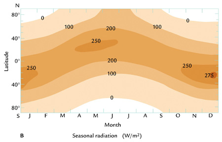
Subtle changes in the Earth's orbital geometry (i.e., changes in the tilt of the axis, the degree of ellipticality of the orbit, and the slow precession of the orbit) are responsible for the coming and going of the ice ages over tens of thousands of years. We will revisit this topic later in the course.
Overview of the Climate System (part 3)
Atmospheric Circulation
We have seen above that the distribution of solar insolation over the Earth's surface changes over the course of the seasons, with the Sun, in a relative sense, migrating south and then north of the equator over the course of the year—that annual migration, between 23°S and 23°N, defines the region we call the tropics. As the heating by the Sun migrates south and north within the tropics over the course of the year, so does the tendency for rising atmospheric motion. As we have seen, warmer air is less dense than cold air, and where the Sun is heating the surface there is a tendency for convective instability, i.e., the unstable situation of having relatively light air underlying relatively heavy air. Where that instability exists, there is a tendency for rising motion in the atmosphere, as the warm air seeks to rise above the colder air. As a result, there is a tendency for rising air (and with it, rainfall) in a zone of low surface pressure known as the Intertropical Convergence Zone or ITCZ, which is centered roughly at the equator, but shifts north and south with the migration of the Sun about the equator over the course of the year. Due to the greater thermal inertia of the oceans relative to the land surface, the response to the shifting solar heating is more sluggish over the ocean, and the ITCZ shows less of a latitudinal shift with the seasons. By contrast, over the largest land masses (e.g., Asia), the seasonal shifts can be quite pronounced, resulting in dramatics shifts in wind and rainfall patterns such as the Indian monsoon.
The air rising in the tropics then sinks in the subtropics, forming a subtropical band of high surface pressure and low precipitation associated with the prevailing belt of deserts in the subtropics of both hemispheres. The resulting pattern of circulation of the atmosphere is known as the Hadley Cell circulation. In sub-polar latitudes, there is another region of low surface pressure, associated again with rising atmospheric motion and rainfall. This region is known as the polar front. These belts of high and low atmospheric surface pressure, and the associated patterns of atmospheric circulation also shift south and north over the course of the year in response to the heating by the Sun. You can explore the atmospheric patterns using the following animation (1:04):
The animation shows Hadley cells profile, ITCZ, pressure, and precipitation as they vary across a year.
Center of the Hadley cells (ITCZ) sit at 0 degrees in February and October. The cells move 10 to 15 degrees north February through June and then more 10 to 15 degrees south July through December. At any one point ITCZ varies depending on location around the globe.
Pressure has high and low pressure zones. Low pressure sits just north of the Arctic Circle, around the tropic of cancer and Greenland. High pressure sits above the Tropic of Cancer and along the Tropic of Capricorn. January through July most pressure zones south of the tropic of cancer grow while others shrink. July through December most pressure zones north of the Tropic of Capricorn grow and any south shrink. Two exceptions sit along the west coast of North and South America. They are both high-pressure zones and do the opposite of the other zones in their hemisphere.
Precipitation increases in the summer of each hemisphere and decreases in each hemispheres winter.
We have seen above that there is an imbalance between the absorbed incoming short wave solar radiation and the emitted outgoing long wave terrestrial radiation, with a relative surplus within the tropics and a relative deficit near the poles. We, furthermore, noted that the atmosphere and ocean somehow relieve this imbalance by transporting heat laterally, through a process known as heat advection. We are now going to look more closely at how the atmosphere accomplishes this transport of heat. We have already seen one important ingredient, namely the Hadley Cell circulation, which has the net effect of transporting heat poleward from where there is a surplus to where there is a deficit.
Wind patterns in the extratropics also serve to transport heat poleward. The lateral wind patterns are primarily governed by a balance between the previously discussed pressure gradient force (acting in this case laterally rather than vertically), and the Coriolis force, an effective force that exists due to the fact that the Earth is itself rotating. This balance is known as the geostrophic balance.
The Coriolis force acts at right angles to the direction of motion: 90 degrees to the right in the Northern Hemisphere and 90 degrees to the left in the Southern Hemisphere. The pressure gradient force is directed from regions of high surface pressure to regions of low surface pressure. As a consequence, geostrophic balance leads to winds in the mid-latitudes, between the subtropical high pressure belt and the sub-polar low pressure belt of the polar front, blowing from west to east. We call these westerly winds. For reasons that have to do with the vertical thermal structure of the atmosphere, and the combined effect of the geostrophic horizontal force balance and hydrostatic vertical force balance in the atmosphere, the westerly winds become stronger aloft, leading to the intense regions of high wind known as the jet streams in the mid-latitude upper troposphere.
Conversely, winds in the tropics tend to blow from east to west. These are known as easterly winds or, by the perhaps more familiar term, the trade winds. In the Northern Hemisphere, geostrophic balance implies counter-clockwise rotation of winds about low pressure centers and clockwise rotation of winds about high pressure centers. The directions are opposite in the Southern Hemisphere.
Due to the effect of friction at the Earth's surface, there is an additional component to the winds which blows out from high pressure centers and in towards low pressure centers. The result is spiraling in (convergence) towards low pressure centers and a spiraling out (divergence) about high pressure centers. The convergence of the winds toward the low pressure centers is associated with the rising atmospheric motion that occurs within regions of low surface pressure. The divergence of the winds away from the high pressure centers is associated with the sinking atmospheric motion that occurs within regions of high atmospheric pressure.
The inward spiraling low pressure systems in mid-latitudes constitute the polar front, which separates the coldest air masses near the poles from the warmer air masses in the subtropics. In fact, it is the unstable property of having clashing air masses with vastly different temperature characteristics, known as baroclinic instability, that is responsible for the existence of extratropical cyclones. The energy that drives the extratropical cyclones comes from the work done as surface air is lifted along frontal (i.e., cold front and warm front) boundaries. These extratropical storm systems relieve high-latitude deficit of radiation by mixing cold polar and warm subtropical air and, in so doing, transporting heat poleward, along the latitudinal temperature gradient.
You can explore the resulting large-scale pattern of circulation of the global atmosphere in the following animation (1:05):
Ocean Circulation (Gyres, Thermohaline Circulation)
While we have focused primarily on the atmosphere thus far, the oceans, too, play a key role in relieving the radiation imbalance by transporting heat from lower to higher latitudes. The oceans also play a key role in both climate variability and climate change, as we will see. There are two primary components of the ocean circulation. The first component is the horizontal circulation, characterized by wind-driven ocean gyres.
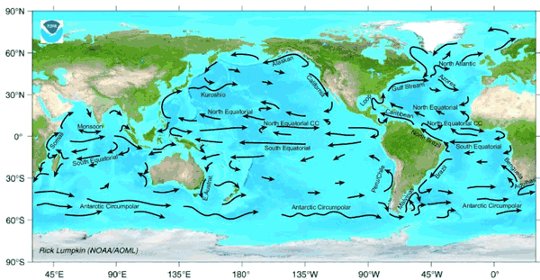
The major surface currents are associated with the ocean gyres. These include the warm poleward western boundary currents such as the Gulf Stream, which is associated with the North Atlantic Gyre, and the Kuroshio Current associated with the North Pacific Gyre. These gyres also contain cold equatorward eastern boundary currents such as the Canary Current in the eastern North Atlantic and the California Current in the western North Atlantic. Similar current systems are found in the Southern Hemisphere. The horizontal patterns of ocean circulation are driven by the alternating patterns of wind as a function of latitude, and, in particular, by the tendency for westerly winds in mid-latitudes and easterly winds in the tropics, discussed above.
An important additional mode of ocean circulation is the thermohaline circulation, which is sometimes referred to as the meridional overturning circulation or MOC. The circulation pattern is shown below:
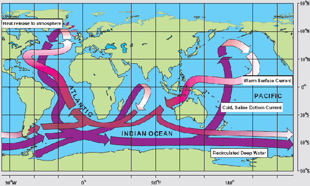
By contrast with the horizontal gyre circulations, the MOC can be viewed as a vertical circulation pattern associated with a tendency for sinking motion in the high-latitudes of the North Atlantic, and rising motion more broadly in the tropics and subtropics of the Indian and Pacific Ocean. This circulation pattern is driven by contrasts in density, which are, in turn, largely due to variations in both temperature and salinity (hence the term thermohaline). The sinking motion is associated with relatively cold, salty surface waters of the sub-polar North Atlantic, and the rising motion with the relatively warm waters in the tropical and subtropical Pacific and Indian ocean.
The picture presented in Figure 1.11 above is a highly schematized and simplistic description of the actual vertical patterns of circulation in the ocean. Nonetheless, the conveyor belt is a useful mnemonic. The northward surface branch of this circulation pattern in the North Atlantic is sometimes erroneously called the Gulf Stream. The Gulf Stream, as discussed above, is part of the circulating waters of the wind-driven ocean gyre circulation. By contrast, the northward extension of the thermohaline circulation in the North Atlantic, is rightfully referred to as the North Atlantic Drift. This current system represents a net transport of warm surface waters to higher latitudes in the North Atlantic and is also an important means by which the climate system transports heat poleward from lower latitudes. Changes in this current system are speculated as having played a key role in past and potential future climate changes, as will be explored later in this course.
Other Fundamental Principles
Natural vs. Human Forcing

Let us consider more closely the above figure (Figure 1.12) from the IPCC Summary for Policy Makers . There is a lot of information packed in this figure. Figure 1.12 summarizes the relative impacts of various natural and human forcing factors on the Earth's climate. Later on in the course, we will look at how these forcing factors are likely to have impacted global mean temperature trends over the past century. In the meantime, we can make some rough assessment of the relative importance of the different factors as gauged by their estimated radiative forcing — measured by the energy per unit time that a given forcing factor exerts per square meter of the Earth's surface. The first thing to pay attention to is whether the indicated forcing factor is a warming factor (black dot to the right of zero) or cooling factor (black dot to the left of zero). The next thing to take note of is how high or low the forcing associated with that factor is, as indicated by the length of the bar. Finally, take note of the error bars (these are shown as the horizontal "barbell" symbols) indicating whether the factor in question is relatively well known, or relatively uncertain.
The forcings are separated into two fundamentally different categories: anthropogenic (that is, human-caused) and natural. You may be surprised to learn that while greenhouse gases are the primary anthropogenic forcing, there are other notable anthropogenic forcing contributions. Indeed, if one computes the net effect of anthropogenic aerosols (primarily sulfate) produced by industrial activity, adding together the direct and indirect effects of these aerosols, the total negative global radiative forcing (roughly -0.8 W/m2) is nearly half as large as the positive radiative forcing (roughly 1.7 W/m2) due to human-caused CO2 concentration increases (though the uncertainty associated with the most recent estimate of aerosol forcing is quite large). As we will see in later lectures, the cooling effect of these aerosols offset a substantial fraction of anthropogenic greenhouse warming over the past century.
One important historical natural forcing of climate is not shown in this diagram. This is the cooling effect of volcanic eruptions due to reflective aerosol injected into the stratosphere. Unlike other forcings, this volcanic forcing is episodic, rather than continuous in nature. Explosive volcanic eruptions may have a cooling effect on climate for several years. If there is a large number of eruptions over a sustained period of time, this can have an overall cooling impact on climate. We will revisit this issue in Lesson 4.
Feedback Mechanisms
The response of the climate to forcing, whether natural or human-caused, would be far more modest than it is, were it not for the influence of feedback mechanisms. Feedback mechanisms are mechanisms within the climate system that act to either attenuate (negative feedback) or amplify (positive feedback) the response to a given forcing. On balance, the feedbacks are believed to be positive in the sense that the response of the climate system to a positive forcing is greater than one would expect from the forcing alone, because of the net warming effect arising from these responses.
The principle feedback mechanisms, relevant to climate change on historical timescales, are:
- The water vapor feedback. Warming atmosphere can hold larger amounts of water vapor. Since water vapor is a greenhouse gas, this leads to further warming: a Positive Feedback
- The ice-albedo feedback. Surface of the Earth has less snow/ice as it warms, leading to less reflection and greater absorption of incoming solar radiation: a Positive Feedback
- The cloud radiative feedbacks. There are different competing effects:
- Warmer atmosphere produces more low clouds. The primary impact of more low clouds would be to reflect more solar radiation out to space: a Negative Feedback
- Warmer atmosphere produces more high clouds, like cirrus. The primary impact of such thin, high clouds is to increase the greenhouse effect due to their ability to trap much of the outgoing longwave terrestrial radiation while remaining largely transparent to incoming shortwave solar radiation: a Positive Feedback
On balance, it has been believed that the negative cloud radiative feedbacks win over the positive cloud radiative feedbacks - though the low cloud feedbacks are quite uncertain, and the overall cloud radiative feedback could very well be positive.
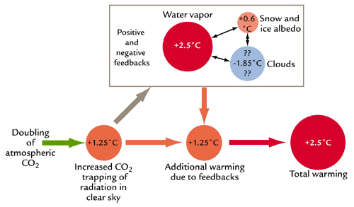
The net effect of all these feedbacks is positive and serves to increase the warming due a particular external forcing (be it increased greenhouse gas concentrations due to fossil fuel emissions, increased solar output, or some other external forcing) beyond what would be expected purely from that factor alone. For example, a doubling of CO2 concentrations relative to pre-industrial levels would, in the absence of feedbacks, lead to roughly 1.25°C warming. However, our best estimates indicate that the positive water vapor feedback would add about 2.5°C additional warming, while the positive ice albedo feedback adds about 0.6°C warming. While substantially more uncertain, the negative cloud radiative feedback could lead to just under 2°C cooling. Add up the numbers, and the total comes to about 2.5°C warming (actually, current generation climate models average closer to 3°C).
This quantity--how much we expect the Earth to warm once it equilibrates to a doubling of greenhouse gas concentrations--is known as the equilibrium climate sensitivity. We will explore this key concept in more detail in subsequent lectures.
The Carbon Cycle
The traditional concept of climate sensitivity envisions the concentration of CO2 and other greenhouse gases as specified (i.e., doubled from some initial level), and calculates the expected warming. This construction is somewhat artificial, however, because activities, such as fossil fuel burning, do not directly regulate the concentration of CO2 or other greenhouse gases, but instead govern the atmospheric emissions, which can interact with the climate system. For example, life on land and in the ocean can both take up and give off CO2: CO2 is taken up during photosynthesis — production of organic matter by green plants, and given off during respiration (or remineralization) — a reverse process during which organic matter is decomposed. As climate becomes warmer, the living organisms are affected by the change, e.g., green plants might consume more CO2 because the growing season becomes longer and the plants have more time for photosynthesis; or, on the other hand, warmer temperatures might induce bacterial activity and the rates of decay of organic matter, causing an increase in the CO2 emissions. In general, the Earth system processes of chemical, physical, or biological origin that emit CO2 to the atmosphere are referred to as carbon sources, while those that take up CO2 from the atmosphere are referred to as carbon sinks or losses. Climate change affects the characteristics of living things, as well as other components of the climate system, such as, for example, the overturning ocean circulation (which helps to sequester atmospheric carbon in the deep ocean), and therefore can influence various carbon sources and sinks that exist within the Earth system.
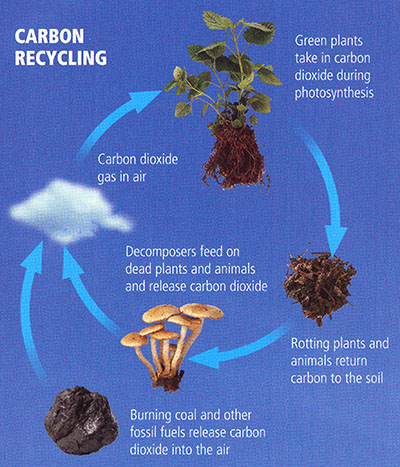
- Burning coal and other fossil fuels release carbon dioxide into the air
- Carbon dioxide gas in air
- Green plants take in carbon dioxide during photosynthesis
- Rotting plants and animals return carbon to the soil
- Decomposers feed on dead plants and animals and release carbon dioxide (Repeats/Return to step 1)
© 2015 Pearson Education, Inc.
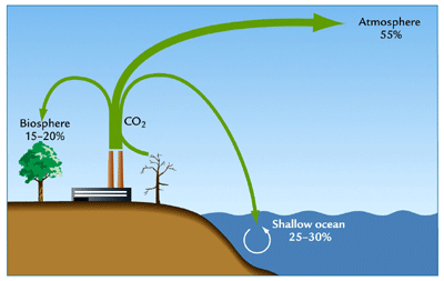
We refer to the amount of emitted CO2 that actually stays in the atmosphere as the airborne fraction of CO2. So far, only roughly half of our carbon emissions remain airborne. The other half has been absorbed by carbon sinks. The primary carbon sink is the upper ocean, which has absorbed roughly 25-30% of the CO2, while the terrestrial biosphere has absorbed another 15-20% of the CO2.
These sinks are not constant over time, however. Numerous studies indicate that both the upper ocean and terrestrial biosphere are likely to become less able to absorb and hold additional CO2 as the globe warms. Were this to happen, the airborne fraction of CO2 in the atmosphere would increase, and CO2 would accumulate in the atmosphere more quickly for a given rate of emissions. Such responses are known as the carbon cycle feedbacks, because they have the ability to influence the accumulation of CO2 in the atmosphere.
The existence of carbon cycle feedbacks forces us to reconsider the concept of climate sensitivity discussed earlier. Consider for example, the accumulated carbon emissions that we might calculate would lead to a doubling of CO2 in the atmosphere in the absence of carbon cycle feedbacks. As the climate warms, the positive carbon cycle feedbacks discussed above would cause the airborne fraction to increase. As a result, the final increase in atmospheric CO2 would be greater than the originally calculated doubling. Accordingly, there would be even more warming than one would estimate from applying the standard concept of equilibrium climate sensitivity to the original estimated slug of carbon emissions.
Such complications lead to the more general notion of the Earth System sensitivity. We will revisit these concepts later in the course.
Lesson 1 Discussion
Activity
Directions
At this point, you have completed the Course Orientation and the first lesson for METEO 469. Let's talk! Please participate in an online discussion of the course in general and of the material we have covered thus far. Please share your thoughts about the general topic of this course and what you hope to learn. Also, please discuss the material presented in Lesson 1.
This discussion will take place in a threaded discussion forum in Canvas (see the Canvas Guides for the specific information on how to use this tool) over approximately a week-long period of time. Since the class participants will be posting to the discussion forum at various points in time during the week, you will need to check the forum frequently in order to fully participate. You can also subscribe to the discussion and receive e-mail alerts each time there is a new post.
Please realize that a discussion is a group effort, and make sure to participate early in order to give your classmates enough time to respond to your posts.
Post your comments addressing some aspect of the material that is of interest to you and respond to other postings by asking for clarification, asking a follow-up question, expanding on what has already been said, etc. For each new topic you are posting, please try to start a new discussion thread with a descriptive title, in order to make the conversation easier to follow.
Suggested topics
The purpose of the discussion is to facilitate a free exchange of thoughts and opinions among the students, and you are encouraged to discuss any topic within the general discussion theme that is of interest to you. If you find it helpful, you may also use the topics suggested below.
General discussion of METEO 469
- Why are you taking this course?
- Why are you interested in climate change?
- Is it important to you to understand the scientific basis of climate science?
- Is it important to you to learn about impacts of climate change?
- What do you hope to learn in this course?
Lesson 1: Introduction to Climate and Climate Change
- In your understanding, what is the difference between the climate and the weather? Why is it important to differentiate between the two?
- Discuss natural versus anthropogenic climate change.
- What are feedback mechanisms in regard to the climate system? Can we know all feedback mechanisms in our climate system? Which mechanisms are considered most important and why?
- Discuss the concept of climate sensitivity. Why is this concept useful?
- Discuss the components of the carbon cycle and how carbon sources and sinks influence atmospheric CO2 levels.
Submitting your work
- Go to Canvas.
- Go to the Home tab.
- Click on Lesson 1 discussion: General Discussion of METEO 469.
- Post your comments and responses.
Grading criteria
You will be graded on the quality of your participation. See the online discussion grading rubric for the specifics on how this assignment will be graded. Please note that you cannot get full credit on this assignment if you wait until the last day of the discussion to make your first post.
Lesson 1 Summary
We have reviewed the essential basic concepts necessary for understanding climate change and global warming, including:
- The concepts of climate, climate change, and global warming;
- The components of the Earth's climate system: the atmosphere, oceans, cryosphere, and biosphere;
- The structure and composition of the Earth's atmosphere;
- The concepts of radiation and energy balance;
- The nature of the circulation of the atmosphere and the oceans;
- The concept of radiative forcing;
- Climate feedbacks and climate sensitivity;
- Carbon cycle feedbacks and the Earth System sensitivity.
We are now well-equipped to begin digging into the details. Our first foray will be into the world of climate observations. What data are available that can inform our understanding of how climate has changed over historic time? What indirect data are available that place historical observation in a longer-term context? How do we analyze such data to assess whether there is indeed "climate change"? This will be our next topic.
Reminder - Complete all of the module tasks!
You have finished Lesson 1. Double-check the list of requirements on the first page of this lesson to make sure you have completed all of the activities listed there before beginning the next lesson.
Lesson 2 - Climate Observations, part 1
The links below provide an outline of the material for this lesson. Be sure to carefully read through the entire lesson before returning to Canvas to submit your assignments.
Introduction
About Lesson 2
How do we know that climate change is taking place? Or that the factors we believe to be driving climate change, such as greenhouse gas concentrations, are themselves changing?
To address these questions, we turn first to instrumental measurements documenting changes in the properties of our atmosphere over time. These measurements are not without their uncertainties, particularly in earlier times. But they can help us to assess whether there appear to be trends in measures of climate and the factors governing climate, and whether the trends are consistent with our expectations of what the response of the climate system to human impacts ought to look like.
What will we learn in Lesson 2?
By the end of Lesson 2, you should be able to:
- Discuss the various modern observational data characterizing changes in surface and atmospheric temperature over the historical period;
- Discuss the nature of the uncertainties in the observational record of past climate; and
- Perform simple statistical analyses to characterize trends in, and relationships between, data series.
What will be due for Lesson 2?
Please refer to the Syllabus for the specific time frames and due dates.
The following is an overview of the required activities for Lesson 2. Detailed directions and submission instructions are located within this lesson.
- Read:
- IPCC Sixth Assessment Report, Working Group 1 -- Summary for Policy Makers (link is external)
- The Current State of the Climate: p. 4-11 (same as Lesson 1, but review information about the atmosphere)
- Dire Predictions, v.2: p. 34-35, 38-39, 80-81
- IPCC Sixth Assessment Report, Working Group 1 -- Summary for Policy Makers (link is external)
- Problem Set #1: Perform basic statistical analyses of climate data.
Questions?
If you have any questions, please post them to our Questions? discussion forum (not e-mail), located under the Home tab in Canvas. The instructor will check that discussion forum daily to respond. While you are there, feel free to post your own responses if you can help with any of the posted questions.
Observed Changes in Greenhouse Gases
Before we assess the climate data documenting changes in the climate system, we ought to address the question — is there evidence that greenhouse gases, purportedly responsible for observed warming, are actually changing in the first place?
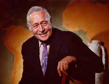
Thanks to two legendary atmospheric scientists, we know that there is such evidence. The first of these scientists was Roger Revelle.
Revelle, as we will later see, made fundamental contributions to understanding climate change throughout his career. Less known, but equally important, was the tutelage and mentorship that Revelle provided to other climate researchers. While at the Scripps Institution for Oceanography at the University of California in San Diego, Revelle encouraged his colleague Charles David Keeling to make direct measurements of atmospheric CO2 levels from an appropriately selected site.
Think About It!
Why do you suppose it is adequate to make measurements of atmospheric CO2 from a single location as an indication of changing global concentrations?
Click for answer.
Revelle and Keeling settled on the top of the mountain peak Mauna Loa on the big island of Hawaii, establishing during the International Geophysical Year of 1958 an observatory that would be maintained by Keeling and his crew for the ensuing decades.
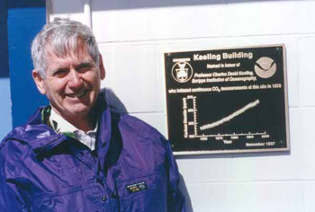
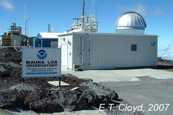
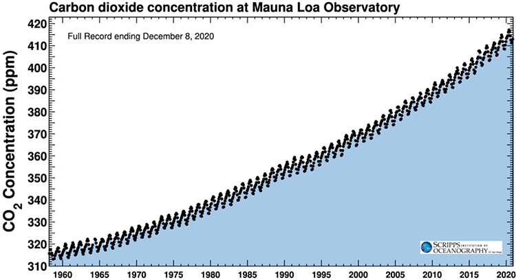
From this location, Keeling and crew would make continuous measurements of atmospheric CO2 from 1958 henceforth. Since then, long-term records have been established in other locations over the globe as well. The result of Keeling's labors is arguably the most famous curve in all of atmospheric science, the so-called Keeling Curve. That curve shows a steady increase in atmospheric CO2 concentrations from about 315 ppm when the measurements began in 1958 to over 400 ppm today (and climbing by about 2 ppm per year presently).
You might be wondering at this point, how do we know that the increase in CO2 is not natural? For one thing, as you already have encountered in your readings, the recent levels are unprecedented over many millennia. Indeed, when we cover the topic of paleoclimate, we will see that the modern levels are likely unprecedented over several million years. We will also see that there is a long-term relationship between CO2 and temperature, though the story is not as simple as you might think.
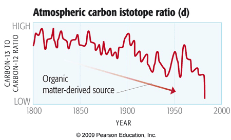
But there is other more direct evidence that the source of the increasing CO2 is indeed human, i.e., anthropogenic. It turns out that carbon that gets buried in the earth from dying organic matter and eventually turns into fossil fuels tends to be isotopically light. That is, nature has a preference for burying carbon that is depleted of the heavier, 13C, carbon isotope. Fossil fuels are thus relatively rich in the lighter isotope, 12C. However, natural atmospheric CO2 produced by respiration (be it animals like us, or plants which both respire and photosynthesize) tends to have a greater abundance of the heavier 13C isotope of carbon. If the CO2 increase were from natural sources, we would therefore expect the ratio of 13C to 12C to be getting higher. But instead, the ratio of 13C to 12C is getting lower as CO2 is building up in our atmosphere -- i.e., the ratio bears the fingerprint of anthropogenic fossil fuel burning.
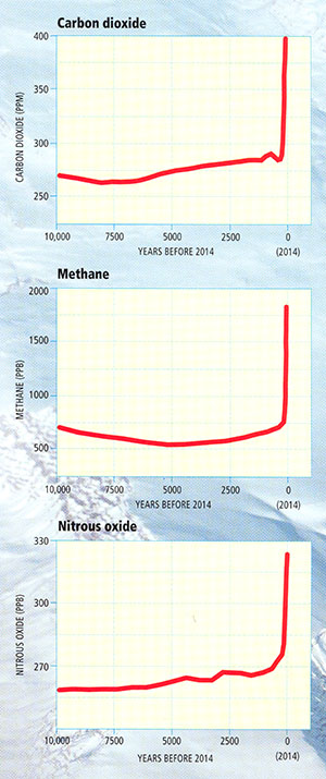
Of course, CO2 is not the only greenhouse gas whose concentrations are rising due to human activity. A combination of agriculture (e.g., rice cultivation), livestock raising, and dam construction led to substantial increases in methane (CH4) concentrations. Agricultural practices have also increased the concentration of nitrous oxide (N2O).
Using air bubbles in ice cores, we can examine small bits of atmosphere trapped in ice, as it accumulated back in time, to reconstruct the composition of the ancient atmosphere, including the past concentrations of greenhouse gases. The ice core evidence shows that the rise over the past two centuries in the concentrations of the greenhouse gases mentioned above is unprecedented for at least the past 10,000 years. Longer-term evidence suggests that concentrations are higher now than they have been for hundreds of thousands of years, and perhaps several million years.
© 2015 Pearson Education, Inc.
We are continuously monitoring these climate indicators. This website shows the latest values as well as their change since the year 1000.
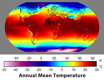
Modern Surface Temperature Trends
Instrumental surface temperature measurements consisting of thermometer records from land-based stations, islands, and ship-board measurements of ocean surface temperatures provide us with more than a century of reasonably good global estimates of surface temperature change. Some regions, like the Arctic and Antarctic, and large parts of South America, Africa, and Eurasia, were not very well sampled in earlier decades, but records in these regions become available as we move into the mid and late 20th century.
Temperature variations are typically measured in terms of anomalies relative to some base period. The animation below is taken from the NASA Goddard Institute for Space Studies in New York (which happens to sit just above "Tom's Diner" of Seinfeld fame), one of several scientific institutions that monitor global temperature changes. It portrays how temperatures around the globe have changed in various regions since the late 19th century. The temperature data have been averaged into 5 year blocks, and reflect variations relative to a 1950-1980 base period, i.e., warm regions are warmer than the 1950-1980 average, while cold regions are colder than the 1950-1980 average, by the magnitudes shown. You may note a number that appears in the upper right corner of the plot. That number indicates the average temperature anomaly over the entire globe at any given time, again, relative to the 1950-1980 average.
Take some time to explore the animation on your own. You may want to go through it several times, so you can start to get a sense of just how rich and complex the patterns of surface temperature variations are. Do you see periodic intervals of warming and cooling in the eastern equatorial Pacific? What might that be? [We will talk about the phenomenon in upcoming lessons].
Take note of any particularly interesting patterns in space and time that you see as you review the animation. You can turn your sound off the first few times, so you do not hear the annotation of the animation. Then, when you are ready, turn the sound on, and you can hear Michael Mann's take.
Video: Surface Temperature Patterns (1:19)
Let's look at the pattern of surface temperature changes over the past century. We are looking at surface temperatures relative to a base period from 1951 to 1980. So we're looking at whether the temperatures are warmer or colder than the average temperature over that late 20th century baseline. And we're looking at five year chunks.
We can see that in the 1930s, for example, there was some warming at high latitudes but not global in nature. We can see that in later decades, the 1960s to 1970s, there was some cooling over large parts of the Northern Hemisphere, but we'll talk about that later on in the course. That might have had in part a component due to aerosol production by human activity. And of course, as we get into the late 20th century, we see large scale warming that is unprecedented over at least the period covered by the instrumental record.
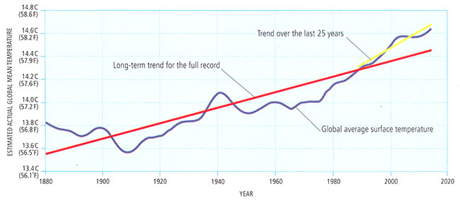
We can average over the entire globe for any given year and get a single number, the global average temperature. Here is the curve we get if we plot out that quantity. Note that in the plot below, the average temperature over the base period has been added to the anomalies, so that the estimate reflects the surface temperature of the Earth itself.
© 2015 Pearson Education, Inc.
We can see that the Earth has warmed a little less than 1°C (about 1.5 F) since widespread records became available in the mid-19th century. That this warming has taken place is essentially incontrovertible from a scientific point of view. What is the cause of this warming? That is a more difficult question, which we will address later.
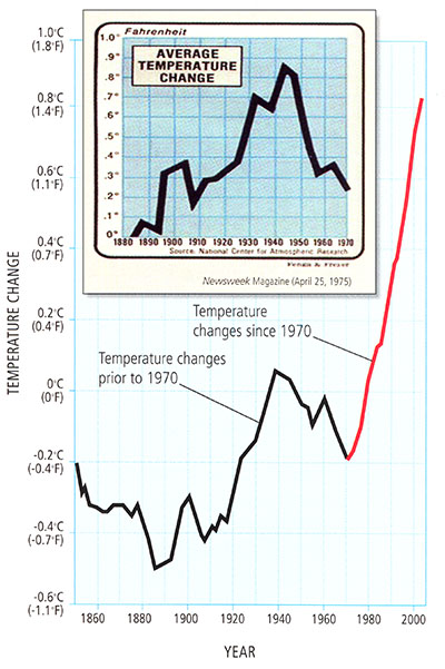
We discussed above the cooling that is evident in parts of the Northern Hemisphere (particularly over the land masses) from the 1940s-1970s. There was a time, during the mid 1970s, when some scientists thought the globe might be entering into a long-term cooling trend. There was a reason to believe that might be the case. In the absence of other factors, changes in the Earth's orbital geometry did favor the descent (albeit a very slow one!) into the next ice age. Also, the buildup of atmospheric aerosols, which, as we will explore, can have a large regional cooling impact, favored cooling. Precisely how these cooling effects would balance out against the warming impact of greenhouse gases was not known at the time.
Some critics claim that if the scientific community thought we're entering into another Ice Age in the 1970s, why should we trust the scientists to know about global warming? In fact, it was far from a scientific consensus within the scientific community in the mid 1970s that we were headed into another Ice Age. Some scientists speculated this was possible, but the prevailing viewpoint was that increasing greenhouse gas concentrations and warming would likely win out.
We know that, indeed, the short term cooling trend for the Northern Hemisphere continents ended in the 1970s, and, since then, global warming has dominated over any cooling effects.
© 2015 Pearson Education, Inc.
As mentioned earlier, we cannot deduce the cause of the observed warming solely from the fact that the globe is warming. However, we can look for possible clues. Just like forensics experts, climate scientists refer to these clues as fingerprints. It turns out that natural sources of warming give rise to different patterns of temperature change than human sources, such as increasing greenhouse gases. This is particularly true when we look at the vertical pattern of warming in the atmosphere. This is our next topic.
Vertical Temperature Trends
As alluded to previously, the vertical pattern of observed atmospheric temperature trends provides some important clues in establishing the underlying cause of the warming. While upper air temperature estimates (from weather balloons and satellite measurements) are only available for the latter half of the past century, they reveal a remarkable pattern. The lower part of the atmosphere — the troposphere, has been warming along with the surface. However, once we get into the stratosphere, the temperatures have actually been decreasing! As we will learn later when we focus on the problem of climate signal fingerprinting, certain forcings are consistent with such a vertical pattern of temperature changes, while other forcings are not.
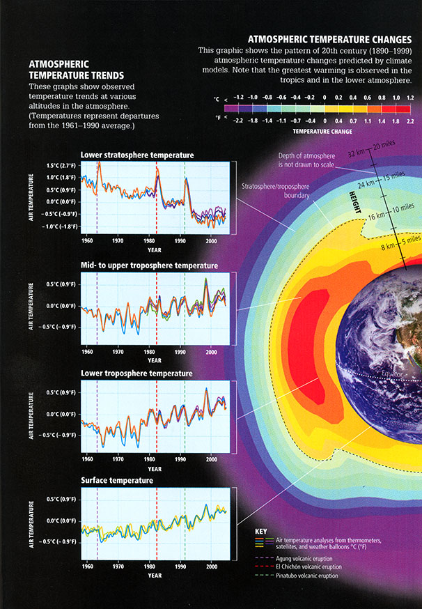
© 2015 Pearson Education Inc.
Think About It!
Care to venture a guess as to which forcing might be most consistent with this vertical pattern of temperature change?
Click for answer.
We will later see why this explanation is consistent with the observed pattern of warming, while other explanations, such as natural changes in solar output, are not.
Historical Variations in Precipitation and Drought
Recall our discussion of the general circulation of the atmosphere from Lesson #1.
There we learned that the circulation of the atmosphere is driven by the contrast in surface heating between the equator and the poles. That contrast results from the difference between incoming short wave solar heating and outgoing loss from the surface through various modes of energy transport, including radiational heat loss as well as heat loss through convection and latent heat release through evaporation.
It, therefore, stands to reason that climate change — which in principle involves changing the balance between incoming and outgoing radiative loss via changes in the greenhouse effect — is likely to alter the circulation of the atmosphere itself, and thus, large-scale precipitation patterns. The observed changes in precipitation patterns are far noisier (very variable and difficult to interpret) than temperature changes, however. Regional effects related to topography (e.g., mountain ranges that force air upward leading to wet windward and dry leeward conditions) and ocean-atmosphere heating contrasts that drive regional circulation patterns, such as monsoons, etc., lead to very heterogeneous patterns of changes in rainfall, in comparison with the pattern of surface temperature changes.

We might expect certain reasonably simple patterns to emerge, nonetheless. As we shall see in a later lesson looking at climate change projections, climate models predict that atmospheric circulation cells and storm tracks migrate poleward, shifting patterns of rainfall between the equator and poles. The subtropics and middle latitudes tend to get drier, while the subpolar latitudes get wetter (primarily in winter). The equatorial region actually is predicted to get wetter, simply because the rising motion that occurs there squeezes out more rainfall from the warmer, moister lower atmosphere. If we average the observed precipitation changes in terms of trends in different latitudinal bands, we can see some evidence of the changes.
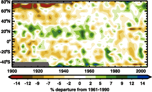
For example, we see that over time the high northern latitudes (60-80N) are getting wetter, while the subtropical and middle latitudes of the Northern Hemisphere are getting drier. However, there is a lot of variability from year to year, and from decade to decade, making it difficult to clearly discern whether the theoretically predicted changes are yet evident.
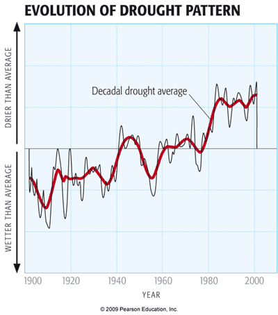
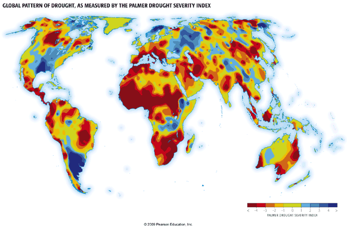
Drought, as we will see, does not simply follow rainfall changes. Rather, it reflects a combination of both rainfall and temperature influences. Decreased rainfall can lead to warmer ground temperatures, increased evaporation from the surface, decreased soil moisture, and thus drying.
Like rainfall, regional patterns of drought are complicated and influenced by a number of different factors. However, the combination of shifting rainfall patterns and increased evaporation has led to very pronounced increases in drought in subtropical regions, and even in many tropical and subpolar regions, where rainfall shows little trend (as indicated in the earlier graphic) but warmer temperatures have led to decreased soil moisture. These broad trends are seen in measurements of the Palmer Drought Severity Index -- an index that combines the effects of changing rainfall and temperature to estimate soil moisture content; the more negative the index, the stronger the drought.
In the next lesson, we will assess evidence for changes in extreme weather events, such as heat waves, floods, tropical cyclone activity, etc. In the meantime, however, we are going to digress a bit and discuss the topic of how to analyze data for inferences into such matters as discerning whether or not trends are evident in particular data sets, and whether it is possible to establish a relationship between two or more different data sets.
Review of Basic Statistical Analysis Methods for Analyzing Data - Part 1
Now that we have looked at the basic data, we need to talk about how to analyze the data to make inferences about what they may tell us.
The sorts of questions we might want to answer are:
- Do the data indicate a trend?
- Is there an apparent relationship between two or more different data sets?
These sorts of questions may seem simple, but they are not. They require us, first of all, to introduce the concept of hypothesis testing.
To ask questions of a data set, one has to first formalize the question in a meaningful way. For example, if we want to know whether or not a data series, such as global average temperatures, display a trend, we need to think carefully about what it means to say that a data series has a trend!
This leads us to consider the concept of the null hypothesis. The null hypothesis states what we would expect purely from chance alone, in the absence of anything interesting (such as a trend) in the data. In many circumstances, the null hypothesis is that the data are the product of being randomly drawn from a normal distribution, what is often called a bell curve, or sometimes, a Gaussian distribution (after the great mathematician Carl Friedrich Gauss):
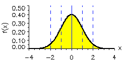
In the normal distribution shown above, the average or mean of the data set has been set to zero (that is where the peak is centered), and the standard deviation (s.d.), a measure of the typical amplitude of the fluctuations, is set to one. If we draw random samples from such a distribution, then roughly 68% of the time the values will fall within 1 s.d. of the mean (in the above example, that is the range -1 to +1). That means that roughly 16% of the time the data will fall above 1 s.d., and roughly 16% of the time the data will fall below 1 s.d. About 95% of the time, the randomly drawn values will fall within 2 s.d. (i.e., the range -2 to +2 in the above example). That means only 2.5% of the time the data will fall above 2 s.d. and only 2.5% of the time below 2 s.d. For this reason, the 2 s.d. (or 2 sigma) range, is often used to characterize the region we are relatively confident the data should fall in, and the data that fall outside that range are candidates for potentially interesting anomalies.
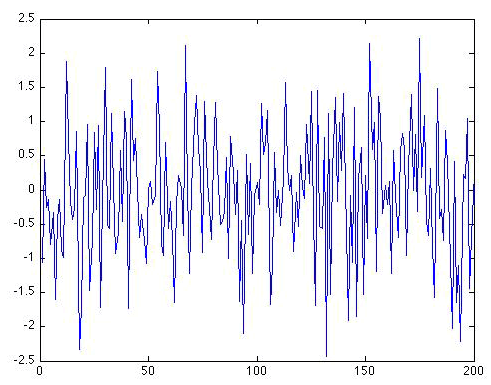
Random Time Series
Here is an example of what a random data series of length N = 200 which we will call ε(t), drawn from a simple normal distribution with mean zero and standard deviation one looks like (for example, you can think of this data set as a 200 year long temperature anomaly record).
This sort of noise is called white noise because there is no particular preference for either higher-frequency or lower-frequency fluctuations. The fluctuations have equal amplitude.
There is another form of random noise, known as red noise because the long-term fluctuations have a greater relative magnitude than short-term fluctuations (just as red light is dominated by low-frequency visible wavelengths of light).
A simple model for Gaussian red noise takes the form
where ε(t) is Gaussian white noise. As you can see, a red noise process tends to integrate the white noise over time. It is this process of integration that leads to more long-term variation than would be expected for a pure white noise series. Visually, we can see that the variations from one year to the next are not nearly as erratic. This means that the data have fewer degrees of freedom (N' ) than there are actual data points (N). In fact, there is a simple formula relating N' and N:
The factor measures the "redness" of the noise. Let us consider again a random sequence of length N = 200, but this time it is "red" with the value ρ = 0.6. The same random white noise sequence used previously is used in equation 2 for ε(t):
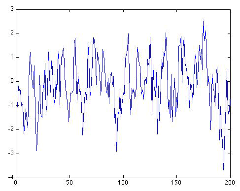
Self-Check
How many distinct peaks and troughs can you see in the series now?
Click for answer.
I counted about 55 distinct peaks and troughs in the series.
Self-Check
How many degrees of freedom N ' are there in this series?
Click for answer.
That's how many effective degrees of freedom there are in this red noise series.
This is roughly the number of troughs and peaks you should have estimated above by eyeballing the time series!
As ρ gets larger and larger, and approaches one, the low-frequency fluctuations become larger and larger. In the limit where ρ = 1, we have what is known as a random walk or Brownian motion. Equation 2 in this case becomes just:
You might notice a problem when using equation 3 in this case. For ρ = 1, we have N' = 0! There are no longer any effective degrees of freedom in the time series. That might seem nonsensical. But there are other attributes that make this a rather odd case as well. The time series, it turns out, now has an infinite standard deviation!
Let's look at what our original time series looks like when we now use ρ = 1:
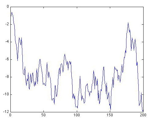
As you can see, the series starts out in the same place, but immediately begins making increasingly large amplitude long-term excursions up and down. It might look as if the series wants to stay negative. But if we were to continue the series further, it would eventually oscillate erratically between increasingly large negative and positive swings. Let's extend the series out to N = 1000 values to see that:
The swings are getting wider and wider, and they are occurring in both the positive and negative direction. Eventually, the amplitude of the swings will become arbitrarily large, i.e., infinite, even though the series will remain centered about a mean value of zero. This is an example of what we refer to in statistics as a pathological case.
Now let's look at what the original N = 200 long pure white noise series look like when there is a simple linear trend of 0.5 degree/century added on:
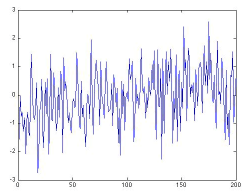
Can you see a trend? In what direction? Is there a simple way to determine whether there is indeed a trend in the data that is distinguishable from random noise. That is our next topic.
Review of Basic Statistical Analysis Methods for Analyzing Data - Part 2
Establishing Trends
Various statistical hypothesis tests have been developed for exploring whether there is something more interesting in one or more data sets than would be expected from the chance fluctuations Gaussian noise. The simplest of these tests is known as linear regression or ordinary least squares. We will not go into very much detail about the underlying statistical foundations of the approach, but if you are looking for a decent tutorial, you can find it on Wikipedia. You can also find a discussion of linear regression in another PSU World Campus course: STAT 200.
The basic idea is that we test for an alternative hypothesis that posits a linear relationship between the independent variable (e.g., time, t in the past examples, but for purposes that will later become clear, we will call it x) and the dependent variable (i.e., the hypothetical temperature anomalies we have been looking at, but we will use the generic variable y).
The underlying statistical model for the data is:
where i ranges from 1 to N, a is the intercept of the linear relationship between y and x, b is the slope of that relationship, and ε is a random noise sequence. The simplest assumption is that ε is Gaussian white noise, but we will be forced to relax that assumption at times.
Linear regression determines the best fit values of a and b to the given data by minimizing the sum of the squared differences between the observations y and the values predicted by the linear model . The residuals are our estimate of the variation in the data that is not accounted for by the linear relationship, and are defined by
For simple linear regression, i.e., ordinary least squares, the estimates of a and b are readily obtained:
and
The parameter we are most interested in is b, since this is what determines whether or not there is a significant linear relationship between y and x.
The sampling uncertainty in b can also be readily obtained:
where std(ε) is standard deviation of ε and μ is the mean of x. A statistically significant trend amounts to the finding that b is significantly different from zero. The 95% confidence range for b is given by . If this interval does not cross zero, then one can conclude that b is significantly different from zero. We can alternatively measure the significance in terms of the linear correlation coefficient, r , between the independent and dependent variables which is related to b through
r is readily calculated directly from the data:
where over-bar indicated the mean. Unlike b, which has dimensions (e.g., °C per year in the case where y is temperature and x is time), r is conveniently a dimensionless number whose absolute value is between 0 and 1. The larger the value of r (either positive or negative), the more significant is the trend. In fact, the square of r (r2) is a measure of the fraction of variation in the data that is accounted for by the trend.
We measure the significance of any detected trends in terms of a a p-value. The p-value is an estimate of the probability that we would wrongly reject the null hypothesis that there is no trend in the data in favor of the alternative hypothesis that there is a linear trend in the data — the signal that we are searching for in this case. Therefore, the smaller the p value, the less likely that you would observe as large a trend as is found in the data from random fluctuations alone. By convention, one often requires that p<0.05 to conclude that there is a significant trend (i.e., that only 5% of the time should such a trend have occurred from chance alone), but that is not a magic number.
The choice of p in statistical hypothesis testing represents a balance between the acceptable level of false positives vs. false negatives. In terms of our example, a false positive would be detecting a statistically significant trend, when, in fact, there is no trend; a false negative would be concluding that there is no statistically significant trend, when, in fact, there is a trend. A lower threshold (that is, higher p-value, e.g., p = 0.10) makes it more likely to detect a real but weak signal, but also more likely to falsely conclude that there is a real trend when there is not. Conversely, a higher threshold (that is, lower p-value, e.g., p = 0.01) makes false positives less likely, but also makes it less likely to detect a weak but real signal.
There are a few other important considerations. There are often two different alternative hypotheses that might be invoked. In this case, if there is a trend in the data, who is to say whether it should be positive (b > 0) or negative (b < 0)? In some cases, we might want only to know whether or not there is a trend, and we do not care what sign it has. We would then be invoking a two-sided hypothesis: is the slope b large enough in magnitude to conclude that it is significantly different from zero (whether positive or negative)? We would obtain a p-value based on the assumption of a two-sided hypothesis test. On the other hand, suppose we were testing the hypothesis that temperatures were warming due to increased greenhouse gas concentrations. In that case, we would reject a negative trend as being unphysical — inconsistent with our a priori understanding that increased greenhouse gas concentrations should lead to significant warming. In this case, we would be invoking a one-sided hypothesis. The results of a one-sided test will double the significance compared with the corresponding two-sided test, because we are throwing out as unphysical half of the random events (chance negative trends). So, if we obtain, for a given value of b (or r) a p-value of p = 0.1 for the two-sided test, then the p-value would be p = 0.05 for the corresponding one-sided test.
There is a nice online statistic calculator tool, courtesy of Vassar college, for obtaining a p-value (both one-sided and two-sided) given the linear correlation coefficient, r , and the length of the data series, N. There is still one catch, however. If the residual series ε of equation 6 contains autocorrelation, then we have to correct the degrees of freedom, N', which is less than the nominal number of data points, N. The correction can be made, at least approximately in many instances, using the lag-one autocorrelation coefficient. This is simply the linear correlation coefficient, r1, between ε, and a carbon copy of ε lagged by one time step. In fact, r1 provides an approximation to the parameter ρ introduced in equation 2. If r1 is found to be positive and statistically significant (this can be checked using the online link provided above), then we can conclude that there is a statistically significant level of autocorrelation in our residuals, which must be corrected for. For a series of length N = 100, using a one-sided significant criterion of p = 0.05, we would need r1 > 0.17 to conclude that there is significant autocorrelation in our residuals.
Fortunately, the fix is very simple. If we find a positive and statistically significant value of r1, then we can use the same significance criterion for our trend analysis described earlier, except we have to evaluate the significance of the value of r for our linear regression analysis (not to be confused with the autocorrelation of residuals r1) using a reduced, effective degrees of freedom N', rather than the nominal sample size N. Moreover, N' is none other than the N' given earlier in equation 3 where we equate
That's about it for ordinary least squares (OLS), the main statistical tool we will use in this course. Later, we will encounter the more complicated case where there may be multiple independent variables. For the time being, however, let us consider the problem of trend analysis, returning to the synthetic data series discussed earlier. We will continue to imagine that the dependent variable (y) is temperature T in °C and the independent variable (x) is time t in years.
First, let us calculate the trend in the original Gaussian white noise series of length N = 200 shown in Figure 2.12(1). The linear trend is shown below:
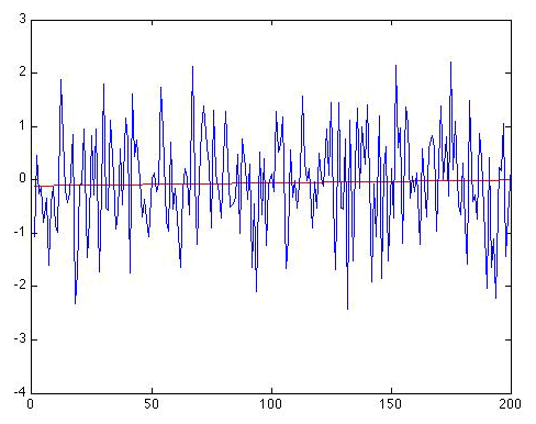
The trend line is given by: , and the regression gives r = 0.0332. So there is an apparent positive warming trend of 0.0006 °C per year, or alternatively, 0.06 °C per century. Is that statistically significant? It does not sound very impressive, does it? And that r looks pretty small! But let us be rigorous about this. We have N = 200, and if we use the online calculator link provided above, we get a p-value of 0.64 for the (default) two-sided hypothesis. That is huge, implying that we would be foolish in this case to reject the null hypothesis of no trend. But, you might say, we were looking for warming, so we should use a one-sided hypothesis. That halves the p-value to 0.32. But that is still a far cry from even the least stringent (e.g., p = 0.10) thresholds for significance. It is clear that there is no reason to reject the null hypothesis that this is a random time series with no real trend.
Next, let us consider the red noise series of length N = 200 shown earlier in Figure 2.12(2).
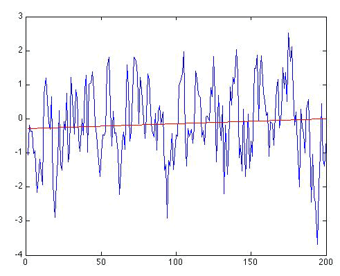
As it happens, the trend this time appears nominally greater. The trend line is now given by: , and the regression gives r = 0.0742. So, there is an apparent positive warming trend of 0.14 degrees C per century. That might not seem entirely negligible. And for N = 200 and using a one-sided hypothesis test, r = 0.0742 is statistically significant at the p = 0.148 level according to the online calculator. That does not breach the typical threshold for significance, but it does suggest a pretty high likelihood (15% chance) that we would err by not rejecting the null hypothesis. At this point, you might be puzzled. After all, we did not put any trend into this series! It is simply a random realization of a red noise process.
Self Check
So why might the regression analysis be leading us astray this time?
Click for answer.
The problem is that our residuals are not uncorrelated. They are red noise. In fact, the residuals looks a lot like the original series itself:
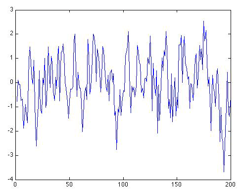
This is hardly coincidental; after all, the trend only accounts for , i.e., only about half a percent, of the variation in the data. So 99.5% of the variation in the data is still left behind in the residuals. If we calculate the lag-one autocorrelation for the residual series, we get r1 = 0.54. That is, again not coincidentally, very close to the value of ρ = 0.6 we know that we used in generating this series in the first place.
How do we determine if this autocorrelation coefficient is statistically significant? Well, we can treat it like it were a correlation coefficient. The only catch is that we have to use N-1 in place of N, because there are only N-1 values in the series when we offset it by one time step to form the lagged series required to estimate a lag-one autocorrelation.
Self Check
Should we use a one-sided or two-sided hypothesis test?
Click for answer.
After all, we are interested only in whether there is positive autocorrelation in the time series.
If we found r1 < 0, that would be an entirely different matter, and a complication we will choose to ignore for now.
If we use the online link and calculate the statistical significance of r1 = 0.54 with N-1 = 199, we find that it is statistically significant at p < 0.001. So, clearly, we cannot ignore it. We have to take it into account.
So, in fact, we have to treat the correlation from the regression r = 0.074 as if it has ≈ 60 degrees of freedom, rather than the nominal N = 200 degrees of freedom. Using the interactive online calculator, and replacing N = 200 with the value N' = 60, we now find that a correlation of r = 0.074 is only significant at the p = 0.57 (p = 0.29) for a two-sided (one-sided) test, hardly a level of significance that would cause us to seriously call into doubt the null hypothesis.
At this point, you might be getting a bit exasperated. When, if ever, can we conclude there is a trend? Well, why don't we now consider the case where we know we added a real trend in with the noise, i.e., the example of Figure 2.12(5) where we added a trend of 0.5°C/century to the Gaussian white noise. If we apply our linear regression machinery to this example, we do detect a notable trend:
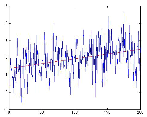
Now, that's a trend - your eye isn't fooling you. The trend line is given by: . So there is an apparent positive warming trend of 0.56 °C per century (the 95% uncertainty range that we get for b, i.e., the range b±2 σb, gives a slope anywhere between 0.32 and 0.79 °C per century, which of course includes the true trend (0.5 °C/century) that we know we originally put in to the series!). The regression gives r = 0.320. For N = 200 and using a one-sided hypothesis test, r = 0.320 is statistically significant at p<0.001 level. And if we calculate the autocorrelation in the residuals, we actually get a small negative value (), so autocorrelation of the residuals is not an issue.
Finally, let's look at what happens when the same trend (0.5 °C/century) is added to the random red noise series of Figure 2.12(2), rather than the white noise series of Figure 2.12(1). What result does the regression analysis give now?
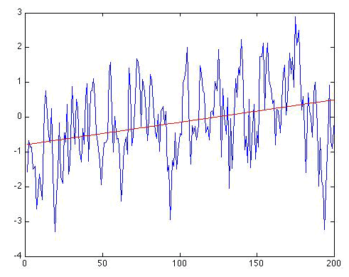
We still recover a similar trend, although it's a bit too large. We know that the true trend is 0.5 degrees/century, but the regression gives: . So, there is an apparent positive warming trend of 0.64 °C per century. The nominal 95% uncertainty range that we get for b is 0.37 to 0.92 °C per century, which again includes the true trend (0.5 degrees C/century). The regression gives r = 0.315. For N = 200 and using a one-sided hypothesis test, r = 0.315 is statistically significant at the p < 0.001. So, are we done?
Not quite. This time, it is obvious that the residuals will have autocorrelation, and indeed we have that r1 = 0.539, statistically significant at p < 0.001. So, we will have to use the reduced degrees of freedom N'. We have already calculated N' earlier for ρ = 0.54, and it is roughly N' = 60. Using the online calculator, we now find that the one-sided p = 0.007, i.e., roughly p = 0.01, which corresponds to a 99% significance level. So, the trend is still found to be statistically significant, but the significance is no longer at the astronomical level it was when the residuals were uncorrelated white noise. The effect of the "redness" of the noise has been to make the trend less statistically significant because it is much easier for red noise to have produced a spurious apparent trend from random chance alone. The 95% confidence interval for b also needs to be adjusted to take into account the autocorrelation, though just how to do that is beyond the scope of this course.
Often, residuals have so much additional structure — what is sometimes referred to as heteroscedasticity (how's that for a mouthful?) — that the assumption of simple autocorrelation is itself not adequate. In this case, the basic assumptions of linear regression are called into question and any results regarding trend estimates, statistical significance, etc., are suspect. In this case, more sophisticated methods that are beyond the scope of this course are required.
Now, let us look at some real temperature data! We will use our very own custom online Linear Regression Tool written for this course. The demonstration how to use this tool has been recorded in three parts below. Here is a link to the online statistical calculator tool mentioned in the videos below.
In addition, there is a written tutorial for the tool and these data available at these links: Part 1, Part 2.
Video: Custom Linear Regression Tool - Part 1 (3:16)
Click for transcript
PRESENTER: We're going to look at an example here I'm loading in December average temperatures for State College Pennsylvania for the one hundred and seven year period from 1888 to 1994 let's plot out the data that's what they look like it's a scatter plot or if we like we can view them in terms of a line plot by clicking this radio button if you look at the statistics tab it tells you the average of the temperature is 30.9 just under 31 degrees Fahrenheit so the average December temperature in State College of Pennsylvania is founded degree Fahrenheit below freezing the standard deviation is three point nine five just under four degrees Fahrenheit so the fluctuation from year to year in the average December temperature in State College is a fairly sizable four degrees Fahrenheit one year might be thirty the next year might be thirty four the next year it might be 31 the next year might be twenty-seven thank its you some idea of the fluctuations and of course we can see those fluctuations here in the plot now we can calculate a trend line let's go to the trend lines tab this calculates a linear trend in the time series it tells us there's a trend right here of zero point zero to five degrees fahrenheit warming per year or if we want to express that in terms of a century two point five degrees fahrenheit warming per century that's the warming trend in State College Pennsylvania now the correlation for the coefficient for that regression R is R it equals zero point one nine three we look that up in the online statistics table I put in 107 years for the length of our series and 0.193 for our it calculate we look that up in the online statistics table we calculates the significance it tells us the p value is zero point zero two three four one tailed test and zero point zero four six or two-tailed tests so in either case the correlation the regression the trend in the series will be significant at greater than P equals zero point zero two zero five level it would be significant at the 95% confidence level arguably we should go with the one tailed test since we're really testing the hypothesis that there is a warming trend in State College since we know the globe is warming our hypothesis was unlikely to be that State College showed a cooling trend we were interested to see if State College said the warming trend that we know is evident in the temperature records around the world so one could in fact one typically would motivate a one-tailed or one-sided hypothesis test so the trend passes that test at the 0.02 level that's fairly significant if we go back again we can see the standard error of the slope is 0.01 - if we were to take the value 0.025 and add plus or minus 2 times this number of 0.01 - it would give us the 95 percent confidence range in the slope of this warming trend.
Video: Custom Linear Regression Tool - Part 2 (1:03)
Click for transcript
PRESENTER: So this slope here 0.024 six is roughly twice the standard error of this slope and in fact the ratio of the slope to its standard error is something that we call T and in this case it's a little larger than two this means that the slope itself is two Stander's away two standard errors away from zero in this case on the positive side typically when T is 2 or larger that signifies a result that's significant at the 0.05 level for a two-tailed test which is what we see here so in essence this is when we see a t-value 2 or larger typically that signifies that the results of the regression are statistically significant at least for a large sample where n is larger than 100 or so and as long as we don't have the problem of autocorrelation of residuals which we talked about a bit before and so our next topic is going to be to talk a little bit about this issue of autocorrelation in this example.
Video: Custom Linear Regression Tool - Part 3 (1:53)
Click for transcript
PRESENTER: Now let's look at the residuals or what's left over in the data when we remove this regression line we can use the regression model tool here to find the residuals regression we've done is where our independent variable is year and our target variable our dependent variable is temperature we can run that regression here and that gives us two things first of all it tells us the autocorrelation in the residuals which is we could say C is pretty small it says value down here it's minus 0.1 one and if we look up the statistical significance of a negative correlation of 0.1 one on the order of one hundred and seven degrees of freedom we'll find that it's statistically insignificant so that means in this particular case it doesn't look like we have to worry about the added caveats associated with autocorrelation when our residuals do not look like uncorrelated white noise but instead have this low frequencies strong structure now we can actually plot these residuals and I'll make a plot here we'll go back to plot settings I go down to model residuals and so I'm going to plot the residuals as a function of year I no longer need a trendline here but it will keep the zero line and that's what we have so when we remove the trend we counted for a statistically significant trend and when we remove that trend this is what was left over these are the residuals and they look pretty much like Gaussian random white noise which is good that means that the results of our regression are basically sound we fulfilled the basic underlying assumption that what's left over after we account for the significant trend in the data looks random.
You can play around with the temperature data set used in this example using the Linear Regression Tool
Review of Basic Statistical Analysis Methods for Analyzing Data - Part 3
Establishing Relationships Between Two Variables
Another important application of OLS is the comparison of two different data sets. In this case, we can think of one of the time series as constituting the independent variable x and the other constituting the independent variable y. The methods that we discussed in the previous section for estimating trends in a time series generalize readily, except our predictor is no longer time, but rather, some variable. Note that the correction for autocorrelation is actually somewhat more complicated in this case, and the details are beyond the scope of this course. As a general rule, even if the residuals show substantial autocorrelation, the required correction to the statistical degrees of freedom (N' ), will be small as long as either one of the two time series being compared has low autocorrelation. Nonetheless, any substantial structure in the residuals remains a cause for concern regarding the reliability of the regression results.
We will investigate this sort of application of OLS with an example, where our independent variable is a measure of El Niño — the so-called Niño 3.4 index — and our dependent variable is December average temperatures in State College, PA.
The demonstration is given in three parts below:
Video: Demo - Part 1 (3:22)
PRESENTER: Now we're going to look at a somewhat different situation where our independent variable is no longer time but it's some quantity it could be temperature it could be an index of El niño or the North Atlantic Oscillation. Let's look at an example of that sort. We are going to look at the relationship between El niño and December temperatures in State College Pennsylvania. We can plot out that relationship as a scatterplot. On the y-axis we have December temperature in State College, the x-axis is our independent variable the niño 3.4 index negative values indicate La niña and positive values indicate El niños. The strength of the relationship between the two is going to be determined by the trendline. That describes how December temperatures in State College depend on El niño and by fitting the regression, we obtain a slope of 0.7397. That means for each unit change in El niño in niño 3.4 we get a 0.74 unit change in temperature. So for a moderate El niño event where the niño 3.4 index is in the range of plus one, that would imply that December temperatures in State College, for that year, are 0.74 degrees Fahrenheit 0.74 degrees Fahrenheit warmer than usual. And for modestly strong La niña in weather niño 3.4 indexes on the order of minus one or so the December State College December temperatures would be about zero point seven four degrees colder than normal. You can also see that the y-intercept here the case when the niño 3.4 index is zero we get roughly the climatological value for December temperatures 30.9. Now the correlation coefficient is associated with that linear regression in this case 0.74. Now we have a 107 years our data set as before it goes from 1888 to 1994. If we use our table, and take n equal to 107, and R of 0.74, we find that the one tailed value of P is 0.365 the two tailed value is 0.073. So if I threshold for significance where P of 0.05 the 95 percent significance level, then that relationship a correlation of coefficient of 0.174 with 107 years of information would be significant for one tailed test but it would not past the 0.05, the 95% significance threshold, for a two-tailed test. So we have to ask the question, which is more appropriate here, the one tailed test or the two tailed test. Now if you had a reason to believe that El niño events form the northeastern US, for example, you might motivate a one tailed test since only a positive relationship would be consistent with your expectations. But if we didn't know beforehand whether El niños had a cooling influence or warming influence on the northeastern US you might argue for a two-tailed test. So whether or not the relationship is significant at the P equals 0.05 level is going to depend on which type of hypothesis test were able to use in this case.
Video: Demo - Part 2 (4:10)
PRESENTER: Let's continue with this analysis. Now what I'm going to do here is plot instead the temperature as a function of the year instead of niño 3.4. That's plot number one. That's a State College December temperatures. And now for pot number two. I'm going to plot the niño 3.4 index as a function of year. I use axis B here to put them on the same scale so here we could see the two series. We had the State College December temperatures in blue and the niño 3.4 index in yellow. And you can see that in various years it does seem to be a little bit of a relationship between large positive departures in the niño 3.4 index are associated with warm Decembertemperatures, and large negative departures are associated with cold temperatures. We can visually see that relationship we also saw we plotted the two variables in a two dimensional scatterplot and looked at the slope of the line relating the two datasets. Here now we're looking at the same time looking at the time series of the two data sets and we can see some of that positive covariance, if you will, that there does seem to be a positive relationship although we already know it's a fairly weak relationship.So let's do a formal regression.
So I'm going to take away the niño series here. What we've got here is our State College December temperatures in blue. Now our regression model is going to use the niño 3.4 index as the independent parameter and temperature as our dependent variable We'll run the linear regression. There is a slope 0.74 is the coefficient that describes the relationship between the niño 3.4 index of december temperatures. It's positive, we already saw the slope was positive. There's also a constant term we're not going to worry much about here. What we're really interested in is the slope of the regression line that describes that changes in temperature depends on changes in the niño 3.4 index. And as we've seen, 0.74 implies that for a unit increase in niño 3.4 an anomaly of +1 on the niño 3.4 scale, we'll get a temperature for December that, on average, is 0.74 degrees fahrenheit warmer than average. The r-squared value right here is 0.032 and if we take that number, take the square root of that that's an r-value of 0.1734 and we know that's a positive correlation because the slope is positive. We already looked up the statistical significance of that number and we found that for a one-sided hypothesis test that the relationship is significant at the 0.05 level. But if we were using a two-sided significant criterion hypothesis test, that is to say, if we didn't know a priori whether we had a reason to believe that El niños warm or cool State College December temperatures, then the relationship would not quite be statistically significant. So we've calculated the linear model, so now we can plot it. So now I'm going to plot year and model output on the same scale. You can change the scale up these axes by clicking on these arrows arrows. I'm gonna make them both go from 20 to 40. This one over here. And so now, the yellow curve is showing us the component of variation in the blue curve that can be explained by El niño and we can see it's a fairly small component. It's small compared to the overall level of variability in December state college temperatures which vary by as much as plus or minus 4 degrees or so Fahrenheit.
Video: Demo - Part 3 (3:22)
PRESENTER: So continuing where we left off. The yellow curve is showing us the component of the variation in December State College temperatures that can be explained by El niño. In a particularly strong El niño year, where the niño 3.4 index is say as large as +2. We get a December temperature that's about one and a half degrees Fahrenheit above average. That is to say that 0.74 degrees Fahrenheit that we get for one unit change in niño 3.4. Particularly strong La Niña event, we get a -0.74 degrees effect that we get for the negative niño 3.4 anomaly of negative two or so. Yet, I'm sorry, a -1.5 Fahrenheit cooling effect for negative two or so. So the influence of El niño is small compared to the overall variability of roughly four degrees Fahrenheit in the series. But it is statistically significant. At least if we are able to motivate a one-sided hypothesis test. If we had reason to believe that the El Niño events warm State College temperatures in the winter then the regression gives us a significant result that's significant at the 0.05 level. The standard threshold for statistical significance. Okay, so that may not be that satisfying. We're not explaining a large amount of the variation in the data, but we do appear to be explaining a statistically significant fraction of the variability in the data. Now finally, let's look at the residuals from that regression. So what I'll do is, I will get rid of these other graphs. Let's keep year. Let's change this to model residuals. I'm just going to plot the model residuals as a function of time, and that's what they look like. There isn't a whole lot of obvious structure and in fact if you go back to the regression model tab, and we look at the value of the lag 1 autocorrelation coefficient, we'll see that it's -0.09 that's slightly negative and it's quite small, close to zero. If we look up the statistical significance it's not going to be even remotely significant. So we don't have to worry much about autocorrelation influencing our estimate of statistical significance. We also don't have much evidence here of the sort of low-frequency structure and the residuals that might cause us to worry. So the nominal results of our regression analysis appear to be valid and again if we were to envoce a one-sided hypothesis test, we would have found a statistically significant, albiet a weak, influence of El niño on State College December temperatures.
You can play around with the data set used in this example using this link: Explore Using the File testdata.txt
Problem Set #1
Activity: Statistical Analysis of Climate Data
NOTE: For this assignment, you will need to record your work on a word processing document. Your work must be submitted in Word (.doc or .docx), or PDF (.pdf) format.
The documents associated with this problem set, including a formatted answer sheet, can be found on CANVAS.
- Worksheet successfully downloaded! Be sure also to download the answer sheet from CANVAS (Files > Problem Sets > PS#1).
Each problem (#2 through #7) is equally weighted for grading and will be graded on a quality scale from 1 to 10 using the general rubric as a guideline. Thus, a raw score as high as 70 is possible, and that raw score will be adjusted to a 50-point scale; the adjusted score will be recorded in the grade book.
The objective of this problem set is for you to work with some of the data analysis/statistics concepts and mechanics covered in Lesson 2, namely the coefficient of variation (You are welcome to use any software or computer programming environment you wish to complete this problem set, but the instructor can only provide support for Excel should you need help. The instructions also will assume you are using Excel.
Now, in CANVAS, in the menu on the left-hand side for this course, there is an option called Files. Navigate to that, and then navigate to the folder called Problem Sets, inside of which is another folder called PS#1. Inside that folder is a data file called PS1.xlsx. Download that data file to your computer, and open the file in Excel. You should see two time series: average annual temperature for State College, PA [home of the main campus of Penn State!], and Oceanic Niño Index [ONI, a measure of ENSO phase]. Both series are for 1950 to 2021.
- An important first step of exploratory data analysis is always to visualize the data. Construct a scatterplot of each time series (i.e., two different plots). If you need pointers on how to make a scatterplot in Excel, this is a good resource. Include only markers in the scatterplots, and remember that a proper graph always has a descriptive title and axis labels, including the units of the quantities being displayed. Place the scatterplots on the answer sheet.
- An important second step of exploratory data analysis is to find some basic summary statistics. For both time series, find the mean, median, and standard deviation, and record the values of these statistics on the answer sheet.
- The next step is to explore whether there is a linear trend in State College annual average temperature over time and the nature of that trend. You will explore the calculation of the linear trend line in a couple of different ways.
The first way is using the equations derived in Lesson 2. As a recap, the equation for a linear trend line is:
where ranges from 1 to , is the intercept of the linear relationship between and , and is the slope of that relationship. In this context, is given by the number of years (and also values) in the time series, is given by State College annual average temperature, and is given by time. Accordingly, and are calculated from the data as follows:
and
Note that must be calculated before can be calculated. To calculate the value of , first calculate each value that is in the equation for it, recording your results on the answer sheet:
As a hint, the second value that you are to calculate is a summation (which is what the sigma notation indicates), and it is suggested that you use Excel to find the sum of all the values (i.e., State College annual average temperature values); if you need a resource on sum functions in Excel, look here. For the fourth value, you should first calculate the “” products (again, Excel would be helpful), and then add those products together. For the fifth value, you are finding the square of each value and then summing those squares. For the sixth value, you are finding the square of the sum of all the values; in other words, you are squaring a value that you previously found.
Now, you can calculate . Substitute the values you calculated above into the equation for that is given above (and also given in Lesson 2). On the answer sheet, report the value you calculate for , and also show the equation for with the values substituted into the equation. If you need a refresher on Microsoft Word Equation Editor, look here. Be cautious with order of operations!
The calculation of the value of is more straightforward, as you might note that you have already calculated all the values that appear in the equation for . On the answer sheet, report the value you calculate for , and also show the equation for with the values substituted into the equation.
You now can write the equation for the linear trend line. Report this equation on the answer sheet.
You may have found this calculation to be tedious. It is a useful exercise to work through the mechanics of how a linear trend line equation comes together, but you would not want to go through all this work every time you want to perform a regression analysis. Excel has already helped quite a lot, but it can help even more.
The second way of exploring whether there is a linear trend in State College annual average temperature over time is to use Excel to add a linear trend line to the scatterplot you already made for the State College annual average temperature time series dataset and to display the equation for that trend line. Use Excel to do this, and place the scatterplot with trend line and trend line equation on the answer sheet. If you need help with how to do this in Excel, look here. You will find that the trend line equation given by Excel is likely different than the one that you found, especially in terms of the y-intercept. This discrepancy is due to rounding: you likely rounded more than Excel does. Do not worry about this.
Now, you will consider whether the linear trend is statistically significant. (It is likely that you can already see a trend!) Calculate the correlation coefficient , and report that value on the answer sheet. It is suggested that you use Excel’s CORREL function to do this, but, whatever tool or software you use, make sure you are calculating Pearson’s correlation coefficient value, as there are many different flavors of correlation value.
Next, use the online calculator that is introduced in Lesson 2 to test whether the correlation coefficient is statistically significant. Note that we are using the correlation coefficient as a means of evaluating the statistical significance of the linear trend. Report the P-value on the answer sheet, and state, in a complete sentence, whether the correlation coefficient is statistically significant based on that P-value.
For the last part of the exploration, you will consider whether the time series exhibits autocorrelation by calculating the lag-1 autocorrelation coefficient . This calculation can be done using the CORREL function in Excel with one modification that is illustrated below:
The third column shown is actually just the second column shifted forward one year (a lag of one year, hence lag-1 autocorrelation). This leaves pairs (i.e., the degrees of freedom) on which you can implement the CORREL function to calculate the lag-1 autocorrelation coefficient. Report the value of ρ that you find on the answer sheet. Then, use the online calculator that is introduced in Lesson 2 to determine whether the value of is statistically significant. Report the P-value that you find on the answer sheet and, in a complete sentence, whether the autocorrelation in the time series is statistically significant, and also report the value of that you inputted into the calculator.
- Perform a similar linear trend analysis as you performed in #4 for the ONI time series. That is, calculate the linear trend line (you can use Excel and need not calculate the and values using the equations), calculate the correlation coefficient, calculate the lag-1 autocorrelation coefficient, and discuss whether the linear trend and whether any autocorrelation are statistically significant. Report all results and your discussion on the answer sheet.
- Is there a linear relationship between ONI and State College annual average temperature? If so, what is the strength of that relationship, and is the relationship statistically significant? Is there any concern about autocorrelation in this context? Report your results and discussion on the answer sheet.
- Suppose, hypothetically, that you split the State College annual average temperature time series into two sub-time series – one covering the earlier 1950-1984 period and another covering the latter 1985-2021 period. You calculate the slopes of the linear trend lines corresponding to these sub-time series and the standard errors of those slopes. By adding the corresponding standard error to each slope value and also subtracting it from each slope value, you find the upper and lower bounds, respectively, of the 95% confidence interval for each slope. You find that the two confidence intervals overlap. Given this finding, explain whether or not the slopes are statistically different. Give your discussion on the answer sheet.
Lesson 2 Summary
In this lesson, we reviewed key observations that detail how our atmosphere and climate are changing. We have seen that:
- Greenhouse gas concentrations, including atmospheric CO2 and methane, are increasing dramatically, and these increases are associated with human activity;
- The surface of the Earth is warming and certain regions (e.g., the Arctic) are warming faster than others, consistent, as we will see, with expectations from climate model projections;
- The vertical pattern of the warming indicates that the surface and lower atmosphere (troposphere) are warming, while the atmosphere is cooling at altitude (in the stratosphere), a pattern that is consistent with greenhouse warming, but not with the natural factors such as solar output changes;
- There is a complicated pattern of changes in rainfall patterns around the globe, with some regions becoming wetter while other regions become drier;
- Despite the heterogeneous pattern of changes in rainfall, there is a trend towards more widespread drought, consistent with the additional impact of warming on evaporation from the soil.
We also learned how to analyze basic relationships in observational data, including:
- How to assess whether or not there is a statistically significant trend over time in a data series;
- How to assess whether or not there is a statistically significant relationship between two distinct data series.
In our next lesson, we will look at some additional types and sources of observational climate data, and we will explore some additional tools for analyzing data.
Reminder - Complete all of the lesson tasks!
You have finished Lesson 2. Double-check the list of requirements on the first page of this lesson to make sure you have completed all of the activities listed there before beginning the next lesson.
Lesson 3 - Climate Observations, part 2
Introduction
About Lesson 3
In Lesson 2, we focused on atmospheric observations documenting historical changes in the climate system. In this lesson, we will turn to other evidence of climate change, including paleoclimate data that can be used to document, albeit with added uncertainty, more distant past changes in climate, and other variables documenting changes in the climate system including measures of ocean circulation, changes in sea ice, glaciers, and other climate change data documenting extreme weather, including tropical cyclone and hurricanes.
What will we learn in Lesson 3?
By the end of Lesson 3, you should be able to:
- discuss the various modern observational and paleoclimate data sets relevant to assessing modern-day climate change, and their uncertainties;
- discuss the role of both the oceans and atmosphere in observed climate variability and climate change;
- perform statistical analyses where there are multiple potential factors influencing some climate variable.
What will be due for Lesson 3?
Please refer to the Syllabus for specific time frames and due dates.
The following is an overview of the required activities for Lesson 3. Detailed directions and submission instructions are located within this lesson.
- Read:
- IPCC Sixth Assessment Report, Working Group 1 -- Summary for Policy Makers (link is external)
- The Current State of the Climate: p. 4-11 (same as Lesson 1, but review information about the cryosphere, sea level, and oceans)
- Dire Predictions, v.2: p. 36-37, 100-101, 110-111, 148-149
- IPCC Sixth Assessment Report, Working Group 1 -- Summary for Policy Makers (link is external)
- Problem Set #2: Statistical Analysis of Atlantic Tropical Cyclones and Underlying Climate Influences.
- Take Quiz #1.
Questions?
If you have any questions, please post them to our Questions? discussion forum (not e-mail), located under the Home tab in Canvas. The instructor will check that discussion forum daily to respond. Also, please feel free to post your own responses if you can help with any of the posted questions.
Sea Ice, Glaciers, Ice Sheets, and Global Sea level
From the standpoint of climate change impacts, nothing could be more important than the potential changes in Earth's cryosphere — that is, the sea ice, the glaciers, and the two major ice sheets.
Sea Ice
As temperatures warm in the Arctic, the extent of summer sea ice coverage continues to decrease. Ice extent dropped to precipitous levels in 2007. Arctic sea ice seemed to recover in 2008, but then the sea-ice cover decline resumed. In 2012, the area of Arctic sea ice at the end of the summer melting season reached a low of 3.3 million square kilometers (1.3 million square miles), well below the projections of IPCC models. You can read more about the current state of Arctic sea ice in this recent report from the National Snow and Ice Data Center.
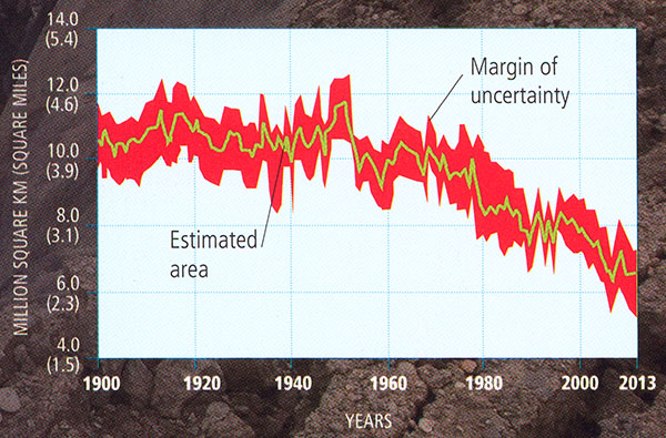
© 2015 Pearson Education, Inc.
Perhaps more significantly, much of the more resilient, thicker multi-year ice (the ice that survives the summer melt season so that it can further accumulate winter after winter) has disappeared, and the remaining ice is largely just seasonal ice that is far more prone to melting. In fact, when the decreasing thickness, as well as the extent, is taken into account, based on sophisticated computer analyses, the decrease in sea ice volume (the most relevant quantity) is in fact seen to be declining even more abruptly than the extent alone.
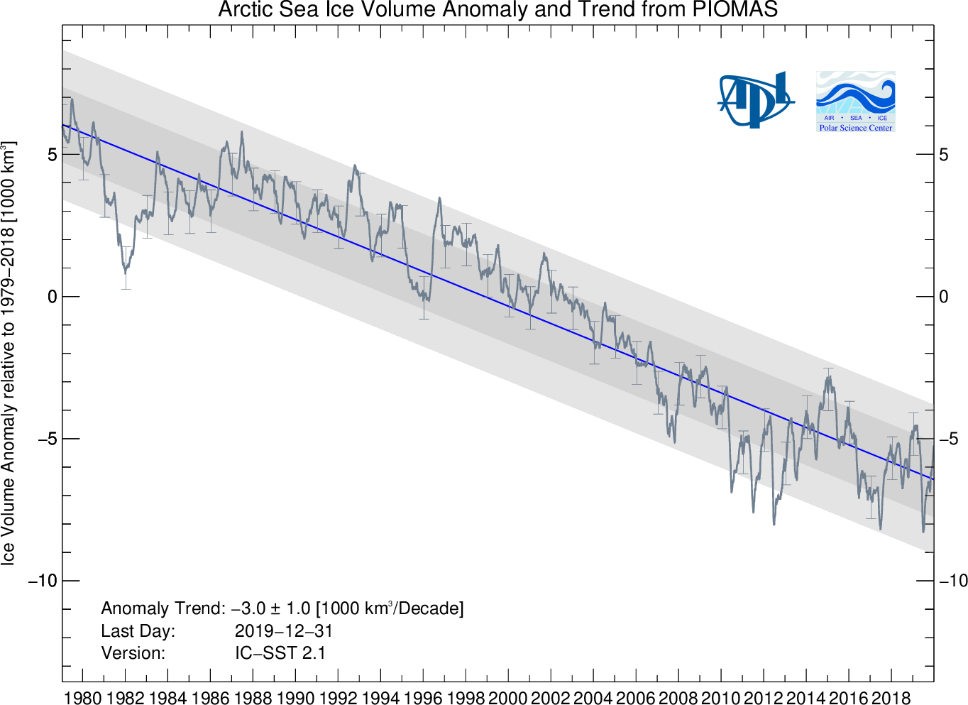
As we will see later, the decreases shown by the observations are actually ahead of schedule as far as state-of-the-art climate change projections are concerned. In fact, some predictions based on the observed trends have Arctic sea ice disappearing completely during the summer in as few as a couple of decades.
Glaciers
Mountain glaciers can be found on all of the continents of the world with the exception of Australia. They exist typically at high elevations where the accumulation of snow out-paces the ablation — the loss of ice through melting or sublimation. Because glaciers are vertically distributed, the accumulation and ablation may take place in different locations. For example, the accumulation may take place largely at the apex of a mountain where conditions are cold and most if not all precipitation falls as snow, while the ablation may take place at the periphery of the glacier at lower elevation, where temperatures are high enough, at least seasonally, for ice to melt.
Mountain glaciers have been retreating around the world over the past century. Below are some examples of "before and after" photos demonstrating the dramatic retreat of mountain glaciers in various regions of the world including (top) the McCall Glacier of the Brooks Range in Alaska, (middle) Muir Glacier in Alaska, and (bottom) Qori Kalis Glacier in Peru.
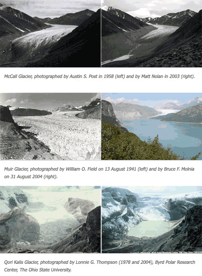
This is primarily because of warming temperatures leading to increased summer melt.
In some cases, the situation is a bit more complicated. Consider for example Mount Kilimanjaro. The iconic glacier fields atop this mountain are essentially located at the equator. This iconic equatorial ice cap was immortalized by Ernest Hemingway during the 1930s in his novel The Snows of Kilimanjaro. Ironically, the snows of Kilimanjaro are disappearing rapidly (see below).
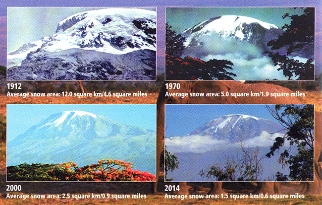
- 1912 - Average snow area: 12.0 km2/4.6 mi2
- 1970 - Average snow area: 5.0 km2/1.9 mi2
- 2000 - Average snow area: 2.5 km2/0.9 mi2
- 2014 - Average snow area: 1.5 km2/0.6 mi2
At the current rate of ablation, Kilimanjaro's ice fields will be gone within the next two decades. Is this imminent disappearance due to global warming? Well, Kilimanjaro's ice fields have been around for at least 12,000 years. It would seem quite a coincidence, therefore, that they just happened to choose to disappear now. However, it isn't quite as simple as one might imagine. Melting is probably not the primary process responsible for the ablation of the ice. At this altitude of nearly 6 km (placing it in the mid-troposphere), the primary mechanism by which ice is lost is sublimation, not melting. Moreover, as with many tropical glaciers (see e.g., this article on Tropical Glacier Retreat at the site RealClimate.org), changes over time in the overall mass balance are heavily influenced by accumulation (i.e., the amount of snowfall), not just melting. Some have argued, for these reasons, that the rapid disappearance of Kilimanjaro's ice cap cannot be blamed on human-caused climate change. That argument is probably wrong, however. While changes in humidity and precipitation have clearly played a role in decreasing accumulation, these changes may in part reflect the large-scale reorganization of the atmospheric circulation that is tied to human-caused climate change. Moreover, some direct melting of Kilimanjaro's ice fields has been observed in recent decades, and that melting is almost certainly part of the picture. Such increases in melting have been observed for high-elevation mountain glaciers throughout the tropics, and are tied to large-scale warming of the tropical mid-troposphere that appears to be connected with the larger-scale pattern of a warming troposphere.
Now, there are some exceptions to the pattern of widespread global glacial retreat. See the map below. Certain outlet glaciers in Scandinavia and the Pacific Northwest have actually expanded in extent in recent decades.
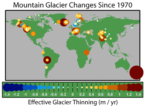
Think About It!
Why do you suppose that expansion is taking place in some locations? [Hint: what do those regions have in common?]
Click for answer.
Winters are quite mild in these maritime regions, and the winds coming off the relatively warm North Atlantic pick up large amounts of moisture before they encounter the continent. When the winds rise up over the coastal mountain ranges, that moisture precipitates out as snow.
A warm winter will typically lead to even greater amounts of snowfall. Counter-intuitively, mountain glaciers can actually expand in these regions as winters warm, which they indeed have in these regions!
If we aggregate all of the major glaciers around the world into a single estimate of 'mass balance', i.e., the net change in ice mass which represents the balance between accumulation through snowfall and loss through melting and sublimation, we find a pronounced trend towards decreasing glacial ice mass, which in many respects mirrors the loss of sea ice shown earlier. However, unlike melting sea ice which does not contribute to global sea level rise (because the ice is already floating on the ocean), the melting glaciers do make a significant contribution to rising global sea levels — a topic we address below.
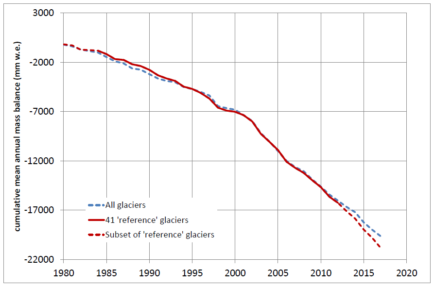
Ice Sheets
While we have seen that the world's glaciers are melting en masse, and at an accelerating rate, we have not yet addressed the behavior of the two largest glaciers in the world — glaciers that are so large, we call them continental ice sheets. There are two continental ice sheets — the Greenland ice sheet and the Antarctic Ice Sheet. In reality, only a portion of the Antarctic ice sheet is susceptible to collapse. The East Antarctic ice sheet sits at a relatively high elevation and is relatively stable. It is unlikely to disappear under most projected climate change scenarios. However, the lower elevation West Antarctic ice sheet is likely susceptible to mass wastage.
The mass of the major ice sheets, like that of smaller glaciers, depends on the balance between accumulation and loss to ablation. Also, as with smaller glaciers, the regions of accumulation and ablation are typically not the same. The primary accumulation is in the colder interiors of the continents, while ice flowing out towards the periphery at lower latitudes is subject to melting and the calving of ice into the ocean. In the case of the Greenland ice sheet, fissures known as moulins may form, allowing meltwater to percolate to the bottom and help lubricate streams of melting ice that escape to the ocean in ice channels. In the case of the Antarctic Ice sheet, ice calves into the southern ocean at the periphery of expansive ice shelves that extend out over the relatively warm ocean.
Because of the complex balance between the processes favoring accumulation and ablation, it was not known for some time whether the observed warming of the globe had in fact led to any net loss of ice mass for either of the two continental ice sheets. In recent years, however, careful satellite measurements have suggested that detectable changes are indeed underway. The area of summer ablation over Greenland, for example, has expanded greatly in recent years (see figure below).
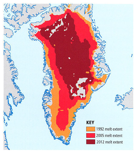
© 2015 Pearson Education, Inc.
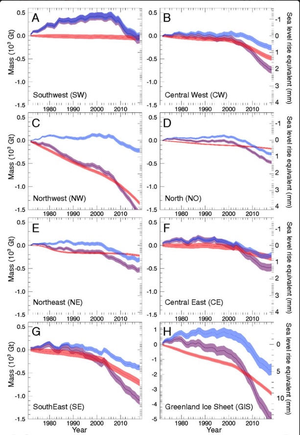
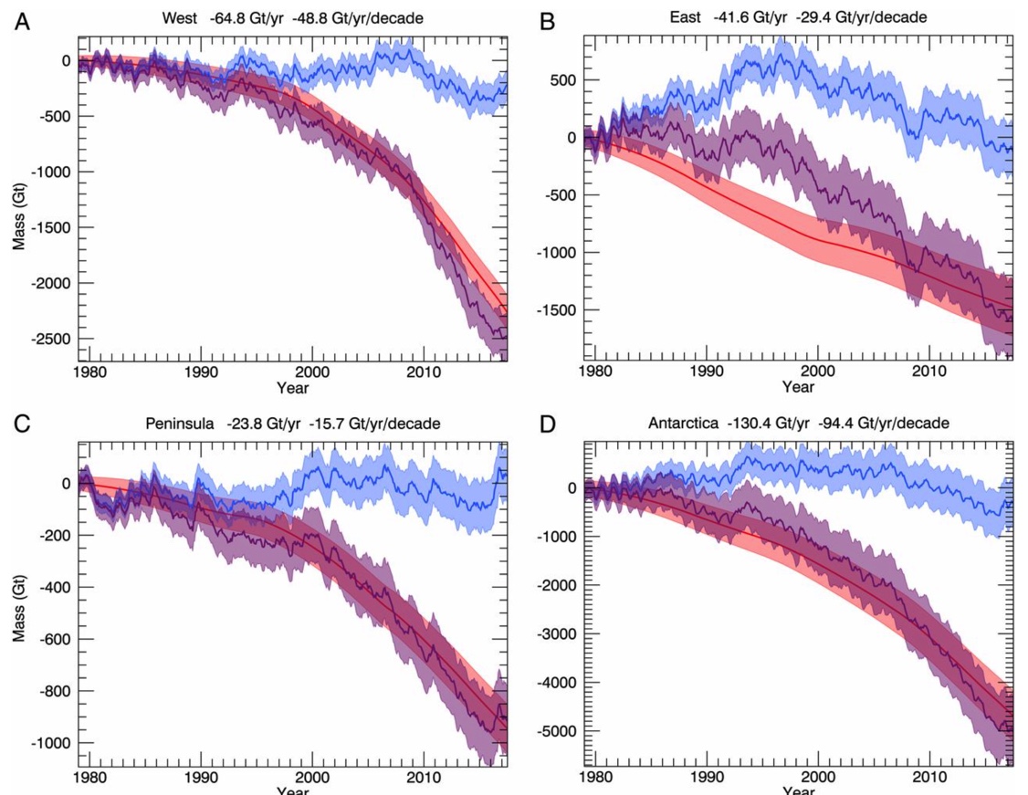
Figure 3.9: Changes in Ice Mass for the Antarctic Ice Sheet over Past 40 Years.
Credit: Riguot et al. (2019), PNAS
Global Sea Level
We have seen that the world's ocean surface is warming. Indeed, as we will see later in this lesson, that warmth is slowly penetrating down into the deep ocean. As ocean water warms, it expands, and thus contributes to raising sea level. We refer to this component of global sea level rise as the thermosteric component. But there are other key contributions of global warming to global sea level. In fact, we've just discussed them above: the melting of glaciers, and the loss of ice mass now underway for both of the two continental ice sheets.
The latter contribution exceeds the expectations scientists had just a few years ago, before there was any consensus that the decay of the Greenland and West Antarctic ice sheets was likely to happen in the near future, let alone already be underway. Not surprisingly, we are observing that global sea level rise is proceeding at the very upper extreme of the range that was projected by the models just a couple decades ago (see below).
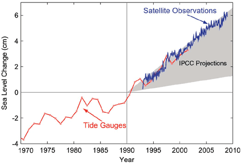
The Oceans
As we have seen previously, the entire surface of the Earth has warmed by a bit less than 1°C over the past century. It is evident that the oceans, on average, have warmed a bit less than the land regions. The warming of the oceans has been damped by their greater thermal inertia — water has a greater heat capacity than land, and the oceans are several kilometers deep, and heat can efficiently be buried below the surface.
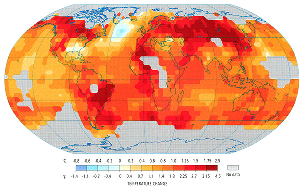
© 2015 Pearson Education, Inc.
Part of the reason that the surface of the oceans is warming less than the land surface, then, is that a good deal of the heat is being buried below the ocean surface. In other words, the heating from global warming is slowly diffusing down through the ocean, warming the entire layer of ocean water several kilometers down below the surface.
© 2015 Pearson Education, Inc.
Because the processes (small-scale convection and diffusion) by which this heat penetrates down through the ocean are slow, these processes lead to a substantial delay in how the ocean (surface and sub-surface) warms in response to any given radiative forcing, including that due to increasing greenhouse gas concentrations. These considerations have profound implications for global sea level rise, as alluded to in the previous section on sea level rise. Because seawater expands with warming, ocean levels continue to slowly rise as the heating penetrates down through the deep ocean. As we will see later in the course when we discuss climate change impacts, it is such slow, delayed responses to global warming that leads to very long-term consequences of policy decisions being made today; global sea level will continue to rise for several centuries, even if we were to freeze greenhouse gas concentrations at current levels. Such lasting impacts of current human influences on climate are referred to as the committed climate change. They are part of the motivation for calls by many for immediate reductions in greenhouse gas emissions.
It is important to recognize that the oceans are not simply a passive reservoir for absorbing surface heating. They are, as we saw in our first lesson, highly dynamic. Oceans play a key role, for example, in transporting heat from low latitudes to higher latitudes to help relieve the imbalance in solar heating. Much of this transport takes place within the horizontal ocean gyres. As the gyres are governed primarily by the latitudinal pattern of variations in surface winds, they are relatively robust. Climate change may alter prevailing wind patterns somewhat, but the main features, e.g., the presence of easterly surface winds in the tropics and westerly surface winds in mid-latitudes, are not projected to change. Therefore, we don't expect substantial changes in the role played in the climate system by the horizontal ocean gyres.
There could be a larger role, however, played by the ocean's thermohaline circulation.
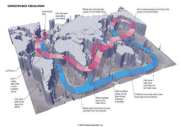
We know that the thermohaline circulation plays a significant role in the natural long-term variability of the climate system. Indeed, there is a mode of climate variability known as the Atlantic Multidecadal Oscillation (or simply 'AMO') that appears to arise from long-term oscillations in the North Atlantic component of the thermohaline circulation, although evidence is mounting that the AMO is not a reflection of internal variability.

There may also be a role of the thermohaline circulation in climate change itself. As we will see later in the course when we examine climate model projections of future climate change, there is the possibility that the thermohaline circulation could weaken, or even collapse, in a global warming scenario. It is a combination of the salty and cold properties of surface waters in the sub-polar North Atlantic that leads to their high density, and consequent sinking motion. That sinking motion forms the descending limb of the thermohaline circulation, so any substantial freshening and warming of these waters could inhibit that sinking. It has long been suspected that global warming, through the influx into the North Atlantic of fresh water from melting land snow and ice, could thus inhibit or even shut down the thermohaline circulation. There is quite a bit of debate as to whether or not the data show that such a weakening is underway. Direct measurements of the strength of the thermohaline circulation are scarce and are sparse over time. Thus, evidence for trends are at best equivocal.
As we will see later in this lesson, there is some evidence that a thermohaline circulation collapse scenario may have played out at the end of the last ice age, during a period known as the Younger Dryas. At that time, the large amount of meltwater produced from the initial termination of the ice age appears to have shut down the thermohaline circulation. Since the thermohaline circulation is a source of poleward heat transport in regions surrounding the North Atlantic, this event appears to have temporarily sent the climate back into a glacial state before the final termination of the ice age a thousand or so years later. Could such a scenario play out because of human-caused climate change? We will revisit that question in a later lecture.
The El Niño/Southern Oscillation
We have already seen an example of a natural mode of climate variability above in the AMO. However, the single most important mode of natural variability in the climate system—certainly on interannual timescales—is the El Niño/Southern Oscillation or ENSO. ENSO represents a coupled mode of the ocean and atmosphere, which is to say that the atmosphere influences the ocean (primarily through the impact of surface winds on horizontal and vertical 'upwelling' ocean currents), while the oceans, in turn, influence the atmosphere (primarily through the effect of east/west variations in ocean surface temperature, which, in turn, drive a pattern of circulation in the overlying atmosphere). The net result is that the tropical Pacific combined ocean/atmosphere system naturally oscillates with a characteristic timescale of roughly 2-7 years.
During the El Niño phase of the oscillation, the eastern/central tropical Pacific is warmer than usual. Sea level in the eastern tropical Pacific is higher than usual because the waters are warm (and thus less dense), in the absence of vertical upwelling of colder, denser water. The warmer waters in the central equatorial Pacific lead to rising motion in the atmosphere, shifting the rising limb of the so-called Walker Circulation (the vertical and longitudinal pattern of atmospheric circulation over the equatorial Pacific), and associated tendency for rainfall, from its normal position in the western equatorial Pacific. This circulation pattern, in turn, implies a decrease in the strength of the easterly trade winds in the eastern tropical Pacific. But it is those trade winds that are responsible for the upwelling of the cold waters in the first place. Thus, the ocean and atmosphere work in concert to sustain the ENSO pattern of temperature, winds, and rainfall. The La Niña state, when sea surface temperatures are cooler than normal in the eastern and central tropical Pacific, is based on these various features of the tropical Pacific ocean-atmosphere system being opposite to that described above for the El Niño phase.
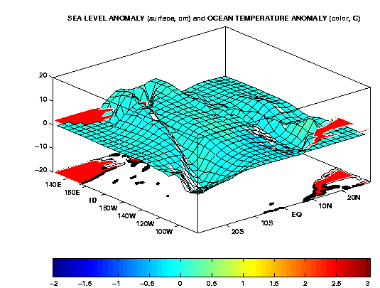
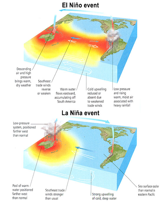
El Niño
- Descending air and high pressure brings warm, dry weather
- Southeast trade winds reverse or weaken
- Warm water flows eastward, accumulating off South America
- Cold upwelling reduced or absent due to weakened trade winds
- Low pressure and rising warm, moist air associated with heavy rainfall
La Niña
- Low-pressure system, positioned farther west than normal
- Pool of warm water positioned farther west than normal
- Southeast trade winds, stronger than usual
- Strong upwelling of cold, deep water
- Seas surface cooler than normal in eastern Pacific
© 2015 Pearson Education, Inc.
The system tends to oscillate between the El Niño and La Niña phases because of equatorial ocean wave dynamics that are beyond the scope of this course. The net effect of these waves—Kelvin waves and Rossby waves—is to make the system unstable so that it does not persist either in the El Niño or La Niña phase for more than a year or so, constantly oscillating between these two phases with a characteristic 2-7 year timescale.
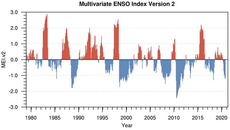
If we look at the pattern of evolution of sea surface temperature anomalies over the tropical Pacific during recent years, we can clearly see this alternation between states when the eastern and central tropical Pacific are relatively warm (El Niño events) and states when the regions are relatively cold (La Niña events).
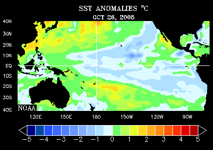
By some measures, ENSO is the largest signal in the observational climate record, even competing with the climate change signal itself. That is because El Niño and La Niña events can be large, leading to more than a degree C cooling or warming over a large part of the tropical Pacific Ocean, and ENSO events have global teleconnections. That is to say, ENSO affects seasonal weather patterns around the world through the impact of the tropical Pacific cooling/warming on the extratropical jet streams, the Monsoons, and other regional atmospheric circulation patterns. As we will see in the next section, ENSO even influences Atlantic seasonal hurricane activity. The largest and most reliable regional impacts of ENSO are shown below:
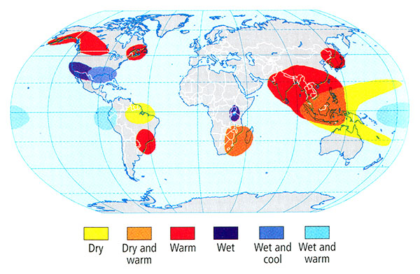
© 2015 Pearson Education, Inc.
Given the prominent impact of ENSO on year-to-year variations in climate around the world, it is well worth asking, how might ENSO itself change, in response to human-caused climate change? Such questions are key to assessing regional impacts of future climate change. Yet, we don't have the firm answers here that one might expect or want. In the time series plot above, there does seem to be some evidence of a trend towards more El Niño-like conditions in recent decades, but it is difficult to establish any statistical significance in this trend. Indeed, some climate models suggest the possibility of the opposite trend—a prevalence of the La Niña state—in response to anthropogenic climate change. We will return to the issue of climate variability in a later lecture on projections of future climate change.
Tropical Cyclones / Hurricanes
There is perhaps no more impressive or—for that matter—deadly a weather phenomenon than tropical cyclones (and hurricanes—which are simply strong tropical cyclones).
We will focus, for the purpose of our discussion, on Atlantic tropical cyclones (TCs), as they are the best observed, providing records that go back more than a century (albeit with some uncertainties, particularly in earlier decades), and they are most relevant from the standpoint of North American impacts.
The 2020 Atlantic hurricane season was the most active ever, with a total of 30 TCs forming over the course of the Atlantic hurricane season (which formally runs from Jun 1-Nov 30, though storms sometimes occur outside this window).
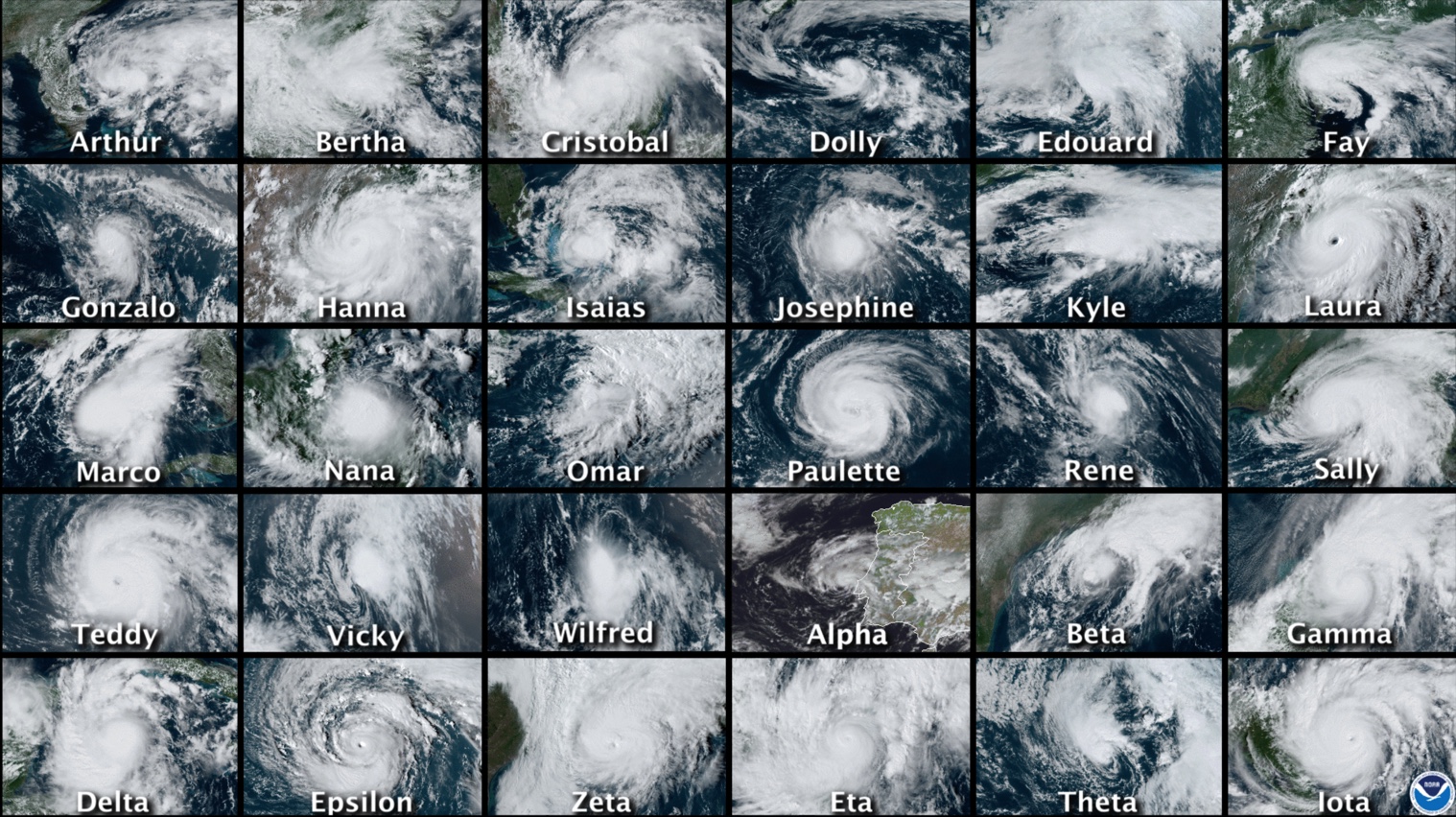
One might well ask, is the apparent recent trend towards more destructive Atlantic hurricanes in some way tied to climate change? Well—as we will discuss in more detail in the next section on extreme weather—it is never possible to attribute any single weather event to climate change. But we can arguably see the impacts of climate change in the longer-term shifts in frequency and intensity of such events. In the case of Atlantic tropical cyclones & hurricanes, one convenient measure of activity is the net power dissipation, a measure that measures the energy dissipated by tropical cyclones & hurricanes as they interact with the ocean surface, averaged over the integrated lifetime of all storms during a particular season. Simple theoretical arguments developed by MIT hurricane expert Kerry Emanuel imply that this measure of hurricane activity should closely follow sea surface temperatures.
If we compare sea surface temperatures over the tropical Atlantic in the main development region (MDR) for tropical storms during the core of the hurricane season (August-October) to estimates of the power dissipation index, we do, indeed, find a very close relationship as far back as reliable records go (the mid 20th century). Indeed, the increase in powerfulness of storms in recent decades (the broader context for the unusually active 2005 season) does appear to be tied to the warming of Atlantic Ocean surface temperatures. Moreover, computer modeling studies aimed at detecting and attributing human impacts on climate (a topic discussed in later lectures) do indeed tie this warming to human causes. In this sense, it can be argued that human-caused climate change has played a role in the increased destructiveness of Atlantic hurricanes in recent years.
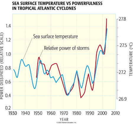
What about the number of Atlantic TCs, including the hyperactive 2005 season with its 28 named storms? Is this part of a longer-term trend? And if so, is that trend related to human influences on the climate? This question is still being actively debated within the scientific community. For one thing, there is some question about how reliable long-term records of TC counts are, particularly prior to the use of modern aircraft reconnaissance in the mid 1940s (if you're interested in the details, you can find a journal article about this topic by Michael Mann entitled Evidence for a modest undercount bias in early historical Atlantic tropical cyclone counts). Furthermore, while sea surface temperatures are one factor driving Atlantic tropical cyclone activity, there are other important factors as well. Even if sea surface temperatures are high—a favorable factor for development—other factors may mitigate tropical storm formation. High amounts of vertical wind shear, for example, are unfavorable for development. Such conditions typically prevail over the Caribbean during El Niño years, which are consequently unfavorable for Atlantic TC activity. La Niña years, by contrast, are favorable for Atlantic TC activity. Another climate pattern known as the North Atlantic Oscillation ('NAO'), which represents the year-to-year changes in the configuration of the jet stream over the North Atlantic, also has an influence on Atlantic TC activity. During years with a tendency for the negative phase of the NAO, when the Bermuda subtropical high pressure system is weaker than normal, storms are more likely to track through the tropical Atlantic and Caribbean where they encounter more favorable conditions for development. During positive NAO years, storms are more likely to track northward over colder extratropical Atlantic waters.
It is thus possible to relate year-to-year changes in Atlantic TC counts to three basic climate factors: (1) tropical Atlantic sea surface temperatures (SSTs) over the MDR during the August-October season, (2) ENSO, and (3) NAO. The long-term history of annual Atlantic TC counts, along with the time histories of factors (1)-(3) are shown below (for a, the red coloring indicates years with greater than average annual TC counts; for b-d, the red coloring indicates that the factor in question is more favorable than average for Atlantic TC activity. The Niño3.4 index is a time series that measures the state of ENSO where positive values indicate El Niño events and negative values indicate La Niña events.
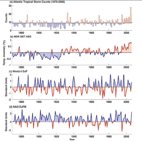
There are a number of observations that can be made here. First of all, it is clear that annual TC counts have increased over time. How much we can conclude they have increased depends on the assumptions regarding how many TCs might have been missed in earlier decades, but even allowing for the upper-end estimates of undercounted past activity, the levels of activity over the past 15 years are without any modern-day precedent. It is also clear that this increase is coincident with increasing sea surface temperatures in the MDR. (Some researchers have argued that much of the long-term variability in temperatures is associated with the AMO mode discussed in the previous section; others, however, have argued that the long-term trends are mostly forced by a combination of human influences including greenhouse gases and sulphate aerosols. If you're interested in Michael Mann's work in this area, you can refer to the publication in the journal Eos entitled Atlantic Hurricane Trends Linked to Climate Change).
In the absence of other factors, we might assume that any continued warming of the tropical Atlantic in the future will lead to further increases. Yet, as alluded to earlier, there may be mitigating influences as well. We can, for example, see the mitigating impacts on annual TC counts of individual El Niño events if we look carefully at the respective time series shown above. Is it possible that a future trend towards a more El Niño-like climate could offset the effects of warming temperatures on Atlantic TC activity? We will revisit such questions in a later lecture on projected climate change impacts.
The historical relationship between annual TC counts and three climate factors identified above provide us with an ideal application of a new, somewhat more sophisticated statistical tool in our arsenal of methods for analyzing data. We will investigate the method of multivariate linear regression, a generalization of the OLS method investigated in our first problem set, which allows us to investigate a problem where there is more than one factor or 'predictor' (in our case, multiple climate factors such as MDR SST, El Niño, and the NAO) that appear to influence some target variable (in this case, annual TC counts) of interest. [note: Technically speaking, ordinary linear squares methods, including multivariate linear regression, are not strictly valid for discrete data, i.e., data such as storm counts that take on integer values, i.e., 0, 1, 2...rather than like, say, temperature, which takes on continuous values which better conform to a Gaussian distribution, as discussed in our previous lesson. Strictly speaking, a more sophisticated regression approach, known as Poisson Regression, is best used in such cases. However, it turns out that, as the counts become large, the assumption of continuous Gaussian behavior becomes increasingly valid. If we were looking at, say, the number of U.S. land falling major hurricanes, where numbers are quite small (typically at most a couple in any given year), that condition would not be met. But for looking at total named TCs, where the average value is about 10 per year, the Gaussian assumption is not too bad, and we can get away with applying standard regression methods.]
Later, you will perform a multivariate regression using these data in your next problem set, using the multivariate option in the online Regression Tool that you used in your previous problem set. In the meantime, however, we will use another example to explore how multivariate linear regression works...
Multivariate Regression Demonstration
We will now investigate the multivariate generalization of ordinary linear regression, using a data set of Northern Hemisphere land temperature data over the past century. We will attempt to statistically model the observed data in terms of a set of three predictors: (1) estimates from a simple climate model (discussed in our next lesson) known as an Energy Balance Model that has been driven by estimated historical anthropogenic (greenhouse gas and aerosol) and natural (volcanic and solar) radiative forcing histories, and two internal climate phenomena discussed in the previous subsection: the (2) DJF Niño3.4 index, measuring the influence of the El Niño phenomenon, and the (3) DJFM NAO index.
The demonstration is in 4 parts below:
Video: Linear Regression Demonstration - Part 1 (1:52)
PRESENTER: We're going to take a look at an example of multivariate regression and I'm going to read in a data set here this data set contains the average temperature of the Northern Hemisphere land regions over the past century so let's start out by plotting the data so we can see what it looks like and there it is we're going to look at three potential quantities that may explain some of the variations that we're going to see in this temperature series so the temperature series is our dependent variable and our we're going to look at three different independent variables what are these independent variables is a simulation that I've done using a climate model called an energy balance model that we'll be talking about in a future lesson and I've subjected this theoretical climate model to both human impacts estimated radiative forcing by greenhouse gases and anthropogenic sulfate aerosol emissions as well as radiative forcing by natural causes including volcanoes explosive volcanic eruptions and estimated changes in solar output over time so let's take a look at what that simulation looks look looks like click here in EBM so we have both series here we have the temperature anomaly in blue and the EBM output in yellow with the values on the right-hand side so you can see that in fact the energy balance model simulation the yellow curve does capture quite a bit of the variation in the blue curve the instrumental surface temperature data there's still quite a bit of variation that's left unexplained and we will now look at two other factors that are internal to the climate system rather than external in nature that might explain some of that residual variability.
Video: Linear Regression Demonstration - Part 2 (2:09)
PRESENTER: Before we go on let's actually do the formal regression using only the single predictor of the energy balance model simulation as a predictor of the Northern Hemisphere and land temperatures will run the regression here IBM Turner observation is temperature run we see that the r-squared value is 0.7 1/6 that means a fairly impressive just under 72% of the variation in northern land northern hemisphere and land temperatures is explained just using this the energy balance model if we look at the value of Rho the lag 1 autocorrelation coefficient 0.067 tells us the autocorrelation of the residuals doesn't appear to be a problem so let's go back to the plot and now we're going to plot the regression model output instead of the EPM but we'll put them both on the same scale here 1 and you can see that it does provide as we saw saw before a fairly good fit to the data it explains just under 472 percent of the variation of the data if I turn off these plots and look at just the residuals from the model we can see that the residuals look still look pretty random and that doesn't appear to be a whole lot of structure although there's quite a bit of internal variability and perhaps we can explain some of the inter annual variability through to other predictors the El Nino phenomenon and the North Atlantic Oscillation phenomenon to internal climate modes that influence northern hemisphere layin temperatures so we'll look at that next.
Video: Linear Regression Demonstration - Part 3 (1:56)
PRESENTER: So let's look at the other factors that might potentially explain some of the variation in this temperature series first of all we'll look at the niño 3.4 index we'll plot that here that as we know is a measure of El Niño variability you can see that measure on the right axis as soon as we can see there seems to be somewhat of a correlation between Northern Hemisphere and land temperatures in El Niño one of the more obvious examples is the 97-98 El Niño one of the largest El Niño events on record that was also associated with an unusually warm year when we see other evidence of relationships between El Niños and warmer cooler air temperatures so we see the El Niño index this yellow curve dips down on this extreme negative value that was an unusually cold year in 1917 so we might expect there's a positive relationship between these two times time series and that we can explain some of the variation in northern hemisphere temperature series with El Niño now let's finally look at the NAO index let's put that here here and nao right down the line plot that's here in green let's turn this one off again we can see somewhat of a positive relationship usually in warm years in some cases appear to be associated with the positive nao index so we might expect that El Niño and the nao can explain some of the remaining variation in our energy our energy balance model simulation didn't explain and so our next step would be to try all three factors at once.
Video: Linear Regression Demonstration - Part 4 (3:23)
PRESENTER: So now let's try our multivariate regression using all three predictors the energy balance model simulation El Niño and the nao so we go the regression model tab here and with a click of the mouse we can select all three quantities at once IBM media 3.4 and the nao and we're trying to predict we're trying to predict temperature so we run that model and now we can see that we explained nearly 80% of the variation in the temperature series we went from just under 72% to know essentially 80% of the variation using these three predictors and that's about as good as you can expect to do in a simple multivariate regression of this sort to explain roughly for face of the total variation in the data we can see also that the autocorrelation coefficient is small this row value down the bottom it's not going to be statistically significant and we don't have to worry about autocorrelation and the residuals which is nice so now let's go back to plot settings and we're going to plot alongside our temperature series our model output from the simulation let's make that a line plot and put these on the same scale click over here click one down here minus one so our model simulation result remembers includes both the energy balance simulation El Niño and nao these two internal factors the yellow curve is our statistical model but based on these three predictors the blue curve is the actual temperature series and we've explained a fairly impressive amount of variation in the data we can see the effect of volcanic eruptions and some of the short-term Cooling's that are so seen in the record and then a lot of the other internal fluctuations are at least partially explained by the NAO and El Niño if we like we can recover the regression coefficients in our regression model the constant the term multiplied in the energy balance model El Niño niño 3.4 in the NAO index the sum of these terms is our statistical model and it does quite well in this particular case finally we can take a look at the residuals what's left over after all this let's get rid of that plot the residuals and that's what's shown here in the blue curve there is some variability of course it's left over that isn't explained by law by the factors we've considered but there isn't a whole lot of structure in that time series suggesting that the results of this multivariate regression are probably meaningful and telling us something about the underlying factors that explain long-term variations and nearly year variations the Cadle variations in the northern hemisphere land temperatures over time we can see our total model values for -1 to 1 the residuals are here are minus 0.42 roughly 0.3.
You can play around with the data sets used in this example yourself using the Linear Regression Tool and selecting the data 'tempexample.txt'. Note the final model from this example is: Y(t)=c0+c1*x1(t)+c2*x2(t)+c3*x3(t), where Y(t) is the predicted temperature anomaly at time t, x1 is the EBM value, x2 is the Nino 3.4 value, and x3 is the NAO value for a given time t.
Extreme Weather
We have already looked at the relationship between climate (and climate change), and one particular type of severe weather—tropical cyclones & hurricanes. Let's now consider other types of severe weather and possible connections with climate change.
Heat Waves
It is perhaps obvious that global warming leads to more frequent and intense heat waves. What is not so obvious, however, is just how profound an impact even modest warming has on the frequency of heat extremes. It all has to do with the statistical properties of our friend, the Gaussian distribution.
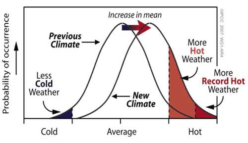
Note from this schematic that even a modest warming can lead to a dramatic increase in the shaded region that exceeds some threshold (i.e., that exceeds 1 or even 2 standard deviations above the mean). Let's work out a simple example based on things we already know about the standard deviation. Let us consider a hypothetical city where the mean daily high temperature in July is 28°C (82°F), and the standard deviation in that measure (i.e., the amplitude of typical day-to-day fluctuations) is 5°C (9°F). Then, using what we know about the standard deviation, roughly 16% of the time, the daily high temperature would be expected to exceed 1 s.d. above the mean (i.e., 33°C/91°F). [You can check this out yourself using Vassar's online calculator, setting z = 1 and using the one-sided test result.] Only roughly 2.5% of the time would it be expected to exceed 2 s.d. above the mean (i.e., 38°C/100°F). [Again, you can check this with the online calculator, using z = 2 and observing the one-sided result.] Put in even more basic terms, we would only expect one day in July when the temperature would exceed the 'century mark' of 100°F.
Now, consider the effect of a hypothetical warming of 1°C/2°F (the rough actual warming of the globe since pre-industrial time). We can represent the effect of this warming by shifting the entire temperature distribution to the right by 1°C as shown qualitatively in the schematic above. Now, with the mean of 29°C (and assuming the standard deviation is still 5°C), a 'century mark' temperature of 38°C/100°F is only 1.8 s.d. above the mean.
Think About It!
Use Vassar's online calculator to determine the probability of exceeding the 'century mark' after a warming of 1°C/2°F has occurred.
Click for answer.
That is nearly double the probability (2.5%) we calculated before the warming occurred.
We now would expect twice as many days in July (2 per year) to exceed the century mark. As we will see, a doubling of the probability of record heat extremes is not at all out of line with what we actually are seeing in the temperature observations.
So, is there evidence that this is really happening? Indeed, there is. Let's start with the single example of the 2003 European heat wave. This wasn't just 'another heat wave'. It killed more than 30,000 people as a result of exposure to extremely high temperatures coupled with a lack of widespread access to modern air conditioning in large parts of Europe. The entire summer was unusually warm, making individual record breaking heat waves exceptionally more likely.
In Europe, there are reasonably reliable temperature records stretching back several centuries (including thermometer measurements back to the late 18th century—see figure below, and longer-term documentary evidence stretching back as far as 500 years). The 2003 summer temperatures were by far the warmest on record. So, there was a context for the summer 2003 European heat wave. It wasn't just a single random event, but it occurred in the larger-scale context of an unusually warm summer, imbedded in a long-term trend of warming European summer temperatures. One prominent study in the journal Nature in 2004 suggested that global warming had already played a significant role in the European heat waves, taking what might have been thought as a one-in-a-thousand-year event (what is termed a 'thousand year event') and instead turning it into a 20-year event. Additional projected warming, the authors argued, would turn it into a 2-year event, i.e., every other summer would have similar heat waves. Indeed, prolonged European heat waves in 2018 and 2019 eclipsed many of the records that were set in 2003!
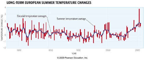
That unusually warm summer was associated with a poleward expansion of the jet stream relative to its typical position and a migration of the warm, dry descending air usually found in the descending limb of the Hadley circulation that is typically located in the subtropics (e.g., the Sahara desert), well into Northern Europe (see figure below).
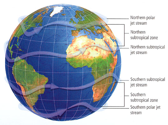
© 2015 Pearson Education, Inc.
Indeed, as we will see later in the course when we cover projected changes in atmospheric circulation, this pattern of poleward migration of the descending limb of the Hadley circulation is a robust prediction of state-of-the-art climate models. Viewed in this context, the 2003 European summer heat wave is probably as good an example as any of the potential impact of anthropogenic climate change on heat extremes.
The year 2010 saw record heat around the globe. Perhaps best publicized was the record-breaking heat wave in Moscow and western Russia, where new all-time temperature records (111°F) were set, and temperatures hovered around or above 100°F for most of July, replete with massive wildfires and dangerously poor air quality. However, a large number of other countries set new heat records for maximum warmth, including Finland, Pakistan, Sudan, Saudi Arabia, Iraq, and Pakistan.
One might rightfully argue that pointing to any one year, be it 2003 in Europe, or 2010 in many other countries, is cherry-picking. And indeed, we need to look at the broader picture in which this fits.
The plot below shows the change over the course of the latter half of the 20th century in the number of days per decade qualifying as unusually warm (defined as exceeding the 90 percentile). Most, though not all, regions have seen an increase in the frequency of extremely warm days. Even more striking is the fact that virtually all regions have seen increases in the frequency of extremely warm nights. As we will discuss further in our assessment of climate change impacts later in the course, it is actually the latter feature—the increase in very warm nights—that represents a greater threat from the standpoint of human mortality.
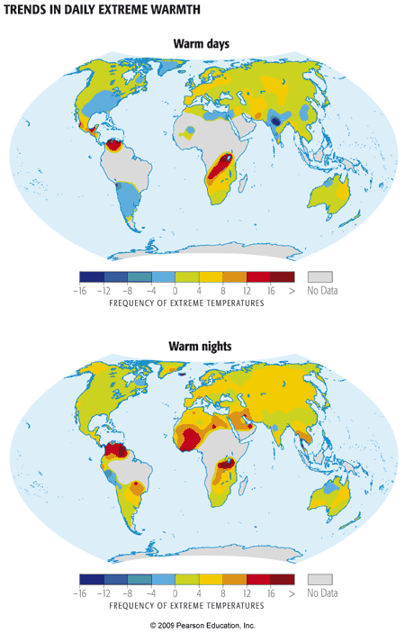
What about closer to home, i.e., the U.S.? 2010 was a record-breaking year for heat in many respects for the U.S.
On any given day, just by chance alone, there are likely some places in the U.S. where it is unusually cold, and other places where it is unusually warm. Record cold and record warm are often likely to be found somewhere. The real question to ask is, if we look at all of the reporting locations in the U.S. over all of the days of year, how often are we breaking warm records vs. cold records. As temperatures warm overall, we expect cold records to increasingly be outstripped by warm records. This was certainly the case for 2010.
Not surprisingly, summer (June-August) 2010 was the warmest, or one of the few warmest, summers ever for a large swath of the southeastern and mid-Atlantic U.S. [for example, in State College, PA, daily maximum temperatures in the summer exceeded 90°F more than twice as often as usual] and were unusually warm over much of the rest of the U.S. Only in the northwestern corner of the U.S. was it relatively cool.
Again, one might be tempted to argue that focusing on any particular year is cherry-picking. So let us again step back, and look at the long-term context for this anomalous recent warmth. We will look at the trend from decade to decade in the frequency of warm and cold record-breakers, totaled over all locations of the U.S. and over all days of the year. This is what the trend looks like through 2015:
In the absence of global warming, one would expect record highs to occur as often as lows. This was true in the middle of the century. Then during the 60s and 70s as mean northern hemisphere temperatures—as we have seen before—actually cooled a bit, cold records began to slightly outpace warm records. Since then, we have seen a dramatic increase in the ratio of warm to cold record-breakers as the globe, northern hemisphere, and North America have continued to warm. This trend culminates in a warm/cold record-breaker ratio of more than two-to-one for the past decade. In other words, we've now seen a doubling in the relative frequency of hot vs. cold temperature extremes. Note that this increase (roughly a factor of two) in probability of heat extremes is similar to that motivated by the simple example I used at the very beginning of this section on heat waves.
An excellent analogy for the impact of global warming on temperature extremes involves the simple rolling of a six-sided die. So we're going to do a little experiment with die rolling—I think you'll find it both fun and instructive (and amusing—a special thanks to Penn State's David Babb and Matt Croyle for their help in constructing this!).
Start rolling the pair of dice. One of the dice is a fair die, and the other is "loaded", though just how, you'll need to figure out. It should become clearer and clearer as time goes on, and the number of rolls increases. Note that you can "roll" in rapid succession to get larger and larger samples (you don't need to wait for the animation to complete on each roll). Start out with 1 roll, then 5, then 10, 30, 50, 100, and so on, as many as 500 or more if you have the patience! rolls of the die. Pay attention to the number of numbers you've rolled for each of the two dice (the % of time each possible value of the die is rolled is conveniently recorded for you).
Do your rolls seem to be converging towards some well-defined fraction? Is one number showing up more often on one of the two die? How does it compare with your expectation for a fair die? When you think you're ready to guess which of the two dice is loaded, go for it. You can repeat the experiment over and over again. Sometimes it's the red die that will be loaded, other times it will be the blue die. How quickly can you successfully identify which is which?
Think About It!
Can you figure out which number is favored and how scewed (loaded) the results are?
Click for answer.
So, as you've figured out by now, I loaded the die so that sixes would come up twice as often as they ought to. The more rolls of the die you do, the more obvious that becomes. Consider your first incidence of rolling a six with the loaded die. Was the fact that you rolled a six on that roll directly attributable to the loading of the die? Of course not, you might rightly respond! Even with a fair die, there was a chance (1 in 6) of rolling a six. But the loading of the die nonetheless made it twice as likely that, on any given roll—including that one—you would roll a six. And this becomes increasingly clear as you roll the die more times.
This is a very useful analogy for talking about the influence of global warming on weather extremes such as heat waves. In our first example, we showed that a moderate amount of warming—equivalent to that which has occurred on average over the past century—nearly doubled the probability of breaching the 'century mark' of 100°F during mid-summer. We furthermore saw above that, on average, the relative frequency of extremely warm days in the U.S. has roughly doubled since the mid 20th century. Using the die rolling analogy, we can think of these changes as the equivalent of loading the die in the way we did in the above example. And just as we can't say for certain that any one extremely hot summer day was due to global warming, we can say that the chances were twice as high—and because of global warming. We are indeed seeing the loading of the weather die in the trends toward greater heat extremes in the U.S., and elsewhere.
Other Weather Extremes
Climate change appears to have influenced other types of meteorological extremes (see table below). Not surprisingly, for example, extremely cold days, early frosts, etc., have decreased. Extremely heavy precipitation events and flooding episodes appear to have increased, consistent with the more vigorous hydrological cycle expected with a warming atmosphere. Extratropical cyclones (i.e., mid-latitude storm systems) appear to have strengthened, though the confidence on this observation is somewhat less. Ironically, on the day the first version of this lecture was written (October 27, 2010), the mid-west of the U.S. had just experienced their strongest extratropical cyclone on record, with a central low pressure of 954 millibars (that is lower than that of many category 2 Hurricanes!). This is what the October 2010 'superstorm' looked like:
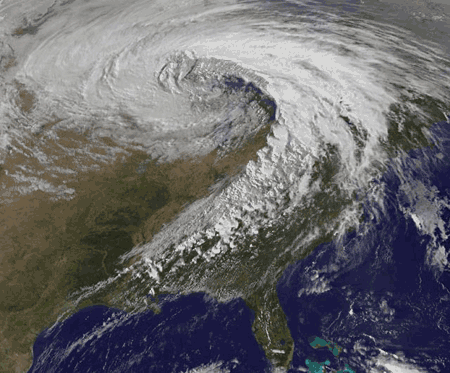
Modeling studies suggest that human-caused climate change may actually decrease the number of extratropical cyclones because the projected polar amplification of warming is likely to reduce the equator-to-pole temperature gradient, which is ultimately what drives these storms through the process of baroclinic instability. However, it may at the same time increase the intensity of the storms systems that do form, because the greater amounts of water vapor available in a warmer atmosphere, once condensed into precipitation as the air rises along frontal boundaries, yield additional latent heating that can add to the energetics of the storm. You can find an excellent discussion of this topic here on Jeff Master's Weather Underground site).
Here is a summary of some extreme weather and other climate indicators from Figure 1.2 of the Fourth National Climate Assessment in 2018:
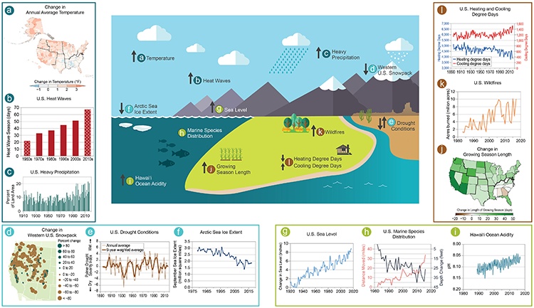
| Phenomenon | Change | Region | Period | Confidence | Section |
|---|---|---|---|---|---|
| Low-temperature days/nights and frost days | Decrease, more so for nights than days | Over 70% of global land area | 1951 - 2003 (last 150 years for Europe and China) | Very likely | 3.8.2.1 |
| High-temperature days/nights | Increase, more so for nights than days | Over 70% of global land area | 1951- 2003 | Very likely | 3.8.2.1 |
| Cold spells/snaps (episodes of several days) | Insufficient studies, but daily temperature changes imply a decrease | ||||
| Warm spells (heat waves) (episodes of several days) | Increase: implicit evidence from changes in inter-seasonal variability | Global | 1951 - 2003 | Likely | FAQ 3.3 |
| Cold seasons/warm seasons (seasonal averages) | Some new evidence for changes in inter-seasonal variability | Central Europe | 1961 - 2004 | Likely | 3.8.2.1 |
| Heavy precipitation events (that occur every year) | Increase, generally beyond that expected from changes in the mean (disproportionate) | Many mid-latitude regions (even where reduction in total precipitation) | 1951 - 2003 | Likely | 3.8.2.2 |
| Rare precipitation events (with return periods > ~10 yrs) | Increase | Only a few regions have sufficient data for reliable trends (e.g. UK and USA) | Various since 1893 | Likely (consistent with changes inferred for more robust statistics) | 3.8.2.2 |
| Drought (season/year) | Increase in total area affected | Many land regions in the world | Since 1970's | Likely | 3.3.4 and FAQ 3.3 |
| Tropical cyclones | Trends towards longer lifetimes and greater storm intensity, but no trend in frequency | Tropics | Since 1970's | Likely; more confidence in frequency and intensity | 3.8.3 and FAQ 3.3 |
| Extreme extratropical storms | Net increase in frequency/intensity and a poleward shift in track | NH land | Since about 1960 | Likely | 3.8.4, 3.5 and FAQ 3.3 |
| Small-scale severe weather phenomena | Insufficient studies for assessment |
Paleoclimate Evidence
Among contrarians in the public debate about climate change, one often hears an argument that goes something like this:
"Sure, the climate is changing. But climate is always changing. It was warmer than today in the past due to natural causes! So the warmth today could also be due to natural causes?"
Is this a legitimate argument? Well, we began to address the issue back during our introduction to the concept of climate change. Let's explore the issue in more detail now, looking at what observations are available to document (a) how climate changed in the past and (b) what factors appear to have been responsible for those changes.
Geological Variations
Let's start out with a look at the longest timescale changes that are documented in the geological record. We're talking hundreds of millions of year timescales. While the records are imperfect at best, we do have a rough idea from very old sedimentary records as to the broad-scale changes in global temperatures and in atmospheric CO2 over these timescales. On these very long timescales, the changes in atmospheric CO2 are related to geologic processes such as plate tectonics, which govern the outgassing of CO2 from Earth's interior by volcanoes, and the slow changes in Earth's continental configuration and relief, which influence natural processes such as chemical and physical weathering that take CO2 out of the atmosphere.
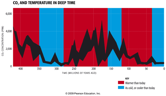
Its quite clear from the comparison above that, on these long timescales, atmospheric CO2 levels and global temperatures appear to be very closely correlated. Warm periods, with some exceptions, are periods of high atmospheric CO2, and cold periods, geologically, have been periods of low atmospheric CO2. You can hear Penn State professor Richard Alley's eloquent Bjerknes Lecture on the subject at the 2009 meeting of the American Geophysical Union.
Let's zoom in further over the past 50 million years.

© 2015 Pearson Education, Inc.
This interval takes us from the warm early Eocene period, to the cooler Miocene period, and eventually to the Plio-Pleistocene period of the past 5 million years, during which large-scale glaciation of the modern continents was first observed. We see that this transition from a warm to glacial climate was accompanied by a major decrease in atmospheric CO2 levels.
The decrease in atmospheric CO2, once again, doesn't explain all of the details of course. For example, CO2 appears relatively flat for the final two million years, even as the climate continues to have cooled through the Plio-Pleistocene transition. Some of that cooling may represent positive ice albedo feedbacks that kick in once large-scale glacial inception takes hold over the past 20-30 million years. Nonetheless, CO2 clearly remains the major knob controlling global climate over the past 50 million years. Once we zoom in on yet shorter timescales, that is tens of thousands of years, we see that another dynamic appears to have been at play.
Glacial/Interglacial Variations
Once we enter into the Pleistocene period of the past 1.5 million years, large-scale glaciation of the Northern Hemisphere takes hold, but there are prominent alternations between relatively ice-covered periods (the "Ice Ages"), and warmer periods more similar to modern, pre-industrial conditions. It is instructive to consider what factors appear to have been driving these variations.
Pleistocene Ice Ages
For nearly the past million years, CO2 concentrations, as recorded in Antarctic ice cores, have oscillated by roughly 100 ppm, alternating between low glacial levels of roughly 180 ppm and relatively high interglacial levels of roughly 280 ppm. Methane (CH4) concentrations oscillate by nearly a factor of two as well. And temperatures in Antarctica, as recorded by oxygen isotopes in the ice cores, have varied in concert with these greenhouse gas concentrations changes. If one takes into account the typical polar amplification of warming, the peak-to-peak changes in temperature in Antarctica (roughly 10°C) translate to a change in global mean temperature of about 3°C. At least half of that temperature change is due to changes in Earth's albedo (reflectivity) associated with the changes in surface ice cover. That leaves the remaining 1.5°C temperature change to be explained by the changes in greenhouse gas concentrations (CO2 and also CH4). If we work out the implied sensitivity of the global climate to greenhouse gas concentrations, it implies a value that lies within the typical range of estimates, i.e., between 1.5° and 4.5°C for a doubling of CO2 concentrations. (You can read more about the details of this argument in The lag between temperature and CO2 article from Real Climate).
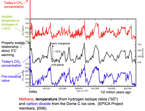
But why do the oscillations occur? Why do they have a roughly 100,000 year ('100 kyr') periodicity? And why is the shape of the oscillation not a sinusoidal cycle, but a "sawtooth" waveform with a slow, long-term descent into glacial conditions and a very rapid termination? These features certainly require further explanation.
The pacing of the 100 kyr oscillation is almost certainly tied to long-term changes in Earth orbital geometry. As I alluded to in the introductory lecture of the course, the geometry of Earth's annual orbit around the Sun changes slowly over time. These changes are subtle, but they are persistent over thousands of years and have a profound impact on climate.
The first of these orbital variations involves the very slow wobble (or to use the more technical term, the precession) of the Earth's rotational axis. One full wobble (analogous to the wobbling of a gyroscope—see animation below) takes roughly 19-23 kyr. The precession determines when the Northern and Southern Hemisphere are each tilted toward (summer) or away (winter) from the Sun.

The primary importance of this factor is that it determines whether the summer solstice in a given hemisphere occurs when Earth is farthest (making summer a little cooler) or closest (making summer a little warmer) to the Sun. This factor only matters, then, because Earth's annual orbit around the Sun is not circular, but slightly elliptical - a factor discussed further below.
The second of these changes involves the tilt angle (or to use the more technical term, the obliquity) of Earth's orbit. The Earth's rotational axis today is inclined at an angle of roughly 23.5 degrees from the vertical (this is the angle of the precessing top shown in the animation above). This is why the tropics are located at 23.5N and 23.5S and why the Arctic and Antarctic circles are located at 90-23.5 = 66.5 N and S respectively. This angle of inclination is not fixed over time, however. It varies between roughly 21.5 degrees and 25.5 degrees. Seasonality only exists because of the tilt; if not for the tilt, neither hemisphere would be preferentially tilted towards the Sun at any time of the year. Therefore, periods when the tilt angle is greatest are periods of heightened seasonality, while periods when the tilt angle is smallest have reduced seasonality. It takes roughly 41 kyr for the tilt angle to go through one full cycle of alternation between lesser and greater values of the obliquity.
The final of the changes involves the ellipticity (or, to use the more technical term, the eccentricity) of the orbit. Earth's orbit around the Sun is not circular, but, instead, is slightly elliptical. The degree of ellipticity is measured by the eccentricity, which ranges from roughly zero (an essentially circular orbit) to a maximum of roughly 4% (a very slightly elliptical orbit). It takes roughly 100 kyr for the eccentricity to go through one full cycle of alternation between low and high eccentricity.
This might sound like the smoking gun to explain the dominant 100 kyr periodicity of the ice ages. But it's not quite that simple.
The changes in insolation associated with the 100 kyr eccentricity variations is considerably smaller than the shorter (19-23 kyr and 41 kyr) precession and obliquity periodicities. And prior to about 700,000 years ago, the glacial/interglacial cycles were dominated by these shorter periodicities. So what is it that is responsible for the dominant 100 kyr oscillation of the past 700,000 years?
To understand this, we have to think a bit more about how these various effects interact. The precession and obliquity don't actually change the net solar radiation at the top of the atmosphere; they simply redistribute it with respect to season and latitude. The eccentricity, however, does change the net solar radiation. When Earth's orbit is more elliptical, it spends more time over the course of a year being relatively far away from the sun, and thus there is a decrease in the received solar radiation. Because the change is very small, however, it's necessary to have large amplifying feedbacks to give this effect a greater role.
Think About It!
Any guess as to what feedbacks may do the trick?
Click for answer.
The ice-albedo feedback is key to understanding the glacial/interglacial cycles. While this feedback is a moderate player in the context of modern climate change (responsible, for example, for only about 0.6°C of the 2.5-3°C warming expected for a doubling of CO2 concentrations), it is considerably more important during ice ages, when continental ice sheets reached as far south as New York City.
This observation provides a clue as to how the 100 kyr periodicity emerges when the actual radiative forcing at the 100 kyr timescale is so weak. Roughly every 100 kyr or so, the eccentricity reaches a particularly high value, favoring the largest possible differences in Earth-Sun distance over the course of the annual cycle. During such times, there will be a point over the course of the much faster 19-23 kyr precession cycle, where the Northern Hemisphere winter solstice will coincide with the minimum Earth-Sun distance ('perihelion'), and the summer solstice will coincide with the maximum Earth-Sun distance ('aphelion'). This makes winters at high northern latitudes unusually warm and summers at high northern latitudes unusually cool. Such conditions are ideal for growing ice sheets: the warm winters actually allow for greater amounts of snowfall (since warm winter air holds more moisture than cold winter air), and the cool summers help prevent any accumulated winter snow from melting over the course of the summer. Ice begins to accumulate, more solar radiation is reflected to space, and the cooling spreads southward. Pretty soon, you've got a full-fledged ice age on your hands. This effect, of course, is enhanced when the obliquity is greatest.
So, we can see how all three factors—the eccentricity, the precession, and the obliquity—work together to create ice ages. But the thing that appears to trigger it all is the slow, 100 kyr eccentricity forcing, since high eccentricity—reached roughly every 100 kyr—sets up the perfect storm of conditions for establishing an ice age. Once those conditions occur, an ice age slowly sets in and builds, for tens of thousands of years. This is the slow descent into the ice ages seen in the ice core figure earlier. Eventually, however, as we near 100 kyr from the starting point, the eccentricity again rises to high levels. Then, when the faster precession cycle reaches a point where seasonality is enhanced rather than diminished, ie., northern summers are especially warm—the ice begins to melt, and the positive ice-albedo feedback kicks in in an especially dramatic fashion, yielding the rapid warming that defines the abrupt termination evident in the ice core figure.
The mechanism described below requires the possibility of building large ice sheets. It is widely speculated that the climate had to cool beyond some threshold where large ice sheets could grow, and that the slow cooling was provided by the gradual lowering of CO2 concentrations over the course of the Pleistocene. Eventually, the climate cooled to that point, and the 100 kyr oscillations ensued.
And what about the role of CO2 in all of this? As I noted above, CO2 is clearly an important player. We cannot explain the extent of the warming and cooling over the glacial/interglacial cycles without including the direct warming effect of CO2. But the situation is somewhat more complicated than that since CO2 is not simply a control variable on these timescales. The global carbon cycle (in particular the oceanic carbon cycle) is changing in response to the climate changes taking place. For example, a warming ocean favors outgassing of CO2 into the atmosphere, which of course amplifies the warming further because of the greenhouse effect.
So CO2 is acting both as a forcing and as feedback. That is different from the current situation, where we essentially have our hands on the CO2 knob of the system (though, even here, there are some complications, as we will discuss in more detail in Lesson 6 on carbon emission scenarios).
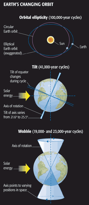
The Younger Dryas
At the termination of the last ice age, roughly 12 kyr ago, something surprising happened. Just as Earth appeared to be coming out of the ice age, it staged a reversal and headed back into glacial conditions for at least 1000 years. The cooling event seems to have been centered in the North Atlantic ocean. This episode is known as the Younger Dryas (named after the spread of the tundra-loving Dryas flower, whose range during this time interval plunged southward in regions surrounding the North Atlantic ocean).
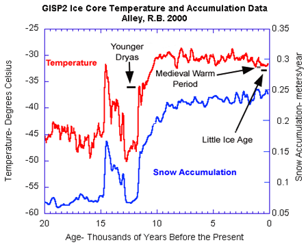
While there is still some scientific debate about the details, it is generally believed that this rapid cooling resulted from a slowdown or collapse of the ocean's thermohaline circulation in response to the massive flux of freshwater into the high-latitude North Atlantic as the Northern Hemisphere ice sheets and glaciers rapidly began to melt. This fresh water would have inhibited the sinking motion that typically occurs in the sub-polar regions of the North Atlantic, suppressing the overturning circulation associated with the North Atlantic drift current which helps to warm the high-latitudes of the North Atlantic and surrounding regions.
It is, in fact, this event from the distant past that has given rise to the popular, if rather flawed (as we will see when we look at actual climate projections), concept that global warming may ironically lead to another ice age. This concept was caricatured in the movie 'The Day After Tomorrow'. The problem with the analogy is that there isn't nearly the amount of ice around today to melt that there was at the termination of the last ice age, and thus the effect is likely to be much smaller. As we will see later in the course, however, there may be a very small grain of truth to the scenario laid out in the movie.
The Holocene
Even during interglacial intervals, when there is relatively little ice around, the higher-frequency orbital forcings still have an influence on climate. In particular, the impacts of the roughly 19-23 thousand year precession cycle are evident over the course of the current interglacial period of the past 12,000 years known as the Holocene. Today, precession has the effect of minimizing Northern Hemisphere seasonality, since perihelion occurs very close (January 3) to the winter solstice (Dec 22nd). Roughly 1/2 of a precession cycle (i.e., about 11,000 years) ago, precession had the effect of maximizing Northern Hemisphere seasonality. Indeed, it was this exaggerated seasonality that helped end the last ice age by favoring summer melting. Over the next 12,000 years, the seasonal pattern of insolation slowly evolved to what it is today.
If we look at temperature estimates based on oxygen isotopes from Arctic ice cores, we find that summer temperatures were relatively high during a period sometimes called the Holocene optimum that lasted from about 10,000-6,000 years ago, before slowly declining towards pre-industrial levels (and then spiking again over the last 100 years—something we'll discuss more below). This pattern of high-latitude summer temperature change is precisely what we expect, given the precession changes discussed above. On the other hand, tropical insolation was actually reduced, as was winter insolation at higher northern latitudes. That makes these natural past changes in radiative forcing very different from those associated with modern greenhouse increases which are positive during both seasons, in both hemispheres, and in the tropics as well as high latitudes.
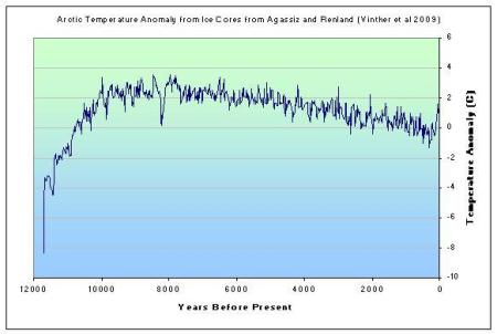
As the seasonal and latitudinal pattern of solar heating evolved over the course of the Holocene, so did the atmospheric circulation which is driven in substantial part by those variations in heating. For example, paleoclimate evidence suggests that the Sahara desert was considerably more lush than today, supporting steppe vegetation and large lakes that were home to crocodiles and hippopotamuses. Simulations with climate models, forced by the known changes in seasonal insolation, reproduce this pattern, as a consequence of strengthened west African monsoon, driven by the larger seasonal changes in insolation.
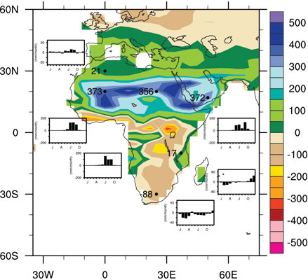
The Past 1,000 Years
Over the past 1,000 years, changes in insolation due to Earth orbital effects are relatively small. The primary natural radiative forcings believed to be important on this time frame (as we will see in Lesson 5 when we talk about Estimating Climate Sensitivity) are volcanic eruptions and changes in solar output.
The basic 'boundary conditions' on the climate (distribution of ice sheets, orbital geometry, continental configuration, etc.) were essentially the same as they are today, making this a useful interval to study from the standpoint of modern climate change. The pre-industrial interval of the past 1,000 years forms a sort of 'control', as the only real difference from today is the added impact over the past century or two of human influence on climate. Some (in particular, the atmospheric chemist Paul Crutzen, who won the Nobel Prize for his work on the stratosphere ozone hole) have argued that the period since the dawn of industrialization (i.e., the past two centuries) has been impacted substantially enough already by human activity that we should consider it as a distinct interval separate from the current interglacial, i.e., that we are no longer in the Holocene, but rather, an entirely new, human-created interval of Earth history known as the anthropocene.
Patterns of surface temperature can be estimated in past centuries from "proxy" records such as tree-rings, corals, ice cores, faunal remains and other sources. For more information about the work that Michael Mann has done on this topic, you might check out an Interactive Presentation of the Global Temperature Patterns in Past Centuries.
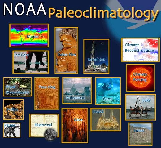
Looking at the temperature patterns reconstructed from these proxy records, we can gain a longer-term perspective on the natural climate variability associated with ENSO, and the NAO, and other known dynamical patterns influencing the climate system. Can you spot some big El Niño events in the 18th century? What about the effect of the NAO—can you discern that in the patterns? How?
If we average over these patterns (focusing on the Northern Hemisphere, since information in the Southern Hemisphere is limited) , we can obtain an estimate of the average temperature in past centuries. There are numerous reconstructions that have been performed of this sort, using different types of proxy data, and different statistical approaches to estimating temperatures from the data. But one thing they all have in common is finding that the recent warming is anomalous as far back as these reconstructions go (more than 1,000 years now).
Does this mean that the warming is due to human activity? No—it's possible that the warming could just be a fluke of nature. To assess whether or not the recent warming can be attributed to human activity, we'll need to turn to theoretical climate models - the topic of our next lesson!
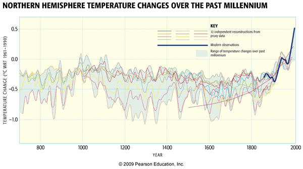
Problem Set #2
Activity: Statistical Analysis of Atlantic Tropical Cyclones and Underlying Climate Influences
NOTE: For this assignment, you will need to record your work on a word processing document. Your work must be submitted in Word (.doc or .docx) or PDF (.pdf) formats. A formatted answer sheet is available on CANVAS as a convenience for students enrolled in the course.
- Be sure also to download the answer sheet from CANVAS (Files > Problem Sets > PS#2).
Each problem (#2 through #6) is equally weighted for grading and will be graded on a quality scale from 1 to 10 using the general rubric as a guideline. Thus, a score as high as 50 is possible, and that score will be recorded in the grade book.
The objective of this problem set is for you to work with some of the data analysis/statistics concepts and mechanics covered in Lesson 2, namely the coefficient of variation and multi-variate regression. You are welcome to use any software or computer programming environment you wish to complete this problem set, but the instructor can only provide support for Excel and an online tool that is introduced in this problem set should you need help. The instructions also will assume you are using Excel and that online tool.
Now, in CANVAS, in the menu on the left-hand side for this course, there is an option called Files. Navigate to that, and then navigate to the folder called Problem Sets, inside of which is another folder called PS#2. Download the data file PS2.xlsx in that folder to your computer, and open the file in Excel. You should see five time series: HURDAT (“unadjusted”) tropical-cyclone (TC) count for the Atlantic basin, Vecchi-Knutson (2008) (“adjusted”) TC count, August-October Main Development Region (MDR) sea-surface temperature (SST), December-March North Atlantic Oscillation (NAO) index, and December-February Niño3.4 index (which measures ENSO phase). All five series cover 1878 to 2019.
- Construct a scatterplot and calculate the mean, median, and standard deviation for each of the five time series in the data file. Recall that you constructed scatterplots and calculated these summary statistics in PS#1. Place the five scatterplots and report the summary statistics for each time series on the answer sheet
- The two TC count time series should be thought of as dependent variables; you will be building models that should give meaningful predictions of those two dependent variables. One TC count series is “unadjusted” and comes from the HURDAT data-set. However, a weakness of this data-set is that it does not take into account the effect of satellite observations on TC counts. Satellite observations began to be used to observe TCs around 1966, providing comprehensive counts of annual TC activity, whereas, prior to 1966, some TCs were missed due to sparse observation networks, which grow more sparse going back farther and farther in time. Many scientists have tried to estimate the undercount of TCs in the more distant past, and Vecchi and Knutson made such an estimate in a 2008 paper, yielding the “adjusted” TC count series that you will explore in this data-set.
On the other hand, the MDR SST, NAO, and Niño3.4 time series should be thought of as independent variables, or predictor variables. The justification for the choice of these predictor variables is that warmth of the surface of the seawater in the Main Development Region (an area of the Atlantic Ocean roughly east of the Caribbean Sea), pressure patterns in the North Atlantic region, and pressure patterns in the equatorial Pacific region, respectively corresponding to MDR SST, NAO, and Niño3.4, are thought to be related to TC activity in the Atlantic basin.
Considering the “unadjusted” TC count as the predictand, calculate the linear trend line equation (i.e., single-variable regression equation) for each of the three predictor variables. Also calculate the correlation coefficient r and the coefficient of variation R2 for each of the three regression equations. Moreover, for each of the three regressions, state how much of the variation in the predictand is explained by the predictor. Report your results on the answer sheet.
- Repeat the calculations and analysis that you performed in #3, but, this time, consider the “adjusted” TC count as the predictand. Comment on any differences compared to the “unadjusted” regressions. Report your results on the answer sheet.
- Multi-variate regression methods, which you learned about in Lesson 3, allow for the simultaneous use of multiple variables to predict a response. Instead of constructing a separate regression for each predictor-predictand pair, like you did in #4, one regression can be constructed that uses all available predictors to predict a response.
A sidebar: Excel could be used to construct a multi-variate regression, but it is not the best tool for this task. In the real world, you might leverage your computer programming skills to accomplish this task, but knowledge of programming is not a pre-requisite for this course. More likely, you might have available a statistical software package for the task, but such packages generally are proprietary and cost money and are not a required technical capability for this course. In past offerings of this course, for this problem set, we have asked students to use the regression tool that you saw used in video demonstrations in Lesson 3, but it presents technical problems depending on the Web browser being used. Therefore, we suggest use of this online multi-variate regression calculator, but you may use any tool you wish.
Using this online multi-variate regression calculator (or any tool you wish), calculate two multi-variate regressions using all three predictor variables available to you: one to predict the “unadjusted” TC count and one to predict the “adjusted” TC count. The equation should be given in the form
where y is the predictand, is a constant, and , , and are coefficients for predictor variables , , and respectively. If you are using the online calculator, display output to four decimal places, and include no interactions. Find the coefficient of variation for each regression, and interpret it, comparing it to the coefficients of variation for the single-variable regressions you calculated in #3 and #4. Note that is an output of the online calculator. Report your results and discussion on the answer sheet.
- In #5, you found two multi-variate regressions, one that predicts (or models) “unadjusted” TC counts and one that predicts “adjusted” TC counts. You now will see how well these regressions model 2020 TC count. Given that, in 2020, August to October MDR SST was 28.3531 degrees Celsius, December to March NAO index was -0.135, and Niño3.4 index was -0.987, use both regressions to model 2020 TC count in the Atlantic basin. Research (citing your source) the number of TCs that actually occurred in the Atlantic basin in 2020, showing predictor values substituted into the multi-variate regression equation, and compare your modelled counts to the actual count. Report your results and discussion on the answer sheet.
Lesson 3 Summary
In this lesson, we reviewed key observations that detail how our atmosphere and climate are changing. We have seen that:
- Ice in its various forms (sea ice, glaciers, and ice sheets) is disappearing as the globe warms;
- Global sea level is rising due both to the expansion of warming seawater and the contribution from melting glaciers and ice sheets;
- The deep ocean, as well as the ocean surface, is warming in a manner consistent with a warming climate; the slow nature of the ocean warming means that global sea level will continue to rise for several centuries, even if we were to freeze greenhouse concentrations at current levels;
- Ocean circulation trends are difficult to establish, but there is some reason to believe that the ocean's thermohaline circulation may weaken;
- There is substantial natural multidecadal variability that appears related to oscillations in the strength of the ocean's thermohaline circulation;
- The El Niño/Southern Oscillation (ENSO) is the most prominent mode of climate variability on interannual timescales, and one important uncertainty in projecting future climate change involves uncertainties in how ENSO will change in the future;
- There is a trend toward increasingly powerful Atlantic Hurricanes over the past half century, and this increase appears to mirror warming tropical Atlantic sea surface temperatures;
- There is also a trend toward increased Atlantic tropical cyclone counts, though the reliability of the data, particularly in earlier decades, has been called into question. A variety of factors, including sea surface temperatures, El Niño, and the so-called North Atlantic Oscillation (NAO) atmospheric circulation pattern, influence Atlantic tropical cyclone counts;
- Other extreme weather events appear to have become more common in recent decades. The increased frequency and duration of heat waves around the world is likely related to large-scale warming; there is also some evidence that mid-latitude storm systems have become more powerful, consistent with predictions of climate models;
- Paleoclimate evidence demonstrates that CO2 has been the 'major lever' influencing global climate change over geological time;
- CO2 and CH4 greenhouse gas forcing is a key component in the glacial/interglacial cycles of the late Pleistocene, with ice albedo feedback playing an especially important role, and with changes in Earth orbital geometry providing the pacing, including the dominant 100 kyr oscillations of the past 700,000 years;
- The Younger Dryas cooling, even in the North Atlantic, that occurred at the termination of the last ice age demonstrates the potentially important role of ocean dynamical responses to meltwater fluxes; such effects are unlikely to be as important in the context of modern climate change;
- Earth orbital changes have influenced climate changes over the course of the current interglacial period (the Holocene). Increased high-latitude summer insolation was responsible for the relatively warm summers at high Northern latitudes during a period from roughly 10,000-6,000 years ago known as the Holocene optimum. The same seasonal and latitudinal redistribution of solar insolation was responsible for changes in atmospheric circulation such as the strengthened west African Monsoon that led to the greening of the Sahara at this time;
- Temperatures over the past millennium have been dominated by other radiative forcings, such as natural forcing by volcanic eruptions and solar insolation changes, and anthropogenic forcing over the past two centuries;
- The warming of the past few decades appears to exceed the range seen for at least the past millennium.
Reminder - Complete all of the lesson tasks!
You have finished Lesson 3. Double-check the list of requirements on the first page of this lesson to make sure you have completed all of the activities listed there before beginning the next lesson.
Lesson 4 - Modeling of the Climate System, part 1
The links below provide an outline of the material for this lesson. Be sure to carefully read through the entire lesson before returning to Canvas to submit your assignments.
Introduction
About Lesson 4
We have now seen evidence indicating that the globe is warming, and that there is an array of other internally-consistent changes in the climate system that are associated with that warming. While these changes are suggestive of human-caused climate change, the existence of trends cannot alone be used to draw causal inferences.
That is where theoretical climate models come in. Climate models allow us to test particular hypotheses about climate change. For example, we can interrogate the models with respect to how much warming of the globe we might expect for a given change in greenhouse gas concentrations. In this lesson, we will consider the simpler classes of climate models, and we will engage in hands-on climate modeling activities.
What will we learn in Lesson 4?
By the end of Lesson 4, you should be able to:
- Describe the factors that govern Earth's climate system;
- Perform basic energy balance computations to estimate the surface temperature of the Earth;
- Perform basic energy balance computations to estimate the response of Earth's surface temperature to hypothetical changes in natural and anthropogenic forcing; and
- Explain what "equilibrium climate sensitivity" is.
What will be due for Lesson 4?
Please refer to the Syllabus for specific time frames and due dates.
The following is an overview of the required activities for Lesson 4. Detailed directions and submission instructions are located within this lesson.
- Problem Set #3: Estimate the warming due to an increase in CO2
- Read: Dire Predictions, v.2: p. 68-69
Questions?
If you have any questions, please post them to our Questions? discussion forum (not e-mail), located under the Home tab in Canvas. The instructor will check that discussion forum daily to respond. Also, please feel free to post your own responses if you can help with any of the posted questions.
Energy and Radiation Balance
We actually covered this topic back in the introductory lecture (lecture #1), so I'm going to ask you to simply review the Overview of the Climate System (part 2) before continuing on to our initial discussion of climate models...
Simple Climate Models
We will start out our discussion of climate models with the simplest possible conceptual models for modeling Earth's climate. These models include different variants on the so-called Energy Balance Model. An Energy Balance Model or 'EBM' does not attempt to resolve the dynamics of the climate system, i.e., large-scale wind and atmospheric circulation systems, ocean currents, convective motions in the atmosphere and ocean, or any number of other basic features of the climate system. Instead, it simply focuses on the energetics and thermodynamics of the climate system.
We will start our discussion of EBMs with the so-called Zero Dimensional EBM—the simplest model that can be invoked to explain, for example, the average surface temperature of the Earth. In this very simple model, the Earth is treated as a mathematical point in space—that is to say, there is no explicit accounting for latitude, longitude, or altitude, hence we refer to such a model as 'zero dimensional'. In the zero-dimensional EBM, we solve only for the balance between incoming and outgoing sources of energy and radiation at the surface. We will then build up a little bit more complexity, taking into account the effect of the Earth's atmosphere—in particular, the impact of the atmospheric greenhouse effect—through use of the so-called "gray body" variant of the EBM.
Zero Dimensional EBM
The zero dimensional ('0d') EBM simply models the balance between incoming and outgoing radiation at the Earth's surface. As you'll recall from your review of radiation balance in the previous section, this balance is in reality quite complicated, and we have to make a number of simplifying assumptions if we are to obtain a simple conceptual model that encapsulates the key features.
For those who are looking for more technical background material, see this "Zero-dimensional Energy Balance Model" online primer (NYU Math Department). We will treat the topic at a slightly less technical level than this, but we still have to do a bit of math and physics to be able to understand the underlying assumptions and appreciate this very important tool that is used in climate studies.
We will assume that the amount of shortwave radiation absorbed by the Earth is simply , where S is the Solar Constant (roughly 1370 W /m2 but potentially variable over time) and α is the average reflectivity of Earth's surface looking down from space, i.e., the 'planetary albedo', accounting for reflection by clouds and the atmosphere as well as reflective surface of Earth including ice (value of roughly 0.32 but also somewhat variable over time).
We will assume that the outgoing long wave radiation is given simply by treating the Earth as a 'black body' (this is a body that absorbs all radiation incident upon it). The Stefan-Boltzman law for black body radiation holds that an object emits radiation in proportion to the 4th power of its temperature, i.e., the flux of heat from the surface is given by
where σ is known as the Stefan-Boltzmann constant, and has the value ; ε is the emissivity of the object (unitless fraction) — a measure of how 'good' a black body the object is over the range of wavelengths in which it is emitting radiation; and Ts (K) is the surface temperature. For the relatively cold Earth, the radiation is primarily emitted in the infrared regime of the electromagnetic spectrum, and the emissivity is very close to one.
We will approximate the surface temperature, TS, as representing the average 'skin temperature' of an Earth covered with 70% ocean (furthermore, we will treat the ocean as a mixed layer of average 70m depth—this ignores the impacts of heat exchange with the deep ocean, but is not a bad first approximation). We can then approximate the thermodynamic effect of the mixed layer ocean in terms of an effective heat capacity of the Earth's (land+ocean) surface, . The condition of energy balance can then be described in terms of the thermodynamics, which states that any change in the internal energy per unit area per unit time (<) must balance the rate of net heating, which is the difference between the incoming shortwave and outgoing longwave radiation. Mathematically, that gives:
Let's suppose that the incoming radiation (the first term on the right hand side) were larger than the outgoing radiation (the second term on the right hand side). Then the entire right-hand side would be positive, which means that the left-hand side, the rate of change of Ts over time, must also be positive. In other words, Ts must be increasing. This, in turn, means that the outgoing radiation must increase, which will eventually bring the two terms on the right hand side into balance. At this point, there is no longer any change of Ts with time, i.e., we achieve an equilibrium.
In equilibrium, the time derivative term is, by definition, zero, and we thus must have equality between the outgoing and incoming radiation, i.e., between the two terms on the right-hand side of equation 1. This yields the purely algebraic expression
The factor of 1/4 comes from the fact (see Figure 4.1, below) that the Earth is emitting radiation over the entirety of its surface area (4πR2 where R is the radius of the earth), but at any given time only receiving incoming (solar) radiation over its cross-sectional area, πR2.
It turns out that since the Earth's surface temperature varies over a relatively small range (less than 30° K) about its mean long-term temperature (in the range of O° C, or 273° K), i.e., it varies only by at most 10% or so, it is valid to approximate the 4th degree term in equation (1) by a linear relationship, i.e.,
A and B, thus defined, have the approximate values: ;
Such an approximation is often used in atmospheric science and other areas of physics when appropriate, and is called linearization.
Using this approximation, we can readily solve for TS as
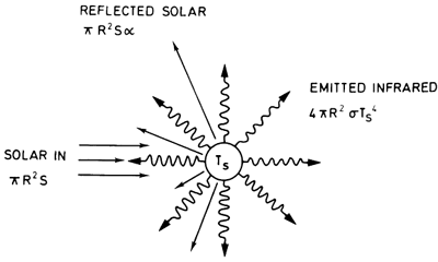
You might find it rather disappointing that, after all the work we did above to develop a realistic Energy Balance Model for Earth's climate, we were way off. Our EBM indicates that, given appropriate parameter values (i.e., ), the Earth should be a frozen planet with TS = 255° K, rather than the far more hospitable TS= 288° K we actually observe. Our model gave a result that was a whopping 33° C (roughly 60° F) too cold!
Think About It!
What do you think we forgot?
Click for answer.
So, how do we include the effect of the atmospheric greenhouse effect in a simple way? That is the topic of our next section.
Simple Climate Models, cont'd
Gray Body Variant of the Zero Dimensional EBM
Even in the presence of the greenhouse effect, the net longwave radiation emitted out to space must balance the incoming absorbed solar radiation. So, we can think of the Earth system as still possessing an effective radiating temperature (Te), which is the black body temperature we calculated earlier with the zero-dimensional EBM and the black body parameter values for A and B, i.e., T = 255o K. It is the temperature Earth's surface has in the absence of any greenhouse effect. The outgoing longwave radiation to space is still given by . The atmosphere will have a temperature Te somewhere aloft in the cooler region of the mid-troposphere. If we like, we can think of the Earth as, on average, emitting temperature to space from this level; hence, we refer to the temperature as the effective radiating temperature.
When a greenhouse effect is present, the temperature at the surface, TS, will be substantially higher, however, due to the additional downward longwave radiation emitted by the atmosphere back down towards the Earth's surface.
We can attempt to account for this effect by simply changing the way we model the longwave radiation in the zero-dimensional EBM to account for the additional downward longwave radiation component.
Returning to the linearized form of the energy balance equation (i.e., equation (5) on the previous page), we will, therefore, now relax the assumption that A and B are given by their black body values. Instead, we will allow A and B to take on arbitrary values. This is a crude way of taking into account the fact that the Earth does not behave as a black body because the atmosphere has non-zero emissivity due to the presence of atmospheric greenhouse gases.
Simply put, we can tweak the values of A and B until they provide a good approximation. We refer to this generalized version of the black body approximation as the gray body approximation. The gray body model is a very crude way of accounting for the greenhouse effect in the context of a simple zero-dimensional model. In Lesson 5, we will build our way up to more realistic representations of the atmospheric greenhouse effect.
Various gray body parameter choices for A and B have been used by different researchers, in different situations. Since the gray body approximation is a linear approximation to a non-linear (Planck radiation) relationship, it is only valid over a limited range of temperatures about a given reference temperature. This means that a different set of parameters might be used for studying, e.g., the ice ages than would be used for studying, e.g., the early Cretaceous super greenhouse.
It turns out that the choices and yield realistic values for the current average temperature of the earth TS, and gives a value for the climate sensitivity — a concept we will define in the next section — that is consistent with mid-range IPCC estimates. We will, therefore, adopt these as our standard gray body parameter values, but we will also explore the impact of using alternative values a bit later.
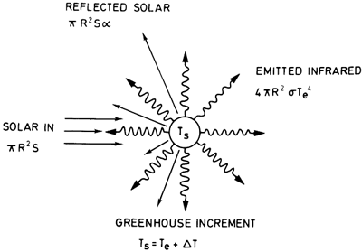
Think About It!
Use the Online 0d EBM Application to estimate the average temperature of the Earth for the "mid-range IPCC" gray body parameter values. What surface temperature do you find, and how does it compare with the previous black body estimate of Earth's surface temperature?
Click for answer.
You should have found that TS = 288o K in the gray body approximation.
This is roughly 33o C (or 60o F!) warmer than the black body value.
In other words, the greenhouse effect has the effect of warming Earth from a frigid average temperature of -18o C to a far more hospitable 15o C!
The Concept of Equilibrium Climate Sensitivity
Let us rewrite the equation energy balance equation (5) on the previous page in a slightly different form,
where Fin represents the total incoming radiative energy flux at the surface, which includes incoming short wave radiation, but also any potential changes in the downward longwave radiation towards the surface.
Let us now consider the response of Ts to an incremental change in Fin. Since the 2nd term in (7) is a constant, we simply have
We can also rewrite (8) as
The change in downward longwave radiation forcing associated with a change in CO2 concentration from a reference concentration, [CO2]0 to some new value, [CO2], can be approximated by the following relationship from a paper by Myhre et al. (1998)
Now, let us further specify that we are interested in the change in radiative forcing resulting from a doubling of atmospheric CO2 concentrations. For a CO2 doubling, e.g., an increase from pre-industrial levels of 280 ppm to twice that value, 560 ppm,
We can define equilibrium climate sensitivity, s, as the change in temperature resulting from a doubling of pre-industrial CO2 concentrations; s has units of K (or equivalently degrees C, since differences in C and K are equal). To estimate s, we combine equations (8) and (11)
The equilibrium climate sensitivity is the equilibrium warming we expect in response to CO2 doubling. In the simple case of the 0d EBM, it is readily calculated through equation (12).
Think About It!
Using the formula above (12), estimate the equilibrium climate sensitivity s for both the black body model and our standard version of the gray body model. Record your answers.
Click for answer.
For the black body model, we have:
, i.e., approximately 1K
For the standard gray body model, we have:
, i.e., approximately 3K.
Think About It!
Let's now use the Online 0d EBM Application again to estimate the climate sensitivity for these two cases, by explicitly varying the CO2 level until you achieve a CO2 doubling, and recording the warming that you observed. Compare to the results you calculated above directly from the formula for climate sensitivity for the 0d EBM.
Click for answer.
We find the same answers that we found earlier, namely that the black body models gives just under 1o C warming, while the gray body model gives roughly 3o C warming.
As we will see later, this is close to the best current available estimate of the warming expected from a doubling of CO2 concentrations.
Problem Set #3
Activity
NOTE: For this assignment, you will need to record your work on a word processing document. Your work must be submitted in Word (.doc or .docx) or PDF (.pdf) format so I can open it.
The documents associated with this problem set, including a formatted answer sheet, can be found on CANVAS.
- Worksheet successfully downloaded! Be sure also to download the answer sheet from CANVAS (Files > Problem Sets > PS#3).
Each problem (#2 to #4) will be graded on a quality scale from 1 to 10 using the general rubric as a guideline. Problems #3 and #4 will each be worth twice as much as #2, meaning each of those two problems will be given a quality score as high as 10, which then will be multiplied by 2. Thus, a score (up to 10 points, 20 points, and 20 points from #2, #3, and #4, respectively) as high as 50 is possible, and that score will be recorded in the grade book.
The objective of this problem set is for you to work with some of the concepts and mathematics around zero-dimensional energy-balance models (0-D EBMs) covered in Lesson 4. You may find Excel useful in this problem set, but you may use any software you wish, keeping in mind that the instructor only can provide help with Excel.
- The following is the equation for planetary surface temperature under zero-dimensional energy balance, which is equation (5) on this page from Lesson 4:
Re-read the derivation of that equation in Lesson 4. After re-reading the derivation, explain what each variable in the equation is. Summarize also the assumptions behind the derivation; in other words, explain what a 0-D EBM is. This is as straightforward as it seems, but this problem is here to ensure that you understand the underlying concepts because they are referenced often in climate science. Report your discussion on the answer sheet.
- Report your responses to all parts of this problem on the answer sheet.
- Determine the planetary surface temperature TS for a blackbody Earth in both Kelvin and degrees Celsius, rounding to two decimal places. For the input values, let “A” be 315 W m-2 and “B” be 4.6 W m-2 °C-1 and the solar constant be 1,370 W m-2 and the planetary albedo value be 0.32, the “standard” values mentioned in Lesson 4. Although the answer to this question is given in Lesson 4, you MUST show explicitly all values substituted into the equation for TS. Be mindful of the order of operations as you perform the calculation.
- Recall that the graybody assumption is that Earth’s atmosphere has a greenhouse effect, i.e., the atmosphere itself emits longwave radiation downward to the surface. We account for it by varying the values of terms “A” and “B”. Let “A” be 214.4 W m-2 and “B” be 1.25 W m-2 °C-1 and the solar constant be 1,370 W m-2 and the planetary albedo value be 0.32. Calculate the planetary surface temperature for this conception of a graybody Earth, rounding the result to two decimal places and expressing it in both degrees Celsius and Kelvin. Once again, you MUST show explicitly all values substituted into the equation for TS.
- Using values of solar constant ranging from 0 to 2,000 W m-2, incremented by 100 W m-2, and assuming that the planetary albedo value is 0.32 and that term “A” is 214.4 W m-2 and “B” is 1.25 W m-2 °C-1, calculate planetary surface temperature, displaying the results in a table, expressing them in Kelvin, and rounding them to two decimal places. Also, plot the results, with the horizontal axis giving values of solar constant and the vertical axis giving values of planetary surface temperature.
- Using values of planetary albedo ranging from 0 to 1, incremented by 0.05 W m-2, and assuming that the solar constant is 1,370 W m-2 and that term “A” is 214.4 W m-2 and “B” is 1.25 W m-2 °C-1, calculate planetary surface temperature, displaying the results in a table, expressing them in Kelvin, and rounding them to two decimal places. Also, plot the results, with the horizontal axis giving values of planetary albedo and the vertical axis giving values of planetary surface temperature.
- Using values of term “A” ranging from 0 to 350 W m-2, incremented by 50 W m-2, and assuming that the solar constant is 1,370 W m-2, planetary albedo value is 0.32, and term “B” is 1.25 W m-2 °C-1, calculate planetary surface temperature, displaying the results in a table, expressing them in Kelvin, and rounding them to two decimal places. Also, plot the results, with the horizontal axis giving values of term “A” and the vertical axis giving values of planetary surface temperature.
- Using values of term “B” ranging from 0 to 5.0 W m-2 °C-1, incremented by 0.5 W m-2 °C-1, and assuming that the solar constant is 1,370 W m-2, planetary albedo value is 0.32, and term “A” is 214.4 W m-2, calculate planetary surface temperature, displaying the results in a table, expressing them in Kelvin, and rounding them to two decimal places. Also, plot the results, with the horizontal axis giving values of term “B” and the vertical axis giving values of planetary surface temperature.
- This problem will deal with the notion of climate sensitivity, which is described in Lesson 4 Report all responses to the parts of this problem on the answer sheet.
- Write the equation that approximates the change in downward longwave radiation forcing associated with a change in CO2 concentration from a reference concentration to some new concentration value, defining each of the variables that are in the equation.
- Define equilibrium climate sensitivity in words, and write the equation that approximates it, defining each of the variables that are in the equation. How is this equation related to the equation that you wrote down in part (a)?
- The European Union has defined 2°C warming relative to pre-industrial temperatures as the threshold for Dangerous Anthropogenic Interference (DAI) with the climate system. Estimate the concentration of carbon dioxide (in ppm) at which we would expect to breach the DAI amount of warming. Assume a “mid-range” graybody parameter setting, i.e., term “B” is 1.25 W m-2 °C-1. Also assume that the pre-industrial carbon-dioxide concentration is 280 ppm and that the pre-industrial average global temperature is 288 K. Show your work.
- The atmospheric carbon-dioxide concentration is currently at about 414 ppm and is increasing by about 2 ppm per year. If we continue to increase carbon-dioxide concentration at this rate, how many years will it take until we commit ourselves to DAI, based on the climate sensitivity (i.e., the graybody parameter setting) considered above? If you were advising policy makers, how many years would you tell them we have to stabilize carbon-dioxide emissions and why? Show your work.
- Some scientists have argued that the threshold of 2°C is actually too high for DAI and that it should be a lower value. Re-work (c) and (d) assuming an alternative DAI of 1.5°C, and report the results. Is it too late to avoid DAI at this threshold? Show your work.
Lesson 4 Summary
In this lesson, we began to explore the use of theoretical models of the climate system. We saw that:
- A simple zero-dimensional energy balance model can be used to estimate the surface temperature of the Earth, as well as the response of surface temperatures to changes external (including human-induced perturbations). The model balances the incoming solar radiation absorbed at Earth's surface and the outgoing longwave radiation emitted from Earth's surface;
- A simple linear approximation can be used in the zero dimensional EBM to represent the outgoing longwave radiation, leading to a mathematical simplification and a simple formula for global surface temperature;
- Using the simplest, black body approximation for the outgoing longwave radiation gives a global surface temperature of about 255K, i.e., 18C below freezing—obviously way too cold;
- The gray body approximation provides a simple fix to the zero-dimensional EBM that incorporates, at least crudely, the atmospheric greenhouse effect;
- Using appropriate values of the gray body model coefficients, we can accurately predict both the Earth's surface temperature (roughly 288K, i.e., approximately 15°C), and the response of surface temperatures to perturbations such as increasing greenhouse gas concentrations (roughly 3°C for a doubling of atmospheric CO2).
This lesson also introduced us to the important concept of equilibrium climate sensitivity—a concept we will encounter again and again throughout this course.
Reminder - Complete all of the lesson tasks!
You have finished Lesson 4. Double-check the list of requirements on the first page of this lesson to make sure you have completed all of the activities listed there before beginning the next lesson.
Lesson 5 - Modeling of the Climate System, part 2
Introduction
About Lesson 5
In this lesson, we will continue with our investigation of climate models. We will investigate more complex models of the climate system than in the previous lesson. We will first investigate a slightly more complex version of the EBM encountered in Lesson 4, where we explicitly insert an atmospheric layer above the Earth's surface. We will consider models that represent the full three-dimensional geometry of the Earth system, and model atmospheric winds and ocean currents, patterns of rainfall, and drought, and other key attributes of the climate system. We will also explore the concept of 'fingerprint detection'—a method that allows us to compare model predictions against observations to discern whether or not the signal of anthropogenic climate change can already be detected.
What will we learn in Lesson 5?
By the end of Lesson 5, you should be able to:
- Describe the hierarchy of theoretical climate models, the underlying assumptions, caveats, and strengths and weaknesses of various climate modeling approaches;
- Discuss both the strengths and limitations of current-generation climate models;
- Speak to the issue of how climate models have been 'validated';
- Assess the relative roles of human vs. natural impacts on climate, based on experiments with climate models;
- Assess the state of our current knowledge regarding the equilibrium climate sensitivity of Earth.
What will be due for Lesson 5?
Please refer to the Syllabus for specific time frames and due dates.
The following is an overview of the required activities for Lesson 5. Detailed directions and submission instructions are located within this lesson.
- Read:
- IPCC Sixth Assessment Report, Working Group 1 -- Summary for Policy Makers (link is external)
- Possible Climate Futures: p. 12-23
- Dire Predictions, v.2: p. 36-37, 100-101, 110-111, 148-149
- IPCC Sixth Assessment Report, Working Group 1 -- Summary for Policy Makers (link is external)
- Problem Set #4
Questions?
If you have any questions, please post them to our Questions? discussion forum (not e-mail), located under the Home tab in Canvas. The instructor will check that discussion forum daily to respond. Also, please feel free to post your own responses if you can help with any of the posted questions.
One-Layer Energy Balance Model
We can increase the complexity of the zero-dimensional model by incorporating the atmospheric greenhouse effect in a slightly more realistic manner than is embodied by the ad hoc gray body model explored in the previous lecture. We now include an explicit atmospheric layer in the model, which has the ability to absorb and emit infrared radiation.
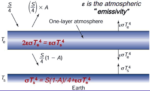
We will approximate the emissivity of Earth's surface as one, that is, we will assume that The Earth's surface emits radiation as a black body. The atmosphere itself has a lower but non-zero emissivity, i.e., it emits a fraction of what a black body would emit at a given temperature. This emissivity is due to property of greenhouse gases within the atmosphere, and we will denote this atmospheric emissivity by (not to be confused with the epsilon of previous lessons which was associated with the emissivity of Earth's surface, which we are approximating here as unity!). According to Kirchhoff's Law, at thermal equilibrium, the emissivity of a body equals its absorptivity (i.e., the fraction of incident radiation that is absorbed by the body). Therefore, is also a measure of the efficiency of the atmosphere's absorption of any infrared radiation (IR) incident upon it. IR radiation that is not absorbed by the atmosphere is transmitted through it; therefore, is the fraction of incident IR radiation that is transmitted through the atmosphere without being absorbed.
An of zero corresponds to no greenhouse effect at all, while an of unity corresponds to a perfect IR absorber, i.e., a perfect greenhouse effect. The true greenhouse effect is, of course, somewhere in between, i.e.,
We denote the effective albedo of the Earth system (i.e., the portion of incoming solar radiation immediately reflected back to space) as A, and we will now distinguish between the atmospheric temperature (which we will envision as representing the mid-troposphere, somewhere around 5.5 km above the surface where roughly half the atmosphere by mass lies below) and the surface temperature TS.
is related to, but not equivalent to, another quantity known as the effective radiating temperature, which we will denote as . is the temperature the Earth would have if it were a black body, i.e., if there were no greenhouse effect. It can be thought of as the temperature at the effective height in the atmosphere from which Earth is radiating infrared radiation back to space. In the limit of a perfectly emissive atmosphere ( ), as you can verify from our mathematical treatment below, we would have the equality = .
You may recall from our earlier discussion (in Lesson 1) of the vertical structure of the atmosphere, that atmospheric temperatures cool on average roughly in the troposphere — what is known as the standard lapse rate.
For the approximate current value of the solar constant S = 1370 W / m2, we saw in Lesson 4 that the black body temperature, i.e., the effective radiating temperature , is roughly 255 K.
Think About It!
Given that the Earth's average surface temperature is = 288 K, the effective radiating temperature is = 255 K, and the standard lapse rate is , can you determine the effective radiating level in the atmosphere?
Click for answer.
This is at the level of the mid-troposphere.
We can now express the condition of energy balance at each level in our simplified model of the Earth:
- The top of the atmosphere
- The atmospheric layer, which we can think of as centered in the mid-troposphere
- The surface
Balancing incoming and outgoing radiation at the top of the atmosphere gives:
Balancing incoming and outgoing radiation from the atmospheric layer gives :
- (Note that short wave radiation is not included in this balance because the atmosphere does not absorb in short wave range.)
Finally, balancing incoming and outgoing radiation at the surface gives:
Solving the system of equations for and gives:
Or more simply
Let us use the standard values of A = 0.3 and S = 1370 W / m2.
- If we take = 0 (which is equivalent to there being no greenhouse effect), we get our original blackbody result = 255 K = -18°C. Too cold!
- If we take = 1 (which is equivalent to a perfectly IR absorbing atmosphere), we get the result = 303 K = 30°C. Too warm!
- However, if we take = 0.77 (i.e., the atmosphere absorbs 77% of the IR radiation incident upon it), we get a result, = 288 K = 15°C. Just right!
Using (7) and = 288 K, we also get the result = 242 K. This is modestly lower than the effective radiating temperature = 255 K, indicating that it is found at about 5.5 km — a modestly higher level in the atmosphere than 5.1 km that you calculated earlier.
Of course, this model is still rather simplistic. For one thing, it only takes into account short wave and long wave radiation. We haven't accounted for important processes involved in the energy budget of the actual atmosphere and surface, which includes convection, latent heating, and the effect of large-scale motion.
We can nonetheless add some further realism to the model by incorporating some of the feedbacks we have discussed previously. In Problem Set 4 you will investigate a slightly more sophisticated version of the standard one-layer model. The model allows for the contribution of clouds to both the Earth's albedo and the longwave absorptive properties of the atmosphere in a very rough way. It also accounts for the positive ice albedo and water vapor feedbacks in a very rough manner.
Each of the feedbacks in the model will be expressed in the form of a feedback factor that you can vary. A feedback factor measures the relative magnitude of a feedback in terms of the amplitude of the response relative to the original forcing. If the response is equal in magnitude to the original forcing, there is no feedback, and the feedback factor is zero. If the response is double that of the original forcing, the feedback factor is one. For example, if a warming of 1°C due to doubling alone causes an increase in water vapor content that adds an additional equilibrium warming of 2°C, so that the net warming is 3°C, the water vapor feedback factor would be two. Feedback factors can be specified for a particular feedback (e.g., the water vapor feedback), or for the sum over all feedbacks under consideration (e.g., water vapor feedback, ice albedo feedback, and cloud feedback). For example, suppose that the initial 1°C warming, which led to 2°C warming due to water vapor feedback, also led to an increase primarily in low cloud cover, which added a relative cooling of -0.5°C, and a melting of ice, which added an additional relative warming of 1°C. Then the cloud feedback factor would be -0.5, the ice albedo feedback factor would be 1.0, and the net feedback factor would be 2 - 0.5 + 1 = 2.5! Alternatively, we could compute the overall feedback factor by taking the total warming (initial 1°C warming + 2°C - 0.5°C + 1°C = 3.5°C) divided by the initial warming, minus one, i.e., (3.5°C/1°C) - 1 = 2.5. The equilibrium climate sensitivity in this case would be 3.5.
While we have measured the feedback factors in terms of the temperature responses, one could also compute these factors in terms of the associated radiative forcing. For example, we know from earlier in the course that the radiative forcing due to doubling is roughly 3.7W/m2. Suppose that the increased greenhouse forcing associated with the water vapor feedback led to an additional downward long wave radiative flux of 7.4 W/m2 (and let us assume for this example that the other feedbacks are zero). Then the water vapor feedback factor would be 7.4/3.7 which is, again, two. The total downward radiative forcing would be 3.7W/m2 +7.4W/m2 =11.1 W/m2 total downward and the overall feedback factor would be 11.1/3.7 - 1 = 2!
Video: One Layer Energy Balance Model (3:56)
PRESENTER: Here is our One Layer Energy Balance Model. Right now it's set for the default settings of the various feedback factors.
The cloud feedback factor is set at a modestly negative value of minus 0.83. The water vapor feedback factor is 2. And the ice albedo feedback factor is 0.5. So these two, the water vapor feedback and the ice albedo feedback, are set at positive values. The cloud ready to feedback is set at a negative value.
And these values are roughly equal to the best current estimates of what those feedback factors are. And so using those default settings gives us sort of a mid-range climate sensitivity. And you'll look at that in your problem set.
So you can calculate the climate sensitivity of course by varying the CO2. And the CO2 can be varied with this lever here. Pre-industrial levels, 280 parts per million. Obviously 560 PPM is twice pre-industrial. If you like, you can even set values outside these ranges by going to the box down below. For example, I could set the CO2 level at 700 PPM.
And we can see the initial temperature-- surface temperature-- to 88k for the standard default settings. The new surface temperature, 292, that was a 4.1 degree warming of the surface. The atmosphere itself-- the mid troposphere-- warmed somewhat less, 3.4k.
We can see what the longwave and the shortwave forcings are. So these are estimates of the radiative forcing due to the combination of the direct influence of changing the CO2 levels, plus the various feedbacks-- the water vapor feedback, increasing the greenhouse gas concentration, giving us longwave forcing, that adds to the longwave forcing from the increase in CO2 alone.
The ice albedo feedback playing into the shortwave forcing. The cloud radiative feedback can influence both a combination of shortwave and long wave forcing. There's the cloud albedo effect, which tends to be a negative feedback. But there's also the greenhouse gas-like properties of clouds, the infrared absorbing properties of clouds which gives us a positive feedback. And as we vary this feedback factor, we can transition from where the negative cloud radiative feedbacks dominate to where the positive cloud feedback dominate.
We can see how the albedo changes as we vary the shortwave feedbacks. We can see how the atmospheric emissivity changes. For example, as we change the CO2 level, the default emissivity in this model being 0.77-- the value that gives us a surface temperature about 280k, the current best estimate of Earth's surface temperature.
Finally, if we like we can vary the solar constant. We can vary the initial albedo-- Earth's planetary albedo-- which will of course be modified as we change some of the feedback factors.
So that's how it works. You're going to explore this model further in your problem set.
One-Dimensional Energy Balance Model
There are many ways one can generalize upon the zero-dimensional EBM. As we saw in the previous section, we can try to resolve the additional, vertical degree of freedom in the climate system through a very simple idealization—the one layer generalization of the zero-dimensional EBM. If for no other reason than the fact that the incoming solar radiation is symmetric with respect to longitude, but varies quite dramatically with latitude, the latitudinal degree of freedom is the next most important property to resolve if we wish to obtain further insights into the climate system using a still relatively simple and tractable model.
That brings us to the concept of the one-dimensional energy balance model, where we now explicitly divide the Earth up into latitudinal bands, though we treat the Earth as uniform with respect to longitude. By introducing latitude, we can now more realistically represent processes like ice feedbacks which have a strong latitudinal component, since ice tends to be restricted to higher latitude regions.
Recall that we had, for the linearized zero-dimensional gray body EBM, a simple balance:
- where is the Earth's albedo and A and B are coefficients for the linearized representation of the 4th degree term.
Generalizing the zero-dimensional EBM, we can write a similar radiation and energy balance equation for each latitude band i:
- where represents each latitude band.
We have now introduced some extremely important generalizations. The temperature , albedo , and incoming solar radiation are now functions of latitude, allowing us to represent the disparity in incoming shortwave radiation between equator and pole, and the strong potential latitudinal dependence of albedo with latitude—in particular, when the temperature for a particular latitude zone falls below freezing, we represent the increased accumulation of snow/ice in terms of a higher albedo. The global average temperature is computed by an appropriate averaging of the temperatures for the different latitude bands .
Recall that the disparity in received solar radiation between low and high latitudes leads to lateral heat transport over the surface of the Earth by the atmospheric circulation and ocean currents. In the absence of lateral transport, the poles will become increasingly cold and the equator increasingly warm. Clearly, we must somehow represent this meridional heat transport in the model if we expect realistic results. This can be done through a very crude representation of the process of heat advection through a term that is proportional to the difference between the temperature, where is some appropriately chosen constant, and is the global average temperature. This term represents processes associated with lateral heat advection that tends to warm regions that are colder than the global average and cool regions that are warmer than the global average.
This gives the final form of our one-dimensional EBM:
The model is complex enough now that there is no way to simply write down the solution anymore. But we can solve the model mathematically, through a very simple and primitive form of something we will encounter much more of in the future—a numerical climate model.
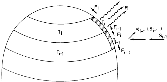
One of the most important problems that was first studied using this simple one-dimensional model was the problem of how the Earth goes into and comes out of Ice Ages. Use the links below to open the demonstration, which is in 3 parts.
METEO 469: One Dimensional Energy Balance Model Demo - part 1 (3:54)
PRESENTER: Let's now do an actual experiment here with our one-dimensional energy balance model where we've now generalized the energy balance model to allow for discrete latitude zones. And we calculate the energy balance as we did before between the incoming solar radiation, the outgoing long-wave radiation, the reflected radiation. We use the same energy balance principles that we used in the zero-dimensional model, but now we're allowing for different solutions of the energy balance model and different latitude zones.
And importantly, we are going to allow for these fluxes, these lateral fluxes of energy F between latitude zones, which represent the very important role that atmospheric and oceanic motions play in transporting heat on the whole from low latitudes to higher latitudes to make up for the imbalance between outgoing and incoming radiation at the tropics and at the poles. There's a surplus of energy at the equator, a deficit of energy at the poles. And so we need these lateral fluxes to make up for that imbalance
So let's take a look at a problem that was first attacked using this sort of approach, the one-dimensional energy balance modeling approach. We're going to use a program that was written in MATLAB. And you can see, this is sort of the heart of the program. It does the energy bounce calculations for each latitude zone. Here, we've specified the lateral heat flux transport coefficient F.
We're using gray body parameters for the energy balance of the sort you saw before in the zero-dimensional model. And we are now accounting for the possibility that the albedo will be vastly different depending on whether a particular latitude zone is ice covered, in which case it has a relatively high albedo, or not ice covered, in which case it has relatively low albedo.
And we will determine whether or not a latitude band is likely to be ice covered through a simple threshold, a parameterization here where if the average temperature for that latitude band is below minus 10 degrees Celsius in the annual average, then it will be ice covered. And that's the assumption that we'll be making. It's not a bad assumption if you look overall at the relationship between mean annual temperatures and which latitude zones are indeed mostly covered by ice in the real world.
And we will perform experiments in which we slowly change the solar constant from a relatively high value larger than today's solar constant to a relatively low value. And we'll see how the temperature of the Earth and of different latitude zones changes. And then we'll increase the solar constant from that low value to the high original value and again, see how Earth's temperature changes. Now we know that changing albedo will be coming into the problem. There will be transport of heat between different latitude zones. So this is a more sophisticated model than the sorts of models that we've looked at so far.
METEO 469: One Dimensional Energy Balance Model Demo - part 2 (4:40)
PRESENTER: Now that we're dealing with an additional degree of freedom-- we've now got the latitude to deal with-- we'll have to do a little bit of geometry. We have to take into account the geometry of Earth's tilt and the variation in incoming solar radiation at the top of the atmosphere as a function of latitude. So all those calculations-- the geometry and the distribution of insulation as a function of latitude-- is calculated in some subroutines.
And that is incorporated, of course, into our solution of the one-dimensional energy balance model. So let's actually run that model, It's simply run by me executing the command one_dim_ebm-- One-Dimensional Energy Balance Model. OK. And when it's done, first of all, it calculates the insulation at the top of the atmosphere as a function of latitude, where we, of course, have very high values of solar installation near the equator, very low values near the pole.
And it is now varying the solar constant. We're describing that through a solar multiplier. So it varies the solar constant from 40% larger than its current value, a multiplier of 1.4, the way to 40% lower than its current value, a multiplier of 0.6. And a multiplier of 1 is the current value of the solar constant.
What the red curve shows is what happens to the average temperature of the earth, which is constructed by averaging over all the latitude bands, each of which has its own temperature, as you lower the solar constant from a value that's 40% larger than it is today to, let's say, the current-day value.
By the time you decrease the solar multiplier to the current day value, you get a temperature somewhere in the range of 15 degrees Celsius or so, which we know is, in fact, a pretty reasonable estimate of the average temperature of the earth. And as we decrease it further, the temperature, of course, decreases, but something very interesting happens.
Suddenly, we reach a critical point where the temperature drops quite rapidly to well below freezing and, of course, continues to drop further as we lower the solar multiplier further. What's happening here is as Earth temperature is getting colder and colder, the latitude zones that are occupied by ice are spreading further and further towards the equator until eventually we reach a point where the entire earth becomes covered with ice and the albedo plummets dramatically. Sorry, the albedo increases dramatically, and Earth's temperature, therefore, plummets dramatically.
Now we have an ice-covered Earth as we continue to lower the solar constant. It, of course, continues to cool, but the ice cover isn't changing. We have a frozen Earth. Now what happens if we instead start out with a solar constant that is 40% below the current value and continue to increase it? Well, that's what's shown by the blue curve. And something very interesting happens.
As you start with a frozen, ice-covered Earth, solar constant 40% lower than today, it, of course, warms as we increase the solar multiplier, but it's still ice-covered. It's still ice-covered. It's still ice-covered. And it actually remains ice-covered, and the temperature remains very low-- the average temperature of the earth remains well below 0-- all the way until we reach a solar constant of 30% larger than today.
At that point, we now suddenly begin to melt away the ice fairly rapidly. And as soon as we do that, Earth temperature increases very rapidly. Now we have an ice-free Earth, and we're back where we begun. And if we increase the solar multiplier to 1.4, we are precisely where we started out.
METEO 469: One Dimensional Energy Balance Model Demo - part 3 (4:54)
PRESENTER: OK, so what happened here? We found that this system has a very interesting and non-intuitive property that for a given value of the governing parameters-- for example, for a solar constant of 1,370 watts per meter squared, Earth's temperature can potentially have two very different values. It doesn't have a unique value. It can either have a value similar to what we see today or a temperature below 30 degrees below 0 Celsius for the current day solar constant.
And what determines which of those two temperatures it's likely to have is the prior history. The properties of the system depend on its prior history. If we had started out with a frozen Earth and increased the solar constant to its current-day value, we would still have a frozen Earth.
And that's because the ice, once it accumulates and increases the albedo, which is reflecting away most of the solar radiation, it's fairly difficult to get rid of that ice, and only when you turn up the solar constant to a very high value are you able to melt away the ice, suddenly lower Earth's albedo from the albedo of an essentially frozen planet, and Earth's temperature can warm quite a bit.
On the other hand, if you start out with a very warm Earth and slowly lower the solar constant, you're not going to form ice until Earth's average temperature gets well below 0 degrees Celsius, and the various latitude zones now start dropping below that critical threshold temperature of minus 10 degrees Celsius, which is the temperature we specified represents when a latitude zone becomes ice-covered. And then, at that point, of course, the albedo increases dramatically, and Earth's surface temperature cools rapidly.
So the temperature of the Earth depends not only on the value of the governing parameters-- in this case, the solar constant-- but the prior history of the system. That is a property that's known as hysteresis, when the properties of a system depend on its prior history, not just on the governing parameters. It is an intrinsically nonlinear property. It's a property of complex systems which exhibit non-linear behavior. And in particular, in this case, bi-stable behavior that for a given value of the parameter, there are two stable points in terms of Earth's surface temperature.
And under some circumstances in systems like this, it's possible to undergo transitions rapidly between these two stable states. That is one theory for explaining the dramatic changes in the meridional overturning circulation of the North Atlantic Ocean that has taken place in the past, and we've talked a little bit about that in the past. We'll talk a little bit more about that in the future.
This is an example of a non-linear and, in this case, a bi-stable system. And in general, as our models become more complex-- in this case, we've generalized the model from 0 dimensions to 1 dimension. We've allowed for the possibility of a temperature dependent albedo. As soon as we start to make our models more complex, more detailed, more sophisticated, we introduce the possibility of very unusual, potentially unusual behavior of the system, this sort of non-linear behavior. And this is something that we'll talk quite a bit more about in this course.
It's relevant to the issue of thresholds and the possibility that as we continue to warm Earth's climate, we will pass certain critical thresholds where the climate system will undergo rapid transitions from its current state to some new state.
Finally, it's worth noting that this original model, constructed by a Russian scientist named Budyko decades ago in the mid 20th century, represented a real conundrum for climate scientists because it suggested that once Earth goes into a frozen ice-covered state, which it has in the past, it is very difficult to get out of that state. Even at current values of the solar constant, the Earth cannot come out of this frozen state.
The solution, it turns out, to this problem has to do with carbon cycle feedbacks and what happens with the Earth's carbon cycle when this happens. We'll talk more about that later on in the course.
General Circulation Models
Finally, we come to the so-called General Circulation Models or GCMs. GCMs attempt to describe the full three-dimensional geometry of the atmosphere and other components of Earth's climate system. Atmospheric GCMs numerically solve the equations of physics (e.g., dynamics, thermodynamics, radiative transfer, etc.) and chemistry applied to the atmosphere and its constituent components, including the greenhouse gases. In more primitive GCMs (the earlier generation models), the role of the ocean was treated in a very basic way, e.g., as a simple slab of water where only the thermodynamic role of the ocean was accounted for.
Current generation climate models typically include an ocean that plays a far more active role in the climate system. The major current systems are modeled, as is their direct role in transporting heat poleward. When the dynamics of the ocean and its interactions with the atmosphere are explicitly resolved by a climate model, the model is referred to as Atmosphere-Ocean GCM, or AOGCM, or sometimes simply a coupled model. Most state-of-the-art climate modeling centers today run AOGCMs. In addition, many state-of-the-art climate models today include a detailed description of the hydrological cycle (which couples atmospheric, terrestrial, and ocean reservoirs of water and the flows between these reservoirs) as well as the role of terrestrial biosphere, the continental ice sheets, and even the ocean's carbon cycle and its interactions with the ocean and the atmosphere.
Unlike simpler climate models like EBMs, GCMs and AOGCMS can be used to study a variety of climate attributes other than surface temperature, such as atmospheric temperature profiles, rainfall, atmospheric circulation, ocean circulation, wind patterns, snow and ice distributions, and many other variables that are part of the global climate system.
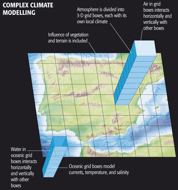
Complex Climate Modelling includes:
- Water in oceanic grid boxes interacts horizontally and vertically with other boxes
- Oceanic grid boxes model currents, temperature, and salinity
- Influence of vegetation and terrain is included
- Atmosphere is divided into 3-D grid boxes, each with its own local climate
- Air in grid boxes interacts horizontally and vertically with other boxes
© 2015 Dorling Kindersley Limited.
EdGCM
The EdGCM project, funded by the U.S. National Science Foundation and spearheaded by scientists associated with NASA Goddard Institute of Space Studies (GISS), uses the GCM originally used in a number of famous experiments (which we will review later in this lesson) by climate scientist James Hansen, Director of GISS. This model was developed in the 1980s and is primitive by modern standards, but it includes much of the important physics that is in current state-of-the-art climate models and it is far less computationally intensive. The scientists at EdGCM have ported the model into a format that can be run on a simple desktop or laptop computer (both PC and Mac). Originally it was free, but to cover expenses for the project, a minor fee is now required for download. Your course author has downloaded EdGCM onto his own laptop (MacBook Pro) and is now going to show you the results of several experiments he has run.
Video: EdGCM Demo - part 1 (3:47)
PRESENTER: OK, so we're going to run a GCM, a very famous GSM, in fact. This is the GCM that was constructed back in the mid-1980s, which was used for a number of very famous climate modeling experiments by James Hansen and his group at the NASA Goddard Institute for Space Studies that we'll be talking about a little bit more later on in this lesson. So that model has actually been taken and put in a format that can be run on a PC, on a Mac or a PC.
Of course by modern standards, the computational requirements of climate models written in the 1980s are far exceeded by current day state of the art models. But because they are a couple of decades old, they can in fact be run fairly efficiently now on simple laptops and PCs like we're going to do. Now, this model is available at the website EdGCM.com.
I would have had students in the class download the model and run it themselves. That was possible a few years ago. Unfortunately, now you actually have to pay to obtain the model. And so I will be doing some experiments with the model. And you will be watching me do these experiments rather than actually downloading it and running it yourself. But if you felt so motivated, you could indeed download this climate model and do the very same sorts of experiments that we're doing right here on your PC, or your Mac, or whatever computer you have.
So let's go ahead. I'm going to look at this Doubled CO2 experiment. If we click here, we can get some information about what that experiment is. It basically takes the CO2 concentration from 1958 and instantaneously doubles that CO2 concentration. And then we see how the climate model responds to that sudden increase in CO2.
Now, because of the presence of a large ocean that has large thermal capacity in this model, it takes quite a bit of time for the climate model to equilibrate to do that increase in CO2 concentrations, in fact, several decades to near a century. So this underscores the point that when we're looking at transient climate change, whether we're looking at observations are looking at the results of a climate model, we are in fact observing a system that is not in equilibrium. And that might take quite a bit of time to equilibrate to whatever change enforcing is imposed.
So ultimately, we know that this model will warm the amount that is consistent with the sensitivity of the model in response to that CO2 doubling. But it will not achieve that equilibrium warming for several decades, again, to nearly a century. And so what I'm going to do now is actually continue a run of that model that I started previously. And I'm just going to click on that. And I should be able to run.
Video: EdGCM Demo - part 2 (3:39)
PRESENTER: OK, so I'm running that experiment. It started in 1957. Then we instantaneously doubled the CO2 concentration. And now we're letting the model equilibrate to that instantaneously doubling of CO2.
And when it comes into equilibrium, it should have warmed by an amount that is consistent with the sensitivity of this particular model. And again, this is the NASA Goddard Institute for Space Studies climate model from the 1980s that was used in a series of famous experiments by James Hansen, by climate scientist James Hansen.
So we're running the model. I've been running this for several days, in fact. And as you can see, I'm now all the way up through September 2012. So we started out in December 1957. The model has now reached September 2012.
And as you can see, I get about one simulation day per second. So it takes the better part of a day running this climate model to simulate anything approaching a century, a long time period. But that's quite fast. By comparison, say, with where things stood in the 1980s when it would take that long to run a simulation like this on a state of the art computer, now we can run it on a desktop.
So we're letting the days tick off day by day. The model is solving all of the equations of motion. It's solving the governing equations of the atmosphere and the ocean. It's calculating the radiative fluxes, the incoming solar radiation. It's computing the distribution of infrared radiation within the Earth's system, the diffusion of heat into a mixed layer ocean.
It's solving the full set of governing three-dimensional equations that describes the coupled ocean atmosphere, cryosphere system. The ocean in this model is fairly simple by modern standards. Today climate models of this sort simulate the complex motions of the ocean currents.
This particular model treats the ocean simply as a slab of water with an appropriate amount of thermal inertia. It can absorb heat. It can give up heat to the atmosphere. It can respond to radiative imbalances.
There is a parameterization of heat transport. So the ocean transports a certain amount of heat poleward. As we know, it needs to. But that heat transport is fixed. It's not variable as it is in modern-day climate models which allow for changes in the intensity of the ocean currents.
So the ocean is pretty primitive by modern standards. And many of the components of this model are in fact primitive by the standards of state of the art models today. But as we'll see, this model is sophisticated enough to have made some surprisingly accurate predictions.
OK, so we're closing in on the end of 2012. And what I'll do is I'll let this model run out to the end of 2012 so I have one more complete year of data. And then we'll start looking at the output of this climate model simulation.
Video: EdGCM Demo - part 3 (2:14)
PRESENTER: OK so let's look at the simulation results. And by the way, there are a number of experiments that can be performed using EdGCM. One of them is the doubled CO2 experiment that we just talked about.
And you can see how there are various settings. You can tell the model what component, what ocean model to use, a mixed layer model with a parameterization of heat fluxes, or a simpler model if you choose to do so. You can change how vegetation and topography is parameterized. So there are lots of different settings in the model that one can change.
And there are various presort of determined experiments that you can just run off of the main menu in EdGCM. But if you liked, you could design your own experiment. You could set all these settings to use that particular version of the model that you want to use. You could specify exactly how to change forcings, whether they be natural forcings like CO2 or other anthropogenic forcings, methane, and CFCs.
You can change natural forcings like solar output or even the Earth orbital geometry changes that we know are important on very long time scales. So there are a variety of experiments that you can perform. And a number of the sort of predetermined experiments are indicated here.
You can simulate the last Ice Age. You can simulate Snowball Earth. We've alluded to the fact that in the past there were periods in Earth's evolution where we believe Earth was entirely frozen. And you can do that Snowball Earth experiment With EdGCM.
But we're going to continue to analyze this CO2 doubling experiment that we were running. And we will look at the output now. As you can see here-- well, we'll do that in a moment.
Video: EdGCM Demo - part 4 (1:57)
PRESENTER: OK, so unfortunately there are quite a few bugs still in EdGCM. And sometimes it freezes up and you have to restart it, which I've done here. So forgive the lack of continuity. But we're going to pick up where we left off. So we have the [INAUDIBLE] doubling experiment. As you can see, we now have years 1958 through 2012 completed. So we've got more than 50 years of output of this [INAUDIBLE] doubling experiment. And this most recent year, 2012, you saw me complete it a little bit earlier.
So we will extract the time series, various variables. You can see that I've selected precipitation, surface air temperature, ocean ice cover, snow cover, water content of the atmosphere, sea surface temperature, and the ground albedo. Or if you like, we could select instead the planetary albedo, which would include both the ground and, for example, cloud albedo. So I've selected these variables.
And now what I'm going to do is generate time series, annual averages for each of these variables for each of the years of the simulation. So I'll be able to plot out time series of the various quantities. And you can see it calculating the annual averages right now. It's going through each month of each year and calculating an annual average. So we'll let it finish that process. And then we will look at the output shortly.
Video: EdGCM Demo - part 5 (4:12)
PRESENTER: OK, so we've calculated all of those values, those annual values of these various quantities that we selected here. Now we're going to extract them, and they are now available to plot. You can see the period is 1958 to 2012. And the quantities we have are the atmospheric water vapor. We have the ocean surface temperature, ocean ice cover. We've got the planetary albedo. We've got surface air temperature. We've got sea surface temperature. And we can start plotting these and seeing what they look like.
Let's start out with the surface air temperature. So this is the global average surface air temperature for the model. And it should be plotting that up for us shortly. There it is. So we can expand that window a little bit. We can change the scale here. So let's go from 9 and 8.5 to 23 on the vertical scale, just to get a finer vertical scale on this.
So the red curve shows us how average global land temperatures are changing over time in the model. The blue curve shows us how the open ocean temperatures are changing the model. Open ocean is going to be warmer, as you can see, by several degrees than land. It's the part of the ocean surface that isn't frozen. And the ocean, in general, warms up more than the land and is warmer than land on average because it doesn't go to as high latitudes, particular in the southern hemisphere.
So ocean temperatures are going to be warmer than land temperatures. The open ocean, the blue curve, is warmer than the full ocean, which includes ice-covered regions of the ocean. It's the green curve. And the black is the global average temperature. It's the average of all the regions, whether they're open ocean, ice-covered ocean, or land. That's what the black curve represents. Let's zoom in on that curve.
So we can say we started out in 1958 with a global average temperature of about 13.8 degrees Celsius, roughly what the global average temperature is prior to the increase in CO2 that's taken place since then. And we've warmed up by 2010 or 2012 to a temperature that's close to 17.8 degrees. So we've gone from about 13.8 to about 17.8. We've warmed up by about 4 degrees Celsius in response to that instantaneous CO2 doubling that took place in 1958.
So you can see how long it's taking the global temperature to equilibrate to that increase in CO2-- many decades. Although we can see that we are asymptotically approaching a new equilibrium value. If we were to extend this several decades into the future, as it turns out, we would probably see a net warming of 4.5 degrees Celsius relative to that initial temperature of 13.8 degrees Celsius.
And that is consistent with the fact that this particular model-- the GISS climate model, the NASA Goddard Institute for Space Studies climate model from the 1980s-- has a relatively high climate sensitivity of about 4.5 degrees Celsius equilibrium climate sensitivity for CO2 doubling. And that's consistent with the transient result that we're seeing here, as the temperature is approaching its equilibrium response to that instantaneous CO2 doubling.
But we can look at many other quantities in this model, in addition to surface temperatures. And so that's what we'll do next.
Video: EdGCM Demo - part 6 (4:45)
PRESENTER: OK. So we looked at surface temperature. Let's look at some other quantities here. These are all global averages. We'll look at the global average snow cover over time.
And we can see that's expressed as percentage-- the percentage of the land surface area that's covered by snow. That's what it looks like. If we look at the global average, that's the black curve. We can zoom in on that. We go from 5 or so to 12.
The global snow cover is decreasing in percentage from about 11% in the annual mean to a little over 7%, as we might expect. As the Earth is warming, snow cover is decreasing. In fact, that's one of the complimentary observations that we looked at earlier in the course that in addition to the warming of the Earth, we see that global snow cover is decreasing. That's just as the models projected to as surface temperatures warm.
We can-- no, I won't save that image-- we could look at the ocean ice cover. And again, we'll focus in on the global mean, so let's try to focus on that black curve. We'll go from a minimum of 1 to a maximum of 5.
And that's the black curve is a global average ice cover, and it is decreasing significantly as the Earth is warming. Again, as we might expect and as we have seen in the observations. Global ice cover is decreasing over time fairly dramatically. Northern hemisphere snow cover, where we have widespread records, is decreasing significantly as the model projects it too. And of course surface temperatures are warming.
So we can look at various variables other than surface temperature in this model and get some sense of what else is going-- what else is going on in this model. What else does this model project that we could look to the observations and see if the things that the models project should happen as we increase CO2 concentrations are indeed happening.
And why don't we take a look at global mean precipitation. And global mean precipitation is increasing. It's wetter over the oceans than it is over land, and the global average, the average of land and ocean regions is the black curve.
If we zoom in on that curve, OK, that gives us an idea of how precipitation is changing. Precipitation, in this case, is expressed as millimeters per day. And in the global average, we've gone from a little over 3 millimeters of precipitation per day in 1958 to something approaching about 3 and 1/2 millimeters of precipitation per day in 2012.
So in the global average, precipitation is increasing. That is also one of the robust projections of climate models. As we increase the surface temperature of the Earth, warmer oceans evaporate more water vapor into the atmosphere. The rate of evaporation increases. And to conserve water, that means that the rate of precipitation has to increase as well. In other words, we get a more vigorous hydrological cycle-- faster evaporation and faster precipitation of water out of the atmosphere.
And so the models project that global precipitation should increase, but what we saw previously in the observations was that, in fact, precipitation is a variable where there are very large regional differences. Certain regions become wetter, but other regions become drier. And so this is a case where looking at the global average, looking at a single time series, is going to be somewhat misleading. We really need to go to the actual spatial patterns of response in the models to see if we can make sense of what the model is projecting, and so that's what we'll do next.
Video: EdGCM Demo - part 7 (2:49)
PRESENTER: OK, so we've now gone to the Maps option. Previously we looked at Time Series, which give us a single number averaged over some region of the globe, typically the entire globe or the oceans or the land regions. But we can also look at the detailed latitudinal and longitudinal structure of these trends in various variables produced from the model.
The easiest way to do that is to pick, say, a five-year period at the beginning of the simulation and a five-year period at the end of the simulation so that we average out some of the year-to-year fluctuations. And we have an early baseline that we can compare to some later average in the model.
And I've already computed averages for various variables here-- snow cover, precipitation, soil moisture, surface air temperature, ocean mixed layer temperature. I've computed those all for a base period of 1958 to 1963, the first five years of the model simulation. And now what I'm going to do is calculate the spatial patterns of those variables for the last five years of the simulation.
So let's do that right now-- 2008, '09, '10, '11, '12. We're going to calculate the averages over that period. And it's doing that right now. You can see it going through the individual months for each of those five years. And it's going to calculate the averages of all those variables for each of the grid boxes in this model.
And the model is fairly low resolution. So as we'll see, the individual latitude-longitude grid boxes are in the order of seven degrees latitude and longitude. So it's a pretty coarse description of the surface. State of the art climate models today are run at much higher resolutions. But this is an earlier climate model. And at that time, it was necessary to resolve the Earth's surface into fairly coarse latitude-longitude grid boxes to run the models efficiently.
So now we're going to take a look at the spatial patterns of some of these variables, and in particular, the difference between the most recent five years and the first five years of the simulation, giving us a sense of how the model simulation is projecting changes over time and over the surface of the Earth.
Video: EdGCM Demo - part 8 (2:46)
PRESENTER: OK. So I've extracted the last five years of the simulation, the period 2008 through 2012, the average for that five-year period. And I'm now going to read it into the Data Browser, where it's available to plot. Then as a baseline, I am going to take the first five years, the average over the first five years of the simulation, read that into the Data Browser.
And you can see that I've got each of these five variables now, Ocean Mixed-Layer Temperature, Precipitation, Snow Cover, Soil Moisture, and Surface Air Temperature, all annual averages for each of these two five-year periods. And what I'm going to do next is to take the difference.
Let me select Surface Air Temperature. We're going to take the difference between the last five years and the first five years of the simulation. And that'll give us the spatial pattern of the trend in temperature over the globe.
So I want Data one minus Data two. It's going to plot that out for me. Unfortunately, it uses a nonsensical color scale. So I am going to change the color scale so that it is more meaningful.
OK. So the warm colors all indicate warming. The cold colors would indicate cooling. Of course, the entire globe is warming in this simulation, warming more at high latitudes, particularly in the northern hemisphere, where, as we know, sea ice is decreasing markedly. And so that ice albedo feedback is kicking in, giving us that additional warming at high latitudes in the northern hemisphere.
And there's some interesting structure in the southern hemisphere, as well, perhaps a little bit more warming over the land regions than over most of the ocean regions, although the variations are fairly small. So that's the projected surface air temperature pattern.
Of course, as I've said before, this is a fairly primitive climate model by modern standards. And a lot of the more interesting variations in ocean circulation and atmospheric circulation that give us more complicated patterns of surface temperature changes in the projections of current state-of-the-art climate models are not really resolved in this relatively primitive model.
But that's what the surface pattern of warming looks like. And we can now look at the patterns of some other variables.
Video: EdGCM Demo - part 9 (4:55)
PRESENTER: OK. So now I've selected Precipitation. And we're going to look at the change in precipitation over the surface of the globe. "Annual" means surface-- precipitation. Differenced-- the first five years minus-- the last five years minus the first five years of the simulation.
OK-- Data one minus Data two. And this is what we get. Again, let's use a more sensible scale. So we'll go from minus 3.09 to plus 3.09.
So we can see that overall, precipitation is increasing over the globe, as we already saw when we plotted out the global average precipitation. But there are some strong regional variations. There is a concentration of increased precipitation in a band near the equator.
The largest increases in precipitation are near the equator, where we have the Intertropical Convergence Zone rising motion in the atmosphere. And since the surface is warmer and there's more water vapor in the atmosphere, we get more rainfall in the region where rainfall tends to occur, which is this Intertropical Convergence Zone.
But as we go to the subtropics, we can see large patches of white. And what that's indicating is that in fact, in the descending branch of the Hadley circulation, where we tend to see deserts, that region is actually expanding poleward somewhat. And so that region of drying is now expanding towards the poles. And that's why we see these large areas of at least small decreases in rainfall in subtropical regions, contrasting with the large increases we see closer to the equator.
And then as we get into higher latitudes again, you can start to see that there's a larger tendency, again, for increased precipitation in the subpolar latitudes. And that is associated with a migration poleward of the mid-latitude band of frontal precipitation in both hemispheres.
So when we look at the pattern of rainfall, there's a far richer pattern of regional variation that tells us that, in fact, if we want to understand projected changes in rainfall, it's important not to just look at global averages or hemispheric averages. But look at the underlying pattern of changes, which is fairly complex, even in this case.
But of course, this is a relatively simple model. In state-of-the-art models today, the patterns of projected change in variables like rainfall are even more complex, even more regionally variable, because these models are able to resolve important changes in ocean and atmosphere circulation that impact on regional precipitation, for example, changes in the El Niño-Southern Oscillation phenomenon, which has a large impact on regional patterns of rainfall.
But even in this fairly basic, this fairly primitive model from the 1980s, we can see this pattern of latitudinal variation in how rainfall changes. Even on the average, there is an increase in global rainfall. That change in rainfall is strongly regionally variable. And there are some regions in the subtropics where this model projects a modest decrease in rainfall.
So we'll leave our discussion of EdGCM there. This, again, is a relatively primitive climate model by modern standards. And yet we can see some of the changes that we know are projected by more state-of-the-art climate models, with regard to changes in temperature, changes in rainfall, changes in sea ice.
And so as we go on into our next couple of lessons and we start to look at projections of state-of-the-art climate models, we will see that many of these predictions with the earliest models are borne out by more realistic models that are available today.
Validating Climate Models
James Hansen is a well known climate scientist who formerly directed NASA's Goddard Institute for Space Studies.
He was the first climate scientist to testify in the U.S. Congress that human-caused climate change had indeed arrived, back during the hot summer of 1988. Today, as far greater evidence has amassed, his early comments appear especially prescient.
During his 1988 congressional testimony, Hansen showed the results of simulations he had performed using the NASA GISS GCM—the very same climate model explored in the EdGCM experiments of the previous section. These simulations included not only historical simulation of past climate changes, but three possible projections of future warming that depended on different possible future fossil fuel utilization scenarios.
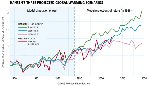
Yogi Berra is quoted as having once said, "predictions are hard—especially about the future". Indeed, there is no better test than making a prediction about the future, and looking back and seeing how it panned out. This sort of post hoc validation is often done with numerical weather models. It's more difficult to do with climate models, however, because you have to wait not days or weeks, but years to see how the prediction actually measured up.
Hansen's 1988 simulations, in this regard, can be viewed as one of the great validation experiments in climate modeling history. In these experiments, Hansen included a high, medium, and low fossil fuel future emissions scenario, corresponding to the green, blue, and purple curves respectively. As it turns out, our actual fossil fuel emissions scenario during the two decades subsequent to Hansen's 1988 projections, has corresponded most closely to his middle scenario, the blue curve. And as you can see from the subsequent observations (the red curve), his prediction for that scenario quite closely matched the observed warming.
Now, you may have noticed, however, that this model simulation didn't capture the observed multi-year cooling in 1992. Is that a fault of the simulation?
No!—there is no way that James Hansen (or anyone for that matter) could have predicted the eruption of Mt. Pinatubo. And rather than proving a fault with the model, the Pinatubo eruption actually provided Hansen with another key test of the climate models. It takes about 6 months for the volcanic aerosol to spread out around the globe and begin to have a global cooling impact. This gave Hansen about six months to run his model and make a prediction, at the instant Pinatubo erupted. As you can see, he was able to predict quite accurately the short-term cooling of the globe by a bit less than 1°C that would result from this eruption. His model simulation (the black curve below) actually predicted a bit too much cooling (observations shown by the blue curve below). But that, too, wasn't his fault. El Niño events occur randomly in time, and there was no way to know that an extended El Niño event would occur in 1991-1993, offsetting some of the volcanic cooling: As you found in your first problem set, El Niño events warm the globe by about 0.1-0.2°C.
These examples may be the most striking examples of how the models have been validated, but they have been validated in many other, more mundane ways. In fact, the various reports of the IPCC include hundreds of pages of 'model validation' showing the models do a good job capturing the main fluxes of energy and radiative balances, the general circulation of the atmosphere and the major ocean current systems, the amplitude and pattern of the seasonal response to changing patterns of solar insolation, etc.
Detecting Climate Change
So, we have seen in the previous section that climate models have been used to make some very successful predictions in the past, and there is reason to take them seriously. Can we use these models to go a step further than we already have? We have seen in previous lessons that modern-day climate change appears anomalous and without any obvious precedent in the historical past. That alone does not establish that the changes that we are seeing—warming of the Earth's surface, and many other changes—are due to human impacts. Using climate models, we can, however, address this issue of causality. We can use the models to investigate the hypothesis that the observed changes can be explained by nature alone, and the alternative hypothesis that they can only be explained by a combination of human and natural factors. Investigations employing more than 20 state-of-the-art climate models (see below) show that natural factors alone cannot explain the global temperature record of the past century—including the long-term warming trend—while human factors, combined with the natural factors, can.
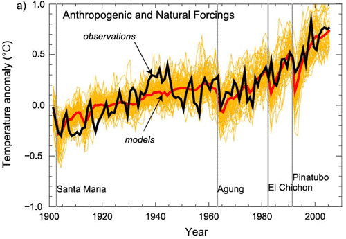
Some might argue that this alone is not convincing evidence. Perhaps, for example, we simply have the trend in solar output wrong and the true trend in solar output closely resembles the trend in human impacts (i.e., greenhouse forcing + anthropogenic aerosols). Then we might be misinterpreting the goodness of the fit shown above.
Let us, for argument's sake, accept that criticism. Is there some other type of comparison of observations and model predictions that might be more robust in this situation? Well, we can try to take advantage of the fact that the patterns of response to different forcings might look different. It turns out that the surface expressions are not that different—the surface expression of warming due to solar output increases actually looks a fair amount like the pattern of surface warming due to greenhouse gas increases. The vertical patterns of temperature change, however, as we alluded to previously in the course, are expected to be quite different. They provide a true fingerprint to search for—and indeed, the process of using the expected patterns of response of different forcings to determine which forcings best explain the observed changes is known as fingerprint detection.
The vertical pattern of response to increasing greenhouse gas concentrations is one in which the troposphere warms (as we have seen in previous exercises), but the stratosphere cools at the expense of this tropospheric warming; greenhouse forcing is a zero-sum game and there is no increase in radiation at the top of the atmosphere, but merely a redistribution of energy and radiation within the atmosphere. The vertical pattern of temperature change we would expect for an increase in solar output, however, is one in which the entire atmosphere warms, from top-to-bottom, as there is an increase in the received radiation at the top of the atmosphere which warms the entire atmospheric column. The pattern of temperature response to an explosive volcanic eruption is yet different from either of these patterns. From comparing the observed patterns of vertical temperature change to model simulations of the responses to each of these different factors, we find that only greenhouse surface warming exhibits the vertical pattern consistent with the model's predicted fingerprint (in fact, there is also the impact of ozone depletion on the cooling of the stratosphere, but even after accounting for that effect, the remaining trend can clearly only be accounted for by greenhouse forcing).
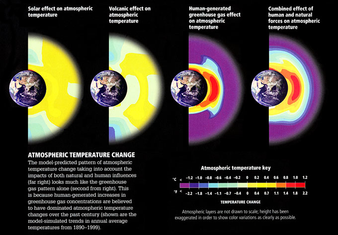
Figures (left to right):
- Solar effect on atmospheric temperature
- temperature ranges from -1.1ºF to 1.1ºF
- Volcanic effect on atmospheric temperature
- temperature ranges from -1.4ºF to 1.1ºF
- Human-generated greenhouse gas effect on atmospheric temperature
- temperature ranges from -2.2ºF to 2.2ºF
- Combined effect of human and natural forces on atmospheric temperature
- temperature ranges from -2.2ºF to 2.2ºF
Atmospheric Temperature Change: The model-predicted pattern of atmospheric temperature change taking into account the impacts of both natural and human influences (far right) looks much like the greenhouse gas pattern alone (second from right). This is because human-generated increases in greenhouse gas concentrations are believed to have dominated atmospheric temperature changes over the past century (shown are the model-simulated trends in annual average temperatures from 1890-1999)
© 2015 Dorling Kindersley Limited.
Estimating Climate Sensitivity
One of the key unknowns in the behavior of the climate, as we have seen, is the sensitivity—how much warming we can expect in response to a doubling of atmospheric concentrations. Current evidence suggests a most likely value of around 3.0°C warming, but there is—as we have seen—a wide range, anywhere from roughly 1.5°C to 4.5°C. Scientists attempt to try to constrain estimates of this key quantity by comparing model simulations with observations.
For example, scientists use models similar to the zero-dimensional EBMs we discussed in Lesson 4, driving them with the estimated changes in both natural factors (volcanoes and solar output) and human factors (greenhouse gas increases and sulfate aerosol emissions). Since the climate sensitivity is simply a parameter that can be changed in the model, scientists can do many simulations using different values of the climate sensitivity, and observe which values yield the best fit with the observations.
Such experiments can be done over the modern period back to the mid 19th century, during which observations of global mean temperature are available.
© 2015 Dorling Kindersley Limited.
During the shorter period of the past half century when deep ocean temperature observations are available, experiments can be done to compare the model-simulated changes in ocean heat content with those that have been observed.
© 2015 Dorling Kindersley Limited.
For the longer period of the past millennium during which temperature changes, as we have seen in Lesson 3, have been documented based on climate proxy data—it is possible to compare simulated and observed changes over a longer time period, providing potentially tighter constraints on climate sensitivity. The computer model simulations in this case are driven by longer-term estimates (e.g., from ice core evidence) of natural (volcanic and solar) forcings as well as modern anthropogenic forcing:
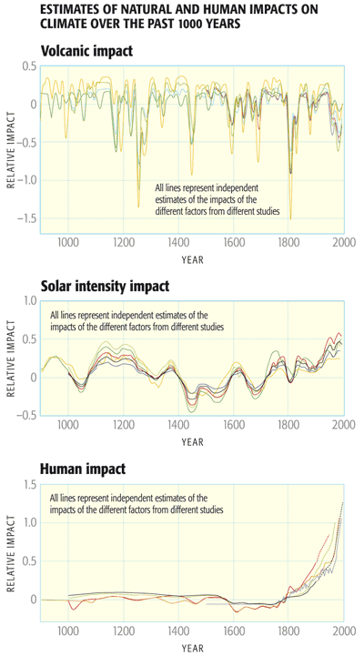
© 2015 Dorling Kindersley Limited.
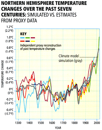
© 2015 Dorling Kindersley Limited.
Going further back in time, scientists compare climate model simulations of the cooling during the height of the Last Glacial Maximum (LGM) roughly 21,000 years ago resulting from lowered atmospheric CO2, increased continental ice cover, and altered patterns of solar insolation, and proxy evidence of ocean surface cooling derived from climate-sensitive surface dwelling organisms trapped in ocean sediment cores.
© 2015 Dorling Kindersley Limited.
Finally, going even further back in time, into the deep geological past, scientists compare model results with geological evidence of past warm and cold periods.

The overall evidence from all of these different lines of evidence regarding both human-caused and natural climate changes over a broad range of time scales, is that the equilibrium climate sensitivity likely falls within the range of 1.5°C to 4.5°C for doubling, with a most likely value of roughly 3°C warming.
Given the full array of available evidence from instrumental and paleoclimate proxy data, and the comparisons of this evidence with theoretical estimates, there is a very low likelihood of either a trivially small (e.g., 1.5°C or less) or extremely high (greater than 7°C) equilibrium climate sensitivity.
Problem Set #4
Activity
Note:
For this assignment, you will need to record your work on a word processing document. Your work must be submitted in Word (.doc or .docx) or PDF (.pdf) format so the instructor can open it.
The documents associated with this problem set, including a formatted answer sheet, can be found on CANVAS.
- Be sure also to download the answer sheet from CANVAS (Files > Problem Sets > PS#4).
Each problem (#2 to #6) will be graded on a quality scale from 1 to 10 using the general rubric as a guideline. For this problem set, each problem is equally weighted. Thus, a score as high as 50 is possible, and that score will be recorded in the grade book.
The objective of this problem set is for you to work with some of the concepts and mathematics around one-layer energy-balance models (1-D EBMs) covered in Lesson 5. You may find Excel useful in this problem set, but you may use any software you wish, keeping in mind that the instructor only can provide help with Excel.
- Re-read the derivation of the equations for planetary surface temperature and planetary atmospheric temperature under the framework of a one-layer energy-balance model, as laid out in Lesson 5. After re-reading the derivation, write the two aforementioned equations, and, for each equation, explain what each variable in the equation is. Summarize also the assumptions behind the derivation; in other words, explain what a one-layer EBM is and how it differs from a 0-D EBM. This is as straightforward as it seems, but this problem is here to ensure that you understand the underlying concepts because they are referenced often in climate science. Report your discussion on the answer sheet.
- Calculate values of global surface temperature and planetary atmospheric temperature for varying values of the solar constant, ranging from 0 to 2,000 W m-2, incremented by 100 W m-2. Assume that the value of planetary albedo is 0.32, emissivity is 0.77, and Stefan-Boltzmann constant is 5.67 x 10⁻⁸ W m-2 K-4. Construct a table to show your results. Using the values that you calculated, plot both global surface temperature and global tropospheric temperature as a function of solar constant; use the same grid for both sets of temperature values. That is, the horizontal axis of the plot should give values of solar constant, and the vertical axis should give values of temperature. Report all results on the answer sheet.
- Calculate values of global surface temperature and global tropospheric temperature for varying values of planetary albedo, ranging from 0 to 1, incremented by 0.05. Assume that the value of the solar constant is 1,360 W m-2, emissivity is 0.77, and Stefan-Boltzmann constant is 5.67 x 10⁻⁸ W m-2 K-4. Construct a table to show your results. Using the values that you calculated, plot both global surface temperature and global tropospheric temperature as a function of planetary albedo; use the same grid for both sets of temperature values. That is, the horizontal axis of the plot should give values of planetary albedo, and the vertical axis should give values of temperature. Report all results on the answer sheet.
- Calculate values of global surface temperature and global tropospheric temperature for varying values of planetary emissivity, ranging from 0 to 1, incremented by 0.05. Assume that the value of the solar constant is 1,360 W m-2, planetary albedo is 0.32, and Stefan-Boltzmann constant is 5.67 x 10⁻⁸ W m-2 K-4. Construct a table to show your results. Using the values that you calculated, plot both global surface temperature and global tropospheric temperature as a function of planetary emissivity; use the same grid for both sets of temperature values. That is, the horizontal axis of the plot should give values of planetary albedo, and the vertical axis should give values of temperature. Report all results on the answer sheet.
- Explain the relationship between each of the independent variables (solar insolation, planetary albedo, planetary emissivity) and planetary temperature. As well, discuss the various energy-balance models covered in Lessons 4 and 5, comparing and contrasting their assumptions. Write your discussion on the answer sheet, limiting it to one to two paragraphs.
Lesson 5 Summary
In this lesson, we further explored the use of theoretical models of the climate system. We found that:
- A generalization of the zero-dimensional EBM known as the one-layer EBM can be used to provide a more realistic description of the greenhouse effect. This model can be used to estimate both surface temperatures and temperatures of the mid-troposphere. It is also possible to study the effect of feedbacks using a simple model of this sort;
- A further generalization known as the one-dimensional EBM can be used to study the latitudinal dependence of energy balance and temperature distributions. The one-dimensional EBM can be used, among other applications, to try to understand the processes that drive climate into and out of Ice Ages;
- Full three-dimensional general circulation models (GCMs) and coupled Atmosphere-Ocean (AOGCM) versions of the GCM can be used to model the more detailed patterns of climate variability and climate change, and the study not just of temperature changes but other key fields such as precipitation, wind patterns, etc.;
- Theoretical climate models have been validated in numerous ways. Predictions of warming made back in the late 1980s have been borne out, and experiments simulating the response to natural events, such as volcanic eruptions, have demonstrated that climate models have the ability to make accurate predictions of the responses of the climate to both natural and human forcings;
- Comparisons of model simulations and observations, including so-called "fingerprint detection" studies, indicate that natural factors alone cannot explain the observed trends of the past century; only a combination of natural and human factors can explain these trends;
- By comparing model simulations and observations on a variety of timescales, scientists have constrained climate sensitivity—the equilibrium warming expected in response to a doubling of concentrations—to lie somewhere within the range of 1.5 to 4.5°C, with a most likely estimate of around 3°C warming.
Reminder - Complete all of the lesson tasks!
You have finished Lesson 5. Double-check the list of requirements on the first page of this lesson to make sure you have completed all of the activities listed there before beginning the next lesson.
Lesson 6 - Carbon Emission Scenarios
The links below provide an outline of the material for this lesson. Be sure to carefully read through the entire lesson before returning to Canvas to submit your assignments.
Introduction
About Lesson 6
Now that we have explored the underlying workings of the climate system, experimented with actual climate models and validated their predictions, we are in a position to use climate models to make projections of future climate change. Before we can project human-caused climate changes, however, we must consider the various plausible scenarios for future human behavior, and resulting greenhouse gas emissions pathways.
What will we learn in Lesson 6?
By the end of Lesson 6, you should be able to:
- Discuss the range of hypothetical pathways of future greenhouse gas emissions;
- Distinguish between the concepts of and equivalent emissions;
- Explain the Kaya Identity;
- Explain the concept of stabilization of greenhouse gas concentrations; and
- Discuss the wedges concept for controlling greenhouse gas emissions.
What will be due for Lesson 6?
Please refer to the Syllabus for specific time frames and due dates.
The following is an overview of the required activities for Lesson 6. Detailed directions and submission instructions are located within this lesson.
- Read:
- IPCC Sixth Assessment Report, Working Group 1 -- Summary for Policy Makers (link is external)
- Possible Climate Futures: p. 12-23
- Dire Predictions, v.2: p. 92-93
- Hausfather, Z. and Peters, G. P., "Emissions – the ‘business as usual’ story is misleading," Nature, 577, 618-620 (2020).
- IPCC Sixth Assessment Report, Working Group 1 -- Summary for Policy Makers (link is external)
- Begin Project #1: Design your own fossil fuel emissions scenario that would limit future warming by 2100 to 2.5°C relative to pre-industrial levels.
- Participate in Lesson 6 discussion: Carbon Emission Scenarios
Questions?
If you have any questions, please post them to our Questions? discussion forum (not e-mail), located under the Home tab in Canvas. The instructor will check that discussion forum daily to respond. Also, please feel free to post your own responses if you can help with any of the posted questions.
'SRES' Scenarios and 'RCP' Pathways
Scientists attempt to create scenarios of future human activity that represent plausible future greenhouse emissions pathways. Ideally, these scenarios span the range of possible future emissions pathways, so that they can be used as a basis for exploring a realistic set of future projections of climate change.
In the early IPCC assessments, the most widely used and referred-to family of emissions scenarios were the so-called SRES scenarios (for Special Report on Emissions Scenarios) that helped form the basis for the IPCC Fourth Assessment Report. These scenarios made varying assumptions ('storylines') regarding future global population growth, technological development, globalization, and societal values. One (the A1 'one global family' storyline chosen by Michael Mann and Lee Kump in version 1 of Dire Predictions) assumed a future of globalization and rapid economic and technological growth, including fossil fuel intensive (A1FI), non-fossil fuel intensive (A1T), and balanced (A1B) versions. Another (A2, 'a divided world') assumed a greater emphasis on national identities. The B1 and B2 scenarios assumed more sustainable practices ('utopia'), with more global-focus and regional-focus, respectively.
Let us now directly compare the various SRES scenarios both in terms of their annual rates of carbon emissions, measured in gigatons (Gt) of carbon (1Gt = 1012 tons), and the resulting trajectories of atmospheric concentrations. Getting the concentrations actually requires an intermediate step involving the use of a simple model of ocean carbon uptake, to account for the effect of oceanic absorption of atmospheric .
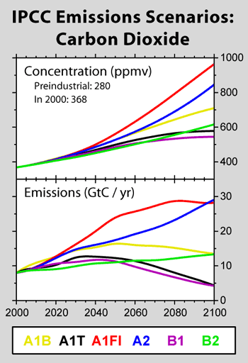
We can see from the above comparison how various trajectories of our future carbon emissions translate to atmospheric concentration trajectories. From the point of view of controlling future concentrations, these graphics can be quite daunting. Depending on the path chosen by society, we could plausibly approach concentrations that are quadruple pre-industrial levels by 2100. Even in the best case of the SRES scenarios, B1, we will likely reach twice pre-industrial levels (i.e., around 550 ppm) by 2100. And to keep concentrations below this level, we can see that we have to bring emissions to a peak by 2040, and ramp them down to less than half current levels by 2100.
You might wonder what scenario do we actually appear to be following? Over the first ten years of these scenarios, observed emissions actually were close to the most carbon intensive of the SRES scenarios—A1FI. This gives you an idea of how challenging the problem of stabilizing carbon emissions at levels lower than twice pre-industrial actually is.
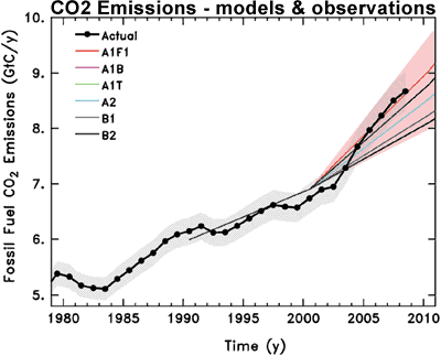
One problem with the SRES scenarios—indeed, a fair criticism of them—is that they do not explicitly incorporate carbon emissions controls. While some of the scenarios involve storylines that embrace generic notions of sustainability and environmental protection, the scenarios do not envision explicit attempts to stabilize concentrations at any particular level. For the Fifth Assessment Report, a new set of scenarios, called Representative Concentration Pathways (RCPs), was developed. They are referred to as pathways to emphasize that they are not definitive, but are instead internally consistent time-dependent forcing projections that could potentially be realized with multiple socioeconomic scenarios. In particular, they can take into account climate change mitigation policies to limit emissions. The scenarios are named after the approximate radiative forcing relative to the pre-industrial period achieved either in the year 2100, or at stabilization after 2100. They were created with 'integrated assessment models' that include climate, economic, land use, demographic, and energy-usage effects, whose greenhouse gas concentrations were then converted to an emission's trajectory using carbon cycle models.
The RCP2.6 scenario peaks at 3.0 W / m2 before declining to 2.6 W / m2 in 2100, and requires strong mitigation of greenhouse gas concentrations in the 21st century. The RCP4.5 and RCP6.0 scenarios stabilize after 2100 at 4.2 W / m2 and 6.0 W / m2, respectively. The RCP4.5 and SRES B1 scenarios are comparable; RCP6.0 lies between the SRES B1 and A1B scenarios. The RCP8.5 scenario is the closest to a ‘business as usual’ scenario of fossil fuel use, and has comparable forcing to SRES A2 by 2100.
In all RCPs global population levels off or starts to decline by 2100, with a peak value of 12 billion in RCP8.5. Gross domestic product (GDP) increases in all cases; of note, the RCP2.6 pathway has the highest GDP, though it has the least dependence on fossil fuel sources. Carbon dioxide emissions for all RCPs except the RCP8.5 scenario peak by 2100.
Even the RCPs have encountered a fair bit of criticism. For the recently released Sixth IPCC Assessment Report, scientists and modelers are using Shared Socioeconomic Pathways (SSPs), which link specific policy decisions with projected emissions outcomes. The readings this week include a Commentary from the journal Nature about the issue of RCPs and the path forward with SSPs.
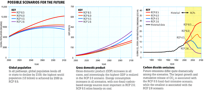
Global Population
In all pathways, global population levels off or starts to decline by 2100; the highest world population (12 billion) is achieved by 2100 in RCP 8.5
Gross Domestic Product
Gross Domestic product (GDP) increases in all cases, and interestingly, the highest GDP is realized in the RCP 2.6 scenario. Energy consumption increases in all scenarios, with non-fossil-carbon-based energy sources most important in RCP 2.6; RCP 8.5 relies heavily on coal
Carbon Dioxide Emissions
Future emissions differ quite dramatically among the scenarios. The largest growth and cumulative release of CO2 is associated with the RCAP 8.5 fossil-fuel-intensive scenario, while the smallest is associated with the RCP 2.6 scenario
© 2015 Dorling Kindersley Limited.
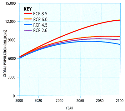
© 2015 Dorling Kindersley Limited.

© 2015 Dorling Kindersley Limited.
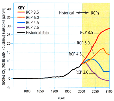
© 2015 Dorling Kindersley Limited.
With all of these scenarios, stabilizing CO2 concentrations requires not just preventing the increase of emissions, but reducing emissions. This leads naturally to our next topic—the topic of stabilization scenarios.
Stabilizing CO2 Concentrations
Before we proceed, it is useful to cover a few more important details. You may recall from an earlier lesson that the radiative forcing due to a given increase in atmospheric concentration, , can be approximated as:
where is the initial concentration and is the final concentration. This gives a forcing for doubling of from pre-industrial values (i.e., = 280 ppm and = 560 ppm) of just under . Given the typical estimate of climate sensitivity we discussed during the past two lessons, we know that this forcing translates to about 3°C warming. That means, we get about 0.75°C warming for each of radiative forcing.
Think About It!
Thus far, has increased from pre-industrial levels of 280 ppm to current levels of around 410 ppm. Based on the relationships above, what radiative forcing and global mean temperature increase would you expect in response to our behavior so far?
Click for answer.
Using the formula above, we get a radiative forcing of ΔF = 2.04 W/m2.
Given that we get roughly 0.75°C warming for each W/m2 forcing, this gives slightly more than 1.5°C warming.
If you successfully answered the question above, you know that the increases so far should have given rise to 1.5°C warming of the globe. Yet we have only seen about 1.0°C warming. Are the theoretical formulas wrong? Did we make a mistake? Actually, it is neither. First of all, we know that it takes decades for the climate system to equilibrate to a rise in atmospheric , so we have not yet realized the expected equilibrium warming indicated by the equilibrium climate sensitivity. Models indicate that there is as much as another 0.5°C of warming still in the pipeline, due to the increases that have taken place already. That alone would almost explain the 0.7°C discrepancy between the warming we expect, and the lesser warming we've observed.
However, we have forgotten two other things that—as it happens—roughly cancel out! First of all, is not the only greenhouse gas whose concentrations we have been increasing through industrial and other human activities. There are other greenhouse gases—methane, nitrous oxide, and others—whose concentrations we have increased, and whose concentrations are projected to continue to rise in the various SRES and RCP scenarios we have examined.
© 2015 Dorling Kindersley Limited.
We need to account for the effect of all of these other greenhouse gases. We can do this using the concept of equivalent (_eq). _eq is the concentration of that would be equivalent, in terms of the total radiative forcing, to a combination of all the other greenhouse gases. If we take into account the rises in methane and other anthropogenic greenhouse gases, then the net radiative forcing is equivalent to having increased to a substantially higher, roughly 485 ppm! In other words, the current value of _eq is 485 ppm. This fact has caused quite a bit of confusion, leading some commentators (see this RealClimate article) to incorrectly sound the alarm that it is already too late to stabilize concentrations at 450 ppm and, hence, to avoid breaching the targets that have been set by some as constituting dangerous anthropogenic interference with the climate (see this article by Michael Mann for a discussion of these considerations).
Nonetheless, if _eq has reached 485ppm, does that mean that we are committed to the net warming that can be expected from a concentration of 485 ppm ? Well, yes and no. The other thing we have left out is that greenhouse gases are not the only significant anthropogenic impact on the climate. We know that the production of sulfate and other aerosols has played an important role, cooling substantial regions of the Northern Hemisphere continents, in particular, during the past century. The best estimate of the impact of this anthropogenic forcing, while quite uncertain, is roughly -0.8 of forcing, which is equivalent—in this context—to the contribution of negative 60 ppm of . If we add -60 ppm to 485 ppm we get 425 ppm—which is closer to the current actual concentration of 408 ppm. So, in other words, if we take into account not only the effect of all other greenhouse gases, but also the offsetting cooling effect of anthropogenic aerosols, we end up roughly where we started off, considering only the effect of increasing atmospheric concentration through fossil fuel burning.
It is, therefore, a useful simplification to simply look at atmospheric alone as a proxy for the total anthropogenic forcing of the climate, but there are some important caveats to keep in mind:
- (1) the various scenarios assume that the sulfate aerosol burden remains unchanged. If we instead choose to clean up the atmosphere to the point of scrubbing all current sulfate aerosols from industrial emissions, we are left with the faustian bargain of experiencing the additional climate change impacts of a sudden effective increase of atmospheric of 60 ppm;
- (2) not all greenhouse gases are created the same—some, such as methane, have far shorter residence times in the atmosphere (timescale of years) than does , which persists for centuries.
That means that there is a far greater future climate change commitment embodied in a scenario of pure emissions than the same equivalent emissions consisting largely of methane. This has implications for the abatement strategies we will discuss later in the course.
These limitations notwithstanding, let us now consider the impact of various pure scenarios. Let us focus specifically on scenarios that will stabilize atmospheric at some particular level, i.e., so-called stabilization scenarios. Invariably, these scenarios involve bringing annual emissions to a peak at some point during the 21st century, and decreasing them subsequently. Obviously, the higher we allow the concentrations to increase and the later the peak, the higher the ultimate concentration is going to be. The various possible such scenarios are shown below in increments of 50 ppm. If we are to stabilize concentrations at 550 ppm, we can see that emissions should be brought to a peak of no more than 8.7 gigatons of carbon per year, by around 2050, and reduced below 1990 levels (i.e., 6 gigatons of carbon per year) by 2100. For comparison, as we saw earlier that current emissions are at roughly 8.5 gigatons per year and rising at the rate of the carbon-intensive A1FI SRES emissions scenario, so we are already "behind the curve" so to speak, even for 550 ppm stabilization.
For 450 ppm stabilization, the challenge is far greater. According to the figure below, we would have had to bring emissions to a peak before 2010 at roughly 7.5 gigatons per year, and lower them to roughly 4 gigatons per year (i.e., 33% below 1990 levels) by 2050. Obviously, that train has already left the station. Alternatively, the RCP2.6 pathway is an example of a 450 ppm stabilization scenario consistent with where we are now, that involves bringing emissions to a peak within the next decade below 10 gigatons per year, and reducing them far more dramatically, to near zero 80% by 2100 through various mitigation policies. With every year, we continue with business-as-usual carbon emissions, achieving a 450 ppm stabilization target becomes that much more difficult, and involves far greater reduction of emissions in future decades. It is for this reason that the problem of greenhouse gas stabilization has been referred to by some scientists as a problem with a very large procrastination penalty.
The "Kaya Identity"
We can actually play around with greenhouse gas emissions scenarios ourselves. To do so, we will take advantage of something known as the Kaya Identity. Technically, the identity is just a definition, relating the quantity of annual carbon emissions to a factor of terms that reflect (1) population, (2) relative (i.e., per capita) economic production, measured by annual GDP in dollars/person, (3) energy intensity, measured in terawatts of energy consumed per dollar added to GDP, and (4) carbon efficiency, measured in gigatons of carbon emitted per terawatt of energy used. Multiply these out, and you get gigatons of carbon emitted. If the other quantities are expressed as a percentage change per year, then the carbon emissions, too, are expressed as a percentage change per year, which, in turn, defines a future trajectory of carbon emissions and concentrations.
Mathematically, the Kaya identity is expressed in the form:
where
- is global emissions from human sources
- is global population
- is world GDP
- is global energy consumption
By projecting the future changes in population (P), economic production , energy intensity , and carbon efficiency , it is possible to make an informed projection of future carbon emissions . Obviously, population is important as, in the absence of anything else, more people means more energy use. Moreover, economic production measured by GDP per capita plays an important role, as a bigger economy means greater use of energy. The energy intensity term is where technology comes in. As we develop new energy technologies or improve the efficiency of existing energy technology, we expect that it will take less energy to increase our GDP by and additional dollar, i.e., we should see a decline in energy intensity. Last, but certainly not least, is the carbon efficiency. As we develop and increasingly switch over to renewable energy sources and non-fossil fuel-based energy alternatives and improve the carbon efficiency of existing fossil fuel sources (e.g., by finding a way to extract and sequester ), we can expect a decline in this quantity as well, i.e., less carbon emitted per unit of energy production.
Fortunately, we do not have to start from scratch. There is a convenient online calculator (Kaya Identity Scenario Prognosticator), provided courtesy of David Archer of the University of Chicago (and a RealClimate blogger ). Below, a brief demonstration of how the tool can be used. After you watch the demonstration, use the link provided above to play around with the calculator yourself.
Note:
The online calculator (Kaya Identity Scenario Prognosticator) has been updated and does not look exactly like the Kaya tool shown in the following videos. The format of the new tool is slightly different from the videos below, but all of the functionality is still available, you will have to use the pull down menus to select which chart you want to view, and you are limited to viewing just two graphs at a time. You will also have to enter the initial values referred to in the video. The initial values are: Population Plateau=11 billion, GDP/Person=1.6, Watts/$=-1.0, and Carbon Released/Watt=-0.3.
Video: Kaya Demo - Part 1 (4:59)
PRESENTER: OK, we're now going to play around with this online calculator that uses that Kaya identity to project future CO2 emissions. And this identity, as we now know, uses the fact that CO2 emissions are going to be a product of various terms that contribute to emissions growth, population, GDP per person, relative economic growth, energy intensity, the amount of energy we can get for a dollar-- a given amount of money, and carbon efficiency, how efficient we are at producing energy in a non-carbon intensive manner.
So the idea is that population, we can use demographic projections that, for example, have global population leveling out somewhere around 11 billion later this century. Projections of relative-- that is per capita economic growth, that as the world becomes more industrialized as developing nations develop more industrial economies, that we're likely to see an increase in relative economic expansion per person. Energy intensity, in principle, should decrease over time. As we develop more efficient means of obtaining energy, we will decrease the cost in dollars for a given watt of power.
And finally, carbon efficiency. As we switch over to less carbon intensive sources of energy, we will decrease over time, the amount of carbon that we emit for each unit of power, say, a terawatt of power. So we can calculate CO2 emissions trajectories as a product of these various terms. Now, let's use the default values that are set in the calculator and do the calculation.
And here we go. This red curve is the projected future carbon emissions, given the values that we've chosen for the various terms. And the blue pluses here show historical values of carbon emissions. And so we can sort of see how our projection ties into the past historical trends. We can use a carbon cycle model that involves some assumptions about both the oceans and the terrestrial biosphere that calculates the changes in CO2 concentrations over time, given this carbon emission scenario.
And the red curve is what we're projecting for future CO2. By 2100, we reach about 700 parts per million. And you can compare that trajectory to various stabilization scenarios. The green curve shows what the CO2 concentrations would be if we were to stabilize CO2 concentrations at 350 parts per million. The blue is 450 parts per million and so on. The yellow is 750 parts per million. Eventually, CO2 concentration stabilizes at 750 parts per million in that stabilization scenario.
So we can see how our projected emissions are comparing with various stabilization scenarios. And if we take this as sort of business as usual, these various assumptions about population, GDP, energy intensity, and carbon efficiency, then we see that, in fact, we'll be well over the 750 stabilization scenario. We'll already be at 700 parts per million at 2,100 with CO2 continuing to rise.
We can calculate accordingly the amount of carbon free energy we would need, given the assumptions of population, energy intensity. We can calculate how much carbon free energy we would need to produce to meet our energy demands if we are to keep CO2 to the specified level. And so we see the amount of carbon free energy that would be required in the various CO2 stabilization scenarios. And the red curve is the amount of carbon free energy that we would need to--
Video: Kaya Demo - Part 2 (3:55)
PRESENTER: OK. So we were just looking at the carbon-free energy requirements. And the red curve tells us how much carbon-free energy we would need to produce, given the assumptions that we've made here and given the scenarios shown for both carbon emissions and CO2 concentrations.
We can also see how our assumptions regarding each of these terms compare to historical numbers, population growth in the past versus our projected population growth under this assumption that we've made of stabilizing global population at 11 billion later this century or early next century, the assumption of a GDP per person relative economic expansion of 1.6% per year-- these are the historical values, the pluses. And the curve shows what we're projecting for the future.
Energy intensity-- our curve sort of follows the past couple decades of data, as far as energy intensity is concerned. And so we might imagine that there have been some developments in technology that have led to a trend in recent decades that may be more representative of the trend we would expect in the future than, say, the numbers from the early 20th century. So our projected energy intensity over time sort of matches the past few decades of energy intensity information.
And finally, carbon efficiency-- this is the decline we're projecting as we become more carbon efficient in our energy usage, fewer gigatons of carbon produced per terawatt. We are extrapolating the past trend. And we project increasing carbon efficiency, increasingly less reliance on carbon-based energy as time goes on.
So these are the underlying assumptions in our default projection here. And as we've seen, in that default projection, which corresponds to business as usual, we're going to be upwards of 700 parts per million by the end of the century.
If we're looking to stabilize CO2 concentrations at, say, 550 parts per million-- down in here, the purple curve-- then clearly, we are going to need to change our behavior. We're going to need to change these various terms, some combination of these terms, in such a way that we lower CO2 increase.
And accordingly, as the purple curve shows, we would need to produce less carbon-free energy in that stabilization scenario, in the 550 parts per million stabilization scenario.
So we can play around with these numbers and try to figure out how we would actually go about achieving a particular stabilization, what terms we might be able to change through technology and through future policy changes, and how those changes would translate to a CO2 emission scenario and our ability to stabilize CO2 concentrations at some particular level.
So the next thing we'll do is to play around a little bit with these numbers and see if we might be able to lower our projected CO2 increase from the current trajectory, the business-as-usual trajectory that has us at 700 parts per million, well over twice pre-Industrial by the end of the century.
Video: Kaya Demo - Part 3 (4:59)
PRESENTER: OK. So first of all, imagine that we found a way to stabilize a population at a significantly lower level. Through appropriate governmental policies, we found a way to limit global population to 10 billion, rather than 11 billion. Well, how does that change things?
Well, we can see we've lowered our carbon emissions, our projected carbon emissions. The CO2 concentration at 2,100 is now a little bit above 650 parts per million. So we've knocked off about 50 parts per million of our projected CO2 increase by 2,100.
It would be very difficult to decrease the projected global population much more than that. But let's say we go for 9 billion. Then we've now lowered the 2,100 CO2 concentration to below 650 parts per million. So we're slowly working our way towards a 550 stabilization.
Let's imagine that we were able to increase energy efficiency more than is currently projected, through new technologies that have not yet been incorporated or implemented, perhaps large-scale use of fusion energy. So let's imagine that the energy intensity, that we can get a better improvement in energy intensity, something closer to 1.5% decline, versus a 1% decline in the amount of energy that we need per unit dollar.
Well, now we have lowered CO2 concentrations even more. We're a little bit above 550 parts per million. Now, of course, if we were to establish policies that favored non-carbon-based forms of energy, renewable energy, technology, then we can, of course, further improve our carbon efficiency.
And so we might imagine changing this number from minus 0.3% to maybe minus 0.6% or so through the introduction of appropriate policies. And now we have come very close to 550 PPM stabilization.
So we would have to go in and look in more detail at the assumptions that go into assuming that we can change our carbon efficiency by the amount that we've changed it or that we can change energy intensity by the amount we've changed it. If we, for example, look at how we now are comparing with the historical trajectories, we can see that our energy intensity curve is far more optimistic than would be suggested by even the past two decades, which we originally used to extrapolate the future trend somewhat optimistically.
If we look at carbon efficiency, then to decrease our reliance on our carbon-based energy by the amount assumed in the carbon efficiency number we've used, again, we would need to start doing significantly better in terms of that decline in use of carbon-based energy than we have done in even the past decade or two.
So clearly, changes in policy, changes in behavior-- somewhat dramatic changes in policy and behavior-- would be necessary to put us on the trajectories that are, in essence, dependent on these optimistic numbers we've now used to replace the so-called "business as usual" settings in our attempt to lower future CO2 emissions and future CO2 concentrations.
We can see, for example, that to follow this 550 PPM, we've come pretty close now to 550 PPM stabilization. We're a little bit above the 550 PPM stabilization, but not too far above--
Video: Kaya Demo - Part 4 (2:57)
PRESENTER: OK. So continuing where I left off, so with these settings, with these assumptions, we've come pretty close to 550 PPM stabilization. If we look at the carbon emissions, we can see that, in fact, to achieve that CO2 trajectory, that roughly 550 PPM CO2 stabilization trajectory, we would need to bring emissions to a peak of less than eight gigatons per year by the next decade or so. And we would need to begin bringing them down.
And in fact, if we had sought to stabilize CO2 concentrations at an even lower level, say, 450 parts per million-- now, that's the blue curve here, which we're well above-- to stabilize CO2 concentrations at 450 parts per million, we would need to bring emissions to a peak even sooner. And we would need to start bringing them down far more quickly in future decades.
And so for your first course project described later on in this lesson, you are going to be playing around with the settings, the various assumptions for per capita economic growth, energy intensity, and carbon efficiency projections for the future and perhaps population assumptions about population growth and population stabilization and see if you can come up with a realistic scenario, a justifiable scenario, of assumptions for these various terms that allow us to stabilize CO2 concentrations at a level that would minimize the risk of exceeding what we might define as dangerous human interference with our climate.
So your first project will involve integrating what we've learned about climate models, using simple climate models to look at projected temperature increases, and then looking at the distribution, the probability of future temperature increases, and what changes we could make in policy and behavior that would allow us to stabilize CO2 concentrations at a level that gives us a fairly high probability of avoiding breaching some temperature, some warming limit, that we might define as dangerous interference with the climate.
So you'll have lots of time to play around with this and get used to using this tool yourself and combining it with projections that we make from our simple energy balance model to address these issues in your first project.
The "Wedges" Concept
An increasingly widespread approach to characterizing greenhouse gas emissions reductions is the so-called Wedges concept introduced by Princeton researchers a few years ago. The concept is relatively straightforward. First, one defines the current path of business-as-usual emissions. We can think of that ramp-like path as defining a stabilization triangle, as shown below.
Based on the past one to two decades, the business-as-usual pathway corresponds to an increase of about 1.5 gigatons per decade—which, if we extrapolate linearly, amounts to about 7 gigatons of carbon emissions over the next 50 years. The stabilization triangle can thus be split into 7 "wedges" that each represent 1 gigaton of carbon over the next 50 years. The first step to stabilizing greenhouse gas concentrations is to freeze annual emissions so that they do not rise any further. To accomplish this, we would need to replace 7 gigaton wedges of projected greenhouse gas emissions that would be required to meet the forecasted business-as-usual global energy requirements over the next 50 years. The individual wedges could be derived from greater energy efficiency, decreased reliance on fossil fuels, new technologies aimed at sequestration of , etc.
Of course, as we have seen from our discussion of stabilization scenarios, simply freezing greenhouse emissions at current levels is not adequate to stabilize concentrations. The emissions must be decreased, eventually to zero, or at least close enough to zero so that they are balanced by the natural rates of uptake of carbon from the ocean and biosphere. So, the wedge approach must be supplemented by an actual decrease in emission rates. In one idealization of the approach, the wedges are used to freeze greenhouse annual emissions for 50 years, after which technological innovations that have been developed over the intervening half century presumably make the problem of fully phasing out fossil fuel-based energy more tractable, and emissions can be reduced over the subsequent 50 years as necessary to avoid breaching, e.g., twice pre-industrial levels. Alternatively, more additional wedges, beyond the original 7, can be used, to not only freeze annual emissions at current levels during the next 50 years, but instead, bring them down.
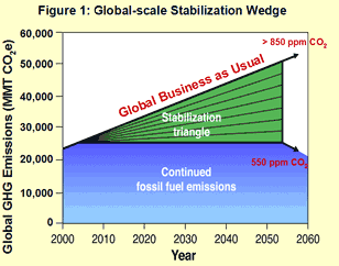
The wedge concept can be generalized beyond the global stabilization problem. For example, the U.S. EPA has introduced wedge-based plan for reducing emissions in the U.S. transportation sector as a means of mitigating this important current contribution to U.S. greenhouse gas emissions.
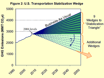
The Wedge Concept is an increasingly popular way to go about achieving the required greenhouse gas emissions in the decades ahead, by thinking about each of the individual mitigation approaches that might buy us a wedge, or some fraction of a wedge, of reductions. It is a way to think about how to take a seemingly intractable problem and break it up into many smaller, potentially tractable problems which collectively can help civilization achieve the daunting emissions reductions necessary for avoiding potentially dangerous climate change.
Project #1: Fossil Fuel Emissions
Scenario for Limiting Future Warming
Climate Change mitigation is an example of the need for decision-making in the face of uncertainty. We must take steps today to stabilize greenhouse gas concentrations if we are to prevent future warming of the globe, despite the fact that we do not know precisely how much warming to expect. Furthermore, it is a problem of risk management. We do not know precisely what potential impacts loom in our future, and where the threshold for dangerous anthropogenic impacts on the climate lies. Just like in nearly all walks of life, we must make choices in the face of uncertainty, and we must decide precisely how risk averse we are. Most homeowners have fire insurance, yet they don't expect their homes to burn down. They simply want to hedge against the catastrophe if it does happen. We can, in an analogous manner, think of climate change mitigation as hedging against dangerous potential impacts down the road. This project aims to integrate a number of themes we have already explored—energy balance and climate modeling, and our current lesson on carbon emissions scenarios—to quantify how to go about answering critical questions like, "How do we go about setting emissions limits that will allow us to hedge against the possibility of dangerous anthropogenic impacts (DAI) on our climate?"
Activity
Note:
For this assignment, you will need to record your work on a word processing document. Your work must be submitted in Word (.doc or .docx), or PDF (.pdf) format, so the instructor can open it.
For this project, you will design your own fossil fuel emissions scenario that would limit future warming by the year 2100 to 2.0°C relative to the pre-industrial level.
Directions
- Defining the threshold for DAI with the climate is a value judgment, as much as a scientific one. The European Union has defined 2°C warming relative to pre-industrial conditions to be the threshold of DAI (and this has been adopted in the recent Paris Agreement). Use a zero-dimensional EBM with the standard, i.e., mid-range values of the gray body parameter (and default settings for solar constant and albedo) to estimate the concentration for which we would achieve such warming when equilibrium is reached. [Hint: you looked at such calculations in Lesson 4, and the gray body parameter here is term "B". Specifically, please look at PS#3, Question 4, part c.]
- As discussed above, where we choose to set our emissions limits is also a matter of risk management. How risk averse are we? Let us assume that we want to limit the chance of exceeding DAI to only 5%, which is a typical threshold used in risk abatement strategies. Now, revisit the calculation that you did in Step 1, and use a high-end setting of the gray body parameter (i.e., increase by 50% term "B" used for mid-range) to calculate the resulting CO2 concentration. This is the highest concentration that we can reach and still keep the chance of exceeding DAI below 5%.
- That was the easy part! Now is where things really get interesting. You have to come up with your own emissions scenario to stabilize concentrations below the dangerous threshold that you calculated in Step 1 (i.e., using the mid-range values). Recall that based on Step 2 we are not being particularly risk-averse under this assumption. By stabilizing, we will mean that by the year 2100 the concentration curve should be flat or nearly flat, indicating that any peak in concentrations has been reached before 2100 - and that the value of that peak should not exceed the threshold found in Step 1. You should make use of the on-line Kaya calculator that we examined earlier in this lesson. Begin with the default settings in the Kaya calculator to figure out what baseline emissions scenario you are starting with and how much you need to do to achieve the required reduction in emissions to stabilize the concentration (given by the 'pCO2' curve when you choose 'ISAM pCO2' in the selector for the display on the right). You then have several knobs you can tune to achieve an alternative emissions scenario; specifically, you can do the following. Through some combination of tuning these knobs within the indicated ranges, it should be possible to stabilize concentrations at the necessary threshold level. (The concentration time-evolution curves corresponding to different specific stabilization scenarios are shown in the 'ISAM pCO2' plot.)
- You can take measures to control global population growth, which are consistent with the spread of the population trajectories of the various SRES scenarios (e.g., A1, A2, B1, B2); though note that you cannot set the limit below the current global population of 7.8 billion.
- You can change the rate of economic expansion (measured by GDP per capita) by up to 75% from the default value of 1.6% per year; that is, you can choose a value within the range of 0.4 to 2.8 % per year.
- You may change the rate of decline in energy intensity (measured in Watts per dollar) through new technology and/or the improvement of existing technology. You are permitted to change this value by 100% from its default setting of -1% per year, that is, you can choose a value within the range of 0 to -2 % per year.
- You may change the decline in carbon intensity by 100% from the default value of -0.3 % per year, that is, you can choose a value within the range of 0 to -0.6 % per year. This would reflect efforts to shift from the current reliance on fossil fuel sources, or the improved carbon efficiency of fossil fuel energy sources, e.g., through sequestration of , etc.
- As you write up your results, please discuss the reasoning that you used in arriving at the various choices for the factors in the Kaya identity, i.e., provide justification for why your choices reflect plausible policies that governments could in principle implement to achieve the necessary reductions. If your projections depart from what might be expected based on an extrapolation of past historic trends, provide some justification. Your discussion here might, for example, be guided by the plot of the required amounts of carbon-free energy to meet the requirements of your scenario, which is provided by the Kaya calculator tool. You will probably want to do some additional background reading. A good place to start would be the original 2001 IPCC report on SRES scenarios: Special Report on Emissions Scenarios.
- Save your word processing document as either a Microsoft Word or PDF file and upload to the appropriate location in Canvas.
Submitting your work
- Upload your file to the Project 1 assignment in Canvas by the due date indicated in the Syllabus.
Grading Rubric
The instructor will use the general grading rubric for problem sets to grade this project.
Lesson 6 Discussion
Activity
Directions
Please participate in an online discussion of the material presented in Lesson 6: Carbon Emission Scenarios.
This discussion will take place in a threaded discussion forum in Canvas (see the Canvas Guides for the specific information on how to use this tool) over approximately a week-long period of time. Since the class participants will be posting to the discussion forum at various points in time during the week, you will need to check the forum frequently in order to fully participate. You can also subscribe to the discussion and receive e-mail alerts each time there is a new post.
Please realize that a discussion is a group effort, and make sure to participate early in order to give your classmates enough time to respond to your posts.
Post your comments addressing some aspect of the material that is of interest to you and respond to other postings by asking for clarification, asking a follow-up question, expanding on what has already been said, etc. For each new topic you are posting, please try to start a new discussion thread with a descriptive title, in order to make the conversation easier to follow.
Suggested Topics
- Discuss the concept of SRES scenarios and RCP pathways. How are these scenarios used for projecting future climate change? Given what we know about the current greenhouse emissions, which scenarios and/or pathways appear to best represent the real world?
- Discuss potential reasons for the switch from SRES scenarios to RCP pathways in the latest IPCC report. How useful do you think the change was?
- What is the difference between emissions and equivalent emissions?
- Atmospheric increases observed so far should have given rise to 1.3°C warming, but we have only seen about 0.8°C warming. Why?
- What are stabilization scenarios?
- Do you find the Wedges Concept a useful tool for characterizing greenhouse gas emissions reductions?
Submitting your work
- Go to Canvas.
- Go to the Home tab.
- Click on the Lesson 6 discussion: Carbon Emission Scenarios.
- Post your comments and responses.
Grading criteria
You will be graded on the quality of your participation. See the online discussion grading rubric for the specifics on how this assignment will be graded. Please note that you will not receive a passing grade on this assignment if you wait until the last day of the discussion to make your first post.
Lesson 6 Summary
In this lesson, we looked at the science underlying greenhouse gas emissions scenarios. We learned that:
- Up through the Fourth Assessment Report, the IPCC employed, for the purpose of projecting future greenhouse gas concentrations, a set of emissions scenarios, known as the SRES scenarios. These scenarios reflect a broad range of alternative assumptions about how future technology, economic growth, demographics, and energy policies will evolve over the next century, and, therefore, plausibly reflect the diversity of potential future global greenhouse emissions pathways;
- The SRES scenarios embody a range of projected increases in atmospheric by 2100 from a lower end of approximately doubling the pre-industrial levels to reach 550 ppm (B1) to a near quadrupling of pre-industrial levels (A1FI). Current emissions place us on a pathway close to the upper-end A1FI scenario;
- In the Fifth Assessment Report, the IPCC switched to the use of Representative Concentration Pathways, or RCPs. These pathways (RCP 2.6, RCP 4.5, RCP 6.0 and RCP 8.5) were chosen to be representative scenarios named for their total radiative forcing in the year 2100 (in watts per meter squared), and reflect a range of policies, from strong mitigation (RCP 2.6) to approximately business-as-usual (RCP 8.5);
- The stabilization scenarios are designed to stabilize atmospheric concentrations at a particular level. The lower the desired stabilization level, the lower and sooner the peak in emissions must be. To stabilize below twice the pre-industrial levels, emissions must be brought to a peak within the next few decades and rapidly brought down by the end of the century, falling below 1990 levels by mid-century. To stabilize below 450 ppm, levels must be brought to a peak within the next decade, and brought down to 80% below 1990 levels by mid-century;
- An increasingly widely used approach to defining the required carbon emissions reductions is the Wedge approach. This approach involves freezing emissions at current rates by offsetting projected business-as-usual emissions over the next 50 years (roughly 7 gigatons), envisioned, e.g., as 7 strategies for 1 gigaton carbon emission reductions. After 50 years, emission rates are brought down, but how abruptly and rapidly depends on the stabilization targets desired. Additional wedges can be used to achieve lower stabilization targets by bringing down, rather than freezing, annual carbon emission rates over the next 50 years.
Reminder - Complete all of the lesson tasks!
You have finished Lesson 6. Double-check the list of requirements on the first page of this lesson to make sure you have completed all of the activities listed there before beginning the next lesson.
Lesson 7 - Projected Climate Changes, part 1
The links below provide an outline of the material for this lesson. Be sure to carefully read through the entire lesson before returning to Canvas to submit your assignments.
Introduction
About Lesson 7
With plausible greenhouse gas emissions scenarios now in hand, we are ready to begin looking at future climate change projections. We will start out by looking at the basic attributes of the projections—changes in surface temperature, atmospheric and oceanic circulation changes, patterns of rainfall and drought, and the climate mechanisms that may influence climate changes at regional spatial scales.
What will we learn in Lesson 7?
By the end of Lesson 7, you should be able to:
- Assess the impact of hypothetical pathways of future greenhouse gas emissions on global temperatures in the context of the estimated uncertainties; and
- Assess potential impacts of projected climate changes on patterns of rainfall and drought patterns, ocean and atmospheric circulation, and modes of climate variability.
What will be due for Lesson 7?
Please refer to the Syllabus for specific time frames and due dates.
The following is an overview of the required activities for Lesson 7. Detailed directions and submission instructions are located within this lesson.
- Take Quiz #2.
- Read:
- IPCC Sixth Assessment Report, Working Group 1 -- Summary for Policy Makers (link is external)
- Possible Climate Futures: p. 12-23 (same as Lessons 5 & 6, but specifically review information about the atmosphere, including temperature, water cycle, and air quality)
- IPCC Sixth Assessment Report, Working Group 1 -- Chapter 1
- p. 98-107 - This section covers Shared Socioeconomic Pathways, the type of scenario that is focused on in the Sixth Assessment Report. The chapters of Working Group 1 have not been finalized as of the time of course preparation (November 2021), and information from this reading will be incorporated directly into the course materials at a later date.
- IPCC Sixth Assessment Report, Working Group 1 -- Summary for Policy Makers (link is external)
- Dire Predictions, v.2: p. 98-103
Questions?
If you have any questions, please post them to our Questions? discussion forum (not e-mail) located under Home tab in Canvas. The instructor will check that discussion forum daily to respond. Also, please feel free to post your own responses if you can help with any of the posted questions.
Surface Temperature Changes
When it comes to climate change projections, the most obvious first thing to look at is the increases in global mean temperature projected by the climate models. When we do that, we are immediately confronted with two major uncertainties each of a fundamentally different nature.
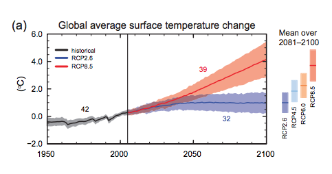
The first of the two uncertainties is the scenario uncertainty, which is represented by the different families of color-shaded regions in the graph below. It corresponds to the uncertainty in what pathway of future behavior we will follow. That uncertainty, in a crude sense, is spanned by the various RCP scenarios explored in the previous lesson. In reality, this set of scenarios alone implies greater constraint on the true spread of potential future pathways of anthropogenic activity, since there are numerous wild-cards, including (i) future anthropogenic aerosol emissions and (ii) potential carbon cycle feedbacks which may accelerate the rate at which the airborne fraction of increases with future emissions. That having been said, it is likely that a lower bound corresponding to RCP2.6 and an upper bound specified by the RCP8.5 scenario, reasonably brackets the range of future emissions pathways that human civilization will choose to follow. As a side note, validation of these projections and previous global surface projections is ongoing and can be found here.
The second of the two uncertainties is the physical uncertainty, and it corresponds to the width of each of the shaded regions (the width of the shading indicates the one standard error range among the 20+ models used in the IPCC assessment; the wider gray bars shown on the right indicate the full range of warming over all 20+ models). Much of this uncertainty comes from the previously discussed uncertainty in cloud radiative feedbacks. On average, as we know from our previous lesson, cloud radiative feedbacks are estimated to be negative. The uncertainty, however, is huge. Among the 20+ models used in the IPCC assessment, the cloud radiative feedback for doubling varies anywhere from around (offsetting roughly half of the direct radiative forcing by the increase ) to nearly (adding nearly half of the radiative forcing due to the increase alone).
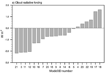
Collectively, the various scenarios and their physical uncertainty ranges span a very large spread of projected warming for the next century. In the most optimistic of scenarios—indeed, an arguably unrealistic scenario—where we could manage to keep fixed at the year 2005 concentration (this would require immediate cession of all activities—including fossil fuel burning, deforestation, etc.—contributing to anthropogenic emissions), warming nonetheless persists for decades owing to the "commitment to warming" we investigated in the previous lesson in our EdGCM experiments. This is warming already in the pipeline, but not yet realized because of the delayed response of ocean warming to greenhouse gas concentration increases that have already taken place. The additional warming by 2100 might be anywhere between 0.2 and 0.6°C depending on the precise sensitivity of the climate, with most likely warming of 0.4°C. At the upper end of the scenarios is the RCP8.5 scenario, which yields anywhere from 3 to 5.5°C additional warming (with the most likely warming of about 4°C) depending, again, on the sensitivity of the climate. Interestingly, we find that the scenario uncertainty and physical uncertainty are, in a sense, of nearly the same magnitude. While the most likely warming (i.e., the central estimates for each scenario) ranges from 0.4 to 4°C, i.e., just under a range of 4°C, the range for any one scenario (i.e., RCP8.5, which ranges from 3 to 5.5°C warming) also corresponds roughly to a maximum 4°C range. In this sense, roughly half the spread shown in the various projections of future warming is under our control, i.e., it depends on choices we make about future emissions.
There is so much focus on climate projections through 2100 that it is easy to lose sight of the fact that the climate does not magically stop changing at 2100 in the emissions scenarios we have been exploring—indeed, there is, in many cases, significant additional warming and associated changes in climate for several more centuries.
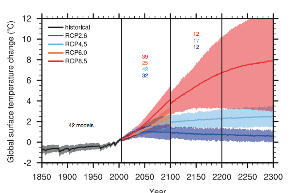
We already discussed that global warming is not predicted to be uniform. High northern latitudes are expected to warm more and faster due, in large part, to the positive ice-albedo feedback, which becomes very strong as Arctic sea ice melts. Land regions are expected to warm faster than ocean regions, owing to the ocean's delaying thermal inertia. Some regions will warm more than others, and some may even cool slightly, due to changing atmospheric and oceanic circulation patterns.
Can we see this effect in the actual spatial temperature patterns projected by a state-of-the-art climate model? Let us take a look—we are going to examine the yearly average spatial patterns of surface temperature change in a simulation of the GFDL CM2.1 coupled model (one of the models that contributes to the 20+ member IPCC CMIP3 model ensemble using in the 4th Assessment Report), subjected to the A1B scenario, as it evolves over the entire course of the 21st century.
As you watch the animation below, take note of the overall pattern of warming. Note the latitudinal breakdown of the warming shown to the right of the map. What patterns do you see—are they what you expect? Take note of the variability, both spatially and temporally. Do you see events that resemble El Niño events? Are there any particularly conspicuous, persistent anomalies that emerge over time which you did not expect? You might want to restart the video several times, so you can absorb all of the information contained in the animation.
Think About It!
One anomaly you may have noted is the cooling in a small region of the North Atlantic south of Greenland. Any idea what might be responsible for that?
Click for answer
If you guessed that it has something to do with the North Atlantic thermohaline circulation, i.e., the "conveyor belt" ocean circulation pattern, you're on the right track.
The fact that in some simulations a very small region in the North Atlantic cools—and some neighboring regions of North America and Europe consequently warm less than they ought to—is the very small grain of truth to the movie The Day After Tomorrow!
How much did the model warm in the global mean from 2000 to 2100? How does this compare to the overall spread of projected warming for the A1B scenario shown earlier? If you had to make an educated guess, what "model number" might you suspect this is, looking at the figure comparing cloud radiative forcing for the different IPCC models? Why?
Click for answer.
The model warms about 4.5°F (i.e., roughly 2.5°C) from 2000-2100. This places it slightly below the mid-range shown earlier for the A1B (green family) scenario.
Thus, we might suspect that the model has a slightly lower than average sensitivity compared to the other models shown, which implies for example a slightly more negative cloud radiative feedback than average.
So, model #7 is a reasonable guess. The GFDL CM2.1 model is known to have an equilibrium sensitivity of roughly 3.4°C for doubling.
Surface temperature changes are of course just one of a myriad effects of anthropogenic climate change. Equally, if not more important, in terms of its impact on civilization and our environment, are the shifts in rainfall and drought patterns. What do the models have to say about this?
Precipitation and Drought
As we alluded to earlier in the course, climate change is projected to lead to a poleward expansion of the Hadley Cell circulation pattern, which results in an expansion of the zone of subsiding, dry air well out of the subtropics into middle latitudes. This is particularly true in the summer when the ITCZ, jet stream, and polar front shift furthest poleward. As a result, we see decreased rainfall over the large parts of the subtropics through the mid-latitudes, including large parts of North America and Europe. Rainfall increases in the deep tropics where more water vapor is available to be squeezed out of the air and turned into rainfall as it rises within the ITCZ, which migrates north and south of the equator over the course of the year. Large rainfall increases are also seen in subpolar latitudes owing to a combination of (a) the poleward shift of the jet stream and polar front, bringing this secondary band of rising atmospheric motion further toward the pole and (b) the effect of increased atmospheric moisture, meaning that where it rains, there will be more of it.
In comparing the spatial pattern of precipitation changes (panel a) Precipitation) with that of soil moisture (panel b) Soil moisture), we might initially be somewhat surprised. The pattern of soil moisture suggests decreases in soil moisture over most of the continents of the world, even in those regions (e.g., the high boreal regions of North America and Eurasia) which see substantial projected increases in precipitation. This might seem like a paradox. Is it?
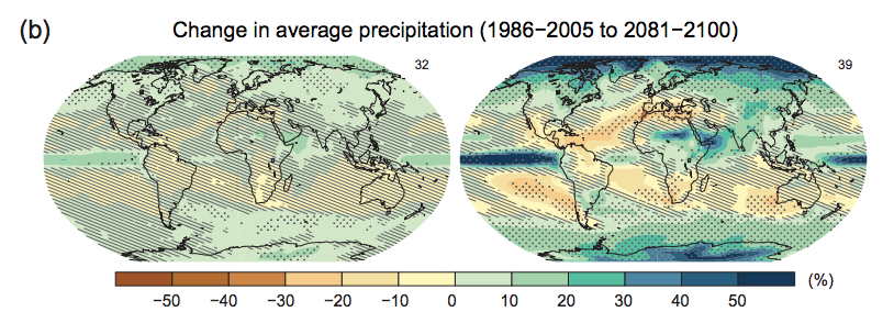
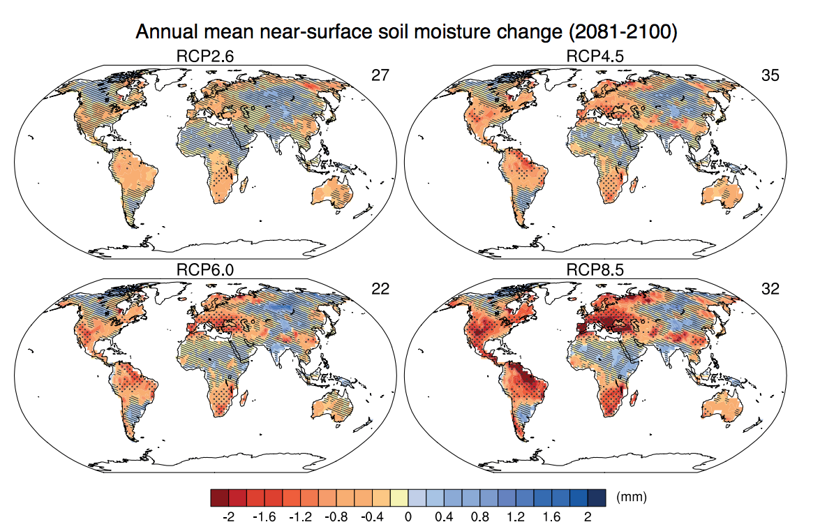
In fact, there is no paradox here at all. Keep in mind that soil moisture reflects a balance between the water coming in (in the form of precipitation, and runoff) and the water leaving the soil (in the form of evaporation/evapotranspiration). Evaporation is projected to increase over most of the continents, including many regions that are projected to see an increase in precipitation. So, what is actually happening is that even in many areas where rainfall is increasing, soil moisture nonetheless is projected to decrease, and drought thereby worsen, because warmer soils are evaporating water into the atmosphere at a faster rate than water is accumulating at the surface from rainfall or snowfall, even when precipitation is projected to increase. As we will see later, a further complication is the distribution of the rainfall—it is projected to come in fewer, but heavier rainfall events—which, seemingly paradoxically, means that both flooding and drought can become problematic for the very same regions. We will discuss this issue later in our treatment of climate change impacts.
Certain projected changes in precipitation are robust, with a fair degree of consensus among models (e.g., much of Canada and Europe). For other regions, however (much of the U.S., and much of tropical and subtropical North Africa) there is no clear agreement among models—meaning that the projected changes are highly uncertain. Much of this uncertainty comes from the fact that many of the projected changes in rainfall patterns are related to projected shifts in atmospheric circulation, and these shifts themselves are often quite uncertain. Let us look at this in greater detail.
Atmospheric Circulation Change
We already saw the pattern of projected change in rainfall. It is especially useful to look at this pattern averaged zonally, i.e., by latitude bands, which provides a simpler picture of how rainfall is projected to change as a function of latitude. When we do that, we see a fairly clear latitudinal pattern emerge.
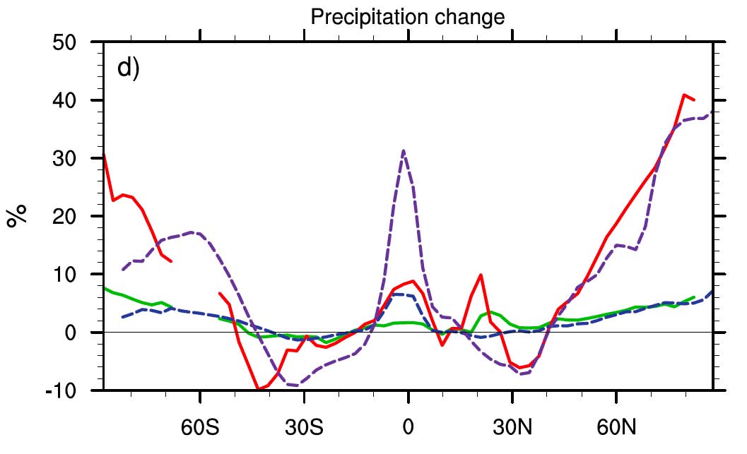
Here we see the increase in precipitation near the equator where the ITCZ lies, decreases from the sub-tropics through the mid-latitudes as the Hadley Cell expands poleward, and increases again in subpolar latitudes where the polar front migrates poleward. In short, we are seeing the effect of the poleward shifting of the zones of rising and descending motion that we reviewed during the overview of atmospheric circulation in our very first lesson.
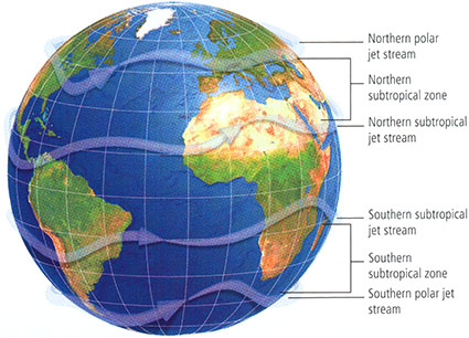
© 2015 Pearson Education, Inc.
We first encountered the notion of a potential poleward migration of the jet stream in our previous discussion of the 2003 European heat wave, which was a possible harbinger of climate change impacts to come. In this particular case, the subtropical jet stream (which lies above the descending limb of the Hadley Circulation in the subtropics, and is associated with the subsidence of warm, dry air in the subtropics) shifted well north of its usual summer location over the northern Sahara desert and southern Mediterranean, well into the middle and even subpolar latitudes of Europe. That single event encapsulated a pattern that is expected to become more prevalent with future climate change, as the various atmospheric bands, including the Hadley Circulation, and polar front, expand poleward.
It is worth looking more closely, in this context, at one particular metric of the latitudinal shift of the polar front and jet stream, the North Atlantic Oscillation (NAO; we introduced this concept briefly in our discussion of factors influencing Atlantic tropical cyclone activity in Lesson 3). The NAO is a measure of the poleward extent of the Northern Hemisphere jet stream and polar front during northern winter over the North Atlantic Ocean. A positive NAO reflects a stronger than usual subpolar Icelandic low surface pressure center and stronger than usual subtropical Bermuda/Azores high surface pressure center during the northern winter. It is associated with a strengthened and more northerly storm track. It is associated with warmer and wetter than usual conditions in Europe. By contrast, the negative phase of the NAO is associated with a weaker than normal jet stream, cooler, dryer winters in Europe, and wet winters in the Mediterranean and near/Middle East.
Often the NAO is associated with a more hemispherically-symmetric mode of atmospheric variability known as the Arctic Oscillation (AO) or Northern Annular Mode (NAM), which reflects a deeper than usual surface low pressure area throughout the subpolar belt of the Northern Hemisphere, and a deeper than usual surface high-pressure area throughout the subtropical belt of the Northern Hemisphere. The positive mode of the AO/NAM is associated with a stronger Northern Hemisphere winter jet stream, while the negative phase is associated with a weakened jet stream.
Climate models project a trend towards a more positive winter NAO/AO/NAM as a result of anthropogenic climate change, due to the changing vertical and latitudinal patterns of temperature (as you may recall from our introductory readings, it is the vertical and latitudinal gradients in atmospheric temperatures which drive the jet stream in the first place). This implies a stronger winter jet stream in the Northern Hemisphere (similar changes are projected for the Southern Hemisphere), and stronger surface westerlies in middle latitudes. The stronger westerly winds at the surface further warm winter temperatures over land regions by spreading heat from the relatively warm oceans over the relatively cold continents. A more positive NAO also leads to a relative increase in winter rainfall in the southeastern U.S. and Northern Europe, and dryer conditions in the near and Middle East and southern Mediterranean. Given that these regions are currently stressed for their limited available water supply, this projected climate change response could represent a substantial threat to water security in these regions.
Monsoonal circulation patterns may also change. The most prominent of the monsoons is the South Asian Summer monsoon, which is the source of much of the annual rainfall in heavily-populated regions such as India. The monsoon is driven primarily by the contrast in heating of the oceans and land. The land responds more strongly to summer heating than the oceans, leading to a tendency for a very large-scale thermally-driven circulation cell, similar in some respects to the Hadley Circulation. There is rising motion inland over the Tibetan plateau and sinking motion over the Indian Ocean, so moist warm air over the Indian Ocean is drawn in toward the land, where it rises and condenses out water vapor. This circulation pattern can be influenced by a number of factors, each of which may be altered by anthropogenic climate change. For example, the differential heating of land relative to ocean, projected over the next century, could drive a stronger monsoonal circulation. On the other hand, increased atmospheric stability in South Asia due to latent heating of the atmosphere arising from condensing water vapor in the rising limb of the monsoon could stabilize the vertical temperature profile, inhibiting the Monsoonal circulation. In state of the art models such as those assessed by the IPCC, this latter factor tends to dominate, and the South Asian Summer monsoon is projected to weaken. Seemingly paradoxically, however, the monsoonal precipitation is projected to remain either stable or even increase. In the face of a weakening Monsoonal circulation this has to do with the fact that even though the circulation may be weakened, there will be greater water vapor content in a warmed atmosphere, leading to the potential for greater amounts of rainfall for a given circulation strength. There is still quite a bit of uncertainty on this, however, and a wide spread in projected behavior is seen among the models assessed by the IPCC.
Another pattern of atmospheric circulation that may potentially change as a result of anthropogenic climate change is the Walker Circulation, which we discussed in our introduction to the ENSO phenomenon. We will defer any discussion of the uncertain potential changes in this atmospheric circulation pattern to a later section discussing potential change in modes of atmospheric-ocean variability.
Of course, it is not only the atmosphere which is projected to change in its circulation patterns as a result of anthropogenic climate change, but also the ocean.
Oceanic Circulation Changes
By far, the most critical issue regarding climate change impacts on ocean circulation patterns involves the thermohaline/conveyor belt /meridional overturning circulation, which we discussed earlier in the course (e.g., Ocean Circulation page of Lesson 1 and the Oceans page of Lesson 3). As we discussed earlier, it was once thought that global warming could paradoxically lead to cooling over a wide region of the globe by sending large amounts of fresh water into the high-latitudes of the North Atlantic, where it would freshen the surface waters and inhibit the formation of dense surface waters whose sinking in the subpolar North Atlantic constitutes the descending limb of the conveyor belt circulation. Since this ocean current system is a substantial contributor to the transport of heat to the high latitudes of the North Atlantic, such an occurrence could lead to widespread cooling of the North Atlantic and neighboring continental regions. Indeed, scientists believe this happened during the Younger Dryas event toward the end of the last ice age, between 13,000 and 12,000 years ago as the climate was warming during the initial phase of deglaciation.
Of course, as noted during our earlier discussion of the Younger Dryas event, the two situations are quite different in many respects. Toward the end of the last ice age, there was much ice to melt, and far greater potential to flood the North Atlantic with extremely large amounts of fresh water. Today, however, the ice sheets are much diminished, and there is less snow and ice available to melt. Nonetheless, certain simple climate models, such as the CLIMBER model used by the Potsdam Institute for Climate Change Impacts, suggest that global warming could lead to a substantial weakening of the thermohaline circulation and a fairly dramatic cooling of the North Atlantic and neighboring regions.
We have seen that current state-of-the-art climate models show only a weak semblance of this effect, however. Earlier in this lesson, we saw that the GFDL CM2.1 coupled model produces a very moderate cooling over a small region of the North Atlantic in response to anthropogenic warming, in part due to a slight weakening of the thermohaline circulation due to the mechanisms discussed before.
In fact, this model exhibits a larger response than most of the models used in the two most recent IPCC assessments. If we look at the average pattern of surface temperature change over the next century in the all of the RCP scenarios, averaged over all 20+ models, we see only the vaguest hint of the effect. Nowhere in the North Atlantic do we see any cooling. Instead, we see a small region in the North Atlantic, south of Greenland and Iceland, where there is less warming than in most other regions. Western Europe also sees somewhat less warming than most other regions due to the downstream effects. So if we take the composite response of the IPCC models as our best current assessment, we are led to conclude that the very, very small grain of truth to the Day After Tomorrow scenario, is that global warming may lead to a bit less warming in some parts of the North Atlantic and neighboring regions, owing to a slowing of the oceanic thermohaline circulation.
If we look at a more direct measure of the thermohaline circulation in the models, namely the intensity of the northward current associated with the meridional overturning component of the ocean circulation and thermohaline circulation, we see that in very few models does it actually collapse. In some models, it does weaken substantially, but in most models, it weakens only very modestly; and in some models, it marches along at near its current intensity, as if nothing happened at all! Why is this? More elaborate climate models, which contain detailed three-dimensional representations of ocean components that finely resolve boundary currents and even the eddies in these currents, tend to show far more robustness of the MOC than the simpler models, which ignore lateral ocean currents, eddies, etc. The state-of-the-art models have more degrees of freedom, i.e., more ways to circulate and transport water, heat, and salinity, and it is, therefore, much harder to cut off the poleward transport of heat by the ocean circulation, as there are multiple components of the oceanic circulation that can deliver heat poleward. These models typically, for related reasons, have a far more stable thermohaline circulation than simpler, earlier ocean models.
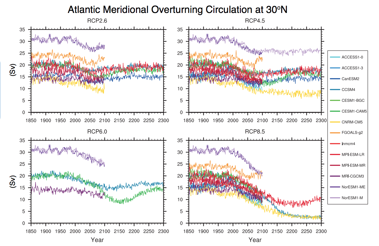
Models of Climate Variability
We know that the ENSO phenomenon has a profound influence on climate on inter-annual timescales, leading to substantial regional alterations in temperature and rainfall patterns around the world, and influencing important phenomena, such as Atlantic hurricane activity. Needless to say, one key question of climate change is how the characteristics of ENSO might change in the future.
© 2015 Pearson Education, Inc.
One of the great limitations in projecting future regional climate change is that we cannot yet confidently assess how ENSO will change in the future. The state-of-the-art models used in the most recent IPCC assessment do not show any clear consensus regarding how anthropogenic climate change will influence the characteristics of ENSO.
Most models (the models that fall in the right half of the plot below) project an overall more El Niño-like climate, that is to say, a weakened Walker Circulation, weakened trade winds and oceanic upwelling in the eastern and central tropical Pacific, and a surface temperature pattern wherein the eastern equatorial Pacific warms up more than the central and western equatorial Pacific Ocean. However, a few state-of-the-art climate models (i.e., the three that fall in the left hand of the plot below) project the opposite, a more La Niña-like pattern. One might be tempted to go with the majority, the El Niño-trending models. However, paleoclimate evidence of the response of ENSO to past natural changes in radiative forcing suggests the possibility that the minority of models (i.e., the La Niña-trending models) might be right. This issue has implications for how anthropogenic climate change might influence Atlantic hurricane activity. We will discuss climate change influences on tropical cyclone activity in more detail in our next lesson.
There is even greater uncertainty regarding the amplitude of ENSO variability, i.e., whether individual El Niño and La Niña events will become larger (models that fall in the upper half of the plot below) or smaller (models that fall in the lower half), with an equal split between the IPCC models with regard to which of the two possibilities is more likely. Since larger El Niño events have a greater impact on regional weather patterns, while smaller events have a lesser impact, this issue has significant implications for projected climate change impacts.
The large uncertainties in projecting changes in ENSO likely result from a combination of factors, including the tendency for state-of-the-art climate models to produce an unrealistic split ITCZ in the eastern tropical Pacific, which biases the strength of the trade winds and equatorial upwelling; the still course resolution of the oceanic component of the models, which may lead to inaccuracies in the ocean wave disturbances that are important for El Niño and La Niña; and uncertainties in the behavior of marine stratocumulus clouds, which play an important role in equatorial Pacific radiation and heat budget.
Lesson 7 Summary
In this lesson, we examined some of the key anthropogenic climate change projections. Some of the main findings were:
- Climate models project anywhere from 0.2 to 7°C warming over the next century, depending on two critical variables: (1) what decisions society makes regarding future carbon emissions and (2) currently irreducible uncertainties regarding the sensitivity of the climate to greenhouse gas radiative forcing;
- The primary source of spread in projected warming is factor #1, the uncertainty in future emissions. Were we to freeze greenhouse gases at their current levels, the average projection among models is an additional warming of 0.5°C. This scenario is highly unlikely, as it is very difficult to find a pathway to zero emissions in the near future. On the other hand, were we to pursue a higher emissions scenario (e.g., continue on the RCP8.5 scenario), the average projection among models is for an additional warming of 4°C;
- The impact of factor #2, the uncertainty in climate sensitivity, is nonetheless quite significant. In the RCP 8.5 scenario, the globe could warm anywhere from a lower bound of 3°C to an upper bound of 5.5°C, depending on which particular climate model is used;
- The variability in temperatures in both space and time is projected to be considerable. High latitudes warm more than low latitudes owing to positive feedbacks related to the melting of ice, and land warms more than oceans due in large part to the greater thermal inertia of the oceans. Even as the globe warms, there will continue to be cold periods over particular regions related to ENSO and other sources of natural variability;
- Precipitation is projected to increase in the tropics and subpolar latitudes, while decreases are projected for subtropical through mid-latitude regions. These changes reflect a combination of the effects of shifting storm tracks and the potential for a warmer atmosphere to hold more water vapor;
- Continental drought becomes more widespread over much of the continents. This results from a tendency for increased evaporation to dry out soil, even in many regions that see an increase in precipitation;
- Anthropogenic climate change leads to substantial changes in atmospheric circulation, including a poleward shift of the descending branch of the Hadley Circulation and of the jet streams, polar front, and storm tracks. These changes also include a weakening of monsoonal circulations, and possible, but uncertain, impacts on the Walker Circulation pattern associated with ENSO;
- The NAO/AO/NAM mode of variability, tied with variations in the position of the Northern Hemisphere winter jet stream, is projected to become more positive, associated with a northward displaced storm track and warmer, wetter winter conditions in regions such as Europe, but drier conditions in semi-arid regions such as the Mediterranean and Near and Middle East;
- A modest weakening is projected for the meridional overturning ocean circulation (variously referred to as the thermohaline circulation and conveyor belt circulation). State-of-the-art models, however, project a far weaker effect than what was once considered possible; rather than leading to cold conditions over the North Atlantic and neighboring regions, what is currently projected is only a moderate decrease of the warming in a small region in the North Atlantic Ocean south of Greenland;
- Projected changes in the character of the El Niño/Southern Oscillation are uncertain. Model projections are divided with respect to whether the future climate state will be more like El Niño or La Niña, and whether individual El Niño and La Niña events will be larger or smaller.
Reminder - Complete all of the lesson tasks!
You have finished Lesson 7. Double-check the list of requirements on the first page of this lesson to make sure you have completed all of the activities listed there before beginning the next lesson.
Lesson 8 - Projected Climate Changes, part 2
The links below provide an outline of the material for this lesson. Be sure to carefully read through the entire lesson before returning to Canvas to submit your assignments.
Introduction
About Lesson 8
We will now look at some of the more subtle, and indeed, less certain, future climate changes projected by climate models. These include changes in the cryosphere—that is glaciers, ice sheets, and sea ice; changes in sea level, which reflect an integration of a number of factors including melting ice and warming oceans; and changes in extreme weather events including tropical cyclones. While it is more difficult to accurately project changes in these attributes of the climate system, their profound potential impact on civilization and our environment necessitate their consideration.
What will we learn in Lesson 8?
By the end of Lesson 8, you should be able to:
- Qualitatively assess the potential impacts of increasing greenhouse gas concentrations on the distribution of ice on the Earth's surface, global sea level, tropical storm activity, severe weather, and other relevant climatic and meteorological phenomena;
- Discuss the potential importance of carbon cycle feedbacks; and
- Discuss the concept of climate tipping points, and their potential impacts.
What will be due for Lesson 8?
Please refer to the Syllabus for specific time frames and due dates.
The following is an overview of the required activities for Lesson 8. Detailed directions and submission instructions are located within this lesson.
- Participate in Lesson 8 discussion forum: Climate Change Projections.
- Read:
- IPCC Sixth Assessment Report, Working Group 1 -- Summary for Policy Makers (link is external)
- Possible Climate Futures: p. 12-23 (same as Lessons 5-7, but specifically review information about oceans, cryosphere, sea level, and carbon/other cycles)
- IPCC Sixth Assessment Report, Working Group 1 -- Summary for Policy Makers (link is external)
-
- Dire Predictions, v.2: p. 110-117
Questions?
If you have any questions, please post them to our Questions? discussion forum (not e-mail), located under the Home tab in Canvas. The instructor will check that discussion forum daily to respond. Also, please feel free to post your own responses if you can help with any of the posted questions.
Sea Ice, Glaciers, Ice Sheets
Critics often argue that climate scientists are alarmist and overstate projections of future climate change (if you have any doubt about this, just do a Google News search on, e.g., "warming" and "alarmist" and see what turns up—warning: the Internet is a wild frontier of information, misinformation, and outright disinformation—you should always question the objectivity and qualifications of any apparent news sources).
Ironically, in many cases, the climate science community has been overly cautious and conservative in their projections, perhaps, in part, out of fear of being labeled as alarmist by its detractors. One case in point is the decline in Arctic summer sea ice extent. The decline in minimum summer Arctic sea ice has outpaced even the most dramatic of the IPCC projections in recent decades. One possibility is that there is missing physics involved—related, for example, to the mechanics of ice fracturing and deformation, that is causing the models to underpredict the fragility of sea ice and the possible feedbacks involved.
Following the dramatic decline of summer 2007 (the minimum value in the red curve below), there was even fear that we had crossed a previously unknown tipping point from which Arctic sea ice would not be able to recover (we will have far more to say about possible climate tipping points later in this lesson). If so, that would have dire implications for, e.g., animal species such as the polar bear, which require a sea ice environment for their existence. Recent scientific work suggests that there is no such tipping point, however, and that the environment of the polar bear can be preserved given ongoing efforts aimed at mitigating future climate change. Those efforts would not be easy, however; the study finds that future warming would have to be kept below 1.25°C, which corresponds to roughly 2°C warming relative to pre-industrial time. As we have seen before, such a target would likely require stabilizing concentrations at 450 ppm or lower.
One problem that declining sea ice does not contribute to (at least, not to any practical extent) is the problem of global sea level rise. The melting of land ice, nonetheless, will contribute to sea level rise. As we saw in a previous lesson, mountain glaciers and ice caps around the word have undergone substantial retreat over the past century. They are projected to contribute a fraction of a meter of sea level rise over the next century (for example, see this news article about a study published in the journal Nature Geoscience).
The melting of the major continental ice sheets will also contribute to future sea level rise. This is part of the reason that so much attention is paid to the stability of the two major ice sheets: the Antarctic and Greenland ice sheets. In a previous lesson, we already saw that the two ice sheets appear to have entered into a regime of negative mass balance, i.e., they are now losing ice. Let us take a look at the best available projections for what is likely to happen to these ice sheets under a global warming scenario.
Shown below is a simulation of the process of Antarctic sea ice retreat in response to global warming. The simulation was done by one of the leading ice sheet modelers, Penn State's own David Pollard. As we see here, it is primarily the low elevation West Antarctic half of the Ice Sheet that is prone to melting, and the process of collapse, at least in this simulation, is potentially quite slow, occurring on the millennial timescale.
The West Antarctic ice sheet has collapsed and re-grown many times in the last few million years, and it might collapse again in the next few thousand years due to greenhouse gas warming. This model shows a typical collapse and re-growth event. The grounding line, the critical boundary between floating and grounded ice, is shown by a thin red line. The relative model time does not represent a specific time in history. However, the generally stable period shown in the first 3000 years is roughly analogous to the past 3000 years of Earth's history.
A similar finding is obtained for the Greenland ice sheet. Shown below is a simulation using NCAR climate model coupled to a dynamical model of the Greenland ice sheet. This particular simulation suggests that it might take a millennium or longer for substantial loss of Greenland ice due to projected global warming.
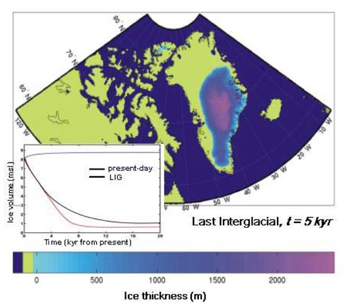
Yet, processes discussed on the Sea Ice page of Lesson 3 could lead to ice sheet collapse on timescales much faster than suggested by these model simulations. The formation of fissures known as moulins allow meltwater to penetrate to the bottom of the ice sheet, where it lubricates the base of the ice sheet, allowing ice to be more easily exported through ice streams out into the ocean. The physics responsible for this phenomenon are not well represented in current ice sheet models.
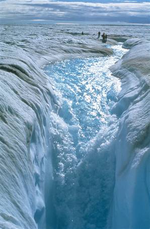
Another effect that is not well represented by the models is the buttressing effect provided by ice shelves. Ice shelves provide support to the interior ice sheet through an effect not unlike that of the flying buttress employed so widely in medieval architecture. As the ice shelves themselves disintegrate, there is the potential for destabilization of the inland ice, which is then free to break up and calve into the ocean. This effect was well documented during the disintegration of the Larsen B ice shelf of the Antarctic Peninsula in January-March (austral summer) 2002. The ice shelf, roughly the size of the state of the Rhode Island, disintegrated in little over a month. In the months following the breakup of the ice shelf, an acceleration in the streaming of inland ice to the ocean was observed, suggesting the possibility that such dynamical processes could accelerate the collapse of the West Antarctic ice sheet—the part of the Antarctic Ice Sheet most susceptible to break-up as a rule of anthropogenic warming. An even more recent, though less dramatic, example is discussed here. Once again, the observation of such processes in nature, and the fact that the ice sheets already appear to be losing ice mass, suggests that the breakup of continental ice shelves could proceed considerably faster than is suggested by current generation ice sheet models.
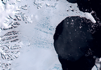
Regardless of the precise timescale of decay of the continental ice sheets, the Greenland ice sheet continues to decay much more rapidly than the models project by reaching a critical level of greenhouse gases in the atmosphere whereby we commit to the initial warming necessary to set in motion the sequence of positive feedbacks leading to the ultimate destruction of the ice sheet. Once again, we encounter the notion of a tipping point—a notion to be explored later in this lesson.
Sea Level Change
There are several components involved in projecting future sea level. One—the thermal expansion of the oceans, is fairly straightforward, and the only real uncertainty involved with that component is the warming itself, and the rate at which it is mixed down beneath the ocean surface. This contribution is projected to be modest, amounting to only a fraction of a meter over the next century. The 2nd component is the contribution from melting mountain glaciers and ice caps. This contribution, too, is likely to be modest, only a small fraction of a meter within the next century. The 3rd contribution—that from the melting of the two major ice sheets—is both the largest and the most uncertain.
As alluded to earlier, even modest additional warming could set in motion the collapse of all or most of the Greenland Ice Sheet (which would add 5-7 meters of sea level rise) and the west Antarctic Ice Sheet (which would add roughly another 5 meters). In our discussion of the projected changes in the Greenland and Antarctic Ice Sheet in the previous section, we saw that there are significant uncertainties regarding the timescale of this disintegration, however. Current ice sheet models suggest that the collapse of the ice sheets may take many centuries. Yet we know there are reasons to be skeptical about current ice sheet models. They are missing some physics that appears to be important in the real world—i.e., the physics responsible for the formation of moulins, and the possible lost of buttressing support by decaying ice shelves—that could allow for much faster disintegration. Indeed, the very same ice sheet models that predict a slow, multi-century breakup of the ice sheets did not predict that ice sheet loss would be observed for many decades, and yet, as we have seen that this loss already appears to be underway.
The uncertainties in projecting the ice sheet melt obviously complicate projections of future sea level rise, since this is potentially the largest contributor to global sea level rise. In the IPCC AR4 report from 2007, the IPCC simply neglected this contribution because they considered it too uncertain to estimate. This means that that their formal projections were almost certainly an absolute lowest estimate. (However, the IPCC AR5 report does include an estimate of the ice sheet contribution, leading to an increased sea level change projection of about 0.60 m by 2100 under RCP8.5.) Is it possible to provide a more realistic estimate? German climate scientist Stefan Rahmstorf and collaborators have used an alternative, so-called semi-empirical approach to projecting future sea level rise. This approach uses the historical relationship between past changes in sea level rise and global mean temperature to construct a statistical model, and, in principle, incorporates the contribution from melting ice sheets, though obviously with some amount of uncertainty. The semi-empirical projections suggest the possibility of more than a meter (roughly 3 feet) of sea level rise by 2100, and more than 3 meters (roughly 9 feet) of sea level rise by 2200. Another analysis using the Structured Expert Judgment (SEJ) method shows that sea level could rise 2 meters (6 feet) by 2100, with higher projected rises by 2300. We will look at the likely impacts of such amounts of sea level rise when we focus on climate change impacts later on in the course.
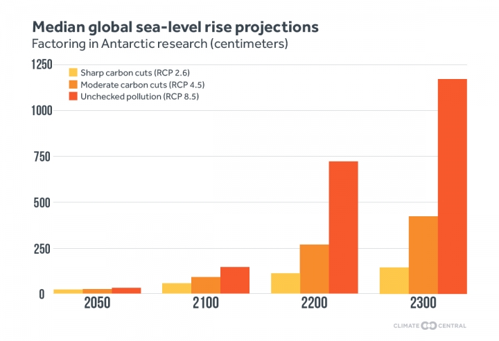
This example also provides a nice introduction to the concept of semi-empirical models. We will examine a similar semi-empirical modeling approach in our discussion of projected changes in Atlantic tropical cyclone activity in the next section.
Tropical Cyclones / Hurricanes
Like global sea level rise, climate change impacts on tropical cyclone activity could have profound societal and environmental implications. And, as with global sea level rise, impacts of tropical cyclone activity represent a substantial challenge scientifically, as there are many uncertainties that are involved. Tropical cyclones occur at spatial scales that are not well resolved by current generation climate models. Various approaches have been used to try to get around this problem, and you can find a discussion by your course author of the relative merits of these different approaches on the RealClimate website.
One approach has been to take a finer-scale atmospheric model that is capable of producing tropical cyclone or at least tropical cyclone-like disturbances, and nest it within a larger-scale climate model. The large-scale boundary conditions from the climate model simulation are then used to drive the storm-resolving model. However, the storm-resolving models used do not generally resolve the critical inner core region of the tropical cyclone, and the cyclones produced are not especially realistic. The models, for these reasons, cannot reproduce major hurricanes (category 4 or 5), and, for this reason, one might call into question their ability to capture changes in hurricane behavior associated with climate change.
An alternative approach used by hurricane scientist Kerry Emanuel of MIT employs embedded modeling. Small-scale disturbances, similar to those that generate real-world tropical cyclones, are randomly distributed in a climate model in a way that mimics the distribution of real world disturbances. Some of these disturbances will find themselves in a favorable environment, others will not—that is determined by the large-scale climate as represented by the climate model. A finely resolved dynamical model, that does indeed resolve the key inner core structure of a tropical storm, is embedded within the climate model and is used to track each such disturbance and model any potential development and intensification. Using this approach, Emanuel is able to closely match the observed tropical cyclone climatologies (i.e., the numbers and intensities of tropical cyclones) in the various basins of tropical cyclone activity. He is also able to reproduce the observed trend, including the increase in tropical cyclone numbers and intensities in the Atlantic in recent decades, when he uses the actual large-scale observations—in place of a climate model simulation—to drive his model of tropical cyclone genesis and intensification.
So, what results does this approach yield when driven with projections of future climate change? The results of the analysis are shown below. What we see, first of all, is that there is quite a bit of variability in the results you get, depending on (a) which particular climate model projection is used and (b) which particular tropical cyclone-producing basin you are looking at. Globally, the number of tropical cyclones may actually decrease, but the power dissipation and intensity are projected to increase globally. We are particularly interested in Atlantic tropical cyclones and hurricanes, since they pose the greatest threat as far as North American impacts are concerned.
We see that majority of the models yield a substantial increase in power/intensity of Atlantic tropical cyclones. A majority also indicate an increase in the number of Atlantic tropical cyclones, but this is highly variable, with at least one of the seven models examined indicating a substantial decrease. The divergence among the various projections of the different models reflects the competition between factors favoring increased power and activity—e.g., warmer oceans and greater energy for driving storms—and other factors, such as changes in atmospheric conditions influencing, e.g., vertical wind shear, that are tied to dynamical changes in the climate system. In particular, the uncertainty in projecting changes in ENSO dynamics (from Lesson 7) comes into play here. El Niño events are associated with increased wind shear over key regions of the Caribbean and tropical Atlantic where tropical cyclone tend to form, so a more El Niño-like climate would tend to mitigate any increases in Atlantic tropical cyclone activity. By contrast, a more La Niña-like climate would mean an even more favorable atmospheric environment. So, the current uncertainty in projecting changes in ENSO and the Walker Circulation translate to uncertainties in projecting future changes in Atlantic tropical cyclone activity.
Yet, an entirely different approach to projecting changes in tropical cyclone activity involves the use of a semi-empirical approach similar in spirit to the semi-empirical modeling approach we encountered in our study of sea level rise projections in the previous section. The semi-empirical approach involves, once again, using a statistical model to relate the phenomenon of interest (tropical cyclone activity) to the climate factors we know appear to govern year-to-year changes in activity today (e.g., tropical Atlantic SSTs, El Niño, and the North Atlantic Oscillation). In fact, you may recall that this is the very same statistical model that you constructed yourself in problem set #2 using these three factors as predictors of Atlantic annual tropical cyclone numbers in a multivariate regression. That approach has been validated, to some extent, by comparisons of predictions of pre-historical changes in Atlantic tropical cyclone activity with geological records of Atlantic tropical cyclone activity spanning the past millennium. You can hear about some work the course author has done in this area in this NSF video press conference.
The statistical model referenced in the previous paragraph reveals that there is a negative correlation between ENSO index and Atlantic tropical cyclone activity (i.e., a more positive ENSO index value, or more El Niño-like conditions, is associated with lower Atlantic tropical cyclone activity), a positive correlation between tropical Atlantic SSTs and Atlantic tropical cyclone activity (i.e., higher tropical Atlantic SSTs are associated with higher Atlantic tropical cyclone activity), and a tenuous relationship between North Atlantic Oscillation and Atlantic tropical cyclone activity.
Extreme Weather
We saw earlier in the course that climate change already appears to have influenced the frequency and intensity of various types of extreme weather events. The observed warming so far amounts to less than a 1°C relative to pre-industrial time. Given projected warming of several more degrees C over the next century (depending on the precise emissions scenario), the future increases in extreme weather events can be expected to be far larger than what we have observed thus far.
A large increase in the incidence of extreme precipitation events is expected. As we know, warmer oceans evaporate water into the atmosphere at a faster rate, and a warmer atmosphere can hold more water vapor. These features imply a more vigorous hydrological cycle, and heavier individual events when conditions are conducive to precipitation. Basic atmospheric physics tells us that 1°C warming we have seen already implies roughly 2% higher concentration of water vapor in the atmosphere on average, and correspondingly, roughly 2% more precipitable water during any particular precipitation event. Depending on the particular emissions scenario, we can expect a several fold larger increase over the next century. Since flooding is associated with large accumulations of rainfall over short periods of time, this increase in precipitation intensity implies greater potential for flood conditions—ironically, even for regions that on average see greater drought, i.e., more dry days (something we alluded in our discussion of general precipitation trends in the previous lesson).
Where atmospheric temperatures are above freezing, we expect precipitation to fall as rain, but where temperatures are below freezing, we expect it to fall as snow. Climate change deniers often claim that heavy winter snowfalls argue against the reality of global warming. Nothing could be further from the truth, however. In any realistic scenario of the next century, we will still have winter. It will still be cold enough for snow over large parts of North America in winter, and as the atmosphere continues to warm and hold more water vapor, we expect those snowfalls to be heavier. In fact, there is a bit of a double whammy involved here: we also know that mid-latitude winter storms will likely become more intense—something we already see evidence of in meteorological observations. These more intense storms will be associated with stronger frontal boundaries, further increasing the potential for large snowfalls.
Profound changes are, of course, also expected in temperature extremes. Heat waves, which, as we saw earlier in the course, have already increased in duration and intensity owing to the warming of the past century, are projected to be subject to further increases over the next century, with the details depending, of course, on the emissions pathway. Not surprisingly, extreme cold days are projected to decrease in number.
In our original discussion of extreme weather in Lesson 3, we likened the incidence of extreme weather to the rolling of a die. Sixes come up relatively rarely in the roll of a fair die (1 in 6 rolls to be precise). Let us think of an unusually warm summer day (say, a 90F day in State College PA in July) as a rolling of a six. We have seen that the incidence of extreme warm days in the U.S. has roughly doubled since the mid 20th century. Think of that as a doubling of the probability of rolling a six. You got a sense for how apparent such a change in the odds might be in the day-to-day weather variations by playing a game where you compared a fair die and one that had been loaded to double the probability of sixes. It took a fair number of rolls in that case—perhaps as many as 10 or so—to be pretty confident from the pattern of rolls as to which one was the loaded die. Now, we will double the probability once more—so there is now a four-fold increase in the likelihood of rolling a six in the loaded die relative to a fair die. Using the updated version of the dice rolling application below, see how many rolls of the die it takes you now to figure out which one is loaded and which one is fair. What does this tell you about the degree to which the "loading of the die" will become more apparent in observations of extreme weather as time goes on?
Be prepared to discuss your observations in this week's discussion.
Carbon Cycle Feedbacks
As we saw earlier in the course, the airborne fraction of in the atmosphere has increased by only half as much as it should have, given the emissions we have added through fossil fuel burning and deforestation. We know that must be going somewhere.
Where Did All The CO2 Go?
Emissions and uptake rates in petagrams (1015g) of carbon (C) per year. The graph at left shows carbon emissions from fossil-fuel combustion and cement manufacturing. The graph at right shows the sum of these along with emissions from deforestation and other land-use changes and uptake in terrestrial ecosystems, the atmosphere, and the oceans.
© 2015 Pearson Education, Inc.
Indeed, it is being absorbed by various reservoirs that exist within the global carbon cycle. As we saw earlier, in Lesson 1, only 55% of the emitted carbon has shown up in the atmosphere, while roughly 30-35% appears to be going into the oceans, and 15-20% into the terrestrial biosphere.
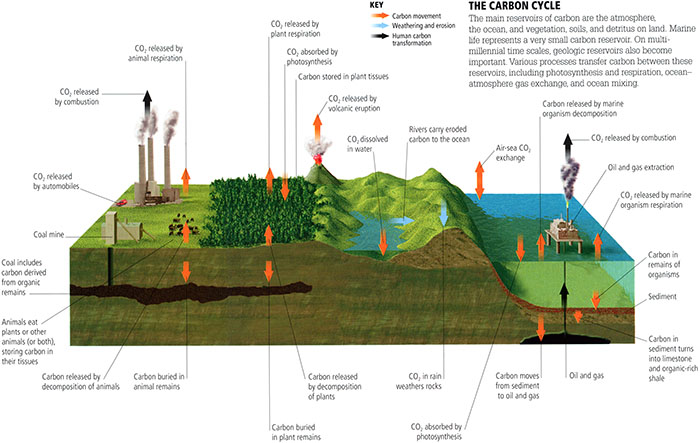
The main reservoirs of carbon are the atmosphere, the ocean, and vegetation, soils, and detritus on land. Marine life represents a very small carbon reservoir. On multi-millennial time scales, geologic reservoirs also become important. Various processes transfer carbon between these reservoirs, including photosynthesis and respiration, ocean-atmosphere gas exchange, and ocean mixing. This figure shows carbon movement, weathering and erosion, and human carbon transformation.
© 2015 Pearson Education, Inc.
The problem is that this pattern of behavior may not continue. There is no guarantee that the ocean and terrestrial biosphere will continue to be able to absorb this same fraction of carbon emissions as time goes on, and that leads us into a discussion of so-called carbon cycle feedbacks.
If we consider the oceans, for example, there are a number of factors that could lead to decreased uptake of carbon as time goes on. Like a warm can of Coke, which loses its carbonation when you warm it up and remove the top, the ocean's solubility decreases as the ocean warms. When we look at the pattern of carbon uptake in the upper ocean, we see that one of the primary regions of uptake is the North Atlantic. This is, in part, due to the formation of carbon-burying deep water in the region. In a scenario we have explored in Lesson 7, the North Atlantic overturning circulation could weaken in the future (though as we have seen, there is quite a bit of uncertainty regarding the magnitude and time frame of this weakening). If that were to happen, it would eliminate one of the ocean's key carbon-burying mechanisms, and allow to accumulate faster in the atmosphere. On the other hand, the biological productivity of the upwelling zone of the cold tongue region of the eastern and central equatorial Pacific is a net source of carbon to the atmosphere, from the ocean. More El Niño-like conditions in the future could suppress this source of carbon, but more La Niña-like conditions could increase this source, further accelerating the buildup of in the atmosphere. So uncertainties in the future course of oceanic uptake abound, but, on balance, it is likely that this uptake will decrease over time, yielding a positive carbon cycle feedback.
Other ocean carbon cycle feedbacks relate to the phenomenon of ocean acidification, which results from the fact that increasing atmospheric leads to increased dissolved bicarbonate ion in the ocean (a phenomenon we'll discuss further in our next lesson on climate change impacts). On the one hand, this process interferes with the productivity of calcite-skeleton forming ocean organisms, such as zooplankton, which bury their calcium carbonate skeletons on the sea floor when they die. This so-called oceanic carbon pump, is a key mechanism by which the ocean buries carbon absorbed from the atmosphere on long timescales. So any decrease in the effectiveness of the ocean's carbon pump would represent a positive carbon cycle feedback. On the other hand, since calcifying organisms release into the water as they build their carbonate skeletons, a decrease in calcite production by these organisms will reduce , amounting to a negative carbon cycle feedback.
There are a number of other carbon cycle feedbacks that apply to the terrestrial biosphere. They vary anywhere from a strong negative to a strong positive feedback. Among them are (a) warmer land increasing microbial activity in soils, which releases (a small positive feedback), (b) increased plant productivity due to higher levels (a strong negative feedback). Finally, there is the negative silicate rock weathering feedback which we know to be a very important regulator of atmospheric levels on very long, geological timescales: a warmer climate, with its more vigorous hydrological cycle, leads to increased physical and chemical weathering (the process of taking out of the atmosphere by reacting it with rocks), through the formation of carbonic acid, which dissolves silicate rocks, producing dissolved salts that run off through river systems, eventually reaching the oceans.
While each of these potential carbon cycle feedbacks are uncertain in magnitude—and even in sign in some cases (see the various colored bars in the figure below), the net result of all of these feedbacks appears to be a net positive carbon cycle feedback (the black bar shown).
Other potential positive carbon cycle feedbacks that are even more uncertain, but could be quite sizeable in magnitude, are methane feedbacks, related to the possible release of frozen methane currently trapped in thawing Arctic permafrost, and so-called "clathrate"—a crystalline form of methane that is found in abundance along the continental shelves of the oceans, which could be destabilized by modest ocean warming. Since methane is a very potent greenhouse gas, such releases of potentially large amounts of methane into the atmosphere could further amplify greenhouse warming and associated climate changes.
The key potential implication of a net positive carbon cycle feedback is that current projections of future warming, such as those we have explored previously in Lesson 7, may actually underestimate the degree of warming expected from a particular carbon emissions pathway. This is because the assumed relationship between carbon emissions and concentrations would underestimate the actual resulting concentrations because they assume a fixed airborne fraction of emitted , when, it fact, that fraction would instead be increasing over time. While the magnitude of this effect is uncertain, the best estimates suggest an additional 20-30 ppm of per degree C warming, leading to an additional warming of anywhere from 0.1°C to 1.5°C relative to the nominal temperature projections shown in earlier lessons.
Earth System Sensitivity
As we saw in the previous section on carbon cycle feedbacks, there are some limitations in the traditional framework for assessing the climate response to anthropogenic forcing. In the case of carbon cycle feedbacks, the assumptions implicit in that framework regarding the relationship between carbon emissions and resulting concentrations may underestimate the future increase in levels, and the degree of climate change.
Another problem in the traditional framework is that the assessment of climate sensitivity—a topic we have looked at in depth in Lesson 5 of this course—may be too limited. Implicit in the traditional definition of climate sensitivity is the so-called "Charney" notion of climate sensitivity—named after a famous climate scientist (Jule Charney) and a late 1970s report of the National Academy of Sciences known as the "Charney Report" which provided the first real estimate of the range of uncertainty in the equilibrium climate sensitivity. The concept of climate sensitivity described in this report, sometimes called the "Charney Sensitivity", envisions the equilibrium sensitivity of Earth's climate to forcing as the equilibrium response of the climate system to a doubling of concentrations including all fast feedbacks—that includes changes in water vapor, clouds, sea ice, and perhaps even small ice caps and glaciers.
The limitation implicit in this definition becomes apparent as soon as we start to think of the lasting, multi-century impacts of anthropogenic climate forcing. The fast feedbacks do not, for example, include the slow retreat of the continental ice sheets or the slow response of the Earth's surface properties and vegetation as, e.g., boreal forests slowly expand poleward. Accounting for these slow feedbacks leads to the possibility that the equilibrium long-term response to anthropogenic greenhouse gas emissions is larger than the IPCC projections we have focused on up until now. This more general notion of climate sensitivity is typically referred to as Earth System sensitivity.
There is good evidence from long-term geological record of climate change that these slow feedbacks do indeed matter, and that the ultimate warming and associated changes in climate might be substantially larger than what is implied by the simple Charney definition of sensitivity implicit in the IPCC projections. For both the mid-Pliocene, roughly 2.8 MY ago, and the mid-Miocene, about 15 MY ago, global mean temperatures appear to have been warmer than would be expected from even the upper range of the estimated Charney sensitivity (4.5°C for doubling). This suggests an earth system sensitivity that is substantially higher than the standard Charney estimate of climate sensitivity.
Studies using climate models that incorporate these slow feedbacks find that the Earth System sensitivity is indeed substantially greater than the nominal Charney sensitivity, roughly 50% higher. Thus, a stabilization of levels at twice pre-industrial levels over the next century might lead to a warming of 3°C over the next 1-2 centuries, but an eventual warming closer to 4.5°C once the land surface and vegetation has equilibrated to the new climate and the ice sheets have melted back to their new equilibrium configuration for the higher concentration—a process that could take a thousand years, but perhaps substantially less.
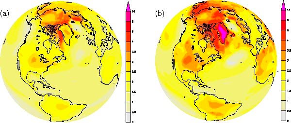
Tipping Points
We will wrap up our discussion of climate change projections with a discussion of so-called tipping points. Tipping points are important because they represent possible threshold responses to forcing. While many of the climate change impacts we have looked at, like surface temperature increases, are projected to follow increasing atmospheric concentrations in a smooth manner, there are other responses that can be more abrupt—once a certain amount of warming takes place, some component of the climate system abruptly transitions to some other regime of behavior. We saw an example of this sort of behavior in our discussion in Lesson Five (see the series of videos at the bottom of this Lesson Five page) of the role of ice-albedo feedback in the long-term evolution of the Earth's climate system. In that case, we saw that there is the potential for more than one equilibrium state of the Earth's climate under a given state of the solar constant. When that is the case, it is possible that one or more of the steady states is unstable. In that case, a small perturbation can cause the system to spontaneously transition from its current state to a very different, other equilibrium state.
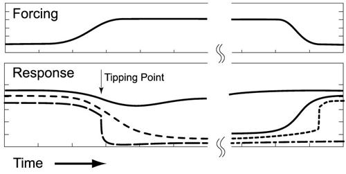
We have already seen some examples of potential climate tipping points—e.g., in the potential response of the cryosphere or patterns of ocean circulation to ongoing warming. There are many other potential tipping points in the system, however. These include the possibility that the ENSO phenomenon might transition rather suddenly into a very different mode of behavior, or that the Indian monsoon system—whose role is so critical to fresh water availability in large parts of South Asia—might suddenly collapse. Other possibilities include one of the possible carbon cycle feedbacks alluded to previously in this lesson; that a sudden release of previously frozen methane from thawing permafrost suddenly enters into the atmosphere. It is, of course, possible that other tipping points exist that we are not even aware of yet! Can you think of any possibilities yourself? If so—this would be another good topic to bring into this week's discussion.
Tipping Points:
- Change in ENSO Amplitude or Frequency
- Boreal Forest Dieback
- Dieback of Amazon Rainforest
- Instability of West Antarctic Ice Sheet
- Melt of Greenland Ice Sheet
- Atlantic Deep Water Formation
- Antarctic Ozone Hole
- Changes in Antarctic Bottom Water Formation?
- Arctic Sea-Ice Loss
- Sahara Greening
- West African Monsson Shift?
- Climatic Change-Induced Ozone Hole?
- Permafrost and Tundra Loss?
- Indian Monsoon Chaotic Multistability
Lesson 8 Discussion
Activity
Please note that you will not receive a passing grade on this assignment if you wait until the last day of the discussion to make your first post.
Directions
Please participate in an online discussion of the material presented in Lessons 7 and 8: Projected Climate Change.
This discussion will take place in a threaded discussion forum in Canvas (see the Canvas Guides for the specific information on how to use this tool) over approximately a week-long period of time. Since the class participants will be posting to the discussion forum at various points in time during the week, you will need to check the forum frequently in order to fully participate. You can also subscribe to the discussion and receive e-mail alerts each time there is a new post.
Please realize that a discussion is a group effort, and make sure to participate early in order to give your classmates enough time to respond to your posts.
Post your comments addressing some aspect of the material that is of interest to you and respond to other postings by asking for clarification, asking a follow-up question, expanding on what has already been said, etc. For each new topic you are posting, please try to start a new discussion thread with a descriptive title, in order to make the conversation easier to follow.
Suggested topics
- What do the climate models project for the future surface temperatures? What are the two fundamental uncertainties associated with these projections? Is the warming projected to be uniform over the globe?
- What are the projected changes in precipitation and drought? What are the main causes for the large uncertainty in the precipitation projections?
- What are the projected changes in the large-scale atmospheric and ocean circulations?
- How well are the climate models able to project future changes in ENSO?
- How is the Earth's cryosphere projected to change?
- What are the projected changes of the sea level?
- What are the projected changes in tropical cyclones and extreme weather events?
- A very important point about all climate projections is that they are uncertain. One way we can attempt to assess how realistic the projections are is to compare the projections with the observations. We are in a position to do that because we have available climate projections that were done some time ago and now we have the observations that cover the projected period. Please share your thoughts on this comparison.
- What are the carbon cycle feedbacks? How many feedback mechanisms does the Earth's carbon cycle have?
- In our current state of knowledge, what are the potential climate tipping points? Should we be concerned about these potential tipping points now or wait for a higher level of scientific certainty before we do anything?
Submitting your work
- Go to Canvas.
- Go to the Home tab.
- Click on the Lesson 8 discussion: Climate Change Projections.
- Post your comments and responses.
Grading criteria
You will be graded on the quality of your participation. See the online discussion grading rubric for the specifics on how this assignment will be graded.
Lesson 8 Summary
In this lesson, we further examined potential anthropogenic climate change influences on a host of climate and meteorological phenomena. We found that:
- Arctic sea ice extent is projected to continue to decrease, and it is likely that summer sea ice will disappear if the globe warms up beyond 2°C. Observations suggest that the rate of decline is greater than what is projected by the models;
- Mountain glaciers and small outlet glaciers around the world are projected to continue their decline under further warming, but there is greater uncertainty regarding the rate and magnitude of decline of the two major continental ice sheets—Greenland and Antarctic;
- While we may commit to enough warming to set in motion the ultimately disappearance of the Greenland and West Antarctic ice sheets within decades and given only modest additional warming, current generation ice sheet models suggest that the scenario could take many centuries or even millennia to play out, owing to the intrinsically slow nature of key governing processes;
- Actual observations of ice mass suggest that both Greenland and West Antarctic ice sheets already have entered into a regime of negative mass balance, and it is quite possible that physical processes not well represented in current generation ice sheet models, such as ice shelf buttressing, could allow for a much faster retreat;
- There are several different components expected to contribute to global sea level rise, including the expansion of seawater with warming, the contribution of melting mountain glaciers, and ice loss from the major ice sheets; the latter component is both likely the largest and the most uncertain;
- Semi-empirical models which attempt to account for all contributions to global sea level rise suggest the possibility of a meter of sea level rise or more by 2100, and perhaps as much as 5 meters by 2300;
- Anthropogenic climate change is projected to lead to further increases in the incidence of specific types of extreme weather events. These include intense rainfall and snow events and flooding, and the incidence of high temperature extremes and heat waves. While the shifts in extreme weather thus far have been subtle, the projected increases are likely to be perceptible in the pattern of day-to-day-weather;
- Climate change projections have traditionally neglected potentially important carbon cycle feedbacks which may serve to further accelerate anthropogenic climate change. For a given emissions pathway, concentrations might increase more than indicated by the nominal concentration scenarios because of feedbacks which tend to further increase levels of atmospheric . The impact is quite uncertain, but probably about 20-40 ppm additional for each degree C of warming, which has non-trivial consequences for the magnitude of future warming;
- The traditional so-called "Charney" concept of equilibrium climate sensitivity may not be appropriate for assessing the full extent of anthropogenic climate change, because it neglects slow feedbacks like changes in vegetation and land surface properties, and the retreat of the continental ice sheets, which tend to further amplify the projected changes; the importance of these long-term feedbacks is suggested by the relationship between levels and global warmth in the geological climate record. The so-called Earth System Sensitivity, which attempts to incorporate the amplifying effects of the slow-feedbacks, suggests a modestly (50%) greater amount of warming and associated climate change than the traditional notion of climate sensitivity;
- There are a number of phenomena, including the behavior of the cryosphere, the thermohaline circulation of the ocean, and certain carbon cycle feedbacks related to, e.g., currently frozen methane stores, which may behave in a threshold-like manner. Rather than exhibiting a steady trend in time, these phenomena may exhibit abrupt transitions in behavior in response to ongoing anthropogenic climate forcing. Other potential examples of systems that might exhibit tipping point behavior are ENSO and the Asian summer monsoon.
Reminder - Complete all of the lesson tasks!
You have finished Lesson 8. Double-check the list of requirements on the first page of this lesson to make sure you have completed all of the activities listed there before beginning the next lesson.
Lesson 9 - Climate Change Impacts
The links below provide an outline of the material for this lesson. Be sure to carefully read through the entire lesson before returning to Canvas to submit your assignments.
Introduction
About Lesson 9
We have seen now the projected potential future changes in climate. What practical impacts might they have? On human civilization? On ecosystems? Necessarily, the answers to these questions are complex and nuanced. They involve integrating a number of uncertain factors—the future greenhouse emissions pathways, the resulting changes in climate, and how human and natural systems might respond to those changes.
What will we learn in Lesson 9?
By the end of Lesson 9, you should be able to:
- Qualitatively assess the potential societal and environmental impacts of alternative future climate change scenarios.
What will be due for Lesson 9?
Please refer to the Syllabus for specific time frames and due dates.
The following is an overview of the required activities for Lesson 9. Detailed directions and submission instructions are located within this lesson.
- Watch the film "Before the Flood". Take note of any issues regarding the science and/or impacts of climate change that are worthy of discussion.
- Read:
- IPCC Fifth Assessment Report, Working Group 2
- Summary for Policy Makers, p. 1-8; Supplementary Material, p. 30-32;
- Dire Predictions, p. 118-149.
- IPCC Fifth Assessment Report, Working Group 2
- Take Quiz #3.
Questions?
If you have any questions, please post them to our Questions? discussion forum (not e-mail), located under the Home tab in Canvas. The instructor will check that discussion forum daily to respond. Also, please feel free to post your own responses if you can help with any of the posted questions.
Sea Level Rise / Coastal Flooding
As we saw in the last lesson, sea level is projected to rise more than a meter over the next century, and perhaps as much as five meters by 2300, given business-as-usual fossil fuel emissions. Scenarios such as 10 meters of sea level rise are not out of reach should, e.g., the west Antarctic ice sheet collapse more abruptly than is indicated by uncertain current model estimates.
The impacts of rising sea level will be differentially felt by different nations and regions. For low-lying island nations like the Maldives, even the lower-end sea level rise scenarios represent a distinct threat. In fact, some island nations, such as Tuvalu, have already made contingency plans for evacuation in the decades ahead.
When asked about climate change impacts on Pennsylvania, I sometimes joke that Jersey Shore, PA may have nothing to fear from sea level rise directly, but all of those Pennsylvanians who make an annual summer pilgrimage to THE Jersey Shore would surely see the effects, as the beaches are increasingly eroded, and will ultimately be inundated.

Even moderate sea level rise (i.e., much less than a meter) can lead to significant increases in coastal erosion and other problems, such as salt water intrusion, wherein saline water penetrates increasingly inland through estuaries and tributaries, contaminating fresh water ecosystems and aquifers relied upon for fresh water supply.
There is also a natural component to changes in sea level in North America. As the Laurentide Ice Sheet that once covered a large part of Northern North America melted at the end of the last Ice Age, the Earth's crust beneath it has slowly rebounded, which has led to ascending motion of the ground in the regions where the ice load was greatest, e.g., the region of the Hudson Bay, and subsiding motion farther away, e.g., the east coast and especially the Gulf Coast. This so-called isostatic adjustment adds a local sea level change component which adds to, or subtracts from, the overall change in global sea level (the so-called eustatic sea level component). This regional component can be comparable to the overall global sea level rise over the past century.
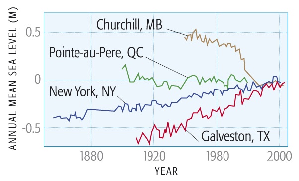
On the other hand, the local component is small compared to the 1 to 5 m sea level rise that is projected over the next one and two centuries under business-as-usual emissions. With 1 meter of sea level rise, we would see the disappearance of low-lying regions of the Gulf Coast, including the Florida Keys. At 5-6 meters of sea level rise we would see the loss of the southern 1/3rd of Florida and many of the major cities of the Gulf Coast and East Coast of the U.S. At 10 meters of sea level rise, New York City would be submerged.
© 2015 Pearson Education, Inc.
© 2015 Pearson Education, Inc.
One can measure the costs of increasing levels of sea level rise in terms of (a) the loss of land area, (b) the damage to our economy as measured by gross domestic project (GDP), and (c) the increase in population impacted either directly (by inundation or increased erosion) or indirectly (by, e.g., by saltwater intrusion into fresh water supply). In the scenario of 10 meters of sea level rise, not entirely out of the question on a timescale of a few centuries, the global costs as measured by any of the above metrics are rather staggering: more than 5000 square km of coastal land lost, nearly three trillion dollars of GDP lost, and more than a third of a billion people exposed to direct or indirect impacts of sea level rise.
As we will see later in this lesson, for many coastal regions the costs will be compounded by the added impact of greater hurricane damage.
© 2015 Pearson Education, Inc.
Ecosystems and Biodiversity
Climate change is already having a demonstrable impact on natural ecosystems and this is particularly evident when looking at niche (e.g., mountain and high-latitude) environments, where species are highly adapted to the prevailing past climatic conditions and have gone extinct, or are in the process of potentially going extinct because of rapidly shifting climatic conditions.
The poster child of climate change-related extinction is the Golden Toad. This magnificent amphibian once ranged throughout the high-elevation cloud forests of Monteverde, Costa Rica. First discovered in the 1960s, the toad appears to have gone extinct in the late 1980s. Scientist Alan Pounds and his colleagues have argued that the demise was due to climate change associated with a long-term drying as the cloud forests have been lifted to higher and higher elevations by a warming atmosphere (the warmer the atmosphere, the higher the so-called lifting condensation level at which clouds first form as one moves up in elevation). Other scientists have since noted that the influence of climate change in this extinction event was likely somewhat more subtle—with the immediate factor having been outbreaks of a fungus known as chytrid (this fungus has been implicated in globally-widespread decline in amphibian populations). The drying conditions may have made the golden toad more susceptible to these fungus outbreaks.

Another poster child is the Polar Bear. Polar bears require a sea ice environment to hunt their primary food source—seals. As we saw in our previous discussion of climate change projections, it is very possible that with a little more than 1°C warming (which we likely commit to with concentrations higher than 450ppm) that environment will essentially disappear within the next century—that is to say, there will be an increasingly long ice-free period from the spring through the fall over most of the polar bear's range. This means that the hunting season for polar bears is getting increasingly short. The impacts are already seen in the declining weights of adult females and the adverse impact this is having on the sustainability of current polar bear populations.
An adult female needs to maintain a minimum of roughly 200 kg of fat to bring a cub to term, and even more to bear twin or triplet cubs. Such reserves were achievable in the past by feasting on seals over a roughly 8-month hunting season. As the hunting season becomes shorter, females are finding themselves unable to sustain these fat reserves. The relative abundance of triplet and twin cub births has already largely given way to single cub births. One recent study by polar bear expert Andy Derocher of the University of Alberta indicates (see, e.g., this news article in the Calgary Herald) that with as little as a one month additional shortening of the season, the majority of adult female polar bears will be unable to bring even a single polar bear cub to term. While some populations of polar bears in the Arctic have actually shown modest increases in the past (generally due to hunting restrictions and other miscellaneous factors unrelated to climate), a majority of well measured populations have indeed shown steady declines in recent decades (see, e.g., the detailed information on polar bear populations provided by the organization Polar Bears International). Other species, such as walruses too may be under similar threat from Arctic warming and sea ice disappearance.
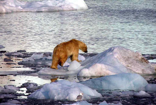
Because of the imminent threat to the species of ongoing warming and Arctic sea ice decline, the U.S. formally designated the polar Bear as a threatened species in May 2008 under the endangered species act.
We have looked at two particularly striking examples of climate change impacts on animal species, but it is worth stepping back and looking at the bigger picture, considering for example, entire ecosystems. There is no better example than coral reefs.
In polar regions, coastal regions, and a narrow band of wind-induced oceanic upwelling near the equator the upwelling of deep water supplies nutrients (e.g., phosphorus, nitrogen, oxygen, etc.) needed to maintain the rich trophic structure that characterizes these marine ecosystems. In contrast, almost all of the tropical and subtropical oceans lack the upwelling of deep water necessary to supply the nutrients. Therefore, these regions generally become oceanic "deserts" that are largely devoid of biological productivity. An important exception are coral reefs, made up largely of the dead calcium carbonate skeletons of previously live coral, which build over time to create elaborate natural reef structures. These structures provide an environment that is home to a rich oceanic food chain. While they occupy less than 0.1% of the world's oceans, they are home to 25% of all marine species, constituting a major reserve of marine biodiversity. Coral reefs, like many other ecosystems (e.g., tropical rainforests) provide so-called ecosystem services—that is to say, they provide resources (e.g., food, recreation and tourism, medicinal products, shoreline protection, etc.) that are of great value to civilization. It has been estimated that the average annual ecosystem services provided by coral reefs globally is a staggering nearly 0.4 trillion dollars. Of course, one could argue that no such dollar figure can truly capture the value of something like the world's coral reefs, and that simple economics and cost/benefit analysis cannot measure the true value to humanity of the ocean's biodiversity or of natural wonders such as the Great Barrier Reef of Australia. We will revisit these deeper, philosophical questions in a later lesson. For now, suffice to say that the loss of coral reefs could represent a monumentally great cost to civilization and our environment.
As it happens, coral reefs are under multiple assault by anthropogenic influences. The whole of these impacts is greater than the sum of their parts, since organisms subject to simultaneous stresses have a greatly reduced behavioral elasticity/adaptive capacity. In addition to the impacts of anthropogenic increases, coral reefs are threatened by pollution, i.e., chemical contaminants that enter coastal waters through river runoff, and by physical destruction by humans via motorboat damages or misuse/overuse by the tourism industry. Increased damage by ultraviolet (UV) radiation due to ozone depletion is also a factor.
Increases in atmospheric , however, may be the proverbial straw that broke the camel's back. This is particularly true because it is a double whammy for corals. First, there is the effect of the warming itself. When ocean waters become exceptionally warm (e.g., into the low 30's °C), the algae that typically live with corals will flee, seeking cooler waters. Since the corals maintain an important symbiotic relationship with these algae, losing them is highly detrimental to the health of the coral. The algae are also what give the corals their color—hence, when these symbionts flee, they leave behind only the white color of the coral themselves, and the event is thus termed coral bleaching. There is little in nature that provides quite the contrast of the comparison between a healthy and bleached coral reef.
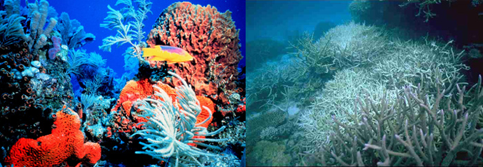
As sea surface temperatures increase, the frequency of bleaching events increases accordingly. Thus, ongoing global warming is projected to lead to increasing stress on coral reefs from bleaching alone. Coastal damage from more intense hurricanes are an added threat. An even greater impact, however, is likely to arise from direct effects of the increasing atmospheric concentrations, the phenomenon of ocean acidification discussed in an earlier lesson.
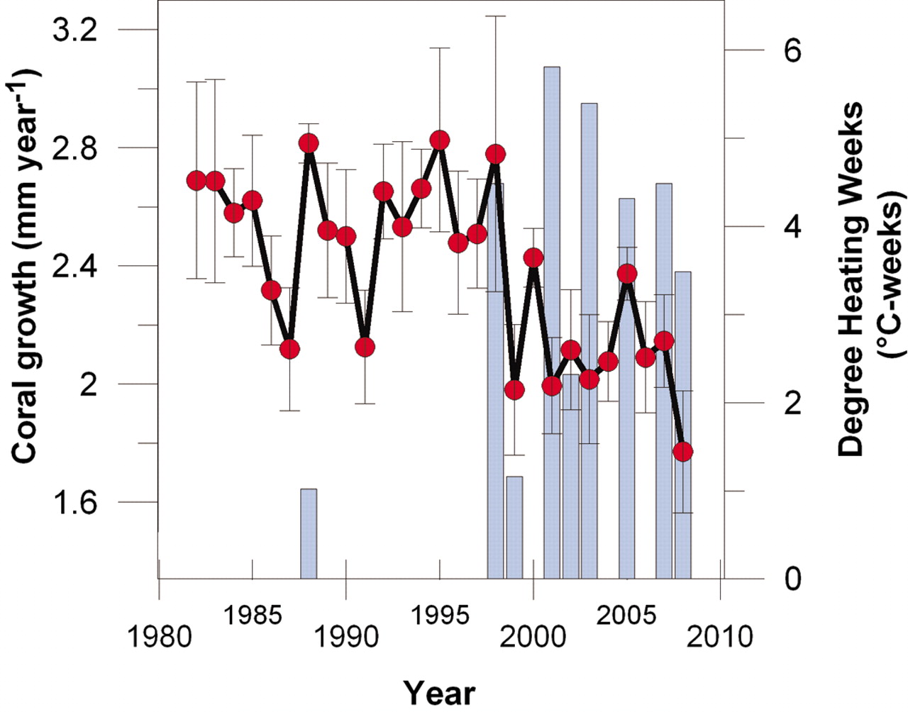
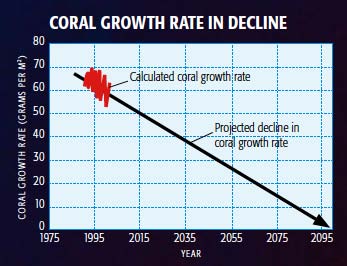
As atmospheric concentrations increase, the increased dissolved in the upper ocean acts to lower the pH of the ocean. As the ocean becomes more acidic (or, if you like, less basic—technically speaking the ocean is on average alkaline, not acidic), the ocean chemistry increasingly favors the dissolution of calcium carbonate (calcite)—the very substance corals use to grow their skeletons. This means that coral growth rates decline. If we extrapolate this relationship based on a middle-of-the-road future fossil fuel emissions scenario, we reach the point of zero coral growth by the end of this century. In reality, the collective effects of other impacts, in particular increased bleaching from warming ocean waters, has lead scientists to project a far more imminent demise of coral reefs worldwide—as soon as a few decades from now—if we continue with business-as-usual fossil fuel emissions (see, e.g., this news article about a UNESCO-funded scientific study of this issue).
It is convenient to summarize the impacts on animal species, ecosystems, and biodiversity in terms of a "thermometer" scale that characterizes the degree of species loss, etc., as a function of additional warming. We already saw that amphibians in particular are under threat from global warming. With less than 2°C additional warming, we might see widespread disappearance of amphibians, and above 2°C warming, a loss of as much as a third of all species. At 3°C additional warming, we could see as much as a 50% loss of all species worldwide. At 4°C warming, that rises to as much as 70%.
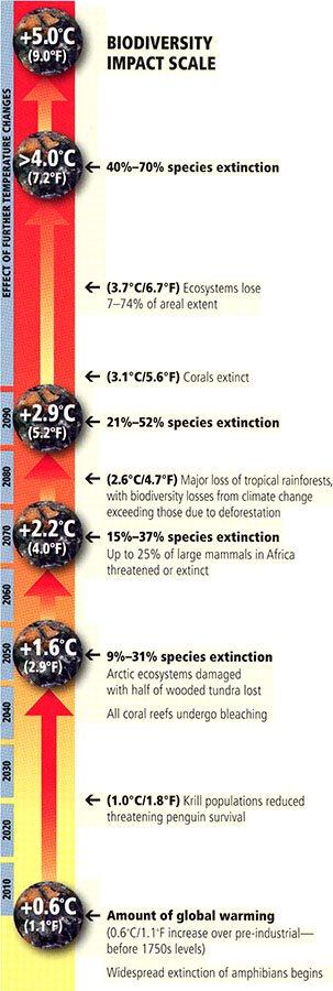
Biodiversity Impact Scale:
- +0.6 Degrees Celcius: Widespread extinction of amphibians begins
- +1 Degree Celcius: Krill populations reduced, threatening penguin survival
- +1.6 Degrees Celcius: 9 percent to 31 percent species extinction, Arctic ecosystems damaged with half of wooded tundra lost, All coral reefs undergo bleaching.
- +2.2 Degrees Celcius: 15 percent to 37 percent species extinction, Up to 25 percent of large mammals in Africa threatened or extinct
- +2.6 Degrees Celcius: Major loss of tropical rainforests, with biodiversity losses from climate change exceeding those due to deforestation
- +2.9 Degrees Celcius: 21 percent to 52 percent species extinction
- +3.1 Degrees Celcius: Corals Extinct
- +3.7 Degrees Celcius: Ecosystems lose 7 to 74 percent of areal extent
- + > 4.0 Degrees Celcius: 40 - 70 percent species extinction
© 2015 Pearson Education, Inc.
Shifting Water Resources
Water is essential to life and it is essential to human civilization. Either too much or too little is a problem. And as we have seen in Lesson 7, climate change may, ironically, give us both.
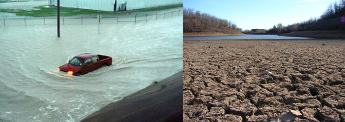
As atmospheric circulation patterns and storm tracks shift, and changing rainfall patterns combine with the effects of changing evaporation and changing runoff patterns, one thing is for certain—water resources will be impacted. The greatest threat is the uncertainty of increasingly irregular and shifting patterns of precipitation.
In some regions, like the desert southwest of the U.S., climate change threatens to reduce fresh water availability due to both decreased winter rainfall and snowfall that ultimately feeds major reservoirs through spring runoff. Current projections are that Lake Powell, which provides southern Nevada with much of its fresh water supply, may run dry within a matter of decades, extrapolating recent drying trends. These decreases in water supply are on a collision course with demographic trends, as population centers, such as Las Vegas and Phoenix, continue to expand in size. Similar scenarios are likely to play out in Southern Europe and the Mediterranean, the Middle East, Southern Africa, and parts of Australia.
Other regions, meanwhile, are projected to get too much water. Bangladesh, already threatened by rising sea level, is likely to see increased flooding from the intense rainfalls expected with a warmer, more moisture-laden atmosphere.
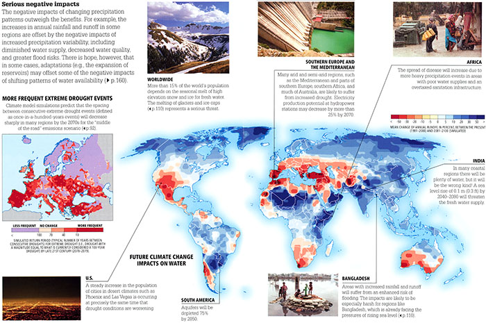
- Serious Negative Impacts: The negative impacts of changing precipitation patterns outweigh the benefits. For example, the increases in annual rainfall and runoff in some regions are offset by the negative impacts of increased precipitation variability, including diminished water supply, decreased water quality, and greater flood risks. There is hope, however, that in some cases, adaptations (e.g. the expansion of reservoirs) may offset some of the negative impacts of shifting patterns of water availability.
- More Frequent Extreme Drought Events: Climate model simulations predict that the spacing between consecutive extreme drought events (defined as once-in-a-hundred-years events) will decrease sharply in many regions by the 2070s for the "middle of the road" emissions scenario.
- Future Climate Change Impacts on Water
- U.S. - A steady increase in the population of cities in desert climates such as Phoenix and Las Vegas is occurring at precisely the same time that drought conditions are worsening
- South America - Aquifers will be depleted 75% by 2050.
- Southern Europe and the Mediterranean - Many arid and semi-arid regions, such as the Mediterranean and parts of Southern Europe, Southern Africa, and much of Australia, are likely to suffer from increased drought. Electricity production potential to hydropower stations may decrease by more than 25% by 2070.
- Africa - The spread of disease will increase due to more heavy precipitation events in areas with poor water supplies and an overtaxed sanitation infrastructure.
- India - In many coastal regions there will be plenty of water, but it will be the wrong kind! A sea level rise of 0.1 m (0.3 ft) by 2040-2080 will threaten the fresh water supply.
- Bangladesh - Areas with increased rainfall and runoff will suffer from an enhanced risk of flooding. The impacts are likely to be especially harsh for regions like Bangladesh, which is already facing the pressures of rising sea level.
- Worldwide - More than 15% of the world's population depends on the seasonal melt of high elevation snow and ice for fresh water. The melting of glaciers and ice caps represent a serious threat.
© 2015 Pearson Education, Inc.
Agricultural Impacts
Climate change is likely to challenge global food security, but the situation is complicated. Longer growing seasons in northern latitudes could prove favorable for growing crops, but even moderate warming is likely to lead to substantial decreases in productivity for key cereal crops grown in the tropics—rice, wheat, sorghum, maize. These crops are growing at what is essentially their optimal temperature, and any warming leads to substantial decreases in yield. Added to the mix is the direct impact of the increase in ambient concentrations. There is empirical evidence that the impact of so-called fertilization could also lead to increases in productivity. Plants require for photosynthesis, so, to the extent that is a limiting factor in cereal crop growth, increasing levels might increase productivity. Yet, there are additional factors that might mitigate this effect. As we have seen previously in Lesson 7, large parts of the tropical and subtropical continents are projected to see drying soils as a result of anthropogenic climate change (one exception is central and eastern equatorial Africa—but there is little consensus among models). To take in for the purpose of photosynthesis, plants must maintain open stomata—but at the same time, this increases evapotranspiration, which is a problem as conditions become drier, and water itself becomes a limiting factor. Indeed, any increase in drought stress could easily offset the benefits of longer growing seasons in extratropical regions.
Thus, projecting precisely how agricultural yields will respond to ongoing climate change is quite uncertain, because it requires knowing not only how seasonal temperature patterns will change, but also knowing how regional rainfall and drought patterns will be impacted. This uncertainty notwithstanding, best estimates based on driving theoretical crop models with climate change projections suggest that for 1 to 2°C additional warming we could see modest increases in agricultural productivity in extratropical regions, but substantial decreases in tropical regions. Similar patterns hold for livestock yields, which themselves rely on feedstocks (see the map below). For warming exceeding 3°C, however, we begin to see sharp decreases in global agricultural yields. Some of the limitations of these projections should be kept in mind. Indeed, they may be overly optimistic because they do not account for other potentially detrimental climate change impacts, such as decreased fresh water supply (see the previous section on water resources) for irrigation, or severe weather events, such as the catastrophic Pakistan floods and Russian wildfires last summer, which devastate crops and impair distribution system, and which have been blamed for recent spikes in global food prices. These additional aggravating factors could have devastating consequences for agriculture (see, e.g., this article in The Economist).
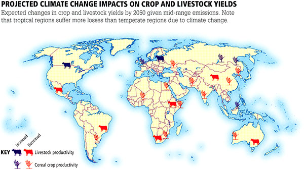
© 2015 Pearson Education, Inc.
In our next lesson on adaptation to climate change, you will investigate these impacts in detail in the context of possible adaptive strategies for mitigating the impacts. For now, we will neglect the prospects for adaptation and simply focus on the projected impacts of climate change on agriculture. To be precise, we will focus on three key cereal crops: wheat, rice, and corn/maize. The impacts are taken from the results of theoretical crop models driven by global warming projections. One limitation that should be kept in mind is that the crop model predictions do not account for other potentially important factors, such as decreased precipitation and fresh water supply. That having been said, such models provide, at the very least, some basic framework for assessing specific potential climate change impacts—as we will see in the next lesson, they can also inform the process of climate change adaptation.
Play around with the interactive application below, and investigate the impacts on the various cereal crops for different amounts of future projected warming, for both tropical and extratropical regions. Be prepared to discuss your findings in next week's discussion. This analysis will be useful to you in advance of our next project, in which we will use a similar interactive application to investigate possible adaptation measures for mitigating climate change impacts on agricultural productivity.
Severe Weather Impacts
We have already seen that climate change is likely to increase the frequency and severity of many types of severe weather impacts, including heat waves, intense precipitation events, and more intense hurricanes.
In North America, we have already seen increased damages, likely related to these increases. Among these is the rise in tropical storm-related damages (though there is some debate about precisely how much of a role has been played by the increase in storm intensity, and how much of a role has been played by increases in coastal infrastructure, real estate values, etc.). We have also seen an increase in damages due to increases in "fire weather", i.e., meteorological conditions such as warm and dry weather, which favor destructive wildfires.
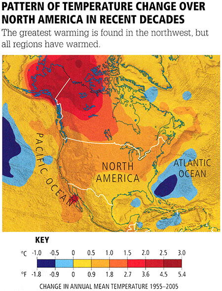
© 2015 Pearson Education, Inc.
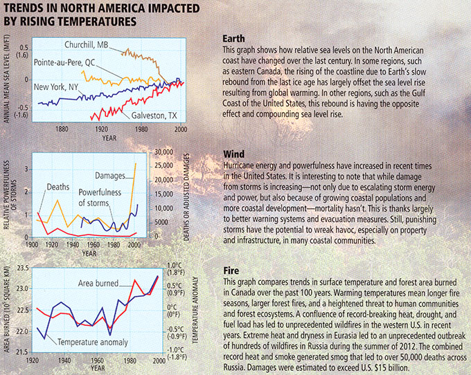
Earth
This graph shows how relative sea levels on the North American coast have changed over the last century. In some regions, such as eastern Canada, the rising of the coastline due to Earth's slow rebound from the last ice age has largely offset the sea level rise resulting from global warming. In other regions, such as the Gulf Coast of the United States, this rebound is having the opposite effect and compounding sea level rise.
Wind
Hurricane energy and powerfulness have increased in recent times in the United States. It is interesting to note that while damage from storms is increasing--not only due to escalating stomr energy and power, but also because of growing coastal populations and more coastal development--mortality hasn't. This is thanks largely to better warning systems and evacuation measures. Still, punishing stomrs have the potential to wreak havoc, especially on property and infrastructure, in many coastal communities.
Fire
This graph compares trends in surface temperature and forest area burned in Canada over the past 100 years. Warming temperatures mean longer fire seasons, larger forest fires, and a heightened threat to human communities and forest ecosystems. A confluence of record-breaking heat, drought, and fuel load has led to unprecedented wildfires in the western U.S. in recent years. Extreme heat and dryness in Eurasia led to an unprecedented outbreak of hundreds of wildfires in Russia during the summer of 2012. The combined record heat and smoke generated smog that led to over 50,000 deaths across Russia. Damages were estimated to exceed U.S. $15 billion.
© 2015 Pearson Education, Inc.
We saw earlier in this lesson that shifting water resources represent a potential climate change threat. In Europe, for example, both extreme drought and flooding due to intense rainfall are likely to incur damages. More powerful winter storms are likely to impact the economies of both Europe and North America (see, e.g., this news article discussing the impact of especially severe winter storms during 2011 winter on air travel in North American and Europe).
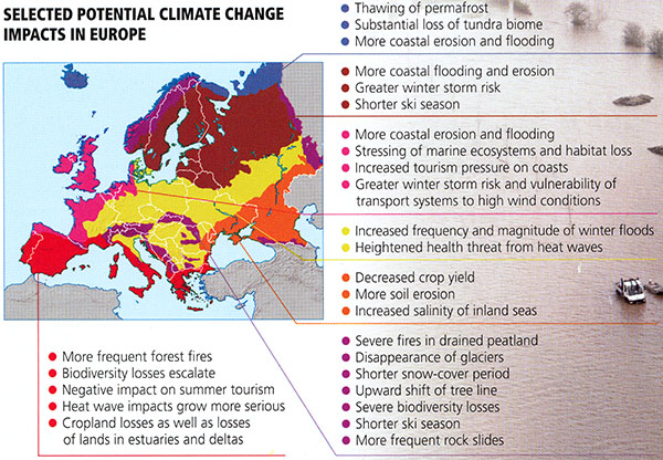
Selected potential climate change impacts in various parts of Europe:
- More frequent forest fires
- Biodiversity losses escalate
- Negative impact on summer tourism
- Heat wave impacts grow more serious
- Cropland losses as well as losses of lands in estuaries and deltas
- Thawing of permafrost
- Substantial loss of tundra biome
- More coastal erosion and flooding
- Greater winter storm risk
- Shorter ski season
- More Coastal flooding and erosion
- Stressing of marine ecosystems and habitat loss
- Increased tourism pressure on coasts
- Greater winter storm risk and vulnerability of transport systems to high wind conditions
- Increased frequency and magnitude of winter floods
- Heightened health threat from heat waves
- Decreased Crop yield
- More soil erosion
- Increased salinity of inland seas
- Severe fires in drained peatland
- Disappearance of glaciers
- Shorter snow-cover period
- Upward shift of tree line
- Severe biodiversity losses
- Shorter ski season
- More frequent rock slides
© 2015 Pearson Education, Inc.
Human Health
Climate change is likely to impact human health in a number of ways. On the one hand, we might expect decreased mortality from extreme cold, but the flip-side is a dramatic increase in warm extremes and heat waves. The young and the elderly, as well as the poor—who are less likely to have access to modern air conditioning, etc., are most at risk. The toll of the unprecedented heat wave in Europe of summer 2003, where more than 30,000 lives were lost, is a possible harbinger of the impact of future, more frequent and intense heatwaves, and to a lesser extent, so are the European heat waves of 2006 and 2010 and, in North America, of 2006 and 2010.
Other weather extremes may have human health impacts. In some cases, such as the physical damage and loss of life from land falling hurricanes, this is obvious. But there are many other examples. Intense rainfall events leading to flooding can cause physical harm or create conditions that favor the spread of disease or lead to various ailments. Drought conditions pose the obvious threat of limiting fresh water supply, but they can also favor disease and malnutrition. Once again, the impacts fall disproportionately on the poor, who are the least able to afford clean water, electricity, and modern health care.
| Predicted Climate Change | Anticipated Effect on Human Health |
|---|---|
| On land, fewer cold days and nights | Reduced mortality from cold exposure (virtually certain) |
| More frequent heat waves | Increased mortality from heat, especially among the young, elderly, and those in remote regions (virtually certain) |
| More frequent floods | Increased deaths, injuries, and skin and respiratory disease incidence (very likely) |
| More frequent droughts | Food and water shortages; increased incidence of food- and water-borne disease and malnutrition (likely) |
| More frequent strong tropical cyclones | Increased mortality and injury, risk of flood- and water-borne disease, and incidence of post-traumatic stress disorder (likely) |
| More extreme high-sea-level events | Increased death and injury during floods; health repercussions of inland migration (likely) |
(Note: Predicted climate change listed in order of decreasing certainty)
© 2015 Pearson Education, Inc.

Climate change is also likely to lead to the spread of various types of infectious disease. Many of these diseases are spread by so-called vectors—pests, such as insects and rodents, which are capable of spreading the disease far and wide. In many cases, the ranges of vectors are restricted by climate. Diseases such as West Nile Fever and Malaria, for example, are spread by mosquitoes. Temperate regions with killing frosts are thus relatively inhospitable to the disease, as they interrupt the life cycle of the vector and thus the disease itself. As the globe warms and cold regions retreat poleward, we can expect the regions where diseases currently classified as "tropical diseases" are endemic to spread well into the extratropics. The outbreak of West Nile Virus in New York State in 2005, for example, was likely due to an unusually warm winter, which allowed mosquitoes to persist through much of the year.
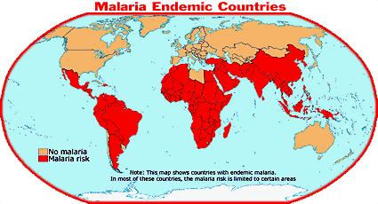
The story is not quite as simple as that, however. Consider malaria. There are reasons why malaria can be found far into the subtropics of Asia and South America, but not, in the U.S. This has to do with the fact that industrial nations, like the U.S., have adequate resources to eradicate Malaria through the use of appropriate health practices and technology that is not available to third world nations.
Moreover, the connection with climate is a bit more complex than warmer temperature = more malaria. Here at Penn State, we have experts who are studying the potential impacts of warming temperatures on the spread of malaria. The problem is complicated, in part, because it is not just the average temperature that determines how rapidly the malaria parasite can reproduce. It turns out that there is a threshold dependence on temperature (recall our discussion of thresholds in the context of climate tipping points). The malaria parasite reproduces at an exponentially greater rate above a particular threshold temperature, roughly 20°C. This is why highland tropical African cities such as Nairobi, with an elevation of nearly 5000 feet and a mean annual temperature of 19°C, are generally free of malaria, even while surrounding lowland regions must contend with the disease. This threshold dependence on temperature also implies that one must not only consider the mean temperatures, but also the variability of temperatures, to assess possible impacts on the spread of malaria. Let us demonstrate this through an example.
Think About It!
Consider two hypothetical cities. City A has an annual mean temperature of 18°C and a standard deviation of 1°C. City B has an annual mean temperature of 17°C and a standard deviation of 3°C.
Which city is more likely to see an increase in spread of malaria if both warm by 1°C on average?
City A
City B
If you answered "City B" you are correct!
Even though it will remain 1°C colder than City A, it will spend considerably more time above the critical temperature of 20°C, because of its greater temperature variability.
The threshold dependence of malaria on temperature means that the problem of projecting climate change influences on malaria is even more challenging than we might have thought. One must be able to project not only how mean temperatures will change, but also how the diurnal temperature range, the seasonal cycle, and even the inter-annual variability might change. And since there is much uncertainty about whether, e.g., ENSO events will be larger or smaller as a result of anthropogenic warming, there is much uncertainty, too, in how the amplitude of inter-annual variability in temperatures will change in many parts of the world.
Of course, temperature is not the only climate variable that might influence malaria. Rainfall matters too: the fewer breeding spots available for the disease vector (anopholes mosquitoes), the less likely that malaria takes hold. Unfortunately, as we have seen, projections of future changes in precipitation in regions such as Kenya is quite uncertain (see the Precipitation and Drought page of Lesson 7), largely because of uncertainties in ENSO. This makes projecting impacts of climate change on infectious disease particularly challenging.
National Security
Opponents to action often present the challenges of climate change as if they are the sole concern of "granola-crunching tree huggers". While it may be convenient, from a rhetorical perspective, for climate change deniers to caricature concern over the climate change threat in this manner, it is not very accurate at all. In reality, the national security community—hardly a bunch of environmental extremists—are among the communities most concerned about the potential impacts of projected future climate changes.
We have already seen that climate change could threaten food security, water security and health security. As there has often been the fierce competition for limited resources—be it food, water, land, etc.—it is reasonable to draw the conclusion that climate change may challenge national security. In fact, that is the conclusion of the U.S. Military. You can hear Dr. David Titley (formerly a Rear Admiral, the Navy's official oceanographer, and most recently a Professor of Practice at Penn State University and Director of the Center for Solutions to Weather and Climate Risk) discussing the potential national security threats of projected future climate change in this video:
Video: TED Talk - "How the Military Fights Climate Change" (7:41)
So I'd like to tell you a story about climate and change, but it's really a story about people and not polar bears. So this is our house that we lived in in the mid-2000s. I was the chief operating officer for the Navy's weather and ocean service. It happened to be down at a place called Stennis Space Center right on the Gulf Coast, so we lived in a little town called Waveland, Mississippi, nice modest house, and as you can see, it's up against a storm surge. Now, if you ever wonder what a 30-foot or nine-meter storm surge does coming up your street, let me show you. Same house. That's me, kind of wondering what's next. But when we say we lost our house -- this is, like, right after Katrina -- so the house is either all the way up there in the railway tracks, or it's somewhere down there in the Gulf of Mexico, and to this day, we really, we lost our house. We don't know where it is.
(Laughter)
You know, it's gone. So I don't show this for pity, because in many ways, we were the luckiest people on the Gulf Coast. One of the things is, we had insurance, and that idea of insurance is probably pretty important there. But does this scale up, you know, what happened here? And I think it kind of does, because as you've heard, as the sea levels come up, it takes weaker and weaker storms to do something like this. So let's just step back for a second and kind of look at this. And, you know, climate's really complicated, a lot of moving parts in this, but I kind of put it about it's all about the water. See, see those three blue dots there down on the lower part? The one you can easily see, that's all the water in the world. Those two smaller dots, those are the fresh water. And it turns out that as the climate changes, the distribution of that water is changing very fundamentally. So now we have too much, too little, wrong place, wrong time. It's salty where it should be fresh; it's liquid where it should be frozen; it's wet where it should be dry; and in fact, the very chemistry of the ocean itself is changing. And what that does from a security or a military part is it does three things: it changes the very operating environment that we're working in, it threatens our bases, and then it has geostrategic risks, which sounds kind of fancy and I'll explain what I mean by that in a second.
So let's go to just a couple examples here. And we'll start off with what we all know is of course a political and humanitarian catastrophe that is Syria. And it turns out that climate was one of the causes in a long chain of events. It actually started back in the 1970s. When Assad took control over Syria, he decided he wanted to be self-sufficient in things like wheat and barley. Now, you would like to think that there was somebody in Assad's office that said,
"Hey boss, you know, we're in the eastern Mediterranean, kind of dry here, maybe not the best idea." But I think what happened was, "Boss, you are a smart, powerful and handsome man. We'll get right on it." And they did.
So by the '90s, believe it or not, they were actually self-sufficient in food, but they did it at a great cost. They did it at a cost of their aquifers, they did it at a cost of their surface water. And of course, there are many nonclimate issues that also contributed to Syria. There was the Iraq War, and as you can see by that lower blue line there, over a million refugees come into the cities. And then about a decade ago, there's this tremendous heat wave and drought -- fingerprints all over that show, yes, this is in fact related to the changing climate -- has put another three quarters of a million farmers into those same cities.
Why? Because they had nothing.
They had dust. They had dirt. They had nothing. So now they're in the cities, the Iraqis are in the cities, it's Assad, it's not like he's taking care of his people, and all of a sudden we have just this huge issue here of massive instability and a breeding ground for extremism. And this is why in the security community we call climate change a risk to instability. It accelerates instability here. In plain English, it makes bad places worse.
So let's go to another place here. Now we're going to go 2,000 kilometers, or about 1,200 miles, north of Oslo, only 600 miles from the Pole, and this is arguably the most strategic island you've never heard of. It's a place called Svalbard. It sits astride the sea lanes that the Russian Northern Fleet needs to get out and go into warmer waters. It is also, by virtue of its geography, a place where you can control every single polar orbiting satellite on every orbit. It is the strategic high ground of space.
Climate change has greatly reduced the sea ice around here, greatly increasing human activity, and it's becoming a flashpoint, and in fact the NATO Parliamentary Assembly is going to meet here on Svalbard next month. The Russians are very, very unhappy about that. So if you want to find a flashpoint in the Arctic, look at Svalbard there. Now, in the military, we have known for decades, if not centuries, that the time to prepare, whether it's for a hurricane, a typhoon or strategic changes, is before they hit you, and Admiral Nimitz was right there. That is the time to prepare.
Fortunately, our Secretary of Defense, Secretary Mattis, he understands that as well, and what he understands is that climate is a risk. He has said so in his written responses to Congress, and he says, "As Secretary of Defense, it's my job to manage such risks." It's not only the US military that understands this. Many of our friends and allies in other navies and other militaries have very clear-eyed views about the climate risk. And in fact, in 2014, I was honored to speak for a half-a-day seminar at the International Seapower Symposium to 70 heads of navies about this issue. So Winston Churchill is alleged to have said, I'm not sure if he said anything, but he's alleged to have said that Americans can always be counted upon to do the right thing after exhausting every other possibility.
(Laughter)
So I would argue we're still in the process of exhausting every other possibility, but I do think we will prevail. But I need your help. This is my ask. I ask not that you take your recycling out on Wednesday, but that you engage with every business leader, every technology leader, every government leader, and ask them, "Ma'am, sir, what are you doing to stabilize the climate?" It's just that simple. Because when enough people care enough, the politicians, most of whom won't lead on this issue -- but they will be led -- that will change this. Because I can tell you, the ice doesn't care. The ice doesn't care who's in the White House. It doesn't care which party controls your congress. It doesn't care which party controls your parliament. It just melts.
Thank you very much.
(Applause)
You can also find a thorough discussion of the potential national security threats of climate change in this report, The Age of Consequences: The Foreign Policy and National Security Implications of Global Climate Change, published by the Center for Strategic International Studies, and co-authored by leading national security experts including former CIA director James Woolsey. There is also a documentary of the same name looking at climate change and national security.
One recurring theme in discussions of U.S. national security impacts is the potential military implications of retreating Arctic sea ice. In recent years, the mythical "Northwest Passage" has finally opened up on a semi-regular basis. That is to say, it is now possible, over part of the year, for ships and submarines to travel unimpeded from the Labrador sea through the Arctic ocean, into the Pacific ocean. As the trajectory of sea ice retreat continues and the open channels widen and deepen, it will likely be possible for large military vessels (ships and submarines) to make this route. That would have deep implications for U.S. national security. Suddenly, the U.S. would need to defend a new (Arctic) coast line against potential invasion and military attack.
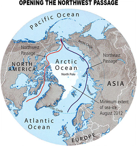
© 2015 Pearson Education, Inc.
Other scenarios involve the idea that increased conflict between nations and cultures may arise from so-called environmental refugeeism—people fleeing regions no longer fit for habitation for other currently occupied regions, thereby increasing the competition for resources. As parts of Sub-Saharan Africa, such as Senegal, become too dry and inhospitable for subsistence agriculture, for example, there may be a flood of human refugees fleeing this environment to the less arid south, e.g., to Ghana (indeed, there is evidence this is already happening). Another scenario is that the extremely large populations of interior Nigeria, driven by drying conditions, flee for the mega-city of Lagos to the south, where there is heightened competition for food and water resources. Adding to the incendiary mix is the skirmishes that might break out among groups and individuals fighting over the last remains of the disappearing oil reserves of the Niger River Delta, and the cronyism and political corruption that may ensue. Consider also the impact of an increasingly dry Middle East. Author Daniel Hillel has argued in Rivers of Eden that it is the competition for scarce water resources over the years that has driven much of the Middle East conflict. Imagine adding further fuel to the fire as water resources continue to disappear. New York Time's columnist (and Nobel Prize winner in economics) Paul Krugman has argued that climate change-related stresses on food supply may have had a role in recent unrest and uprisings in the region, such as that recently witnessed in Egypt. A more recent article on water supply can be found here. Could that be a sign of things to come?
The worst-case scenarios that researchers have envisioned are not entirely unlike the dystopian futures portrayed in 1970s and 1980s apocalyptic films such as Soylent Green and Mad Max.

Lesson 9 Summary
In this lesson, we looked at the potential impacts of projected climate change on civilization and our environment. The key impacts under continuing anthropogenic carbon emissions are:
- Projected sea level rise could threaten many coastal and low-lying regions of the world by the end of this century; low-lying island nations could be submerged. Within two centuries, major east coast and Gulf coast cities would be severely impacted. Costs from damage to coastal infrastructure could rise to a third of a billion dollars for the U.S., and millions of individuals could be displaced.
- Certain species such as the Golden Toad have already gone extinct, at least in part due to climate change. Many other amphibians, and iconic megafauna such as the Polar Bear, are already under threat from climate changes. Projected losses of species could approach 1/3 with only 2°C additional warming, and well over half of all species with 3°C warming. The combined impact of warming oceans and increasing ocean acidity from anthropogenic greenhouse emissions, combined with other human-caused threats such as pollution and ozone depletion, place coral reefs—which account for 25% of the ocean's biodiversity—under threat of disappearance in as soon as a few decades.
- Shifting water resources threaten damage to societal infrastructure through increased precipitation intensity and flooding during certain seasons in some regions, and increased drought during other seasons in other regions. In regions such as the desert southwest of the U.S., decreasing water supply is on a collision course with increasing populations in cities such as Las Vegas and Phoenix.
- Health impacts of climate change are likely to include increased mortality due to more frequent and intense heat waves, increased spread of disease from more widespread flooding and drought, threats to health and life from more increased storm damage, and the poleward spread of tropical disease with warming temperatures.
- National security impacts of climate change include increased conflict arising from the competition between nations and groups for diminishing land, food, and water resources, and the need for additional national defense as new shipping routes and coastlines open as a result of diminished arctic sea ice.
Reminder - Complete all of the lesson tasks!
You have finished Lesson 9. Double-check the list of requirements on the first page of this lesson to make sure you have completed all of the activities listed there before beginning the next lesson.
Lesson 10 - Vulnerability and Adaptation to Climate Change
The links below provide an outline of the material for this lesson. Be sure to carefully read through the entire lesson before returning to Canvas to submit your assignments.
Introduction
About Lesson 10
It is reasonable to conclude, from our previous examination of projected climate change impacts, that some sort of coordinated response is warranted. One potential response involves adaptation — changing our behavior in such a way as to mitigate the impacts of climate change on our lives and livelihood. In fact, given that there is likely substantial additional climate change already in the pipeline, and we are committed to some degree of additional changes in climate regardless of what measures are taken to curtail greenhouse gas emissions, we will have to adapt to some changes that are in store. In this lesson, we will examine what the key vulnerabilities are, and what adaptive measures might be taken to guard against them.
What will we learn in Lesson 10?
By the end of Lesson 10, you should be able to:
- Discuss the vulnerability to climate change across various sectors and regions;
- Summarize potential adaptive responses to climate change;
- Quantitatively assess certain adaptive responses (through analysis of crop models driven with present and future climate conditions); and
- Discuss the limitations of purely adaptive responses vs. climate change mitigation.
What will be due for Lesson 10?
Please refer to the Syllabus for specific time frames and due dates.
The following is an overview of the required activities for Lesson 10. Detailed directions and submission instructions are located within this lesson.
- Begin Project #2: Run crop models (for both tropical and extra-tropical environments) under present and climate change conditions using different variations in planting techniques/cultivar selection to develop possible strategies for dealing with climate change impacts on agriculture.
- Participate in Lesson 10 discussion forum 4: Impacts, Adaptation, and "Before the Flood"
- Read:
- IPCC Fifth Assessment Report, Working Group 2
- Summary for Policy Makers, p. 8-29
- IPCC Sixth Assessment Report, Working Group 1 -- Summary for Policy Makers (link is external)
- Climate Information for Risk Assessment and Regional Adaptation, and Limiting Future Climate Change, p. 23-31
- Dire Predictions, p. 150-163
- IPCC Fifth Assessment Report, Working Group 2
Questions?
If you have any questions, please post them to our Questions? discussion forum (not e-mail), located under the Home tab in Canvas. The instructor will check that discussion forum daily to respond. Also, please feel free to post your own responses if you can help with any of the posted questions.
Adaptation vs. Mitigation
The challenge of confronting the impacts of climate change is often framed in terms of two potential paths that civilization might take: adaptation and mitigation. Mitigation involves reducing the magnitude of climate change itself and, as we will see in the final two lessons, can be subdivided into two alternative strategies: emissions reductions — dealing with the problem at its very source, and geoengineering — somehow offsetting the effects of greenhouse gas emissions.
Adaptation, by contrast, involves efforts to limit our vulnerability to climate change impacts through various measures, while not necessarily dealing with the underlying cause of those impacts. The reference to "our" in the previous sentence is critical, as adaptive measures typically only deal with impacts to human civilization; they do not and, indeed, cannot deal with impacts to ecosystems and our environment. Coral reefs, for example, are unlikely to adapt to the twin impacts of global warming and ocean acidification. A similar case can be made for other ecosystems and living things. At some level, such considerations call into question what we really mean by adaptation. If we were to see the collapse of major ecosystems such as coral reefs, we would in turn see the loss of the ecosystem services they provide — a potentially catastrophic loss for human civilization. We will consider such potential costs when we attempt to work out the economics of climate change in a later lesson.
Such considerations call into question whether we can indeed define our true adaptive capacity to climate change in a way that is divorced from the larger impacts on our environment. Nonetheless, let us for the moment consider adaptation and mitigation as two alternative but potentially complementary and certainly not mutually exclusive strategies for dealing with climate change.
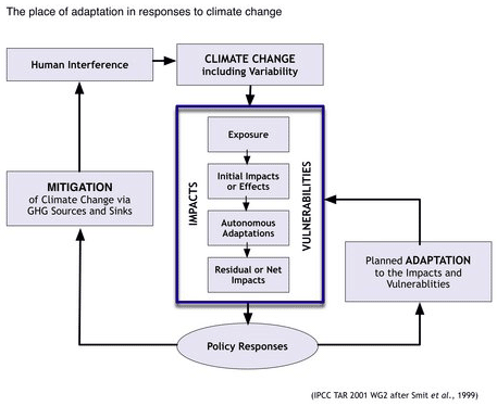
The choice between adaptation and mitigation is in fact, in many ways, a false choice — we will most likely have to do both. As we have seen previously in this course, we are already committed to additional warming of perhaps as much as 1°C due to the greenhouse gases that we have emitted already — this is known as committed climate change. Aside from the possibility of controversial geoengineering measures (which we will discuss in our next lesson), we cannot mitigate that change. So, we must adapt to at least that amount of climate change.
A useful way to look at the level of vulnerability to climate change is considering scenarios that involve no response measures at all (i.e., no adaptation or mitigation), adaptation alone, mitigation alone, and a combination of adaptation and mitigation.
Climate Change Vulnerability in 2100
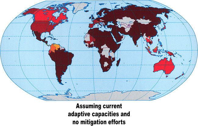
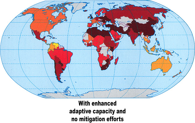
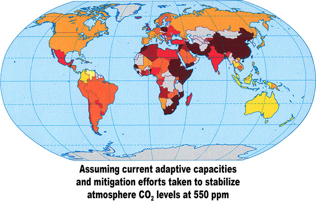
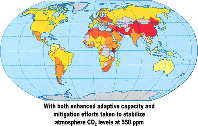

© 2015 Pearson Education, Inc.
As is apparent from the above comparisons, much of the world would likely suffer extreme vulnerability to climate change in the absence of any mitigation efforts at all, regardless of what adaptive measures are taken. Yet, mitigation alone, for example limiting CO2 concentrations to 550 ppm, would in the absence of any adaptive measures still result in great vulnerability, particularly in tropical and subtropical regions. However, a combination of adaptation and mitigation could reduce vulnerability to modest levels for most of the world.
We will talk about mitigation approaches in the final two lessons. For the rest of this lesson, we will examine adaptive strategies. We will focus on specific examples in the areas of coastal protection, water resources, and agriculture/food resources.
Adaptive Strategies - Sea Level Rise
There are various potential measures we might consider taking in defending our coastlines against the threat of sea level rise. We might think of them as sequential steps that can be taken as rising sea level continues to encroach on coastal settlements. We are likely already committed to at least 0.3 m (i.e., roughly 1 foot) of global sea level rise, enough, as we've seen previously, to threaten increased coastal erosion along the east and gulf coast of the U.S., and to submerge low-lying island regions.
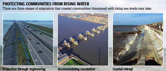
© 2015 Pearson Education, Inc.
The first step is to actively confront encroaching seas by building structures such as polders, which reclaim inundated coastal regions, and coastal defenses such as dikes, beach nourishments, etc., which provide an impediment to rising waters. The United States Navy is considering walls to protect assets at the Washington Naval Yard and the U.S. Naval Academy.
When that is no longer adequate, one might move on to the next step — accommodating some degree of inundation. That might include building flood-proof structures, and floating platforms for agriculture, etc. The final step is retreat. It can involve managed retreating, such as the building of sea walls, and planned evacuation when no other options are available. The island nation of Tuvalu, threatened with imminent impacts from sea level rise, for example, has already arranged for retreat to New Zealand when necessary.
Let us perform a thought experiment. Recall the projected sea level rise for the next two centuries (see figure below). Let us consider the gray region to represent the region of 95% confidence. Suppose you are an owner of a coastal property in a location where sea level rise is predicted to follow the projected global mean rise. Suppose that at 0.3 m sea level rise you can expect significant erosion of your beachfront, at 0.5 m of sea level rise you can expect regular flooding of your property from coastal storms, and at 1 m of sea level rise you can expect the front stairs to your house to be below sea level.
Think About It!
Come up with an answer to this question:
What actions would you take, and when would you plan to take them?Click to reveal an answer.
One reasonable response would be that at 0.3 m some engineering solution, such as beach nourishment, might be viable, while at 0.5 m some degree of accommodation (e.g., using stilts to raise the house above the beach) might be possible, and at 1 m retreat, i.e., requesting some sort of bail out from FEMA, might be your only recourse.
As for the timeline of response, that would depend on how risk averse you are. If you were to err on the highly cautious side, you might be guided by the upper end of the range of projected sea level rise, which gives 0.3 m at about 2050, 0.5 m at about 2070, and 1 m around 2080. That means you would be planning on minor engineering measures in less than 4 decades, while your children who inherit the property would be engaged in major engineering measures in less than 6 decades, and then bailing out by the turn of the century.
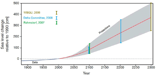
Adaptive Strategies - Freshwater Management
We saw in our previous lesson on climate change impacts, that anthropogenic climate change could profoundly influence freshwater availability around the world.
- Serious Negative Impacts: The negative impacts of changing precipitation patterns outweigh the benefits. For example, the increases in annual rainfall and runoff in some regions are offset by the negative impacts of increased precipitation variability, including diminished water supply, decreased water quality, and greater flood risks. There is hope, however, that in some cases, adaptations (e.g. the expansion of reservoirs) may offset some of the negative impacts of shifting patterns of water availability.
- More Frequent Extreme Drought Events: Climate model simulations predict that the spacing between consecutive extreme drought events (defined as once-in-a-hundred-years events) will decrease sharply in many regions by the 2070s for the "middle of the road" emissions scenario.
- Future Climate Change Impacts on Water
- U.S. - A steady increase in the population of cities in desert climates such as Phoenix and Las Vegas is occurring at precisely the same time that drought conditions are worsening
- South America - Aquifers will be depleted 75% by 2050.
- Southern Europe and the Mediterranean - Many arid and semi-arid regions, such as the Mediterranean and parts of Southern Europe, Southern Africa, and much of Australia, are likely to suffer from increased drought. Electricity production potential to hydropower stations may decrease by more than 25% by 2070.
- Africa - The spread of disease will increase due to more heavy precipitation events in areas with poor water supplies and an overtaxed sanitation infrastructure.
- India - In many coastal regions there will be plenty of water, but it will be the wrong kind! A sea level rise of 0.1 m (0.3 ft) by 2040-2080 will threaten the fresh water supply.
- Bangladesh - Areas with increased rainfall and runoff will suffer from an enhanced risk of flooding. The impacts are likely to be especially harsh for regions like Bangladesh, which is already facing the pressures of rising sea level.
- Worldwide - More than 15% of the world's population depends on the seasonal melt of high elevation snow and ice for fresh water. The melting of glaciers and ice caps represent a serious threat.
© 2015 Pearson Education, Inc.
What, if any, measures could we take to adapt to these changes? Possible adaptations can, in fact, be found on both the supply side and the demand side.
Let us first consider some supply-side options. Freshwater could, for example, be transported from regions that are likely to see more precipitation to those likely to see less. The required transport (which costs both money and energy!) could be minimized by exploiting the fact that in many cases such regions are reasonably near to each other, e.g., tropical Africa (more runoff) vs. South Africa (less runoff), or the Pacific Northwest (more runoff) vs. desert southwest (less runoff) of U.S., or Northern Europe (more runoff) vs. Southern Europe and Mediterranean (less runoff). Other possibilities involve greater exploitation of groundwater sources, though this faces the challenge of over-tapped aquifers, which is already a problem in the U.S. Desalinization makes sense, particularly for coastal regions of the U.S., Australia, and the Mediterranean which are predicted to dry, and where a nearby saltwater source would help minimize transportation costs. Desalinization is currently highly expensive and extremely energy intensive, making it a prohibitive source of freshwater today. However, as water resources diminish and technology improves, it is possible that desalinization will become a more viable option in the future. See table below for other possible supply-side solutions.
What about the demand side? More efficient recycling of water and better conservation of water resources is an obvious approach. Both constitute what is often referred to as no regrets approaches — a concept we will encounter later in the context of climate change mitigation. Such actions not only cost us nothing, but they could, in fact, provide benefits, e.g., lower household water bills! Similarly, more efficient means of irrigation of crops could save water and provide other benefits as well.
Another possibility is the idea of tradable water access rights. This too has an analogy with climate change mitigation, since one approach that has been suggested for reducing carbon emissions is to allow individual companies limited numbers of permits for emitting and then letting them trade and sell them. The same thing could be done for rights to water resources. The idea behind this is that the efficiencies of the free market will, at least in principle, find the most cost-effective means of meeting water resource needs, since those with excess fresh water would be motivated to sell their valuable water rights to others willing to pay a premium for them.
| Supply Side | Demand Side |
|---|---|
| Prospecting and extraction of water | Improvement of water-use efficiency by recycling groundwater |
| Increase of storage capacity by building reservoirs and dams | Reduction in water demand for irrigation by changing the cropping calendar, crop mix, irrigation method, and area planted |
| Desalination of seawater (via reverse osmosis systems) | Reduction in water demand for irrigation by importing products |
| Expansion of rainwater storage | Adoption of indigenous practices for sustainable water use (drawing upon local cultural knowledge in establishing efficient practices) |
| Removal of invasive, non-native vegetation from river margins | Expanded use of water markets to reallocate water to highly valued areas |
| Transport of water to regions where needed | Expanded use of economic incentives, including metering, and pricing to encourage water conservation |
© 2015 Pearson Education, Inc.
Adaptive Strategies - Agricultural Practices
We examined likely impacts on agricultural productivity (and livestock) in our previous discussion of climate change impacts. While on balance these impacts are projected to be negative (particularly in the tropics), there are adaptive measures that can be taken to mitigate the losses in agricultural productivity.
Possible agricultural adaptations include changing crop locations; for example, seeking out higher elevation environments and cooler microclimates. Adaptations also include changing crop rotation patterns and tilling methods; for example, so-called no-till agriculture keeps sub-surface soils cooler and wetter, which might mitigate the effects of warmer and dryer conditions. One can switch to crop varieties (or cultivars) that are better adapted to the changing weather patterns and climate, or amend planting schedules to adapt to shifting seasonal temperature and rainfall patterns. And perhaps as the final line of retreat in the adaptation process, one can change the choice of crops grown, for example, replacing wheat with sorghum as conditions become increasingly arid.
Let us consider the potential mitigation of losses (or maybe even gains) that might come from employing these agricultural adaptations. Let us make the simplifying, if perhaps overly optimistic, assumption of optimal adaptation. That is to say, let us assume that stakeholders operate with perfect information and take the most favorable possible adaptive measures in response to changing climate conditions. Under that assumption, things do not appear too bad, at least for moderate future warming.
Let us consider the predictions for varying levels of future warming and associated CO2 increase (note that there is a direct impact of CO2 fertilization in addition to the indirect climate change impacts from increasing CO2). For 1-2°C warming, we can expect to see increased yields across crops in the extra-tropics, due, in large part, to longer growing seasons, and, with appropriate adaptations, the agricultural productivity could be enhanced even more, approaching 10% for rice and corn and 20% for wheat. For that same amount of warming in the tropics, however, cereal crop productivity either remains the same (rice) or declines (wheat and corn). However, appropriate adaptations can change the picture, turning declines into modest gains. On the global scale for the modest 1-2°C warming, agricultural productivity increases, largely due to the gains in the extra-tropics. However, even at this moderate level of warming, we begin to see the challenges of the regional asymmetry in agricultural productivity responses — the gains are primarily in the regions that are already able to meet food requirements (i.e., the developed world of the extra-tropics), and not in the regions faced by shortfalls owing to their lesser wealth and growing population (i.e., the developing world of the tropics). As warming increases beyond 3°C, this disparity becomes even greater, as low-latitude regions are likely to see agricultural productivity declines regardless of what adaptive measures are taken. For warming beyond 3°C, global agricultural yields decline even with adaptation, and global food prices show substantial increases. As warming approaches 5°C, losses are seen in the extra-tropics as well as in the tropical regions, regardless of the adaptive measures, and global agricultural productivity losses and food price increases become substantial.
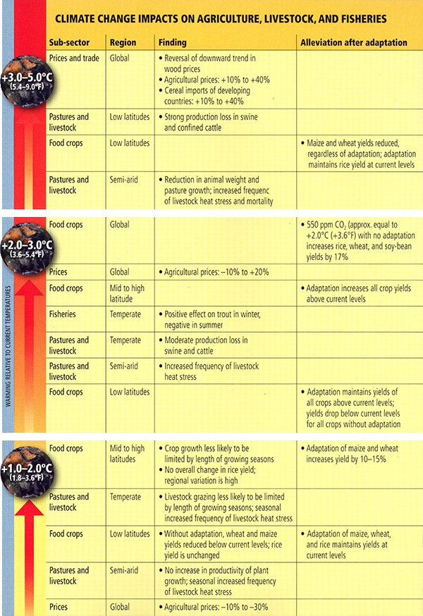
| Temperature Change | Sub-sector | Region | Finding | Alleviation after adaptation |
|---|---|---|---|---|
| +1.0 to 2.0 Degrees Celcius | Prices | Global | Agricultural prices: -10 percent to -30 percent | |
| +1.0 to 2.0 Degrees Celcius | Pastures and livestock | Semi-arid | No increase in productivity of plant growth; seasonal increased frequency of livestock heat stress | |
| +1.0 to 2.0 Degrees Celcius | Food crops | Low latitudes | Without adaptation, wheat, and maize yields reduced below current levels; rice yield is unchanged | Adaptation of maize, wheat, and rice maintains yields at current levels |
| +1.0 to 2.0 Degrees Celcius | Pastures and livestock | Temperate | Livestock grazing less likely to be limited by length of growing seasons; seasonal increased frequency of livestock heat stress | |
| +1.0 to 2.0 Degrees Celcius | Food crops | Mid to high latitudes | Crop growth less likely to be limited by length of growing seasons as well as no overall change in rice yield; regional variation is high | Adaptation of maize and wheat increases yield by 10 to 15 percent |
| +2.0 to 3.0 Degrees Celcius | Food crops | Low latitudes | Adaptation maintains yields of all crops above current levels; yields drop below current levels for all crops without adaptation | |
| +2.0 to 3.0 Degrees Celcius | Pastures and livestock | Semi-arid | Increased frequency of livestock heat stress | |
| +2.0 to 3.0 Degrees Celcius | Pastures and livestock | Temperate | Moderate production loss in swine and cattle | |
| +2.0 to 3.0 Degrees Celcius | Fisheries | Temperate | Positive effect on trout in winter, negative in summer | |
| +2.0 to 3.0 Degrees Celcius | Food crops | Mid to high latitude | Adaptation increases all crop yields above current levels | |
| +2.0 to 3.0 Degrees Celcius | Prices | Global | Agricultural prices: -10 percent to + 20 percent | |
| +2.0 to 3.0 Degrees Celcius | Food crops | Global | 550 ppm CO |
|
| + 3.0 to 5.0 Degrees Celcius | Pastures and livestock | Semi-arid | Reduction in animal weight and pasture growth; increased frequency of livestock heat stress and mortality | |
| + 3.0 to 5.0 Degrees Celcius | Food Crops | Low latitudes | Maize and wheat yields reduced, regardless of adaptation; adaptation maintains rice yield at current levels | |
| + 3.0 to 5.0 Degrees Celcius | Pastures and livestock | Low latitudes | Strong production loss in swine and confined cattle | |
| + 3.0 to 5.0 Degrees Celcius | Prices and trade | Global | Reversal of downward trend in wood prices, Agricultural prices are up 10 to 40 percent, and Cereal imports of developing countries are up 10 to 40 percent. |
© 2015 Pearson Education, Inc.
Now, you will investigate these relationships in detail yourself, interactively, using a more elaborate version of the agriculture application you encountered in our previous lesson. The application now indicates changes in yields of major cereal crops (wheat, rice, and corn) both with and without adaptive measures. Please take some time to explore the agricultural application below. You will be using this tool in Project 2, which begins this week.
Lesson 10 Summary
In this lesson, we looked at the potential impacts of projected climate change on civilization and our environment. The key points are as follows.
- Adaptation and mitigation are two often-discussed strategies for dealing with the threats and challenges of human-caused climate change. The two approaches are not mutually exclusive —it is very likely that both will need to be employed if we are to limit societal vulnerability to climate change.
- Adaptive measures to reduce coastal vulnerability to sea level rise take the form of three progressively more defensive responses to increasing magnitudes of sea level rise — protection through engineering, followed by accommodation to rising sea level and, eventually, managed retreat.
- There are a variety of adaptive responses that might be taken to deal with shifting water resources resulting from anthropogenic climate change. These responses take the form of demand side and supply side actions. On the demand side are better conservation of available freshwater resources (a so-called no regrets strategy), and introduction of a system of tradable water rights to help insure efficient use of available fresh water. On the supply side are the development of better distribution systems to move water from regions of surplus to regions of deficit, better use of available groundwater and freshwater aquifers, and (though currently not cost-effective) the use of desalinization technology, particularly in coastal regions where distribution requirements would be minimized.
- Adaptation can to some extent mitigate the loss of agricultural productivity due to climate change, though there are substantial differences between tropical and extra-tropical regions, and also between different crops (e.g., staple cereal crops such as rice, wheat, and corn/maize).
- Theoretical crop models subject to admittedly limited (and perhaps not wholly realistic) climate change scenarios of, e.g., simple warming of temperatures and elevation of CO2 levels, indicate that for moderate warming, losses in tropical regions can be mitigated through the introduction of appropriate adaptive measures. Adaptive measures can further bolster agricultural increases in extratropical regions that benefit from longer-growing seasons with warming.
- The same crop models indicate that as the warming progresses, gains in the extra-tropical regions become increasingly less, and losses in the tropical regions become increasingly greater, even with appropriate adaptive measures. As warming approaches 5 °C, losses are seen in all regions regardless of adaptation, and both global food productivity declines and global food price increases become substantial.
Reminder - Complete all of the lesson tasks!
You have finished Lesson 10. Double-check the list of requirements on the first page of this lesson to make sure you have completed all of the activities listed there before beginning the next lesson.
Lesson 10 Discussion
Activity
Directions
Please participate in an online discussion of the material presented in Lesson 9: Climate Change Impacts; Lesson 10: Vulnerability and Adaptation to Climate Change; and the movie "Before the Flood".
This discussion will take place in a threaded discussion forum in Canvas (see the Canvas Guides for the specific information on how to use this tool) over approximately a week-long period of time. Since the class participants will be posting to the discussion forum at various points in time during the week, you will need to check the forum frequently in order to fully participate. You can also subscribe to the discussion and receive e-mail alerts each time there is a new post.
Please realize that a discussion is a group effort, and make sure to participate early in order to give your classmates enough time to respond to your posts.
Post your comments addressing some aspect of the material that is of interest to you and respond to other postings by asking for clarification, asking a follow-up question, expanding on what has already been said, etc. For each new topic you are posting, please try to start a new discussion thread with a descriptive title, in order to make the conversation easier to follow.
Suggested topics
The purpose of the discussion is to facilitate a free exchange of thoughts and opinions among the students, and you are encouraged to discuss any topic within the general discussion theme that is of interest to you. If you find it helpful, you may also use the topics suggested below.
"Before the Flood"
- What effect on our planet portrayed in the movie was the most shocking to you?
- Are there solutions presented in the film that give you hope or inspire you to action? Why?
- How effective is the film in presenting the topic? In your opinion, what are the strongest and the weakest points of the film?
Lesson 9: Climate Change Impacts
- In your opinion, what are the most serious projected impacts of climate change?
- What do you think about the concept of "ecosystem services"? Is it ethical to apply cost/benefit analysis to Earth's ecosystems and biodiversity?
- Experiment with the interactive application "global warming impacts on cereal crops". Discuss how different crops are affected by various amounts of future projected warming, for both tropical and extratropical regions.
Lesson 10: Vulnerability and Adaptation to Climate Change
- Two strategies for confronting the impacts of climate change are adaptation and mitigation. What is the difference between the two? Considering that climate change impacts are very non-uniform across geographic regions, in your opinion, which of the two strategies is more ethical?
- Realistically, do we have a choice between adaptation and mitigation? When is the time to start applying these strategies?
- What do you think of trading water access rights as an adaptive strategy for reduced freshwater availability?
Submitting your work
- Go to Canvas.
- Go to the Home tab.
- Click on the Lesson 10 discussion: Impacts, Adaptation, and "Before the Flood".
- Post your comments and responses.
Grading criteria
You will be graded on the quality of your participation. See the online discussion grading rubric for the specifics on how this assignment will be graded. Please note that you will not receive a passing grade on this assignment if you wait until the last day of the discussion to make your first post.
Project #2: Crop Models
We have seen over the past two lessons that agriculture is one key area of societal vulnerability to future climate change, but the challenges are complicated to confront. The effects are likely to be differentially felt in various parts of the globe, with the tropical regions more likely suffering losses, and extra-tropical regions seeing gains, at least for moderate levels of warming and atmospheric CO2 enrichment. Adaptive measures can ameliorate losses and potentially even turn losses into gains. Thus, any solution will likely require some degree of mitigation and some degree of adaptation. Moreover, the regionally-disaggregated nature of impacts will require policies that allow for an equitable redistribution of food resources from regions that are likely to see gains to regions that are likely to see losses.
In this project, you will propose your own policy solution to deal with agricultural vulnerability to future climate change. You will make use of quantitative tools that we have introduced in this course to address climate change mitigation, assess agricultural impacts, and modify those impacts through adaptation.
Activity
Note
For this assignment, you will need to record your work on a word processing document. Your work must be submitted in Word (.doc or .docx), or PDF (.pdf) format, so the instructor can open it.
In this project, you are in charge of drafting an international protocol for maintaining global food security in the face of projected climate change over the next century, through a combination of (1) climate change mitigation, (2) agricultural adaptation, (3) policies for redistributing food resources to where they are needed, and crop substitution.
You will find it useful to employ two applications we have used in this course thus far:
- this Excel Spreadsheet ("toy 0-D energy-balance model (EBM)")
- Global Warming Impacts on Cereal Crops Application. Also found at the bottom of this page
As you proceed to design your policy, please use the following assumptions and rules:
Assumptions:
- Current yields are defined at 0°C warming and correspond to no net deficit or surplus. In the Agricultural application, current yields are graphically depicted as 4 units (bushels) of agricultural yield, so that, for example, a 25% increase in yields would be depicted as an increase to 5 units.
- Increased food demand due to projected population growth is partially offset by improvements in agricultural technology, more widespread allocation of land for agricultural use, and economies of scale. Thus, despite a projected increase in global population of over 70% during the next century, assume that you will be able to meet projected food demands if you achieve a 4% increase in agricultural productivity relative to the current yields. [This is a highly optimistic assumption].
- Assume that food needs (i.e., the projected 4% increase relative to the current yields) are similar in both the tropical and extra-tropical sub-regions. In reality, this is not exactly true, as developing nations that are currently unable to meet existing food requirements are predominantly found in the tropics.
- Assume that each crop contributes equally to the total production in each sub-region, and also that the tropics and the extra-tropics contribute equally to the total world production. This means that, for example, if you increase the tropical wheat production by 6%, this would cause the overall production in the tropical sub-region to increase by 6% * 1/3 = 2% and the total world production to increase by 2% * 1/2 = 1%.
- Assume a mid-range climate sensitivity in establishing the relationship between CO2 concentration stabilization levels and global mean warming.
- In the Agricultural application, current global mean temperatures are defined as 0.8°C higher than the pre-industrial mean temperatures. You need to account for that when using the toy EBM, which measures net warming relative to the pre-industrial temperatures (at 280 ppm CO2 concentrations). That is, you need to subtract 0.8° from the warming calculated by the EBM application for a given CO2 level.
- Because of the projected amplification of warming over the continental regions, we will make a conservative assumption that all land regions warm 25% more than the global mean. That is, for a given CO2 level, you need to increase the projected warming (after making 0.8°C correction) by 25%.
Rules:
- Your default scenario is business-as-usual CO2 emissions, which we will represent by stabilization of atmospheric CO2 at 700 ppm, and a capacity to fund adaptation efforts for each crop in each region.
- As a policymaker confronted with the real world constraints, you face a trade-off in the resources available to fund mitigation and adaptation efforts. That is, for every 50 ppm units you attempt to lower the CO2 emissions below business-as-usual levels (700 ppm), you lose the ability to fund one adaptation effort, i.e., to employ adaptations for one crop in either the tropics or extra-tropics. Note that this set-up provides a floor of 400 ppm stabilization, since there are only 3 crops x 2 sub-regions = 6 total possible adaptation efforts. So, effectively, you are allowed a total of six (adaptation / 50-ppm mitigation) efforts.
- You can substitute up to one crop for another within each sub-region, the tropics and the extra-tropics, at no cost in terms of adaptation / mitigation efforts. For example, if corn yields show less decline than wheat yields in the tropics for a given climate scenario, you may substitute corn for wheat in meeting tropical food requirements. The crop being used to substitute for another may be adapted first, at the normal cost of one adaptation / mitigation effort.
- You are allowed to transfer yields (including adapted yields)from one sub-region to the other but at a cost in terms of CO2 emissions: for each half unit of agricultural productivity to be transferred, the CO2 stabilization level is increased by an additional 50 ppm. Thus, for example, you may theoretically use six adaptation efforts for each crop / subregion combination and transfer a half unit of excess yield from one subregion to the other, but without any mitigation efforts your CO2 stabilization concentration would be 750 ppm. Note also that if you had computed your yields for 700 ppm but then rely on subregional transfer, you would have to recompute your yields to be valid at 750 ppm -- unless you also apply resources towards one 50-ppm mitigation effort, to bring CO2 back down to 700 ppm.
- In your final answer, global yields, as well as yields in each sub-region, must have increased by 4%. If you find multiple scenarios that satisfy all the rules, discuss which of the scenarios you as a policymaker would prefer to implement.
Presenting your work
Please present your work as a formal report, divided into the following sections:
- Introduction (state the objectives here)
- Methods
- Results and discussion
- Summary and conclusions
If needed, you may also include an Appendix to show any extended calculations. Try to keep your report reasonably short (3 pages is a good length).
Submitting your work
- Save your word processing document as either a Microsoft Word or PDF file in the following format: Project2_AccessAccountID_LastName.doc (or .pdf).
- Upload your file to the Project #2 assignment in Canvas by the due date indicated in the syllabus.
Grading rubric
The instructor will use the general grading rubric for problem sets to grade this project. (Downloadable PDF)
Lesson 11 - Geoengineering
The links below provide an outline of the material for this lesson. Be sure to carefully read through the entire lesson before returning to Canvas to submit your assignments.
Introduction
About Lesson 11
We have seen that adaptation is one of the means of dealing with climate change impacts. Indeed, we will have to adapt to some changes that are in store. However, adaptation alone is unlikely to represent an adequate response to the challenges posed by climate change. That leaves only mitigation of climate change itself as an alternative. Fundamentally, there are two different forms of mitigation that have been widely considered —reduction of carbon emissions and geoengineering. Geoengineering attempts to offset the climate changes themselves through other means of human intervention in the climate system. In this lesson, we will look in more detail at the various geoengineering schemes under consideration.
Video: The Home Stretch - part 1 (1:35)
The NCAA tournament, which currently just went beyond the sweet 16 into the Elite Eight shows we're in the home stretch of the NCAA tournament. We're also in the home stretch of this course. It's the latter half of the second half. We've talked about the basic science behind climate and climate change. We've talked about the model projections under various possible scenarios of future carbon emissions, and we've talked about the potential impacts of those emissions, so now we're going to talk about the issue of what to do about this problem. We will consider a few different possibilities. Right now, we've started talking about adaptation, what adaptive measures can we take to adapt to the changes that are coming and in fact we are already committed to some amount of future climate change no matter what we do with our emissions so some degree of adaptation will be necessary. And so we've been talking about adaptive measures we can make in the area of water supply agriculture dealing with sea level rise and other impacts of climate change, but beyond adaptation what can we do to deal with the problem of climate change?
Video: The Home Stretch - part 2 (2:24)
What can we do to deal with the problem of climate change? Well, we can try to mitigate it, and there are actually two different approaches that have been widely discussed in recent years. One of them that's quite controversial is so-called geoengineering, so one possibility is we try to engineer our way out of climate change by perturbing the climate system in other ways to offset the warming due to increasing greenhouse gas concentrations. So we'll talk about that concept of geoengineering and what it might be able to accomplish and what the potential pitfalls are. Finally, if we don't consider geoengineering as a viable solution to the problem, that leaves us with only one solution to stemming the problem at its source which is the increasing greenhouse gas concentrations themselves, and so our final lesson of the course will be talking about mitigating greenhouse emissions. Carbon emissions cross every sector of society, every sector of modern civilization from energy supplied at transportation, to agriculture, to buildings, construction of buildings, to waste management. So clearly if we're going to decrease carbon emissions we need to consider potential actions across all sectors of our modern economy and modern civilization, and so we'll talk about those details, and we'll see if it indeed is possible to decrease emissions in a way that is consistent with stabilizing greenhouse gas concentrations at a level below that where we will start to see some of the more dangerous impacts that we've talked about in this course. And so it isn't coincidental that the titlist course is from meteorology to mitigation. We started with the basic science, the basic meteorology and atmospheric science of climate change, and now as we finish up the course we're going to take the problem all the way through the issue of solutions, or what we do about the problem.
What will we learn in Lesson 11?
By the end of Lesson 11, you should be able to:
- Summarize the geoengineering schemes that have been considered in the context of climate change mitigation; and
- Evaluate the relative strengths and weaknesses of different geoengineering schemes
What will be due for Lesson 11?
Please refer to the Syllabus for specific time frames and due dates.
The following is an overview of the required activities for Lesson 11. Detailed directions and submission instructions are located within this lesson.
- Project #2 due.
- Begin Project #3: Suppose you had 3 minutes to talk to your local congressperson about climate change. What would you tell him/her? Record a 2-3 min video, which will be available to the class to discuss and critique.
- Participate in Lesson 11 discussion forum: Geoengineering.
- Read:
- Dire Predictions, p. 192-193
- Keith 2001, Crutzen 2006, and Robock 2008. (Registered students can access the readings in the Lesson 11 module in Canvas.)
Questions?
If you have any questions, please post them to our Questions? discussion forum (not e-mail), located under the Home tab in Canvas. The instructor will check that discussion forum daily to respond. Also, please feel free to post your own responses if you can help with any of the posted questions.
What is Geoengineering?
Geoengineering is the intentional manipulation of our environment at the global scale. Anthropogenic impacts on our climate thus far do not qualify as geoengineering, because their intent was not to change our climate —climate change was an unintended consequence of the burning of fossil fuels (and the production of sulfate aerosol and, to a lesser extent, changes in land surface properties resulting from human actions).
Geoengineering, at this point, is still only a theoretical construct. But it is increasingly discussed as one of the possible means of mitigating climate change. The idea, at least in principle, is rather simple. It involves engaging in planetary-scale manipulation of the Earth in such a way as to offset the warming impacts of increasing greenhouse gas concentrations.
A variety of geoengineering schemes have been proposed, or at least envisioned. Some involve relatively minimal manipulation or tampering with the environment. For example, carbon capture and sequestration (CCS) involves capturing CO2 from emissions before they enter the atmosphere; while air capture amounts, in essence, to trying to "put the genie back in the bottle", i.e., to actively take carbon out of the atmosphere through, e.g., reforestation or building the equivalent of artificial trees that suck carbon out of the atmosphere more efficiently than natural trees. In all of these cases, the captured carbon must be buried underground or in the deep ocean, where it is isolated from the atmosphere, at least for some time. Other ideas involve fertilizing the ocean by adding iron, which is a limiting nutrient for marine phytoplankton in otherwise very highly productive regions of the oceans, such as the North Atlantic. In principle, this would enhance biological productivity and, therefore, lead to increased uptake of atmospheric CO2 by the upper ocean.
Other schemes attempt to offset the surface warming influence of greenhouse gas increases by reducing the amount of solar radiation impinging on the Earth's surface— so-called solar radiation management. One such scheme involves mimicking the cooling effect of volcanic eruptions by shooting sulfate aerosols into the stratosphere (see, e.g., this review at the site RealClimate). Another scheme involves placing large numbers of reflecting mirrors in space at a stable position in the Earth's orbit. Related schemes involve increasing the Earth's surface albedo by various means (a possibility we also investigated in Problem Set #3).
We will discuss various of the proposed schemes and their relative advantages and disadvantages in more detail over the course of this lesson.
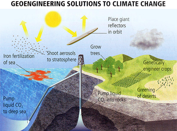
© 2015 Pearson Education, Inc.
Carbon Capture and Sequestration
Arguably the safest of the proposed geoengineering schemes, i.e., the one that is least invasive with respect to the Earth system, is carbon capture and sequestration (CCS). The main idea in this case is to prevent the carbon released during fossil fuel burning from ever getting into the atmosphere. In principle, this would allow for energy generation from fossil fuels with near zero carbon emissions. CCS is only economical when it can be applied to large point sources. In the context of energy generation, this applies almost exclusively to coal-fired power plants. CCS can also be used, however, to capture and sequester carbon emissions resulting from industrial processes, such as steel and cement manufacturing, petroleum refining, and paper mills.
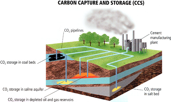
© 2015 Pearson Education, Inc.
While CCS has been implemented in various forms, the first full scale "proof of concept" for CCS in the context of coal-fired power generation was known as FutureGen, and was implemented in Illinois. Once operating, FutureGen would allow for the collection of data regarding efficiency, residual emissions, etc., and form a basis for evaluating performance that would be vital if and when CCS were to be deployed commercially at a larger scale in the future. The project was funded by an alliance of the Department of Energy and coal producers, users, and distributors.
CO2 released during electricity generation from coal burning is scrubbed from the emissions and captured, compressed and liquefied, and then pumped deep into the Earth (several km beneath the surface) where it is reacted with porous igneous rocks to form limestone. This approach mimics the geological processes that bury CO2 on geological timescales, and provides a potential means for long-term geological sequestration of CO2.
CO2 is captured through a process known as oxy-combustion. This process burns coal in a pure mixture of O2 and CO2 (by first removing N2 from the air), which results in relatively pure mixture of CO2 after combustion, from which any residual pollutants (e.g., sulfate, nitrate, etc.) can be removed. The relatively pure remaining CO2 is then compressed and liquefied, and the liquid CO2 can readily be transported deep below for storage. FutureGen scientists estimate that they can annually bury roughly 1.3 million tons of CO2 (i.e., 0.0013 Gigatons carbon per year), equivalent to roughly 90% of the carbon emitted by the plant's coal burning.
Why was FutureGen considered a good choice for testing the efficacy of this CCS? The geology of the Mount Simon site in Illinois is well suited for CCS, but it is also reasonably representative of geological formations found in many other regions of the world, so that whatever is learned from FutureGen could, in principle, be applied to many other potential CCS sites around the U.S. and the world.
Geological formations that contain salt water, like Mount Simon, are ideal because of their porosity. Moreover, there is impermeable caprock to seal in CO2. The formation is deep, placing it well below the depth of aquifers that are tapped for fresh water supply.
More than anything else, FutureGen was proposed as an experiment. The FutureGen operation would have evaluated potential storage sites before deciding precisely where the liquefied CO2 would have been injected for long-term storage, based on both theoretical modeling and data collection to evaluate detailed geological information about potential storage sites. The effectiveness of the injection system would be evaluated, and there would be continual monitoring of the burial process to ensure that CO2 is indeed being sequestered and remains sequestered. Whatever is learned could, in principle, be applied to any full-scale future deployment of CCS in the U.S. and abroad.
Unfortunately, due to difficulties of committing public funds and acquiring public funds, the FutureGen project, reconstituted as the FutureGen 2.0 project, was finally suspended in February 2015 (read the article here). The Kemper County pre-combustion CCS plant in Mississippi came in $4 billion over budget and finally switched to natural gas combustion without any CCS. However, other CCS projects have started or should begin in the near future, such as the large post-combustion coal-based Petra Nova project in Texas, and the sequestration of CO2 from ethanol production into the Mount Simon formation. Other CCS projects are working with non-coal based power plants, like the CarbFix program in Iceland.
CCS might sound like a fool-proof plan for mitigating greenhouse emissions, but many of the assumptions made above may be over-optimistic. Even if the 90% rate of sequestration were correct, that would mean that 10% of the CO2 would still escape to the atmosphere, i.e., even in the best of scenarios, CCS-equipped coal-fired power plants would continue to emit CO2 into the atmosphere, just less of it. Moreover, in the event of unforeseen events, such as earthquakes, or other seismic activity, or alterations in groundwater flow, the efficacy of CCS in any particular location could be compromised. That would mean that the great initial investment made to establish the CCS site would be wasted, and the economic viability of CCS vs. other schemes to lower the carbon intensity of energy production might be undermined.
Despite all of the talk these days about "clean coal technology," such technology — in the sense that "clean" is taken to mean energy that is free or nearly free of polluting greenhouse gases — does not yet exist and remains hypothetical. Until data from experimental sites such as FutureGen have been collected and studied for some years, it will be unclear how much CO2 is actually being sequestered, and it would literally take decades until the efficacy of true long-term carbon burial could be established. Yet, we have seen that even a decade or so of additional business-as-usual greenhouse gas emissions could commit us to substantial and potentially detrimental future climate change. So CCS, despite the promise that it shows, may not be the "magic bullet" we are looking for.
Air Capture
The concept of air capture involves, in essence, "putting the genie back in the bottle". Unlike CCS, which targets emissions from major point sources before they escape into the atmosphere, the CO2 has already made it into the atmosphere in this case, and the objective is to scrub it back out of the ambient atmosphere. One simple way to do this is to grow more trees. Just as deforestation adds CO2 to the atmosphere, reforestation can, in principle, take CO2 out of the atmosphere. Of course, things are not always as easy as they seem. When the trees die, much of the carbon makes it back into the atmosphere as the organic material decomposes, and so the carbon burial process is incomplete and inefficient. There are other problems with this approach. As climate scientist Ken Caldeira of Stanford's Carnegie Institution has pointed out (e.g., in this op-ed in the New York Times), growing more trees in extratropical seasonally snow-covered regions could have the unintended consequence of actually warming the climate by decreasing the Earth's winter and early spring albedo.
Well, what about artificial trees? In fact, this idea has been taken quite seriously in recent years. Synthetic "super trees" might be designed in a way that allows them to take up CO2 far more efficiently than actual trees. They would be immortal in the sense that they would not die, decompose, and return carbon to the atmosphere. And they can be constructed to be white and reflective, not only avoiding the tree albedo problem referred to above, but potentially even increasing the Earth's albedo. More efficient than actual trees, networks of these artificial trees deployed around the world could potentially sequester a non-trivial fraction of the carbon emitted by fossil fuel burning.
In the artificial tree scheme, CO2 is captured from the air using a chemical filter, then removed from the filter for permanent burial. Calcium oxide (also known as "Quick lime"), for example, will absorb CO2 from a mixture of air and steam at high temperatures (400°C or so) to form calcium carbonate, and will then release the CO2 at even higher temperatures (1000°C or so), making it a convenient means for both capturing the CO2 and then releasing for compression and burial. The heating, of course, requires an input of energy, but that can be provided by concentrated solar heating so that no input of fossil fuel-generated energy is necessary.
A potentially more efficient scheme has been introduced by Klaus Lackner of Columbia University. In Lackner's scheme, the "artificial tree" towers are designed to capture CO2 through the use of chemical reactions based on ion exchange resin, where the capture and release of CO2 can be accomplished by varying humidity rather than temperature, which greatly reduces the required input of energy.
These schemes might seem rather fanciful and far-fetched, but, in fact, they are quite implementable. Using a relatively rudimentary carbon capture tower back in 2008 as a proof of concept, geoengineering researcher David Keith at the University of Calgary demonstrated that half of the CO2 could be removed from the air entering the tower. The issue is not the feasibility of the technology, but rather the cost-effectiveness of the technology. After all, the approach will not be viable as long as cheaper approaches are available. This problem becomes particularly clear when one compares with, e.g., conventional CCS as discussed in the previous section, which takes advantage of the far greater efficiency of capturing carbon from concentrated streams of CO2 compared with more diffuse ambient levels in the atmosphere.
However, if the cost of emitting carbon becomes large enough, or put differently if the value of capturing carbon from the atmosphere becomes great enough, then this technology may indeed become cost-effective. For example, in the event that the climate change is perceived as nearing a dangerous threshold and the importance of imminent stabilization of CO2 levels grows ever greater, air capture offers the only means of achieving relatively rapid stabilization of CO2 levels. Indeed, air capture is the only means by which we might actively lower atmospheric CO2 levels if we conclude that even current levels (i.e,. roughly 400 ppm) are too high. NASA/GISS Director James Hansen, for example, has argued that even sustained atmospheric concentrations of 350 ppm will eventually lead to dangerous climate changes such as the melting of the major ice sheets. Hansen's arguments have led to a popular climate change movement known as 350.org which indeed is aimed at achieving 350 ppm stabilization.
One might, of course, argue that other geoengineering approaches, such as solar radiation management (which we will investigate in the next section of this lesson) could accomplish this goal. However, as we shall see, one critical flaw in schemes that try to offset greenhouse warming with cooling techniques from, e.g., sulfate aerosols, is that this does nothing to halt the buildup of CO2 in the atmosphere and, as we have seen earlier in this course, the buildup has other serious consequences, such as ocean acidification.
Solar Radiation Management
Perhaps the most widely discussed and the most controversial of geoengineering schemes involves solar radiation management. Rather than reducing greenhouse gas concentrations, as in the other schemes we have looked at so far (CCS and Air Capture), this geoengineering approach instead seeks to offset the warming effect of increasing greenhouse gas concentrations by reducing short wave radiation received at the Earth's surface. There are a number of ways to do that. Some involve decreasing the amount of solar radiation reaching the surface—this might be thought of as effectively modifying the value of the solar constant, while others involve increasing the surface albedo.
One could consider the introduction of sulfate aerosols into the lower troposphere, which as we know has offset some of the greenhouse warming over the past half century, as such a form of geoengineering. However, since geoengineering, strictly speaking, involves the intentional manipulation of the Earth System, we tend to consider this as an unintended human impact on the climate, much as greenhouse warming, or deforestation, or many other changes in land surface properties due to human influences, are unintentional human impacts.
Nonetheless, these unintended human influences on the climate provide some insight into how intentional forms of manipulation of the short wave radiative forcing of the Earth's surface might potentially be used to offset greenhouse surface warming. For example, we could choose to remove sulfur scrubbers from smokestacks or, in the case of emerging coal users such as China, intentionally not install these scrubbers. We have already seen that the current sulfate aerosol burden is equivalent to us not having emitted a certain amount of CO2. In other words, measured in terms of CO2 concentrations, the mean cooling effect of tropospheric sulfate emissions can be thought of as a sort of a "free pass" for some share of the CO2 concentration increase we have seen so far.
Think About It!
Do you happen to remember how the mean cooling effect of tropospheric sulfate aerosols can be expressed in terms of CO2 concentrations? This is equivalent to all of the CO2 emitted since what year?
Click for answer.
And given current levels of ~410 ppm, that's equivalent to all of the CO2 that has been emitted in the last 30 years!
So, as far as global mean temperatures are concerned, maintaining the current sulfate aerosol burden has the equivalent offset influence on global mean temperature as the increase in CO2 levels seen over the past thirty years. Yet, there are reasons why this sulfate aerosol production is undesirable: acid rain, for example. Even maintaining the aerosol burden at its current level has a cost in terms of acid rain, air pollution, etc. Any increase in tropospheric sulfate aerosols would exacerbate these problems. And as the forcing is only local-to-regional in nature (i.e., we only see the cooling effect of these tropospheric aerosols where they are produced or within a thousand or so miles downstream of that), any global mean cooling effect comes as a result of a large cooling effect in those regions, with no cooling effect at all in other regions—these other regions would feel the full brunt of future greenhouse warming!
An alternative approach involves instead loading the stratosphere, rather than the troposphere, with sulfate aerosols. This is, once again, a geoengineering solution that attempts to mimic what nature does anyway—in the form of explosive volcanic eruptions!
So, the idea is that we inject into the stratosphere the equivalent of a major Pinatubo-like eruption every so often, enough to offset the fraction of the warming resulting from increasing greenhouse gas concentrations.
Think About It!
Do you recall the answer from the problem set? Or if not, want to guess?
Click for answer.
In a relatively rosy scenario that we can keep atmospheric CO2 levels to no more than twice the pre-industrial levels, we would need an artificial Pinatubo-magnitude aerosol loading of the stratosphere every six years. For higher CO2 levels, we would have had to do this even more often. What sort of technology could we use to do this? Well, on the plus side, there is ready supply of sulfate aerosol available. The aerosols are a by-product of industrial activity, after all, the very cause of the tropospheric sulfate aerosol problem we have talked so much about before. Various schemes have been envisioned for transporting the aerosols to the stratosphere, involving either self-releasing containers of sulfate aerosols launched from the surface, or a direct release of the aerosols from jet planes flying in the lower stratosphere.
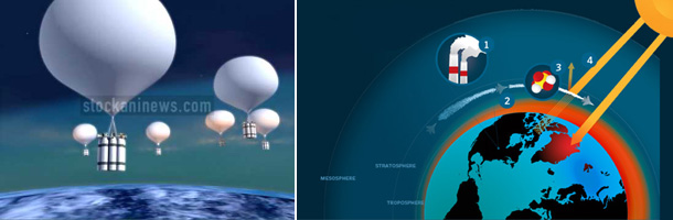

How sensible and safe is this idea? Is any approach that emulates what nature does already harmless? Or might it be "too much of a good thing" (to quote Shakespeare)? Some very respected scientists have advocated the approach, including Paul Crutzen, co-recipient of the 1995 Nobel Prize in chemistry for his work on stratospheric ozone depletion, and NCAR climate scientist Tom Wigley, among others. Their primary argument in favor of employing this approach is that we are unlikely to be able to effect the policy changes in time to avoid breaching DAI (dangerous anthropogenic interference with the climate system) through reduction of emissions alone (or CCS or Air Capture) and, therefore, may need a geoengineering scheme such as stratospheric sulfate aerosol injection to avoid dangerous climate change.
But there are certainly potential pitfalls. We will look at these in more detail later in the lesson. For one, the pattern of cooling, just like for a large volcanic eruption, is not uniform. Resulting changes in atmospheric circulation cause heterogeneous temperature changes, with some regions cooling significantly, and other regions potentially warming. For example, parts of the Arctic might actually warm rather than cool, which would exacerbate Arctic sea ice loss and perhaps the rate of melting of the Greenland ice sheet. These same changes in atmospheric circulation lead to shifts in precipitation patterns, such that many continental regions are likely to dry, meaning adverse impacts on water supply. Moreover, we know that sulfate aerosols can worsen stratospheric ozone depletion. Other approaches to solar radiation management might avoid some of these problems, but in general are either prohibitively expensive, e.g., placing reflecting solar mirrors in space, or require a scale of deployment that is not easily attainable, e.g., increasing the albedo of the Earth's surface by painting roofs and roads white, etc., or cloud seeding on a massive scale. Moreover, since the solar management approaches do nothing to stem the tide of increasing CO2 levels, they do nothing to mitigate the very serious threat of ocean acidification.
One selling point of solar radiation management schemes is that they can be deployed quickly, contrasting with the very slow, deliberate pace of greenhouse gas mitigation approaches. However, this speed might also be a pitfall. Were we to seek to offset substantial increases in greenhouse gas concentrations by such geoengineering schemes, we would become greatly reliant on their maintenance. In the event of war, economic collapse, sabotage, or any number of crises that might interfere with deployment schedules, there would be the very real danger of climate changes far more abrupt than would occur due to anthropogenic climate change alone; we could potentially unmask the previously hidden greenhouse warming due to decades of emissions in just a matter of years!
Oceanic Iron Fertilization
Finally, let us consider another intriguing, but also quite controversial geoengineering scheme: iron fertilization of the oceans. Like CCS and Air Capture, this scheme attempts to slow or reverse the buildup of CO2 in the atmosphere. Unlike those schemes, however, it accomplishes this in amending the natural carbon cycle.
Phytoplankton in the upper ocean play an important role in the marine carbon cycle, taking up CO2 from the atmosphere during the process of photosynthesis —this is the first step in what is known as the marine biological pump; the phytoplankton are consumed by other organisms, including those which form calcium carbonate skeletons. When those organisms produce waste or die, they transport their carbon into the deep ocean (by sinking to the bottom), providing a means of long-term carbon burial. Thus, in principle, one might be able to increase the burial of carbon in the ocean by increasing the productivity of phytoplankton.
In many regions, the primary limitation on phytoplankton productivity is the availability of key nutrients, and iron in particular. This can be seen during the natural phenomenon of phytoplankton "blooms". These natural explosions of phytoplankton activity are typically caused by a sudden increase in availability of nutrients, such as iron, nitrogen, and phosphorus, as a result of natural fluctuations in, e.g., oceanic upwelling. Since iron is the key limiting nutrient impacting phytoplankton productivity in many regions of the world oceans, such as the North Pacific and North Atlantic, adding iron to the upper ocean in those regions could, in principle, increase the burial of carbon in the ocean.
Once again, as fanciful as this scheme might sound, it is actually being done. A company called Planktos began initial efforts at ocean iron fertilization within the past decade, though the effort was cancelled due to lack of interest and funding.
So, does the idea actually have merit? The limited studies that have been done suggest that iron fertilization appears to increase phytoplankton activity. However, measurements of carbon fluxes suggest that the main effect is a faster cycling of carbon through the food chain of the upper ocean, with no impact on the ocean biological pump, i.e., no increase in the actual burial of carbon in the deep ocean. Thus, the effectiveness of iron fertilization in increasing long-term carbon burial remains very much in question.
Potentially even more troubling, however, is, once again, the very real possibility of negative unintended consequences. Some studies suggest that iron fertilization preferentially increases the productivity of toxic plankton, such as those responsible for red tides. Thus, this geoengineering approach could lead to potentially unpredictable, harmful effects on the marine ecosystem.
What Could Possibly Go Wrong?
We have already seen the answer to this question to some extent, but let us investigate the potential downside of geoengineering in a bit more detail.
Alan Robock is a leading climate scientist from Rutgers University. Over the past few years, he has been involved in some of the most innovative scientific work examining both the efficacy and potential pitfalls of geoengineering. You may also recognize him as the author of one of your assigned readings for this lesson, "20 reasons why geoengineering may be a bad idea" (published in the Bulletin of the Atomic Scientists).
Robock primarily focuses on effects of the stratospheric sulphate aerosol solar modification scheme. The key pitfalls in the scheme are as follows.
Effects on regional climate
Stratospheric sulfate aerosol injection will not uniformly offset global warming, but will cool some regions while warming others. The same changes in atmospheric circulation responsible for this heterogeneous pattern of temperature change will lead to an overall drying of the continents.
Ozone Depletion.
Increasing stratospheric sulfate aerosols are likely to increase the rate of ozone-destroying reactions in the stratosphere.
Unintentional Warming
It is possible that sulfate aerosols distributed in the lower stratosphere could sink into the upper troposphere, where they might have the unintended impact of seeding cirrus clouds. As we saw earlier in the course, cirrus clouds may have a net warming influence on the surface, since their greenhouse radiative properties tend to outweigh their albedo impact in the net radiative forcing.
The following Robock's pitfalls apply more generally to other geoengineering schemes.
Lessened Availability of Solar Power
Any solar management scheme (sulfate aerosols, reflecting mirrors, cloud seeding) that involves a reduction in solar radiation received at the surface will mean reduced efficiency of solar power—a key renewable source of energy.
Danger of Rapid Climate Change
As discussed previously in the case of sulfate aerosol geoengineering, any of the solar management schemes suffer the danger that if they are discontinued suddenly for any reason (war, economic crises, human error, sabotage by other nations who view geoengineering as unfavorable to their climate), the greenhouse warming that had been "covered up" by the geoengineering scheme, would emerge suddenly, giving rise to sudden warming, and sudden alterations in wind and precipitation patterns that would be hugely disruptive to civilization and natural ecosystems.
No Going Back
To the extent that geoengineering is used as a crutch to allow continued carbon emissions that would otherwise lead to dangerous influence on the climate, we quickly become "addicted" to the fix of geoengineering. Because our commitment to sustained, long-term elevation of greenhouse gas concentrations becomes increasingly great, we cannot go back. A large fraction of the emitted CO2 will remain in the atmosphere for many centuries, and the only way to avoid realizing the warming impact of the higher CO2 levels is to faithfully continue with geoengineering for perpetuity. Indeed, as CO2 levels continue to rise further, the geoengineering "dose" must get stronger and stronger.
Continuing Ocean Acidification
Other than CCS and Air Capture, none of the geoengineering schemes deal with the threat of ocean acidification (while oceanic CO2 fertilization might stabilize atmospheric CO2, it could increase CO2 concentrations in the upper ocean, and thus might not prevent ocean acidification). We have seen that ocean acidification is one of the greatest environmental threats posed by increasing CO2—indeed, it is sometimes referred to as the "other CO2 problem". Any geoengineering solution that does not deal with this problem is, at best, a very incomplete solution.
Unintended Consequences
For every potential we come up with, there are probably several others we have not even thought of yet. Once you begin tampering with a system so complex as the Earth system, of which our understanding is very incomplete, and for which our theoretical models are still relatively crude, there is the potential for surprises. And it is unlikely that those surprises will weigh in our favor.
Summary
So, finally, where does this put us? If we conclude that the risks of geoengineering are not worth taking, what options does that leave us for mitigation? That is indeed the subject of our next, and final lesson of the course.
Lesson 11 Summary
In this lesson, we investigated the concept of geoengineering, and investigated various of the specific geoengineering schemes that have been proposed as potential approaches to mitigating climate change. We found that:
- Geoengineering schemes that have been proposed fall within one of two basic categories, either seeking to prevent CO2 from building up in the atmosphere, or offsetting greenhouse warming through schemes aimed at reducing the short wave, solar radiation received by Earth's surface.
- The least invasive scheme (so much so, that it is often not even considered geoengineering at all) is carbon capture and sequestration (CCS), aimed at capturing and burying CO2 at the point of emission. CCS is only useful, however, for large, concentrated emission sources such as coal-fired power plants. Moreover, it cannot lower CO2 ambient levels, but simply decrease the rate at which they are increasing.
- An alternative scheme, known as air capture, actively filters CO2 out of the atmosphere. It has the advantage of that it can be deployed widely (i.e., it isn't necessary to place it at or near the source of emissions), and because it acts on ambient CO2 levels, it could in principle be used to lower CO2 concentrations as well as stabilize them. It has the disadvantage of being far less efficient (and more expensive) than methods such as CCS which act on concentrated streams of CO2 emission.
- A number of other geoengineering schemes that fall under the category of solar radiation management instead attempt to decrease the incoming shortwave radiation by placing reflective sulfate aerosols, or reflecting mirrors, in the lower stratosphere, or by decreasing the albedo of Earth's surface.
- Stratospheric sulfate aerosol injection might be a relatively inexpensive option for offsetting greenhouse warming, but suffers a number of potential undesirable side-effects, including inhomogeneous temperature changes that could actually lead to even more warming in certain regions like the Arctic, possible decreases in continental precipitation, worsening of ozone depletion, and other potentially harmful chemical side-effects. Other schemes for radiation management avoid some of these complications, but are likely to be highly expensive or impractical.
- Another scheme known as oceanic iron fertilization seeks to stem the buildup of CO2 in the atmosphere by adding iron to regions where marine phytoplankton productivity is primarily limited by this nutrient, thus potentially speeding the uptake of atmospheric CO2 by the ocean. Initial experiments have shown no clear evidence however of increased deep ocean carbon burial, calling into question the efficacy of the scheme. Possible unintended consequences include increasing the competitive advantage of harmful plankton, such as those which cause red tides.
- In general, geoengineering schemes appear to be fraught with potential uncertainties, harmful known and perhaps unknown side effects. The law of unintended consequences would appear to apply to many, if not all schemes that have been proposed.
Reminder - Complete all of the lesson tasks!
You have finished Lesson 11. Double-check the list of requirements on the first page of this lesson to make sure you have completed all of the activities listed there before beginning the next lesson.
Introduction to Project #3
Suppose you had 3 minutes of your local congressperson's time to share with them your message about climate change. What would you tell them?
For this project you will put together a 2-3 minute multimedia presentation that can be made available to the class to view, discuss and critique.
Activity
What does Project #3 involve?
Your multimedia presentation should involve text, images, and narration of some sort, but it must include video. How you put this together, which application(s) you decide to use or what assortment of information, media, or images that you use is entirely up to you.
This project must follow the following guidelines:
- It must not exceed 3 minutes.
- It must include video (either yours or someone else's) somewhere in the presentation.
- It must include your own narration or explanation.
- All sources used that are not in the public domain should be cited as part of the presentation.
How should you get started?
PLAN
- Think about the central theme(s) of the message you want to convey. Ideally, it would include aspects of each of the three "phases" of the course (i.e., the basic science and projections, impacts, adaptation, and mitigation).
- Write this down in as clear and concise manner as possible. (Consider an intro, body, and conclusion approach for this.)
- Make a list of the evidence (text, images, video) that you will use to support your message.
STORYBOARD
- Sketch out a simple progression for organizing your presentation. This storyboard form may help you organize the structure of your thoughts as you sketch things out.
- Include an introduction that will capture attention.
- Highlight the section where your central theme is presented.
- Add a concluding piece that reminds or summarizes your main point.
REQUIRED EQUIPMENT FOR CAPTURE
The equipment you will need depends on the application that you choose to build your presentation in.
Minimally, you will need a microphone to capture narration of your message. Most computers have microphones already installed. Headsets with microphones are inexpensive and are good for using with a number of different applications.
A video camera may be something else you may want to use. They come installed in a range of devices, including webcams and the movie mode on your digital camera or smartphone. Digital video recorders will provide the variety of options, whereas 'Flip' or phone cameras are very simple to use and the quality of the picture can be outstanding. However, if you are using a screen capture recording application, you will not need a video camera.
APPLICATIONS FOR BUILDING YOUR PRESENTATION
There are a number of applications that can be used to build your multimedia presentation. The application(s) that you use may depend on your experience and what software you have access to. There are a number of considerations you will need to entertain including:
- What equipment (cameras, microphones, etc.) will you need?
- What software do you have access to, and how difficult is the software to learn?
- How will my presentation be shared with others?
Below are some simple options for you to consider. You are not limited to using these applications. There has been an explosion of good, quick, cheap (or free) resources recently for capturing lectures or talks. Feel free to use any of these. The Quick Examples column on the right are links to simple examples intended to give you an idea of what each of these applications can do or additional resources:
| Resource | Learning Curve | Flexibility or Amount of Control | Notes | Quick Examples |
|---|---|---|---|---|
| Prezi
http://prezi.com/ (link is external) |
Minimal - easy to grasp | Set themes that you modify | Web based application creates a zooming online presentation. You upload your media to your Prezi online. What you share: link to your online Prezi. |
How to create a great Prezi (link is external) Eight Steps to Climate-friendly Work (link is external) |
| VoiceThread
VoiceThread at Penn State (link is external) |
Minimal - easy to grasp | Depends on the media you include | Create a VoiceThread using Penn State's version of this web based application. An interactive online 'conversation' based on the media that you upload and your commentary of this media. What you share: link to your online VoiceThread. |
Global Warming (requires a login) |
| Kaltura
Kaltura - Education (link is external) |
Minimal - easy to grasp | Modification is up to the user | Penn State’s cloud-based media management platform for storing, publishing, and streaming videos, video collections, and other rich media such as audio recordings and images via your computer or mobile device. Kaltura can also embed quizzing functions within the media. | Penn State Media Commons - Kaltura |
| Glogster | Minimal - easy to grasp | Set themes that you modify | Web based application creates an interactive online poster. You upload your media to Glogster online. What you share: link to your online Glogster. | |
| Microsoft PowerPoint + Zoom | Minimal - easy to grasp | Modification is up to the user | Create a slide show in Microsoft PowerPoint (available online with your Penn State Access ID). Create a Zoom meeting by going to psu.zoom.us and hosting a meeting. Share your screen showing the slide show and record your voice-over with the slides. The resulting video can be uploaded to Kaltura or any number of video hosting sites (YouTube, Vimeo, etc.). | |
| Movie (Mac) or MovieMaker (PC) | Time consuming if you have no experience | Modification is up to the user | Normally available on the machine you purchased. If you have never used this software before, it will take time to learn about using the application as well as sharing your result. However, you can customize what your message looks like, just as a film editor would. What you share: Quicktime or Windows Media movie file. |
IMPLEMENT YOUR PLAN - PLEASE NOTE:
Multimedia production using any of these applications is not difficult to figure out. It can, however, be TIME CONSUMING!
Do not leave this project until the last minute. Technology will usually conspire against you! It is also difficult to provide support during the last hour. Plan your message out ahead of time. Explore and play with your equipment ahead of time in order to make sure that you do not minimally complete this assignment but, instead, use your media to get across a powerful message!
Use Free-to-Use images in your Presentation
Images are often protected by copyright. That means you cannot simply Google for images and use what you find. Instead, you must search for images that photographers have made openly available. You can find sources for such images below:
- Wikimedia. Be sure to read the Reusing Content Outside Wikimedia before reusing any images.
- Jamendo - great place to find free-to-use music.
- Free Media Resources - published and maintained as a part of the Media Commons initiative at Penn State.
- Flickr Creative Commons. Images found in Flickr's creative commons gallery can literally be used for almost any project that is related to education, with nothing more than a credit to the original photographer. Be sure to read over the photographer's rules before reusing images and cite the license in your work.
Submitting your work
- Upload your file to YouTube or Vimeo and also post the link to your video in the Project #3 assignment in Canvas by the due date.
Grading Rubric
- The instructor will use the general grading rubric for the problem sets to grade this project. (Downloadable PDF version)
Lesson 11 Discussion
Activity
Directions
Please participate in an online discussion of the material presented in Lesson 11: Geoengineering.
This discussion will take place in a threaded discussion forum in Canvas (see the Canvas Guides for the specific information on how to use this tool) over approximately a week-long period of time. Since the class participants will be posting to the discussion forum at various points in time during the week, you will need to check the forum frequently in order to fully participate. You can also subscribe to the discussion and receive e-mail alerts each time there is a new post.
Please realize that a discussion is a group effort, and make sure to participate early in order to give your classmates enough time to respond to your posts.
Post your comments addressing some aspect of the material that is of interest to you and respond to other postings by asking for clarification, asking a follow-up question, expanding on what has already been said, etc. For each new topic you are posting, please try to start a new discussion thread with a descriptive title, in order to make the conversation easier to follow.
Suggested Topics
- What is the purpose of geoengineering? Why the anthropogenic climate change does not qualify as geoengineering?
- Discuss one of the geoengineering approaches that have been proposed to address climate change. What are the potential benefits of this scheme? What are the potential risk? In your opinion, do the benefits out-way the risks?
- Do you think geoengineering is a viable option for dealing with climate change? Do you see any ethical problems with continuing business-as-usual emissions and offsetting the warming consequences with geoengineering strategies?
Submitting your work
- Go to Canvas.
- Go to the Home tab.
- Click on the Lesson 11 discussion: Geoengineering.
- Post your comments and responses.
Grading criteria
You will be graded on the quality of your participation. See the online discussion grading rubric for the specifics on how this assignment will be graded. Please note that you will not receive a passing grade on this assignment if you wait until the last day of the discussion to make your first post.
Lesson 12 - Reducing Greenhouse Gas Emissions
Introduction
About Lesson 12
In the last lesson, we discussed one means of attempting to mitigate climate change — geoengineering. We saw that geoengineering is not without its perils and potential unintended consequences. If we take geoengineering off the table, that leaves only one approach to mitigation: decreasing our greenhouse gas emissions. How can we reduce greenhouse gas emissions while meeting growing global energy demands? That is the topic of our final lesson.
What will we learn in Lesson 12?
By the end of Lesson 12, you should be able to:
- summarize the contributions of various sectors to current fossil fuel emissions and the potential for mitigation of carbon emissions in the various sectors;
- discuss both the economic and ethical considerations of climate change mitigation; and
- evaluate the efficacy of specific climate change mitigation strategies (i.e., various proposed policies for limiting fossil fuel emissions).
What will be due for Lesson 12?
Please refer to the Syllabus.
The following is an overview of the required activities for Lesson 12. Detailed directions and submission instructions are located within this lesson.
- Continue Project #3 (due next week).
- Read:
- IPCC Fifth Assessment Report, Working Group 3
- Summary for Policy Makers, p. 1-30
- Dire Predictions, p. 164-213
- IPCC Fifth Assessment Report, Working Group 3
- Participate in Lesson 12 discussion forum: Project #3 Videos (begins next week).
Questions?
If you have any questions, please post them to our Questions? discussion forum (not e-mail), located under the Home tab in Canvas. The instructor will check that discussion forum daily to respond. Also, please feel free to post your own responses if you can help with any of the posted questions.
Anthropogenic Greenhouse Gas Emissions
We saw the family of past and possible future trajectories of greenhouse gas emissions and concentrations earlier in the course. But what are the specific greenhouse gases involved, other than the obvious culprit - CO2, and where are these emissions actually coming from? What are the sectors of society and economy responsible for these emissions, the potential for reducing emissions in these various sectors, and the larger economic, political, and ethical considerations surrounding these issues?
First, let us tackle the first question. What are the anthropogenic greenhouse gas emissions in the first place? Indeed, the main culprit is, as we might have expected, CO2. In terms of the net increase in the greenhouse effect due to human-produced greenhouse gases, CO2 is responsible for the lion's share. CO2 from fossil fuel burning alone is more than half the net force. If you add CO2 from fossil fuel burning, deforestation, and other minor sources, this comes to a little more than three-fourths of the net greenhouse radiative forcing by human-caused emissions. That means, however, that a non-trivial fraction of the effect is coming from other gases. What are they?
Well, roughly 14% is methane, mostly from agriculture, livestock raising, and damming projects (which create an artificial breeding ground for methanogenic bacteria), though some also escapes during natural gas recovery attempts. Another 8% is nitrous oxide—also a byproduct of agriculture, and the remaining 1.1% is chlorofluorocarbons (CFCs). It is tempting to simply lump the contribution of these greenhouse gases together with that of CO2, representing the net impact in terms of an effective CO2 concentration called "CO2 equivalent" as we saw briefly earlier in the course. There is a catch, however! Some of these gases (like methane) are considerably more short-lived in the atmosphere than CO2, persisting for decades rather than centuries. Such complications are often dealt with through the concept of global warming potential (GWP), which takes into account both the radiative properties of a particular greenhouse gas molecule and the lifetime that such a molecule typically has in the atmosphere, once emitted. In any case, such details represent a complication for greenhouse emissions mitigation policies. If we need to avoid a dangerous near-term climate tipping point, we might focus more effort on reducing methane because it is a particularly potent, if short-lived, greenhouse gas. On the other hand, if our goal is to stabilize long-term greenhouse gas concentrations, we would be better served by focusing purely on CO2 emissions.
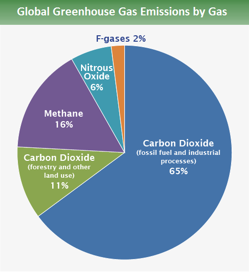
- Carbon dioxide/CO2 fossil-fuel use: 65%
- Carbon dioxide/CO2 (deforestation, decay of biomass, etc.): 11%
- Methane/CH4: 16%
- Nitrous Oxide/N2O: 6%
- CFCs/F-gases: 2%
So, where are these greenhouse gas emissions coming from? They come from literally every sector of our economy. The largest single source is energy supply—primarily coal-fired power plants, and natural gas—used by consumers for electricity and heating. The next largest contribution comes from industry, which includes electricity and heating used by the industrial sector and greenhouse gases released as a byproduct of cement production, chemical processing, and other industrial processes. Energy supply and industry combine for nearly half of the greenhouse gas emissions. Next, accounting for about 17% of emissions, is forestry—mostly the carbon released from forest clearing and forest burning, followed by agriculture and transport, each of which accounts for around 13% of emissions. Agricultural emissions are mostly in the form of methane released by ruminants such as cows used as livestock, and by cultivation of rice paddies, which provide breeding grounds for methanogenic bacteria. Transport-related emissions are mostly in the form of petroleum-based fuels used for personal (i.e., cars and motorcycles, minivans, SUVs, small trucks, buses, airplanes) and commercial (large trucks, ships, airplanes) transportation. Finally, residential buildings (including both construction and maintenance, electricity requirements, etc.) and waste management are responsible for about 8% and 3% of emissions respectively.
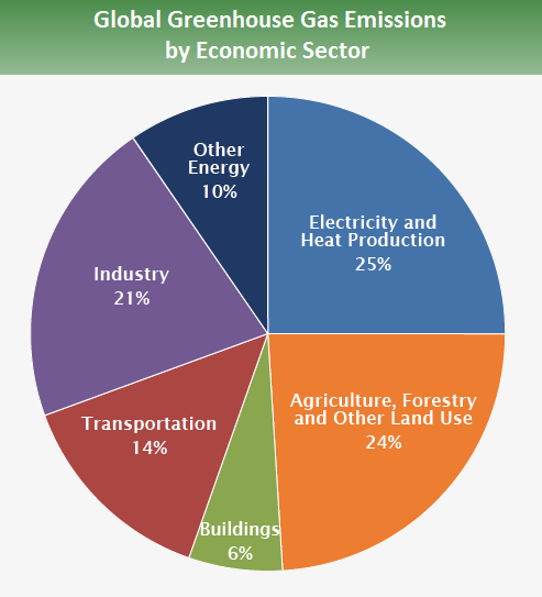
- Agriculture, Forestry, and Other Land Use: 24%
- Transport: 14%
- Residential and commercial buildings: 6%
- Electricity and Heat Production: 25%
- Other Energy: 10%
- Industry: 21%
While it is useful to know what the historical contributions to our emissions have been from the various sectors, looking forward towards the future it is also important to know which sectors are growing most rapidly in their contribution to anthropogenic greenhouse emissions. By comparing emissions rates during the middle of the past decade with those at the beginning of the 1990s, we see that the largest absolute increase (an increase of nearly 3 gigatons/year of CO2 released) has been in the energy sector, though other sectors such as transport and forestry have shown similar (35-40%) increases in emissions over this time frame. It is logical to conclude that these sectors might demand special attention in considering possible emissions mitigation approaches.
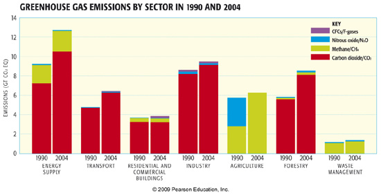
Economics of Emissions Reductions
We have alluded to some of the economic considerations in climate change mitigation elsewhere in this course; now we are going to jump into it with both feet. To some extent, the economics of climate change is a matter of cost-benefit analysis. Alternatively, we can view this as balancing dueling costs. There is, of course, the cost of action. Some mitigation schemes actually cost nothing, and, in fact, they might even save us money—these are called no regrets strategies. They are the things we ought to do anyway: recycle, reuse, reduce our use of energy, etc., whether or not they make a difference for climate change—we will have more to say about these later in the lesson when we discuss reducing individual carbon footprints. However, other mitigation schemes, like carbon sequestration or use of energy sources that are more expensive than relatively cheap fossil fuels, cost money. On the other hand, there is the cost of inaction. We have seen those costs — we know that there is potential harm that could be done across all sectors of society by climate change impacts.
One complication is taking into account so-called externalities — hidden costs that are not, by default, taken into account in the economic decision-making process. What is the value of a coral reef? What is the value of a functioning ecosystem? What is the value of a species? What is the value of human life and does this differ among nations, between rich and poor? Quickly, as you may gather, discussing the economics leads us into a discussion of matters that are no longer simply economic in nature, but, indeed, raise fundamental ethical questions as well. We will discuss these ethical considerations later in the lesson.
But, for the time being, let us return to the economic framing of the problem. To do so, we need to introduce a quantity known as the social cost of carbon (SCC). This is the cost to society of emitting a (metric) ton of carbon. As noted above, precisely evaluating the true cost to society becomes very difficult. Economists typically resolve this difficulty by simply ignoring those costs that are not easily quantified (i.e., ignoring the externalities), and focusing purely on the more straightforward economic costs.
There is quite a bit of debate among economists regarding the true value of the SCC. In part, the divergence of opinion relates to different assumptions regarding the appropriate level of what is known as discounting. Discounting, in economics, relates to the fact that a dollar a year from now is worth less to you than a dollar today, because of the lost opportunity of not having the dollar today. In typical financial markets, this discount rate is somewhere in the range of 6%. One can argue that there is a similar discounting phenomenon that applies to climate change mitigation. The argument is that money that might be spent on climate change mitigation today could be spent on other investments, and perhaps because of improvements in, e.g., energy or in emissions mitigation technology that will arise in the future, it will actually be cheaper to decrease our emissions by the same amount a year from now.
What is unclear, however, is whether or not it is appropriate to apply similar discount rates to those used in financial markets to climate change mitigation. For one thing, the costs and benefits are not borne by the same individuals. The carbon we are emitting today will most likely incur the greatest costs for our children, or even our grandchildren's generation. Is it appropriate to place less value on their quality of life than we place on our own? Once again, we see that deep ethical considerations are easily hidden in the sorts of assumptions that might superficially seem to be objective economic considerations. While some economists like William Nordhaus of Yale University have argued for discount rates as high as 6% (though in recent years he has lowered his estimate of the appropriate discount rate to 3%), others such as Sir Nicholas Stern of the UK, in his well known review of the economics of climate change, argues, for ethical reasons, that the appropriate discount rate should be far lower (Stern favors a 1.4% discount rate). There is a direct relationship between the discount rate and SCC. A 6% discount rate amounts to an SCC of roughly $20/ton, while a 3% discount rate translates to $60/ton, and a 1.4% discount rate translates to an SCC of roughly $160/ton. The U.S. under the Obama administration used a value of $36/ton despite the uncertainties. The Trump administration wanted to reduce this to $1 to $6/ton , even though there are indications that even the Obama-era number could be a substantial underestimate (at nature.com and scientificamerican.com). As of March 2021, the Biden administration has the SCC set at $51/ton. More on the SCC and how we arrive at these numbers can be found in the article: "The Social Cost of Carbon".
Another complication is the possibility of tipping points. Most economic cost-benefit analyses assume that climate changes smoothly with increasing greenhouse gas concentrations. However, if there is a possibility of abrupt, large, and dangerous changes in the climate—e.g., the sudden collapse of ecosystems, melting of the major ice sheets, etc.—and the threshold for their occurrence is not precisely known, then any amount of future climate change could be perilous, with costs that cannot be anticipated in advance. This is one potentially crucial flaw in standard cost-benefit analysis approaches and part of the reason for the so-called precautionary principle, which advises erring on the side of caution (i.e., on the side of dramatic emissions reductions) when the potential threat—great harm to civilization and our environment in this case—is unacceptably costly.
Mitigation efforts, nonetheless, will only proceed if they pass the cost-benefit analysis, and to do so, the estimated SCC must be greater than the cost of emissions reductions. One way to make emissions reductions cost less is to make the emissions themselves cost more, i.e., to put incentives on the reductions. Any serious effort to mitigate carbon emissions must internalize the cost of the damage to our environment that they cause. There have been fierce arguments among economists and policy experts about how best to accomplish this.
The two widely considered approaches are the so-called carbon tax — a surcharge on carbon emissions at the point of origin, e.g., automobiles and trucks, coal-fired power plants, etc., and the so-called cap and trade — a system of tradable emissions permits aimed instead at end use, e.g., the automobile or airline industries, the energy industry, etc. In such a system, a limit is placed on the total allowable emissions; this is the cap for a particular industry, and the emissions rights can be traded in an open market.
Advocates of a carbon tax often see it as a market-based mechanism that is relatively free of bureaucracy, can be used to raise revenue, or can be made revenue-neutral though offsetting reductions in other taxes. Proponents of cap and trade, by contrast, might point out that it is a more effective approach for insuring that emissions remain below some specified level—something that could be particularly important when dangerous tipping points loom. The cap and trade approach, moreover, has been tested and shown viable in other contexts, such as the mandated reduction of sulfate aerosols with the clean air acts of the 1970s to combat the acid rain problem. A limited tradable system for carbon emissions has shown success in the European Union.
We have already seen that, depending on discount rates and other assumptions, one can come up with vastly different estimates of the SCC. But there seems to be some consensus that a reasonable estimate lies somewhere within the range of $20 to $100. As a point of reference, a 9 cents per gallon gasoline tax would amount to roughly 30$/year for the average American who drives roughly 10,000 miles a year, thus emitting a metric ton of carbon.
So, what sorts of emissions reductions might be expected at varying levels of assumed SCC? This is shown in Figure 12.4 below.
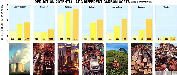
© 2015 Pearson Education, Inc.
It is evident that if we adopt a very low (e.g., $20/ton) value for the SCC, then emissions reductions will be quite modest, while at $100/ton the reductions are considerably more substantial. We saw earlier in the course that carbon emissions, at least approximately a decade ago, were roughly 8.5 gigatons of carbon per year; in the most recent years they are near 10 gigatons per year. In terms of CO2 equivalent that amounts to 37 gigatons/year. [To convert from carbon to CO2 equivalents, we need to consider the following: 1 mole of CO2 contains one mole of carbon; molar weight of carbon is 12 g/mole; molar weight of oxygen is 16 g/mole; molar weight of CO2 is 12+2*16 = 44 g/mol. Therefore, to convert from units of carbon to CO2 equivalents, units of carbon must be multiplied by 44/12 conversion factor.] To bring emissions to zero, we would need to reduce these emissions by 37 gigatons per year. At a $20/ton cost, we see that the reductions over all 7 sectors (energy supply, transport, buildings, industry, agriculture, forestry, and waste removal) add up to about 13 gigatons/year, a small portion of that 31 gigatons/year. On the other hand, at $100/ton, the reductions add up to almost 24 gigatons/year, making a quite serious dent in the 37/year that constitutes current emissions, reducing carbon emissions to 13 gigatons CO2 equivalent/year.
Let us try to place this discussion in the context of what strategies might need to be implemented to avoid dangerous anthropogenic interference (DAI) with the climate system. We saw earlier (in Lesson #6) that to stabilize below 450 ppm, CO2 levels must be brought to a peak within the next decade, and ramped down to 80% below 1990 levels by mid-century. Emissions in 1990 were about 6.5 gigatons carbon per year.
Think About It!
What were 1990 emissions in terms of CO2 equivalent?
Click for answer.
So, doing the calculations, 80% below 1990 levels yields about 5 gigatons CO2 equivalent per year, about 40% of the 13 gigatons we estimated would result from an SCC of $100/ton. So, let us estimate that reducing emissions to 5 gigatons CO2 equivalent would require a SCC on the order of $180/ton.
We can use the Kaya Identity approach to interpret what improvements in carbon efficiency such an SCC would translate too. Since the Kaya identity evaluates emissions in terms of gigatons carbon, let us convert the 5 gigatons CO2 equivalent back to carbon emissions: just under 1.5 gigatons carbon/year, as it turns out.
Think About It!
Using the Kaya Identity calculator from lesson #6, estimate the rate of improvement in carbon efficiency over time required to achieve the reductions in 2050 emissions calculated above.
Click for answer.
So, the bottom line is that if you place a large enough cost on emitting carbon, it is possible to achieve the necessary reductions to stabilize CO2 concentrations at non-dangerous levels. Stabilizing CO2 concentrations at 450 ppm would appear to require an SCC roughly in the range of $180/ton carbon emitted, which, in turn, would amount to a roughly 4% per year improvement in carbon efficiency. How that improvement will come about, necessarily, will be dictated by governmental policies. Only by internalizing the true costs of carbon-based energy and fundamentally revising government incentives for developing non-carbon (or carbon neutral) based energy sources, such as wind, solar, hydro-power, bio-fuels, and potentially—albeit with certain important caveats—nuclear, will market mechanisms operate under rules that will increase the SCC to the necessary levels.
Now, let us take a more detailed look at the opportunities for reductions in the various sectors of our economy and society.
Emissions by Sector: Energy Supply
Energy supply is the single largest source of carbon emissions. As such, it demands special attention in efforts to reduce emissions. The primary fossil fuel energy sources are from the burning of coal and the burning of natural gas (methane), both of which release CO2 into the atmosphere. Petroleum is primarily used for transport—a sector we will discuss in more detail later. Renewable sources of energy, including nuclear energy, biomass burning, hydroelectric, wind, solar, and hydrothermal combine for less than a fraction of either coal or natural gas.
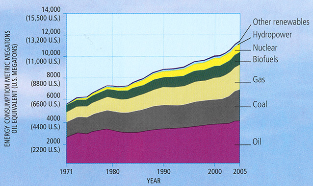
© 2015 Pearson Education, Inc.
Here at Penn State, we have historically gotten much of our power on campus from campus-based coal-fired power plants, but there was a recent move to switch over to natural gas as a primary energy source on campus, a move that was completed in March 2016 (see "Switch to Natural Gas" Article and "One Year Later" Article). Penn State is also making an investment in renewables, like this solar project.
Burning of natural gas emits less carbon than does a similar amount of energy derived from burning of coal, and has thus been favored by some policy advocates as a preferable energy source. On the other hand, coal-burning represents large point source carbon emissions, and thus has the advantage that CCS technology, when it progresses beyond the experimental stage, can be used. Both coal and natural gas extraction are associated with potentially serious environmental externalities. Controversial mountain top removal practices are increasingly being used to get at hard-to-reach coal deposits, but this process can cause extreme environmental degradation over very large areas. Natural gas has its own problems, in particular, damage done to the environment by the controversial practice of hydraulic fracturing or "fracking", which may release harmful chemicals into groundwater and the greater environment. This, and other potentially harmful practices associated with natural gas extraction, has generated quite a bit of debate regarding the development of Pennsylvania's Marcellus Shale. Penn State is now home to the Marcellus Center for Outreach and Research, which focuses on both the potential benefits and potential harm associated with developing Pennsylvania's Marcellus shale.
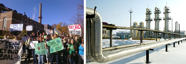
When we look at the regions of the world where per capita energy consumption is greatest, we find, not surprisingly, that much of the current energy consumption is by the developed world, especially the U.S. and Canada, and to a lesser extent Australia, the former Soviet Union, and Japan. However, from the point of view of controlling future emissions, it is important to note that certain developing nations like China and India, are making an increasingly large dent in world energy consumption, and given their very large populations, they are projected to make an even bigger dent in the future. Up until the last few years, China, was now building a new coal-fired power plant every few days! Even today, China continues to subsidize coal-fired power in developing economies despite a push toward lower emissions in their own country. Any efforts aimed at controlling future energy-related emissions clearly need to take into account the developing world, including China, India, and South America.
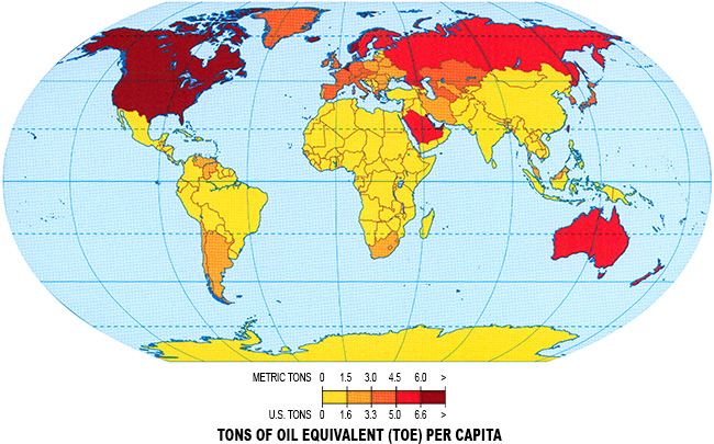
© 2015 Pearson Education, Inc.
Current Emissions by Sector: Transportation
Transportation, as we have seen, accounts for 13% of fossil fuel emissions. Historically, the vast majority of these emissions have come from the road (cars, trucks, SUVs, motorbikes, etc.), and much of the recent growth is related to freight trucks, but emissions from air and sea transport are increasing (much of it is also related to freight transport), and emissions from airlines are projected to become increasingly significant in the decades ahead.
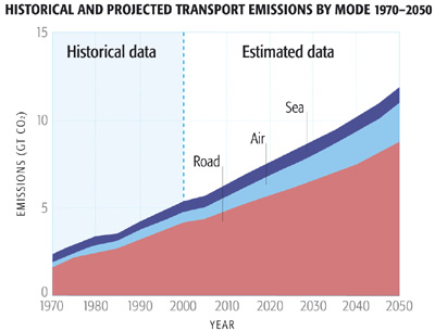
As with the energy sector, transport-related emissions from the developing world, especially China, but also South America and the former Soviet Union, are projected to become increasingly important as these nations develop their transportation infrastructure and adopt driving patterns similar to the developed world.
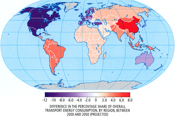
© 2015 Pearson Education, Inc.
There has been quite a bit of discussion about the prospects for so-called Peak Oil taking hold in the decades ahead, as conventional oil reserves begin to run dry. Such predictions are based on the idea of Hubbert's Peak, which uses a simple theoretically-derived expression for the time evolution of production from individual wells, combined with estimates of the declining rate at which new wells/reserves are discovered over time, to project global petroleum production over time. One often encounters the argument that the peak oil phenomenon will serve as a solution to the carbon emissions problem. This argument is flawed, however. While it is true that conventional petroleum reserves could begin to run dry in the years ahead, there are other unconventional reserves in the form of tar sand and oil shale, which could provide a century or more of additional petroleum supplies—of course, such reserves may be considerably more costly to recover. Thus, it is ultimately going to be a matter of economics—as discussed earlier in this lesson—as to whether or not petroleum-based energy will be able to compete with alternative technologies (hydrogen cells, electric vehicles, bio-fuels) for transportation.
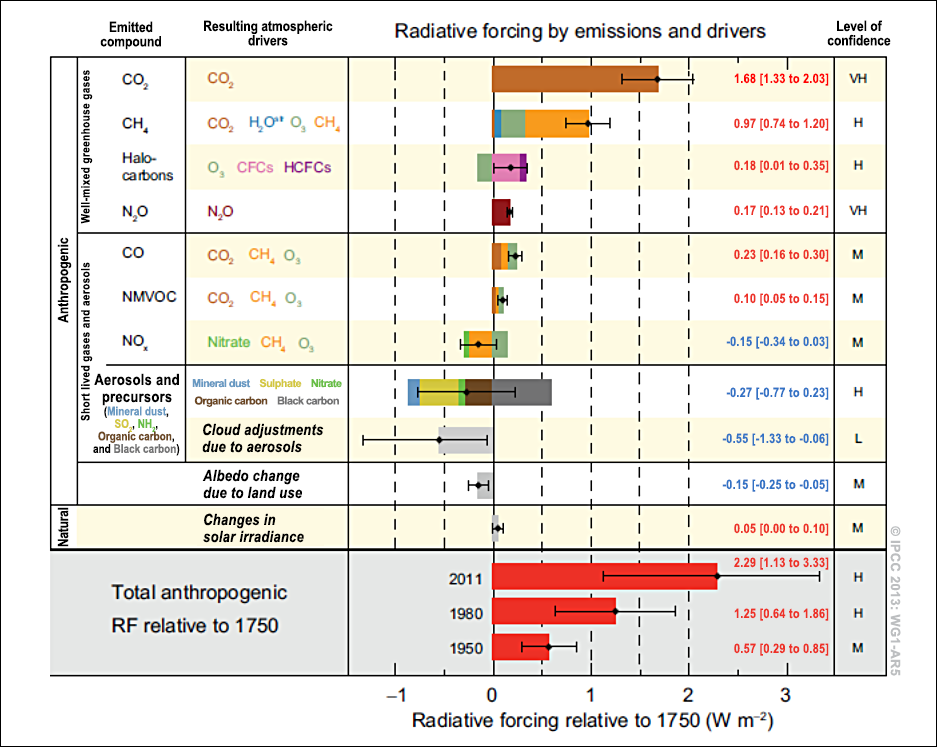
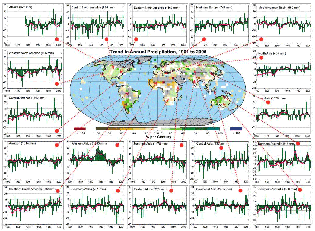
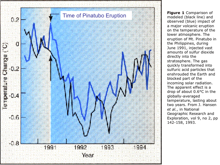
Current Emissions by Sector: Industry, Agriculture, and Forestry
As we have seen earlier, emissions arising from industrial processes, e.g., steel, cement, oil refineries, and paper productions, constitute the 2nd greatest among all sectors, accounting for nearly 20% of all anthropogenic carbon emissions.
As with emissions from coal burning for power, industrial carbon emissions are often from large point sources (i.e., factories), and CCS technology is potentially available as a mitigation option. This means that market-based decisions on emissions reductions are able to consider both the cost of CCS implementation and the cost of paying for emitted carbon (i.e., carbon tax or costs of emissions permits, depending on what scheme for pricing carbon is in place). Estimates of the mitigation potential in the various industrial sub-sectors therefore involve both options.
- Red = EFFECT OF CARBON TAX ON CO2 EMISSIONS: If government agencies were to impose a tax of the amount listed (US $ per metric ton of emissions) on an industry, then it is estimated that the taxed industry would potentially reduce its annual emissions by the amount shown in red.
- Blue = PROJECTED ANNUAL CO2 EMISSIONS BY 2030: These values include emissions resulting from energy supplied to industry from the energy sector.
- Yellow = COST OF CARBON SEQUESTRATION: Some industries also have the potential to remove and store CO2 from industrial emissions before it is released to the atmosphere. Different industries can sequester different amounts per year. If CCS procedures cost the amounts listed about (per metric ton of emissions), then it is estimated that each industry would potentially reduce its emissions by the amounts shown in yellow.
The four pie charts are as follows:
- STEEL: Total amount of projected CO2 emissions by 2030: 1.2 billion metric tons (Gt)
- red (a little over 50%) - Tax: $20-50 per metric ton; Emission reduction: 0.43-1.5 Gt CO2/yr
- yellow (about 5%) - CCS Cost: $20-30 per metric ton; Emission reduction: 0.07-0.18 Gt CO2/yr
- blue (about 45%)
- CEMENT: Total amount of projected CO2 emissions by 2030: 6.5 billion metric tons (Gt)
- red (about 17%) - Tax: up to $50 per metric ton; Emission reduction: 0.72-2.1 Gt CO2/yr
- yellow (about 33%) - CCS Cost: $50-250 per metric ton; Emission reduction: 0.25-4.5 Gt CO2/yr
- blue (about 50%)
- PETROLEUM REFINING: Total amount of projected CO2 emissions by 2030: 4.7 billion metric tons (Gt)
- red (about 3%) - Tax: up to $20 per metric ton; Emission reduction: 0.15-0.30 Gt CO2/yr
- yellow (about 2%) - CCS Cost: $17-31 per metric ton; Emission reduction: 0.08-0.15 Gt CO2/yr
- blue (about 95%)
- PULP & PAPER: Total amount of projected CO2 emissions by 2030: 1.3 billion metric tons (Gt)
- red (a little over 23%) - Tax: up to $20 per metric ton; Emission reduction: 0.05-0.42 Gt CO2/yr
- yellow (0%) - Carbon Capture does not apply to this industry
- blue (about 77%)
The potential for mitigation in the agricultural sector is often given less attention than that in, e.g., the transport sector, even though the two sectors are responsible for nearly equal contributions to global carbon emissions (in fact, agricultural emissions are roughly 0.5% greater!). While agricultural emissions are largely due to methane production from, e.g., rice cultivation and methane-producing livestock, such as beef cattle and dairy cows, interestingly enough, the primary opportunities for greenhouse gas emissions reductions in the agricultural sector actually involve CO2. This is because of the large amount of land globally used for agriculture or livestock pastures. This land has typically been degraded by these uses (i.e., vegetation has been destroyed and soil has been depleted of key nutrients) so that it cannot absorb and sequester atmospheric CO2 efficiently, in contrast with natural vegetated land. Because of this, the primary opportunities for mitigation of carbon emissions in the agricultural sector involve restoring degraded pasture and farm lands. There are other mitigation opportunities, however. One scheme that is being seriously considered involves changing the diet fed to ruminants to decrease their methane emissions. More efficient use of fertilizers can also potentially reduce agricultural emissions of nitrous oxide (not carbon dioxide, but a greenhouse gas, nonetheless). Another scheme involves improving the methods for rice cultivation, which could lead to both fewer emissions and more productive yields.
© 2015 Pearson Education, Inc.
All of the major continents of the world contribute to agricultural carbon emissions today. As nations of South America, Asia, and Indonesia struggle, however, to feed increasingly large populations in the decades ahead, opportunities for carbon emissions mitigation will be greatest in these regions.
© 2015 Pearson Education, Inc.
Let us finally talk about emissions in the forestry sector. Deforestation, as we know, is a major source of carbon emissions, larger than either transportation or agricultural, and the 3rd largest among all sectors, with only energy and industry responsible for greater emissions. So, clearly, the forestry sector has to be on the table if we are looking to mitigate global greenhouse emissions.
Reforestation would seem like an obvious strategy for mitigation in this sector. Unfortunately, reforestation faces some uphill challenges. The process of deforestation actually renders the land greatly degraded and largely stripped of key nutrients (these nutrients, after all, were taken up by the trees which have since been harvested). This makes it more difficult to grow trees on those lands. Since tree root systems and forest canopies are the main features that allow forests to retain water, deforested land has also lost much of its potential to store water and tends to dry out. Combined with a tendency for drying continents as a result of climate change, reforestation faces a serious battle. Indeed, forests are projected by climate models to transition from a net sink of carbon (which they are today) to a net source of carbon, constituting yet another potential positive carbon cycle feedback.
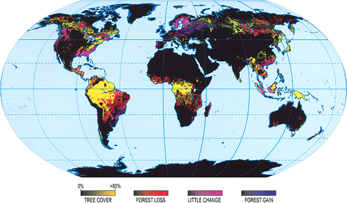
© 2015 Pearson Education, Inc.
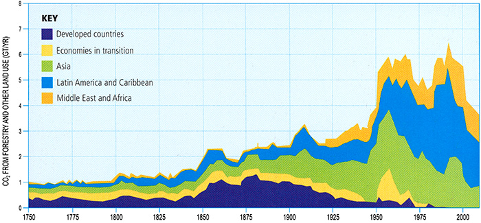
© 2015 Pearson Education, Inc.
Individual Carbon Footprints
We have already seen in this lesson that reducing carbon emissions will ultimately require policies to ensure that market-based economic decisions internalize the cost to society and the environment of emitting additional carbon. Clearly, there is, therefore, not only a role, but a need, for enacting governmental policies to incentivize moving away from practices that emit carbon, including fossil fuel burning.
This does not mean, however, that there is not also a role for the individual. Clearly, making more responsible individual choices can help in the process of reducing carbon emissions. As we saw earlier, the typical American adds 1 metric ton a year to the atmosphere via the use of a personal vehicle. Of course, they would have furthered additional transport-related emissions through air travel, and even through the food and various projects they purchase, many of which are transported large distances. Then, there is the energy we use to power our homes, etc. By the time all is said and done, the average American, through all of their collective activities and actions, will have effectively emitted roughly 20 metric tons of CO2 equivalent in a given year. Call this your carbon footprint. Calculate your personal carbon footprint using the US EPA's calculator here.
What's Your Carbon Footprint?
- Where do you live? There are regional differences in the energy sources used to generate electrical power, and these affect emissions.
- How many people live in your home? Your carbon footprint is smaller ID the energy you use is shared.
- What type of vehicle and how many miles per year do you drive? Your car's gas mileage affects emission.
- How often do you fly, and are your trips short or long? Airline travel is a big emissions contributor. Short trips use more energy per mile because takeoffs are particularly fuel-intensive.
- Do you heat your home with natural gas, heating oil, or propane? How much is your typical monthly heating bill? What is your typical monthly electric bill?
- Do you eat red meat, just chicken and fish, or are you a vegetarian? The various activities that put these foods on your table have differing carbon emission profiles.
- Do you eat mostly local foods and buy mostly local products, or do you prefer imported goods? Long-haul freight consumes fossil fuel aggressively.
- What types of recreation do you prefer? A bicycling trip that begins at your front door contrasts quite markedly with snowmobiling or motor boating at distant recreation sites.
Now take off your shoes and compare your print to two famous footprints!
Sasquatch
Carbon footprint: 30 metric tons CO2 EQ per year
- At home: Lives in a poorly insulated, air-conditioned apartment in the American Midwest with electric heat, loves to soak in a hot bathtub several times a week; does not recycle
- On the go: Drives an SUV 24,000 km (15,000 miles) per year, takes 5-10 business trips by plane each year, both short haul and long haul; and takes one exotic personal vacation each year by plane.
Cinderella
Carbon footprint: 4 metric tons CO2 EQ per year
- At home: Lives with two roommates in France in an energy-efficient, well-insulated apartment with electric heat; prefers taking showers; recycles a significant fraction of household waste
- One the go: Drives a hybrid car 16,000 km (10,000 miles) per year; journeys by train 1,600 km (1,000 miles) per year, uses videoconferencing rather than traveling for business; and takes one exotic personal vacation each year by plane.
Does your footprint look more like Cinderella's dainty glass slipper or Sasquatch's big paw? Get online, find a carbon footprint calculator, and let the site suggest ways in which you can become more carbon stingy and environmentally friendly.
© 2015 Pearson Education, Inc.
Just like real footprints, carbon footprints vary greatly in size. An especially gluttonous individual might emit as much as 30 metric tons a year through his actions—call him a "Sasquatch" (otherwise known as "big foot"). On the other hand, an individual with a more ascetic lifestyle might emit as little as 4 metric tons of CO2 equivalent per year—call her a "Cinderella".
Individuals, one might argue, must do their part in achieving the reductions necessary for achieving stabilization below dangerous levels. Recall that 80% below 1990 global emissions by mid-century, as required for 450 ppm stabilization, is about 5 gigatons CO2 equivalent per year, whereas current emissions are about 31 gigatons.
Think About It!
How close would the typical American have to come to being a "Cinderella" by 2050 to do their part in achieving the necessary reduction in emissions?
Click for answer.
Since average emissions are currently 20 tons/year, these emissions must be reduced to (5/31) x 20 = 3.2 gigatons/year, a bit lower than even "Cinderella"!
So, if you are a Sasquatch, or even just a typical emitter, what can you do to try to fit into Cinderella's shoes? Well, a picture is indeed worth a thousand words—see below.

- Appliances that are not in use can be unplugged, reducing electricity leakage.
- Clotheslines make an excellent substitute for dryers
- Drive alone less or drive a fuel-efficient or electric vehicle
- Remember to recycle
- Replace incandescent bulbs with fluorescent bulbs
- Commute to work by bicycle or on foot.
In many cases, as alluded to earlier in the lesson, there are simple no regrets strategies that can be taken to reducing one's own personal greenhouse gas emissions. Bicycling to work or to run errands is better for your health, as well as less expensive, than driving a car. Conserving energy by turning off appliances when they are not being used, buying energy-efficient appliances, compact fluorescent light bulbs, etc., lowers your energy bills. Many supermarkets give you a discount for using your own reusable canvas shopping bags, and many coffee shops give you a discount for using your own reusable container in place of a disposable paper cup. Other helpful practices such as the "Three Rs"—reducing, reusing, and recycling materials—are simply a matter of good stewardship, and make us feel better and help keep our environment clean. Of course, it is overly optimistic to imagine that civilization will make the major adjustments in lifestyle necessary to stabilize greenhouse gas concentrations based simply on no regrets strategies and an intrinsic commitment to better stewardship.
Policies that provide incentives for these types of behavior will have to play a key role.
Carbon Emissions Policies
We just completed a discussion of how individuals can make a difference in our collective carbon emissions through more responsible choices and decisions in their daily lives. But personal responsibility is hardly enough to effect major changes in carbon emissions. In a market-based economy such as prevails over North America, Europe, and the developed world, and increasingly the developing world as well, only proper market incentives can insure major changes in collective behavior. Ultimately, to solve the climate change problem, we need to fundamentally reshape our incentive structure, which currently provides very little investment for renewable sources of energy, while subsidizing development of fossil fuel sources. Putting a price on the emission of carbon is the only way to do that. And whether it is a carbon tax or emissions permits, only governmental policies coordinated among the nations of the world can implement such a system.
Kyoto Accord
Given the global nature of our carbon emissions, negotiated international treaties are essential if we are to stabilize greenhouse gas concentrations. Awareness of the need for such treaties was recognized by the early 1990s, in the form of the the United Nations Framework Convention on Climate Change (UNFCCC), which was first put forward at the 1992 Earth Summit in Rio de Janeiro. The framework convention was updated at an international summit held in Kyoto, Japan in 1997 to constitute the now-famous Kyoto Protocol, which had as its stated goal, holding greenhouse gas concentrations below a level that would constitute dangerous anthropogenic interference (DAI) with the climate system. This was, indeed, the first reference to the now-familiar concept of DAI. The Kyoto Protocol went into effect 8 years later, in 2005.
While putting a price on carbon emissions is the only way that free market forces will insure stabilization of greenhouse gas concentrations, the Kyoto accord did not mandate a particular approach (i.e., carbon tax, or tradable emissions), nor did it define DAI in terms of a particular CO2 equivalent stabilization level or amount of warming. However, by 2007, the European Union had taken such initiative, defining DAI as 2°C warming relative to pre-industrial time, and implementing its own pilot program in emissions trading.
By the end of 2008, all industrial nations had ratified the treaty except the U.S. (though Canada withdrew from the treaty in 2012 under a new administration). Many developing nations also ratified the protocol, but were not held to mandated reductions due to the financial hardships the reductions might have imposed upon their fragile economies. While ultimately 192 nations signed on to the Kyoto Accord before it expired in 2012 (and many were willing to sign on to even stricter controls on carbon emissions), the two largest emitters of all ”the United States and China” remained holdouts. This is, perhaps, unsurprising. Both countries, as we have seen, rely upon a fossil fuel energy economy and—in the case of the U.S., politicians are lobbied heavily by fossil fuel industry groups not to pass legislation that might put a price on carbon emissions. Progress in mitigation of global carbon emissions is unlikely to occur without the participation of these two nations, placing much of the global political pressure on the U.S. and China to agree to an emissions reductions treaty.
Some nations, for example low-lying island regions and tropical nations most likely to be impacted in the near-term by climate change, argued that Kyoto did not go nearly far enough, and that for them DAI is already around the corner, and they do not have the resources to implement a program of wide-scale adaptation that richer nations have. Other supporters of Kyoto pointed out that it was just a first step in a process that will hopefully lead to more stringent reductions in the future. Critics on the other side argued that the impacts of climate change are overstated, and that passing the Kyoto accord would cost the economy. However, as we saw earlier in this lesson, sober cost-benefit analyses indicate that the costs of inaction are likely to greatly exceed the cost of action, so the credibility of this particular argument might be called into question.
Other complications arose due to the politics of differing interests of the two major holdouts, China and the U.S. China's net greenhouse emissions are now greater than those of the U.S., but their per capita emissions (due in large part to their extremely large population) are lower. Not surprisingly, the U.S. argued that the required emissions reductions be based on total emissions, while China argued it should be based on per capita emissions. Another complication is that western nations, like the U.S. and Europe, have enjoyed the benefits of more than a century of access to cheap fossil energy, while emerging industrial nations like China and India are only now exploiting fossil fuel energy reserves. These nations argue that the developed world already had its turn, and that they deserve their fair share. There are consequently substantial political tensions that make progress in achieving a negotiated emissions treaty slow and difficult.
Paris Agreement and Future Policy
Little progress was made in achieving a binding international climate treaty in the years following Kyoto. No such agreements were reached during either the 2007 Bali summit, or the 2009 Copenhagen summit. The primary obstacles seemed to be those cited above, namely the differing interests of various major players such as the U.S. and China, and more generally between the developed, developing, and undeveloped world. The reticence of the U.S. in committing to mandatory carbon reductions is, too, in part a product of political pressures. Those favoring U.S. participation have had to fight a coordinated, massively funded publicity campaign by the fossil fuel industry and trade groups representing it, which has successfully prevented passage of energy legislation dealing with climate change by attacking its scientific underpinnings, and by opposing politicians who support such legislation by funding their opponents in political campaigns, among other tactics.
This lack of progress and the apparent lack of will to confront the climate change threat has caused many to become discouraged over prospects for a meaningful carbon emissions policy. However, there is some cause for cautious optimism as well. While China is the single largest net emitter of carbon on the planet now, this country has shown signs of commitment to developing renewable and clean energy, investing far more money in this area in recent years that other countries, such as the U.S. In November 2014, General Secretary Xi Jinping, along with President Obama, created a plan to limit greenhouse gas emissions. Meanwhile, the Obama administration pursued executive actions via the EPA to reduce U.S. carbon emissions, including calling for higher automobile fuel-efficiency standards and regulations on coal-fired power plants such as the Clean Power Plan, with a target of reducing U.S. electrical power generation emissions by 32% by 2030. While the U.S. Congress failed to pass a comprehensive climate bill, many states and localities have implemented their own greenhouse gas reduction schemes.
There are past examples of success we can look to, where nations came to agreement on policies to mitigate other emerging global environmental threats, whether it be the passage of the Clean Air Acts in the 1970s to deal with the threat of acid rain, or passage of the Montreal Protocol in 1984 to ban the production of CFCs, which were known to be damaging the stratospheric ozone layer. These past examples show that nations can join together in binding agreements to confront emerging global environmental threats before these threats reach catastrophic magnitudes. Dealing with climate change is admittedly more difficult, as carbon emissions are at the very heart of our current global energy economy, and simple solutions (such as installing scrubbers in smokestacks in the case of acid rain), or ready substitutes (replacing CFCs with other non-ozone-destroying substitutes as propellants in spray cans) are far more challenging to come by. Clearly, confronting global climate change will require greater will and greater global cooperation than has ever been called for before. Nonetheless, we can look with guarded optimism at these past successes and use them as instructive road maps as we seek to deal with the problem of global climate change.

Finally, at the Paris summit in December 2015, the Paris Agreement was composed by consensus of the nearly 200 attending parties of the UNFCCC (countries plus the EU), and became legally binding in November 2016 after sufficient parties representing enough of the world's greenhouse gas emissions ratified the agreement - including, in particular, the United States and China. Each participating party has been required to set an emission reduction target - a Nationally Determined Contribution (NDC) - but the chosen amount is voluntary, and no enforcement mechanism is in place. It was agreed that the goal would be to limit global warming to "well below 2 C above pre-industrial levels", but also "to pursue efforts to limit the temperature increase to 1.5 °C above pre-industrial levels". Course author's Michael Mann's statement on the agreement can be found here.
From a global perspective, there is evidence that mitigation policy is having a noticeable effect. After steady growth in recent decades, global CO2 fossil-fuel emissions nearly stabilized 2014 to 2016 (less than 1% growth per year) despite substantial worldwide GDP growth, in large part due to the phasing out of coal power plants in China and the United States. However, global emissions rose again in 2017 and 2018. The European Union and 174 world states have ratified the Paris Agreement, and after Syria in 2017 and the United States once again joining the agreement in 20201, every country in the world is now a party to the Paris agreement.
Sustainable Development
Climate change is but just one of many global environmental threats we now face. Dealing with these threats in a way that allows us to continue to meet the basic needs of the people on this planet including food, water, shelter, and quality of life, while still maintaining the health of our environment, is the challenge of sustainable development. While the goals of economic growth and environmental sustainability may sometimes seem to be in competition in the short-term, we have seen that in the long-term the threat of environmental degradation and collapse potentially trumps all other considerations. Without a healthy and functioning planet, we cannot sustain the increasingly large global population projected by demographic forecasts. If we accept these assumptions, then the object of governmental policies must be to grow our economy while preserving our environment—the challenge, again, of sustainable development. As developed nations are currently on the most consumptive, unsustainable path, any hopes for environmental sustainability will require fundamental societal changes in developing nations, and a transfer of technology and assistance to developing and undeveloped nations to ensure that they grow their own economies in a manner that is more consistent with environmental sustainability than that of the industrial nations in the past.
Within each of the sectors contributing to global carbon emissions and climate change, we can indeed see opportunities for mitigation that more broadly serve the larger goal of sustainable development. Recycling, for example, saves costs, reduces carbon emissions, and preserves raw materials. Switching to a renewable energy economy will create new industries and economic opportunities, and new jobs. And so on.
| Mitigation Options --> | Improving Energy Efficiency | Reforestation | Deforestation avoidance | Incineration of waste | Recycling | Switching from domestic fossil fuel to imported alternative energy | Switching from imported fossil fuel to domestic alternative energy |
|---|---|---|---|---|---|---|---|
| Compatibility with sustainable development | Cost effective; creates jobs; benefits human health and comfort; provides energy security | Slows soil erosion and water runoff | Sustains biodiversity and ecosystem function; creates potential for ecotourism | Energy is obtained from waste | Reduces need for raw materials; creates local jobs | Reduces local pollution; provides economic benefits for energy-exporters | Creates new local industries and employment; reduces emissions of pollutants; provides energy security |
| Trade-offs | Reduces land for agriculture | May result in loss of forest exploitation income and shift to wood substitutes that produce more emissions | Air pollution prevention may be costly | May result in health concerns for those employed in waste recycling | Reduces energy security; worsens balance of trade for importers | Alternative energy sources can cause environmental damage and social disruption, e.g., hydroelectric dam construction |
© 2015 Pearson Education, Inc.
Ethical Considerations
While the economics of climate change get much attention, the ethical considerations of climate change often get short shrift by comparison.
One of the challenges of applying traditional economics and cost benefit analysis to the problem of climate change is that the costs and benefits are simply not borne by the same individuals. There is a disaggregation of the costs and benefits with respect to both generation and region. We have seen that those who live in the undeveloped and developing world, largely in the tropics, and have had little role in the carbon emissions that have led to climate changes thus far, are likely to see the most devastating impacts in key areas such as agriculture and freshwater availability and—in the case of low-lying island nations—loss of habitability. Because of their relative lack of wealth, the nations of the undeveloped and developing world are the least able to implement adaptations that might better allow them to cope with climate change. One possible solution is a system that would provide for a transfer of funds from industrial nations to poorer nations to allow them to implement adaptive measures.
Aside from the regional disparities, there is a fundamental generational disparity associated with climate change. The generation that is creating the problem—us—is unlikely to see the most severe impacts of climate change. Instead, it is future generations who will see the greatest impacts of the carbon we are emitting today, e.g., inundation due to sea level rise, stronger hurricanes, worsened drought. The economic discounting typically used in purely economic evaluations of the climate change problem, one might argue, does a grave injustice to future generations by placing lesser value on their world than ours.
There is, finally, the even more fundamental ethical question of whether it is ethical to be playing "Russian roulette" with the future of the planet. We have discussed the potential harm to the climate associated with ongoing carbon emissions. But there are other even more immediate and more visceral reminders of the hidden costs—the externalities—of our current reliance on fossil fuel sources that are increasingly more difficult, and more dangerous, to recover. Recent accidents over the past decade, like the Deepwater Horizons oil disaster, which cost human lives and did potentially irreparable harm to the ecosystems of the Gulf of Mexico, or the Upper Big Ranch Coal Mine explosion and collapse, which killed 25 miners (the company, Massey Energy, that runs the mine had been cited for over 500 violations in the past year; this is the same company responsible for the extremely controversial practice of mountain top removal) are reminders of the true cost of our continuing reliance on fossil fuel energy.
The recent Japanese nuclear meltdowns, resulting from a major earthquake off the coast of Japan and devastating tsunami, serve as further warnings regarding the dangers of some other non-carbon energy sources that have been proposed as alternatives to fossil fuel energies. One can make a fairly compelling argument that there are no magic bullets. The only safe way of meeting our current and future energy requirements is to put far greater investment into clean, renewable energy sources—like wind, solar, hydropower, biofuels, etc.
We have talked previously about the so-called precautionary principle. There is only one Earth, and if we choose to perform an uncontrolled experiment with it, and that experiment goes awry--there is no going back. There is no restoring the Greenland and Antarctic Ice Sheets, which took millions of years to form, once they have collapsed. There is no restoring species, who evolved over many millions of years, once they go extinct because of human-caused environmental changes. Naive economic analyses of climate change damages can be surprisingly dismissive of the costs of such catastrophic outcomes. Critics have pointed out, for example, that one widely used economic model for performing carbon emissions cost-benefit analysis places a disturbingly low cost on ecosystem damages: the model favors the elimination of 99% of species going extinct within 40 years because it only values the net loss of those species at $250/capita! (the costs of lost species are valuated only in terms of the fact that humans like having them around, i.e., there is no intrinsic value ascribed to animal and plant species, functioning ecosystems, etc.—arguably a fundamental weakness in the way such damages are treated in these sorts of models in general).
Is this outcome defensible from a moral or ethical point of view? Could we rationalize leaving our children and our grandchildren not only a severely degraded environment, but a world lacking most of the wonder and beauty of our world —charismatic creatures like the polar bear and the now-extinct Golden Toad, and Hemingway's magnificent "Snows of Kilimanjaro"?

Scientists are partnering with communities and evaluating the current best solutions for climate at Project Drawdown. Many of the adaptation, mitigation, and reduction strategies discussed in this course are evaluated there to create a database of the best ideas for "drawing down" carbon in the atmosphere. You can read more about the project here, and quiz your knowledge about the best solutions here.
And, with that thought, we have come to the end of the course.
Lesson 12 Summary
In this lesson, we studied the details of greenhouse gas emissions, including the sectors of the economy responsible for emissions of various greenhouse gases, the potential for mitigation in these various sectors, and the economic and ethical considerations of climate change and climate change mitigation. We observed that:
- CO2 from fossil fuel burning, deforestation, and other human practices, are the primary causes, responsible for roughly three fourths of net anthropogenic greenhouse gas emissions;
- there is a modest but non-negligible contribution (roughly 13%) from methane, produced largely from agriculture/livestock and dam projects; other minor contributors include nitrous oxide, which also produced as bi-product of agricultural practices;
- the primary sector of our economy responsible for greenhouse emissions is energy production, amounting for more than 25% of emissions; other major contributors are industrial practices (nearly 20%), deforestation (roughly 17%), and transport and agriculture (each at 13%). Residential buildings and waste management make up the balance;
- the largest absolute increase over the past two decades (roughly 3 gigatons CO2 equivalent per year) has been in the energy sector, while transport and forestry have shown similar (roughly 35%) increases;
- economists use cost-benefit analysis to assess market-based solutions to stabilization of greenhouse gas emissions;
- a quantity known as the social cost of carbon (SCC) is used to estimate the cost to society of emission of one metric ton of CO2 equivalent. Economists typically estimate the SCC as falling within the range of $20-$100/ton of CO2 equivalent, but this value depends critically on what is known as the discounting rate, a quantity which assumes that costs and returns calculated for the future are less than those calculated for today. Carbon emissions reductions will only pass the cost/benefit analysis when the SCC exceeds the cost of mitigation, i.e., it costs more to emit carbon than not to;
- a simple way to encourage emissions reductions is to raise the cost of emitting carbon through some financial intervention in the form of either a carbon tax or tradable emissions permits (e.g., cap and trade);
- there is a range of mitigation potential among the various sectors, with some of the most significant opportunities in the energy supply and industrial sectors owing to the availability of carbon sequestration for large point source emitters in addition to other mitigation opportunities. There are also substantial mitigation opportunities in the transportation sectors (e.g., use of alternative fuels) and agricultural sectors (e.g., the restoration of degraded agricultural lands);
- individuals have an important role in mitigation through reducing their personal carbon footprints; In many cases, no regrets strategies (i.e., things we ought to be doing anyway for health, financial, or ethical reasons) can greatly reduce greenhouse gas emissions. In the U.S., current emissions are roughly 20 metric tons of CO2 equivalent per year per person; A reduction to under 4 metric tons per year by mid-century would be consistent with a scenario of 450 ppm CO2 stabilization;
- only governmental policies and negotiated global treaties can ensure that proper economic and societal incentives are in place to limit carbon emissions below levels considered to constitute a dangerous anthropogenic interference (DAI) with our climate;
- ethical considerations arising from the disaggregation of costs and benefits of burning fossil fuels, with tropical/developing nations and future generations at great risk of suffering negative climate change impacts, complicate simple cost/benefit analysis approaches to climate change mitigation;
- ethical considerations related to the precautionary principle, i.e., that it is unwise and arguably unethical to be playing dice with the future of our planet, provide additional arguments for stabilizing greenhouse gas emissions beyond simple, and potentially flawed, economic cost/benefit analysis approaches.
Reminder - Complete all of the lesson tasks!
You have finished Lesson 12, the final lecture of the course. Double-check the list of requirements on the first page of this lesson to make sure you have completed all of the activities listed there. Good luck with the final exam!
Lesson 12 Discussion
Activity
Directions
Please participate in an online discussion of Project #3 Climate Change Videos.
This discussion will take place in a threaded discussion forum in Canvas (see the Canvas Guides for the specific information on how to use this tool) over approximately a week-long period of time. Since the class participants will be posting to the discussion forum at various points in time during the week, you will need to check the forum frequently in order to fully participate. You can also subscribe to the discussion and receive e-mail alerts each time there is a new post.
Please realize that a discussion is a group effort, and make sure to participate early in order to give your classmates enough time to respond to your posts.
For this discussion:
1) Make an introductory post about your own video with a couple of sentences about the message you were trying to convey. *Include a link or an attachment of your video, so other students can access it!!*
(Note: if you have not created a Project 3 video but still want to participate in this discussion, for your introductory post state the detailed message you would have tried to convey had you made a video.)
2) Watch the other class videos (or as many as time will allow).
3) Comment thoughtfully on at least *2* of your classmates' posts/videos with a suggestion or critique.
Submitting your work
- Go to Canvas.
- Go to the Home tab.
- Click on the Lesson 12 discussion: Project #3 Videos.
- Post your comments and responses.
Grading criteria
You will be graded on the quality of your participation. See the online discussion grading rubric for the specifics on how this assignment will be graded. Please note that you will not receive a passing grade on this assignment if you wait until the last day of the discussion to make your first post.